








Porta
The logo stayed. We built a new brand language around it.
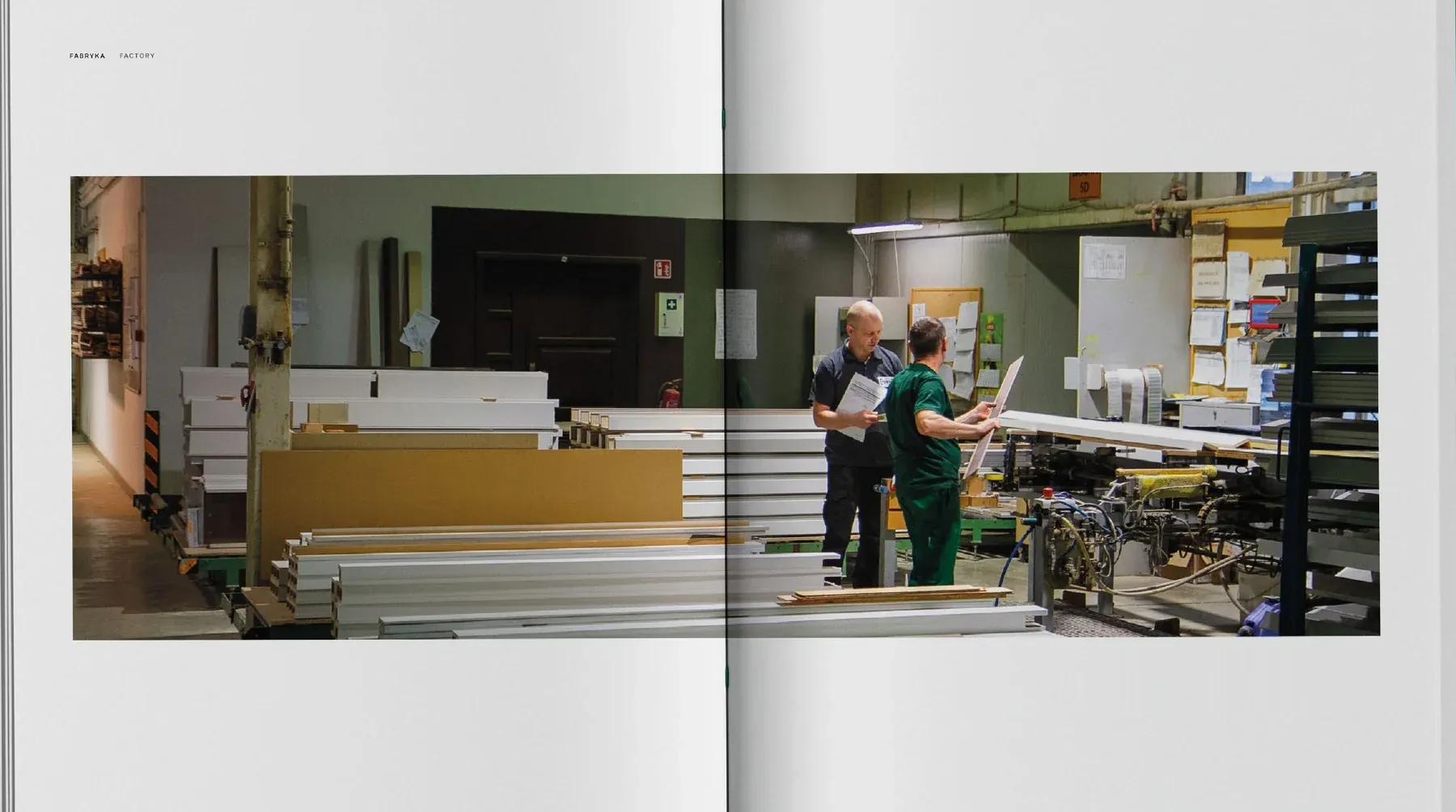
Porta makes doors in its factories in Poland and Romania and sells them in over 2,500 outlets. The company came to us in the middle of big changes to its range: together with designer Maja Ganszyniec it was reorganising the offer into 10 design lines. The new offer needed new communication. The logo was well recognised, so it stayed, and we built everything else around it.
See what we did- Goal
- Reorganise the communication around the new structure of the offer. The catalogue was to be a sales tool, a guide full of inspiration for customers and a handbook for sales staff, all at once.
- Solution
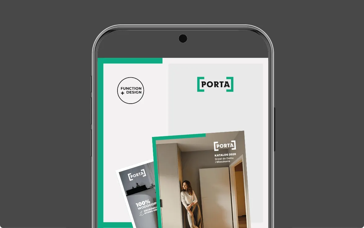
- The logo and the green stayed. We turned the frame of the logo into the main element of the identity and built grids, icons, drawings, labels and templates around it. The catalogue left the building-trade style behind in favour of photos from everyday life.
- Result
- A design system for an existing logo, described in an extensive brand book in Figma. The catalogue, porta.com.pl, social media and sales materials are all made to it.
Identity in motion
The whole system in one film
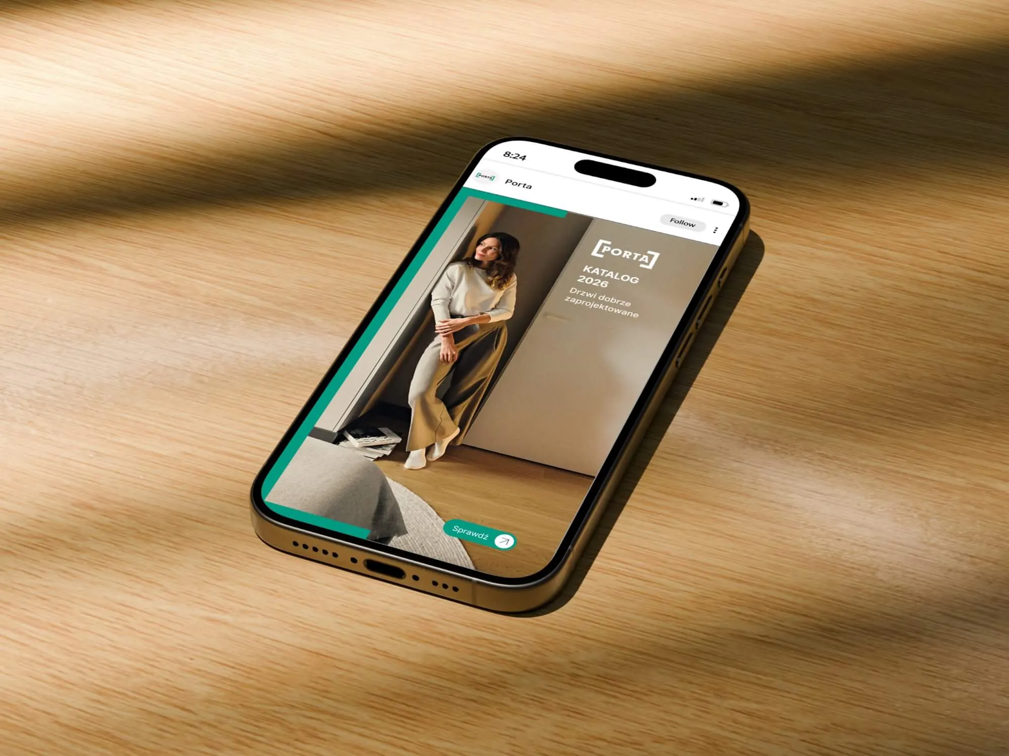
The film opens with just the brackets that make up the logo. Then it shows the catalogue covers, spreads, the website, posts, business cards, shelf wobblers and showroom stickers.
Working together
Over 20 projects for one brand
- 280 catalogue pages in three parts, from inspiration to technical data
- 4 catalogue versions: print, English, interactive and for investors
- 4 sites and pages: porta.com.pl, the catalogue page, careers and Porta PRO
- 30+ materials for the anniversary in Romania, each in two languages
- 5 languages of the animated anniversary invitation
- 1 design system: a brand book in Figma, icons, drawings, post and presentation templates
Plus ongoing work: posts, banners and materials as they're needed.
Brand mission from the workshops
Our products are the quiet heroes of your everyday life.
Workshops
One catalogue, three very different readers
In workshops with the Porta team we described the brand's mission, values and personality, and then the people who pick up the catalogue. Each of them reads it differently, so the catalogue moves from light pages of inspiration to increasingly technical ones.
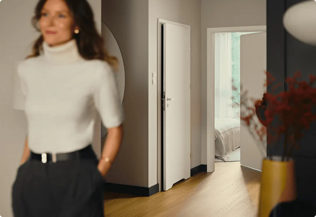
Furnishing a home. Starts with interior photos and only then picks a line and a finish.
Standing with a customer in the showroom. Goes straight to the design lines, dimensions and technical data.
Still getting to know the offer. Reads the catalogue from cover to cover and learns the whole brand from it.
-
01 Inspiration
-
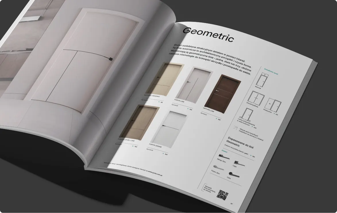
02 Design lines
-
03 Products and data
Big idea
The logo, taken apart
The logo stayed unchanged. We took it apart into its elements and built the whole system from them.
-
01
The logo
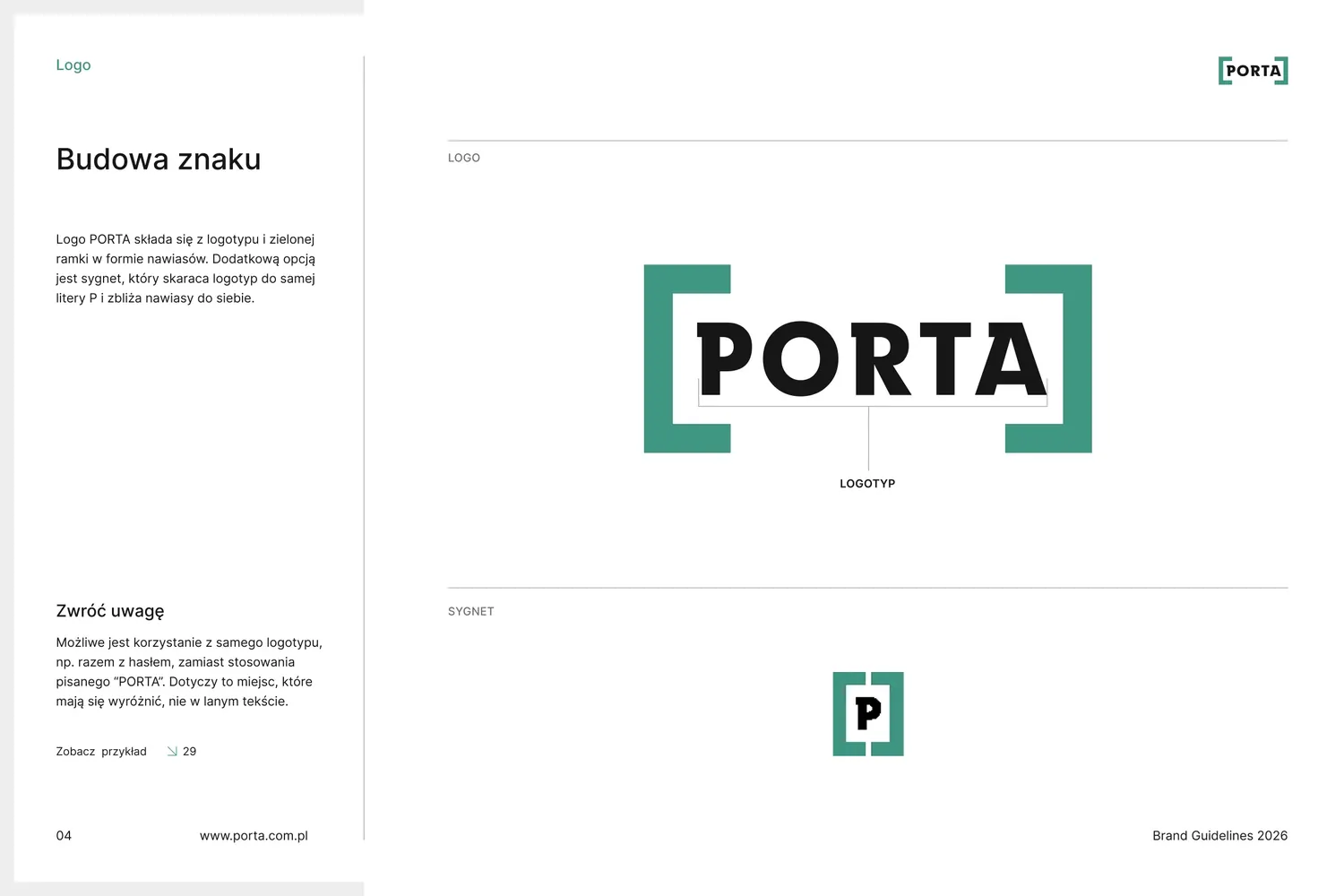
The Porta logo is a wordmark enclosed in two green brackets. Customers and sales staff know it well, so we didn't change a thing.
“The PORTA logo is defined by a minimalist frame (symbolising door leaves) that encloses the wordmark in a compact block.”
-
02
Two leaves
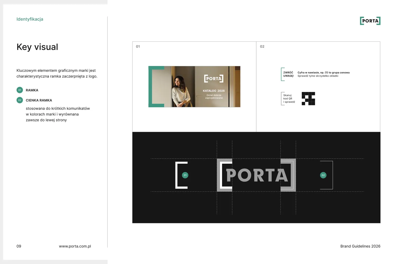
Each bracket is a door leaf. We moved them away from the wordmark and stretched them, so together they form a frame. It can hold a photo, an icon, a slide or an entire cover.
“The motif is used as the shape alone (unchanged), as a delicate frame around a graphic (e.g. icons) or as a frame around a composition.”
-
03
A handle for a new opening
To the two leaves we added a circle with an arrow. In door drawings it sits where the handle is and shows which way the door opens. On the website, in posts and in presentations it's a button that invites you further.
“A circle may be used, applied by contrast in CTAs.”
-
04
Grid
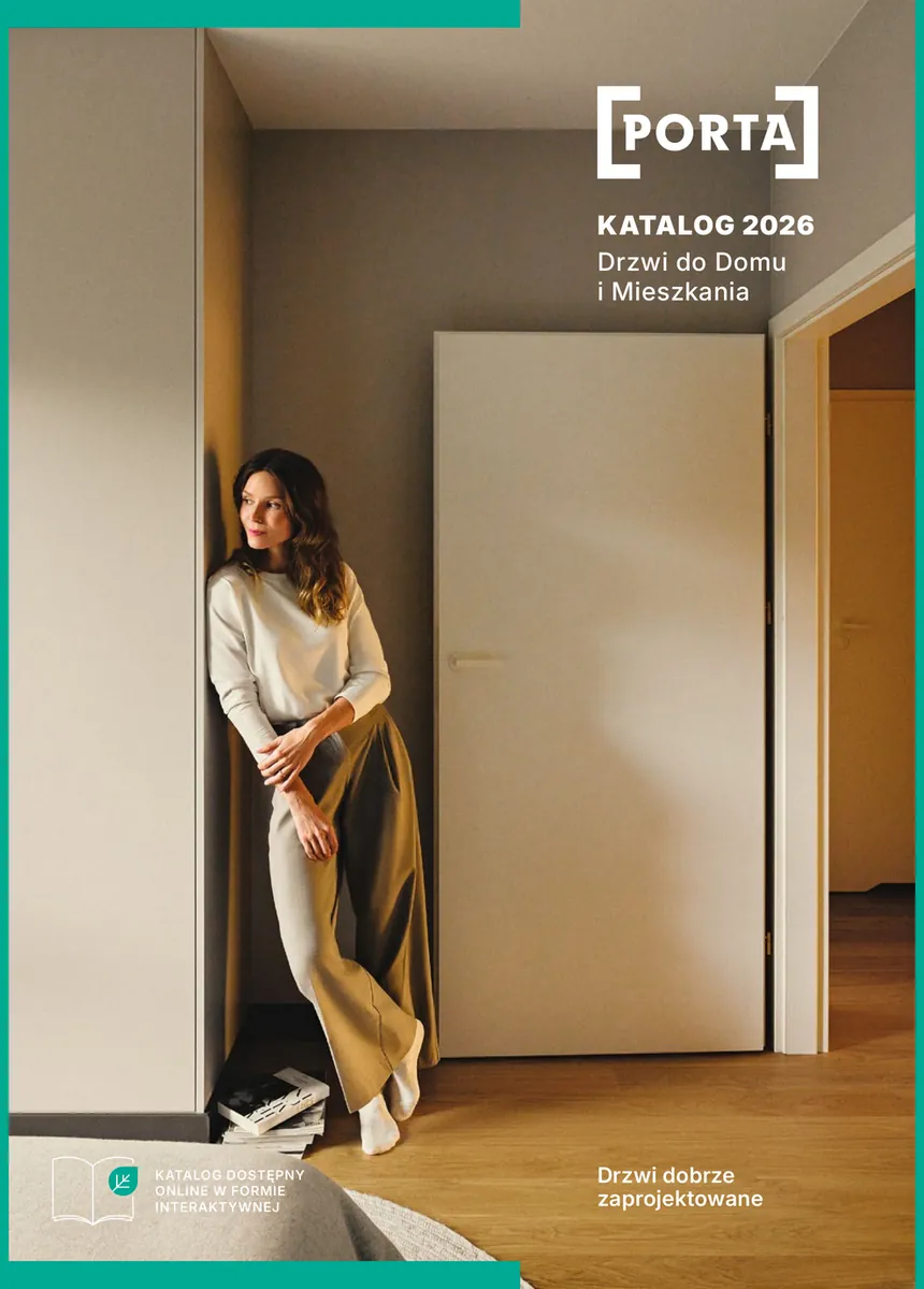
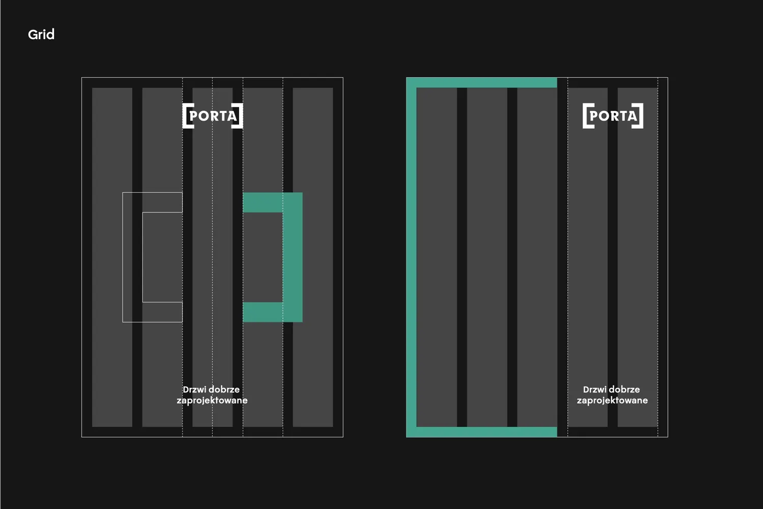
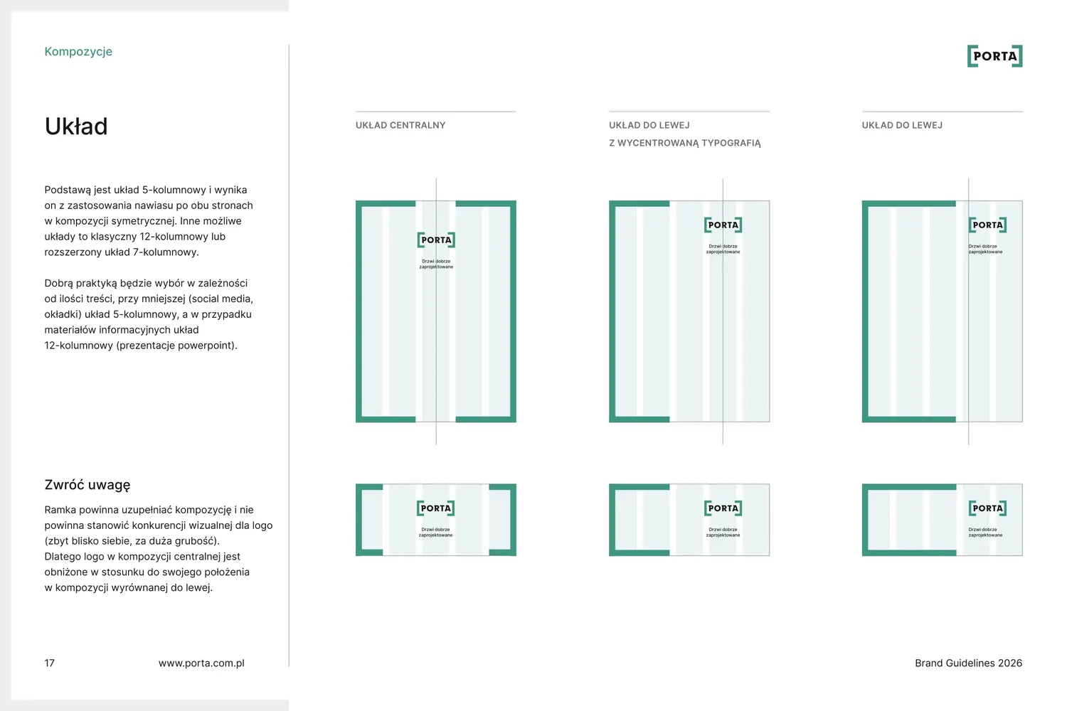
The frame sets the grid. The cover has five columns, and the gutters and margins match the thickness of the frame. The frame can span one column or three.
“Good practice is to use the same thickness for the frame and for the space between columns.”
-
05
Cover
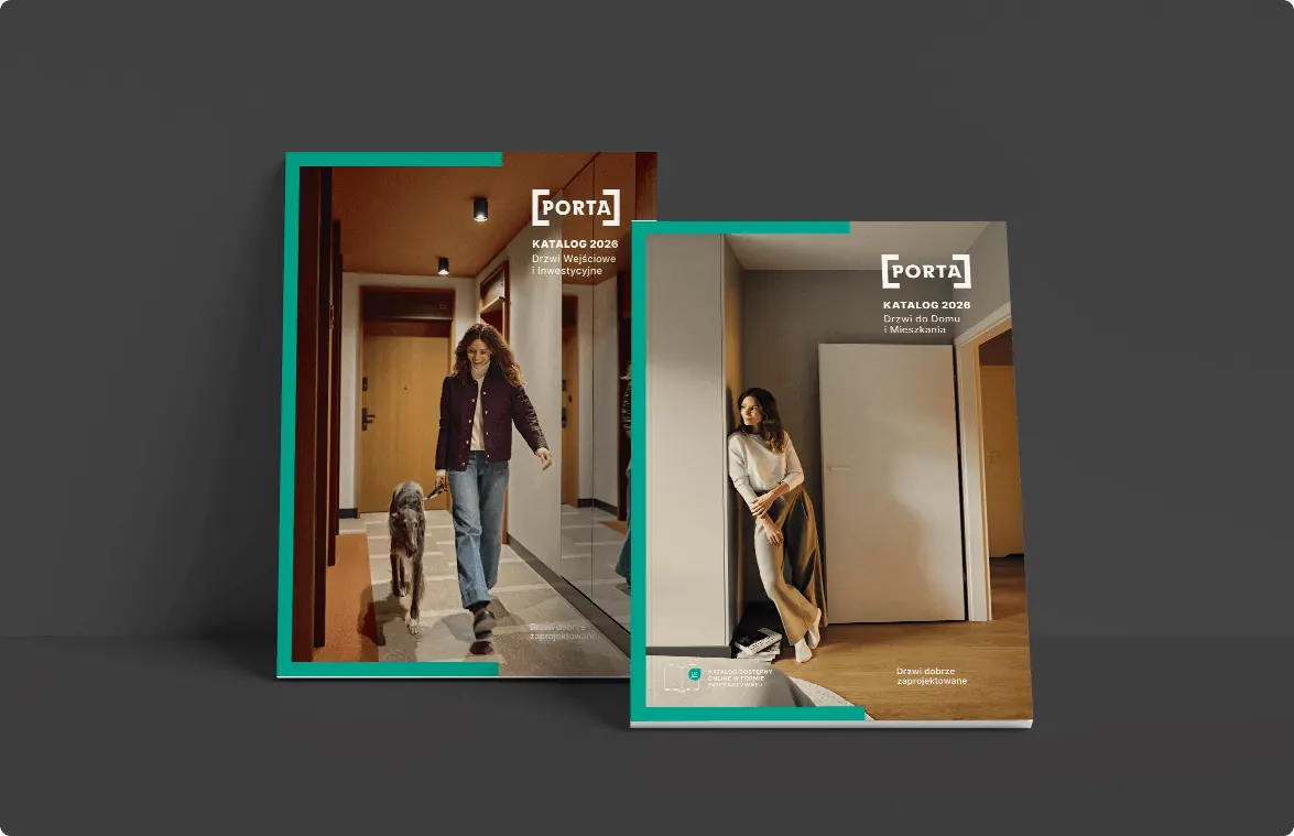
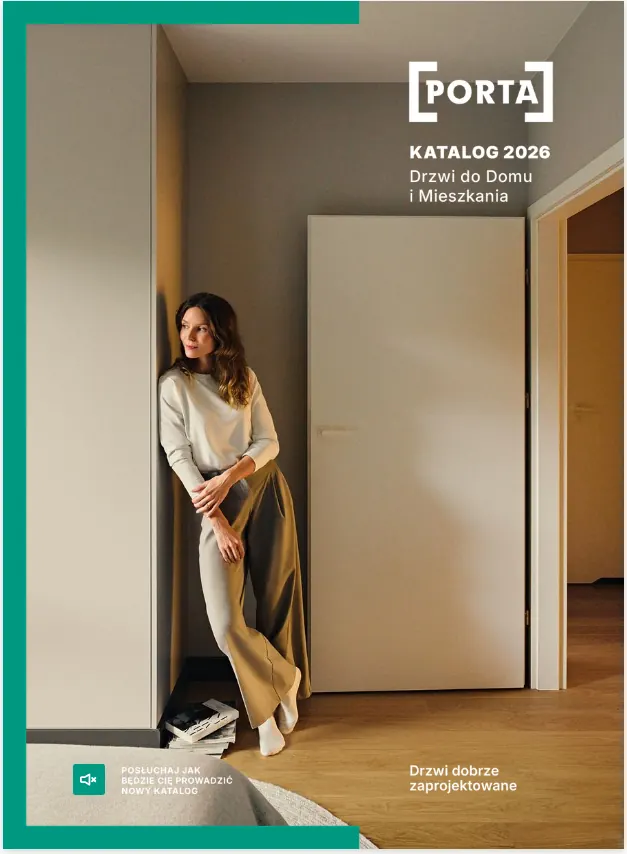
These elements make up the catalogue cover: a photo from everyday life, the frame across three columns and the logo above the other two.
“The catalogue cover is designed on a 5-column layout.”
Kept
- Logo
- Porta green
Added
- Frame and thin frame
- 5- and 12-column grids
- Circle with an arrow
- Icon system
- Door drawings
- Product labels
- Promo band
- Photography guidelines
- Post and presentation templates
- Website style guide
Frame
The frame works everywhere
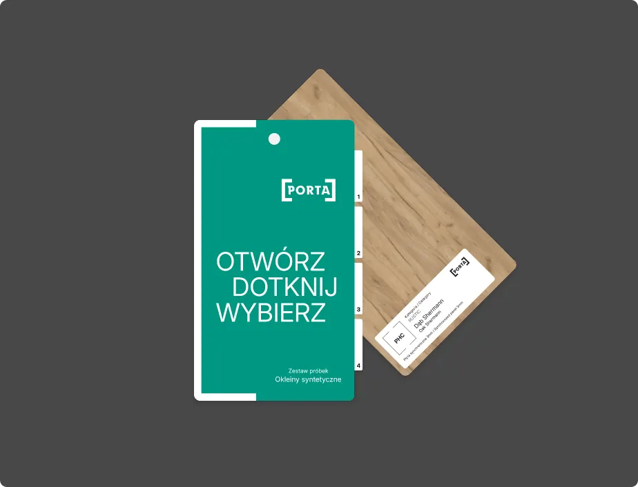
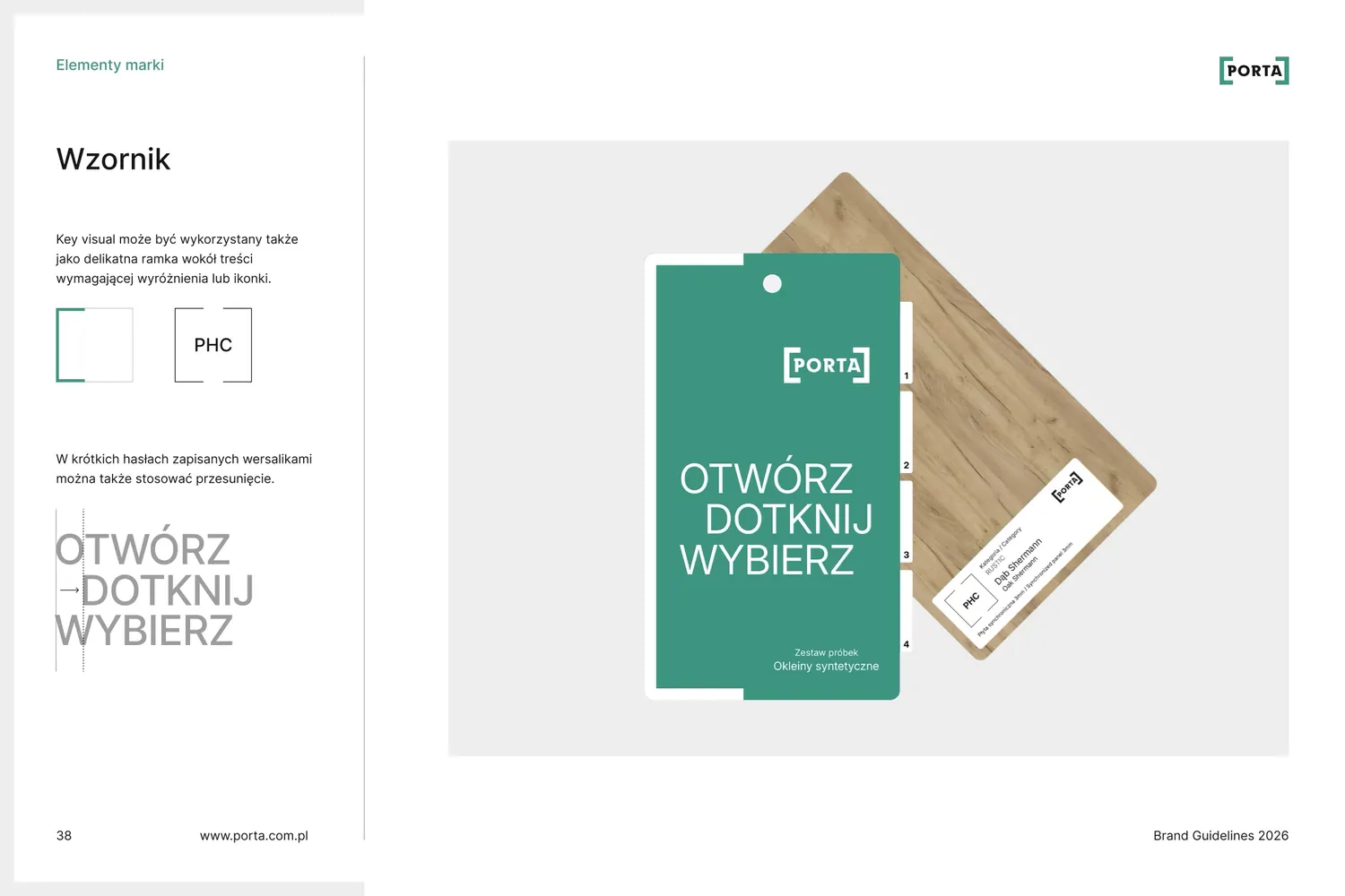
Sometimes it's the logo itself, sometimes a thin frame around an icon or a photo, and sometimes it wraps an entire cover, slide or sample card.
Grid
Five columns in a post, twelve in a presentation
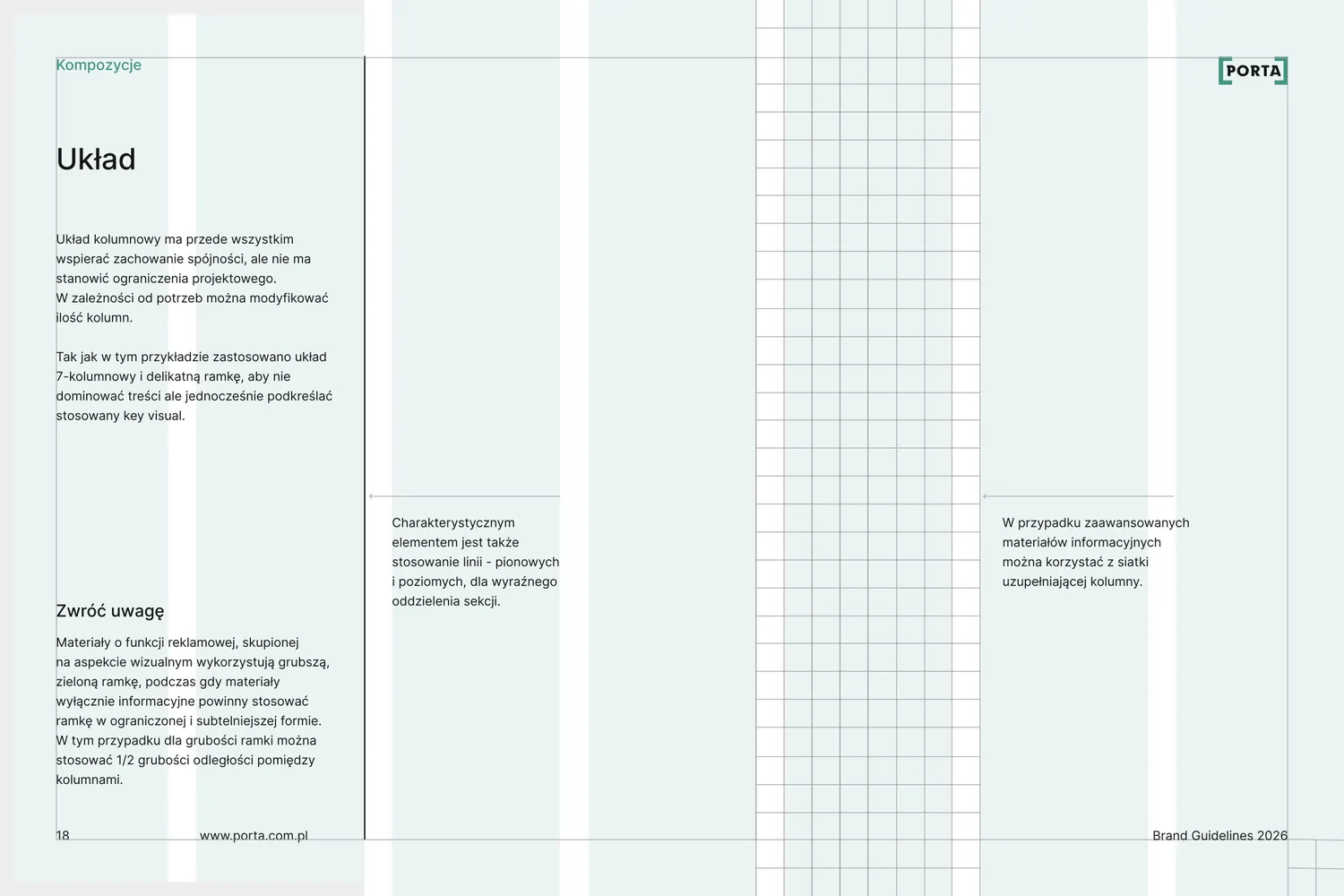
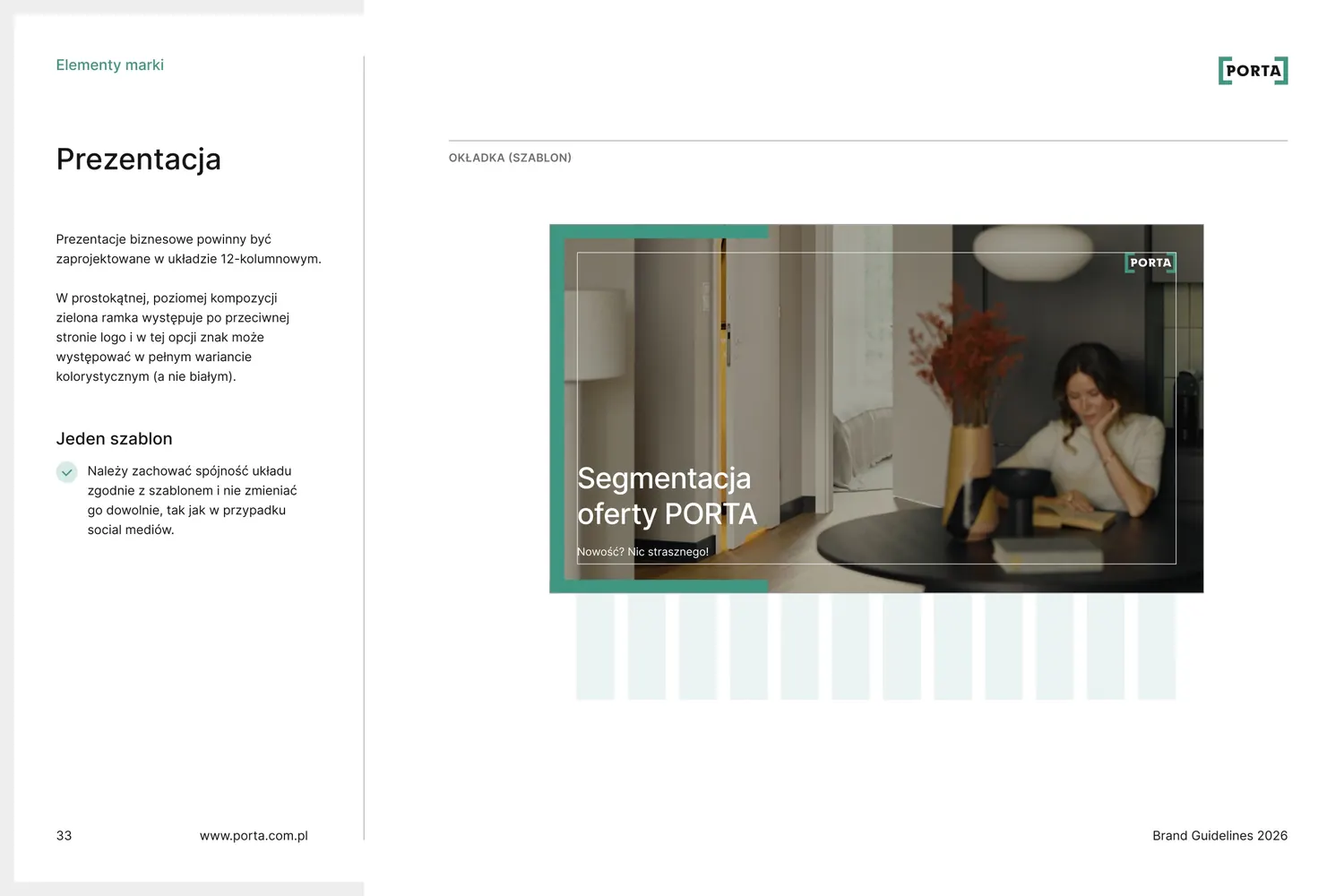
The grid comes from the frame. Posts and covers sit on five columns, and content-heavy materials such as presentations on twelve. Turn on the grid to see how the layout keeps to the columns.
“The basis is a 5-column layout, which comes from using the bracket on both sides in a symmetrical composition.”
Catalogue
A catalogue that guides like a good sales assistant
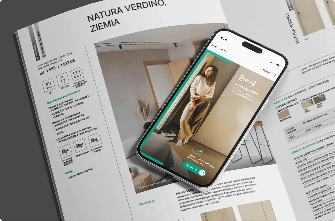
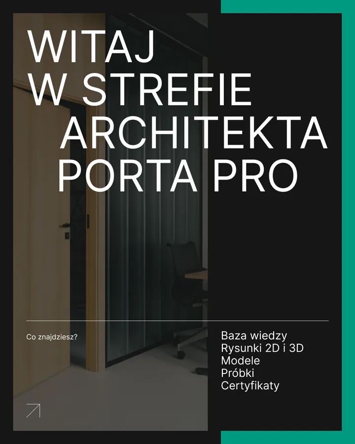
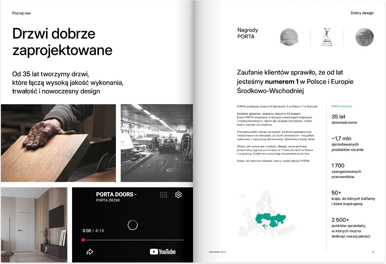
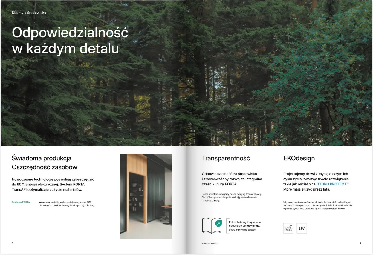
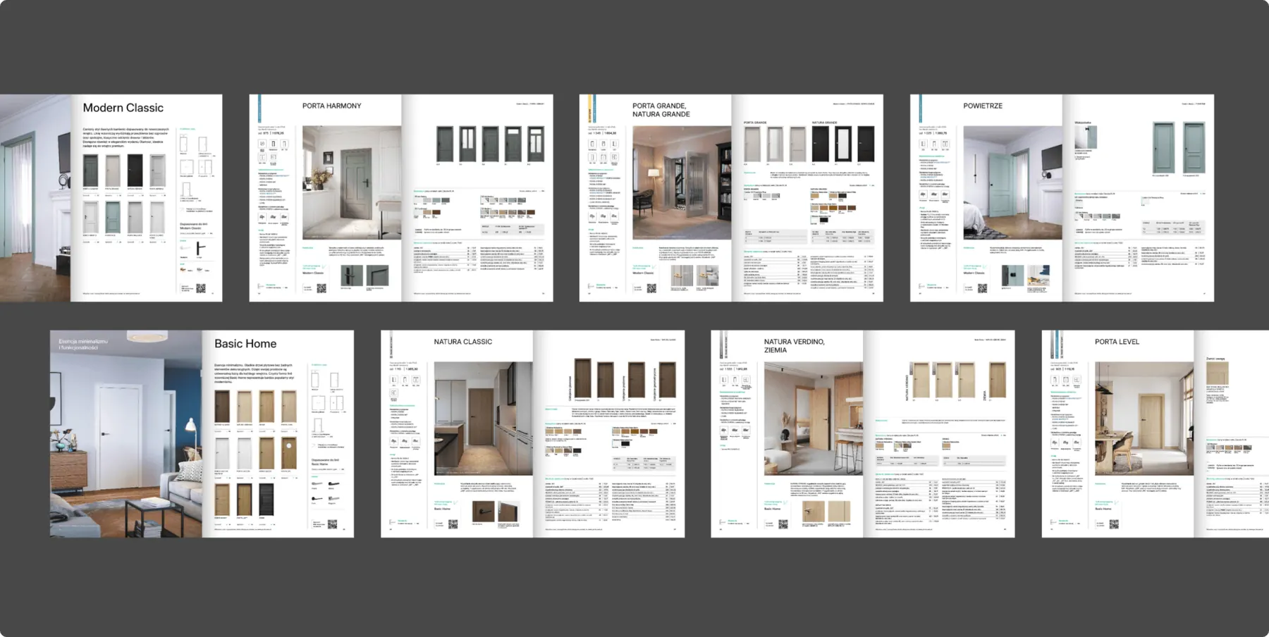
The brand's most important material. We left the building-trade style behind in favour of photos from everyday life. The first pages are light, the following ones increasingly technical, and at the end sales staff find every dimension and finish.
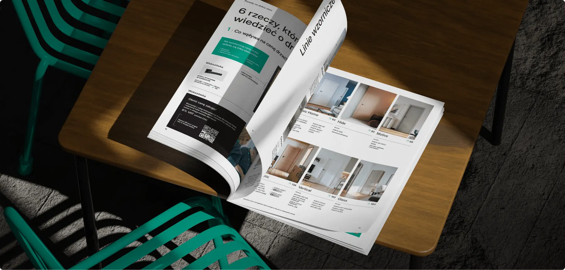
- 280
- pages in three parts
- PL and EN
- two language editions
- Online
- an interactive version with animated product photos
Online catalogue
The interactive version leads straight to the product, lets readers zoom in on colour samples and door photos, and selected photos are animated.
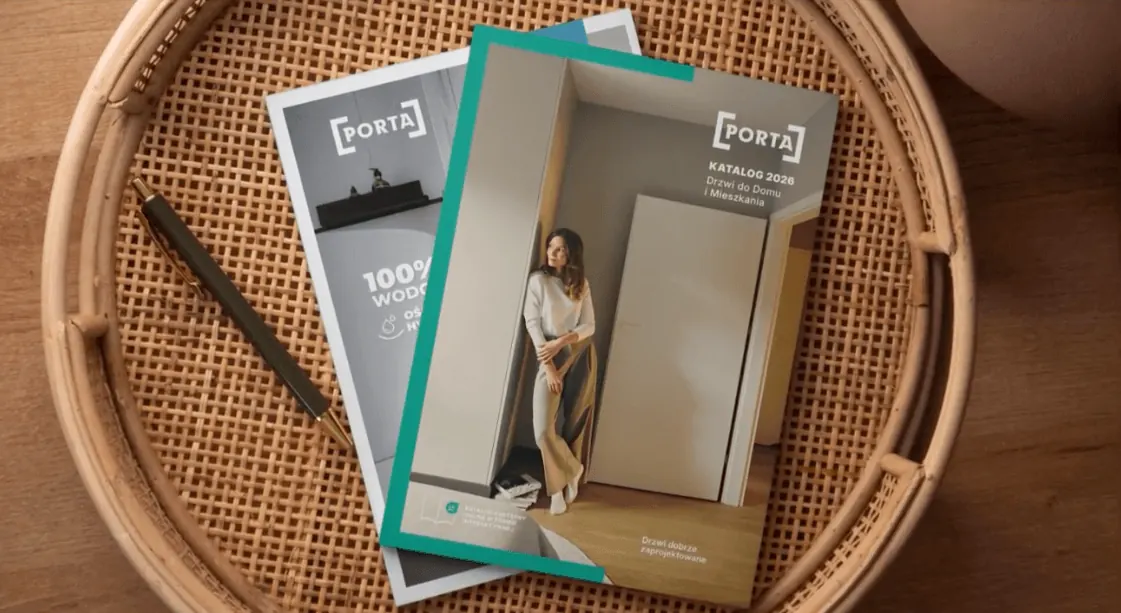
Before and after
The same offer, a new catalogue
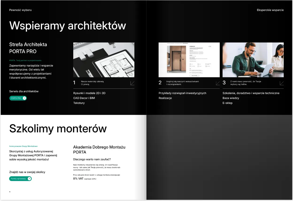
The old catalogue divided the offer into 17 chapters by door type. The new one starts from needs, such as a quiet home, freedom in arranging rooms or living with a pet, and then guides the reader through 10 design lines.
After
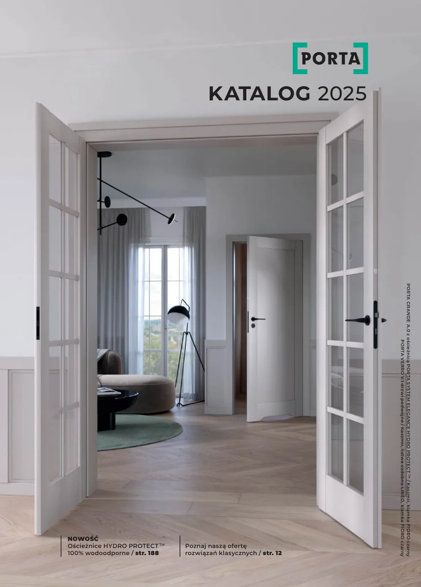 Before
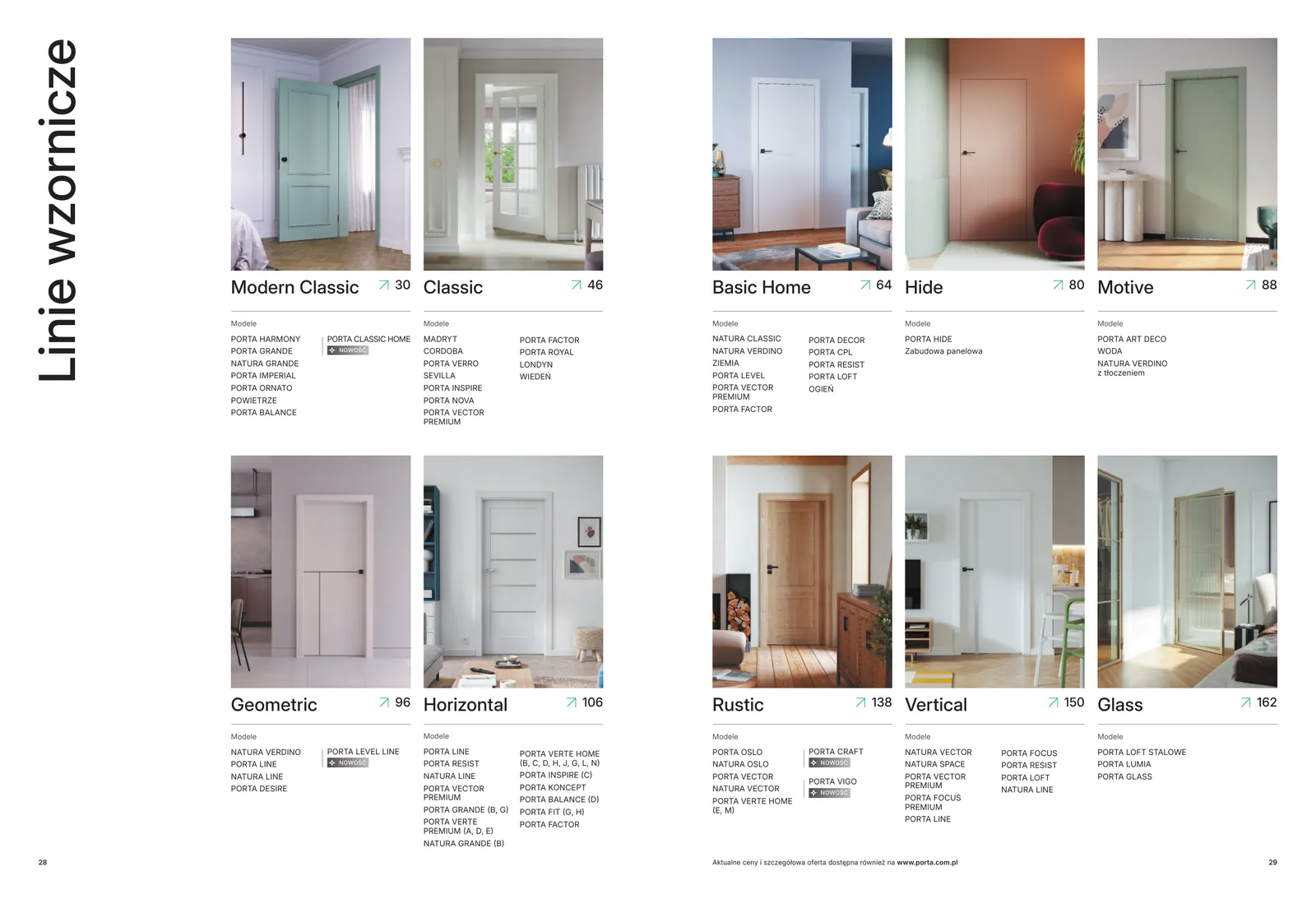 After
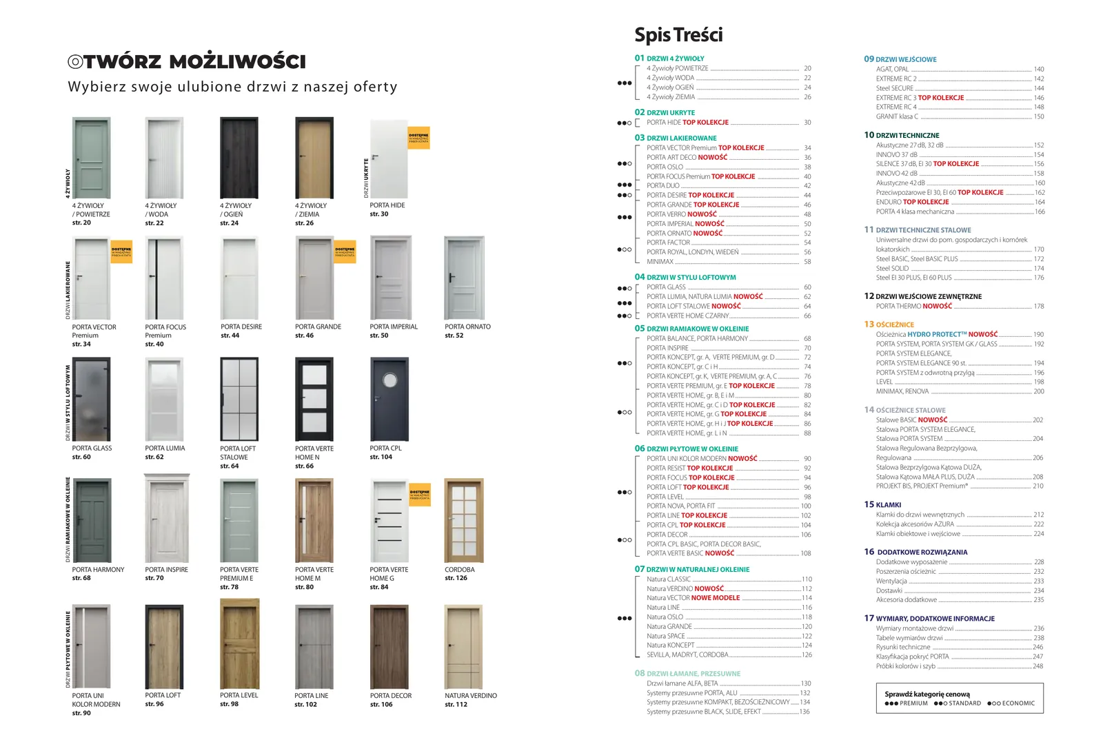 Before
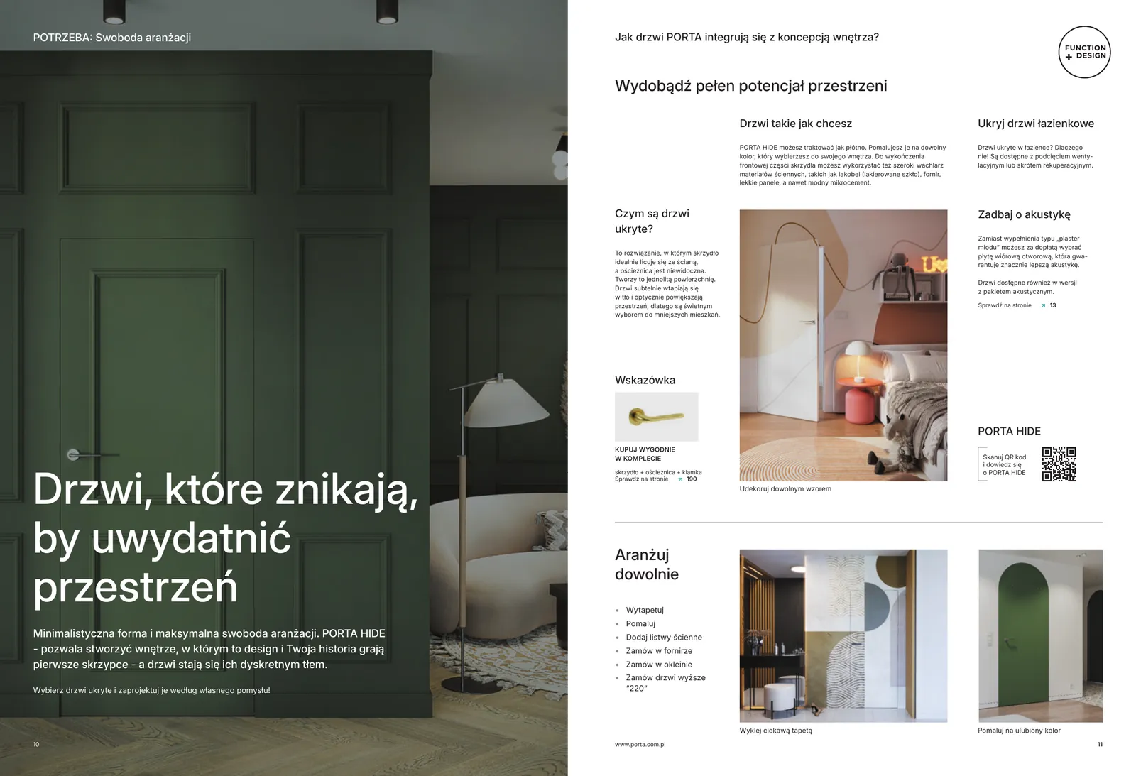 After
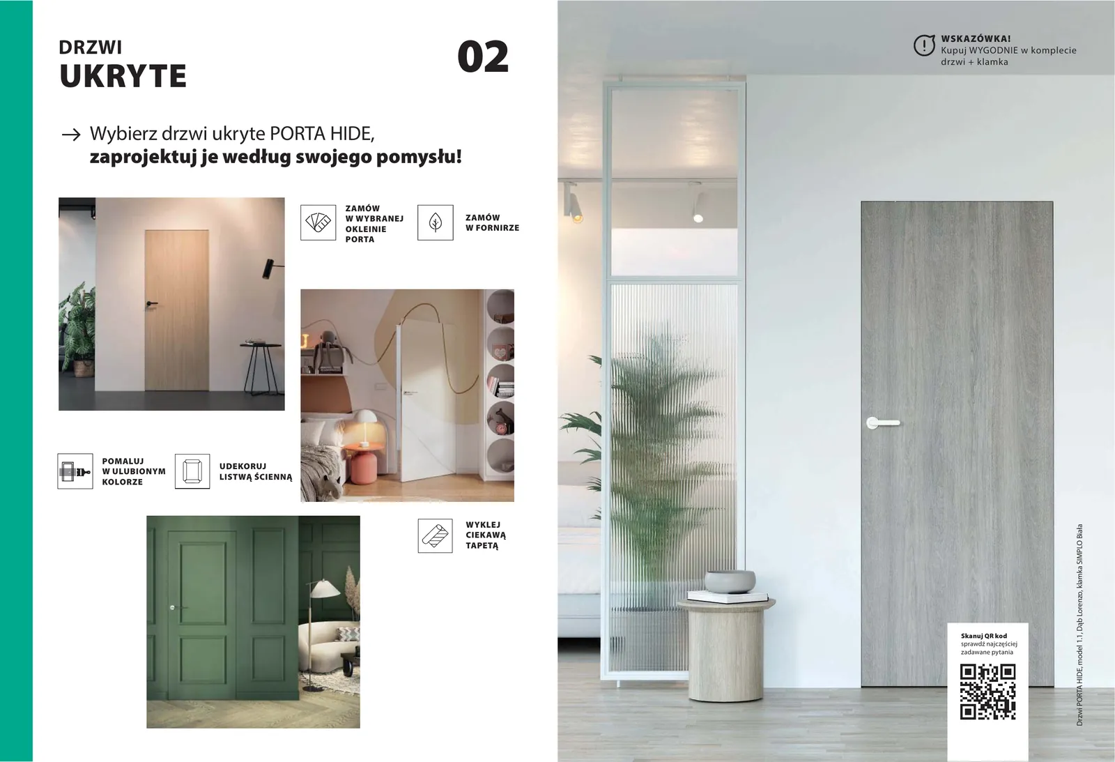 Before
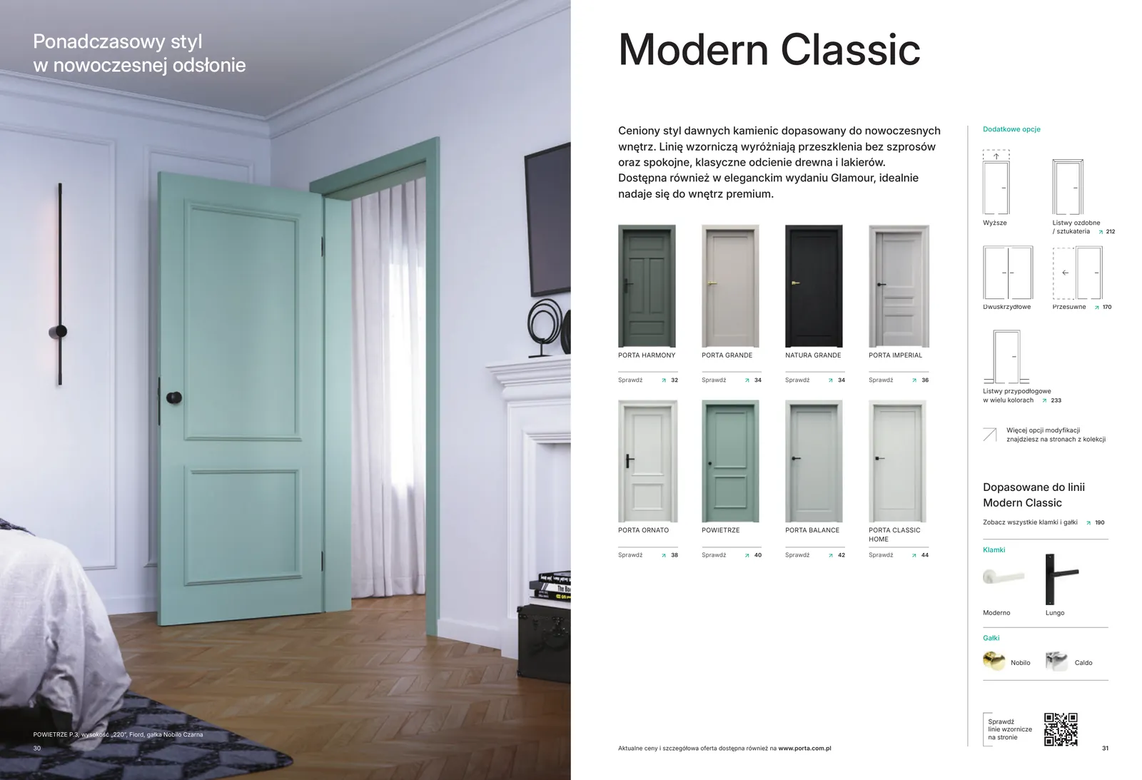 After
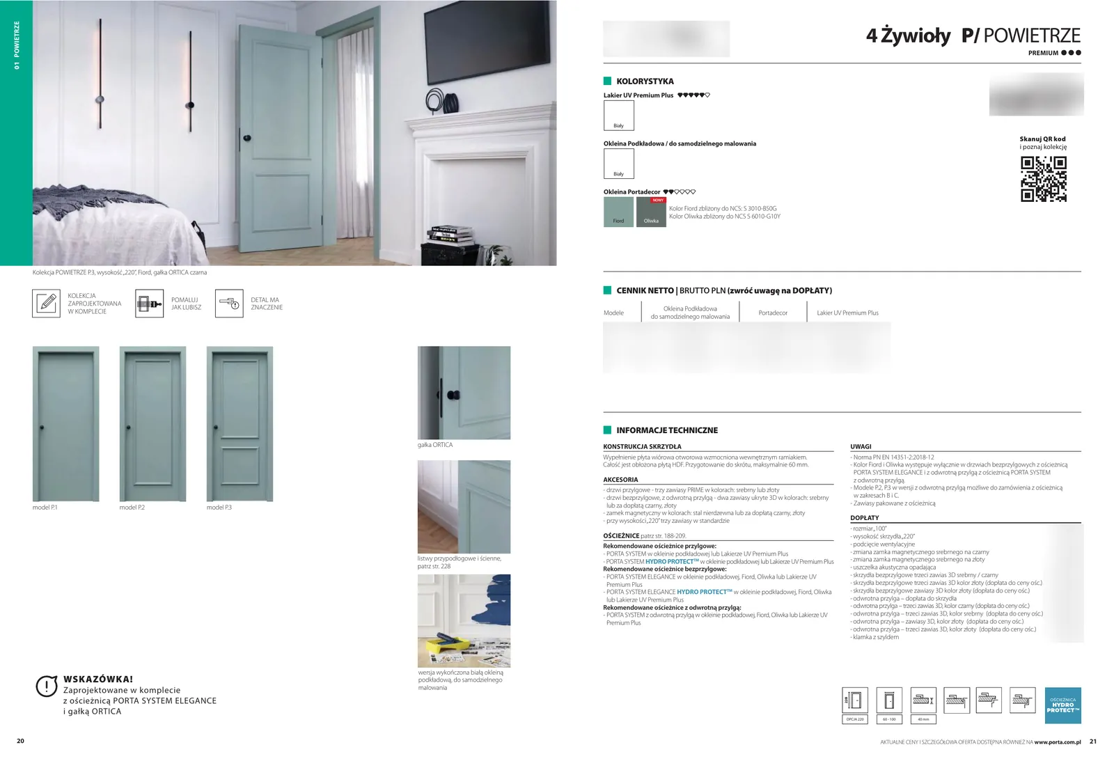 Before
Pages about needs
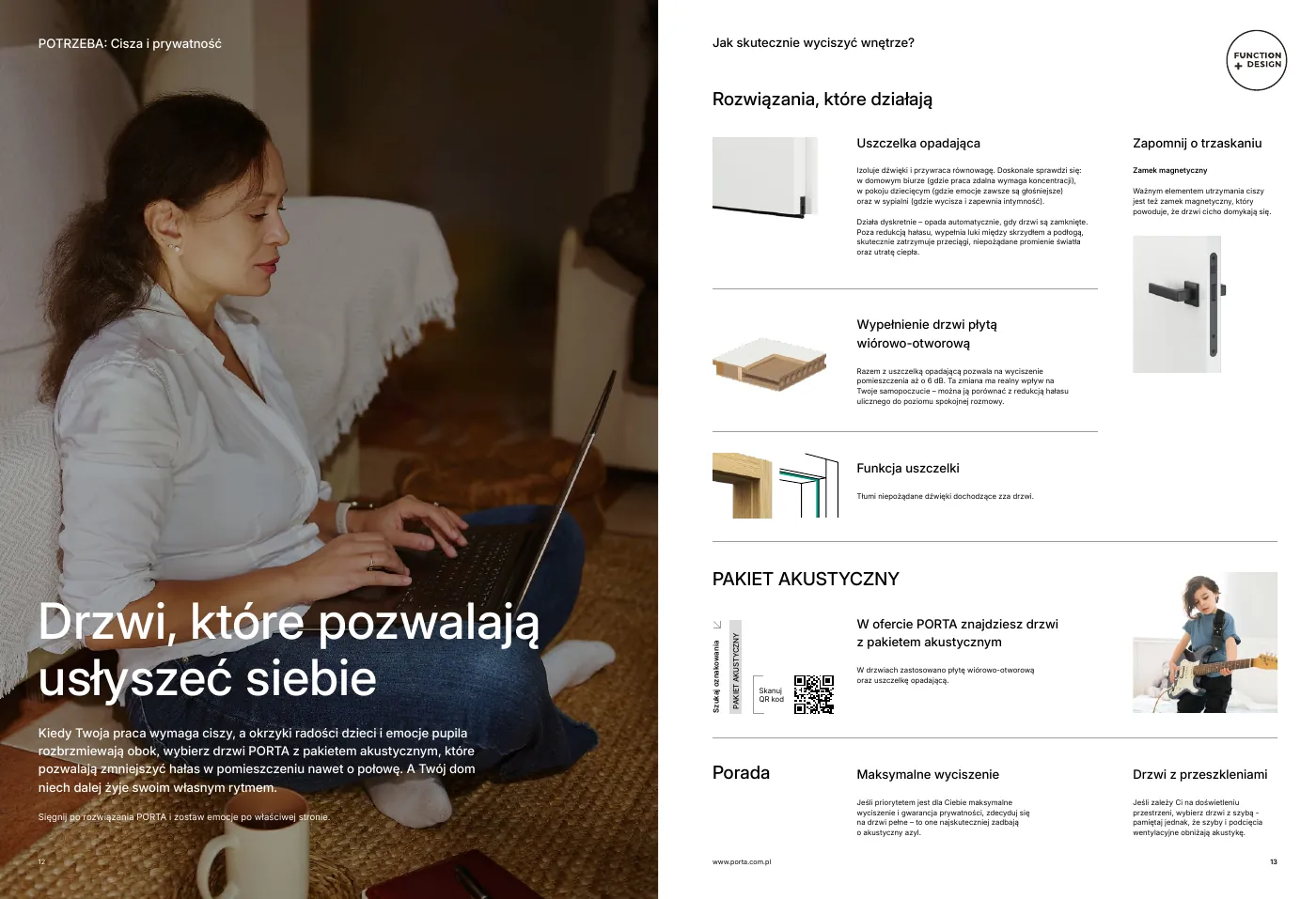
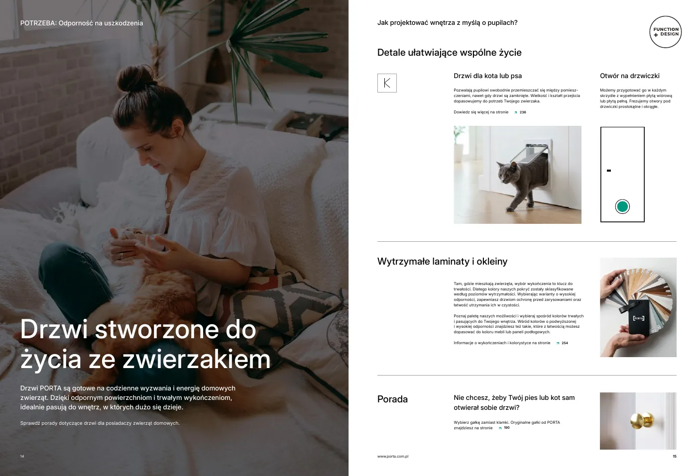
For sales
The same language in over 2,500 points of sale
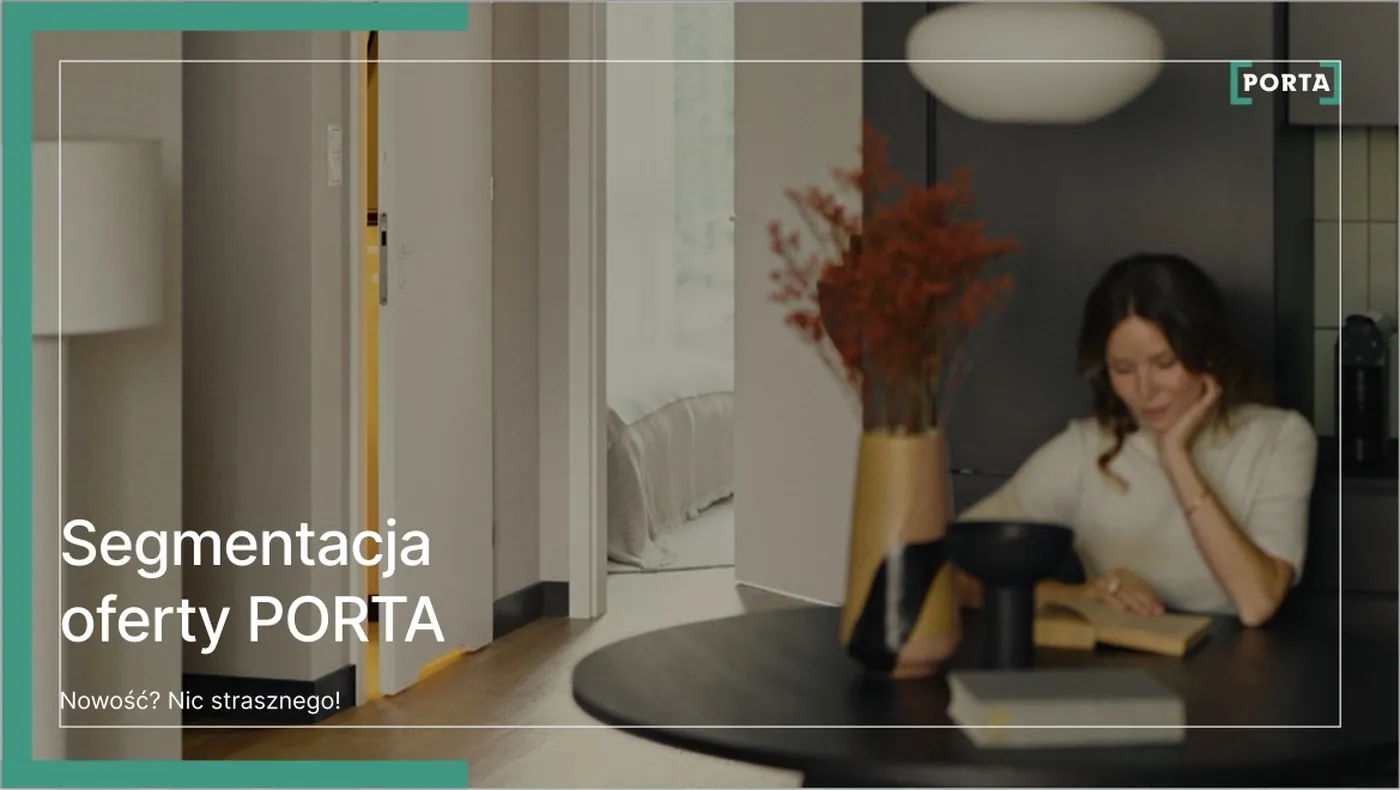
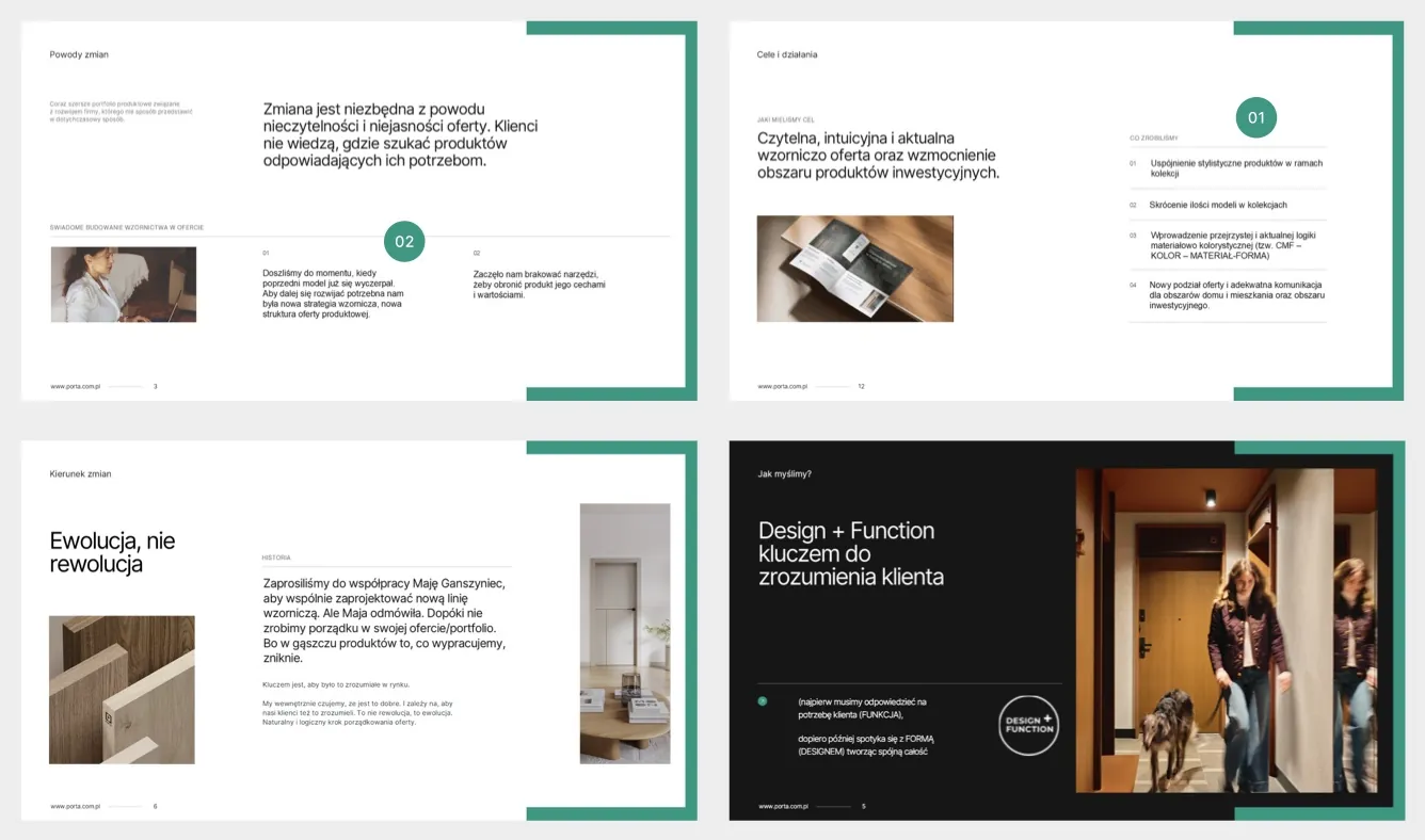
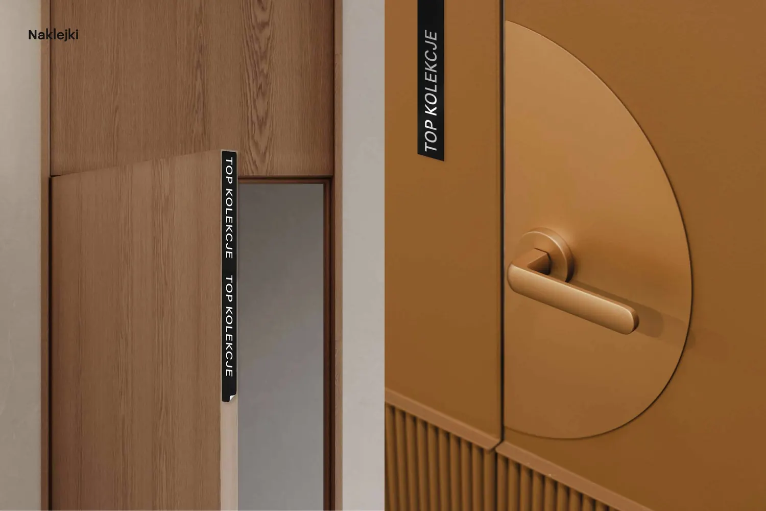
The new structure of the offer had to be explained to sales staff. We designed a presentation on the new segmentation and a template for future ones, a sample book customers can hold in their hands, and stickers that highlight the key collections in the showroom.
Websites
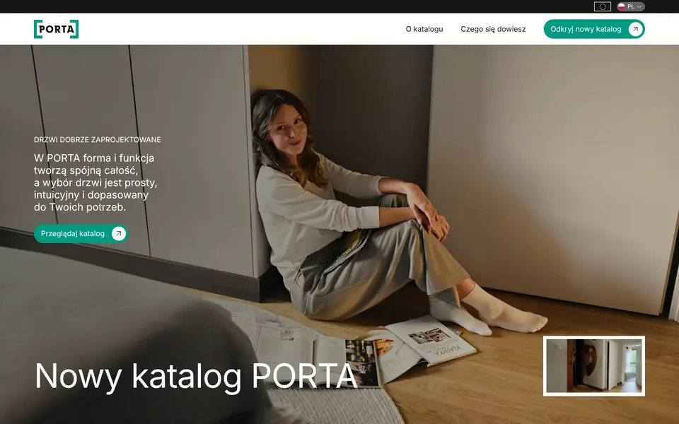
porta.com.pl in the new language
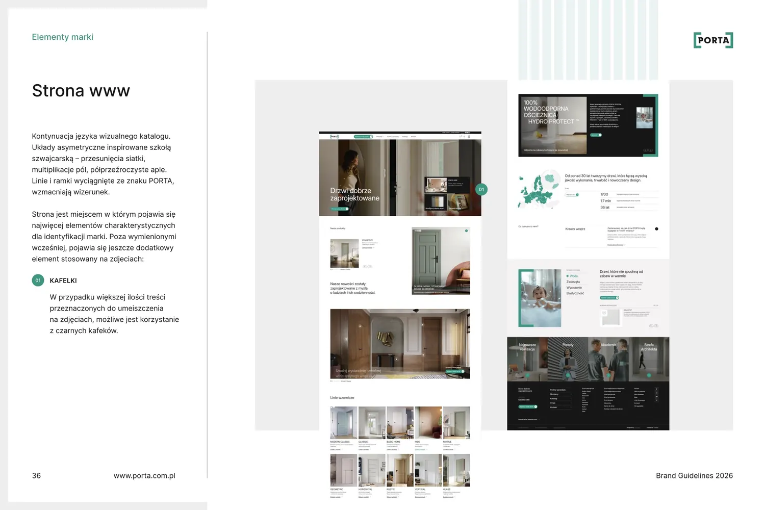
We designed the menu around the new structure of the offer, the design line pages, the catalogue page and the careers page. These are screenshots of the live site, with “Designed by fluostudio” in the footer.




Doors at home
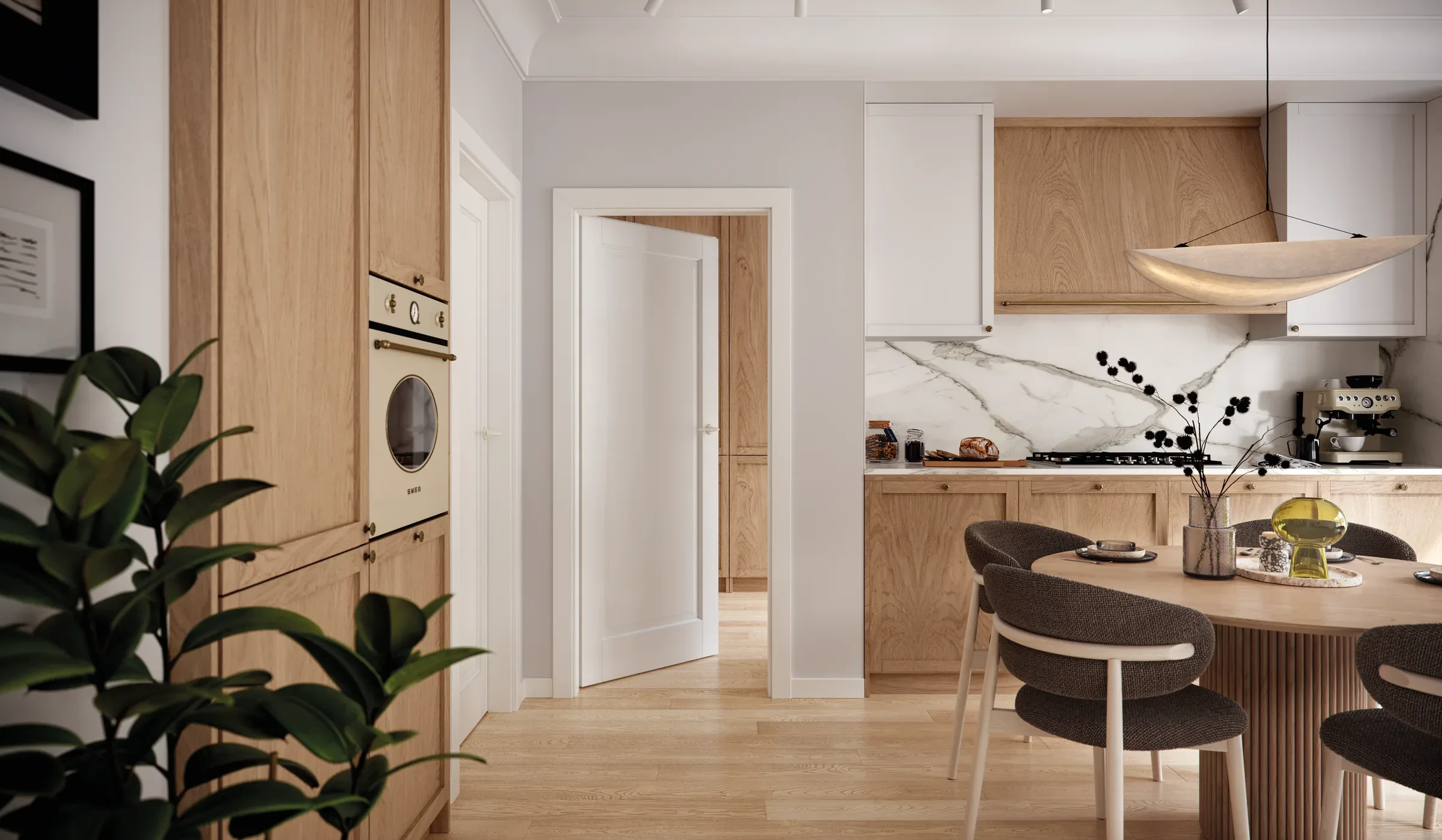
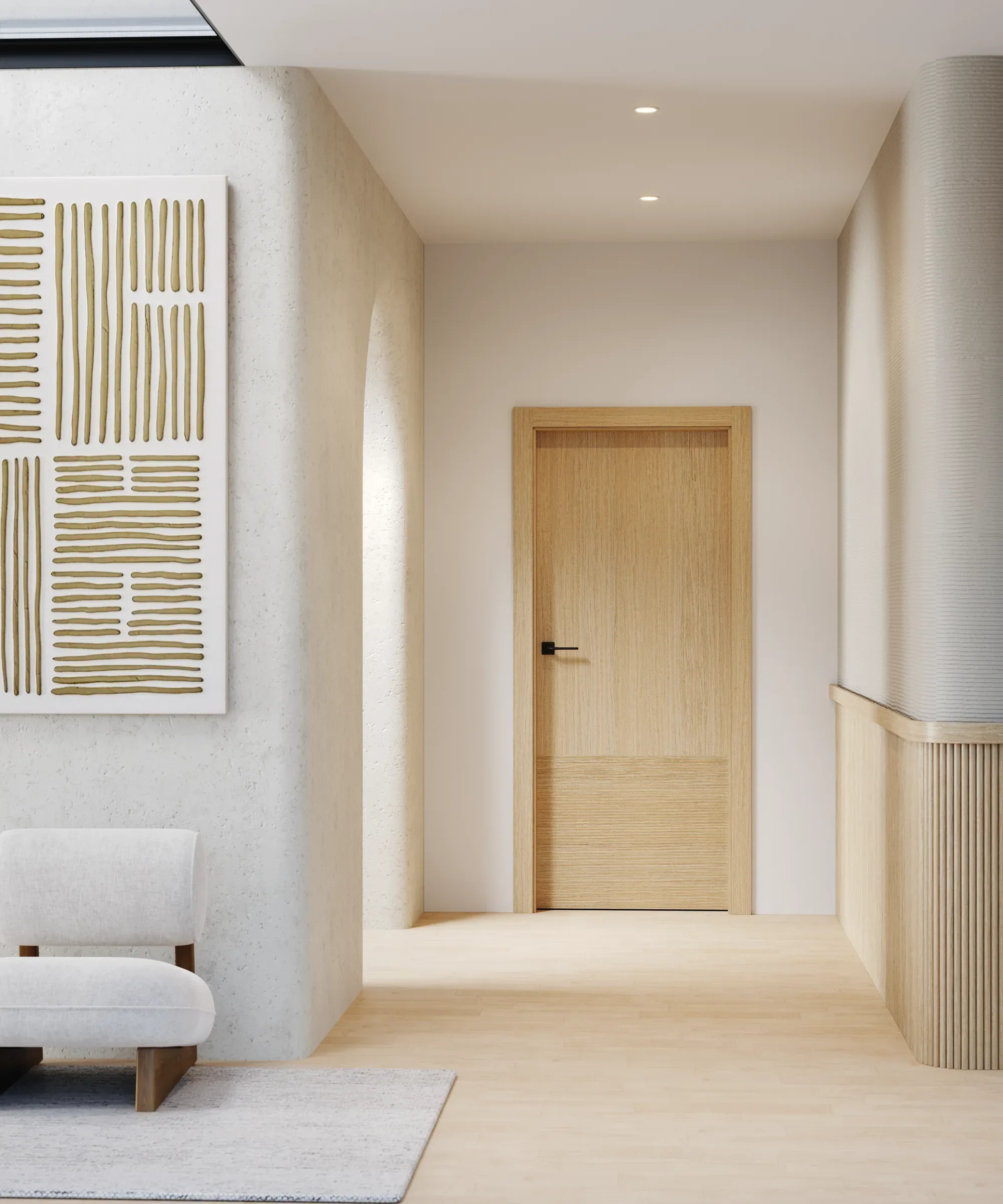
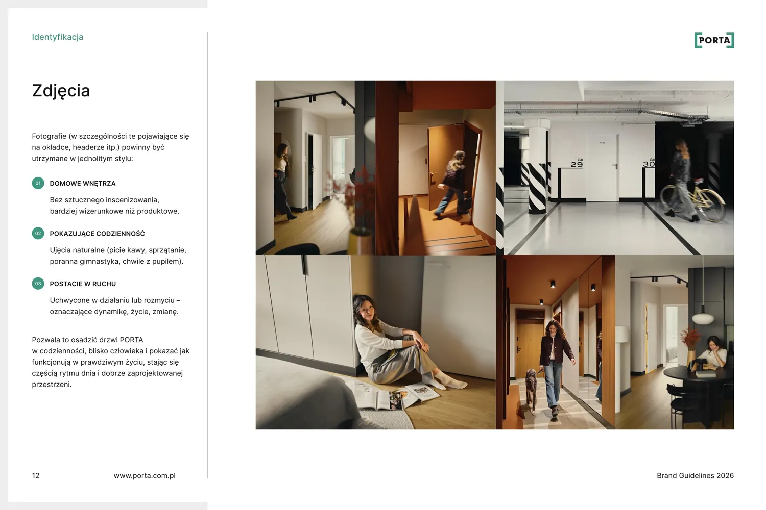
The catalogue and the website speak in photos of everyday life, not of a building supplies warehouse.
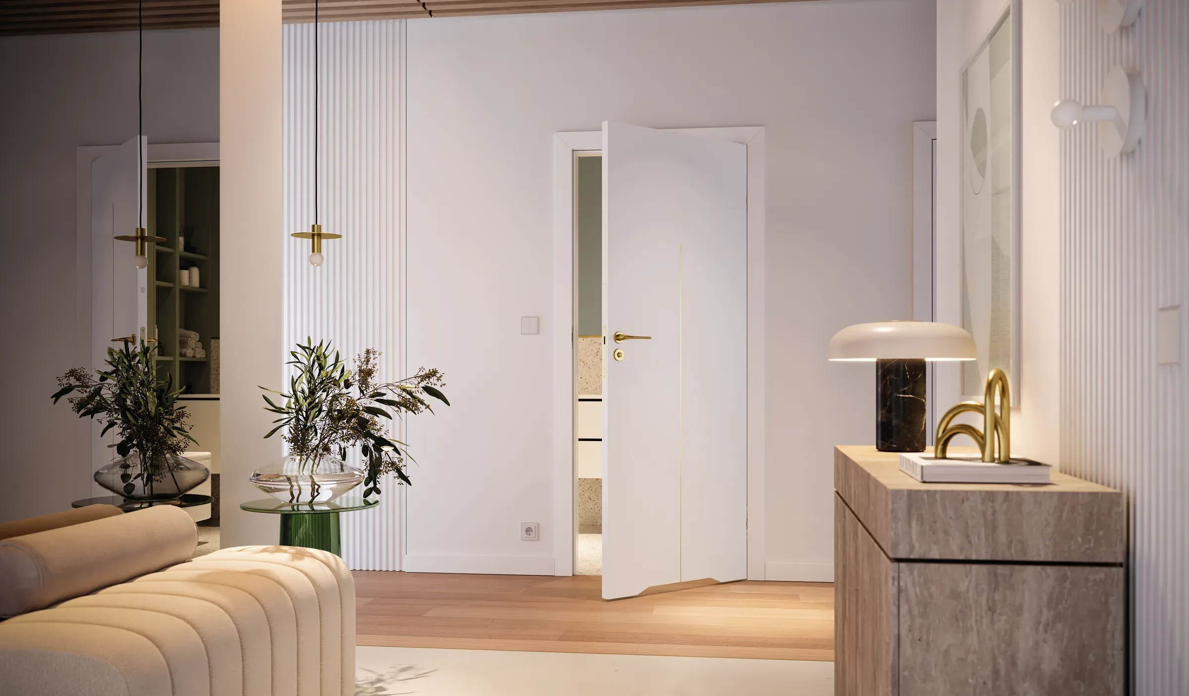
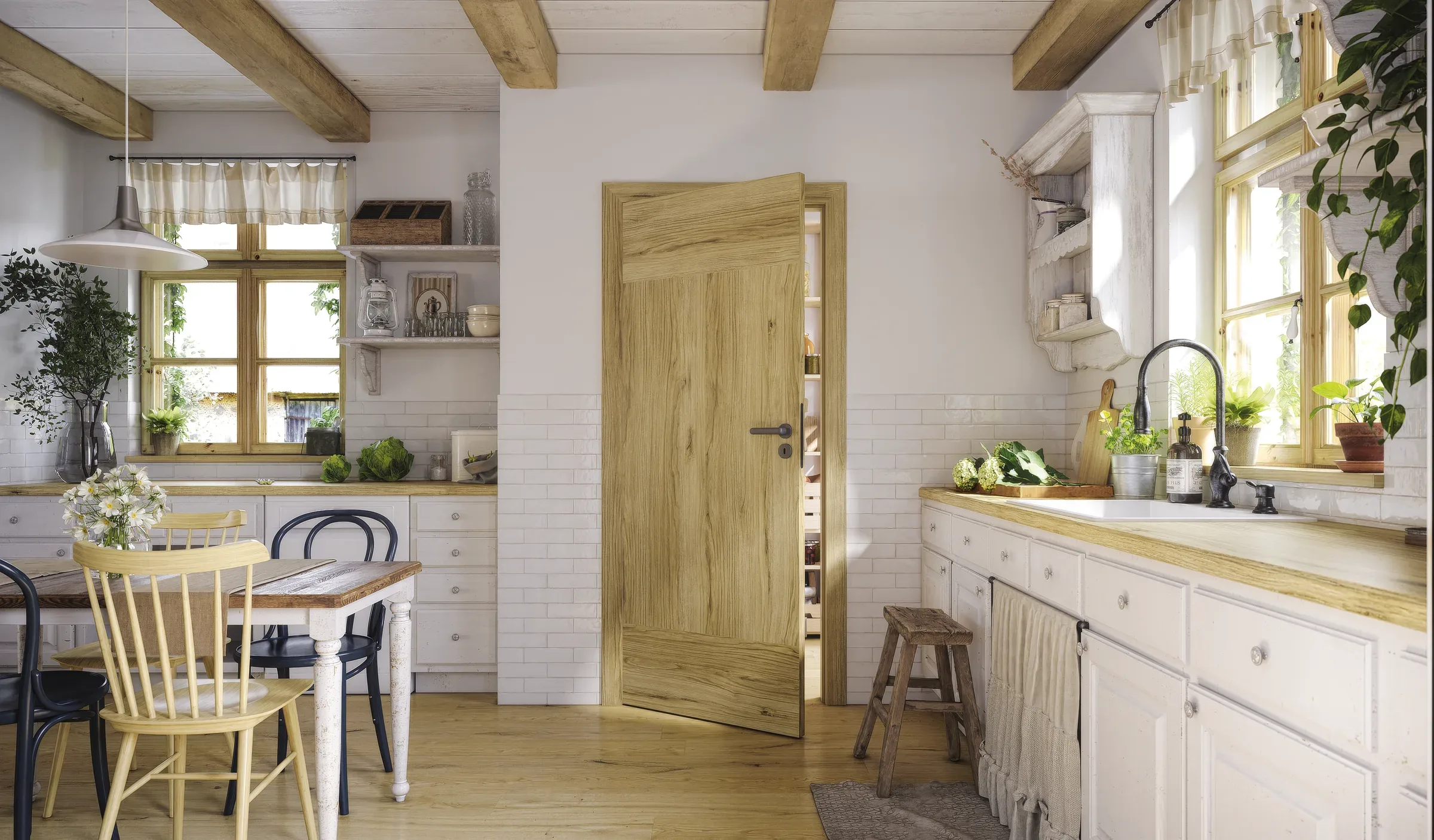
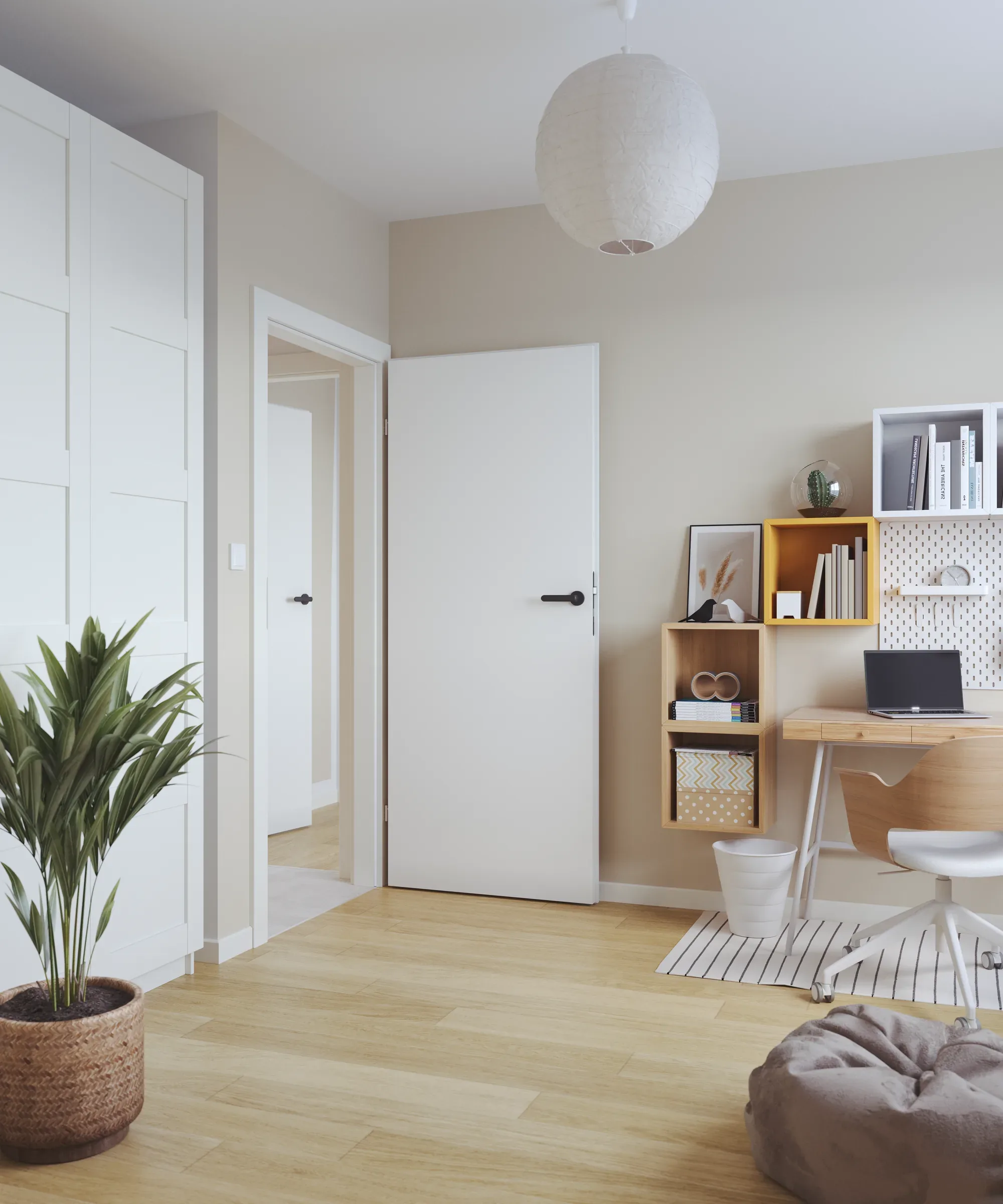
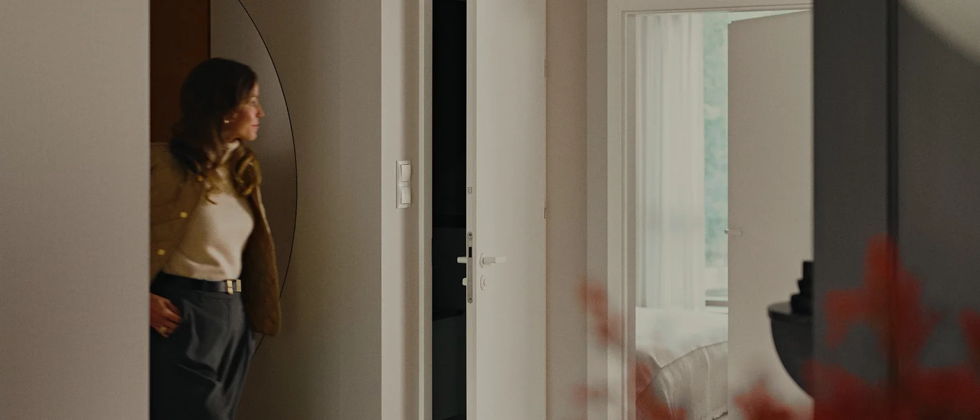
Brand book
An extensive brand book in Figma
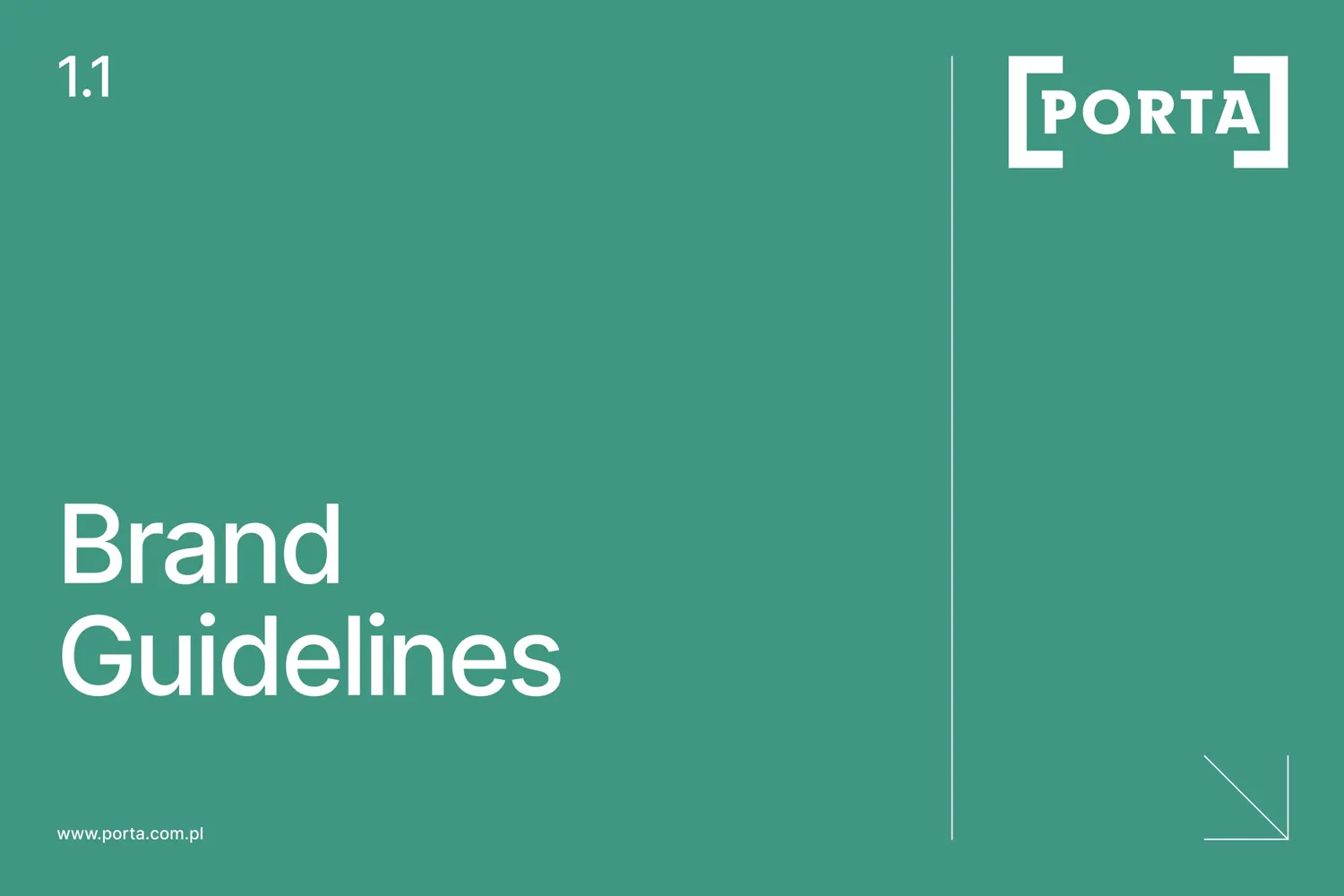
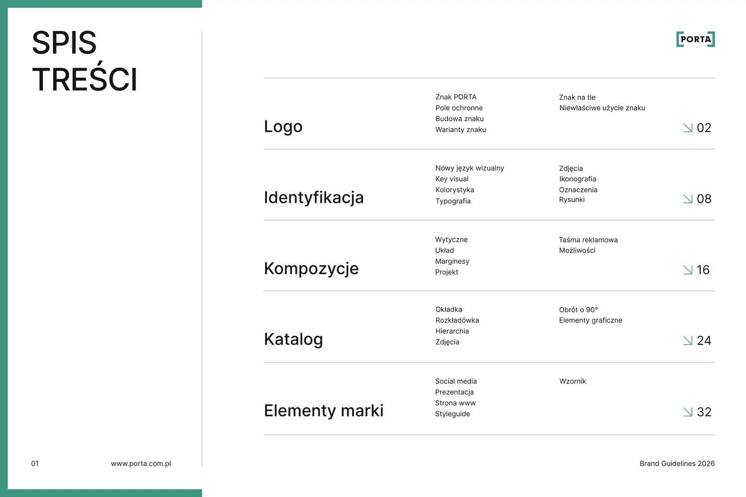
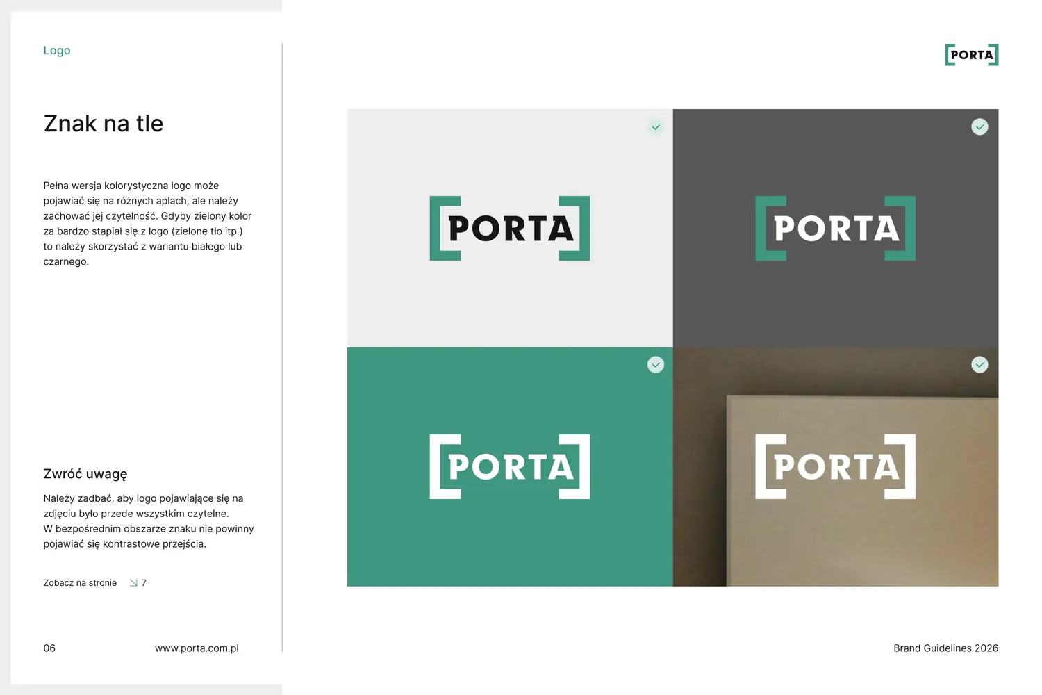
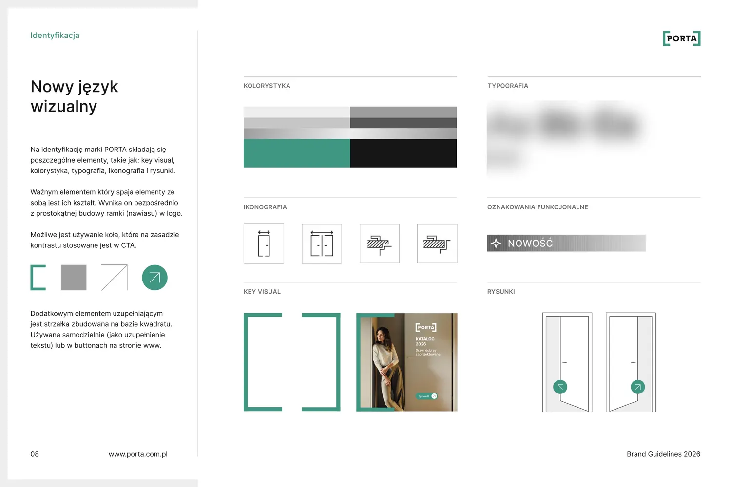
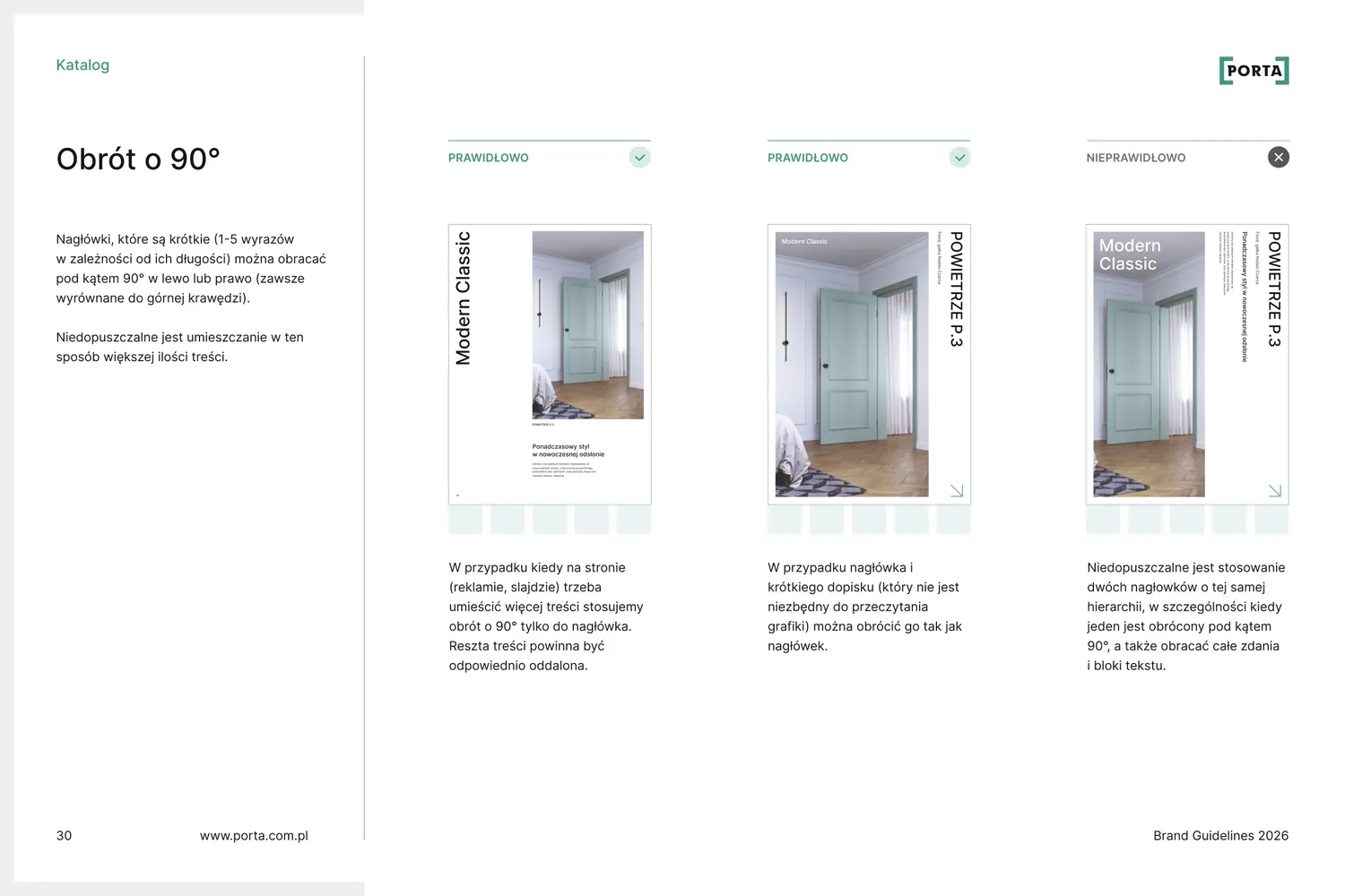
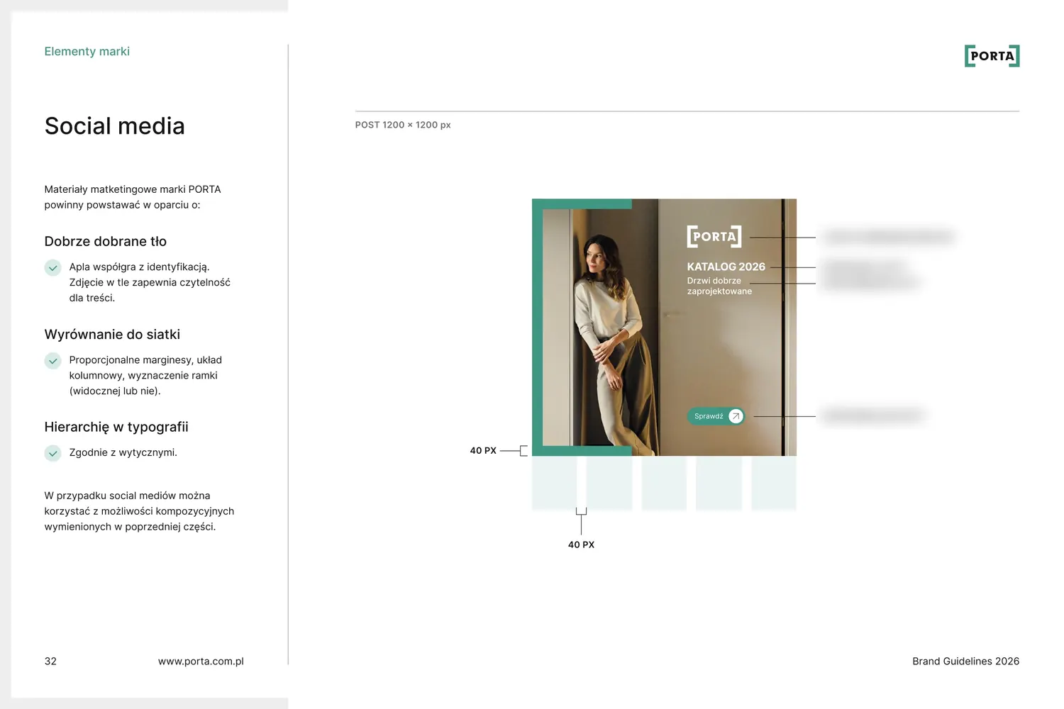
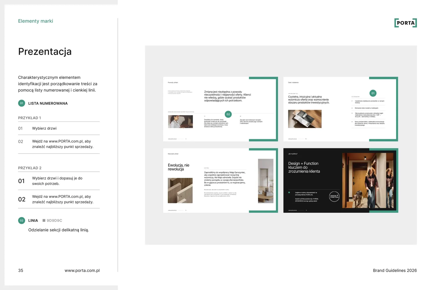
Next to the catalogue, it's the brand's most important tool. It has five chapters: logo, identity, compositions, catalogue and brand elements. Every rule comes with an example, so anyone designing for Porta knows how to use the frame, grid, photos and icons.
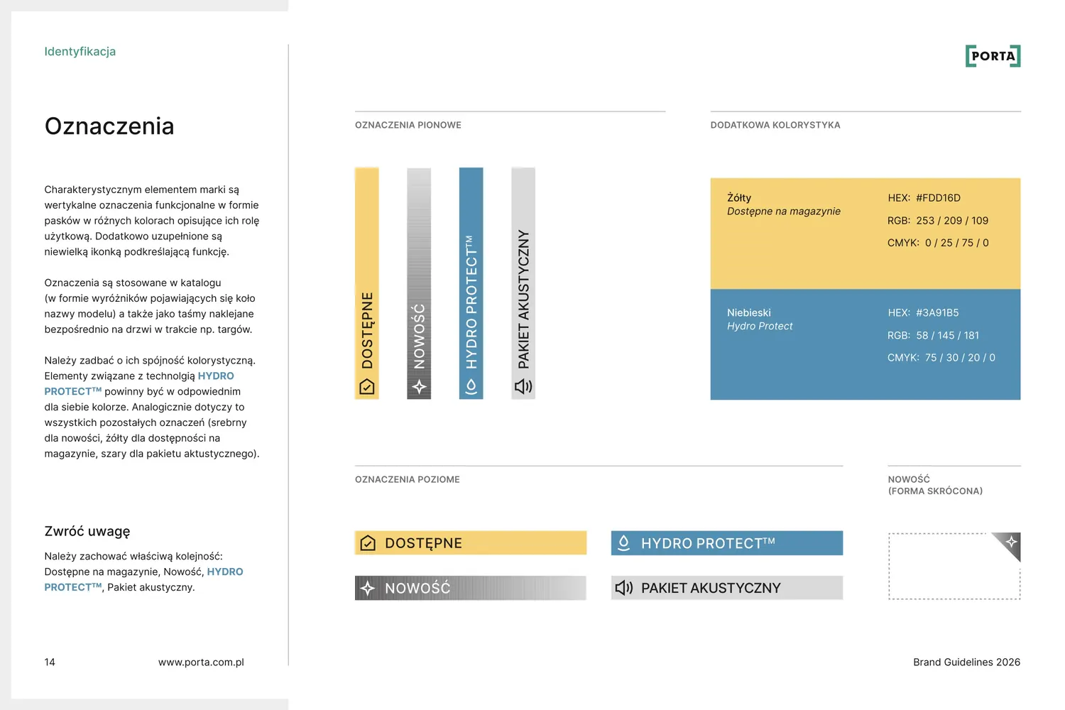
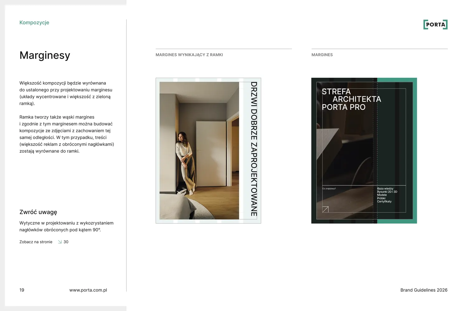
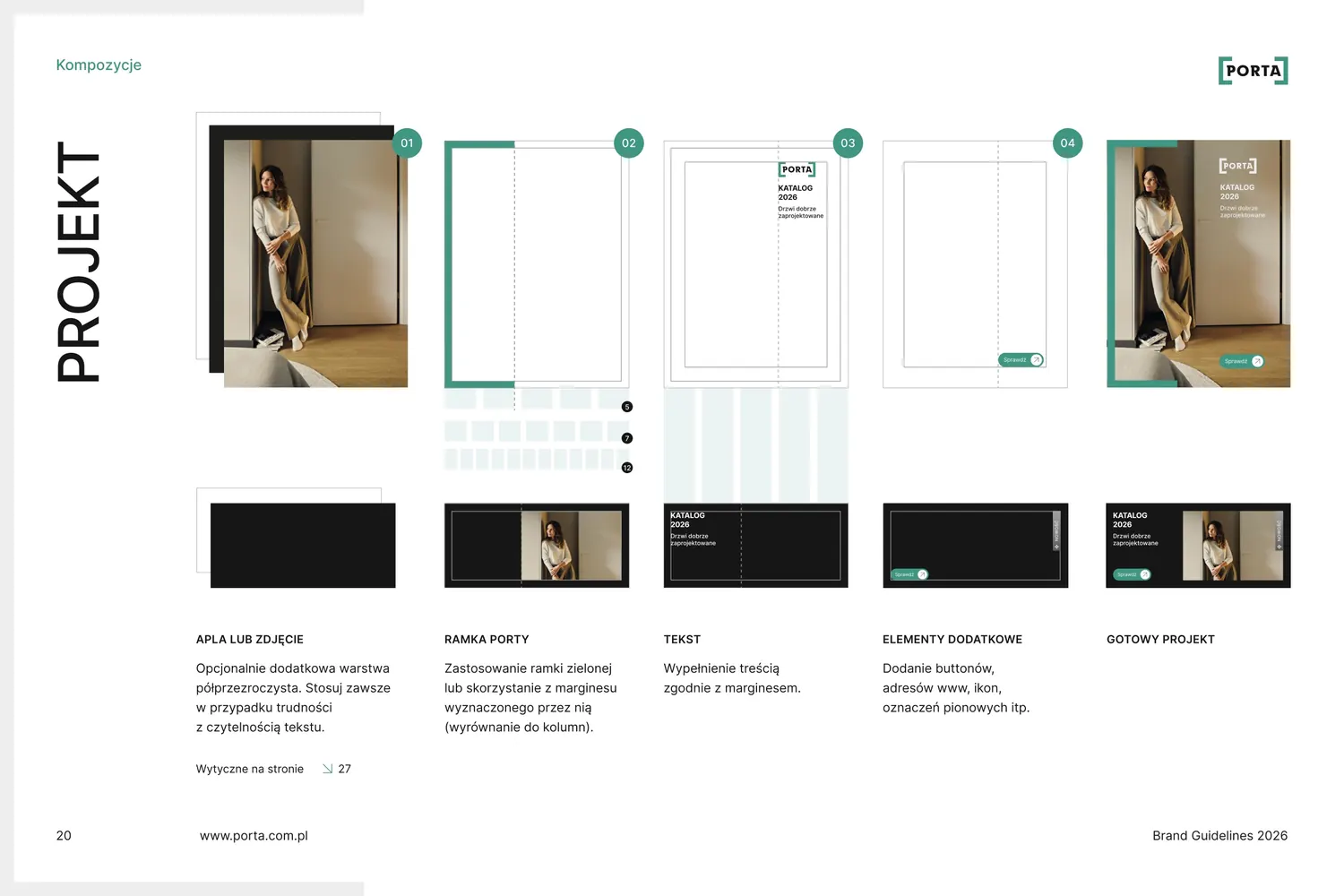
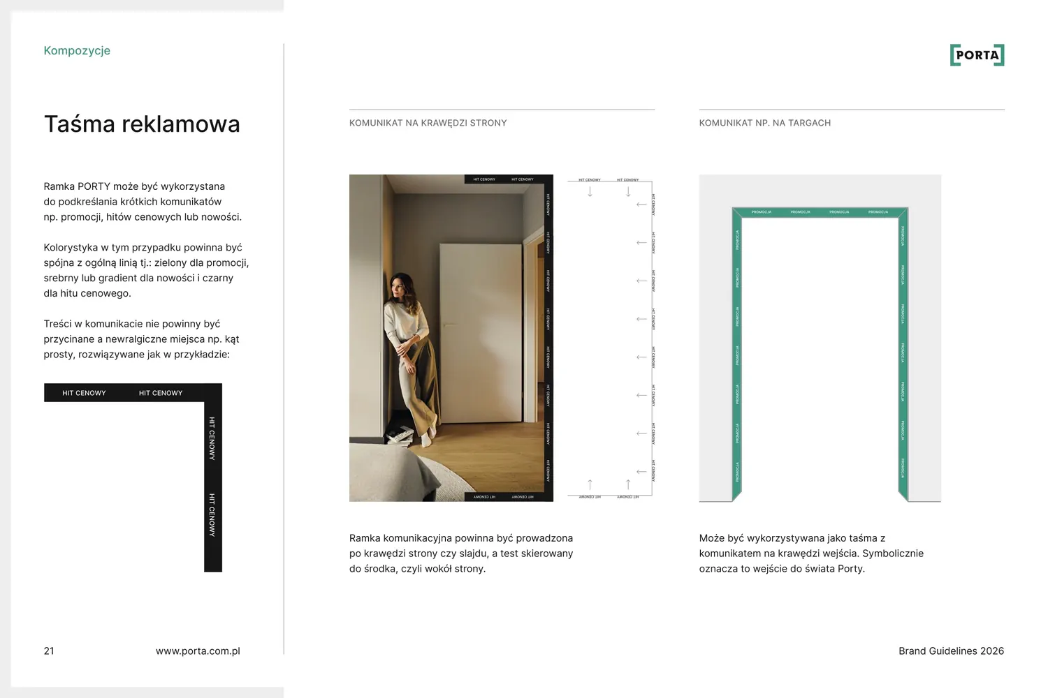
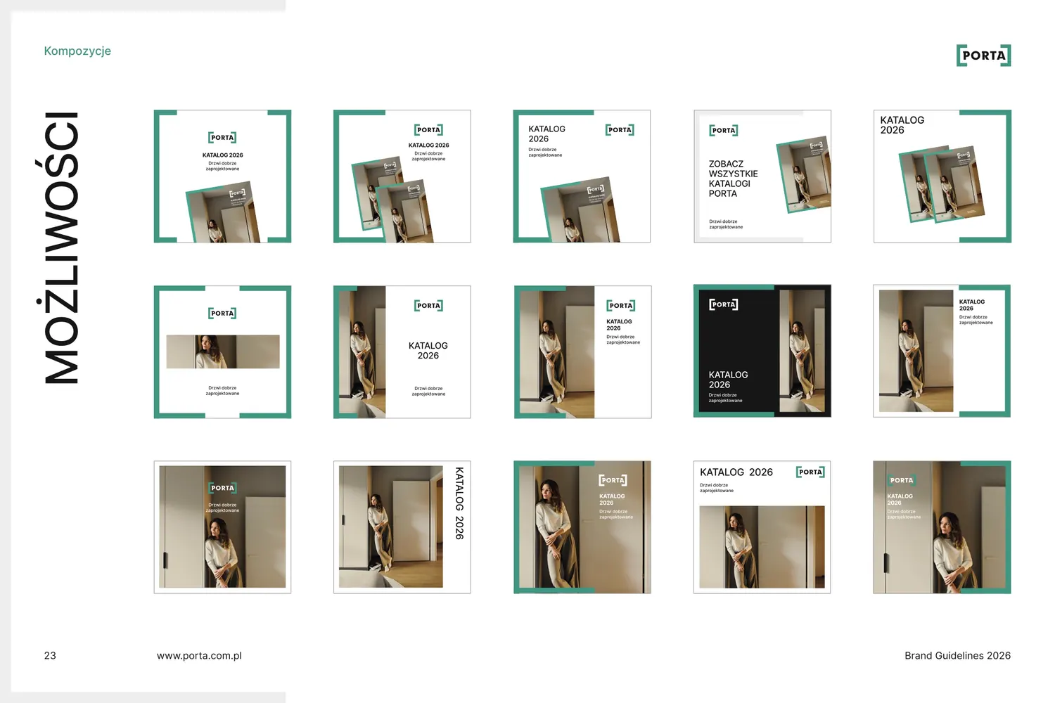
Icons and drawings
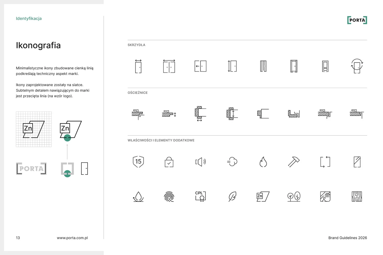
Icons and drawings built like the logo
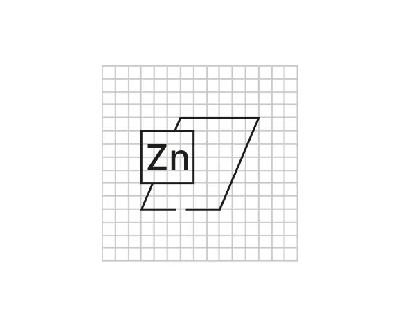
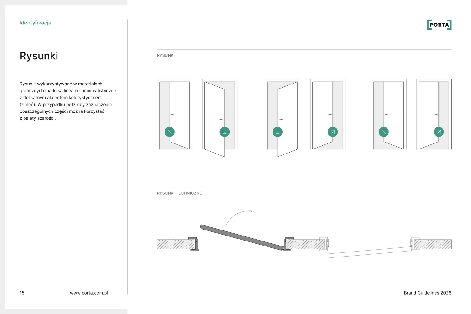
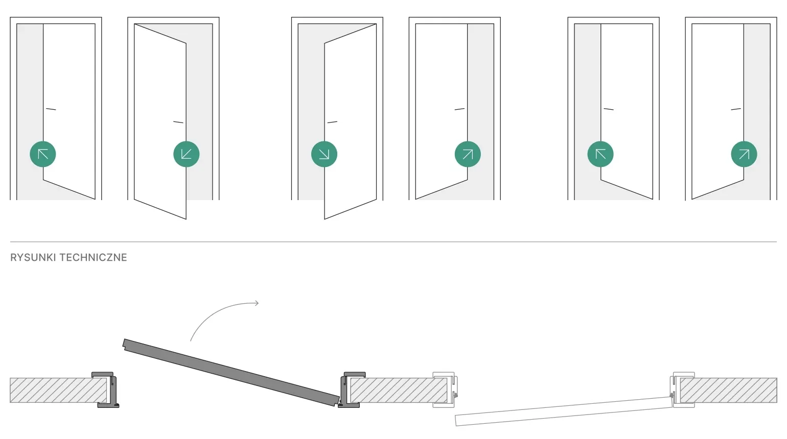
The icons explain the technical features of a door: the type of door frame, the dimensions and opening direction of the leaf, and resistance to fire, smoke and moisture. The drawings show doors in thin line, and a green circle where the handle is shows which way they open.
“Minimalist icons built from a thin line emphasise the technical side of the brand. The icons were designed on a grid. A subtle detail that refers to the brand is the broken line (modelled on the logo).”
Door frame
Door leaf
Features and extras
Hover over an icon to draw it again.
Animations
Motion in the same system
Animation became an important part of the new communication. It shows simply and quickly what changed in the catalogue and on the website: frames open, the cover assembles from columns and products appear in motion.
Events
And then 20 years of Porta in Romania
The factory in Arad celebrated its anniversary. We designed the identity and visual setting for three days: an invitation in five languages, stage screens, a gala and a book on the brand's history.
See the anniversary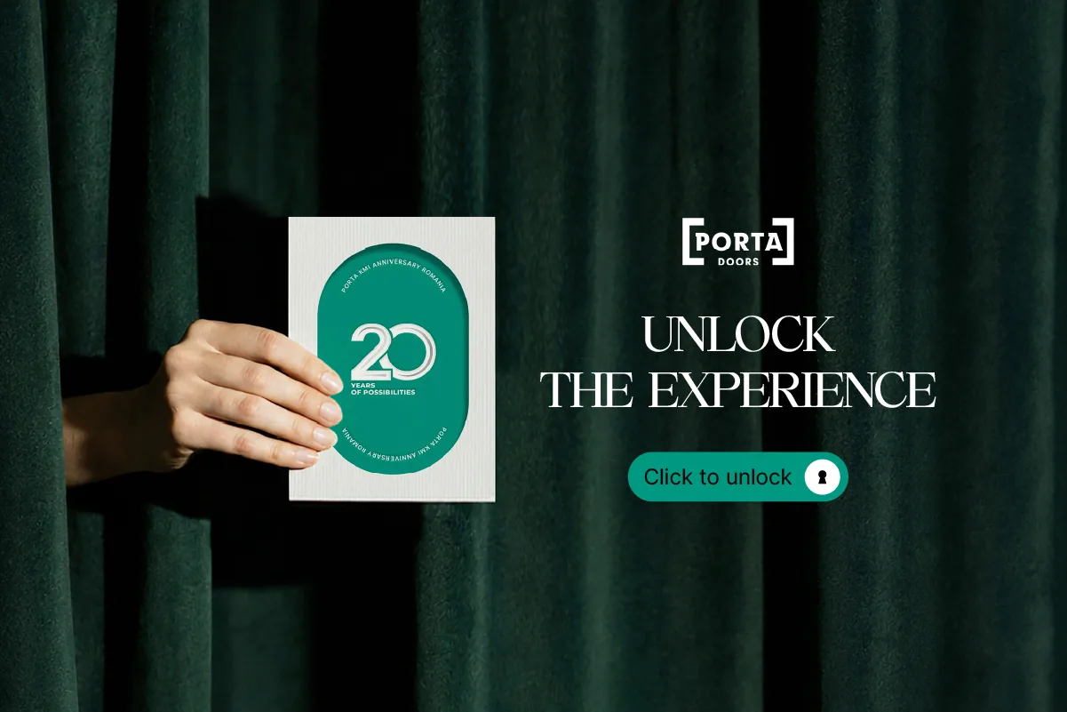
A design system for a logo that was already there.
The logo stayed just as customers know it. We added a frame, grids, a circle with an arrow, a system of icons and drawings, labels, a promo band, photography guidelines and templates.
Everything is new and carefully worked out, and above all it works in day-to-day practice: new catalogues, posts, presentations and web pages are made to these rules.
- Client
- Porta
- Scope
- Workshops, visual identity, brand book, catalogues, websites, animations, social media, sales materials, events
- Online
- porta.com.pl
More projects
-
 Dawtona Group
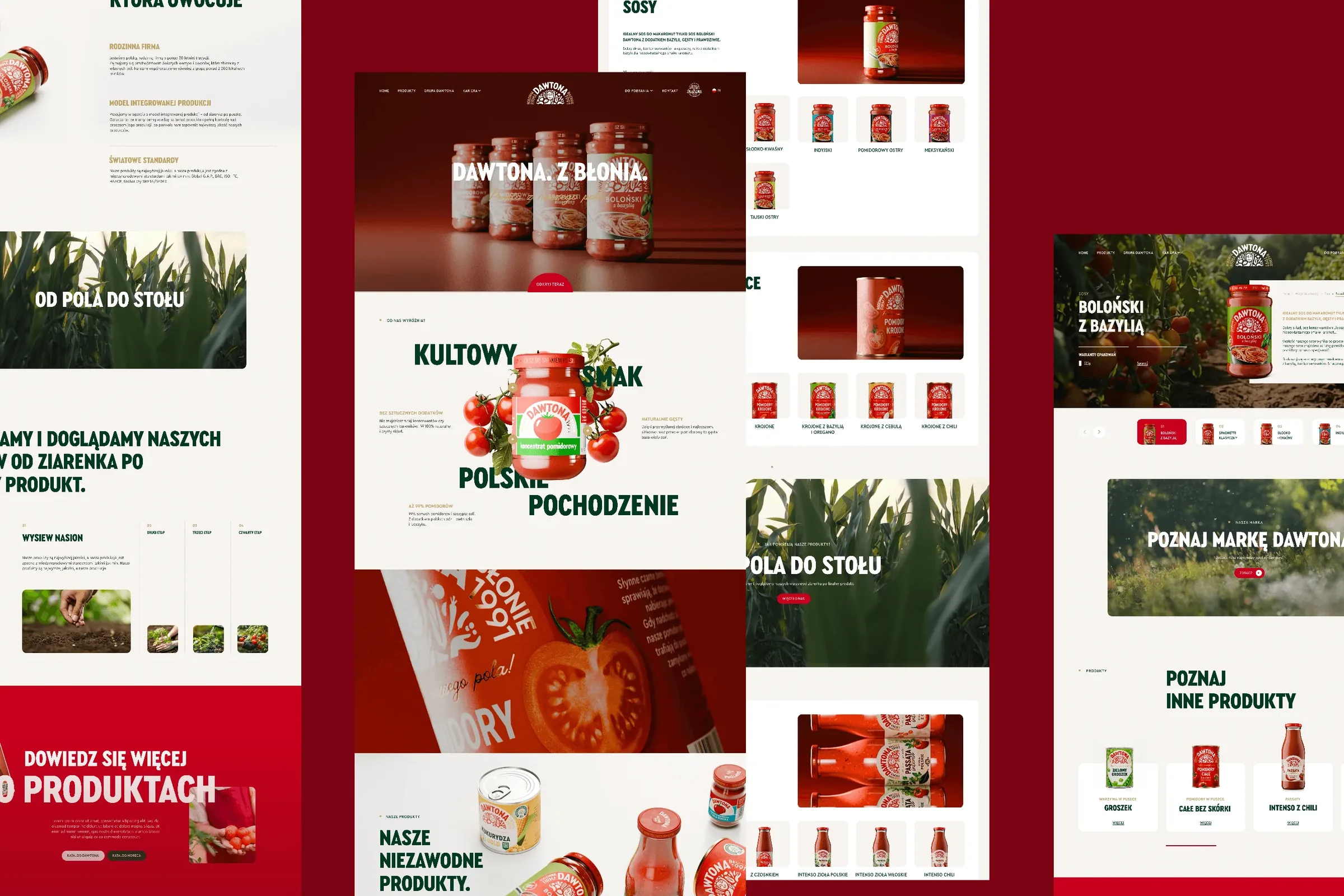
All of Dawtona's communication beyond the shelf: over 90 projects, from posts and trade fair stands to four websites and animations.
-
 Regamet
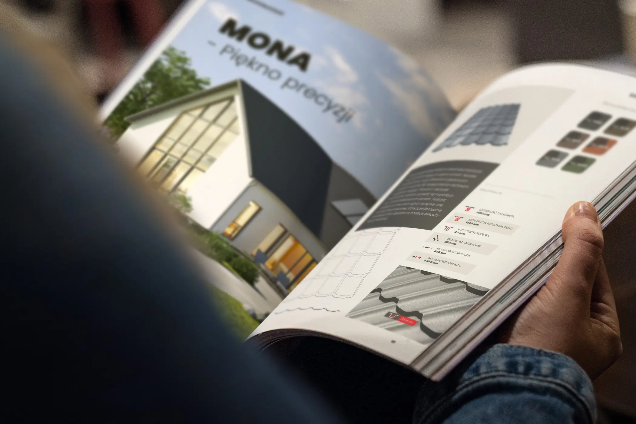
A refreshed logo, logo guidelines with 48 icons and a 56-page roofing catalogue for a manufacturer from Mielec, Poland.
-
 Itrons
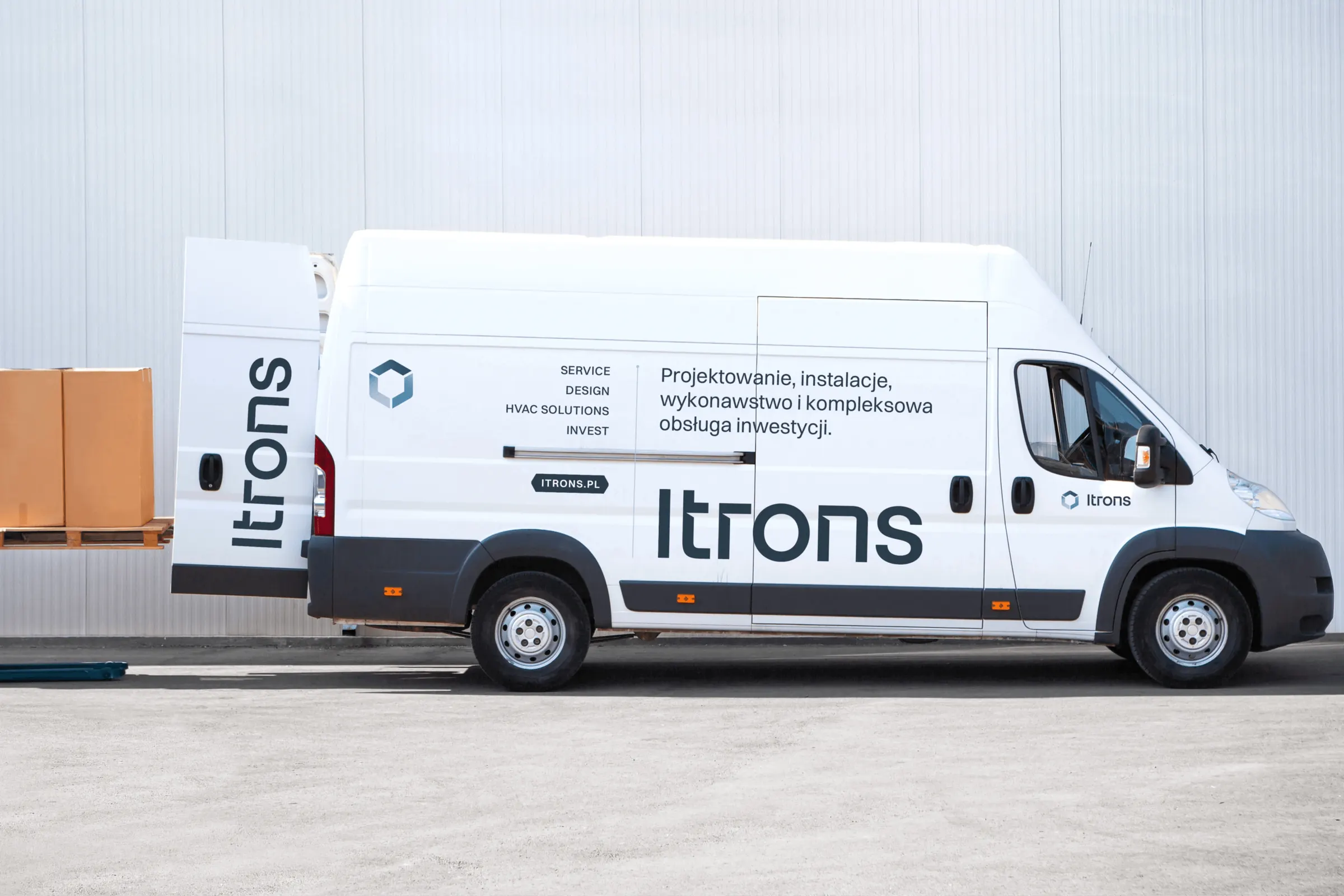
A system of five sub-brands built from a single hexagon, a visual identity and the itrons.pl website for an installation company from Kraków.
-
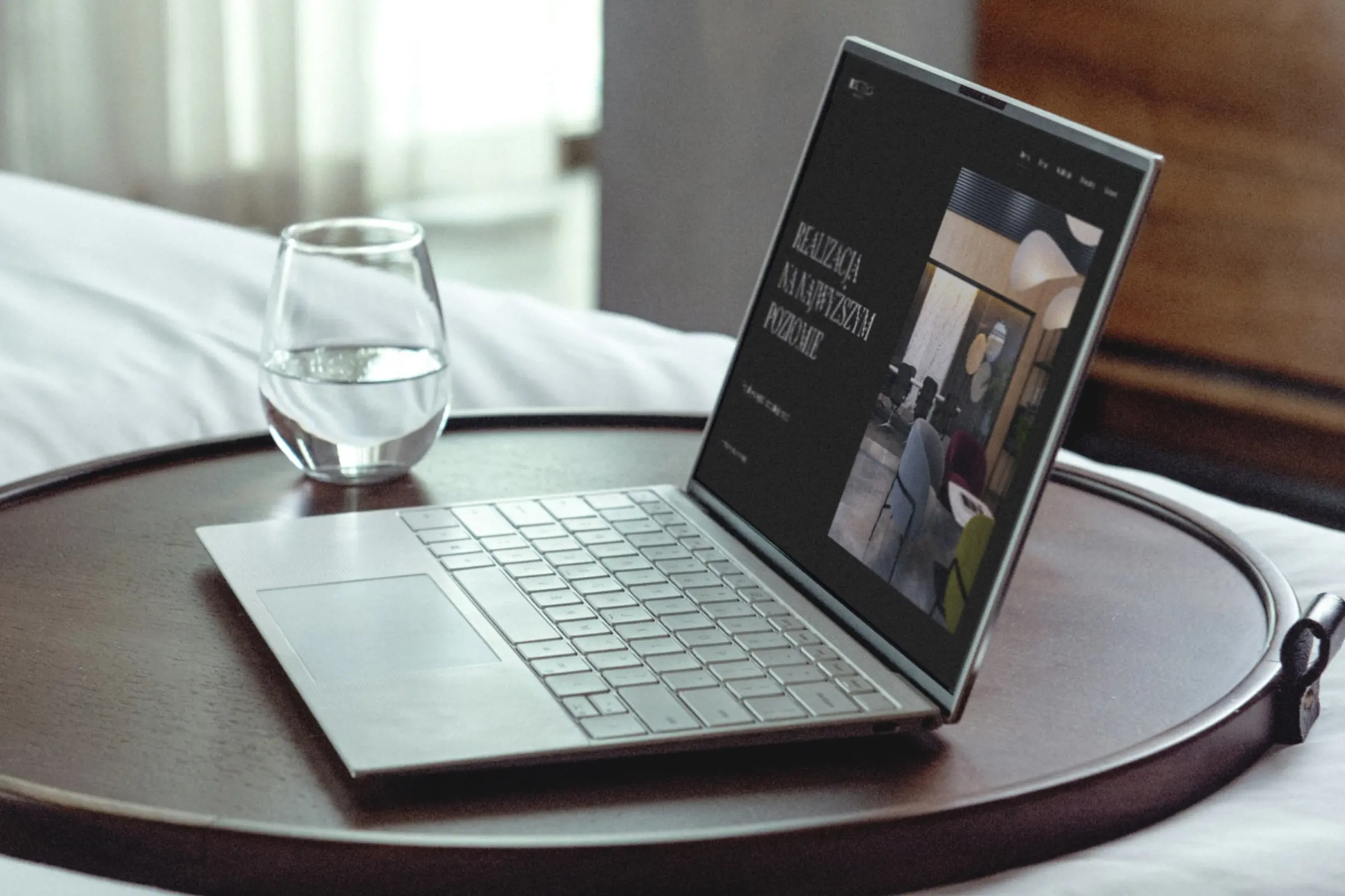 Septima Design
We refreshed the logo of an interior design studio from Kraków and designed its identity, website and a catalogue of 26 product cards.
-
 Mily Group
A rebrand for a deer antler supplier: communication strategy, logo, logo guidelines, the milygroup.com website and trade fair materials.
-
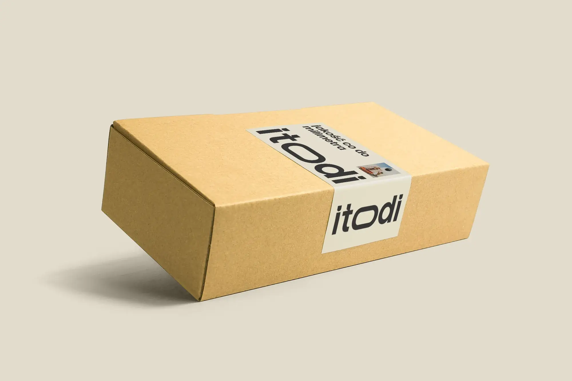 Itodi
A new made-to-measure furniture brand built from scratch: the name, a logo with a stretched “o”, the design of a shop with a configurator, an instruction leaflet and packaging.
-
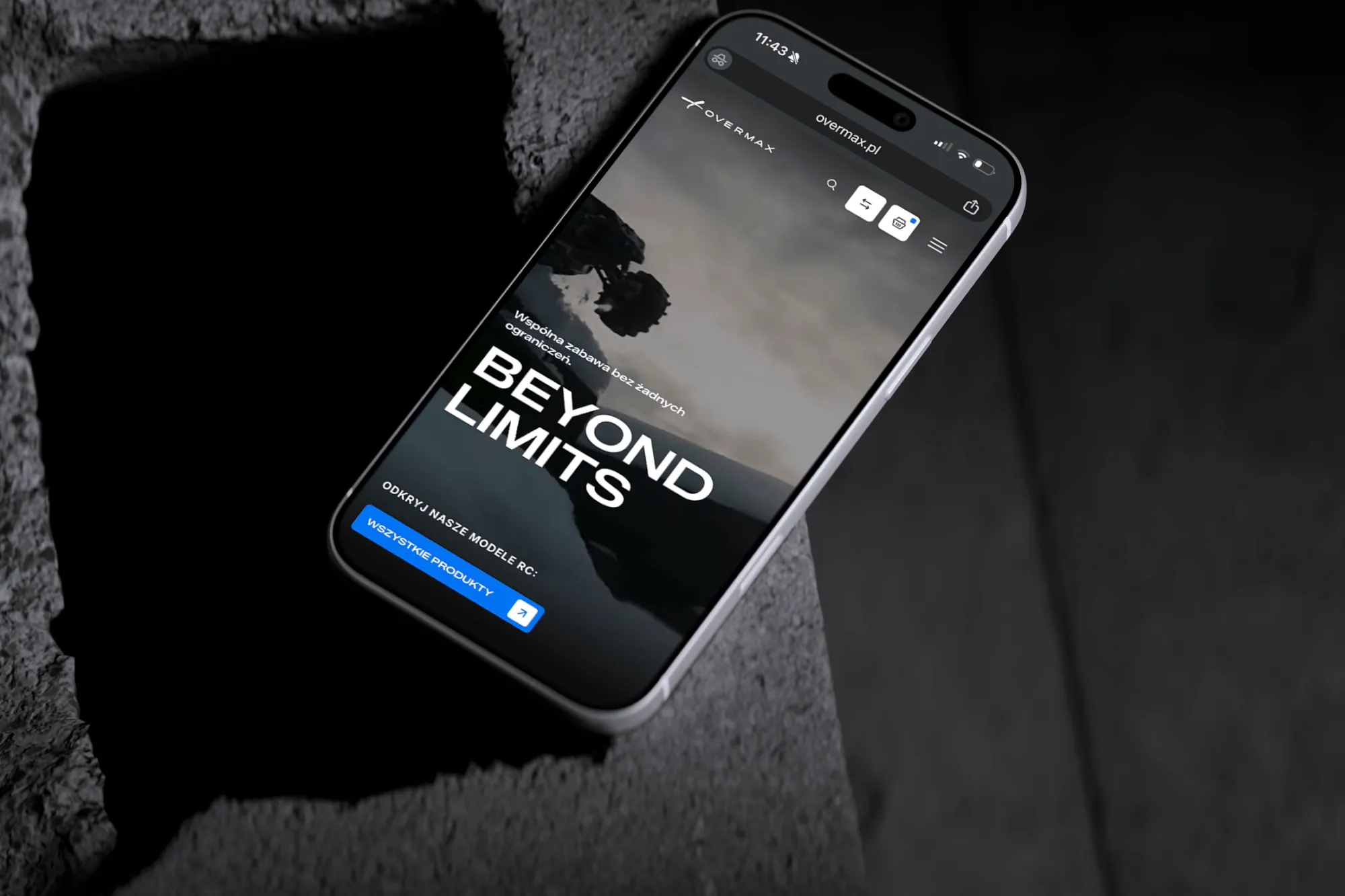 Overmax
UX/UI design for the Overmax shop: RC cars in cinematic shots, a carefully worked-out product page, a category menu and a quiz that picks a model for you.
-
 Design Optyk
A family-run chain of premium eyewear stores: an identity without gold, in-store materials and a new online shop linked to the stock of six of its seven stores.
-
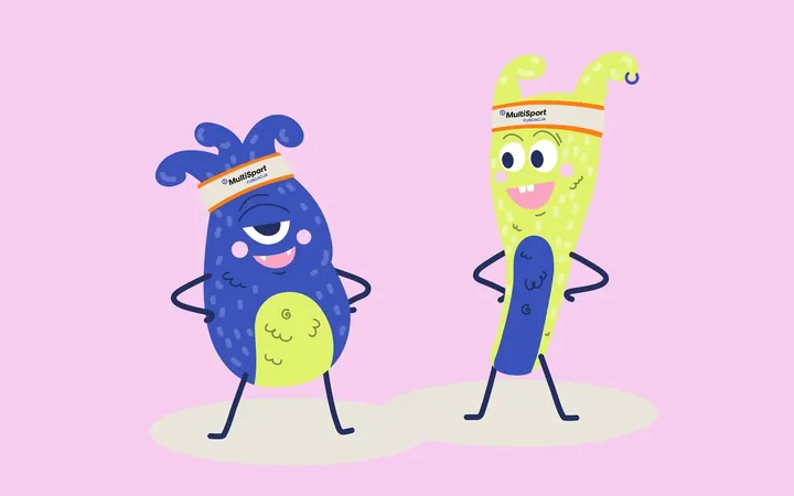
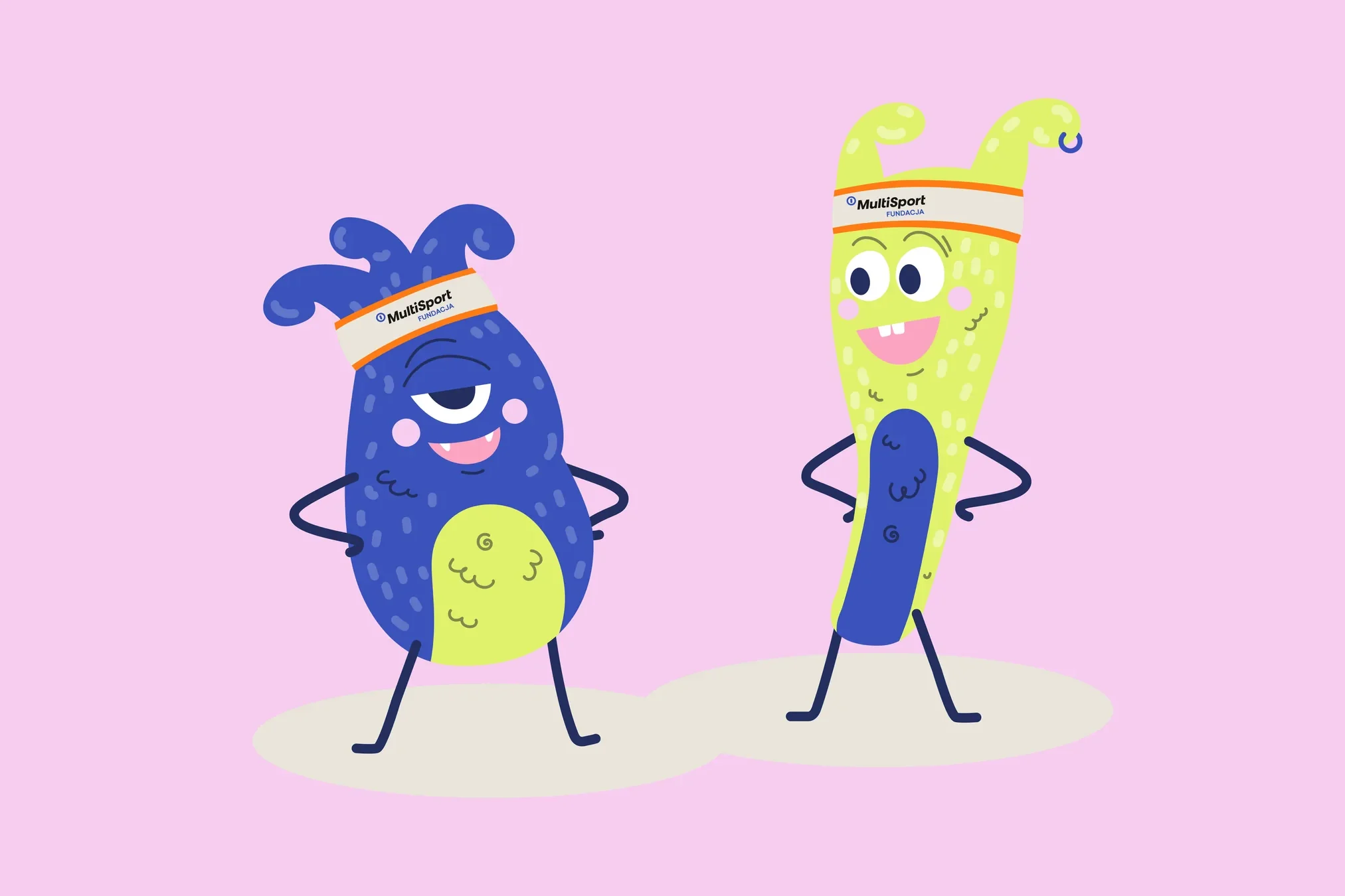 Fundacja MultiSport
An identity with a design system in Figma, a WCAG-compliant website and a brand hero duo that gets people moving.
-
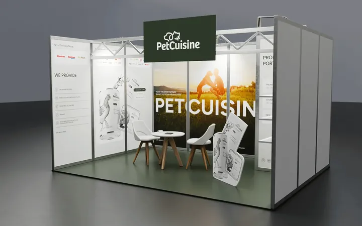
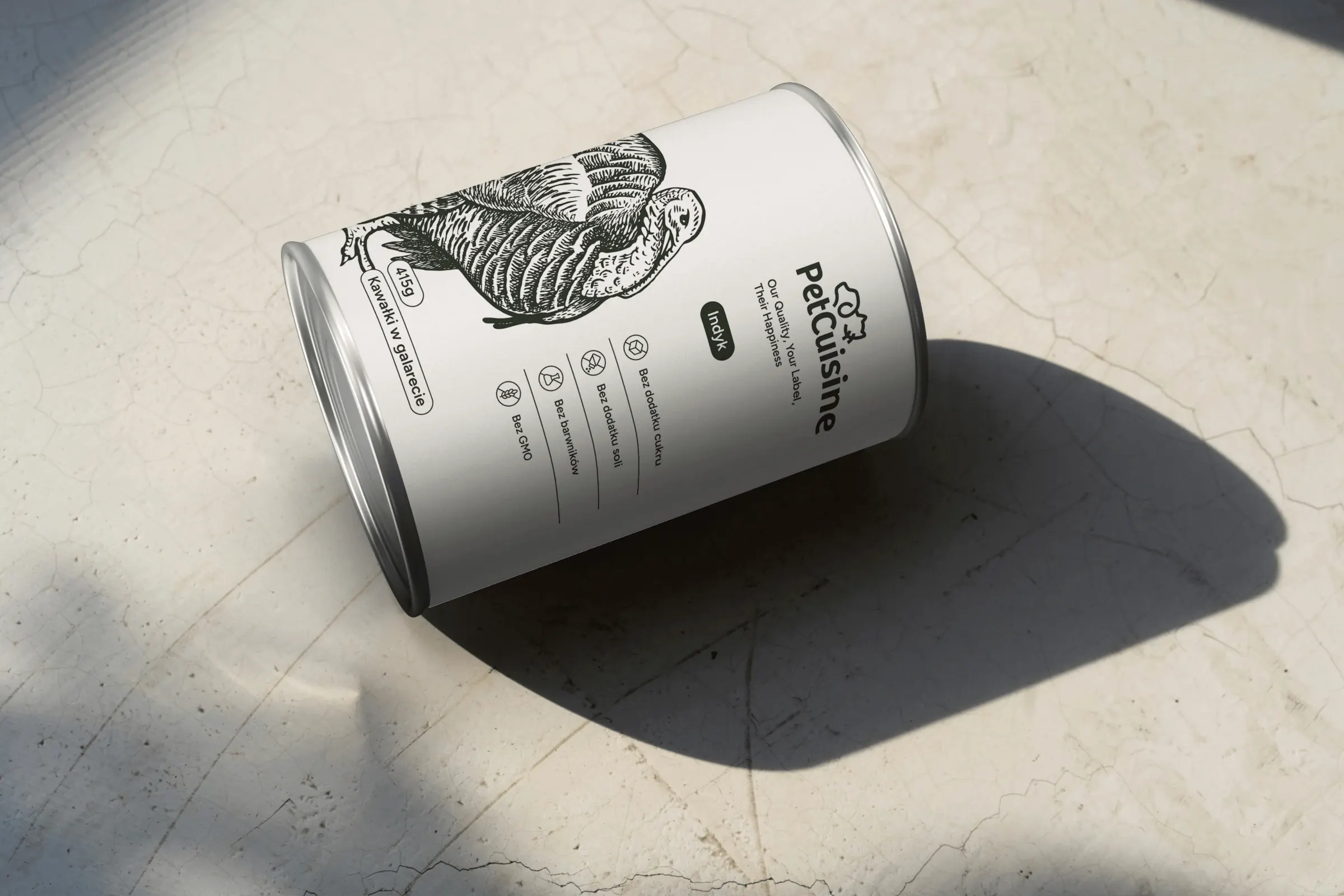 PetCuisine
We built a brand from scratch for a pet food manufacturer in the Dawtona Group: from the name and tagline, through packaging in 12 flavours and the website, to trade fair stands across Europe.
-
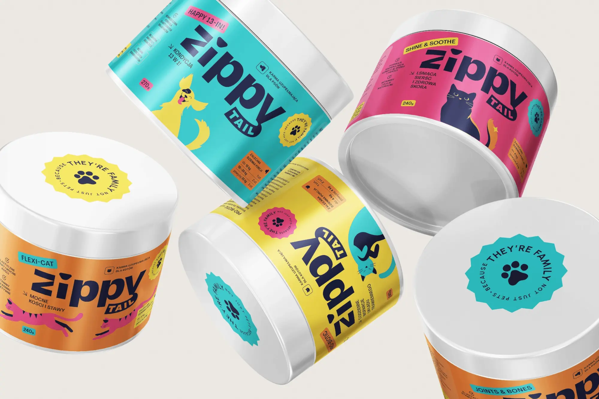 Zippy Tail
We built the Zippy Tail brand from scratch: the name, strategy, labels for eight supplements for dogs and cats, the shipping box and the shop design.
-
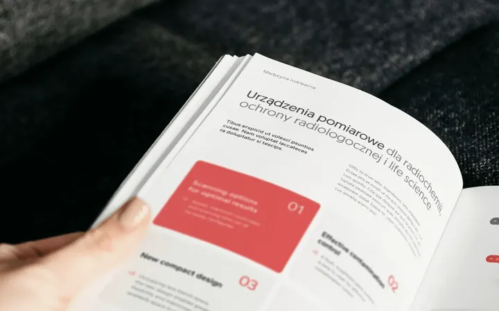
 Intima Clinic
Six medical brands in one group. Workshops, names, identity, clinic signage, print, animations and the intimaclinic.pl website.
Facing a similar challenge?
Tell us what you want to change. In a first, no-obligation call we will see whether and how we can help.
Social media
A series instead of one-off posts
Posts sit on the same grid as the catalogue cover. Sometimes the frame is visible, sometimes it only marks the space for text. That way posts about different lines and features look like one series.