







Zippy Tail
A supplement brand for dogs and cats, from the name to the packing tape
We started with workshops, when the brand didn't have a name yet. Then came the name, logo, communication strategy, labels for eight products, the parcel, ads and the online shop design.
See how it came together- 8 product labels for dogs and cats
- 4 label content layouts to choose from
- 5 display ad formats
- 10 services in one project, from workshops to the shop
Name and logo
First came a sentence, then the name
In workshops with the client we defined what the brand should be: supplements with visible results, easy contact with the brand and support, authenticity. The slogan “Because they’re family, not just pets” was written before the brand had a name.
The name had to be English, because from the start the brand was also aiming at markets abroad. The language: casual, with wordplay, mixing Polish and English. We chose Zippy Tail, a lively tail.
The animal is hidden twice in the logotype: the dot over the “i” is a dog's nose, and the word “tail” curls like a tail.
Communication strategy
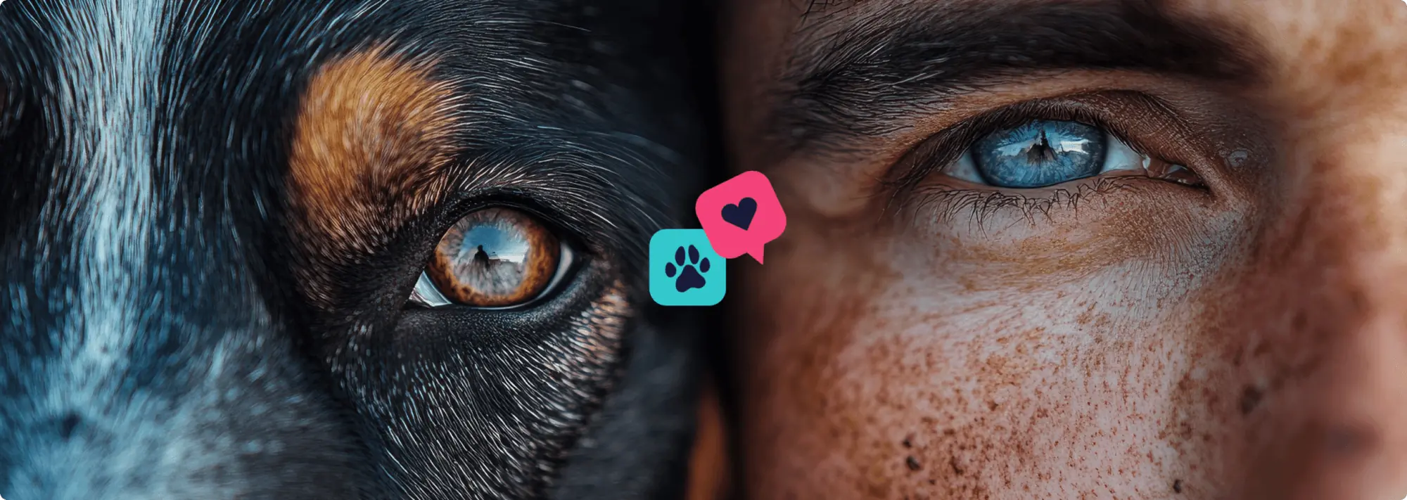
Because they’re family, not just pets
The playbook describes who the brand is, who it speaks to and how. The big idea: a supplement for a dog or cat is of the same quality as one for a person (human-grade). The line between species blurs.
- We cross the line between species
- Quality without compromise
- Mindful care for a family member
- We build deep bonds
How the brand speaks
- Educational but approachable
- Passionate and committed
- Empathetic and understanding
- Authentic and transparent
Always
- Highlight the bond between people and animals
- Explain how the ingredients work
- Share real stories
Never
- A patronising tone
- Overly technical language
- Pushy selling
- Authenticity
- Quality
- Accessibility
Labels
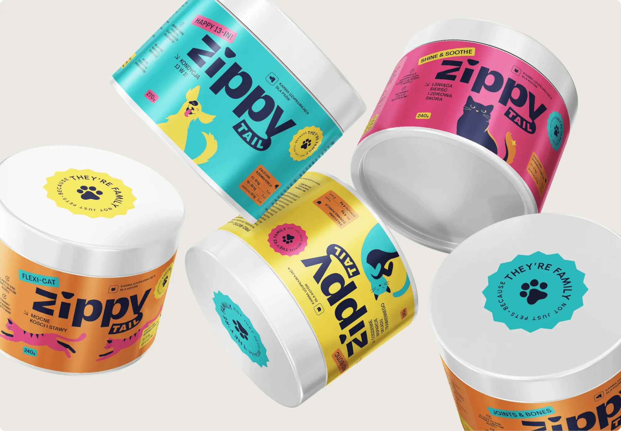
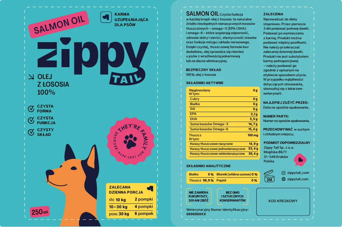
The colour says what it's for. The animal shows how
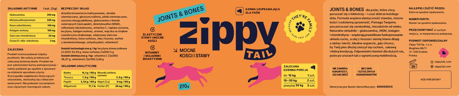
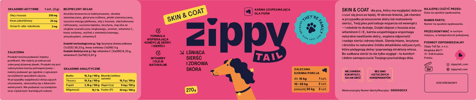
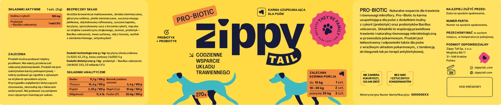
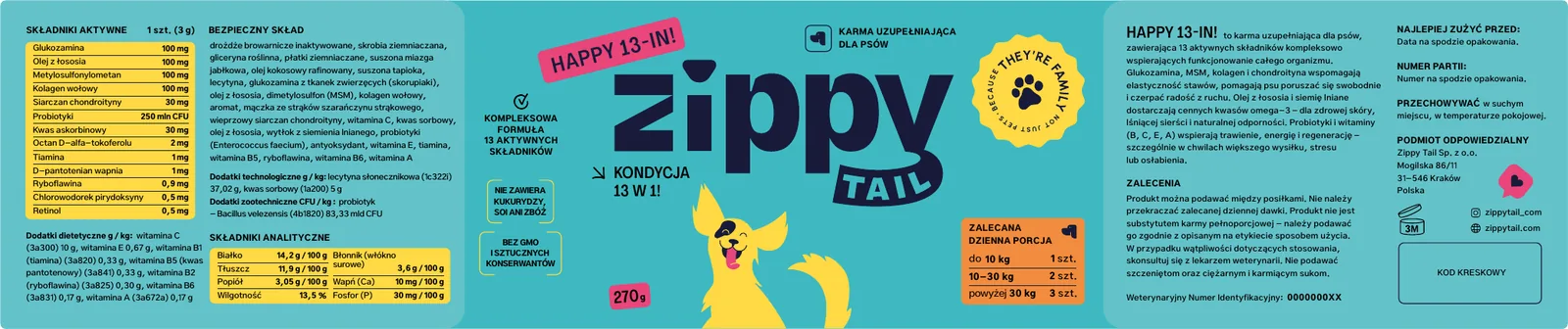
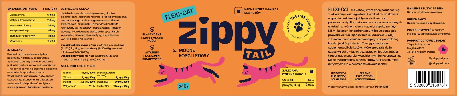
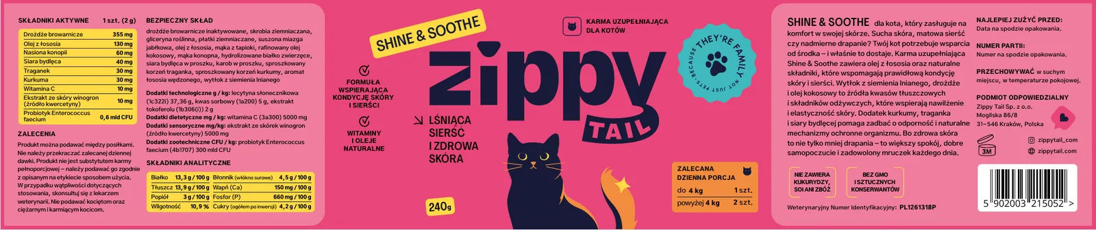
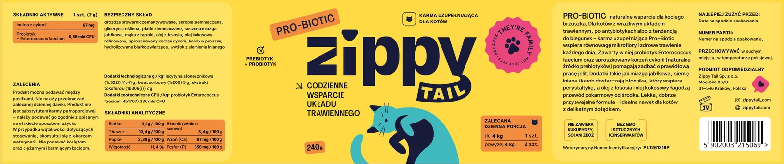
Each category has its own colour, and the illustrated animal strikes a pose that shows what the product does: for joints it runs and jumps, for coat it poses for a portrait, for digestion it takes a calm walk.
The cat labels came as a second series. The client wanted them to go into production together with the dog labels, so the category colours stayed the same and we swapped the dogs for cats: leaping, glossy and curled up in a ball.
The label, step by step
Five takes on one label
A pet supplement label has to fit a lot of mandatory information: composition, active ingredients, weight-based dosage, batch number and veterinary number. We refined the layout with the client over several rounds.
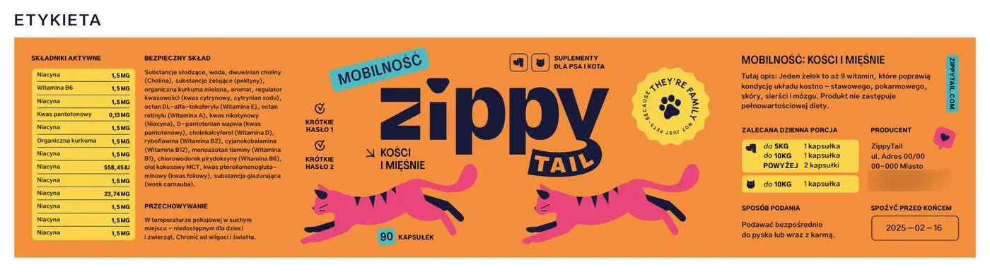
The first label
The first design, on an orange background. The products didn't have names yet, so the label speaks through its category: “Mobilność: kości i mięśnie” (“Mobility: bones and muscles”).
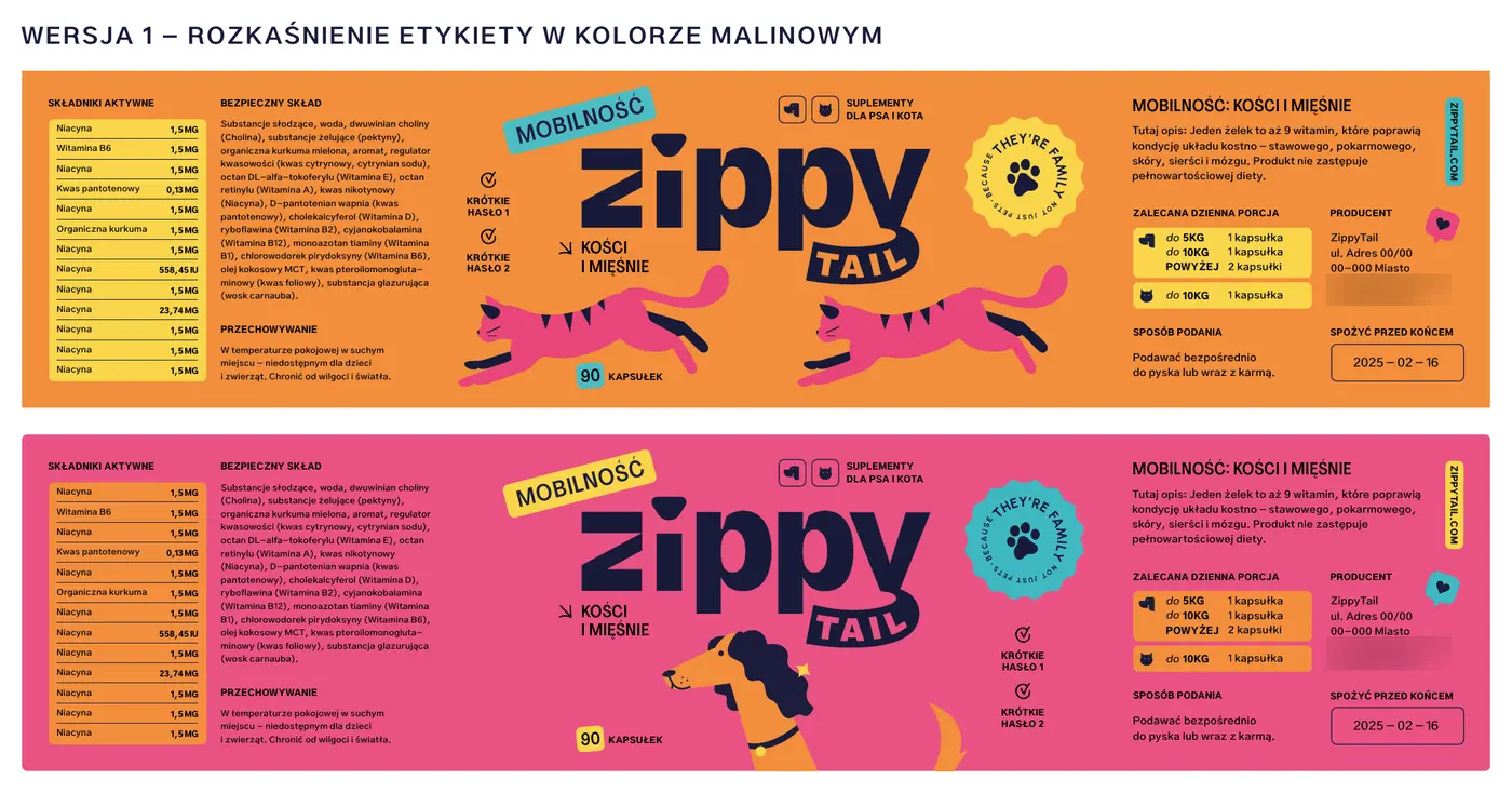
The same label in raspberry
A check of whether the layout works in another colour. Tests like this led to colour-coding the categories.
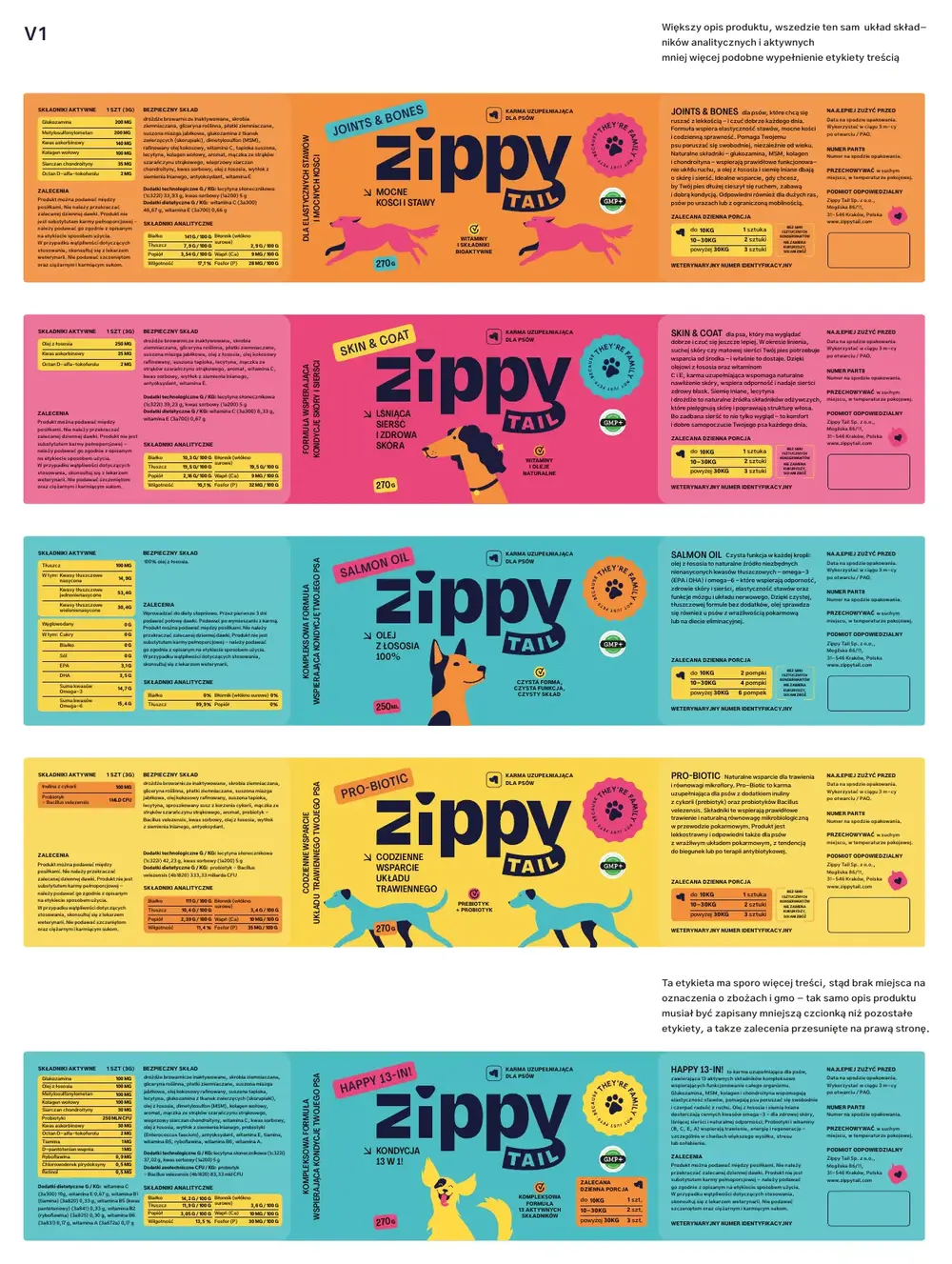
Four content layouts
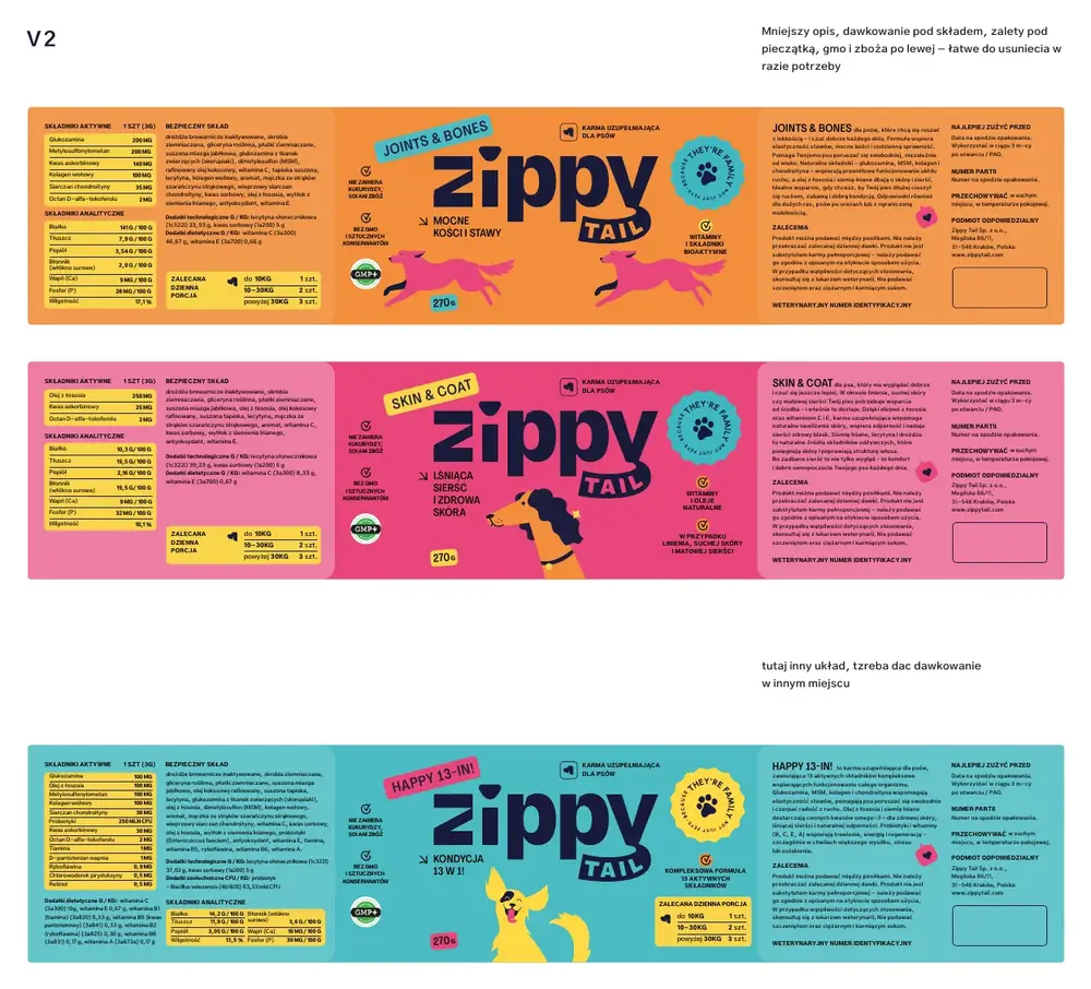
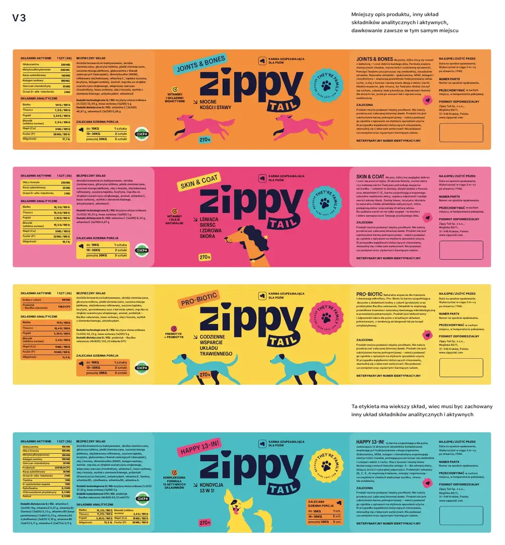
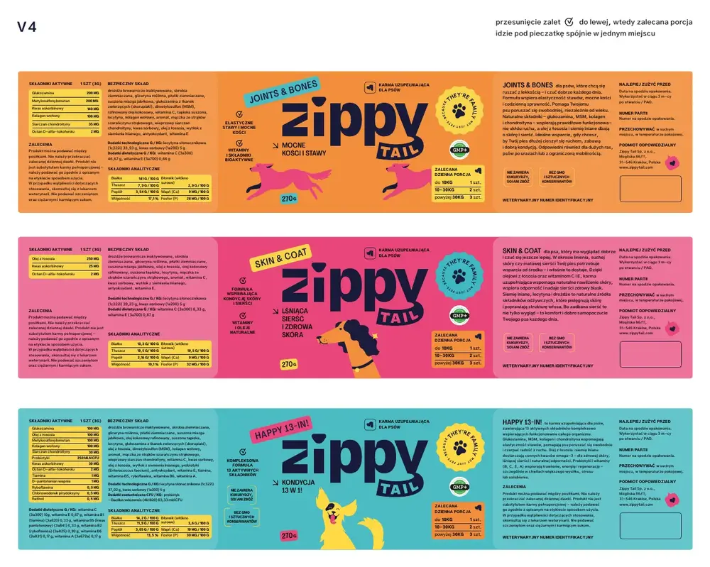
Once the names and ingredients were ready, we drew up four variants of the content layout. The client chose V4, with the benefits on the left and the recommended portion under the stamp, plus twelve editorial fixes, including units written in lower case.
A longer product description, and the same layout of analytical and active ingredients on every label.
A shorter description, dosage under the composition, benefits under the stamp.
A shorter description, a different ingredient layout, dosage always in the same place.
Benefits on the left, recommended portion under the stamp, everything in one place. This variant went forward.
The dog set, ready for print
Four dog supplement labels and a separate, taller label for the bottle of salmon oil.
The cat series
The same dimensions and colours, new cat illustrations and a smaller net weight. The first preview was ready the next day, because the labels were to go into the same production run as the dog ones.
Parcel
The brand doesn't end at the jar
Customers buy online, so their first contact with the brand is the box. It got stickers with Polish slogans such as “wygląd” (looks), “jelita” (gut) and “geriatria” (senior care), and packing tape reading “bezpieczny skład” (safe ingredients) and “najlepsza formuła” (the best formula).
Online advertising
One creative, five formats
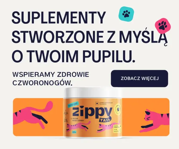
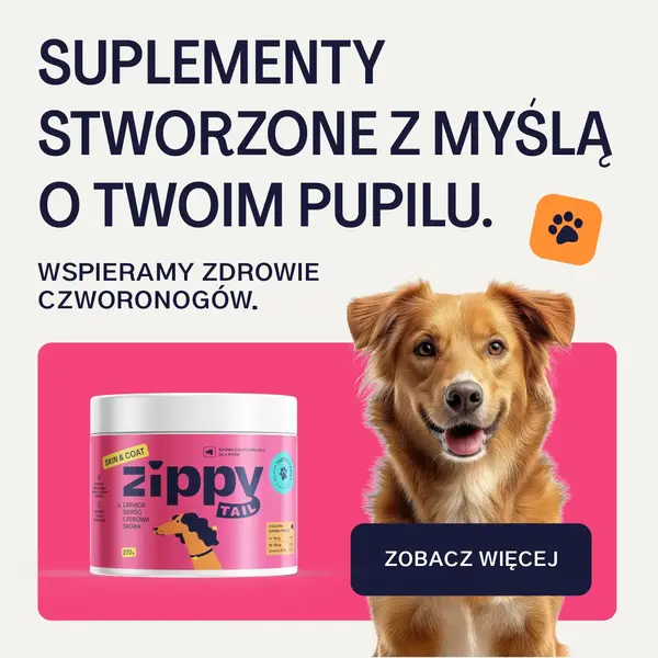
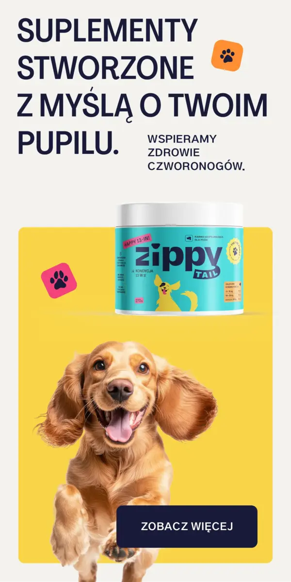
Banners for a display network campaign: a square, a rectangle, two skyscrapers and a billboard. Every format keeps the same elements: the slogan, the jar, the animal and the button.


Online shop
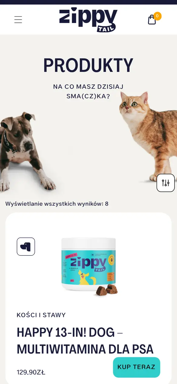
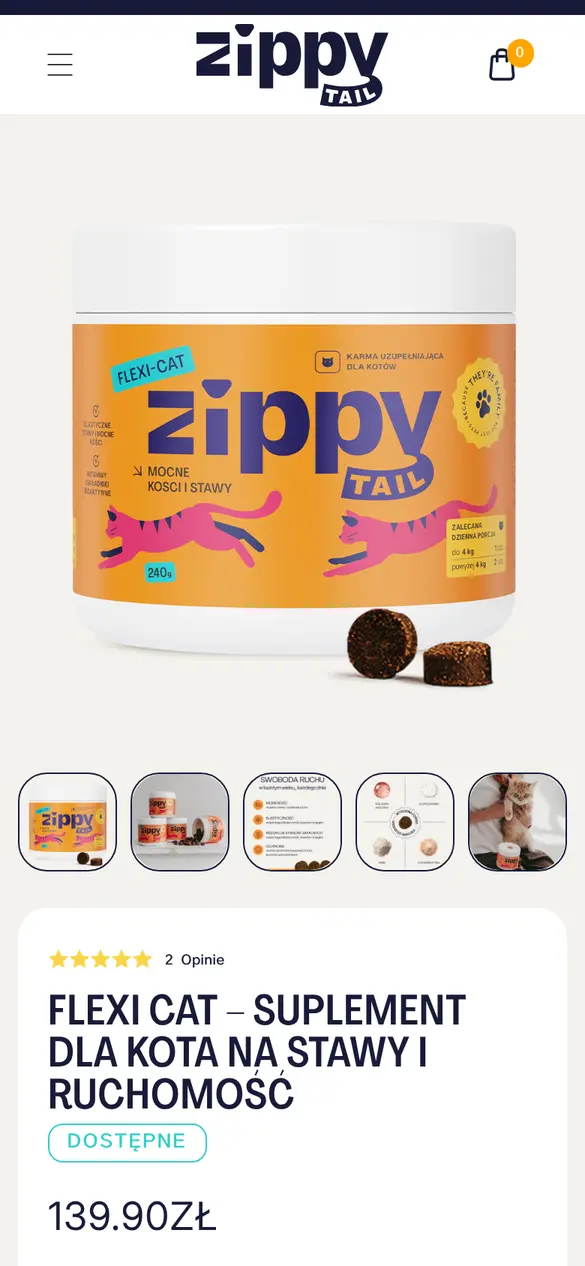
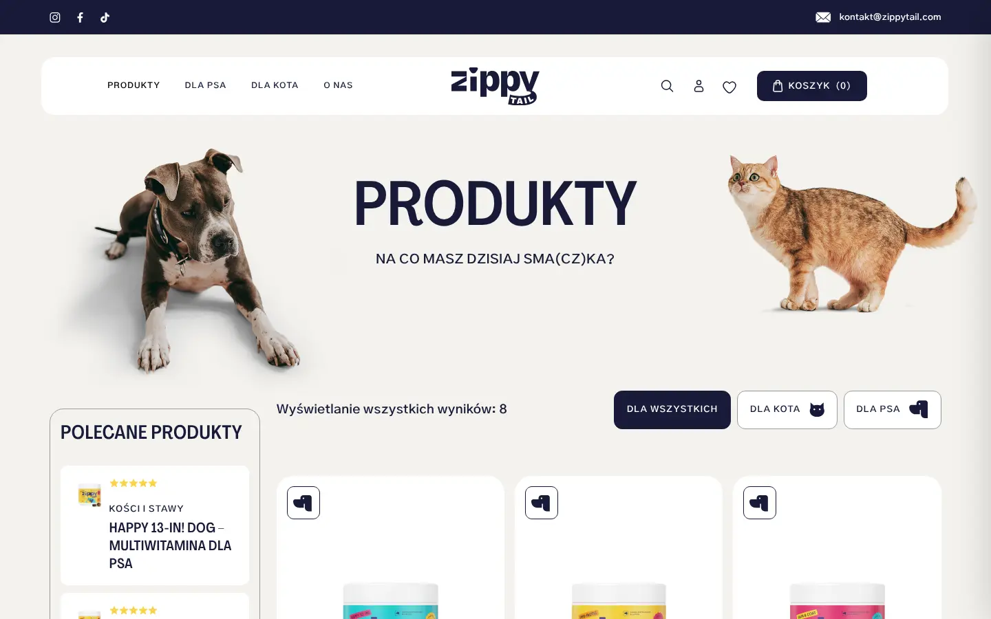
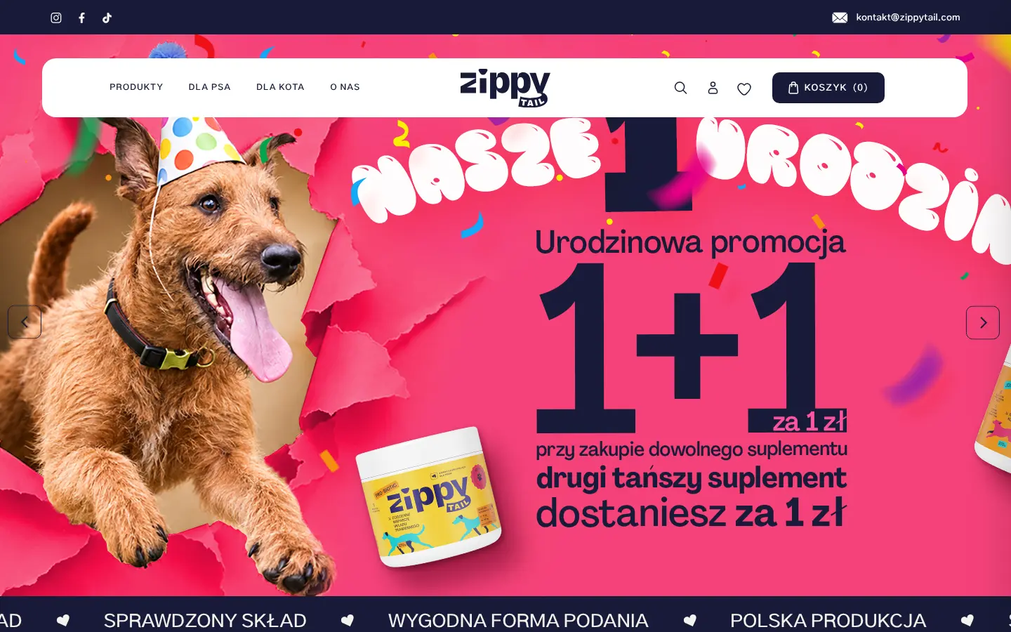
The zippytail.com shop design
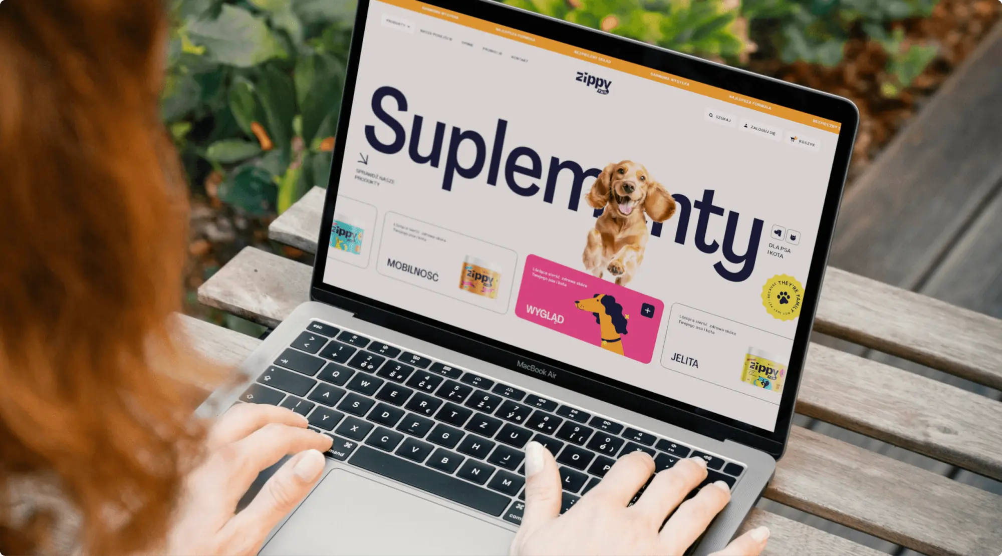
We designed the shop's UX/UI: the home page, the product list and the product page. The hero has two versions: tiles with a carousel for every day, and one large banner for promotions.
Today the shop has eight products, and the site uses the same colours, animals and labels as the packaging.
zippytail.com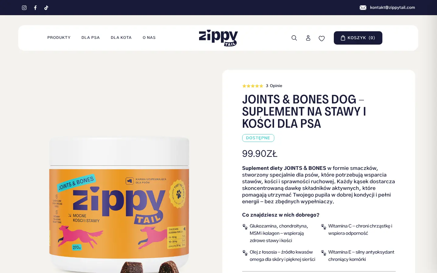
Brand materials
The same system everywhere
Because they’re family
We gave the brand everything it needed to launch: a name, strategy, identity, packaging and shop design. It was all made in one system, so the label, the box and the shop look like the same company.
- Client
- Zippy Tail
- Scope
- Strategy workshops · Communication strategy · Branding · Logo · Animation · Illustration · Packaging · Business materials · Social media · UI/UX Design
- Tools
- Figma · Illustrator · After Effects
- Online
- zippytail.com
More projects
-
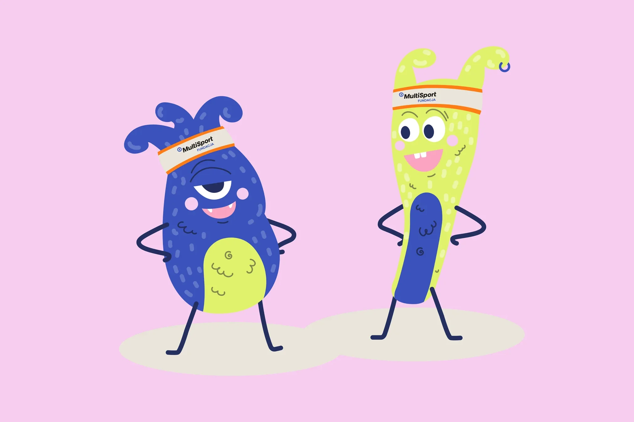 Fundacja MultiSport
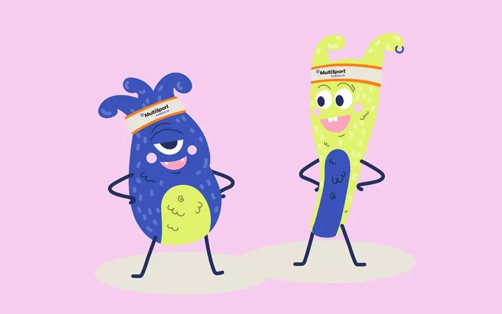
An identity with a design system in Figma, a WCAG-compliant website and a brand hero duo that gets people moving.
-
 Mily Group
A rebrand for a deer antler supplier: communication strategy, logo, logo guidelines, the milygroup.com website and trade fair materials.
-
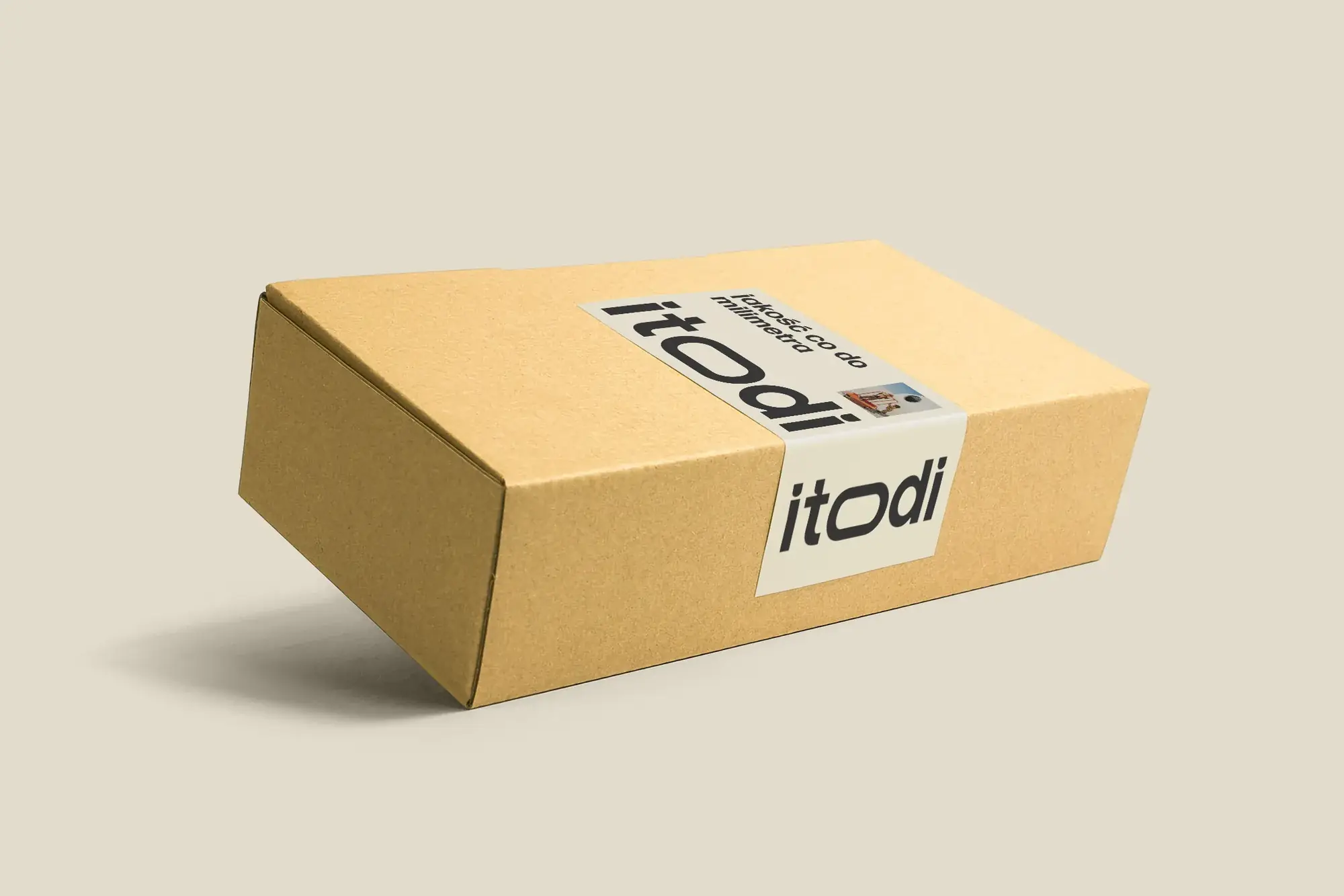 Itodi
A new made-to-measure furniture brand built from scratch: the name, a logo with a stretched “o”, the design of a shop with a configurator, an instruction leaflet and packaging.
-
 Made in Podlasie
Workshops, identity, labels and a trade stand for a Polish health food brand entering Kuwait.
-
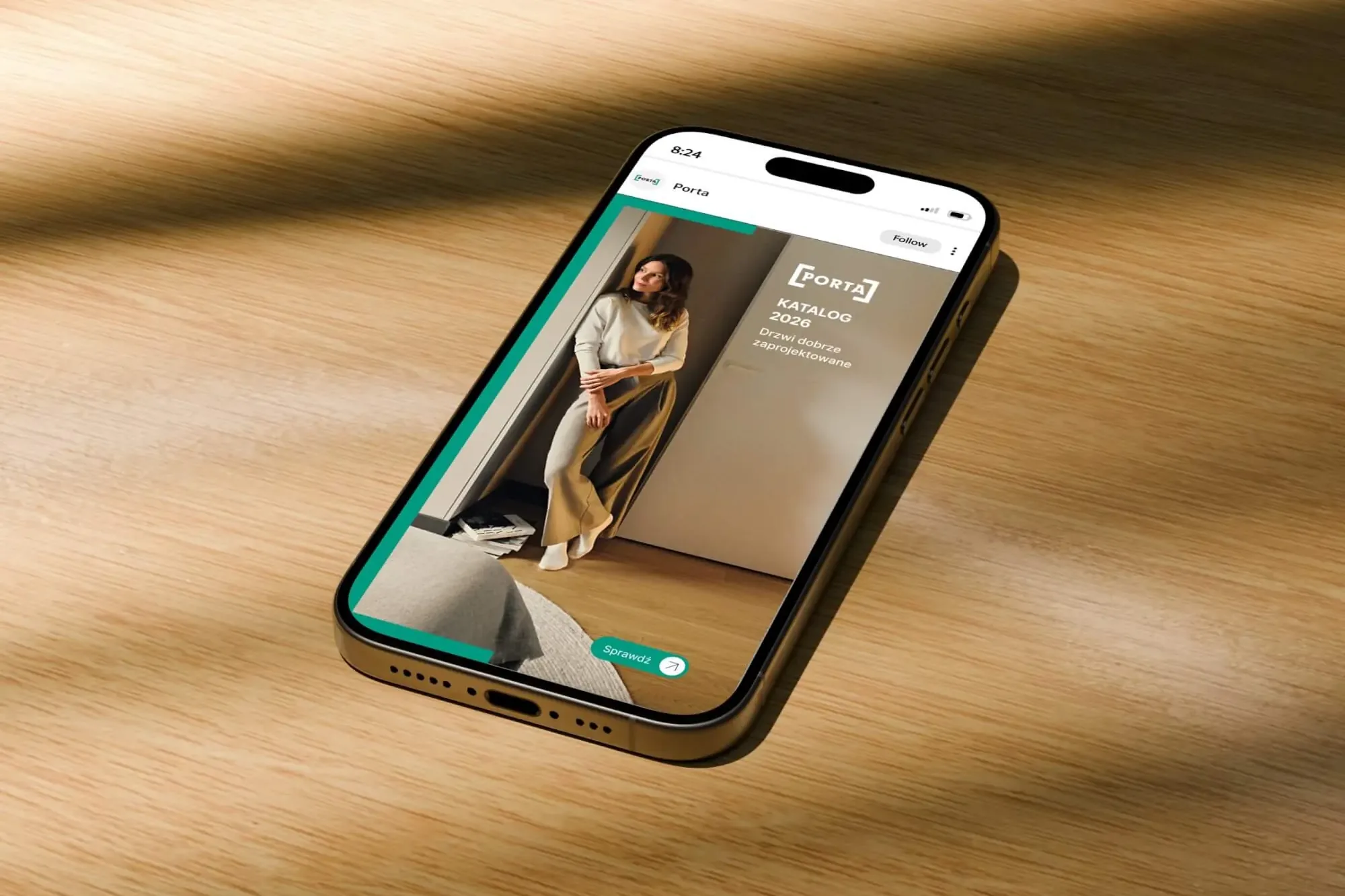 Porta Drzwi
A design system for an existing logo: a frame taken from the logo, grids, icons, drawings, a catalogue, porta.com.pl, social media and sales materials for a door manufacturer.
-
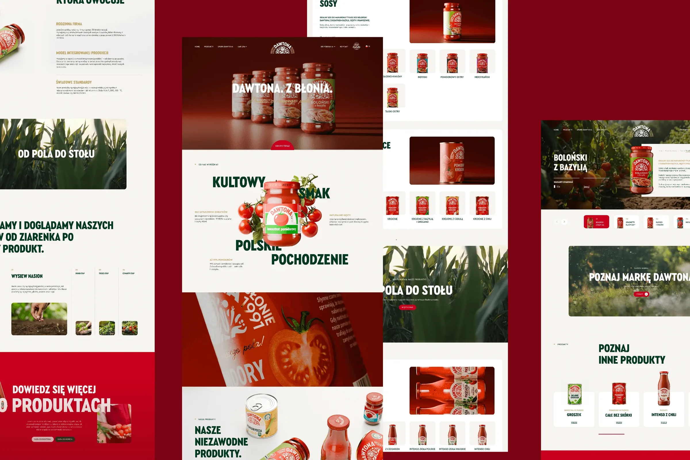 Dawtona Group
All of Dawtona's communication beyond the shelf: over 90 projects, from posts and trade fair stands to four websites and animations.
-
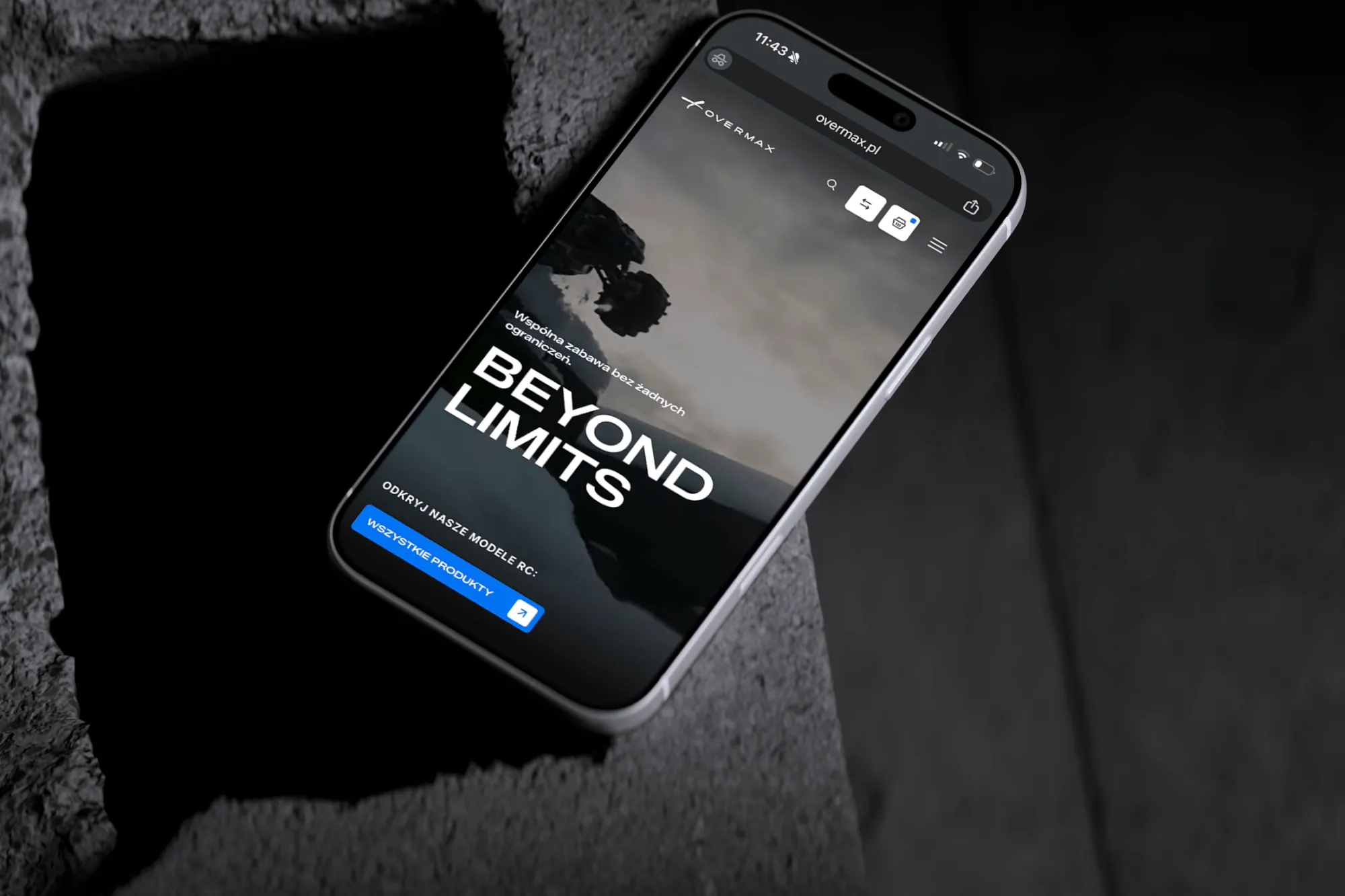 Overmax
UX/UI design for the Overmax shop: RC cars in cinematic shots, a carefully worked-out product page, a category menu and a quiz that picks a model for you.
-
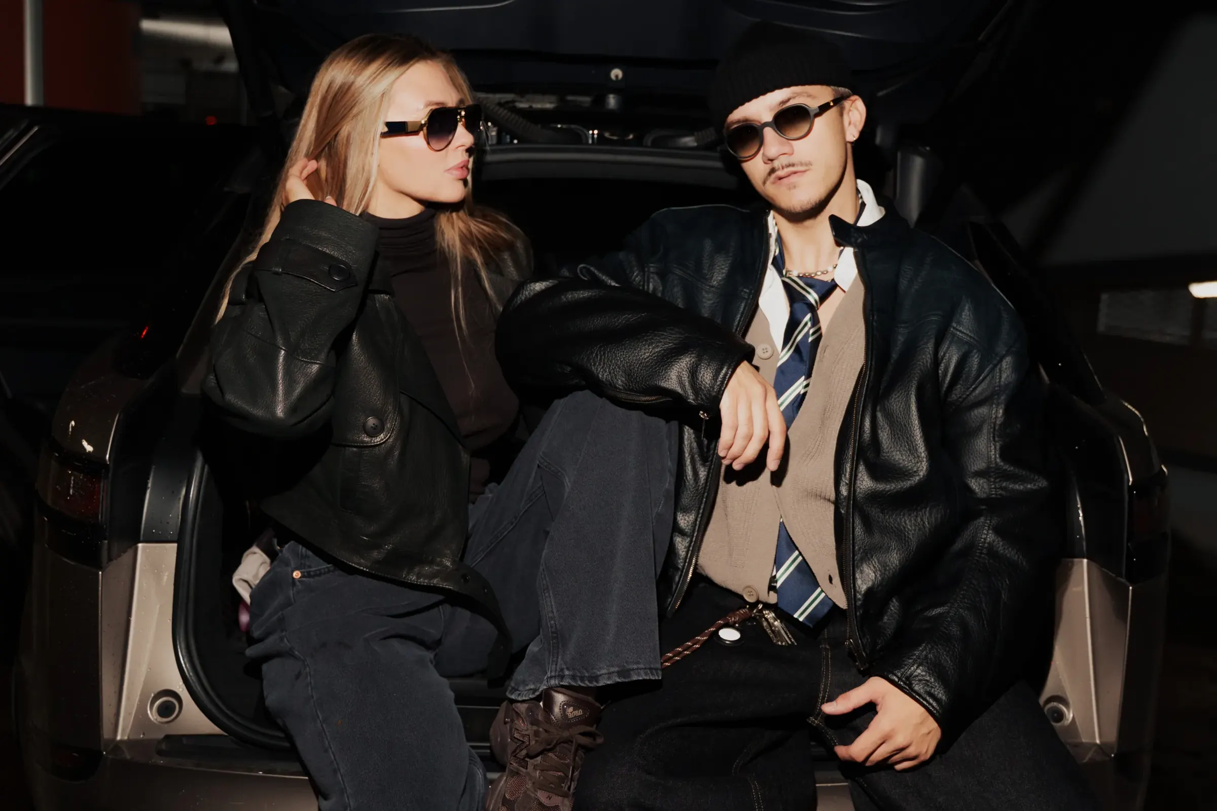 Design Optyk
A family-run chain of premium eyewear stores: an identity without gold, in-store materials and a new online shop linked to the stock of six of its seven stores.
-
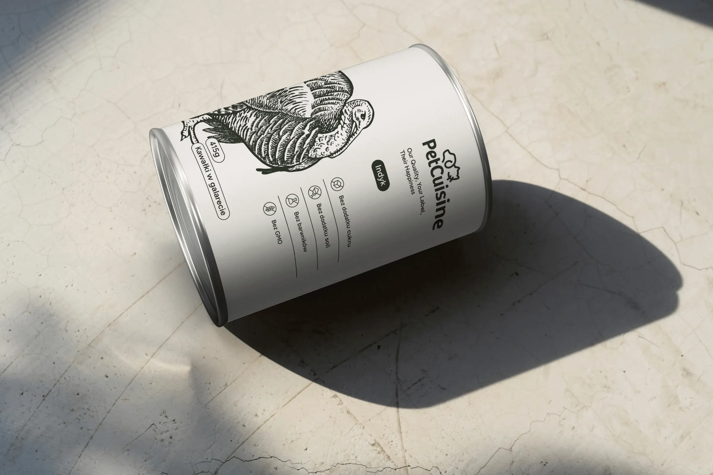 PetCuisine
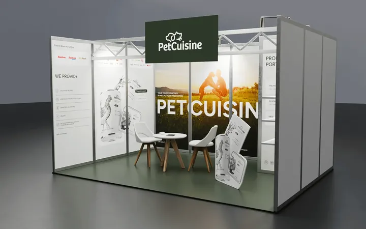
We built a brand from scratch for a pet food manufacturer in the Dawtona Group: from the name and tagline, through packaging in 12 flavours and the website, to trade fair stands across Europe.
-
 Intima Clinic
Six medical brands in one group. Workshops, names, identity, clinic signage, print, animations and the intimaclinic.pl website.
-
 PolTREG
A rebrand for a biotech company listed on the Warsaw Stock Exchange, the poltreg.bio website for patients, investors and partners, and ongoing design support.
-
 Vee
We designed the Vee brand with its sub-brands, the vee.ai website, web applications and trade fair materials, and for myvee, the identity and a store.
Facing a similar challenge?
Tell us what you want to change. In a first, no-obligation call we will see whether and how we can help.