


IBehind the door
First, guests saw a keyhole
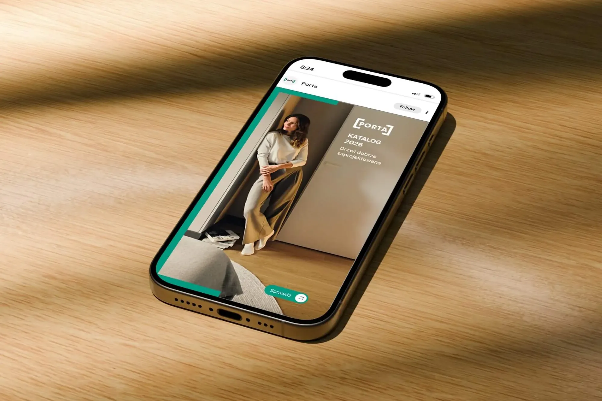
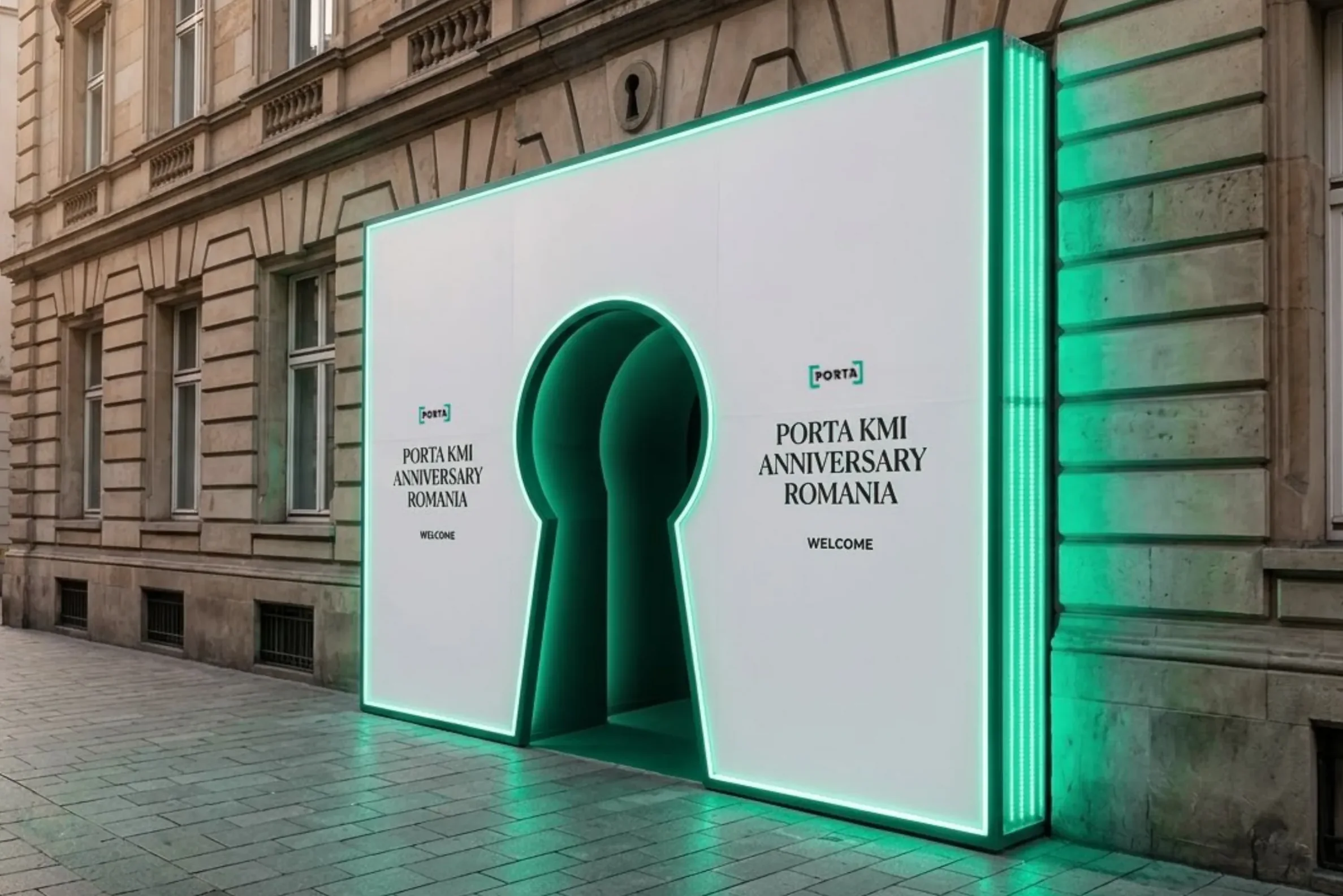
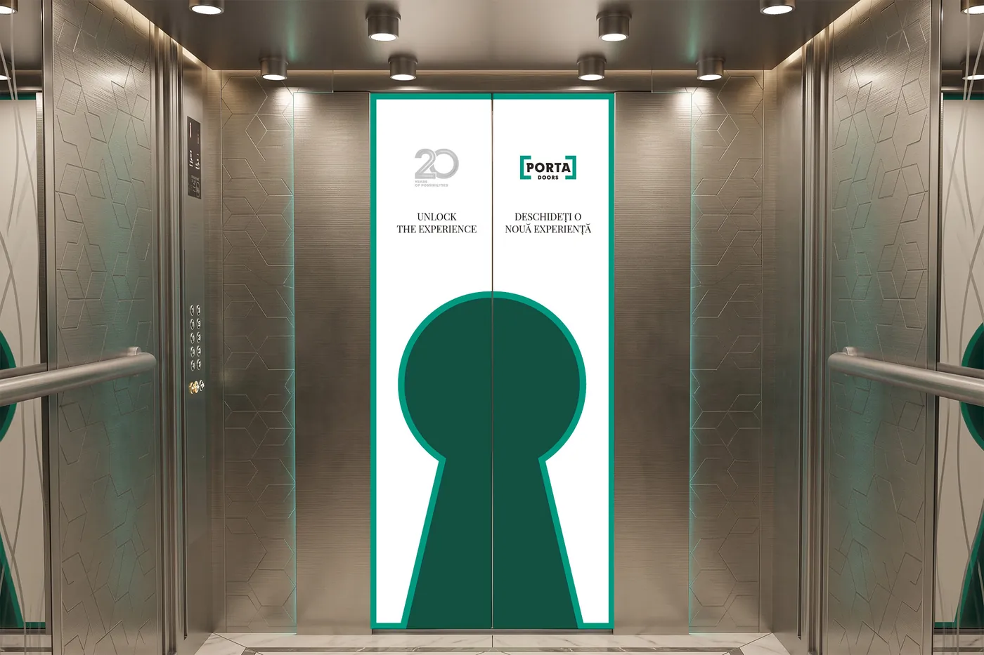
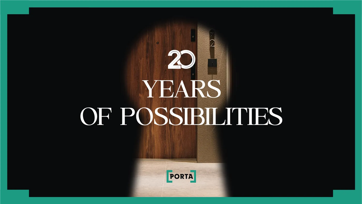
The anniversary tagline was “Unlock the experience”. A keyhole opens the invitation and then comes back on one medium after another: on the wall at the entrance, in the lift, at the bar and on the screens.
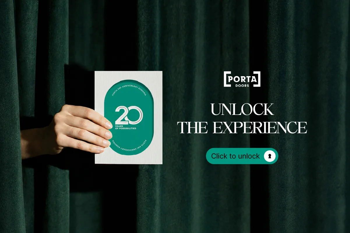
Animated invitation
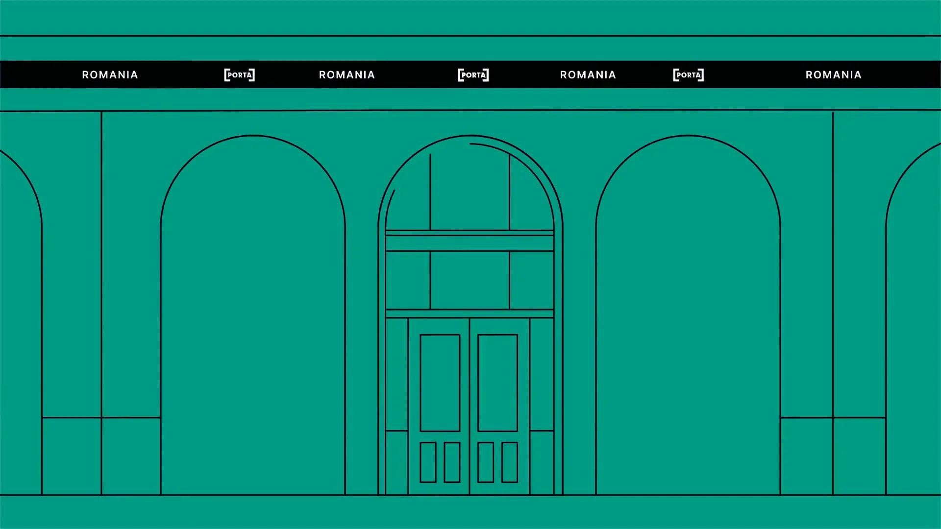
The invitation opens with the tagline in a keyhole, followed by a drawing of the facade, the 20 mark, a short history of Porta in Romania and the gala date.
IIThe idea
Porta is Latin for door
Porta makes doors, and the anniversary conference was called “The Art of Opening”. So the whole visual system is about opening: every item is a door, an arch, a key or a keyhole.
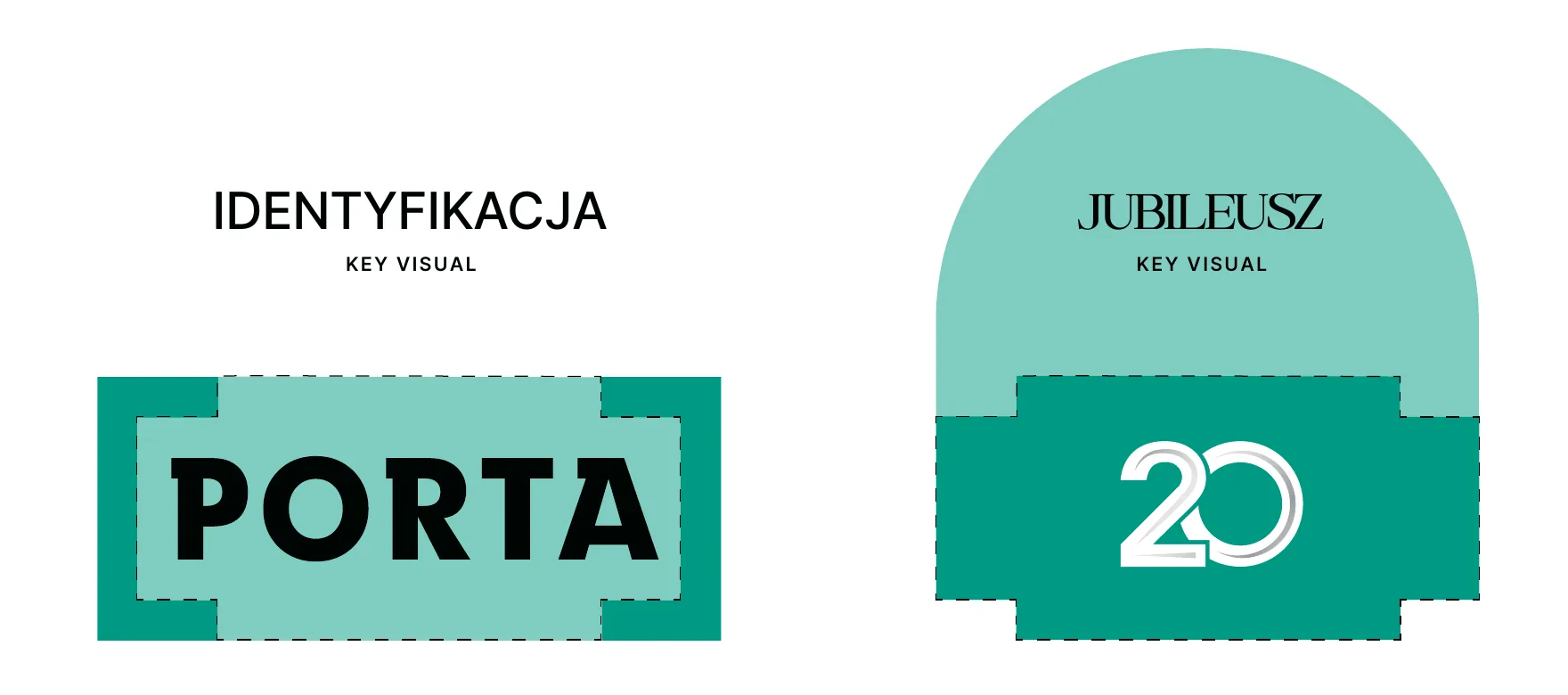
Porta's identity is built on a green frame taken from the construction of the logo. For the anniversary we needed something festive that was still recognisable, so we derived an ornamental art deco frame from the white space around the 20 mark.
We built the rest of the system from motifs everyone associates with doors. That way even an item without a logo, like the drinks menu, instantly looks like part of the same event.
Five motifs
-
01
The logo frame
The green frame from the construction of the Porta mark, and its festive art deco version around the 20 mark.
-
02
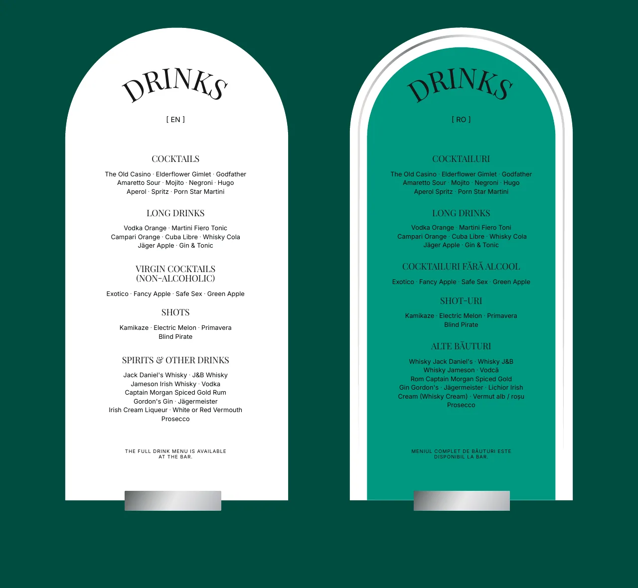
The arch
Silver line drawings of doors and windows. They gave us the arch, the shape of the menu, the agenda, the drinks menus and the welcome screens.
-
03
The key
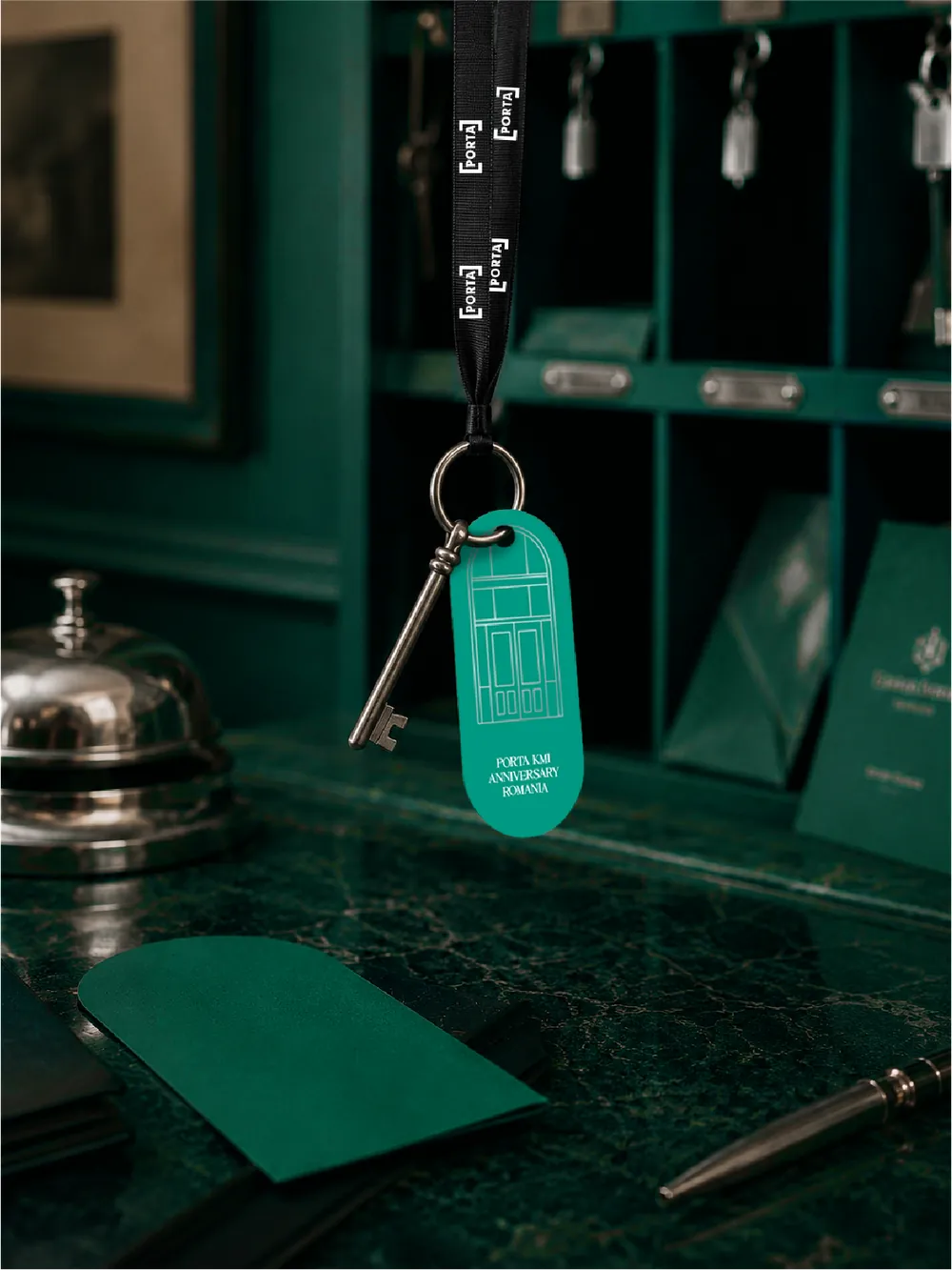
A symbol of passing through the door into the anniversary. It hangs on the tag of each hotel room key.
-
04
The keyhole
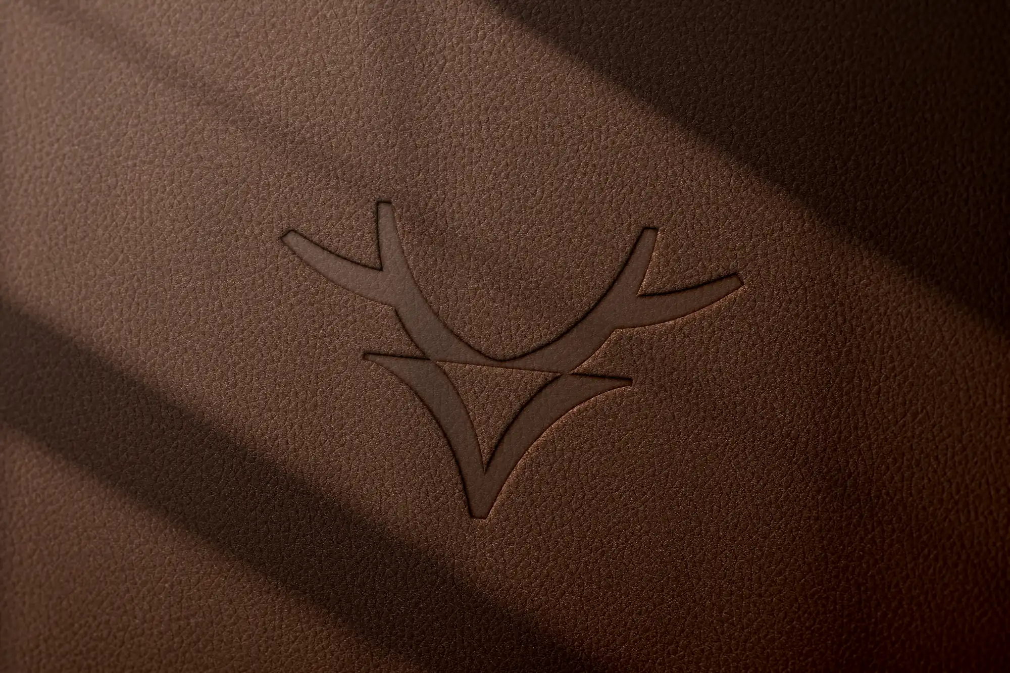
The sign of the “Unlock the experience” tagline. It stands wherever something begins: on the invitation, at the entrance and on the lift doors.
-
05
The curtain
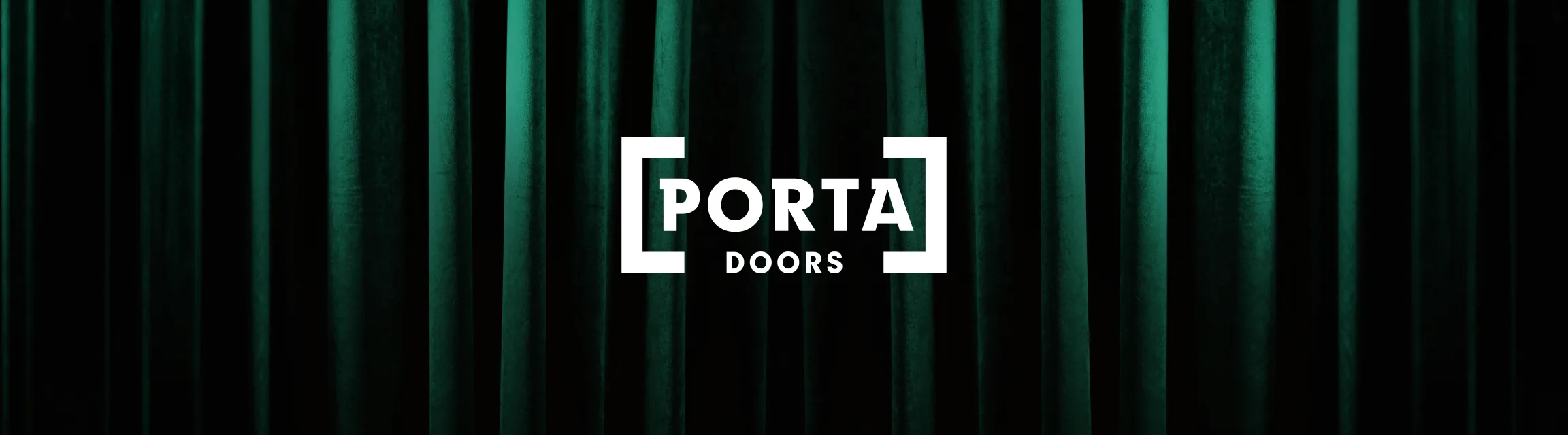
Green velvet is the background of the LED screens, the mailer and the animations. The curtain parts and the show begins.
The 20 Years of Possibilities mark
The 20 mark already existed, so we didn't design a new logo. It got a line frame, white with a silver finish, as an extension of the key visual.
Event palette and typography
- Porta green CMYK 100/0/60/0
- Mint #80CCC0
- Bottle green #135041
- White #FFFFFF
- Silver foil and print
-
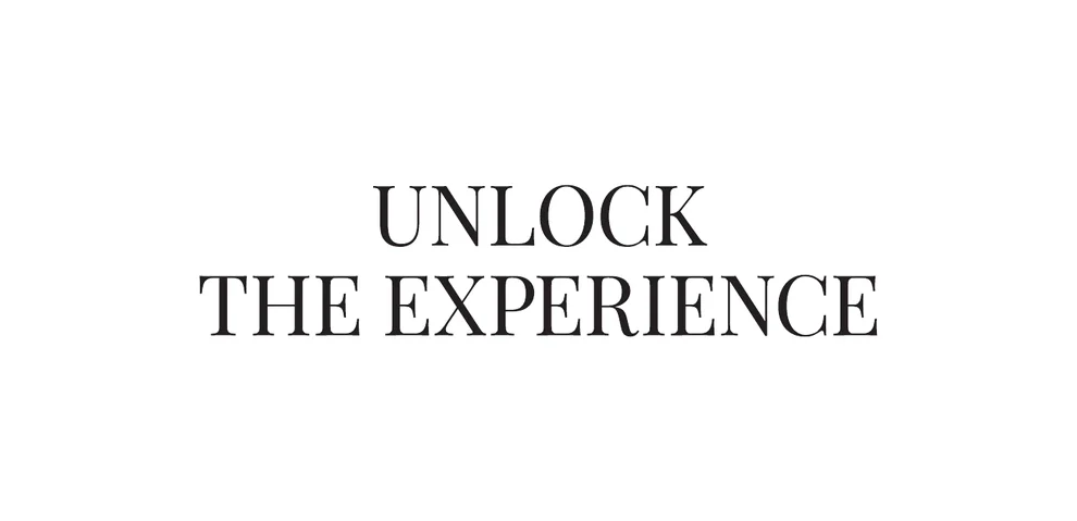
Serif typeface. For headings and taglines, like “Unlock the experience” on the book's band.
-
Inter
Inter. The typeface from Porta's identity, for body text and information.
Concept presentation
-
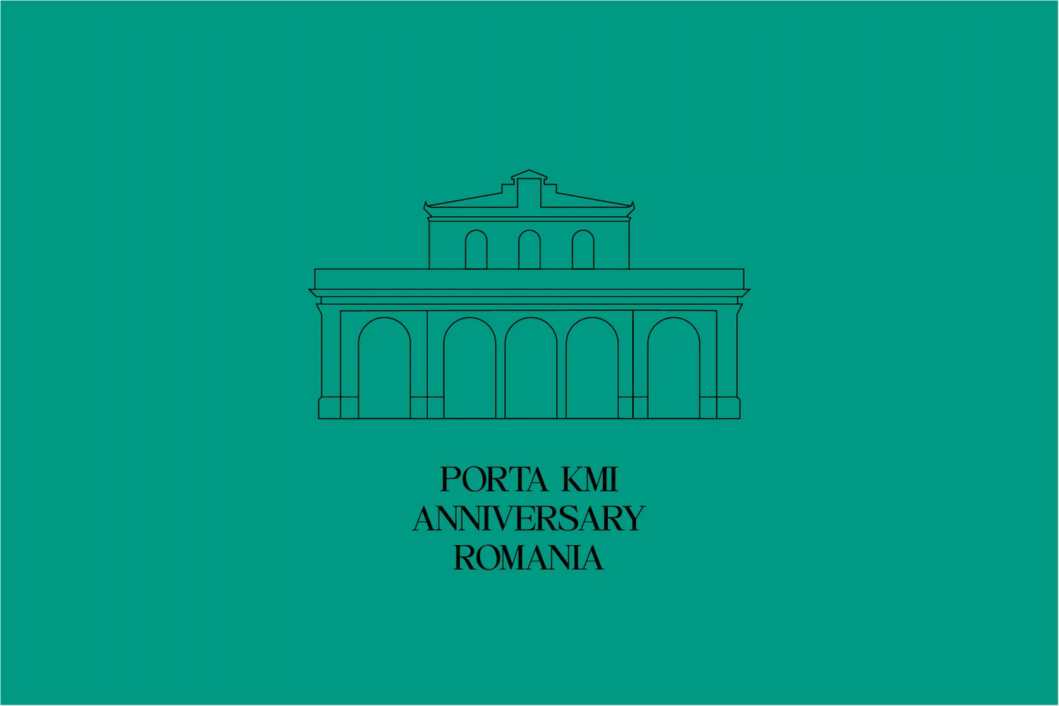
01Facade drawing
-
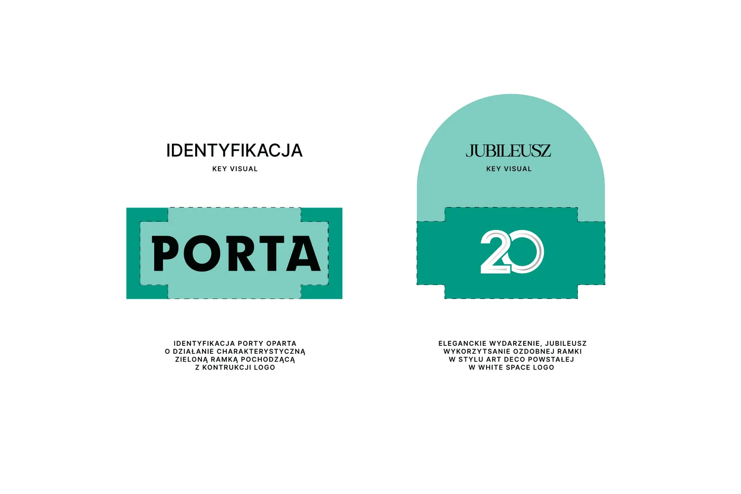
02Identity frame and anniversary frame
-
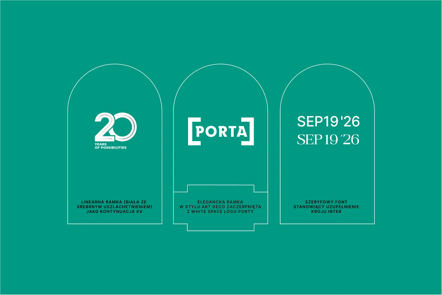
03Mark, frame and typography
-
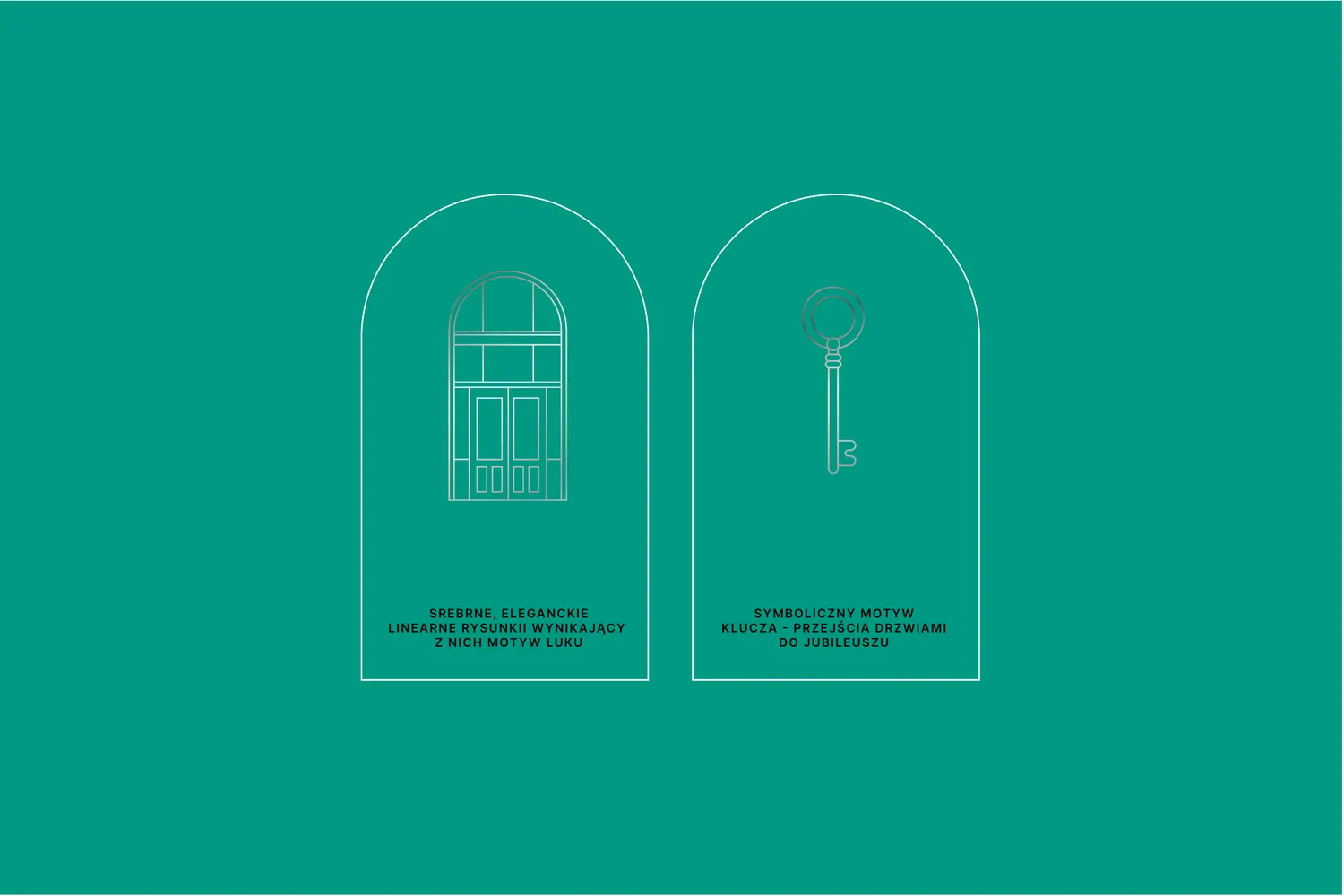
04Drawings: arch and key
-
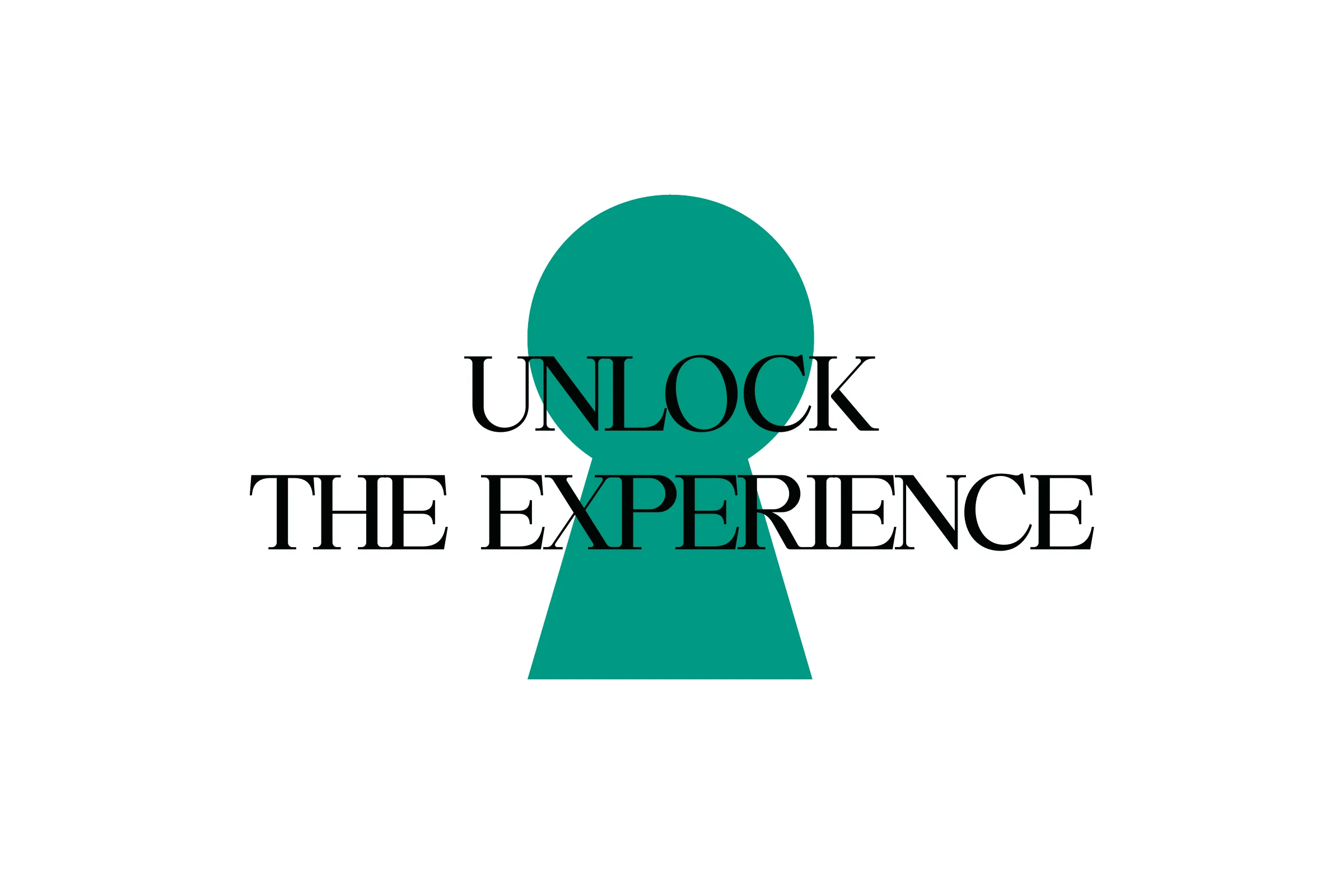
05The tagline in a keyhole
-
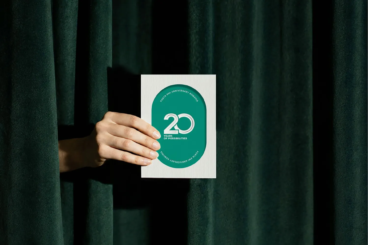
06An invitation from behind the curtain
-
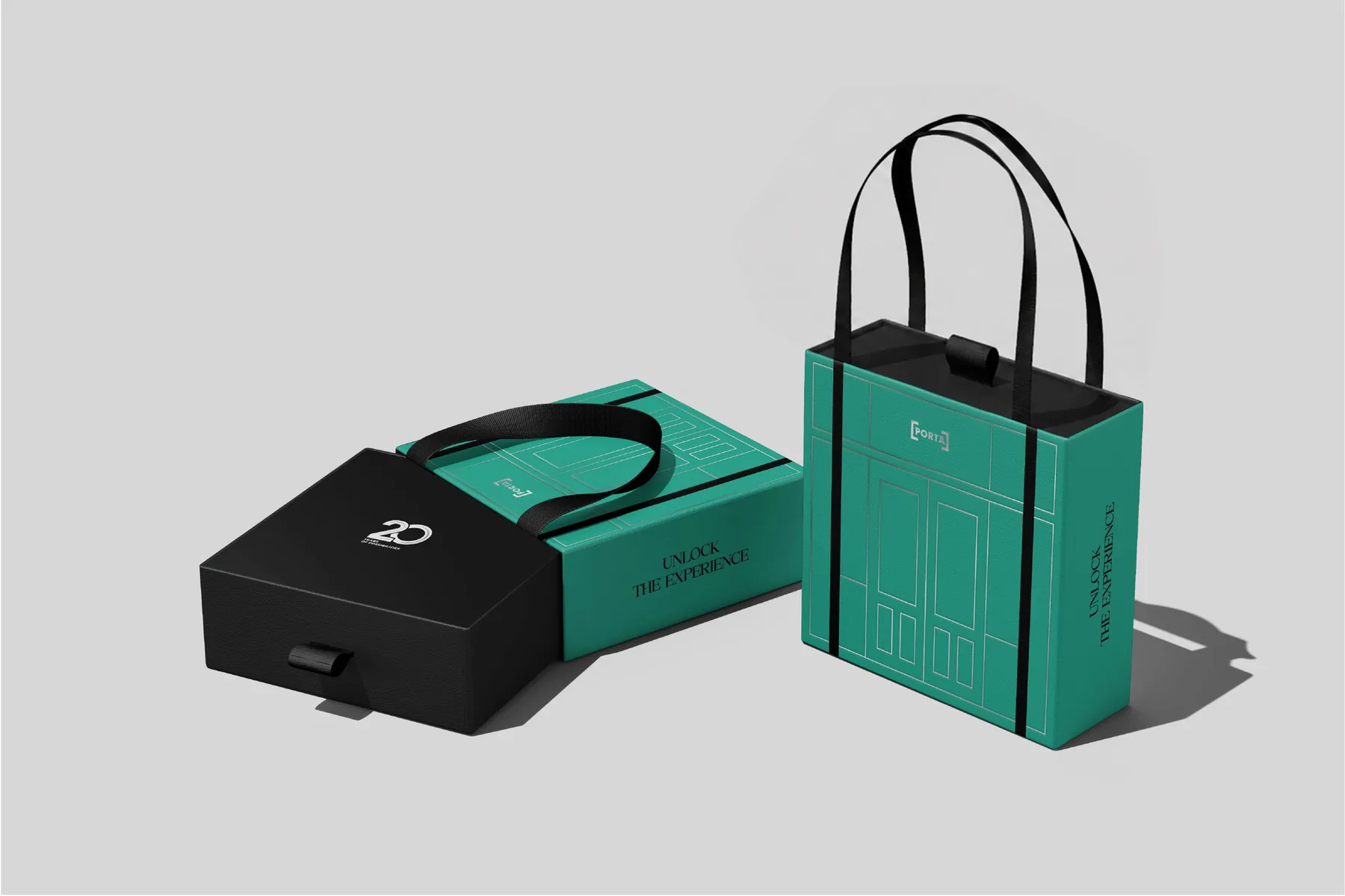
07Bags and gift box
-
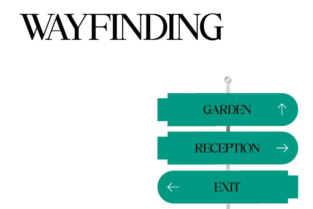
08Wayfinding
Boards from the concept presentation.
-
IIIThree days
The guest's path
We designed, in order, everything a guest would see along the way: from the first email to the evening at the gala.
-
01Before the event
An invitation in five languages
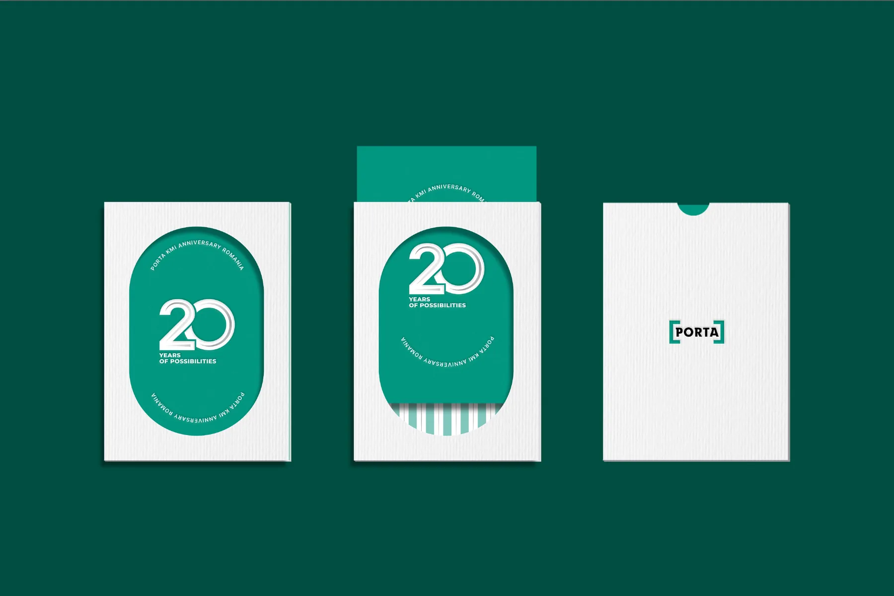
A mailer with a keyhole and an animated invitation in English, Romanian, Bulgarian, Serbian and Hungarian.
- Mailer
- Animation in 5 languages
-
02Day 1 · arrival
A hotel in the anniversary colours
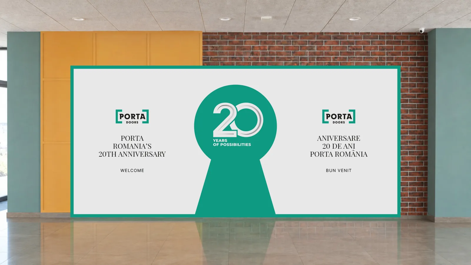
A welcome wall in the lobby, vertical screens with the programme, car park signage, lift stickers, door hangers and a welcome letter.
- 5 × 2.3 m welcome wall
- 1080 × 1920 px screens
- Door hangers
- Welcome letter
-
03Day 2 · morning
Registration at the factory
The day begins at the Porta factory. Guests are welcomed with badges on lanyards, an agenda, pins and a flag at the entrance.
- Badges and lanyards
- A5 agenda
- Ø 55 mm pins
- Flag
-
04Day 2 · conference
The “The Art of Opening” conference
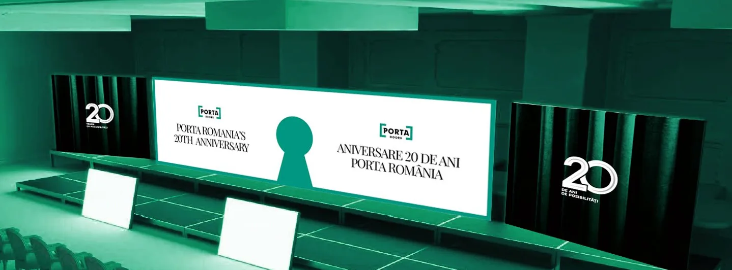
A presentation template for speakers, a show on three LED walls and screens for the awards ceremony.
- 9 × 2.5 m wall
- Two 3 × 2.5 m walls
- PPTX template
-
05Day 2 · evening
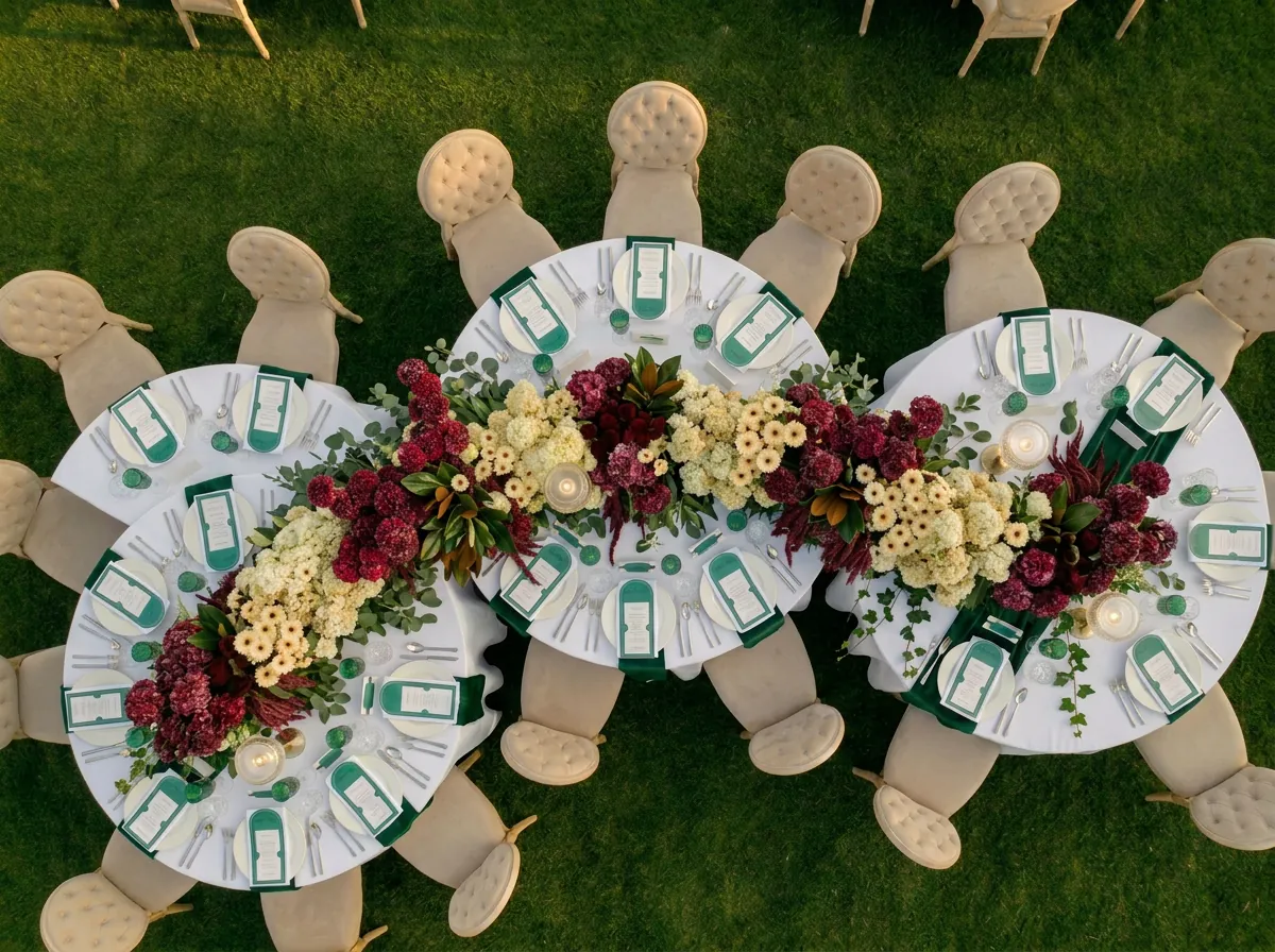
The gala at The Old Casino Arad
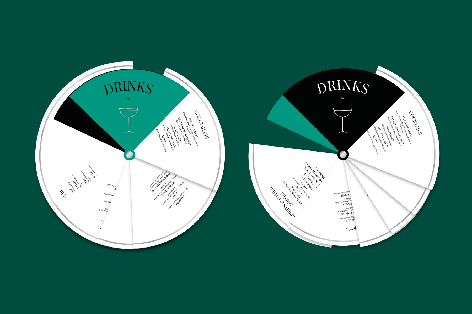
A screen loop, a gobo projection, an arch-shaped menu, a fan-style drinks menu and coasters.
- Drinks fan in EN and RO
- Menu
- Coasters
- Gobo
-
06All three days
Set design
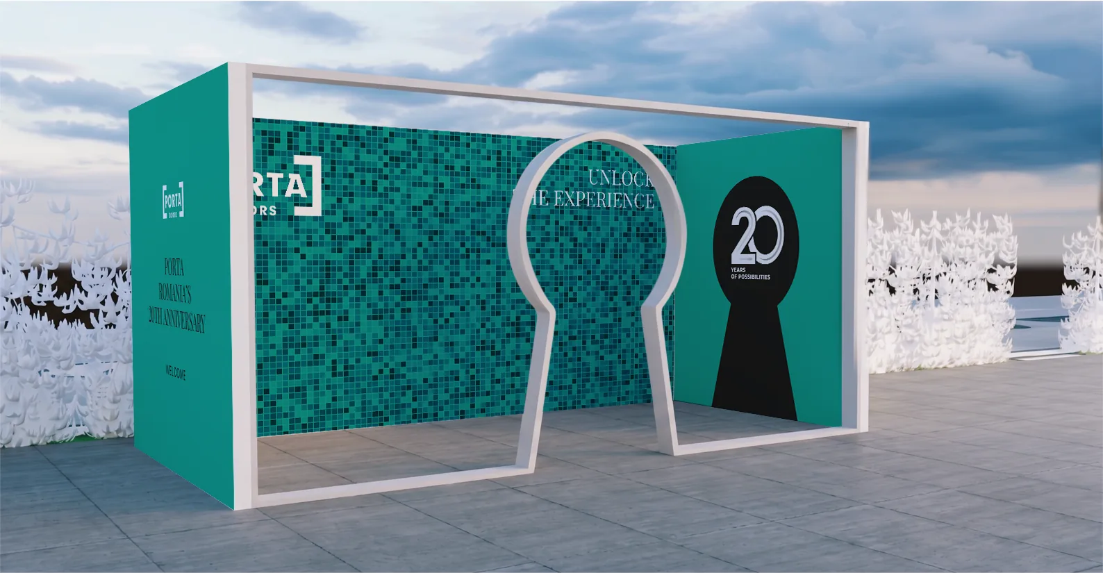
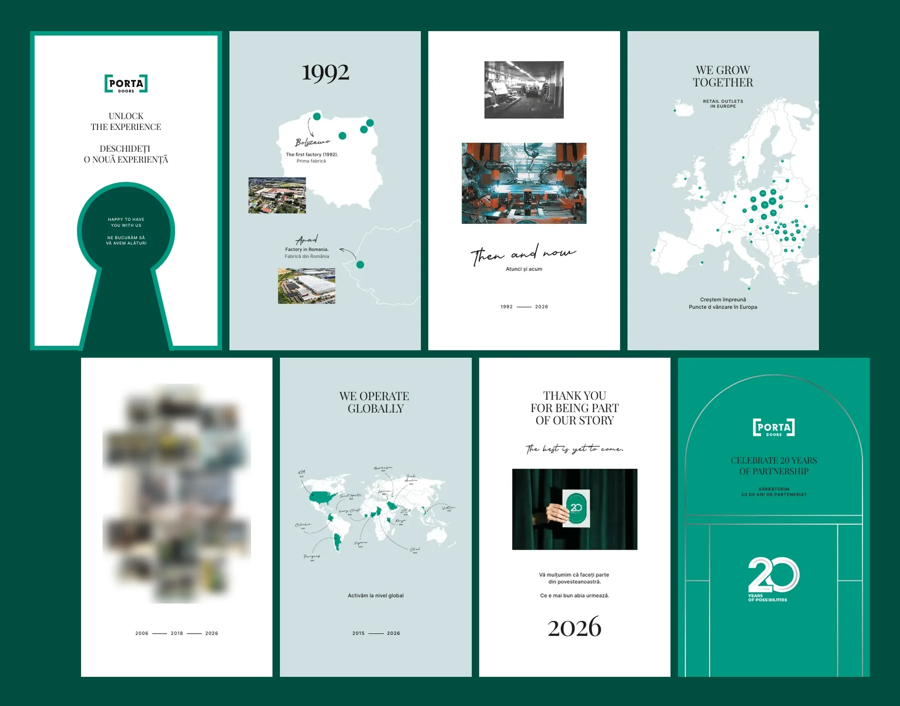
A reception desk with a backdrop, a glam box with a keyhole-shaped frame, a memory wall with the brand's history, gates, roll-ups and signposts.
- Memory wall: 8 panels of 1.5 × 2.5 m
- Glam box
- Gates and roll-ups
-
07To keep
The anniversary book
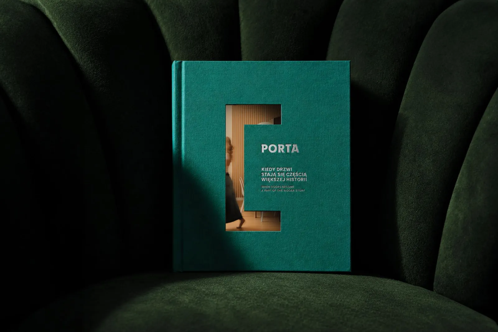
A book on Porta's history: factories, projects and maps, with a band and endpapers in the brand colour.
- 240 × 280 mm
- Hot-stamped band
- Tracing paper pages
IVOn screen
Three LED walls, one stage
For the conference stage we prepared a show for three independent LED walls: a central one of 9 × 2.5 m and two side walls of 3 × 2.5 m. Each scene was made at the resolution of its wall, and the files went to the technical crew in formats for their media servers.
- Centre 2304 × 640 px
- Sides 768 × 640 px
- 30 frames per second
Show sequences
Guests arrive. A keyhole and the 20 mark wait for the guests, with a greeting in English and Romanian.
Countdown. A countdown to the opening animation, framed by the Porta logo on both sides.
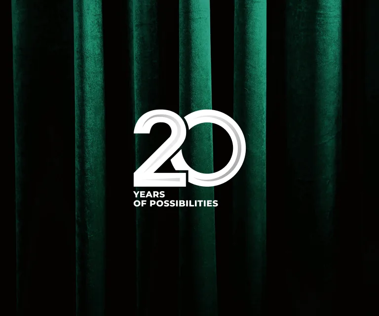
Curtain. A green velvet curtain with the Porta logo. In the opening animation it parts to reveal the tagline “Unlock the experience”.
Talks. The title of each talk in English, with the Romanian translation below.
Thank you. At the end, “thank you” in six languages.
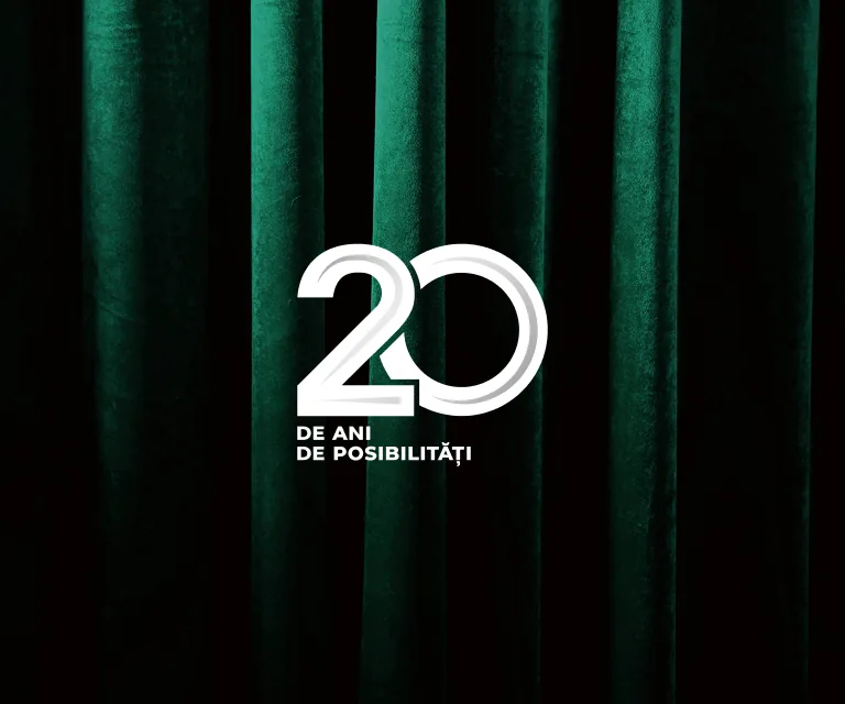
During the talks the side screens show fixed graphics: “20 Years of Possibilities” on the left and “20 de ani de posibilități” on the right.
The left screen speaks English, the right one Romanian. The same rule applies in the hotel, at the gala and on the drinks menu.
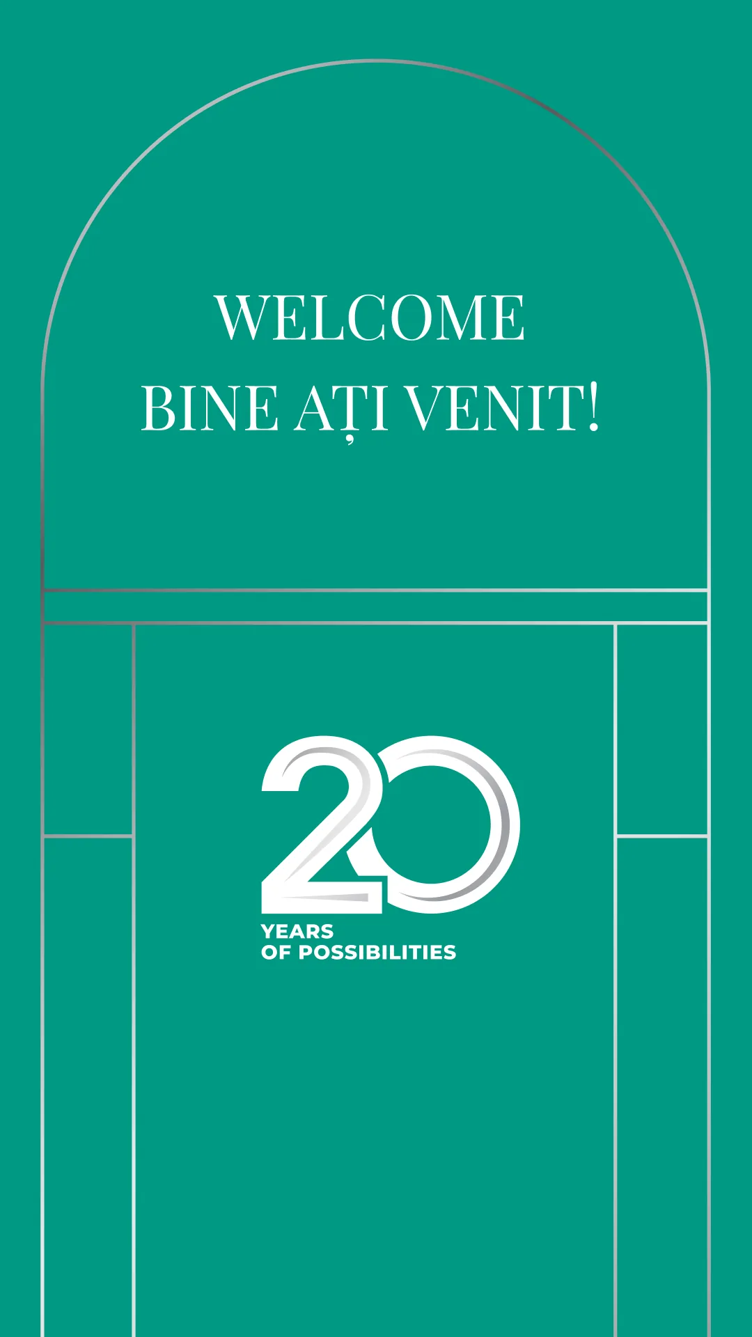
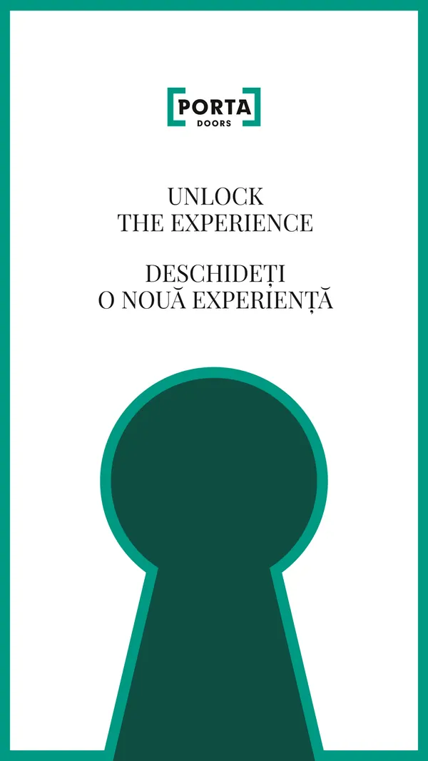
Vertical screens in the hotel
A welcome, the tagline and the programme on 1080 × 1920 px screens, in English and Romanian.
The gala screen
A loop with a line drawing of the casino and an invitation to celebrate in two languages. We prepared it in two formats, because the screen resolution changed on the day of the gala. For the awards ceremony we also made screens for each category and certificates for the winners.
- 1920 × 1080 px
- 1664 × 1152 px
VThe book
A book that stays
The book “When doors become part of a bigger story”, about Porta's factories, people and markets, in Polish and English. We designed it from the mockup to the print files.
-
01 · Band
A hot-stamped band
A 576 × 110 mm strip wraps the book like a ribbon on a present. On it, the tagline “Unlock the experience”.
-
02 · Cover
A bracket from the Porta mark
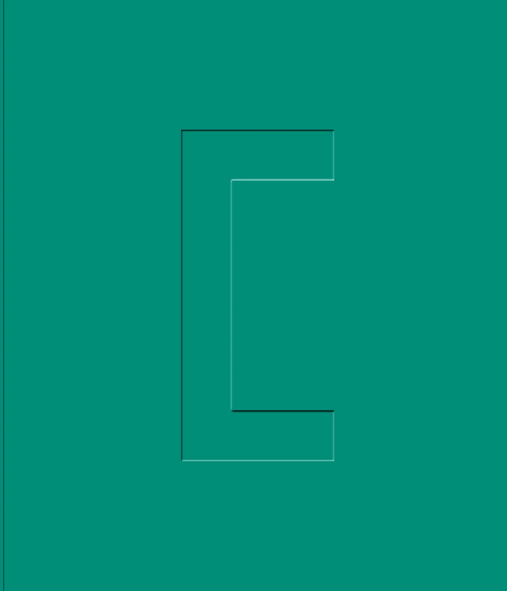
A 240 × 280 mm format. On the green cover, the bracket from the Porta mark, like a door frame.
-
03 · Endpapers
Solid green
Opening the cover, the guest steps into the brand colour before seeing the first photo.
-
04 · Tracing paper
Pages you can see through
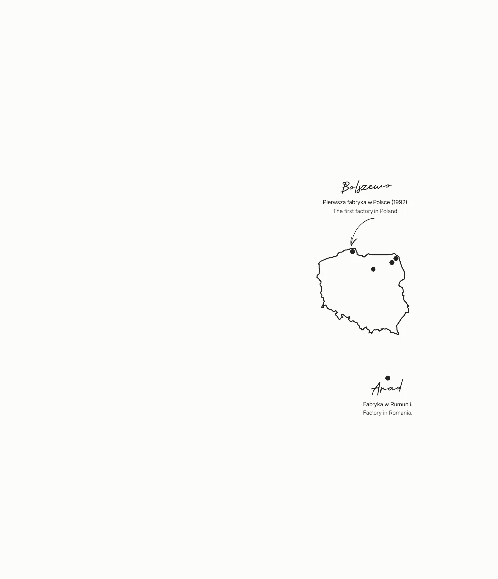
Translucent paper with a map and handwritten notes. The page beneath shows through, as if through a door left ajar.
-
05 · Photography
Factories and projects
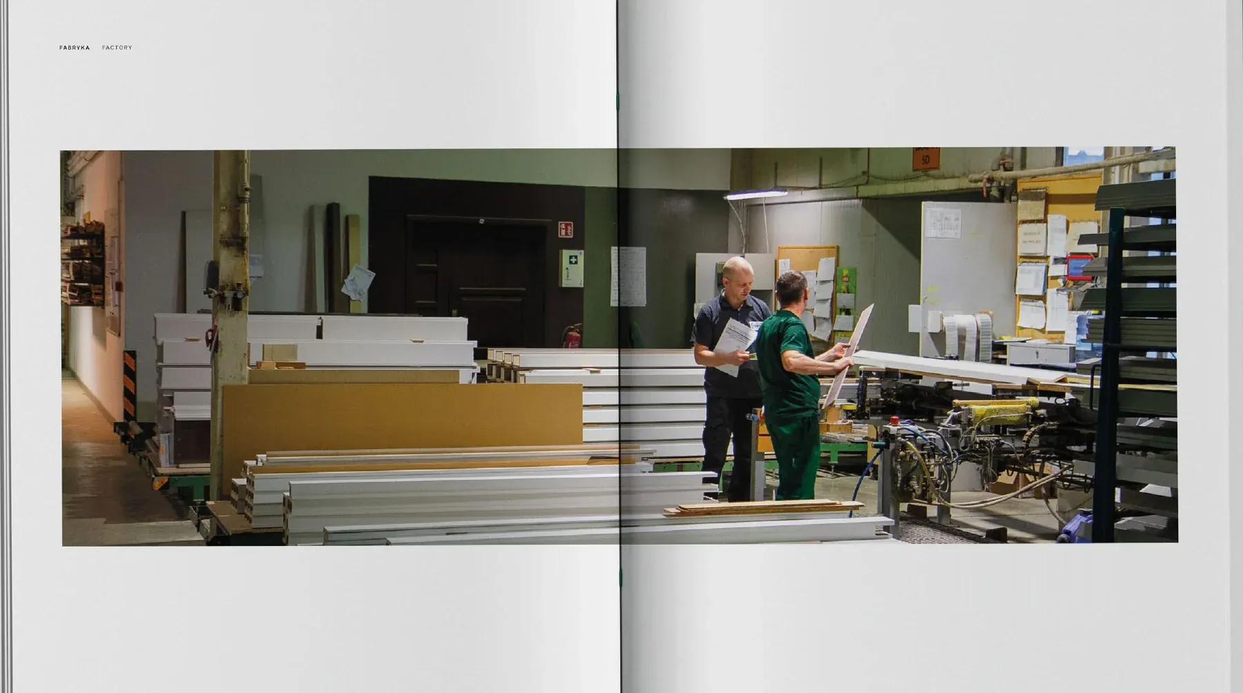
Bolszewo, Ełk, Suwałki and Nidzica in Poland, and Arad in Romania: spreads on production, details and finished projects.
-
06 · Values
Letters from the brand name
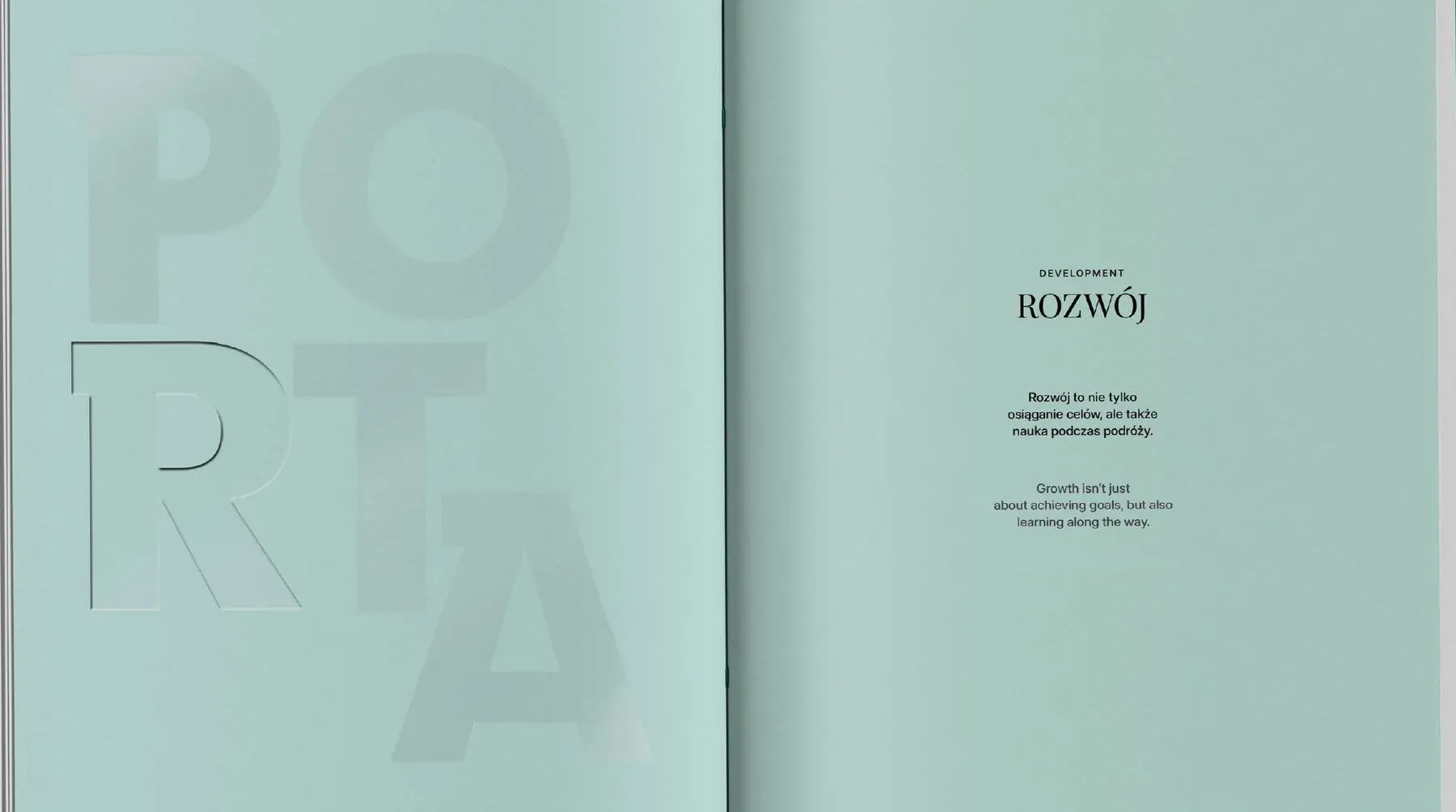
The chapters on values open with the embossed letters P, O, R, T, A. Then come maps of the markets, from Paraguay and Vietnam to Kenya and Côte d'Ivoire.
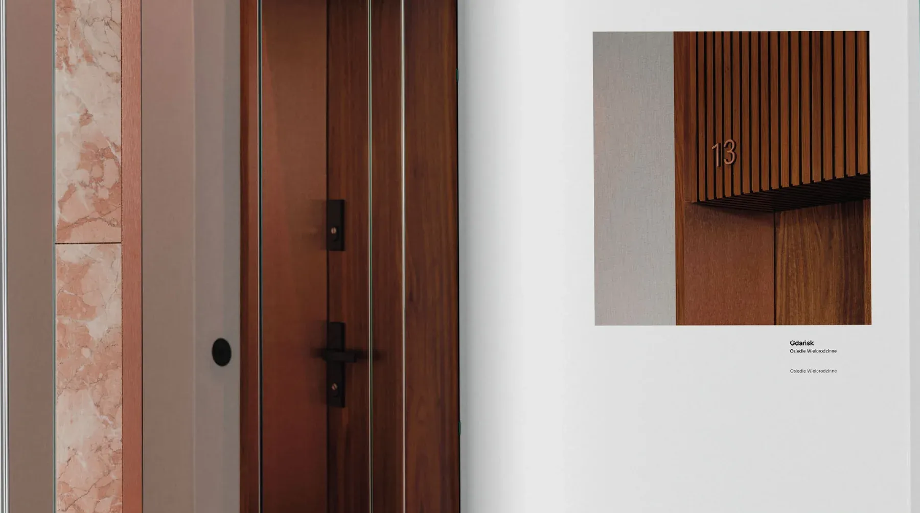
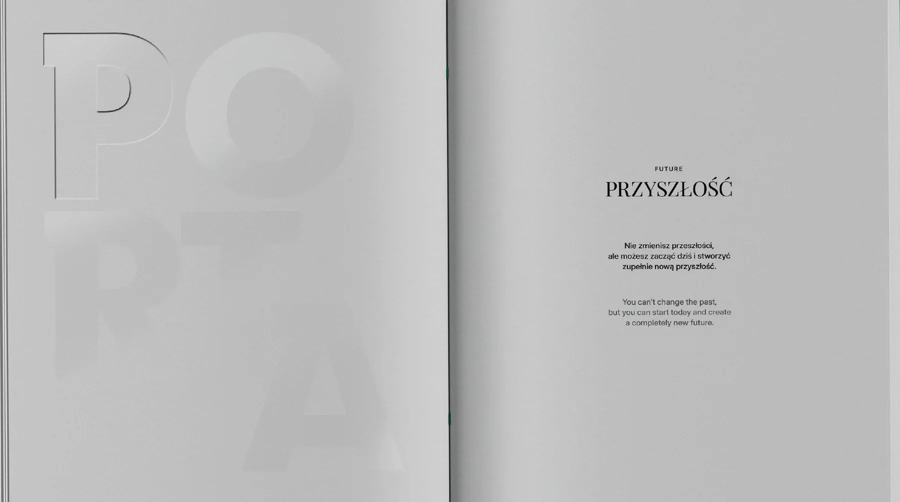
Spreads from the book mockup.
From invitation to book.
One motif, two languages on every item and over 30 materials, ready for printers and technical crews.
- 3
- days of events in Arad
- 3
- LED walls on the conference stage
- 5
- language versions of the invitation
- 30+
- materials in one motif