







Septima Design, Kraków
Identity, website and catalogue for an interior design studio
We refreshed the logo of a Kraków-based interior design studio and designed its identity, website and a catalogue of 26 product sheets.
See the projectThe client
Hotels, restaurants and furniture of its own design
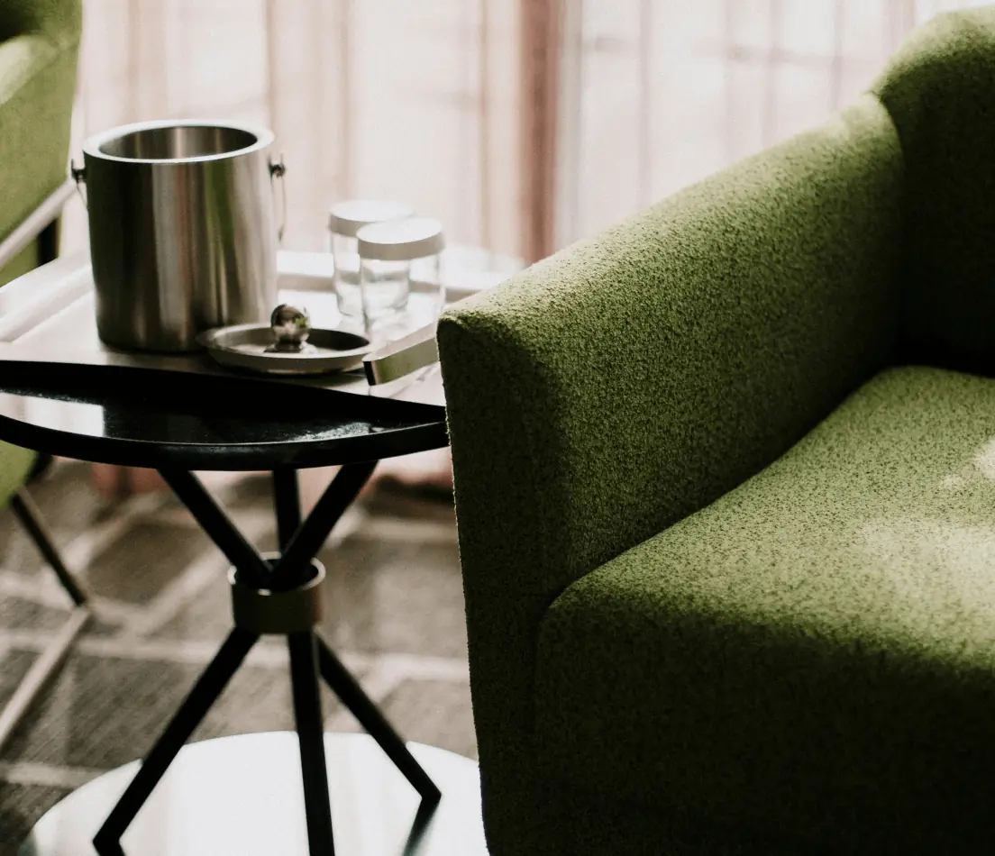
Septima designs commercial and private interiors, finishes and furnishes them on a turnkey basis, and also makes and sells furniture of its own design. It has over a decade of experience and specialises in hospitality. It sources its own materials: stone and sintered stone from Spain and Italy, upholstery fabrics from four European countries, carpets and wallpapers from France. It has a showroom in Kraków.
The studio's clients are hotel investors, private investors and architects in the premium segment. The brand wanted to look the way its projects do: confident, experienced and refined down to the details.
- Goal
- A refresh of the existing logo, plus an identity and website that show Septima's quality, experience, carefully selected materials and design.
- Solution
- Black and shades of beige that together speak of a high standard of service and products. Simple, minimalist layouts with well-balanced light and a serif typeface. In print, silver hot stamping and black through-dyed paper.
- Result
- A consistent premium brand identity, online and on paper. The website makes it easy to move through services and products.
- 4industry brands analysed before the design work
- 26product sheets in one layout
- 6divider sheets opening the catalogue categories
- 30+of the studio's projects in the company presentation
Workshops and analysis
The whole industry looked alike
We started with workshops with the Septima team and an analysis of four brands from the same industry. The conclusions were clear: sans serif typefaces, greys, black, white and beiges with a single accent.
The identity had to reflect the brand core, above all quality, design and innovation. We didn't swap the colours for loud ones, because Septima's furniture and materials often have bold colours and shapes, and the brand should serve as their backdrop. The difference came from the typeface and the finish: the serif Playfair Display paired with the sans serif Standerd, plenty of light in the layouts and silver hot stamping.
The brand core agreed in the workshopsQualityInnovationDesignFlexibilityDependability
Concept design
Commercial and private interior design
We design, finish and furnish interiors on a turnkey basis.
See our projects- Typefaces
- Industry: sans serif, all much alike
- Septima: serif in headings, sans serif in body text
- Colours
- Industry: greys and beiges with one accent
- Septima: black and beiges with no accent, the furniture brings the colour
- Detail
- Industry: flat print
- Septima: silver hot stamping, black through-dyed paper
Logo and identity
A refresh instead of a new mark
Septima already had a logo and recognition, so we didn't throw it away. We refreshed the existing mark and prepared its variants, including a horizontal version, and described everything in the logo guidelines.
The palette is black and two beiges. The same beige comes back as the square under the furniture photo on every product sheet.
Key words for the identityQualityDesignFormInnovationPremium
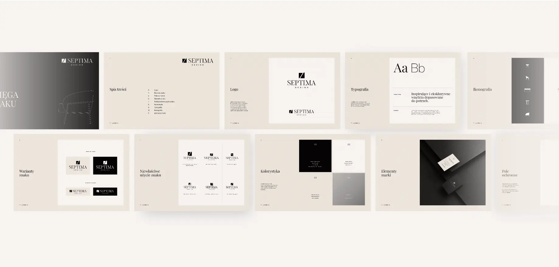
- Colour · #151210 Black CMYK 0 14 24 92 RGB 21 18 16 Background for photos and the silver mark
- Colour · #eae3da Beige CMYK 0 3 7 8 RGB 234 227 218 The square under each product, paper, cards
- Colour · #f7f3f1 Light beige CMYK 0 2 2 3 RGB 247 243 241 Background for the website and documents
- Main typeface Playfair Display headings, product names
- Secondary typeface Standerd body text, technical data
Catalogue
26 pieces of furniture, one layout
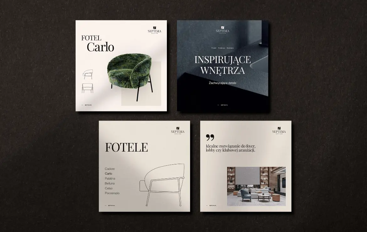
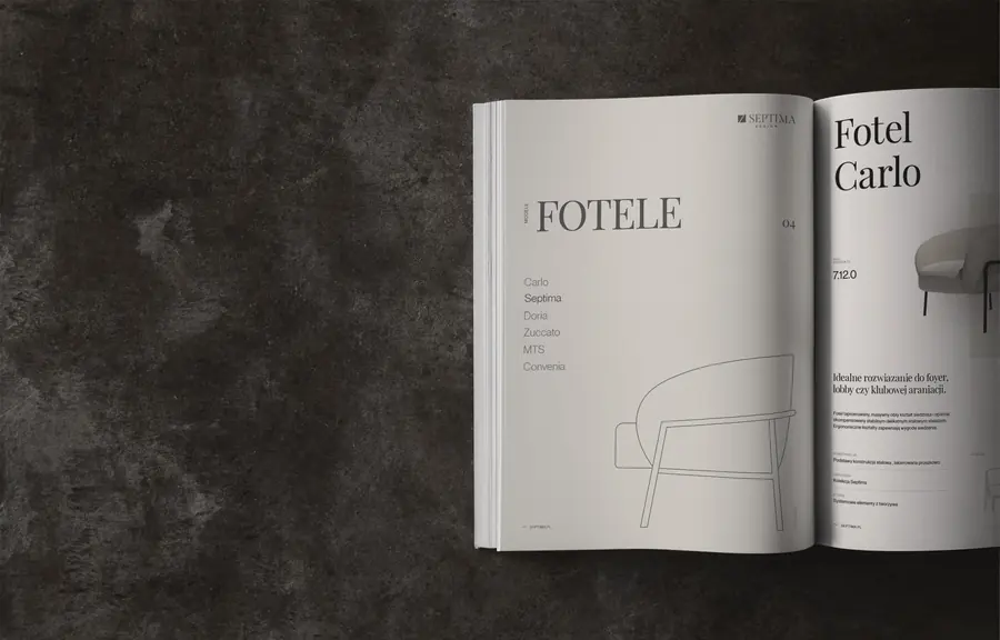
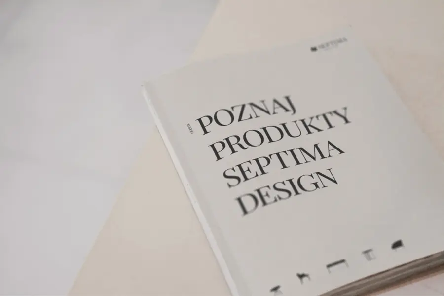
Based on Septima's old catalogue, we designed two sheet templates: a simple one with a single drawing for armchairs, chairs and tables, and an extended two-page one for sofas and corner sofas. The Septima team edits the sheets and adds new items on its own.
We redrew all the technical drawings in one style from the scans in the old catalogue, and cut out the furniture photos from the same perspective. Each category opens with its own divider sheet, and every sheet can be downloaded as a PDF from the product page.
The categories are marked with furniture icons from the identity. Their main job is to inform, which is why they work well in print.
-
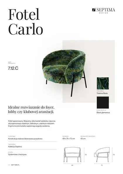 Armchair Carlo
-
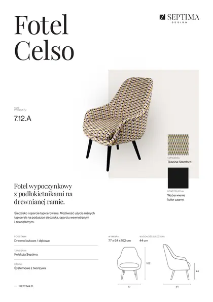 Armchair Celso
-
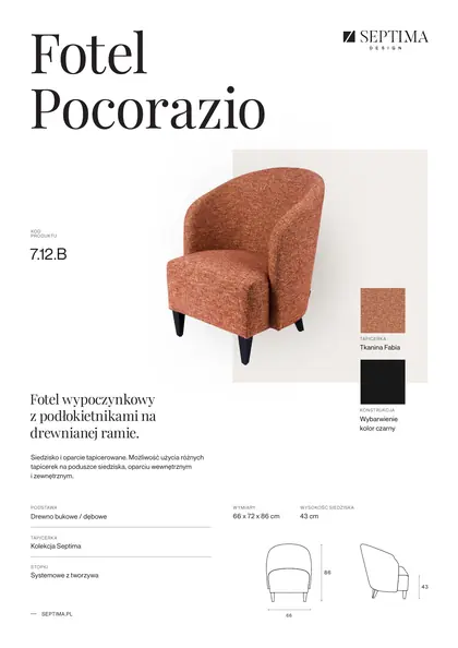 Armchair Pocorazio
-
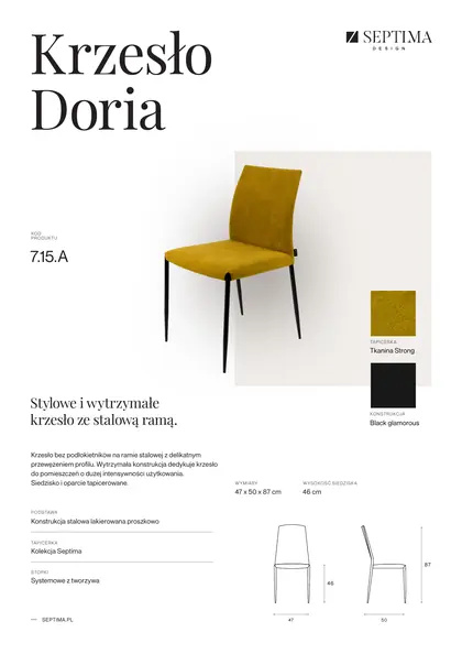 Chair Doria
-
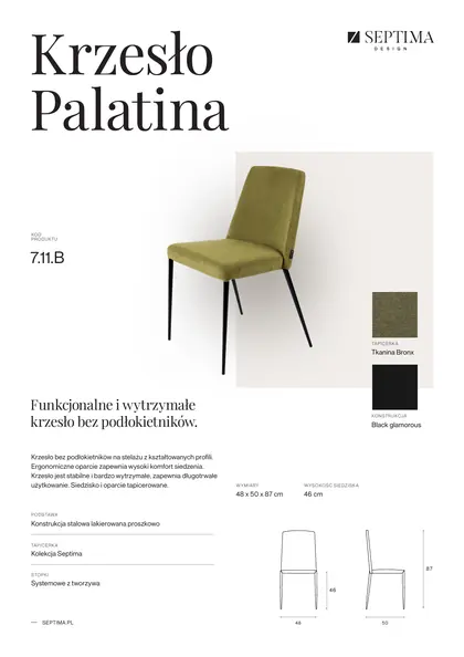 Chair Palatina
-
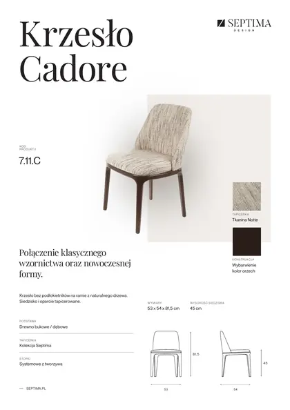 Chair Cadore
-
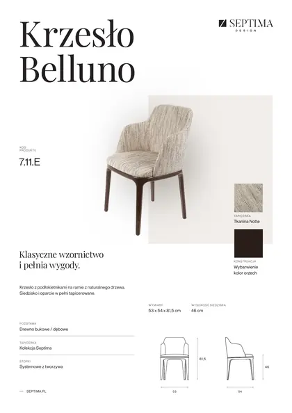 Chair Belluno
-
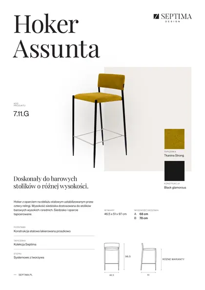 Bar stool Assunta
-
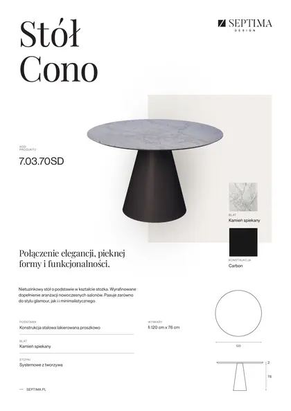 Table Cono
-
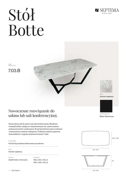 Table Botte
-
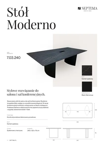 Table Moderno
-
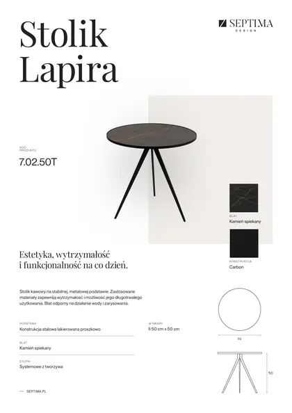 Coffee table Lapira
-
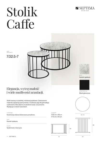 Coffee table Caffe
-
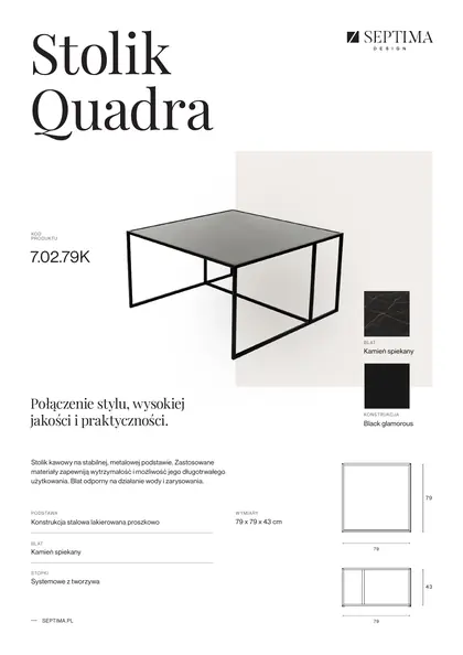 Coffee table Quadra
-
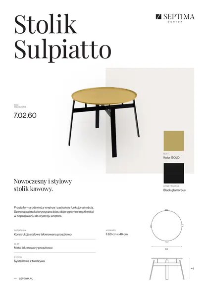 Coffee table Sulpiatto
-
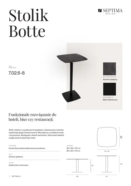 Small table Botte
-
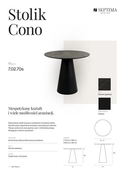 Small table Cono
-
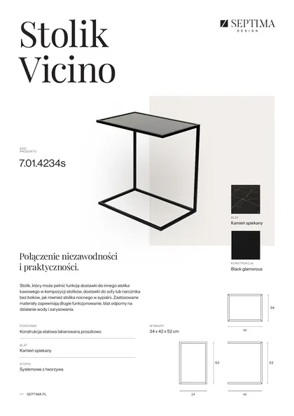 Side table Vicino
-
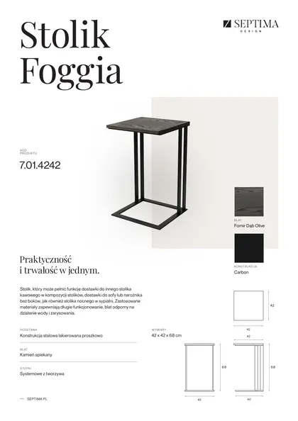 Side table Foggia
-
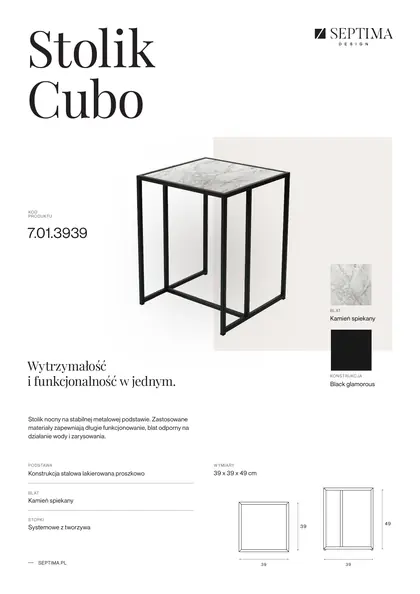 Side table Cubo
-
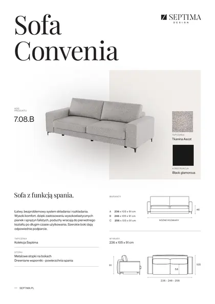 Sofa and corner sofa Convenia
-
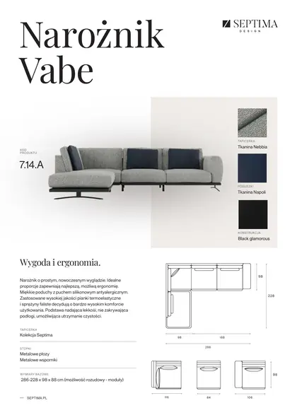 Sofa and corner sofa Vabe
-
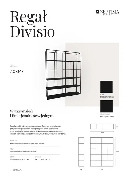 Shelving unit Divisio
-
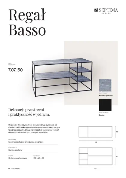 Shelving unit Basso
-
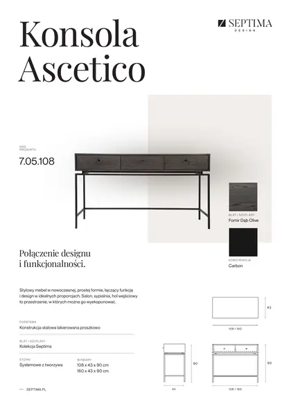 Console Ascetico
-
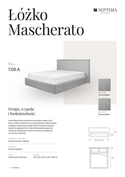 Bed Mascherato
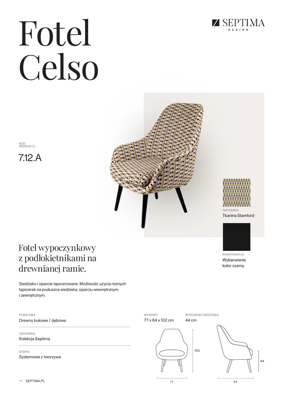
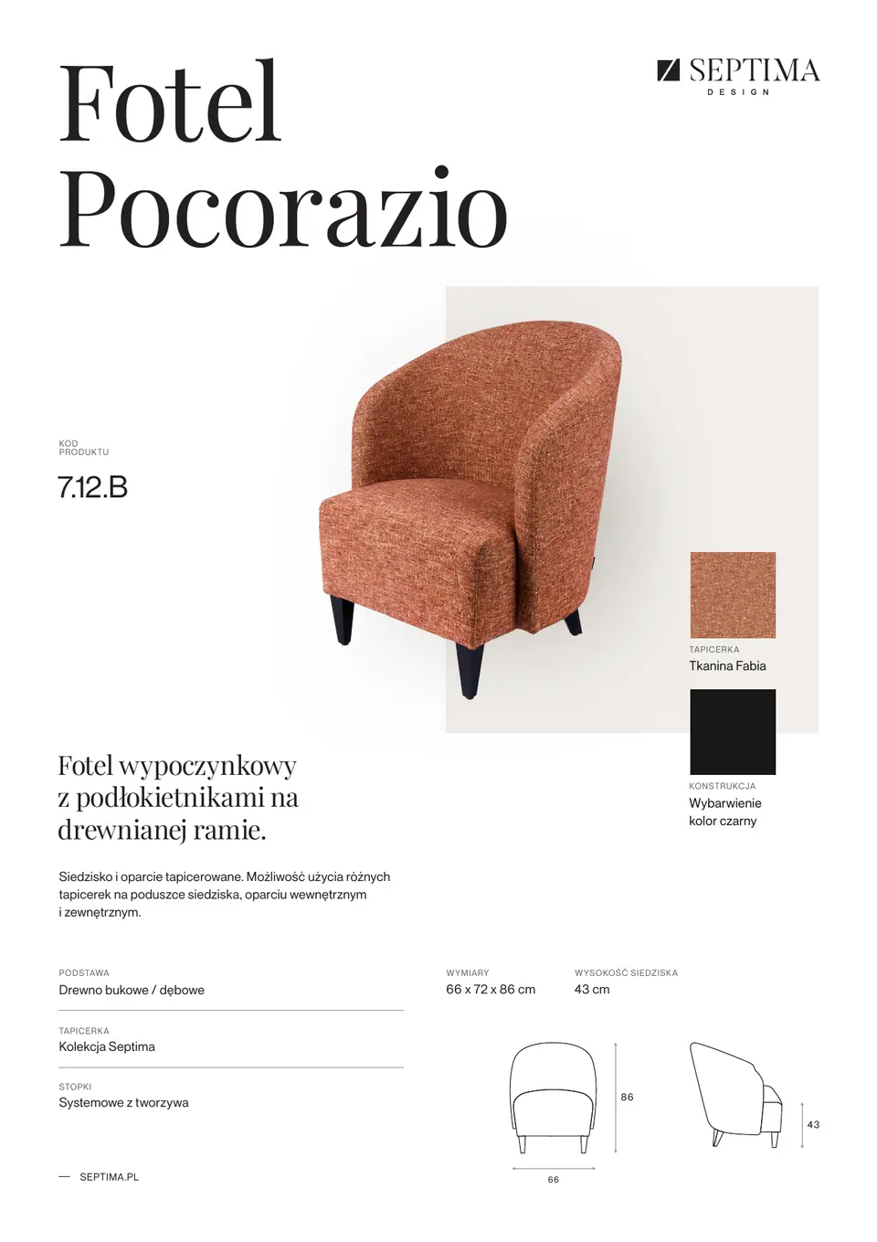
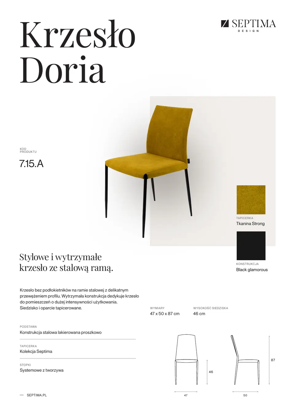
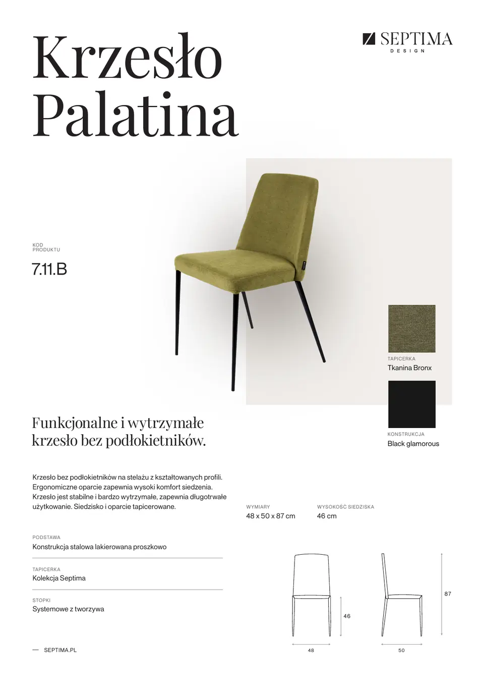
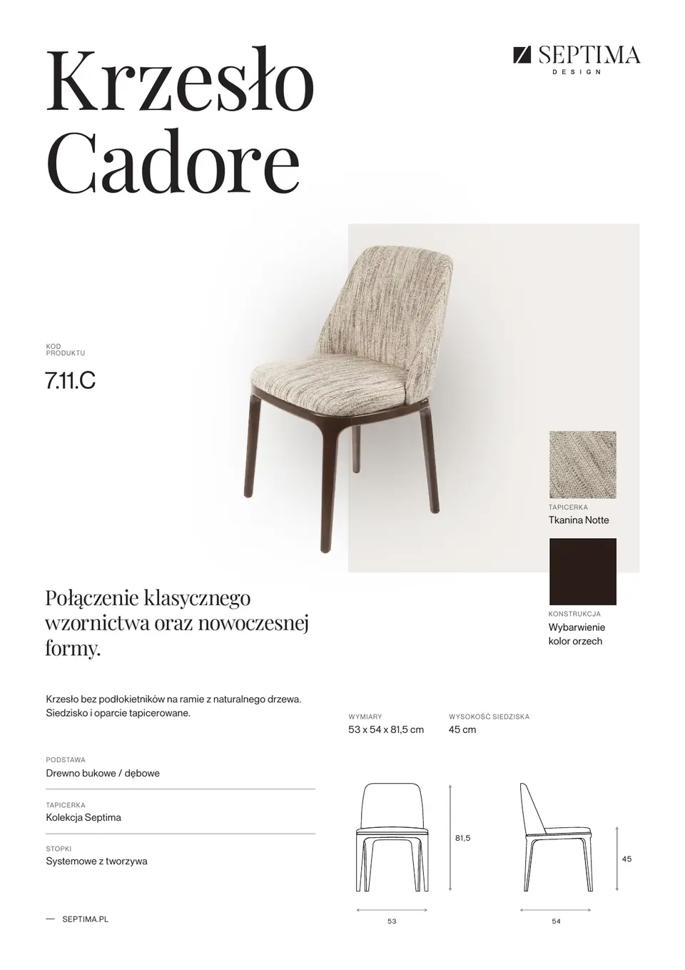
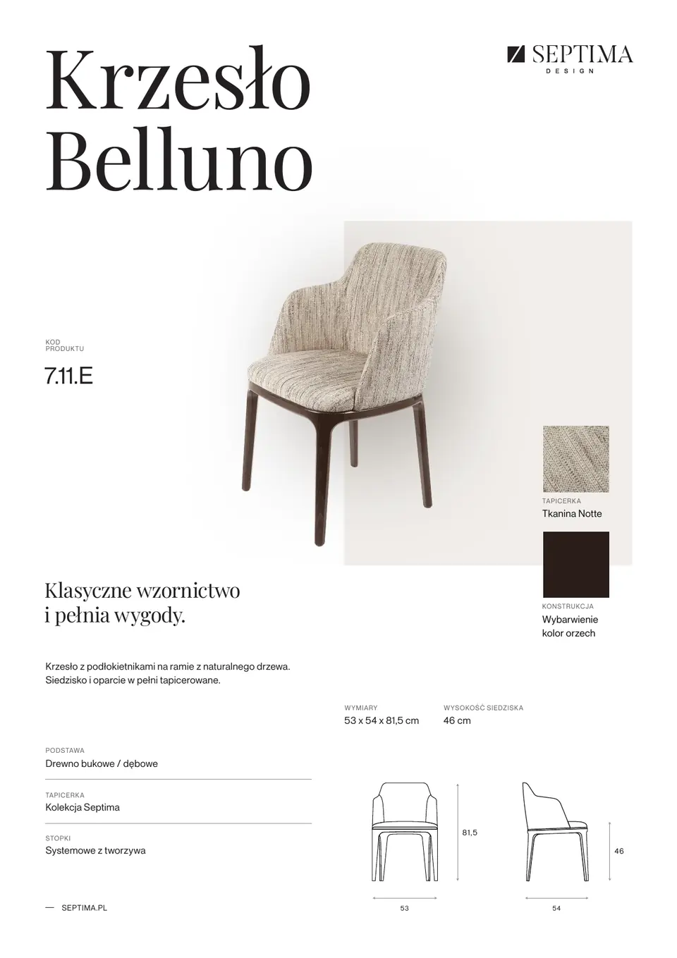
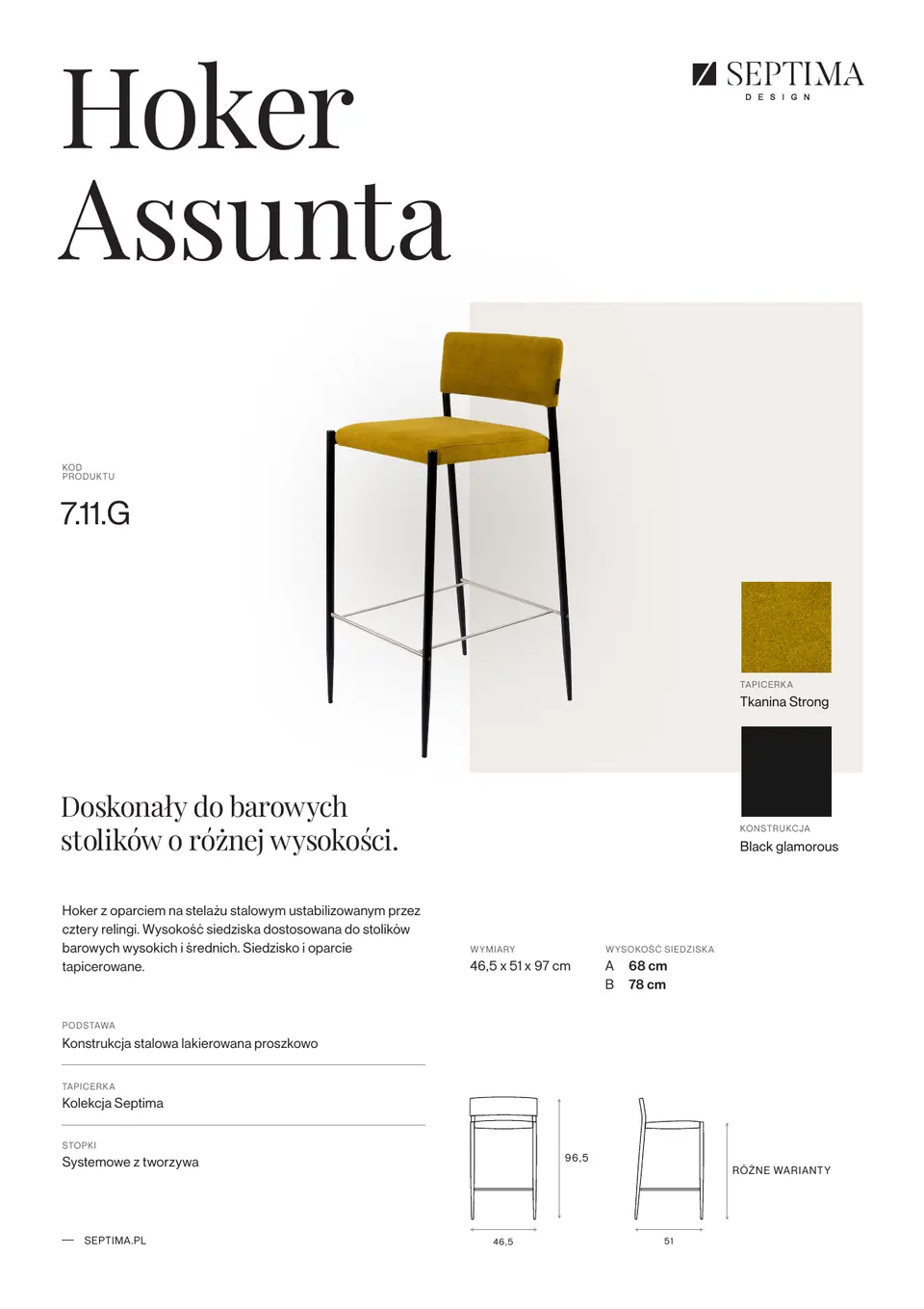
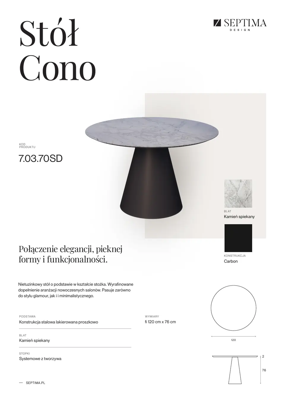
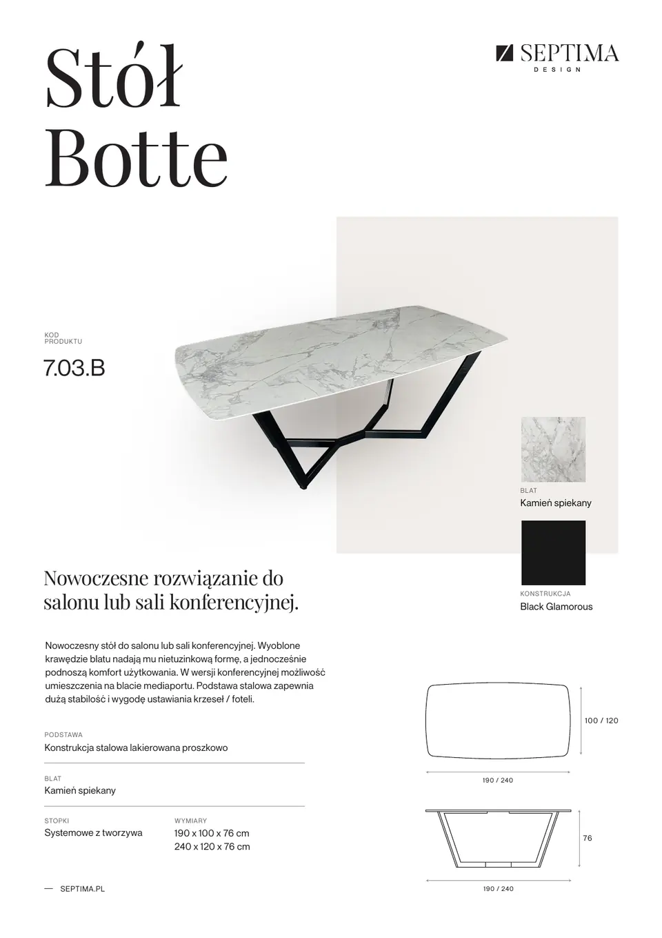
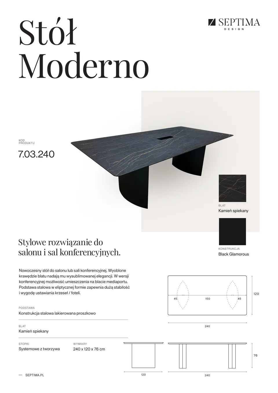
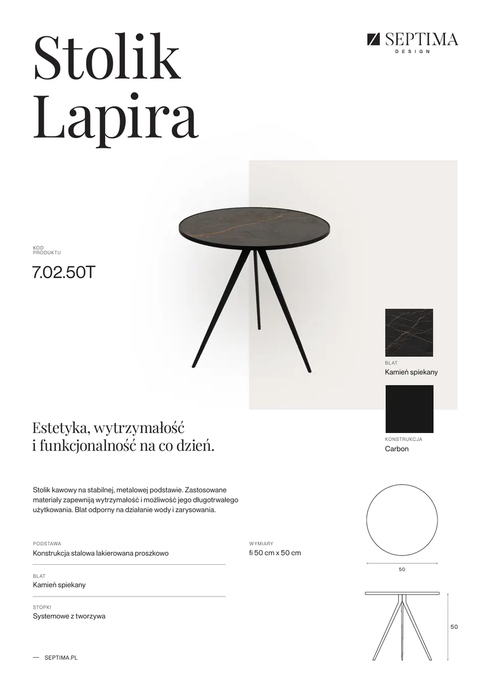
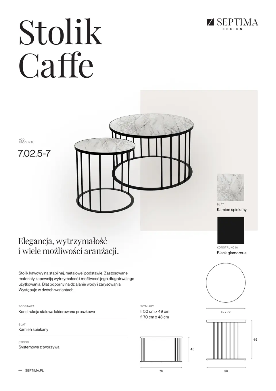
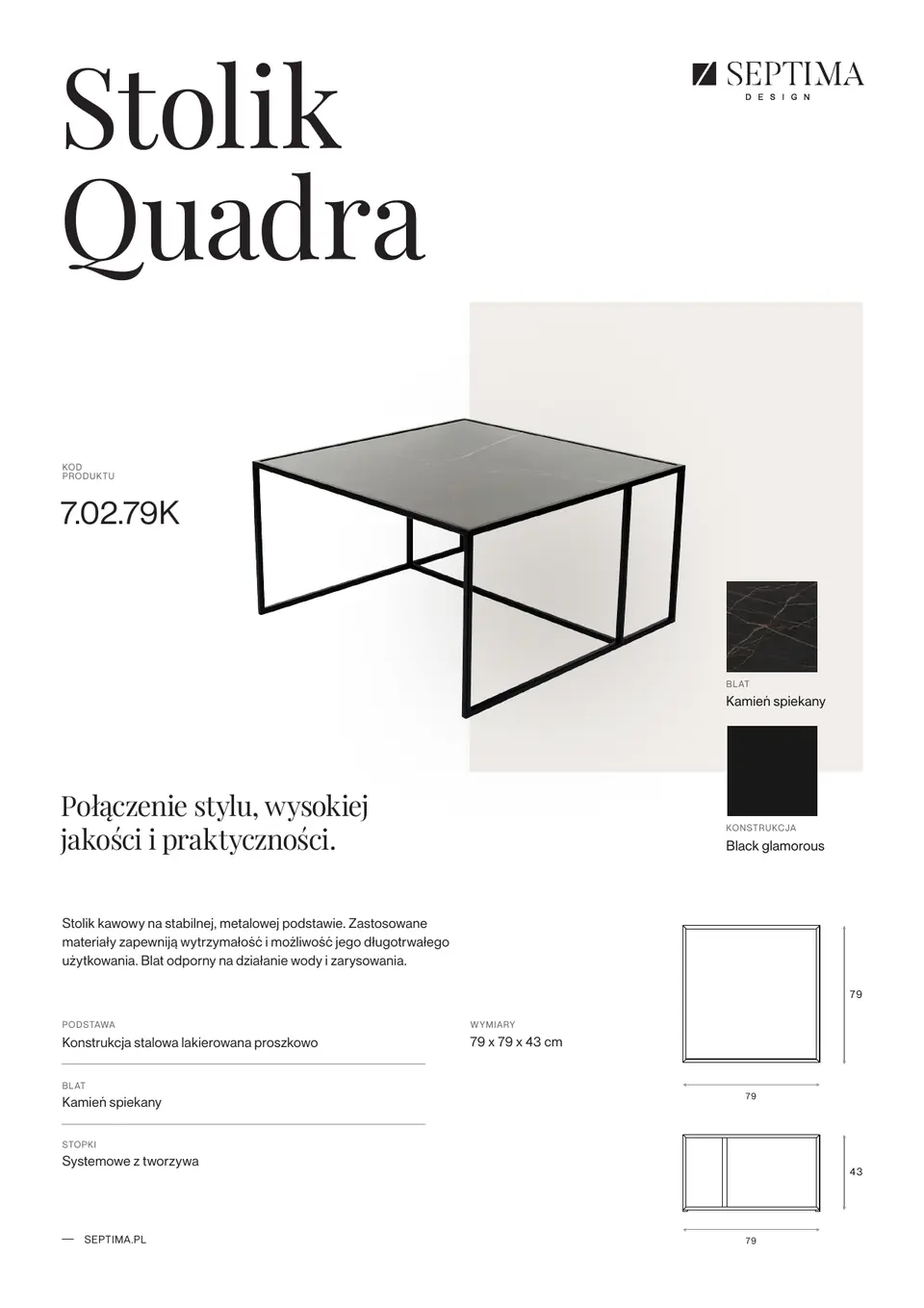
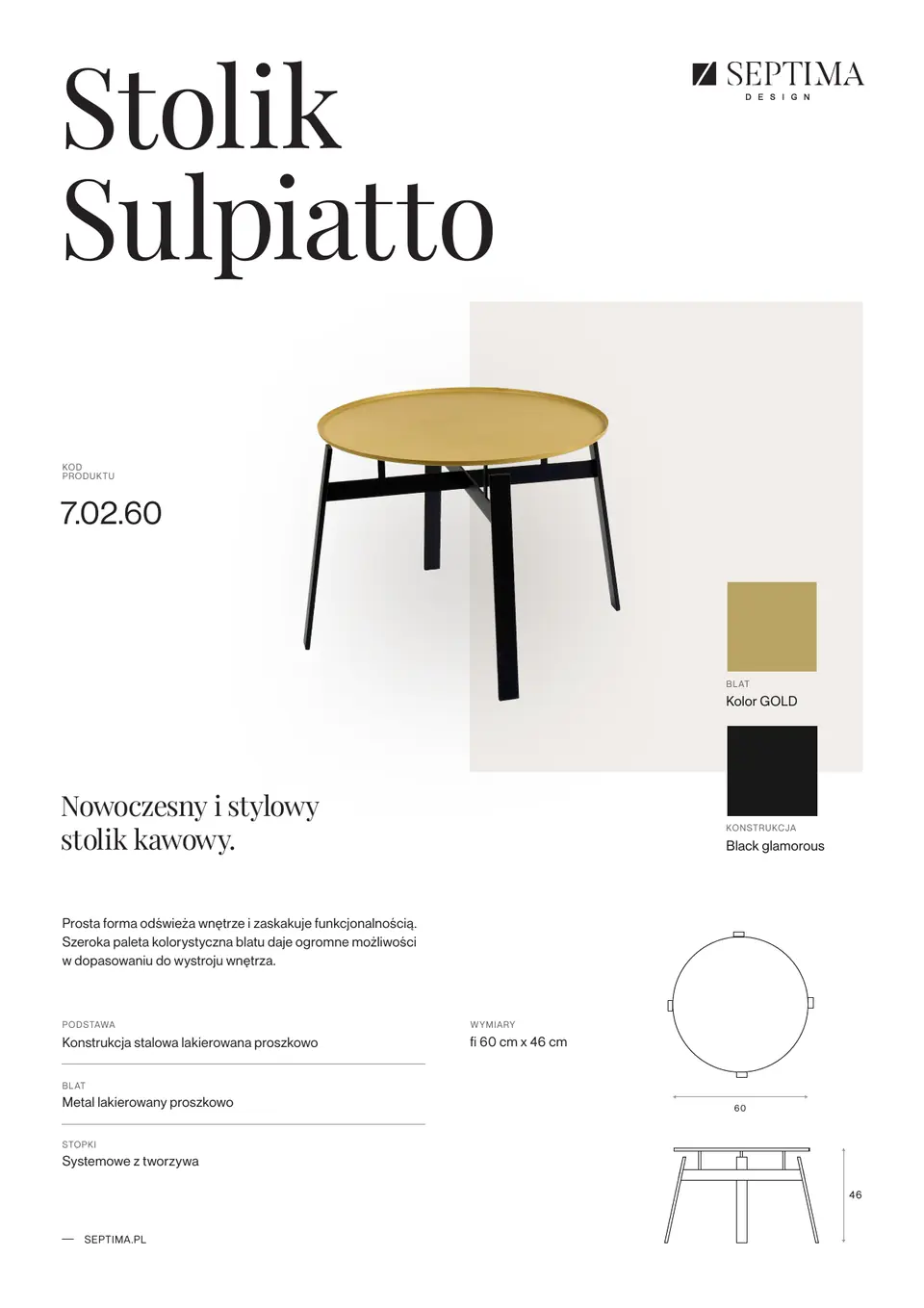
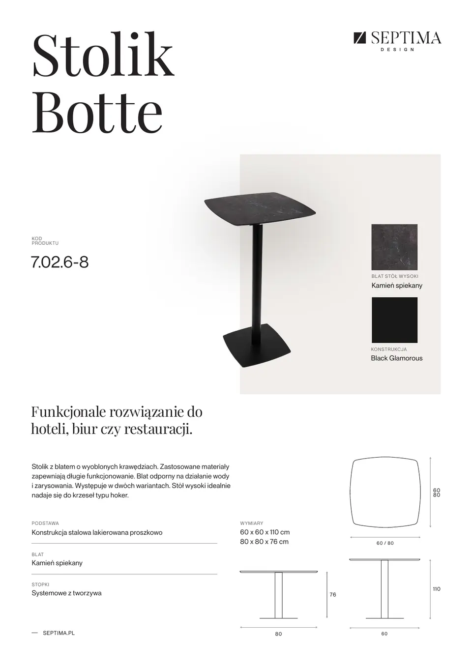
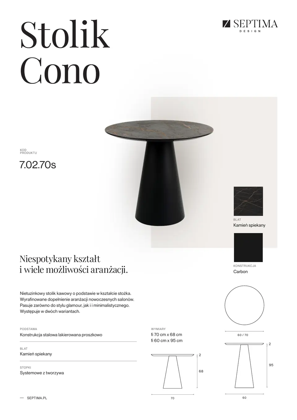
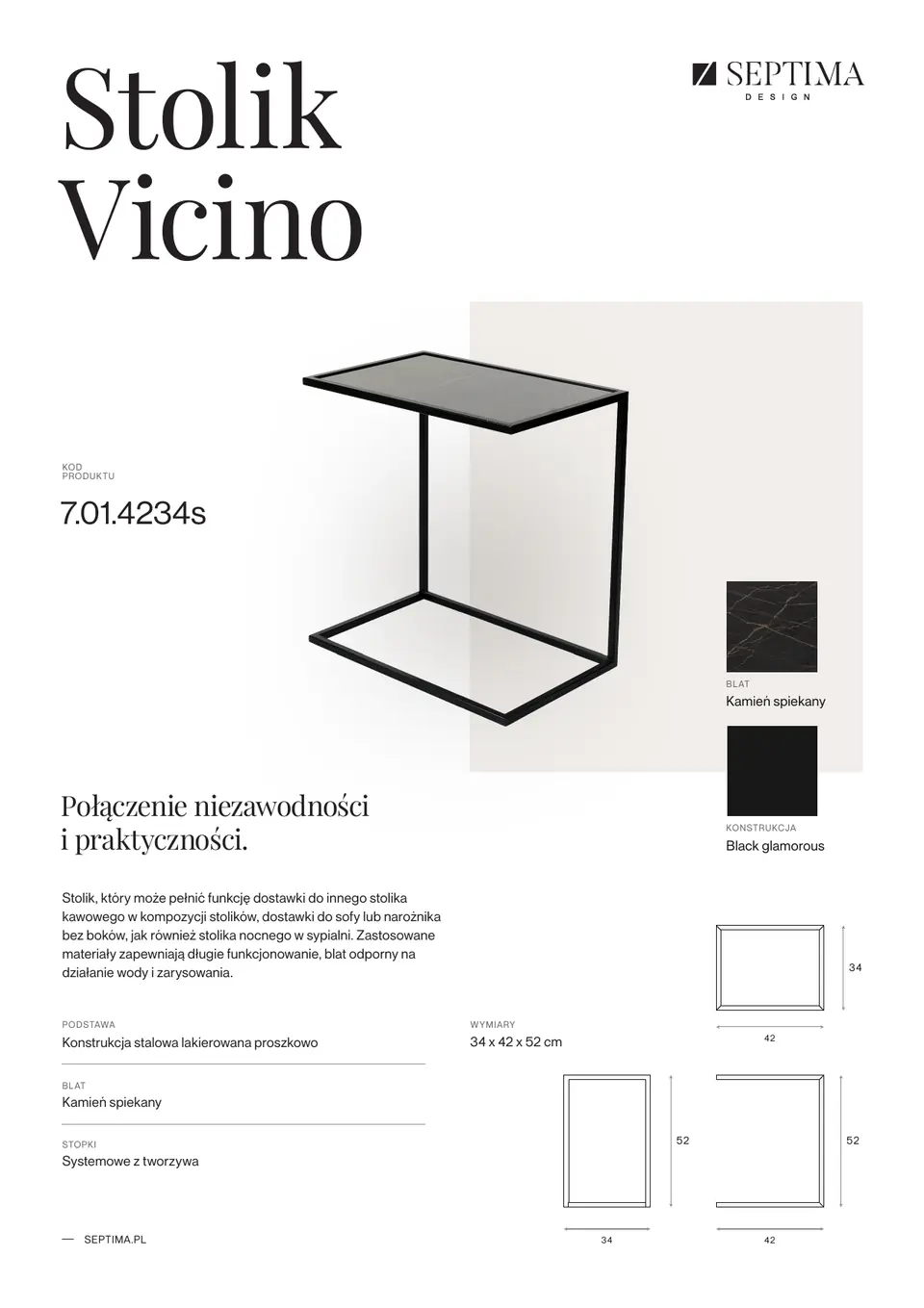
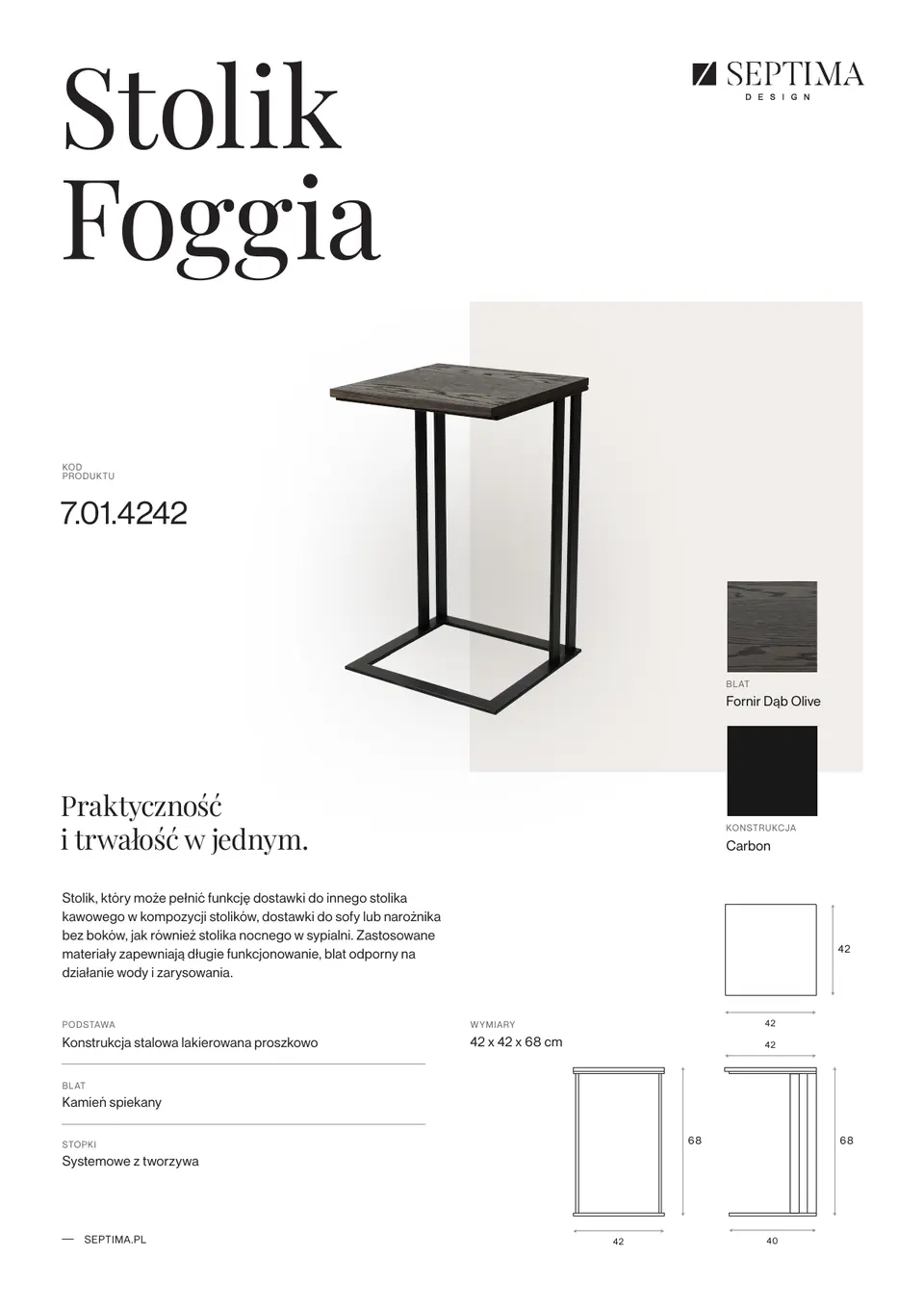
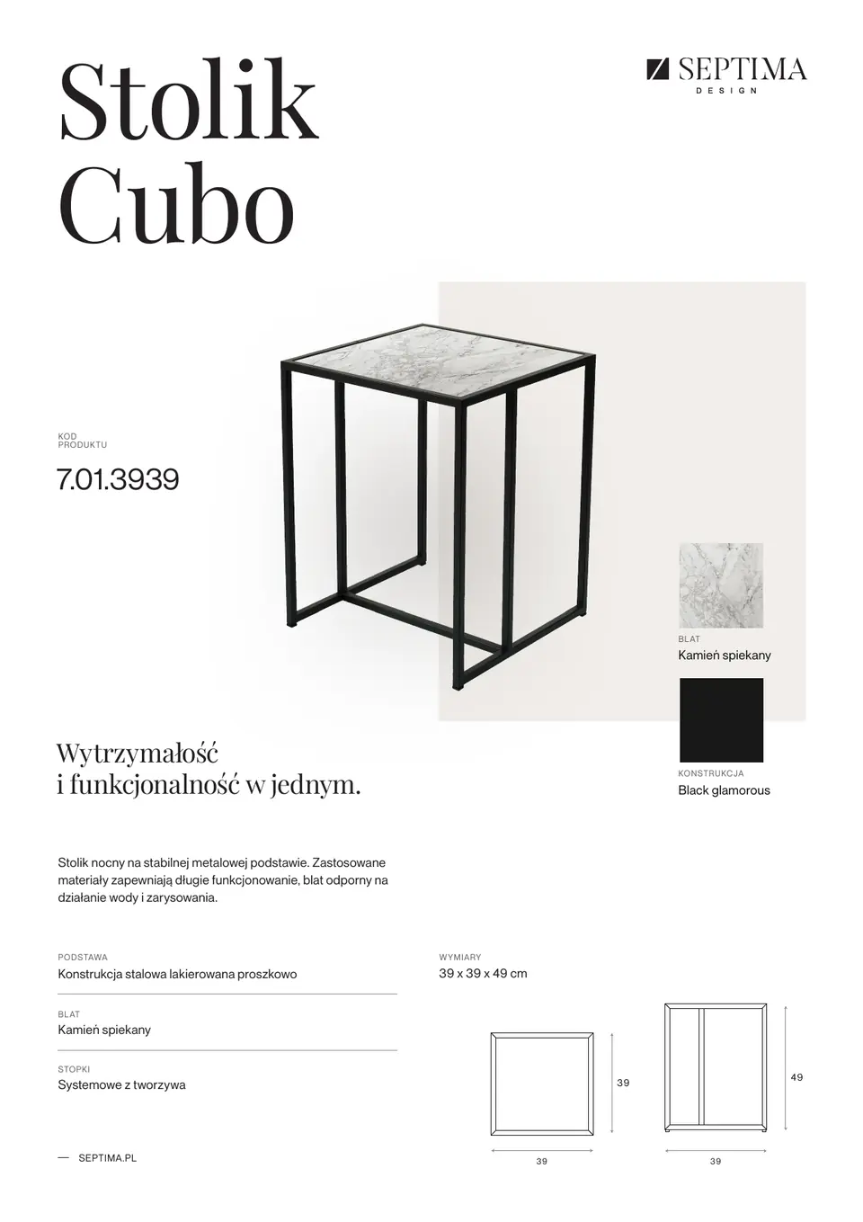
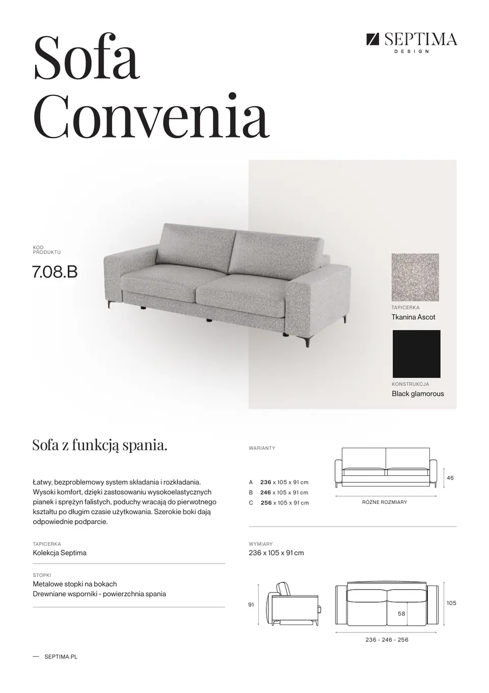
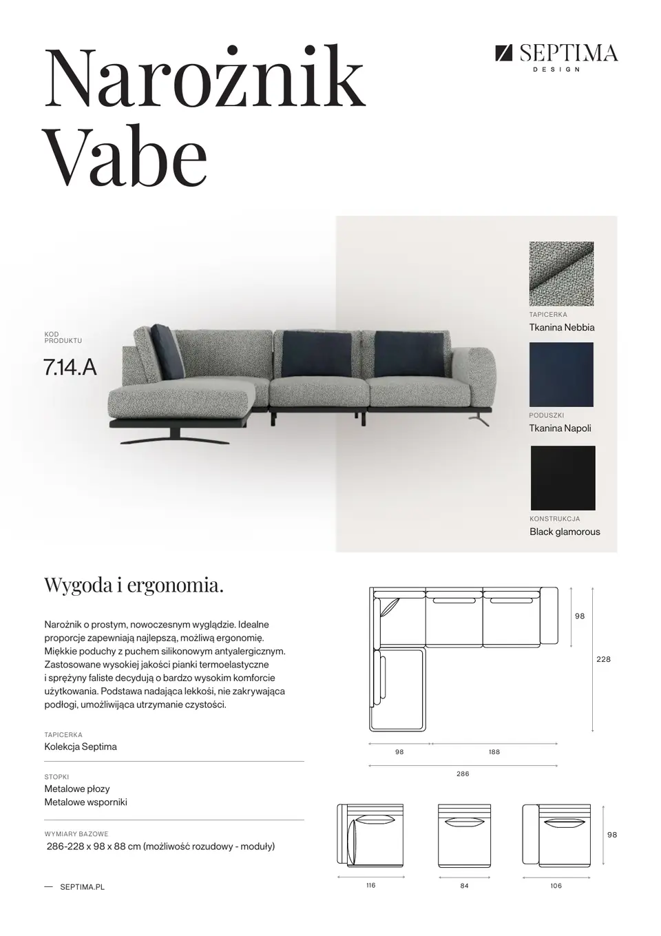
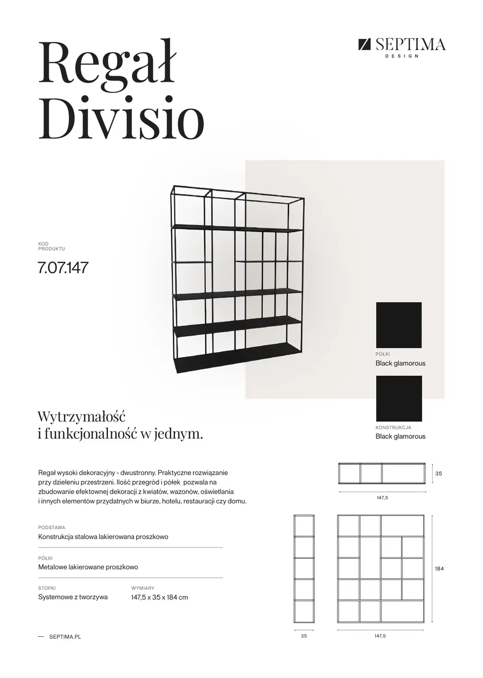
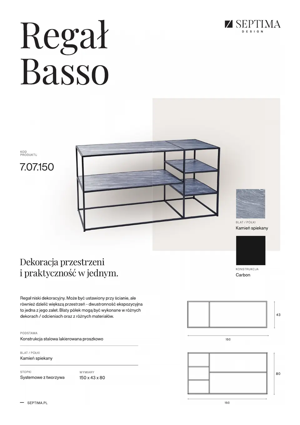
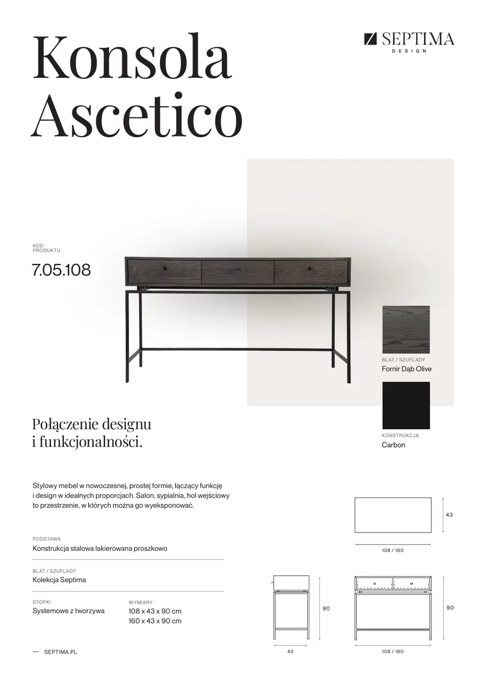
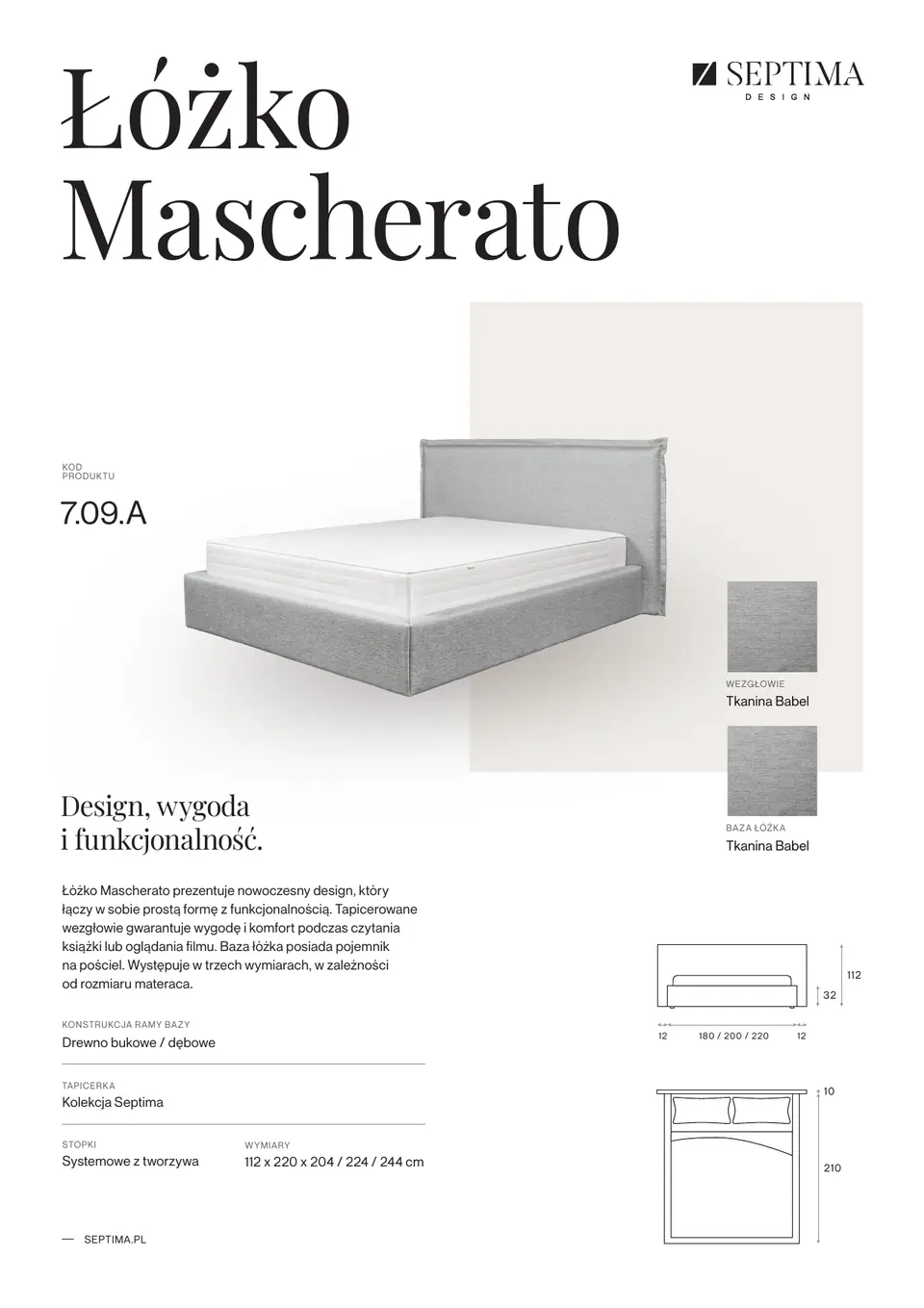
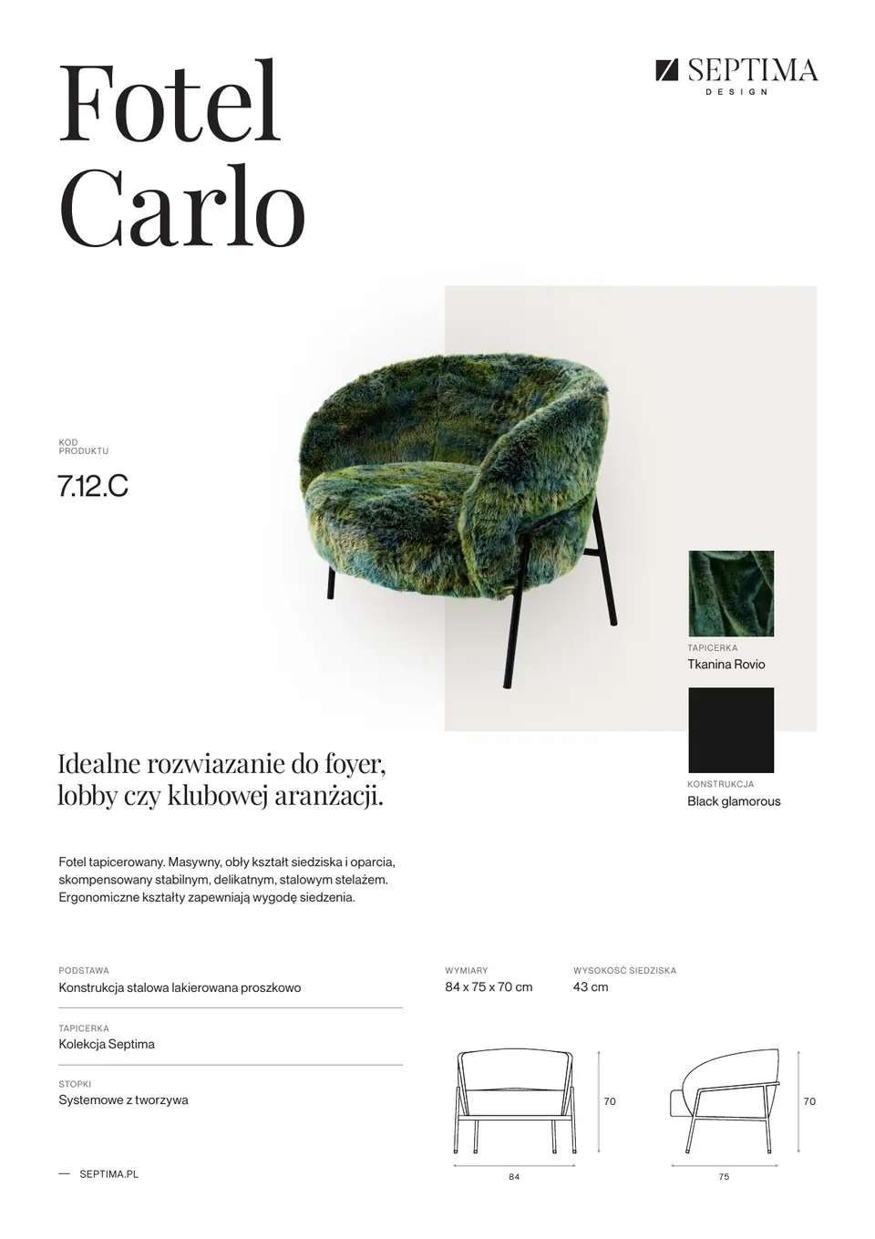
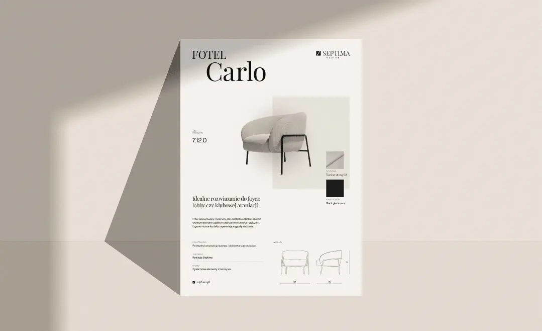
- 1 Name The category and model in Playfair Display, as across the whole identity.
- 2 Product code The same code as in the offer and on the website, so the sales team and the customer are talking about the same piece.
- 3 Photo on beige The furniture is always shown from the same perspective, on a square in a colour from the brand palette.
- 4 Samples The upholstery and frame finish shown as material samples.
- 5 Description One inviting sentence in the serif and a short description of the construction.
- 6 Dimensions and materials Technical data always in the same order: base, upholstery, feet, dimensions.
- 7 Technical drawing Redrawn in one style for all products, with dimensions.
Armchair Carlo · code 7.12.C
Website
A website for architects and investors
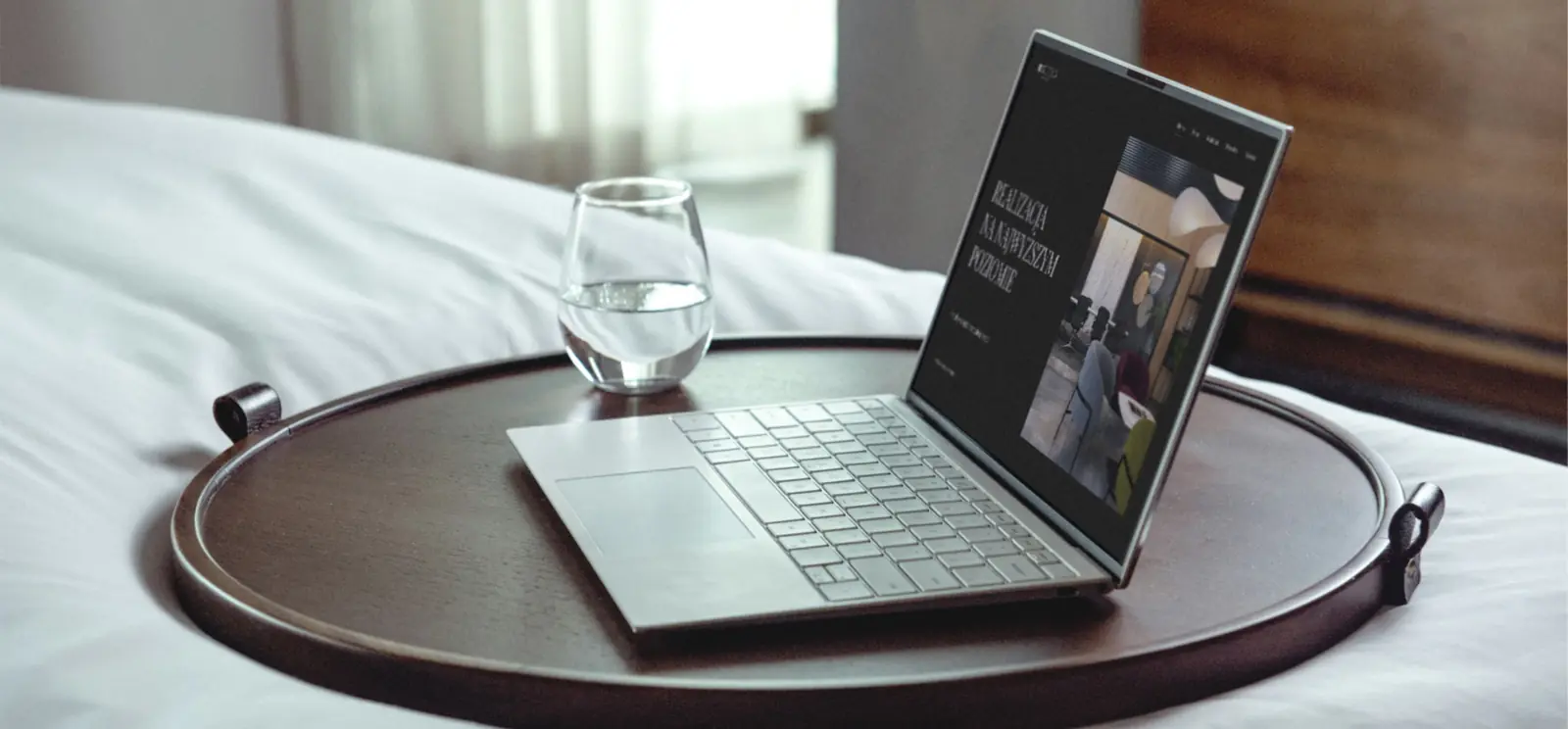
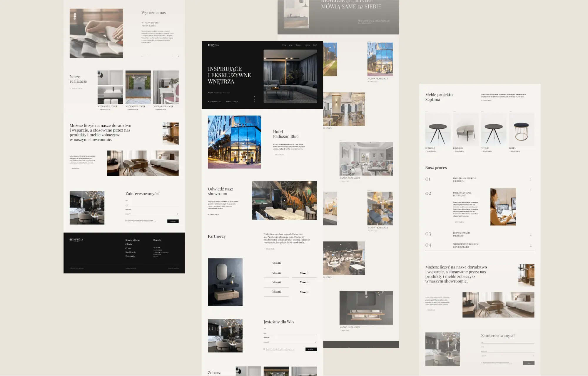
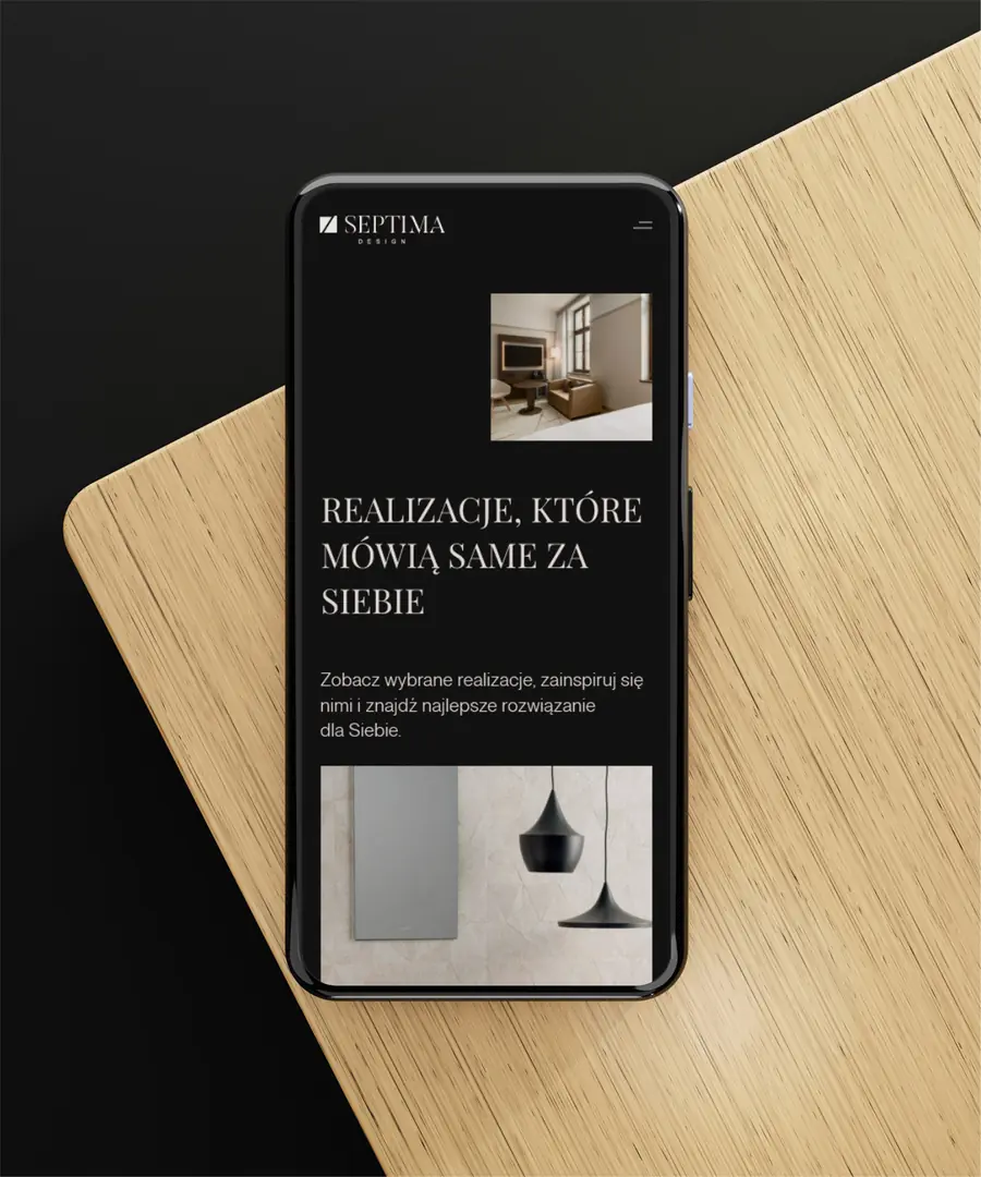
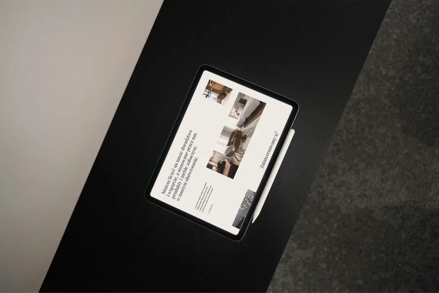
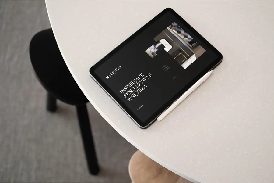
The website presents the brand, its services, products and projects. We went for clarity and simplicity: the site leads from services through projects to products. Every piece of furniture has its own subpage with technical data, an upholstery description, a fabric swatch book and a downloadable product sheet.
Some solutions came out of meetings with the Septima team. In the partners section, clicking a brand changes the photo next to it instead of sending the visitor off to another website. Project sections can be switched off when a project has no client testimonial. The newest products move to the top of the list automatically.
The Septima team took our CMS training and adds products and projects on its own.
Print with silver hot stamping
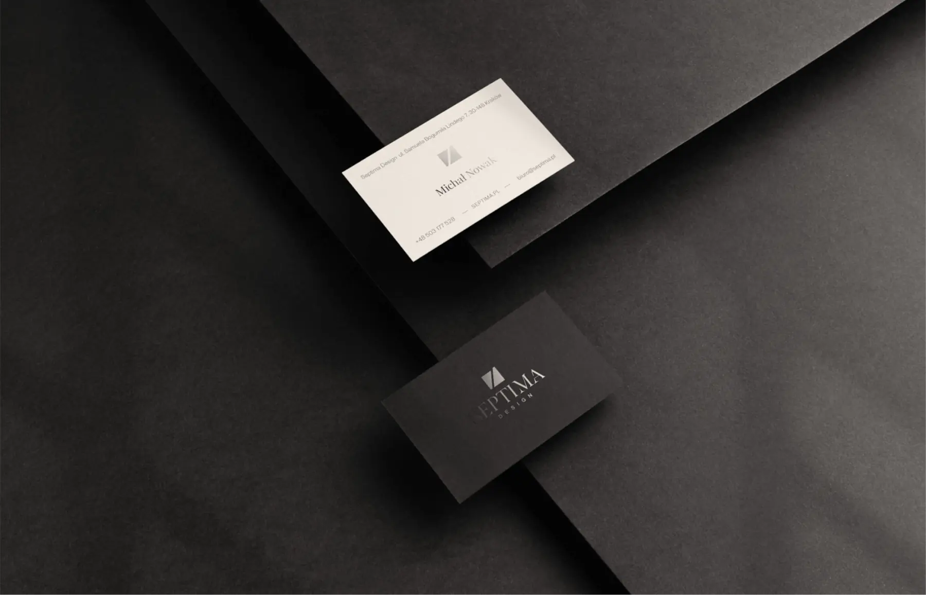
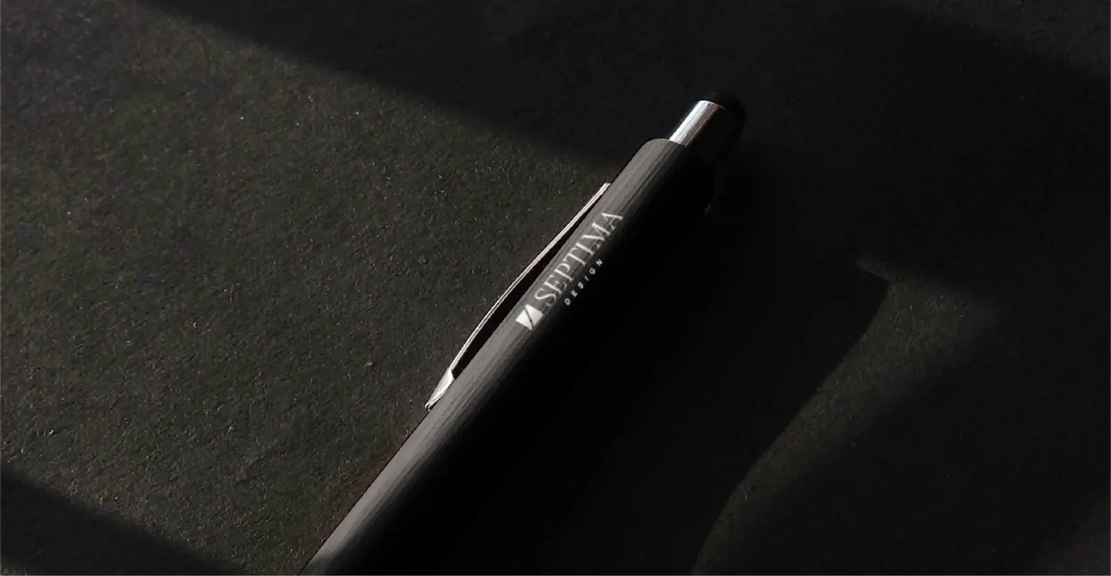
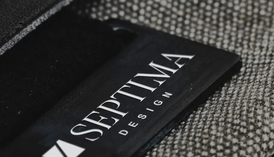
We refined the business cards based on samples the Septima team chose themselves: thick cream paper with black text and a silver symbol on the front, and a black back with a raised silver logo.
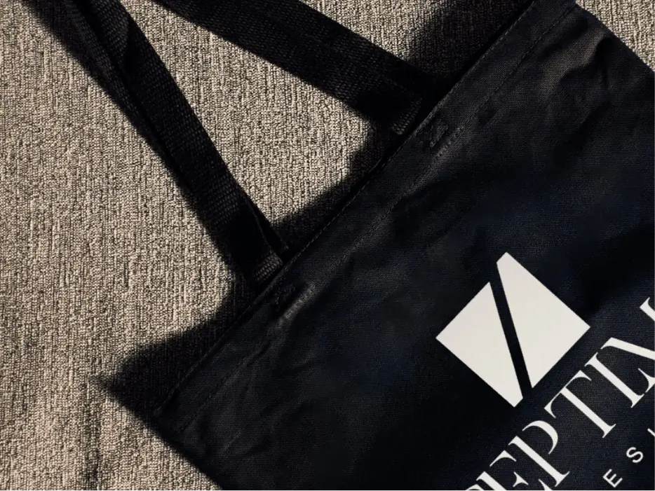
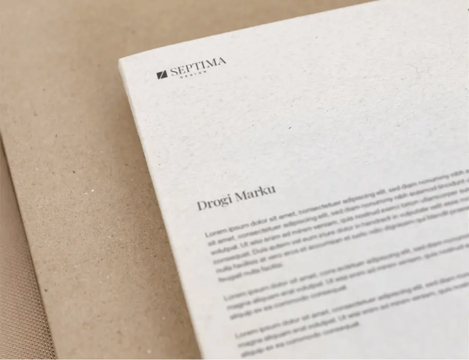
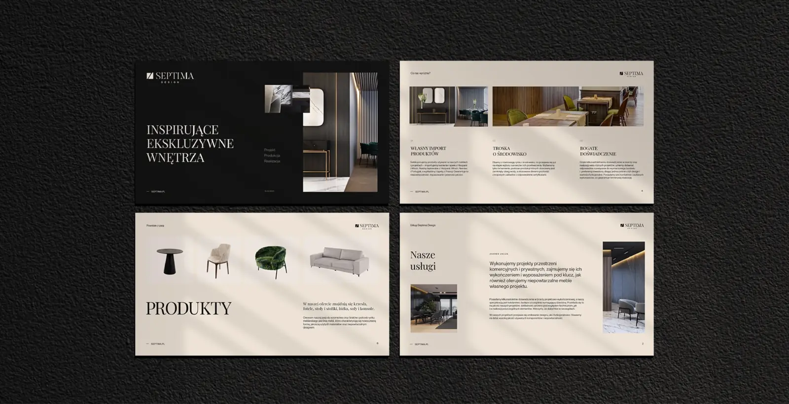
The same system covers the letterhead, folders, bags and pens, as well as a company presentation with projects, materials and furniture. Across all print we focused on quality, special finishes and coloured papers.
Website, catalogue and print in one style
The website, catalogue, business cards and investor presentation look like one company. The Septima team adds products and projects to the website on its own, and new product sheets are created in a ready template.
- Client
- Septima Design
- Scope
- Strategy workshopsBrandingLogoWebsiteUI/UX DesignRolloutCMS panelCatalogueBusiness materialsBranded merchandisePPTX presentationsProduction and printSocial media
- Tools
- WordPressAdobe XDIllustrator
- Online
- septimadesign.pl
More projects
-
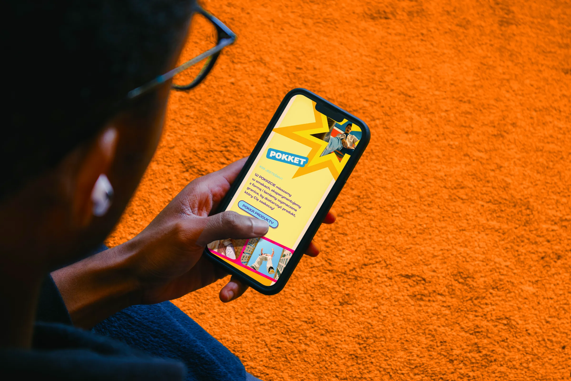 Pokket
A loud, colourful website full of movement for a Gen Z brand of fruit mousse pouches from the Dawtona Group, developed as the brand's range grows.
-
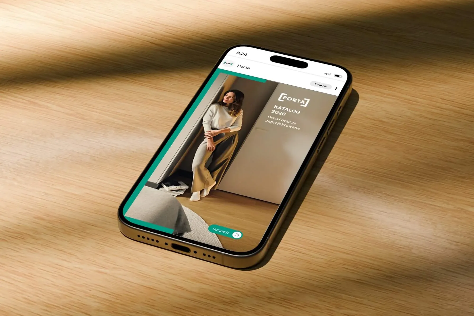 Porta Drzwi
A design system for an existing logo: a frame taken from the logo, grids, icons, drawings, a catalogue, porta.com.pl, social media and sales materials for a door manufacturer.
-
 Intima Clinic
Six medical brands in one group. Workshops, names, identity, clinic signage, print, animations and the intimaclinic.pl website.
-
 PolTREG
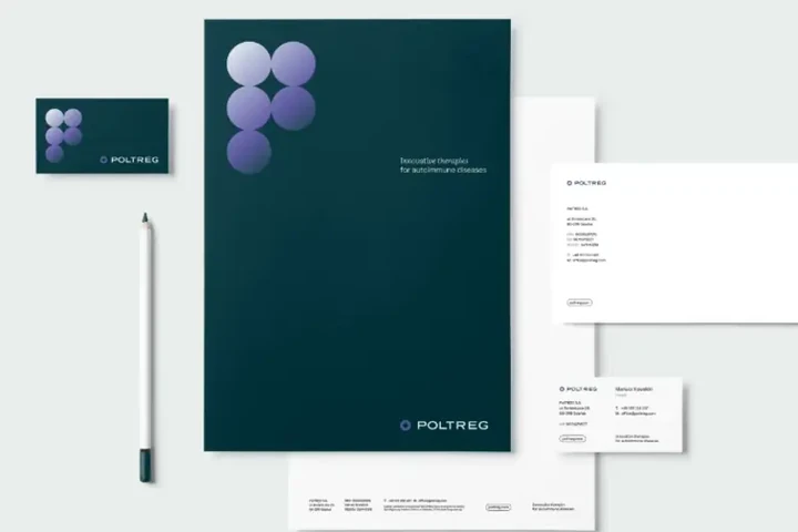
A rebrand for a biotech company listed on the Warsaw Stock Exchange, the poltreg.bio website for patients, investors and partners, and ongoing design support.
-
 Mily Group
A rebrand for a deer antler supplier: communication strategy, logo, logo guidelines, the milygroup.com website and trade fair materials.
-
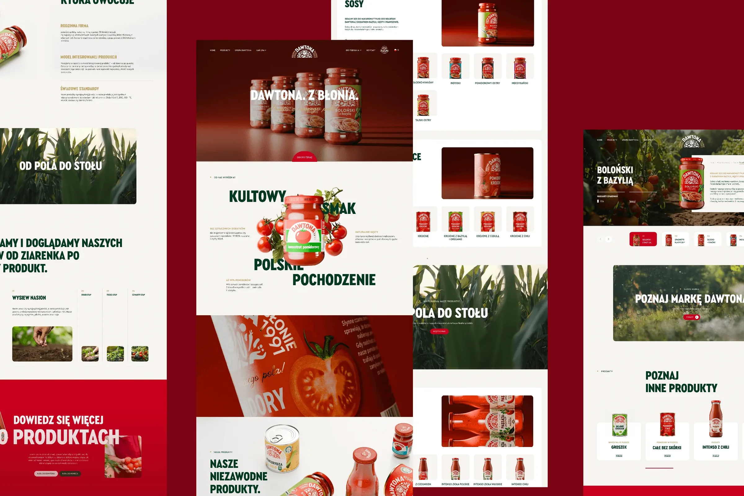 Dawtona Group
All of Dawtona's communication beyond the shelf: over 90 projects, from posts and trade fair stands to four websites and animations.
-
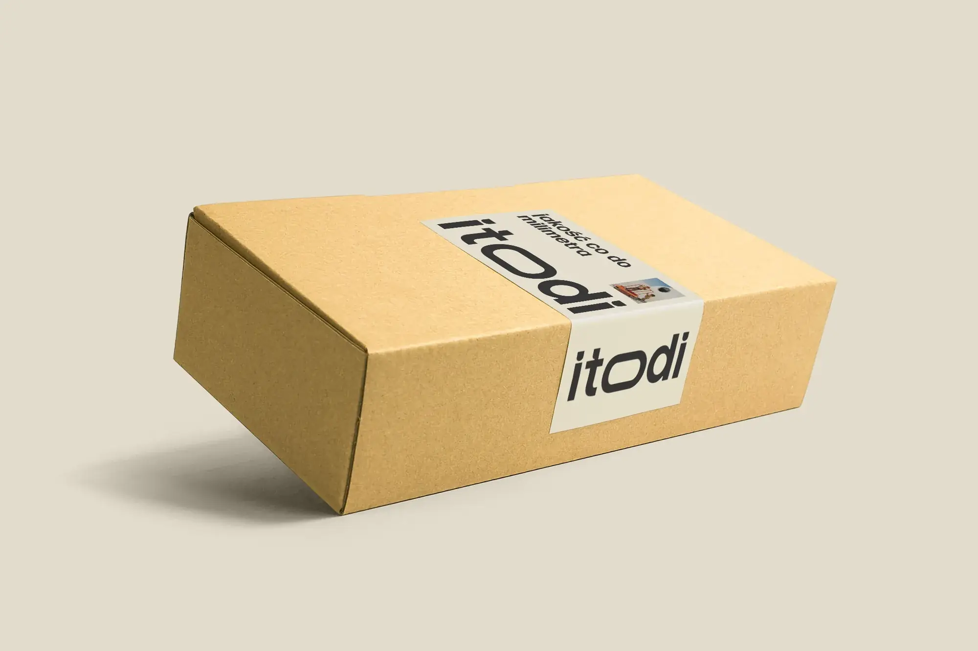 Itodi
A new made-to-measure furniture brand built from scratch: the name, a logo with a stretched “o”, the design of a shop with a configurator, an instruction leaflet and packaging.
-
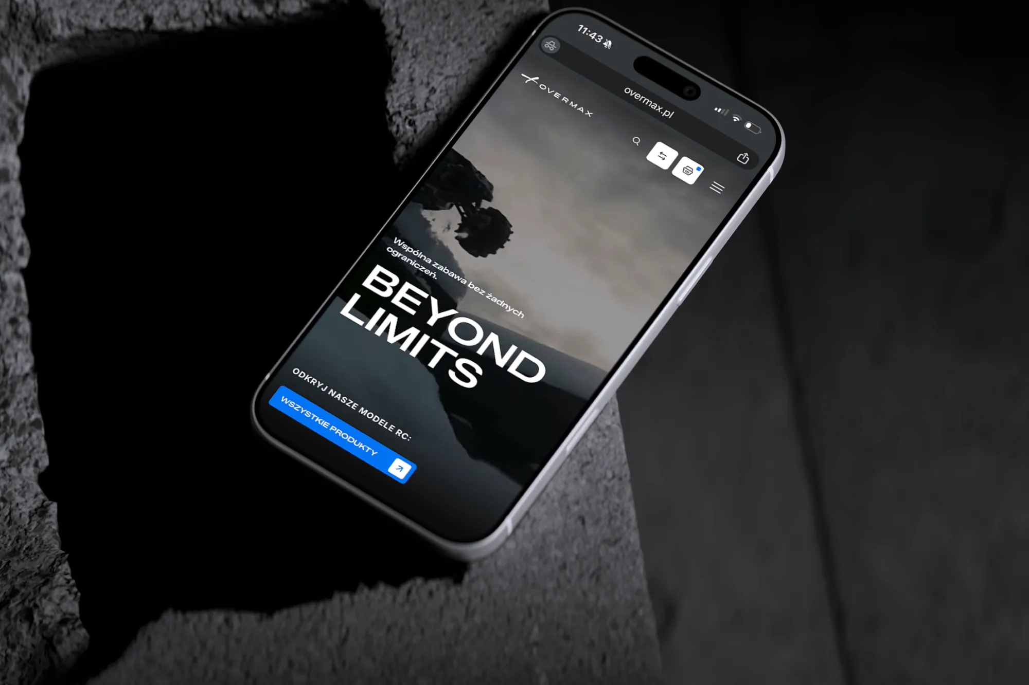 Overmax
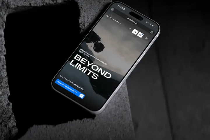
UX/UI design for the Overmax shop: RC cars in cinematic shots, a carefully worked-out product page, a category menu and a quiz that picks a model for you.
-
 Design Optyk
A family-run chain of premium eyewear stores: an identity without gold, in-store materials and a new online shop linked to the stock of six of its seven stores.
-
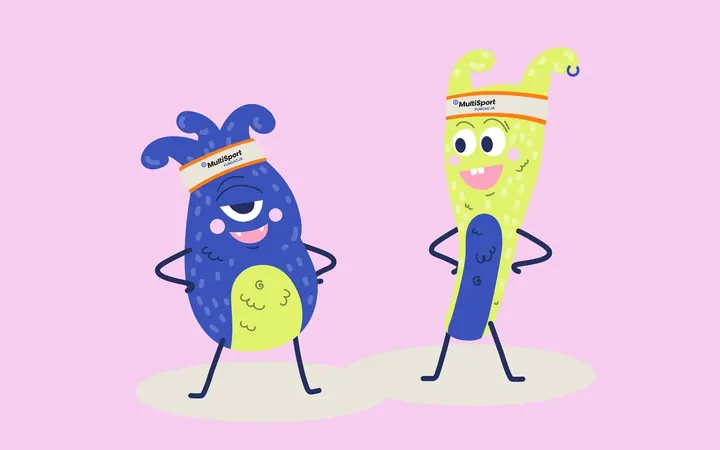
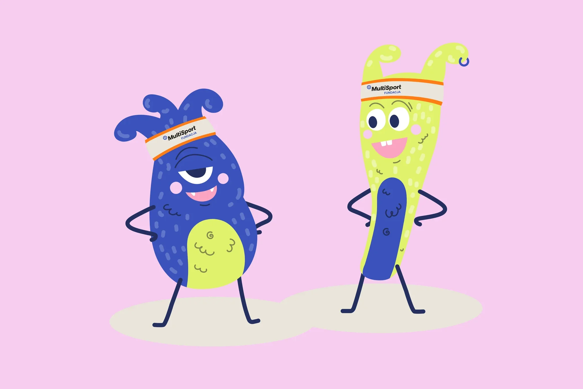 Fundacja MultiSport
An identity with a design system in Figma, a WCAG-compliant website and a brand hero duo that gets people moving.
-
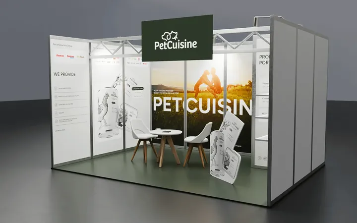
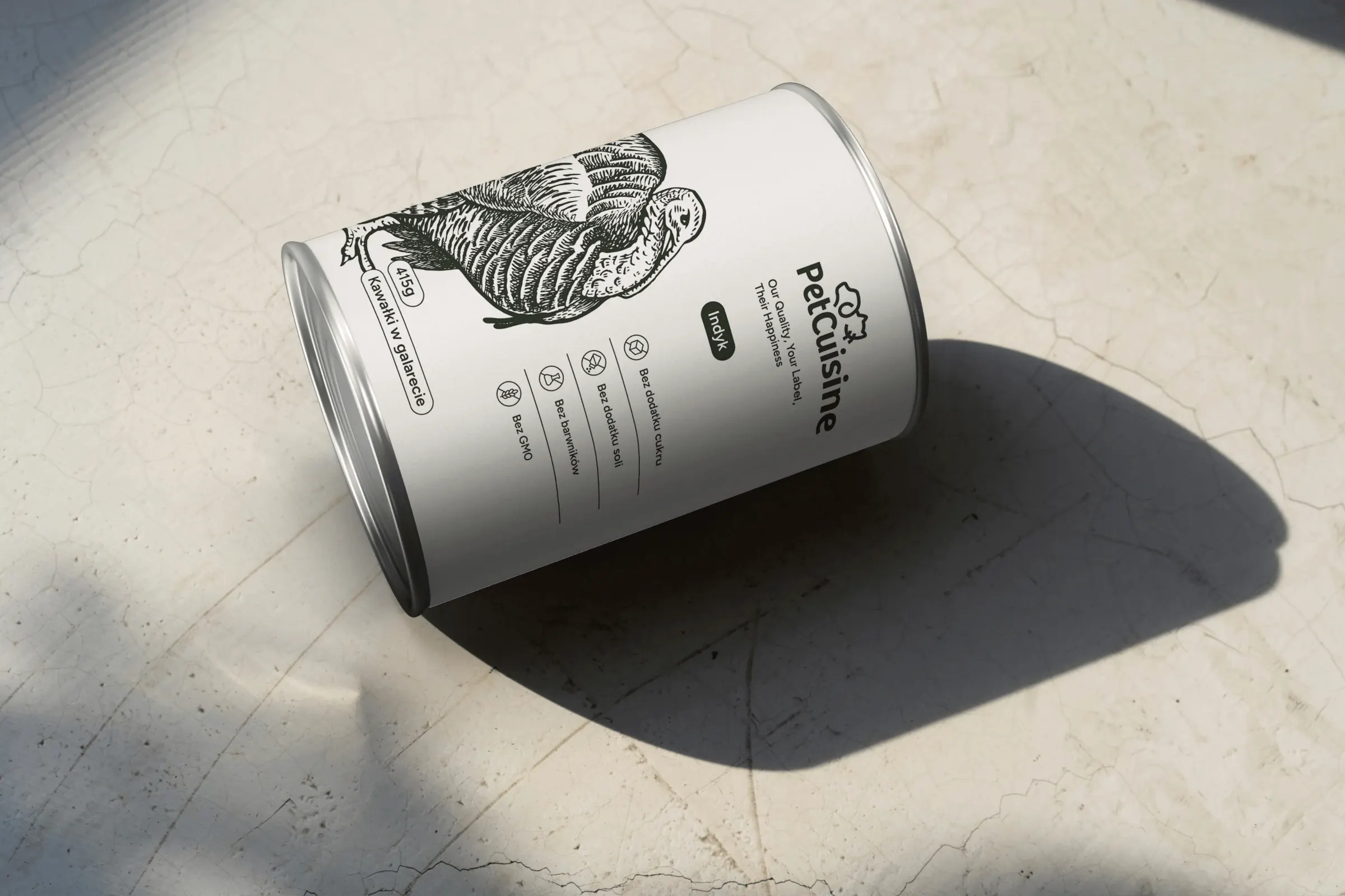 PetCuisine
We built a brand from scratch for a pet food manufacturer in the Dawtona Group: from the name and tagline, through packaging in 12 flavours and the website, to trade fair stands across Europe.
-
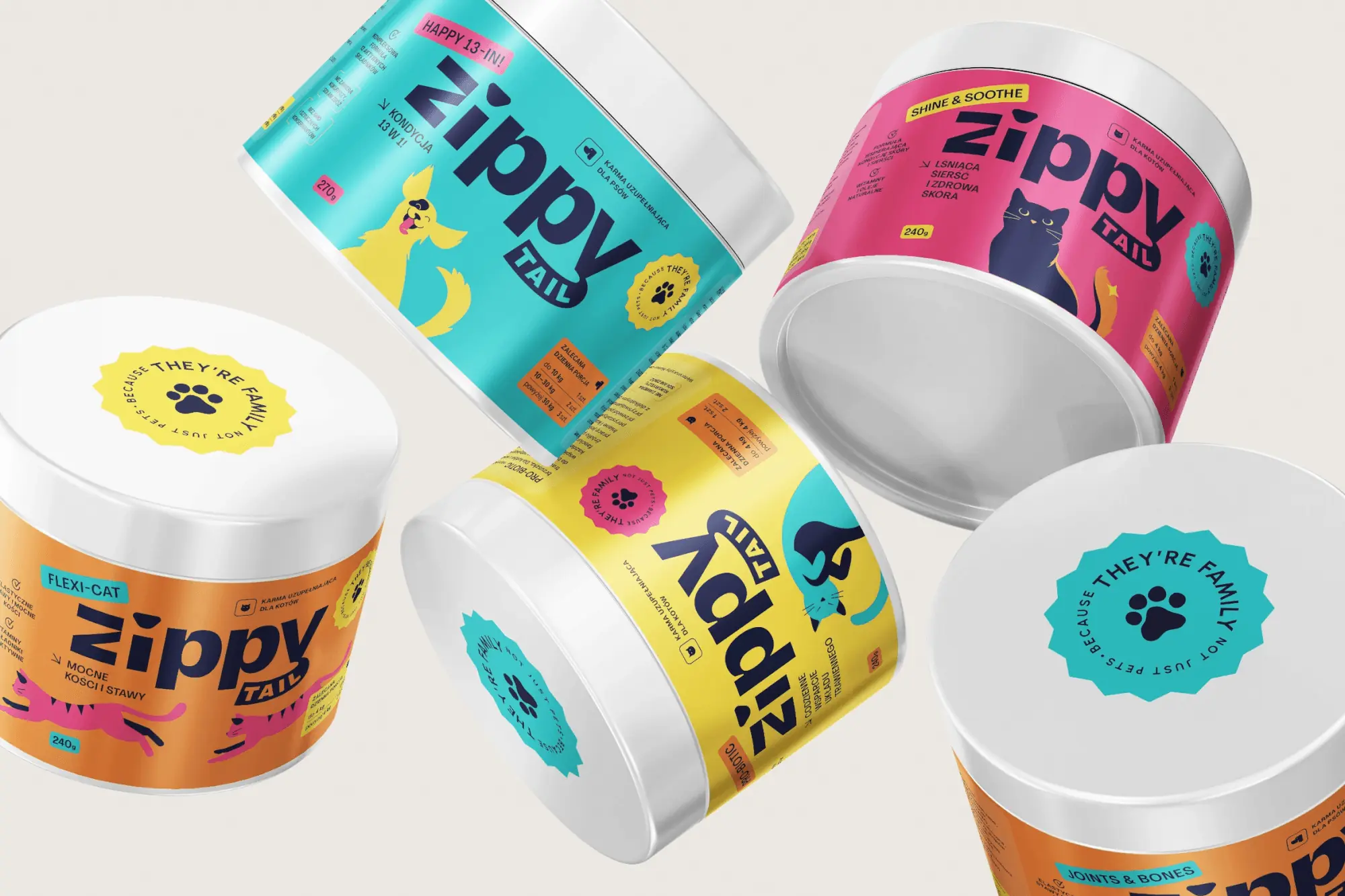 Zippy Tail
We built the Zippy Tail brand from scratch: the name, strategy, labels for eight supplements for dogs and cats, the shipping box and the shop design.
Facing a similar challenge?
Tell us what you want to change. In a first, no-obligation call we will see whether and how we can help.