




Fundacja MultiSport
A website, a brand and a duo that gets people moving.
The foundation had a mark, but no system. We created an identity with a design system, a website and two brand hero characters.
Explore the projectStarting point
There was a mark, but no system
The foundation had its mark, but no rules for building communication around it. Everyone who made materials read the brand their own way: a freelancer one way, the marketing team another, so posts, presentations and print looked different every time.
We brought it all into one system and handed it over in consistent files. With them, the foundation makes sure on its own that all its communication speaks with one voice.
Website
First the website, then the brand
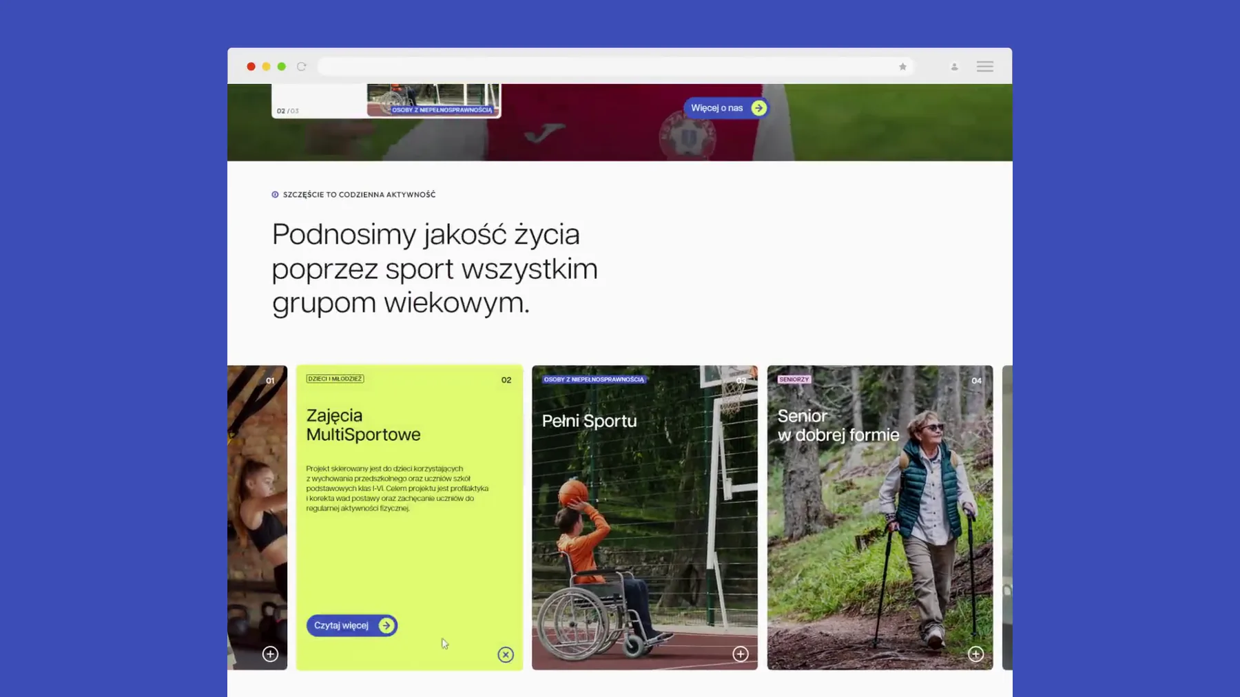
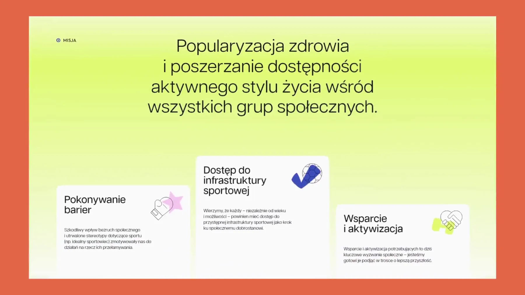
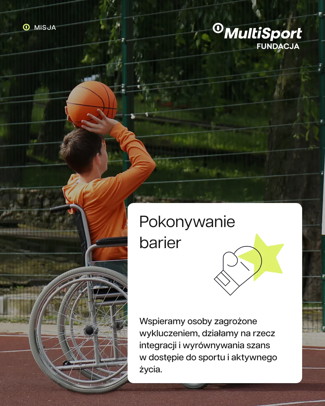
Here the order was the reverse of the usual. First we designed and built the foundation's new website, with programmes in a carousel, the mission in three cards and forms, for desktop and mobile.
Only then did the website's colours and typography give rise to the key visual, which in turn led to the brandbook and the whole brand system.
The entire website follows the WCAG accessibility guidelines. The foundation runs programmes for everyone from children to seniors, so the website has to work for all of them.
We prepared the website for deployment on the client's infrastructure and continue to look after it.
Order of work
- Website Design for desktop and mobile, build
- Key visual Colours and typography carried over from the website
- Brand hero Two characters, scenes and short animations
- Brandbook 21 pages of rules, from the palette to templates
- Standardisation A design system in Figma, templates and print
Key visual and brandbook
Six colours from the website
We carried the website's palette over into the key visual and the brandbook.
We create equal opportunities for a healthy, active life.
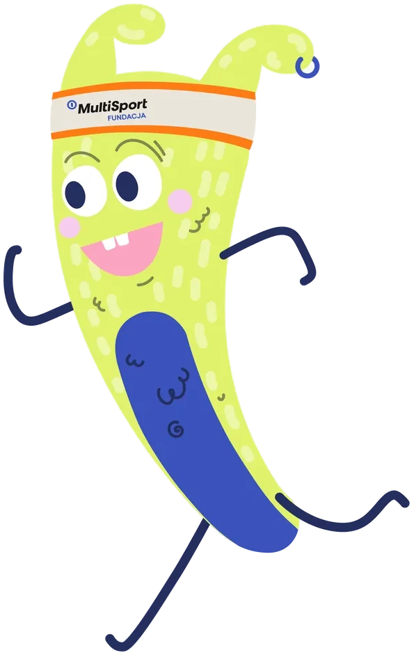
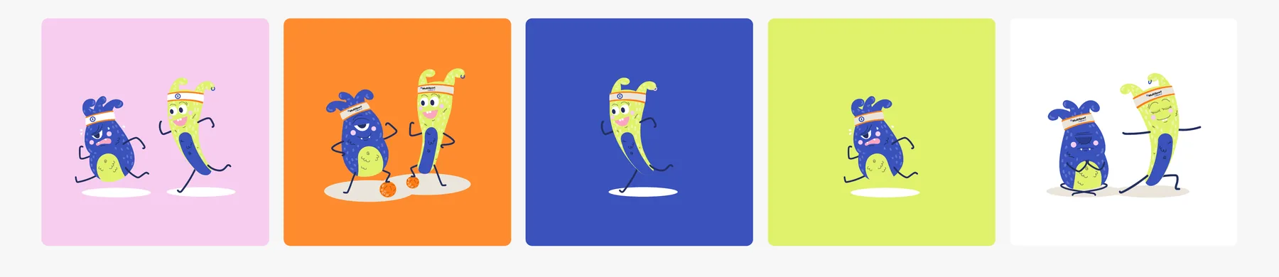
- A character stands on a background in a different colour from its body.
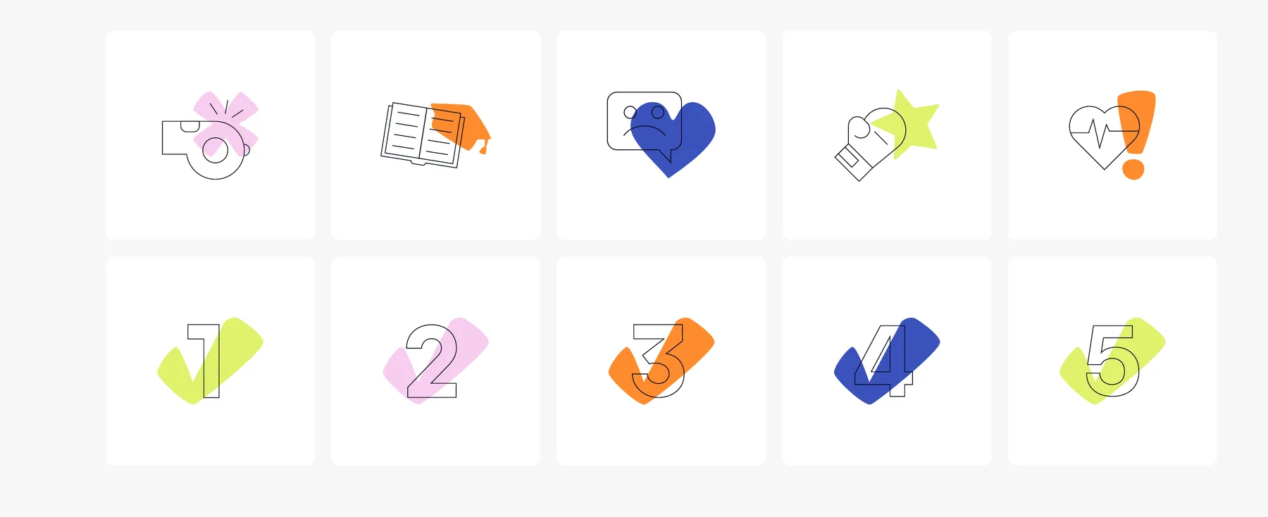
- The shape behind an icon changes colour within the palette.
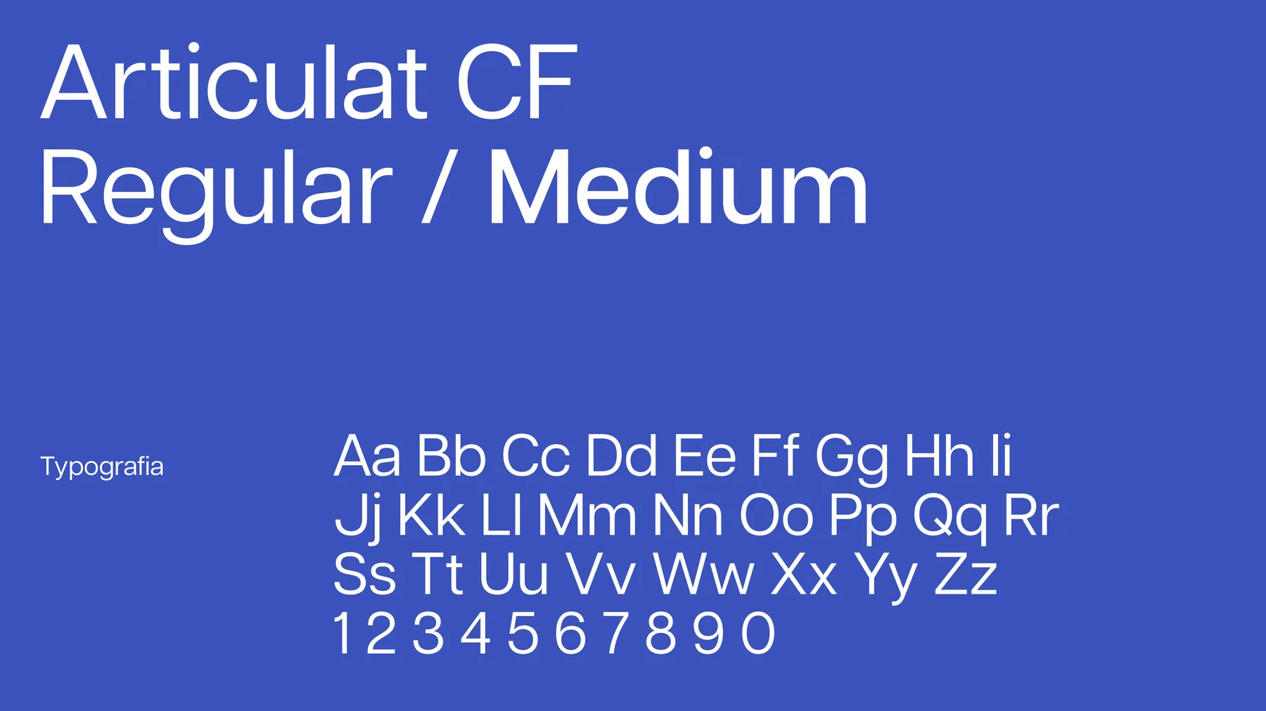
- The main typeface is Articulat CF. Where it can't be installed, Arial takes its place.
The tagline in the scene is set in Arial, the fallback typeface from the brandbook.
From the brandbook
Brand hero
A duo instead of a mascot
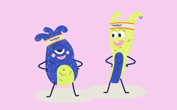
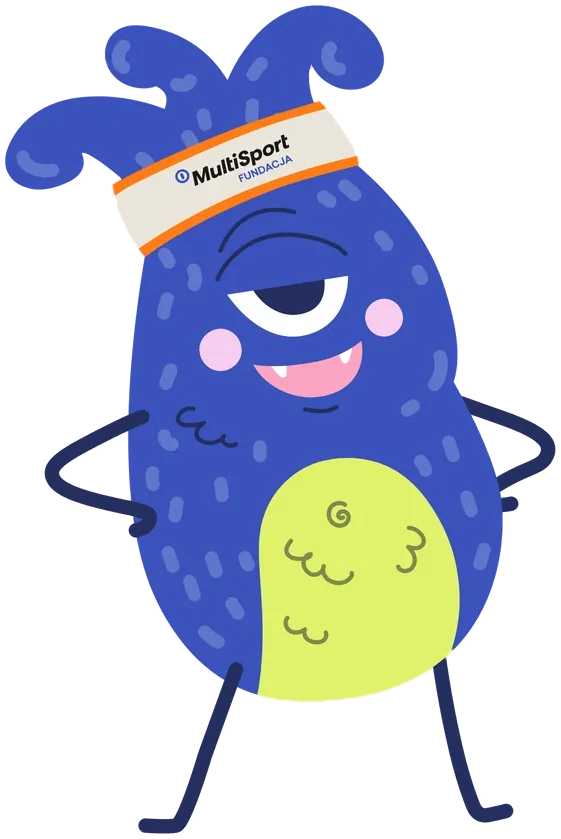
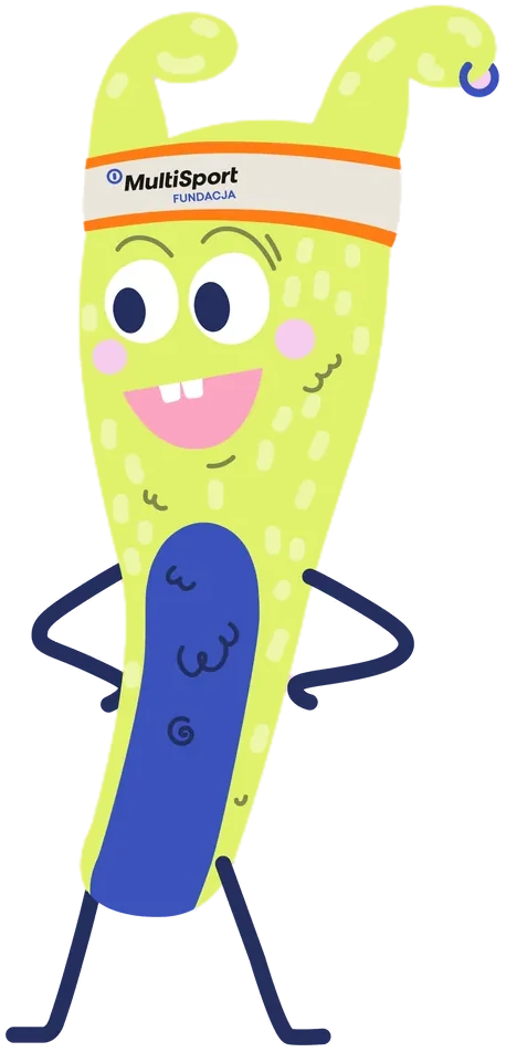
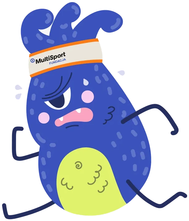
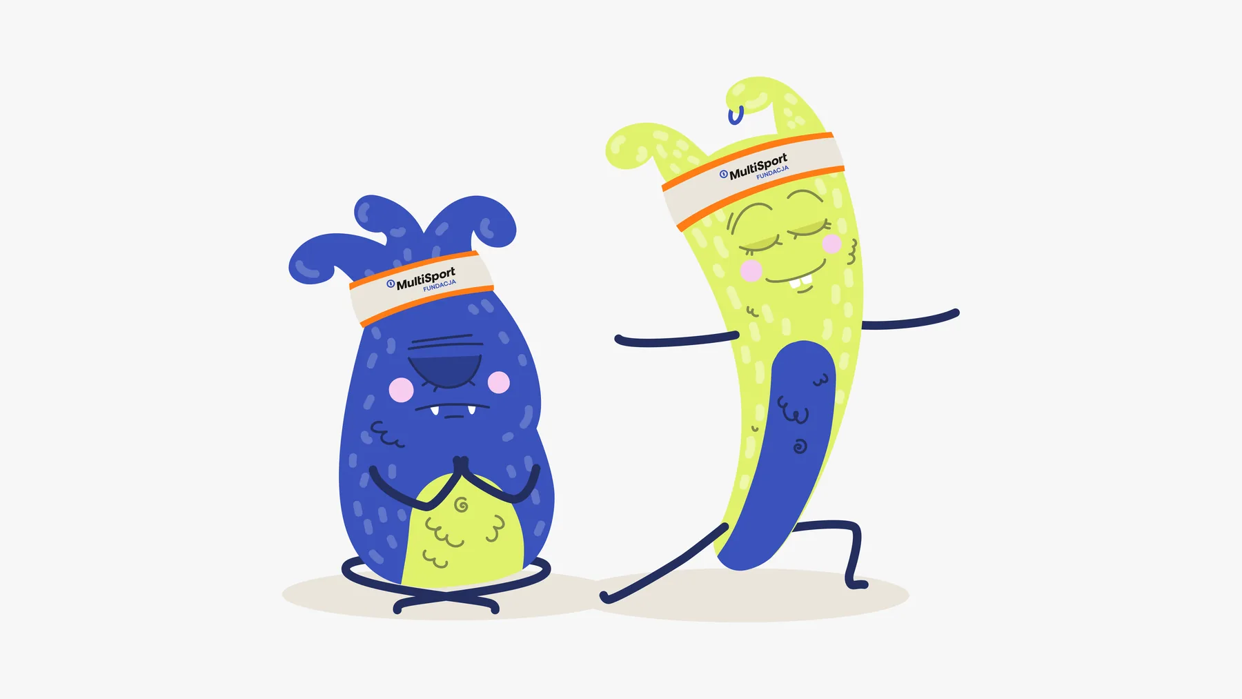
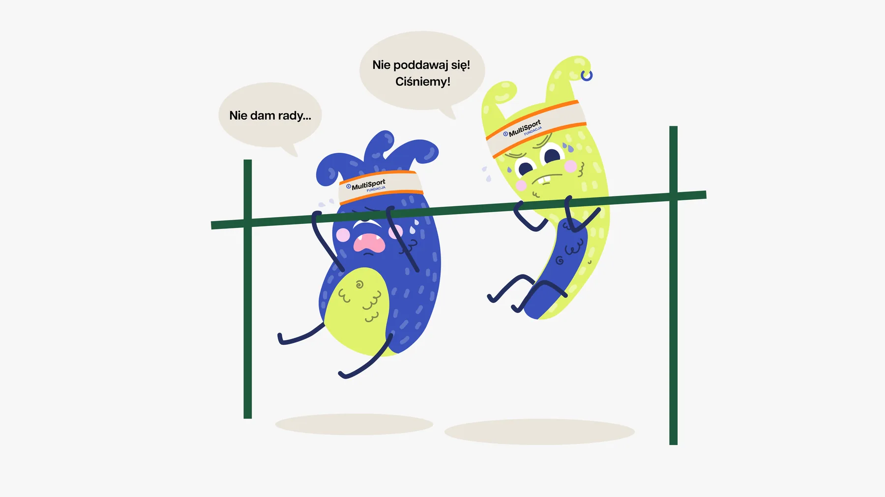
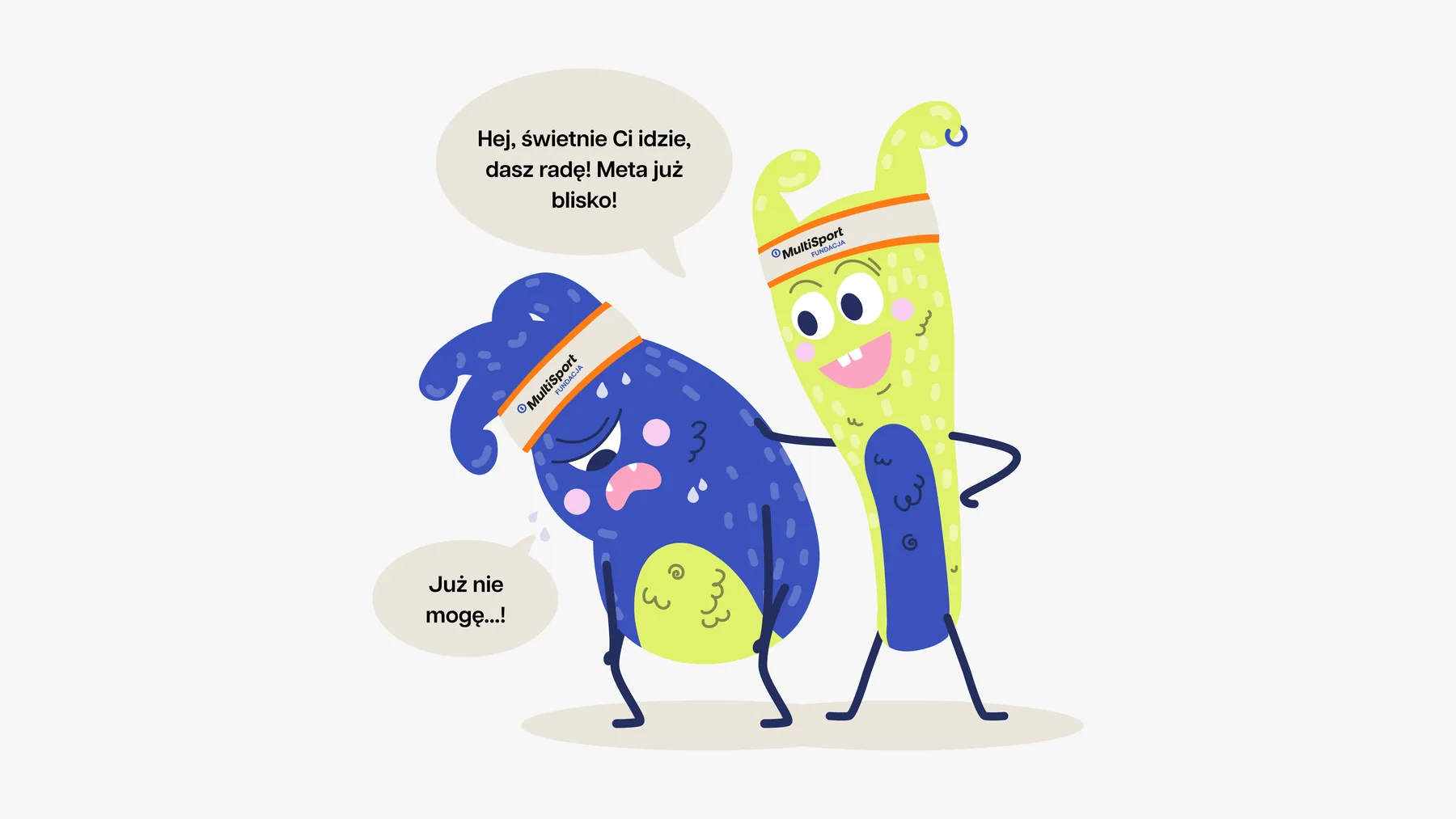
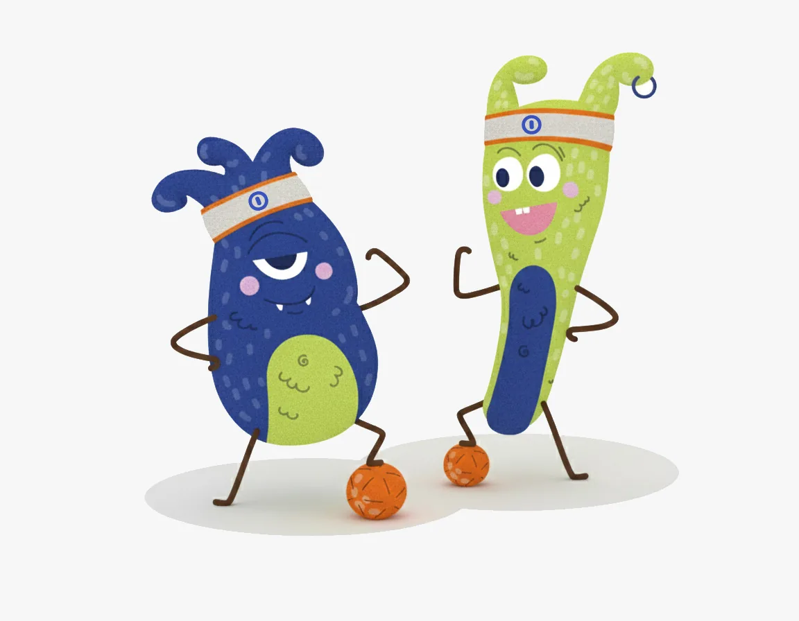
Hart and Wigor always appear together. Hart shows that every effort is worth it, while Wigor spreads energy and encourages that first step.
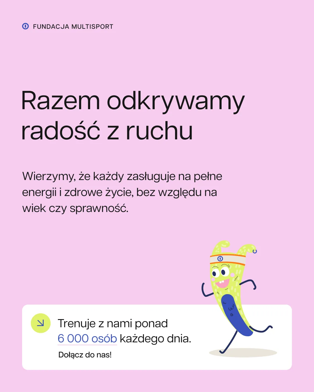
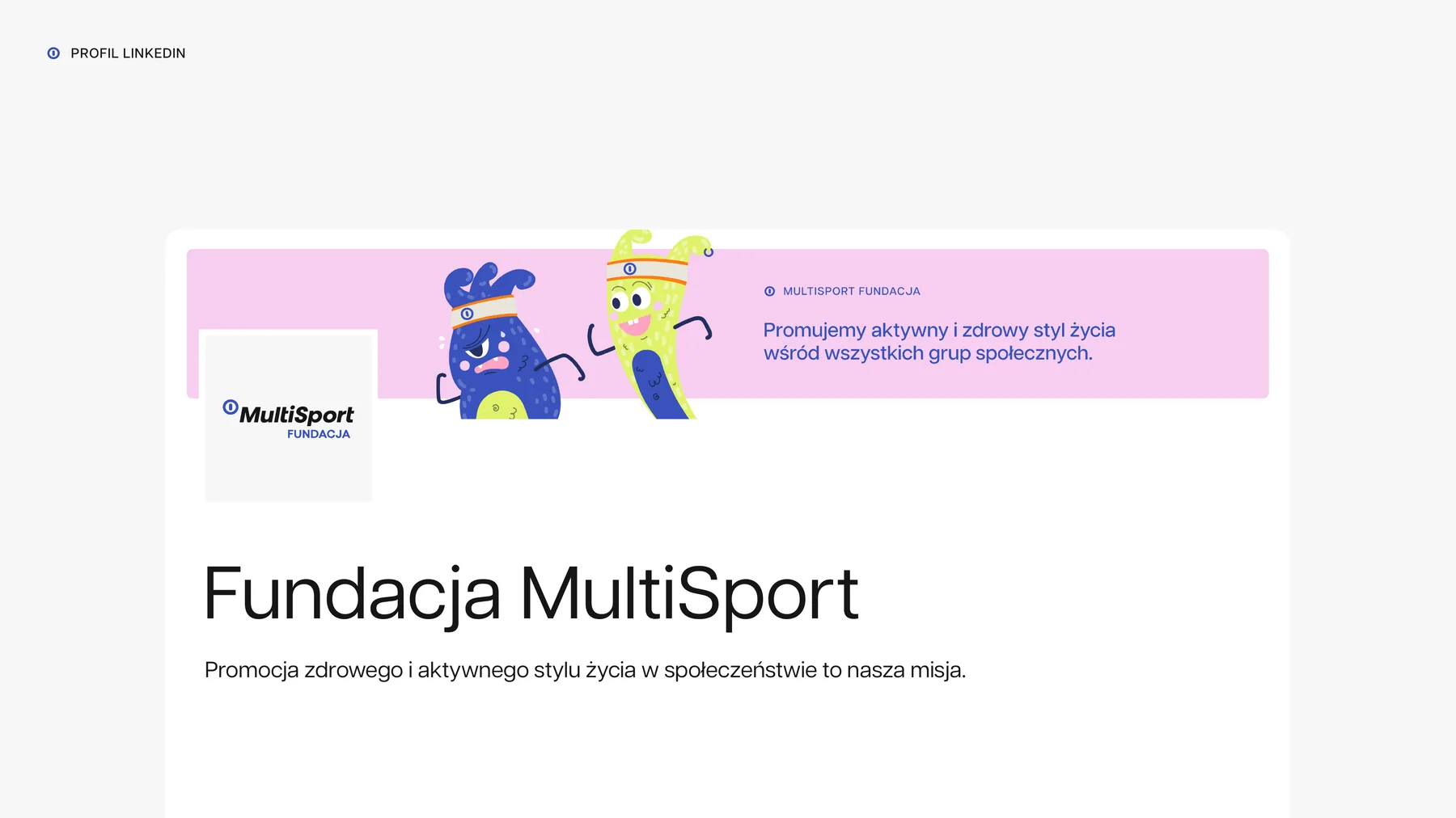
The scenes don't only show success. There's breathlessness, doubt and cheering, and the speech bubbles leave room for short texts.
In frame
Concept
From drawing to 3D
In the concept we showed the same scene as a drawing and as a 3D visualisation. The five final scenes also got 6-second animations.
Standardisation
The brand in everyday work
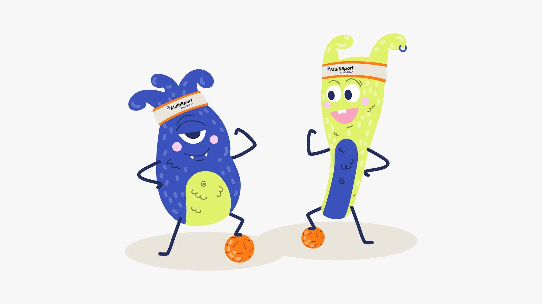
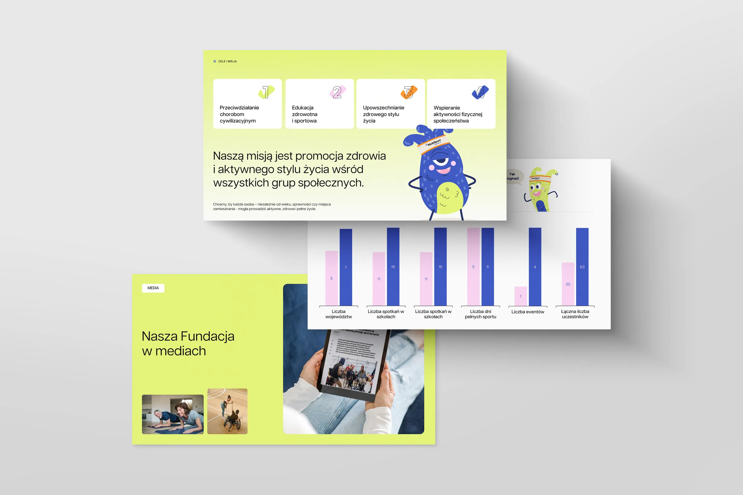
The foundation's marketing team works in an interactive design system in Figma. It holds the typefaces, styles and ready templates for everyday work: YouTube covers, posts, presentations, reports and summaries.
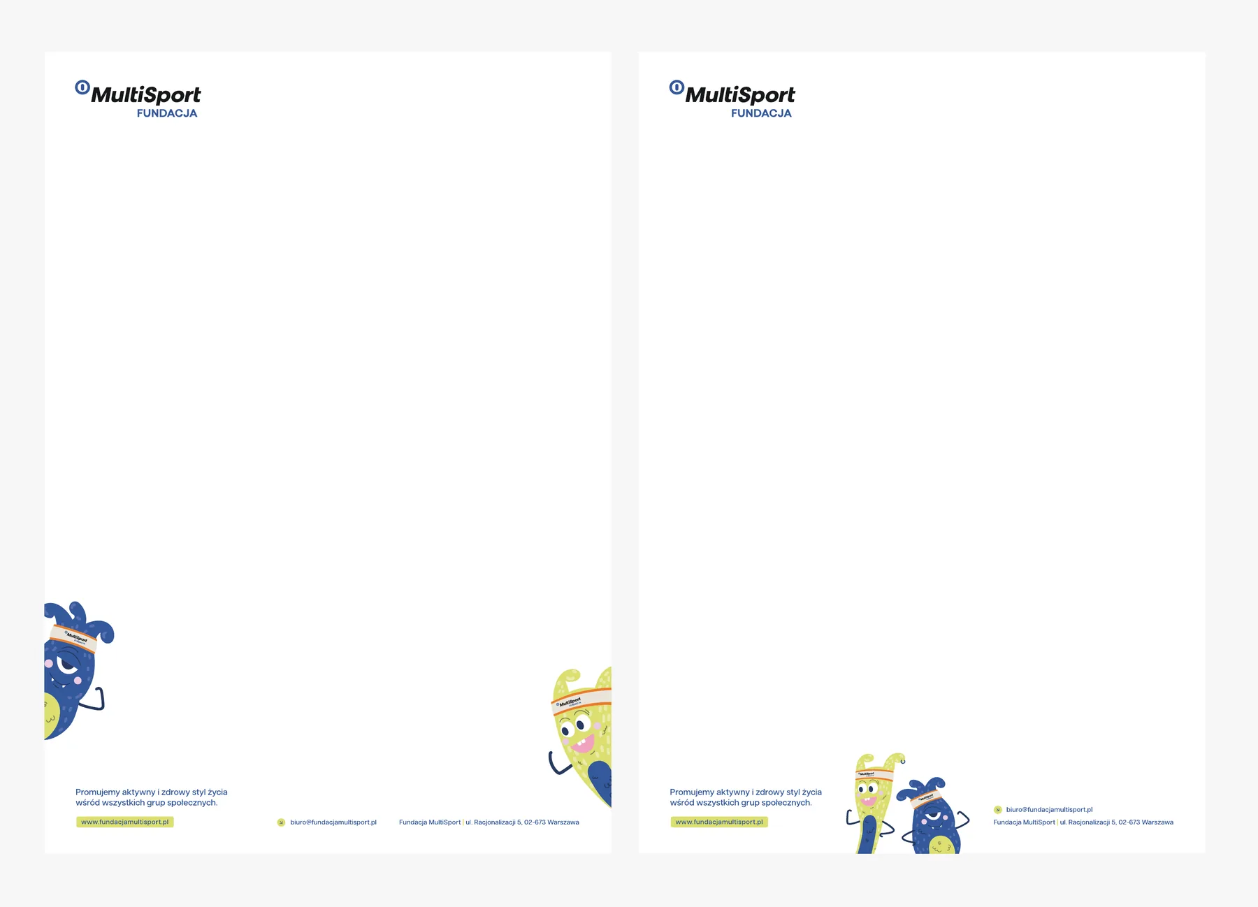
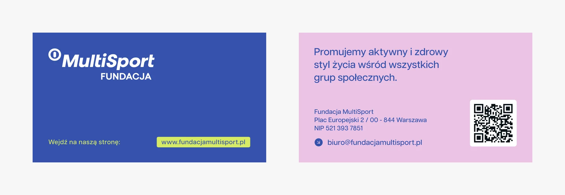
The team swaps the duo's facial expressions and hands on its own, and a business card and letterhead are ready for print.
The website was only the beginning
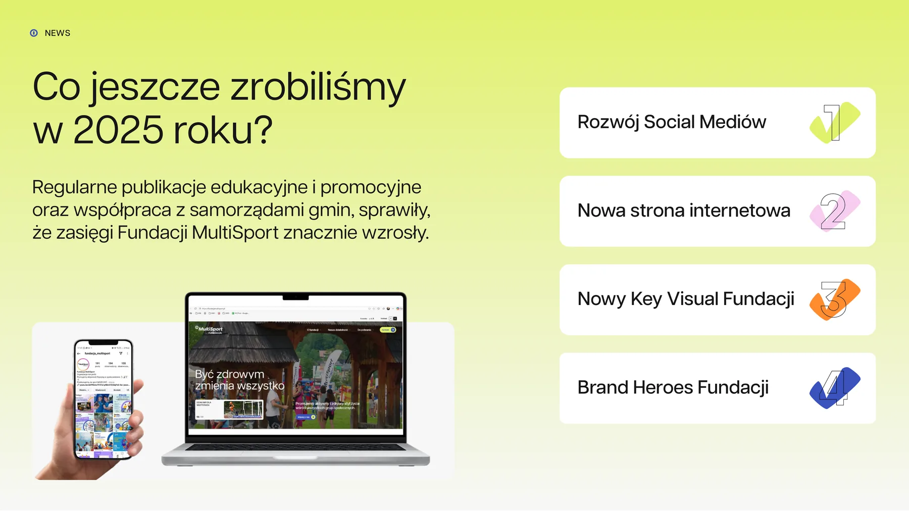
In its annual summary, the foundation listed the new website, the new key visual and the brand heroes among its activities.
The work continues: standardising materials, news on the website and care of its code.
- Client
- Fundacja MultiSport
- Scope
- Branding · Website · Illustration · Animation · UI/UX Design · Coding · CMS panel · Rollout · Social media · Business materials · PPTX presentations
- Technologies
- WordPress · ACF PRO · Gravity Forms · Adobe XD · Figma · Adobe Illustrator · PowerPoint
- Online
- fundacjamultisport.pl
The “MultiSport Fundacja” mark isn't our design. In the brandbook we described the rules for using it.
More projects
-
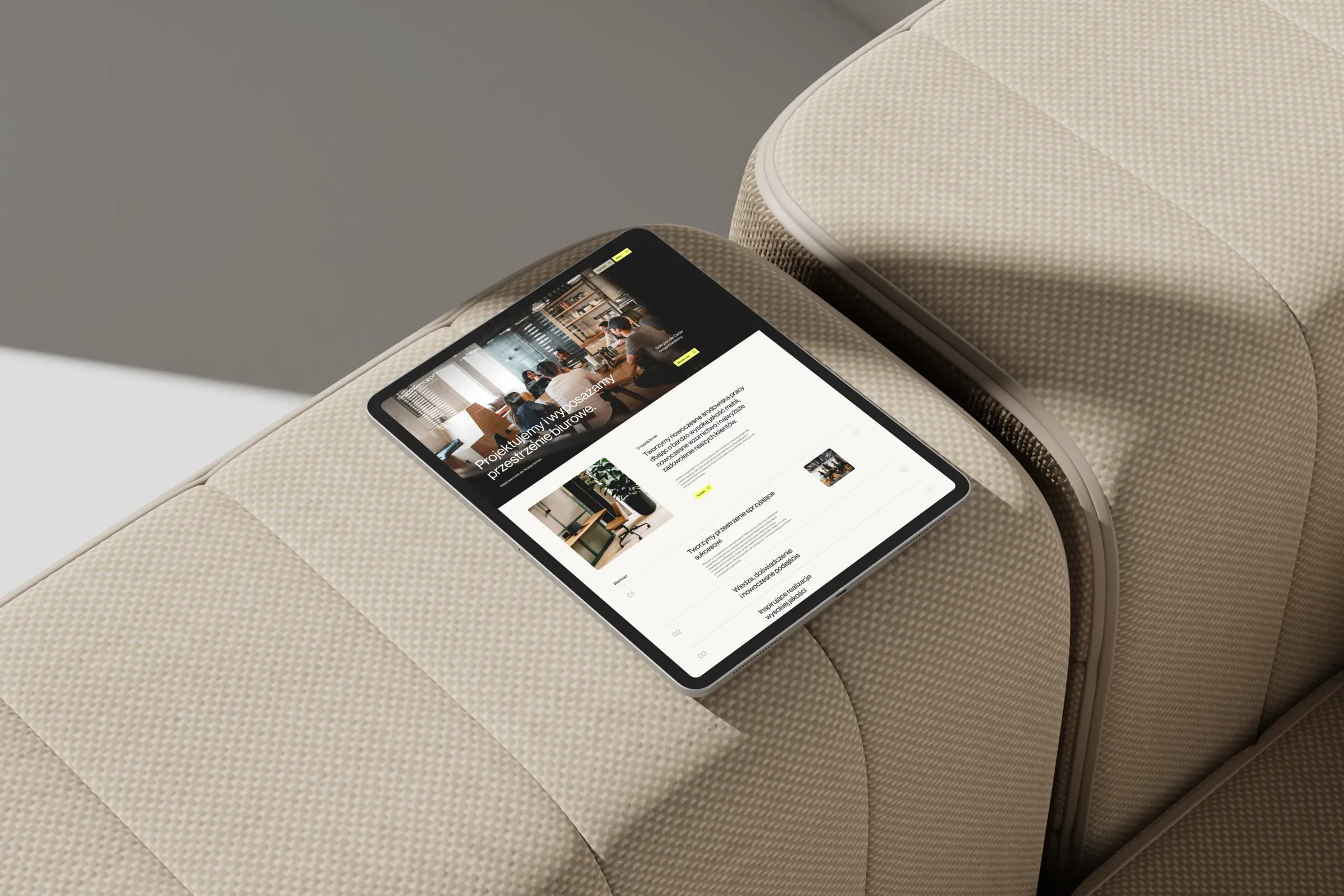 Biurokoncept
We designed and coded biurokoncept.pl: a catalogue of over a thousand pieces of furniture with a pCon configurator and an enquiry basket.
-
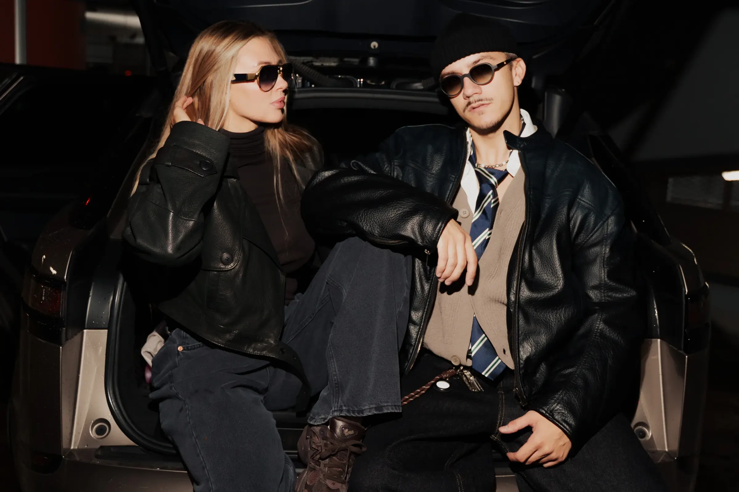 Design Optyk
A family-run chain of premium eyewear stores: an identity without gold, in-store materials and a new online shop linked to the stock of six of its seven stores.
-
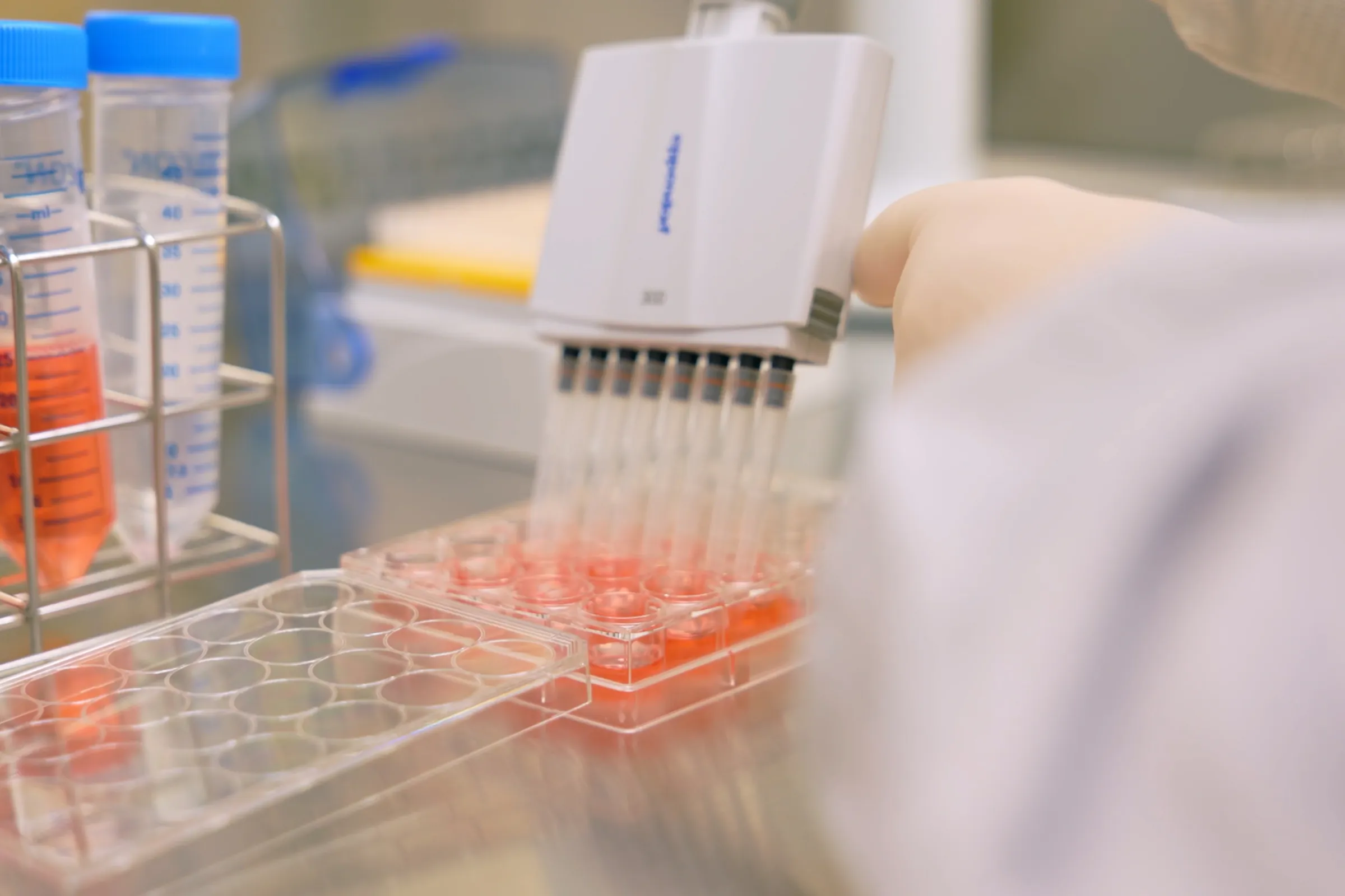 PolTREG
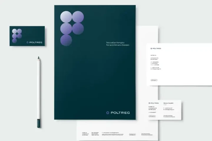
A rebrand for a biotech company listed on the Warsaw Stock Exchange, the poltreg.bio website for patients, investors and partners, and ongoing design support.
-
 Mily Group
A rebrand for a deer antler supplier: communication strategy, logo, logo guidelines, the milygroup.com website and trade fair materials.
-
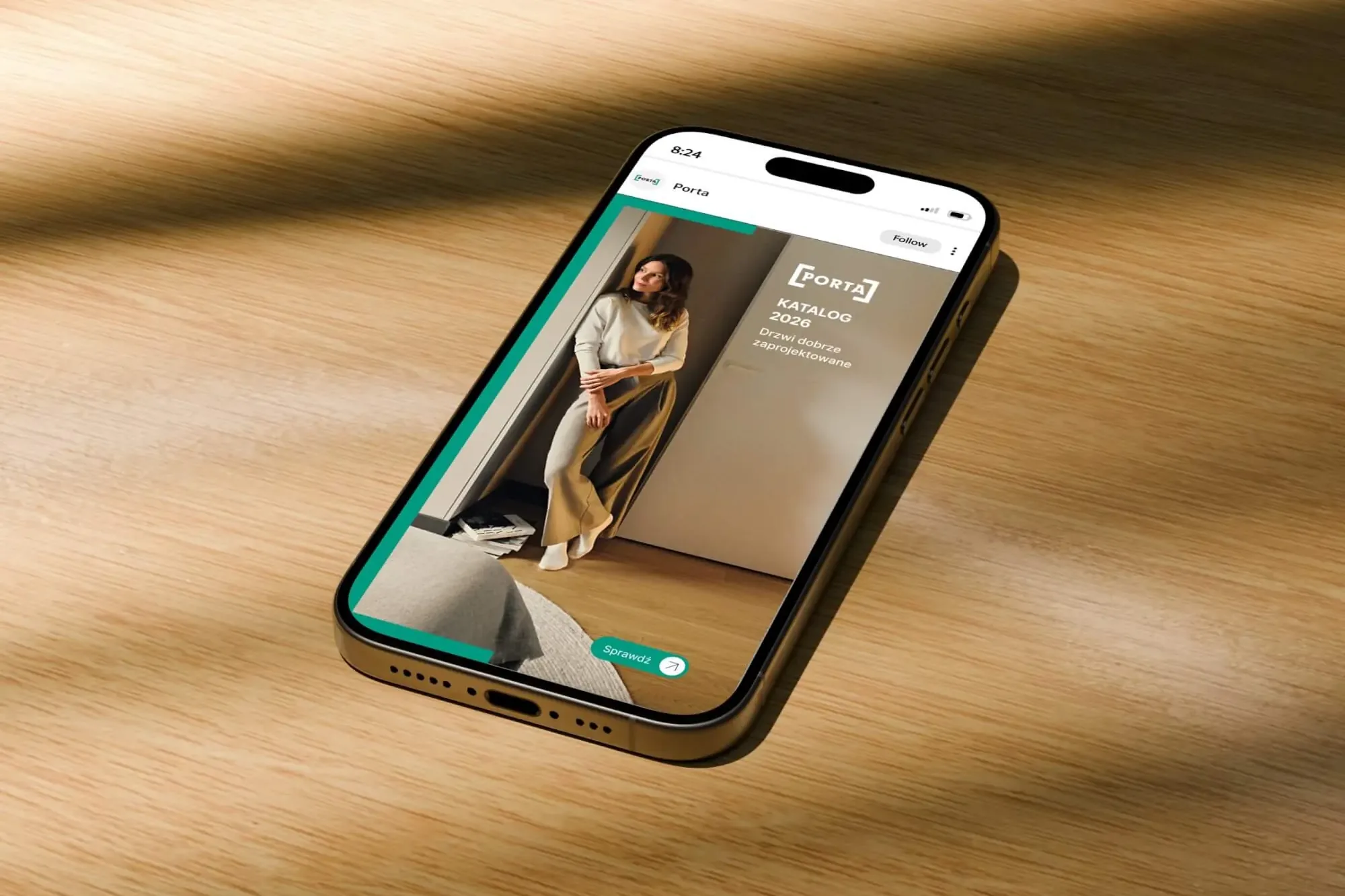 Porta Drzwi
A design system for an existing logo: a frame taken from the logo, grids, icons, drawings, a catalogue, porta.com.pl, social media and sales materials for a door manufacturer.
-
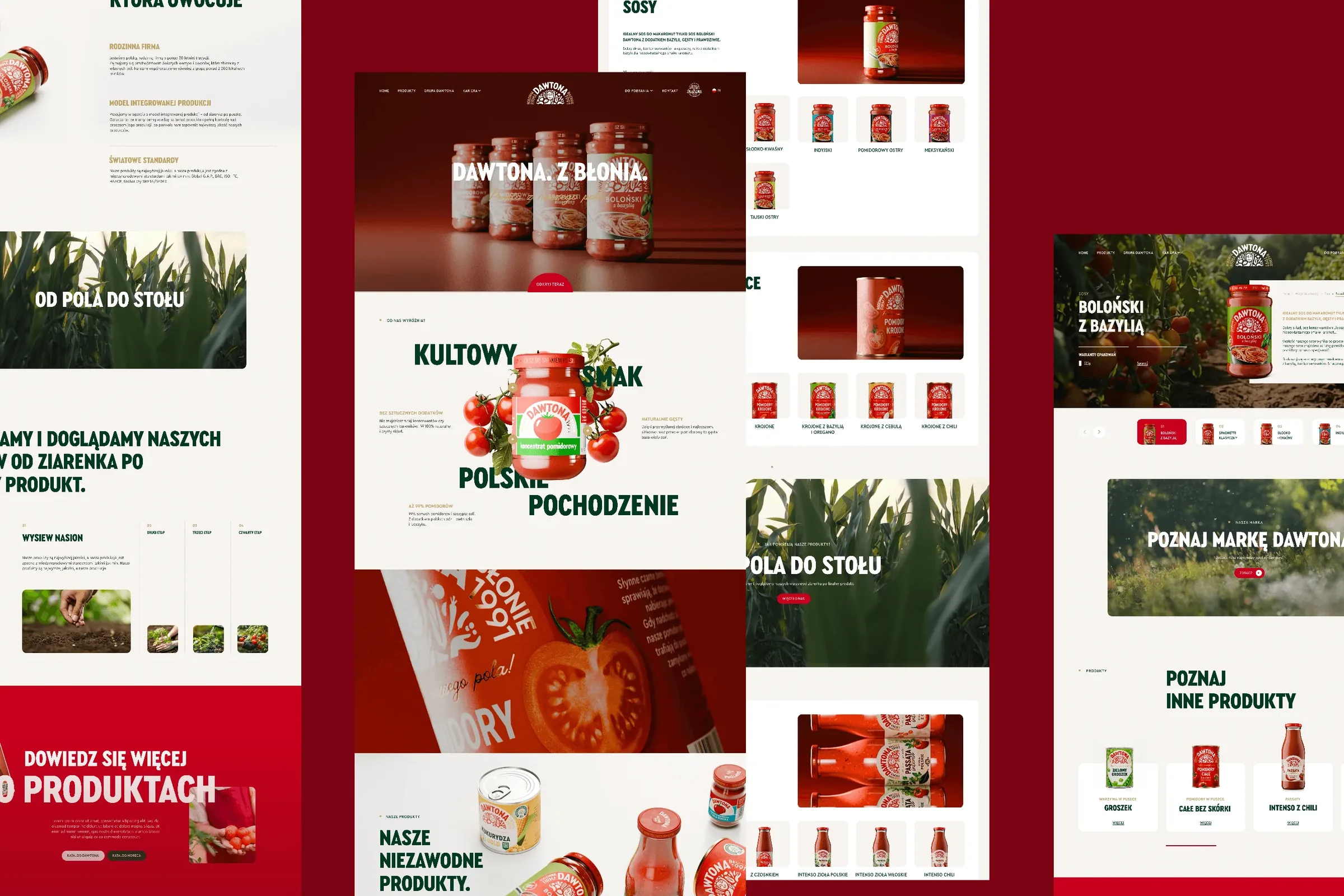 Dawtona Group
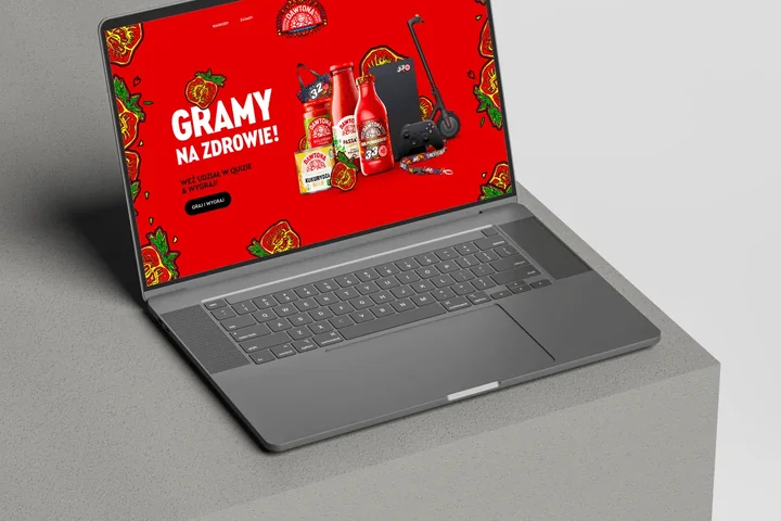
All of Dawtona's communication beyond the shelf: over 90 projects, from posts and trade fair stands to four websites and animations.
-
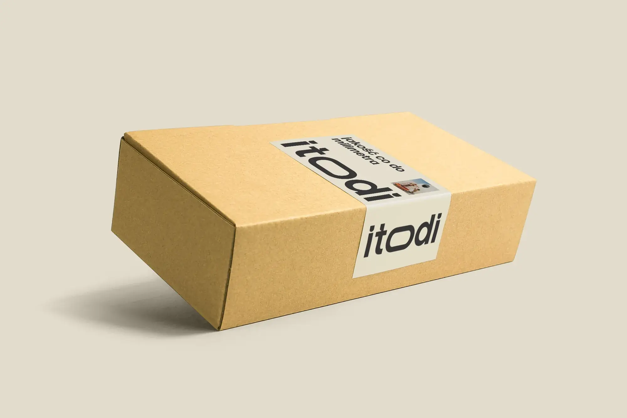 Itodi
A new made-to-measure furniture brand built from scratch: the name, a logo with a stretched “o”, the design of a shop with a configurator, an instruction leaflet and packaging.
-
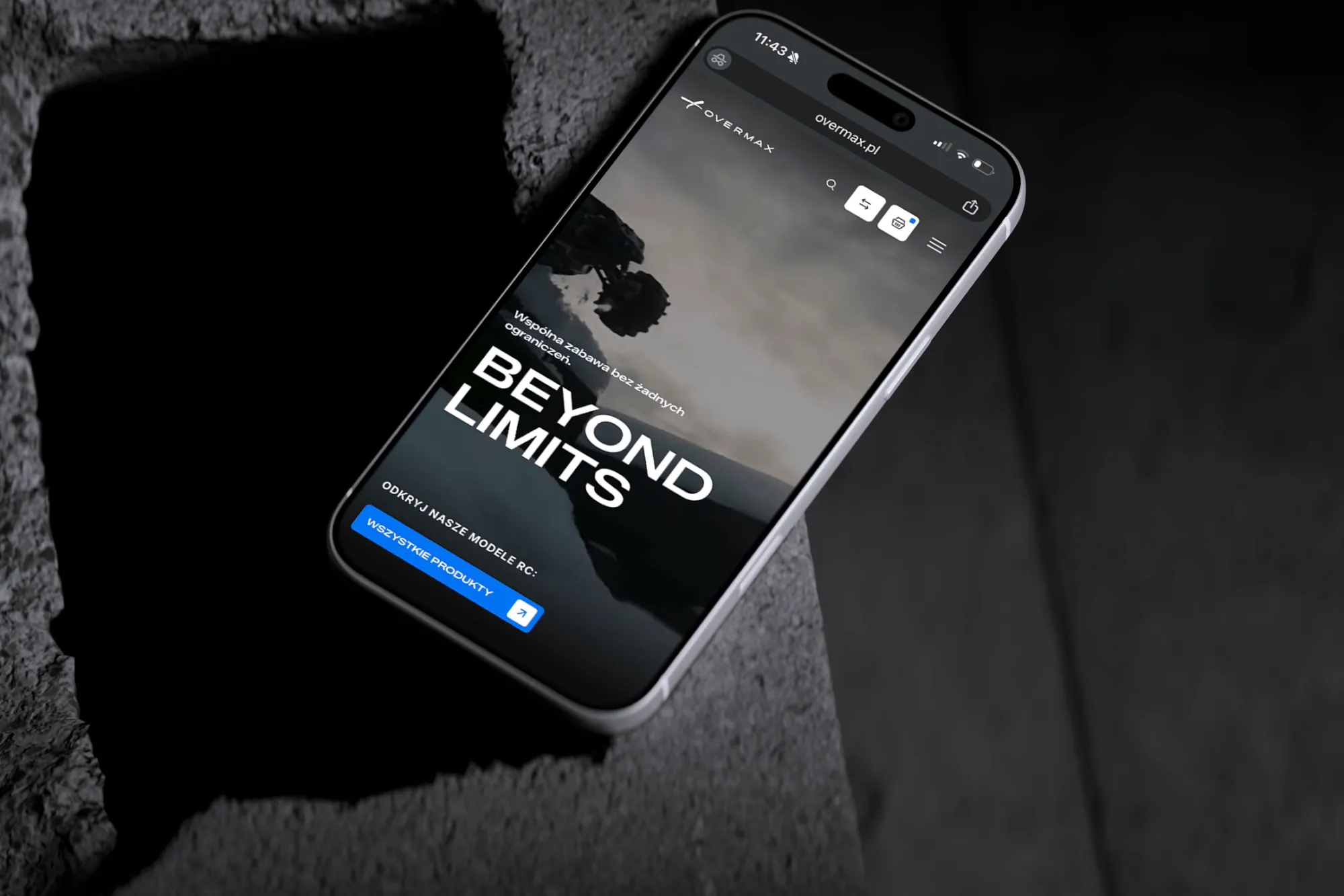 Overmax
UX/UI design for the Overmax shop: RC cars in cinematic shots, a carefully worked-out product page, a category menu and a quiz that picks a model for you.
-
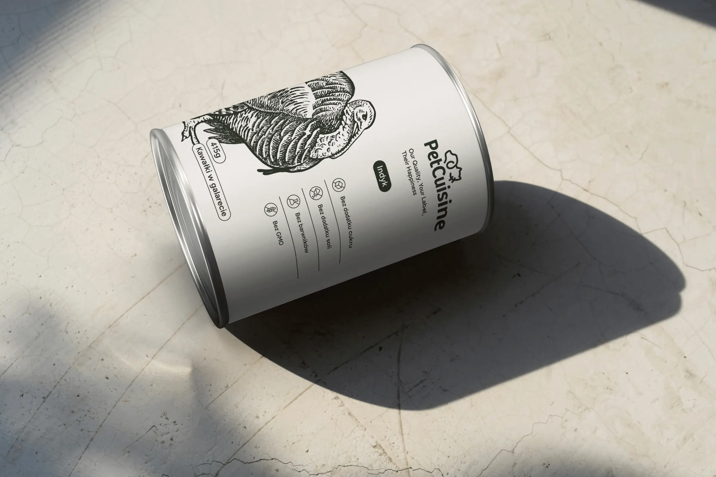 PetCuisine
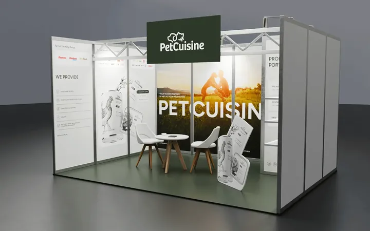
We built a brand from scratch for a pet food manufacturer in the Dawtona Group: from the name and tagline, through packaging in 12 flavours and the website, to trade fair stands across Europe.
-
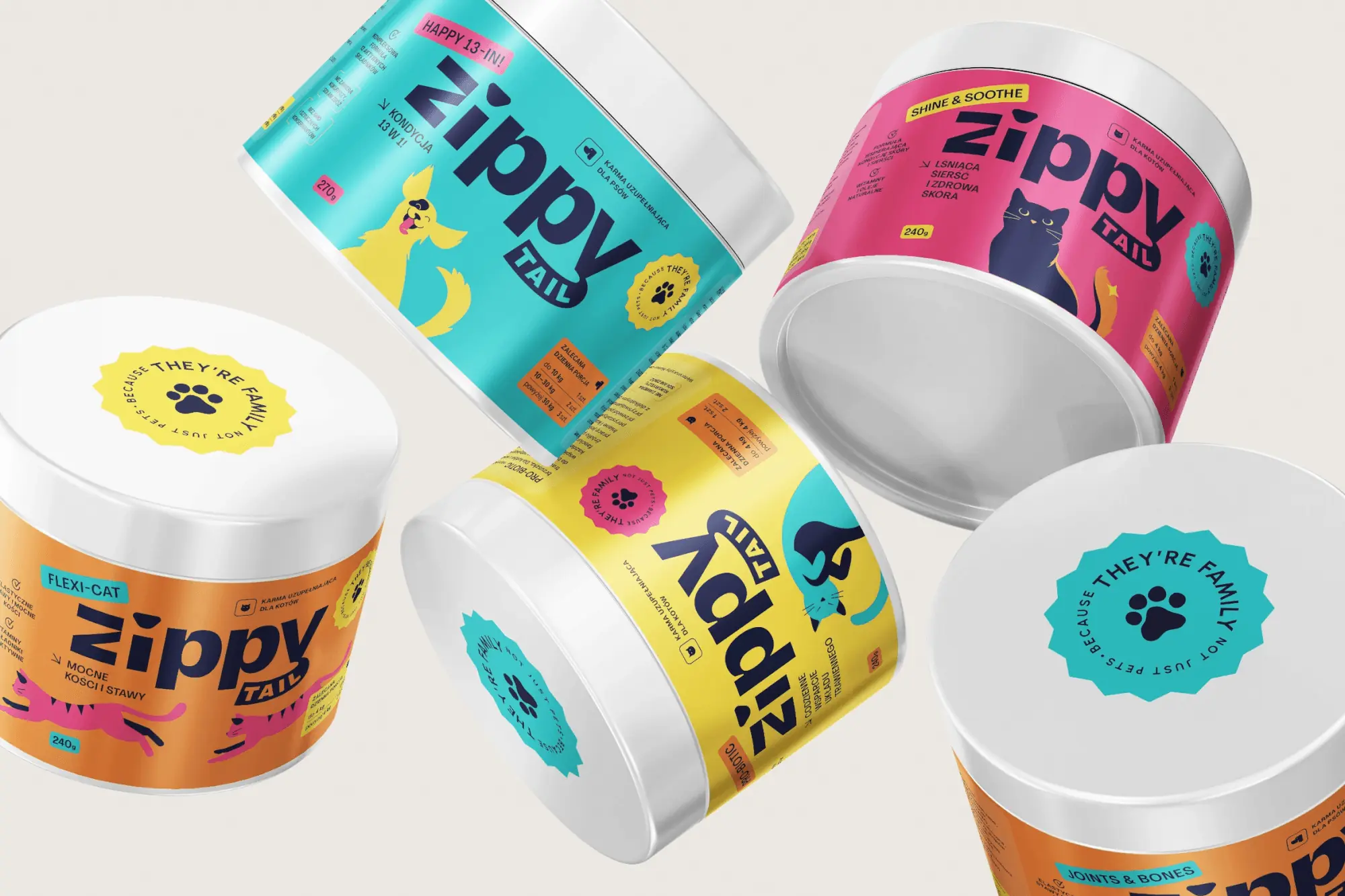 Zippy Tail
We built the Zippy Tail brand from scratch: the name, strategy, labels for eight supplements for dogs and cats, the shipping box and the shop design.
-
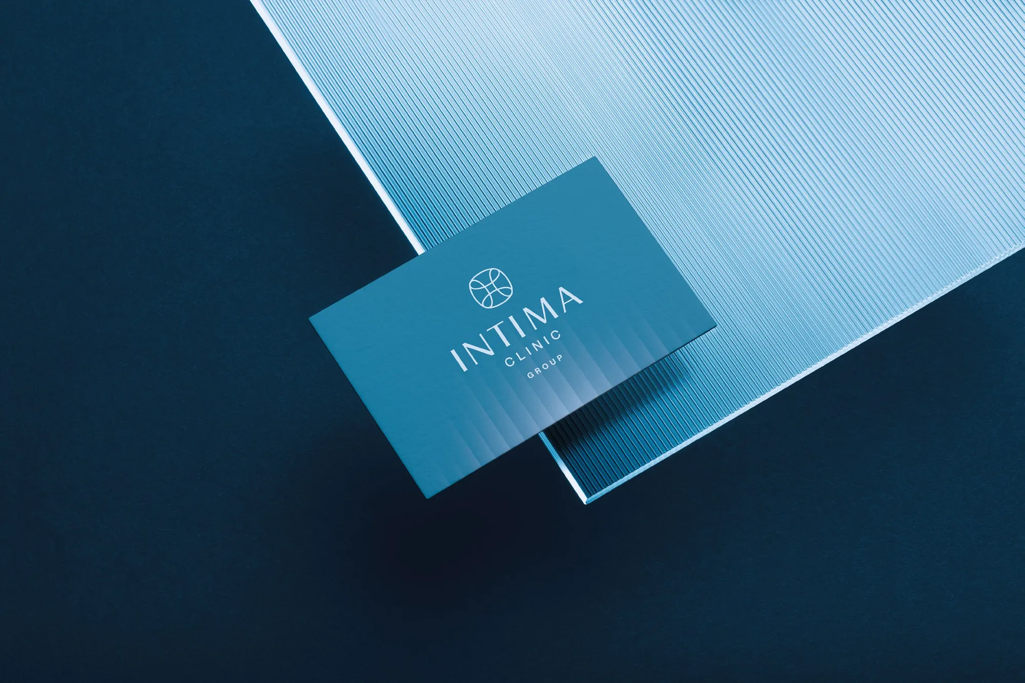 Intima Clinic
Six medical brands in one group. Workshops, names, identity, clinic signage, print, animations and the intimaclinic.pl website.
-
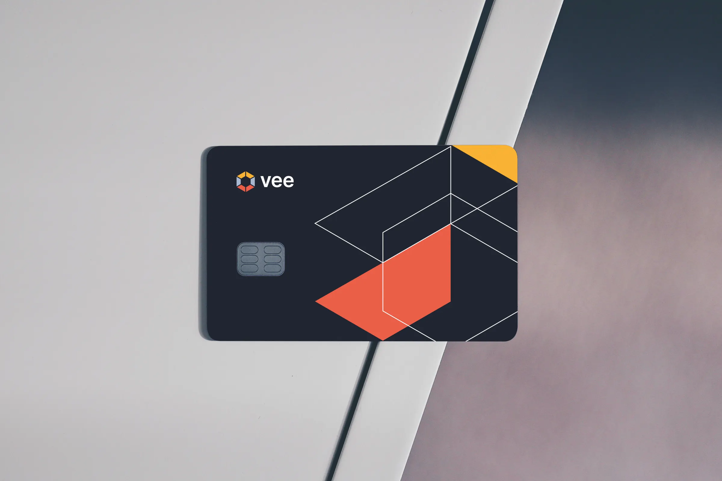 Vee
We designed the Vee brand with its sub-brands, the vee.ai website, web applications and trade fair materials, and for myvee, the identity and a store.
Facing a similar challenge?
Tell us what you want to change. In a first, no-obligation call we will see whether and how we can help.