






PetCuisine · Grupa Dawtona
Our quality, your label
Our quality,your label,their happiness
We built a brand from scratch for a pet food manufacturer in Grupa Dawtona: from the name and slogan, through packaging in 12 flavours and the website, to trade fair stands across Europe.
Take the label offClient
A brand that works in the background
PetCuisine is Grupa Dawtona's sixth production plant, in Płock, Poland, with brand-new machinery. It doesn't sell pet food under its own name. It makes it for other companies on a private and white label model: it develops the recipe, packs the food the way the partner wants and helps with logistics.
A brand like this is harder to design than a consumer brand. Its audience is a buyer who outsources production under their own label and is looking for a partner they can trust. The brand has to show the portfolio, inspire with sample packaging and sell a service: creating the partner's brand.
We design brands meant to stir emotions, and brands that work in the background. Here the goal was the image of a solid, trusted partner with deep expertise, flexible cooperation and real production capacity, whose attention to detail shows on many levels.
- 12flavours, each with its own colour
- 3types of packaging: tin, alucap and pouch
- 6stands and zones at trade fairs in Europe
- 20+projects for the brand alone
Scope
A brand from the name to the trade fair stand
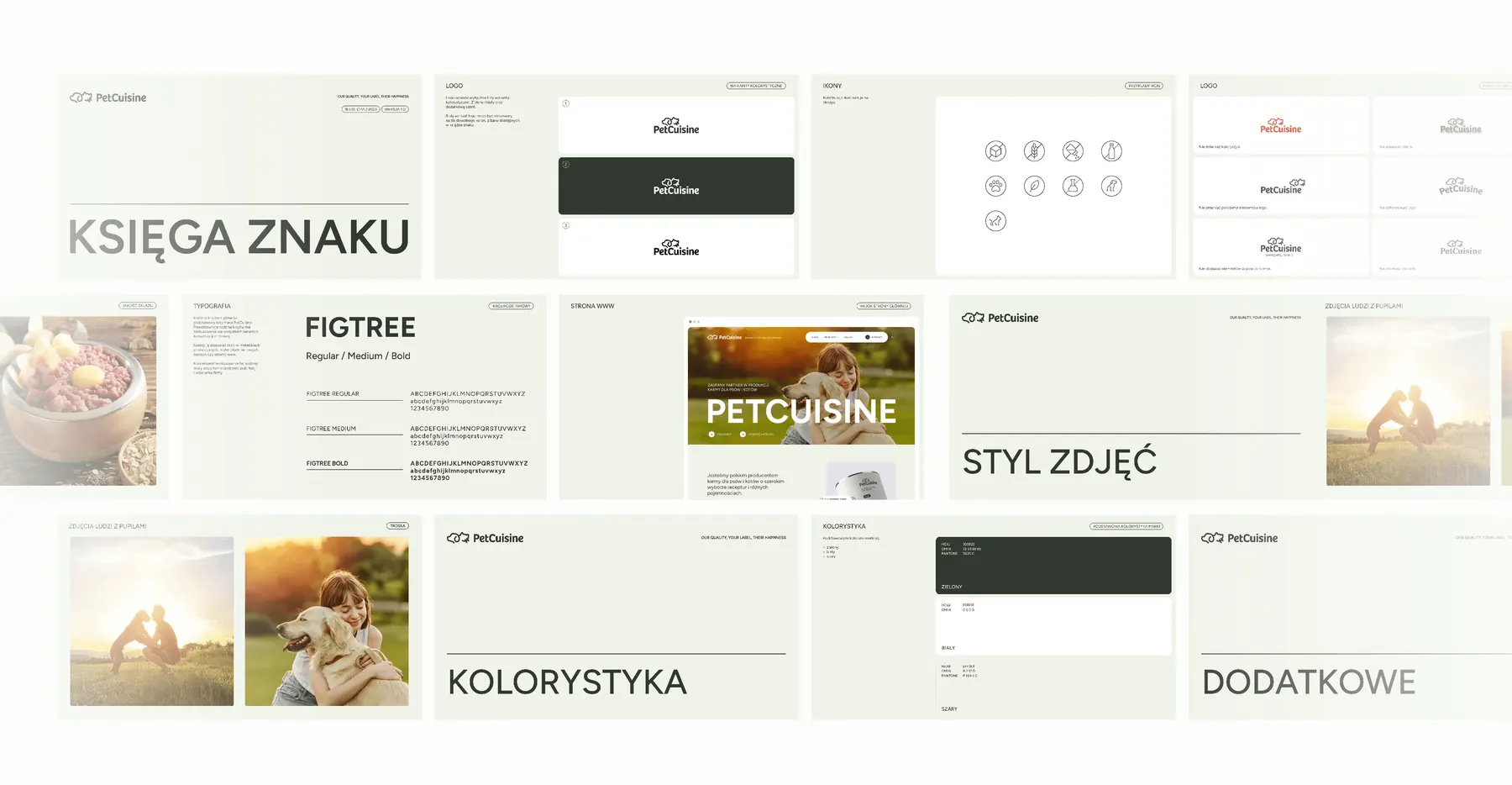
We brought PetCuisine to life from start to finish and got the brand ready for several trade fairs. Most of the work lies in the details: in choosing photos and their colour temperature, in the tone of every message, and in making the presentation, website and stand look like one brand.
- Name PetCuisine, a kitchen for pets
- Slogan Our quality, your label, their happiness
- Tone of voice expert, trustworthy, slightly premium
- Logo and symbol a dog and a cat in one line
- Identity system earth colours, the Figtree typeface, layouts
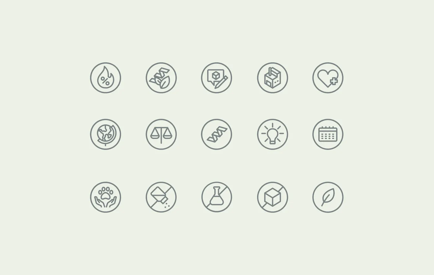
- Iconography line icons based on a circle
- Photo selection natural, sunlit, in one colour temperature
- Brand book brand guidelines on 18 pages
- Offer structure food type, packaging, flavour, recipe
- Packaging three formats in 12 flavours
- Website in Polish and English
- Presentations and catalogue presentation, template, catalogue, one-pager
- Trade fair stands six stands and zones in Europe
- Animations brand animation, reels and screens on the stands
Name and slogan
The name speaks of the kitchen, the slogan of who does what
At the start the brand had a working name with a question mark and logo sketches labelled “Pet food”. We gave it its final shape: PetCuisine, one word with two capital letters, legible even in a small logo.
The name puts the food closer to a meal than to something off a production line. It speaks of cooking and recipes, and PetCuisine prepares a recipe to order for each partner: in its R&D department or from a base of ready recipes. It's in English because from the start the brand was meant to work at trade fairs and in markets across Europe.
- Pet
- companion animalThe dogs and cats the food is made for.
- Cuisine
- kitchenRecipes, ingredients and cooking: what the partner pays for.
A slogan in three parts
The slogan was written in English from the first draft. In three short parts it says who is responsible for what, and sums up the whole private and white label model.
Our quality,your label,their happiness
-
PetCuisine
Our quality
What the manufacturer guarantees
Quality is the manufacturer's job: top-quality meat, eggs and vegetables, with no added preservatives or colourings, and brand-new machinery.
-
Partner
your label
What the partner owns
The label belongs to the partner. PetCuisine makes and packs the food, and the partner sells it under its own brand.
-
Dogs and cats
their happiness
What both are working for
At the end of the chain are the animals. Their happiness is the shared goal of the manufacturer and the partner, which is why the brand photos show people with their pets in the sun.
Earlier versions
Our quality, your label, their delightYour brand, our passion for animal happiness
The version with “happiness” stayed. It's on every stand, in the catalogue, on the one-pager and on the website.
Tone of voice
We set the tone at the start: trustworthy, credible and expert, for the mass market with a slight lean towards premium. That's where the calm earth colours, the simple typeface and the concrete messages about ingredients and capabilities come from.
Packaging
A design that makes room for the partner's brand
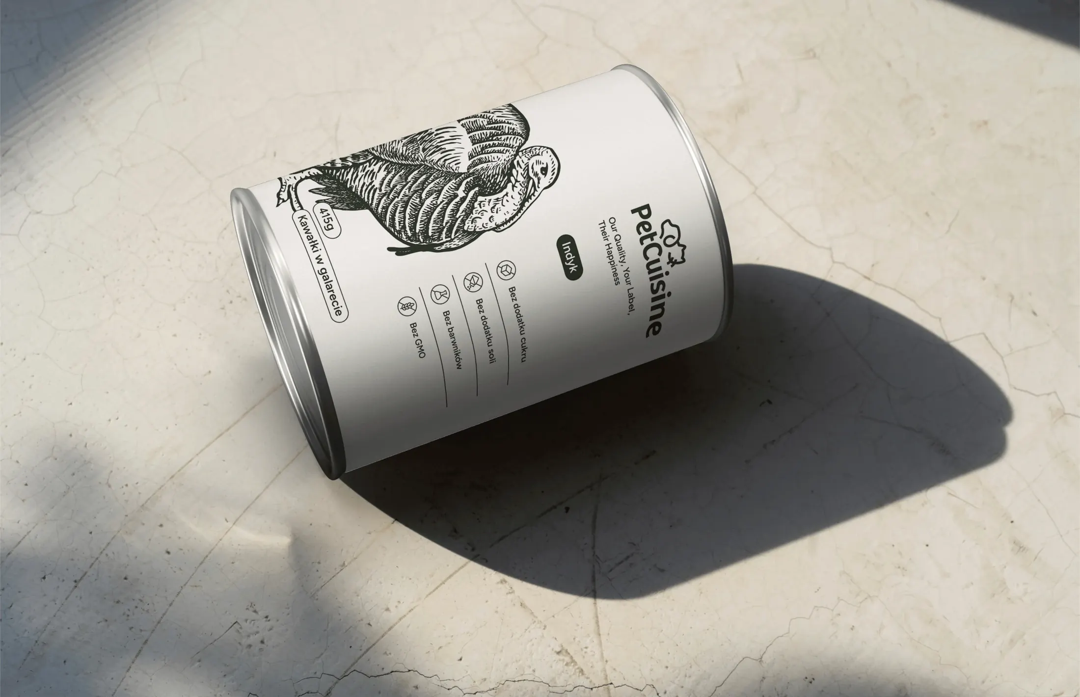
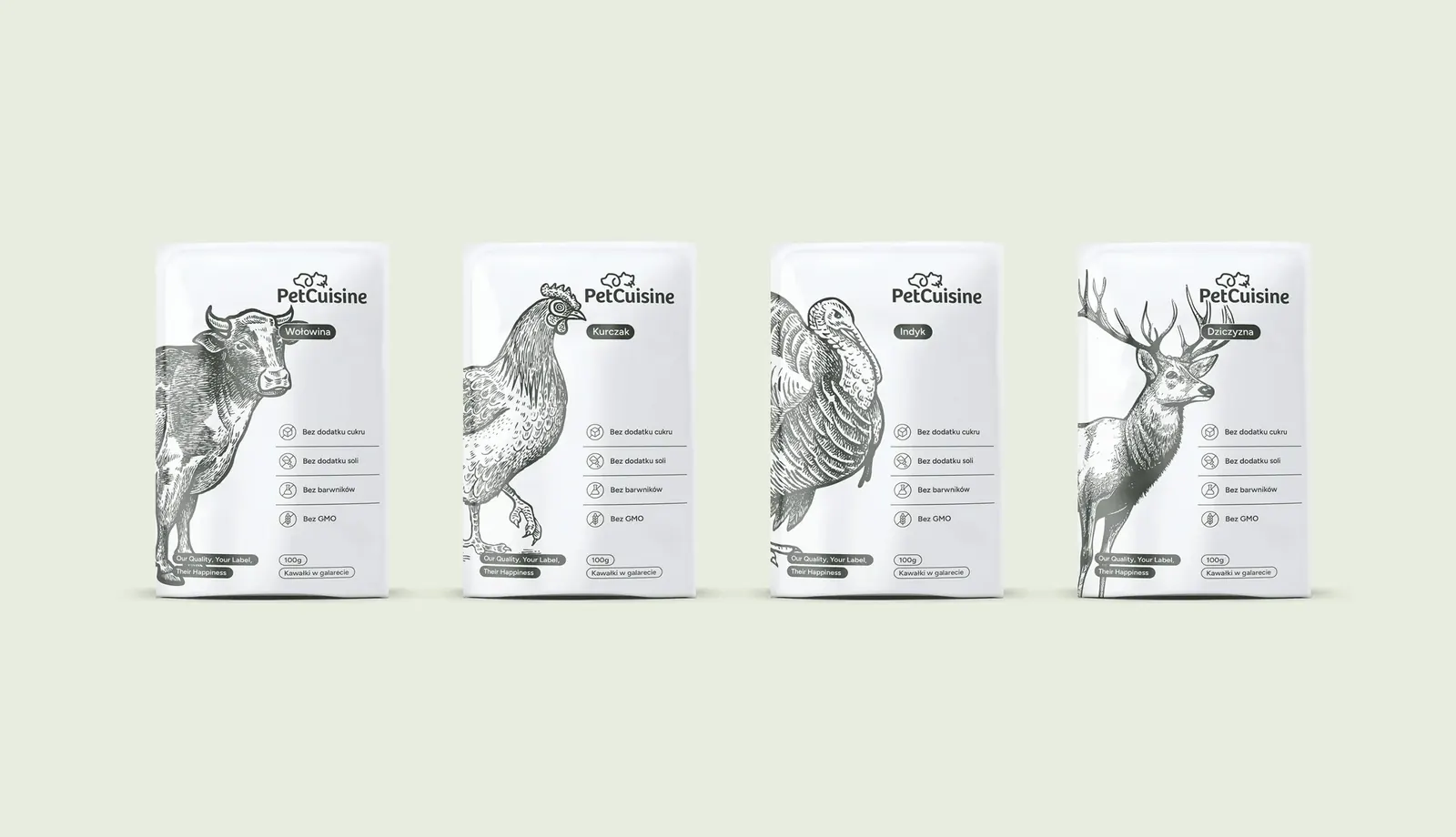
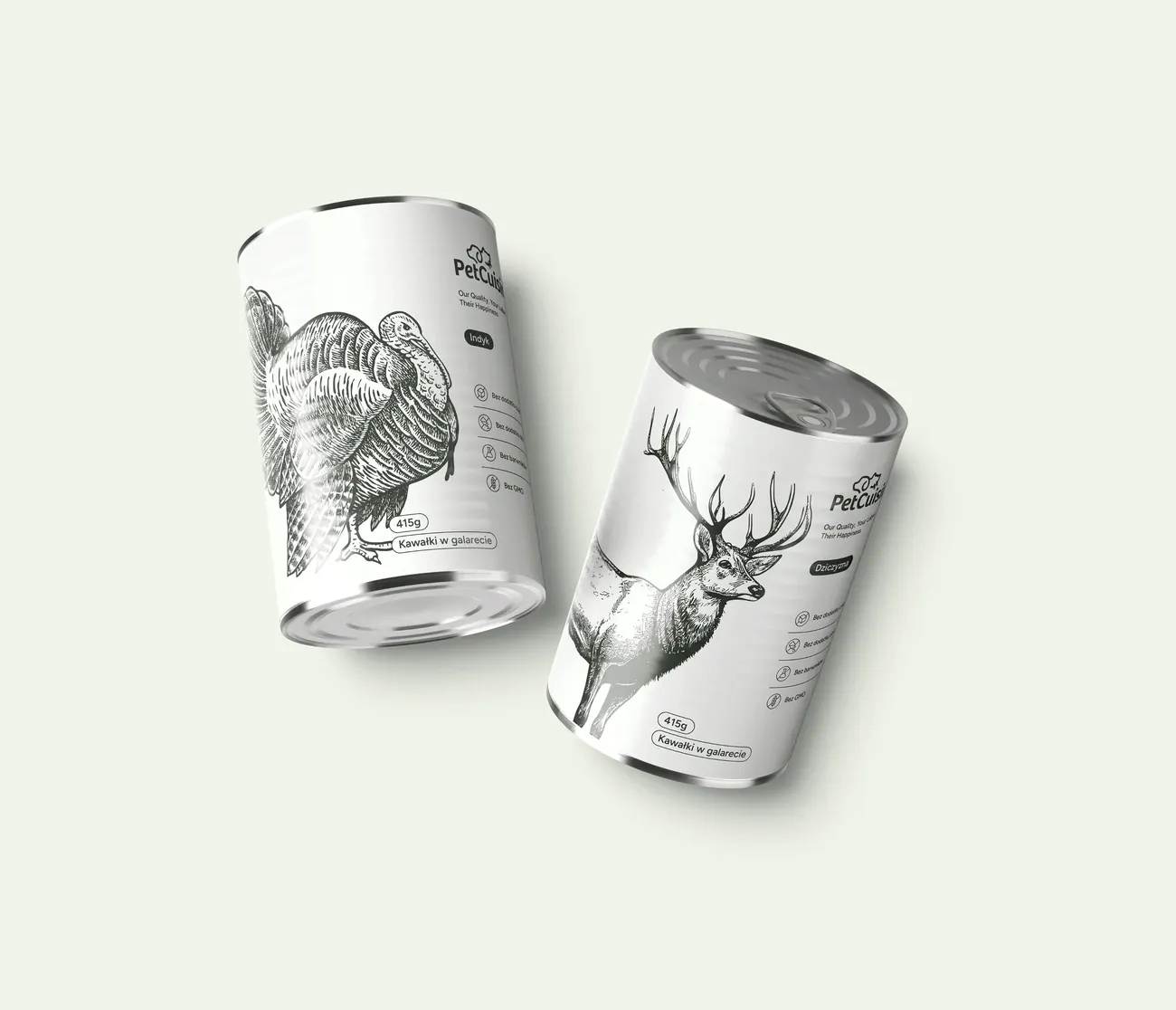
A PetCuisine partner doesn't buy a finished product, but production under its own label. So the brand's packaging works as an appealing placeholder: two lead colours, an animal drawing and subtle typography. It shows quality without taking up the space that belongs to the client.
Each of the 12 flavours has its own accent colour in the brand book, so the variants are easy to tell apart on the packaging, the website and the stand.
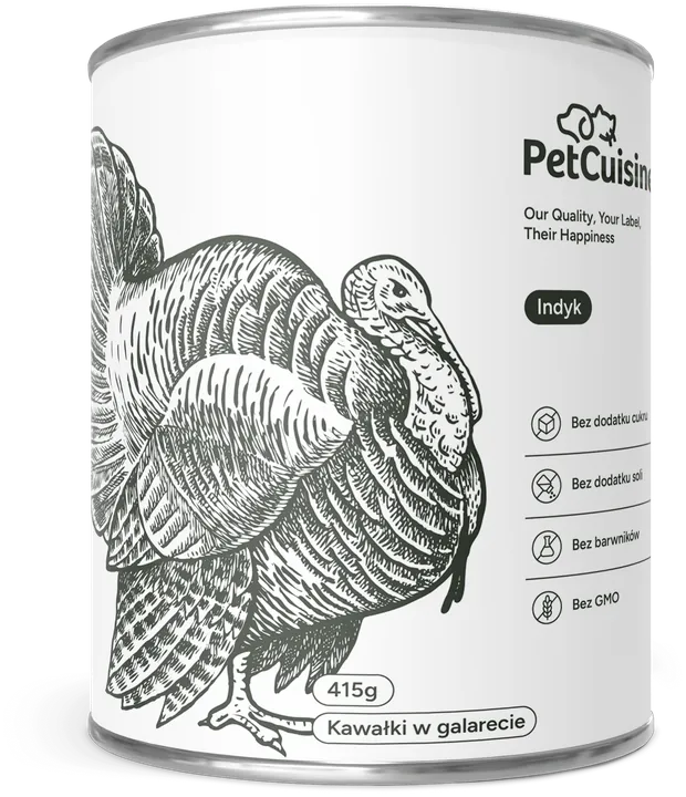
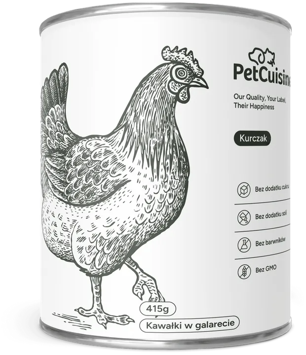
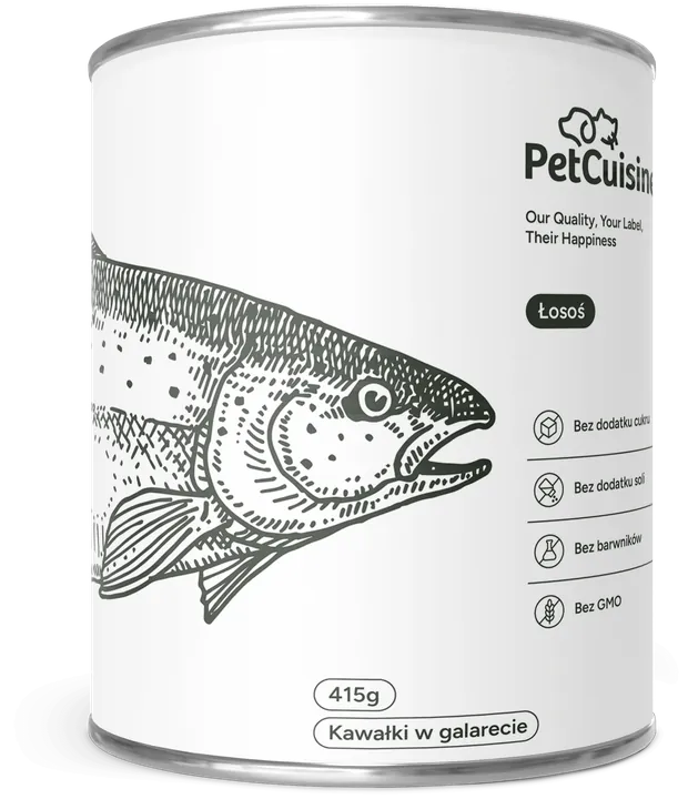
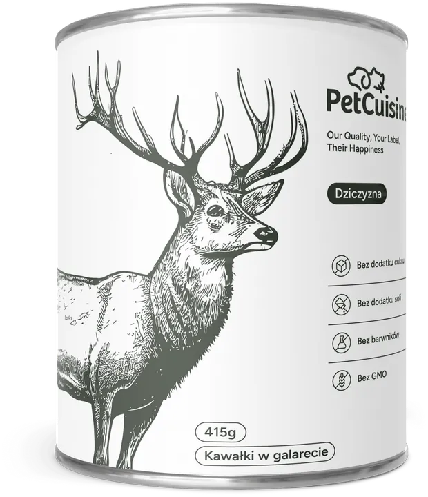
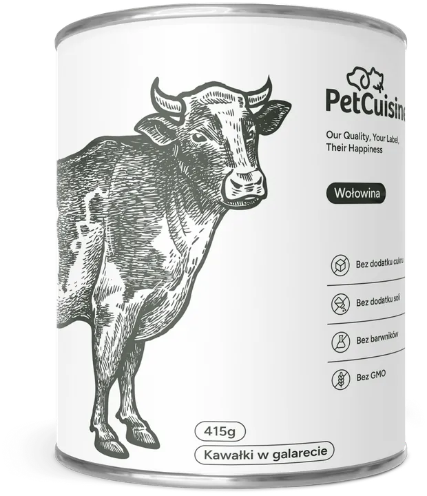
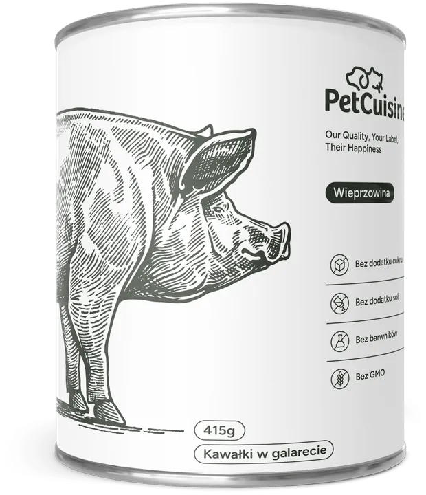
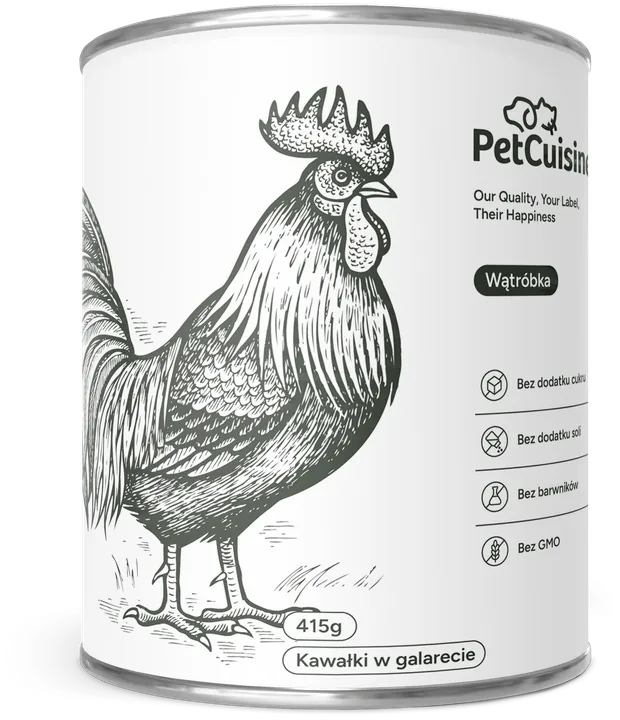
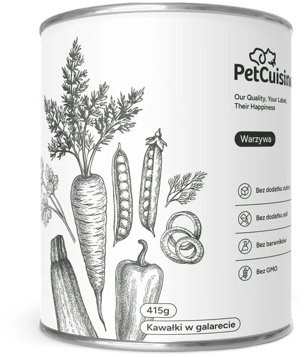
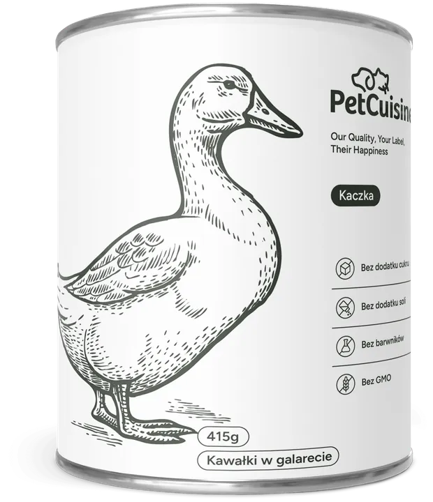
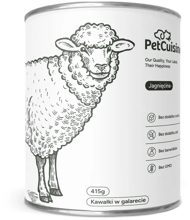
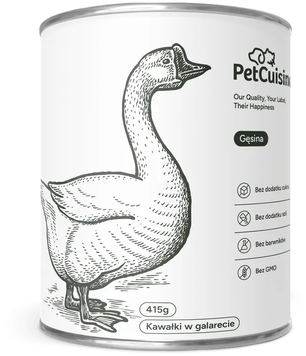
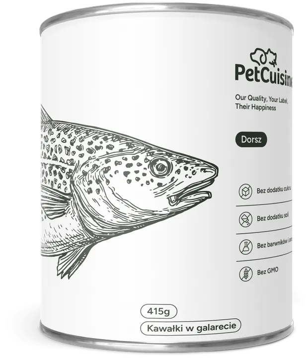


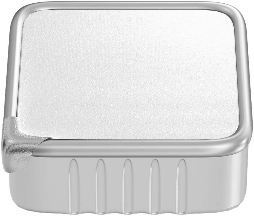
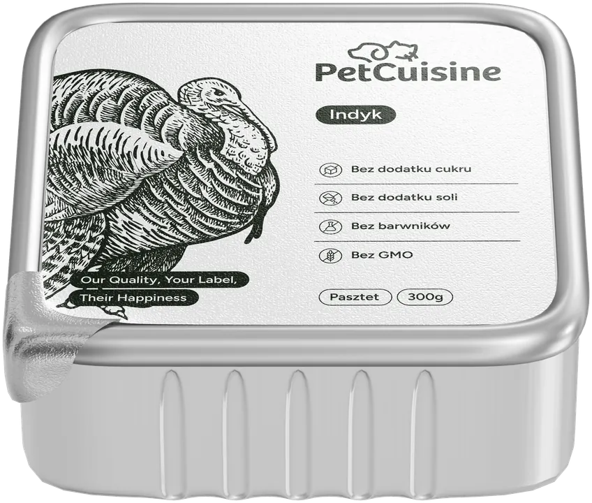
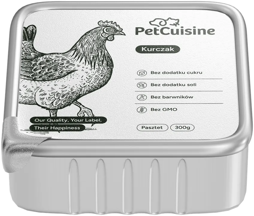
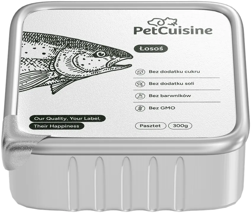
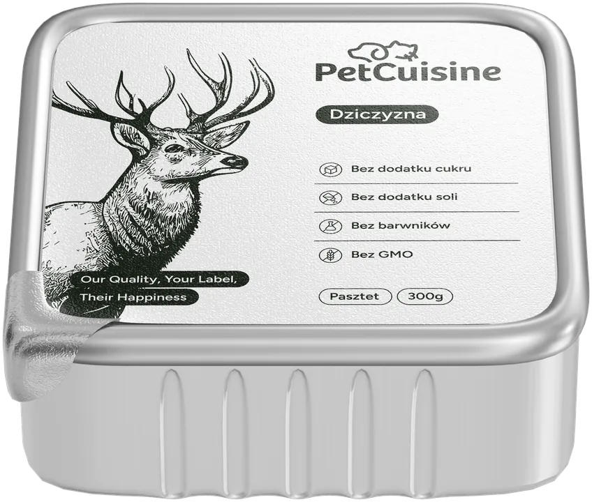
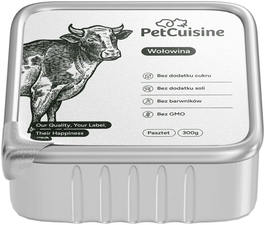
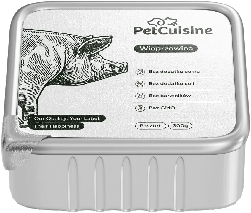
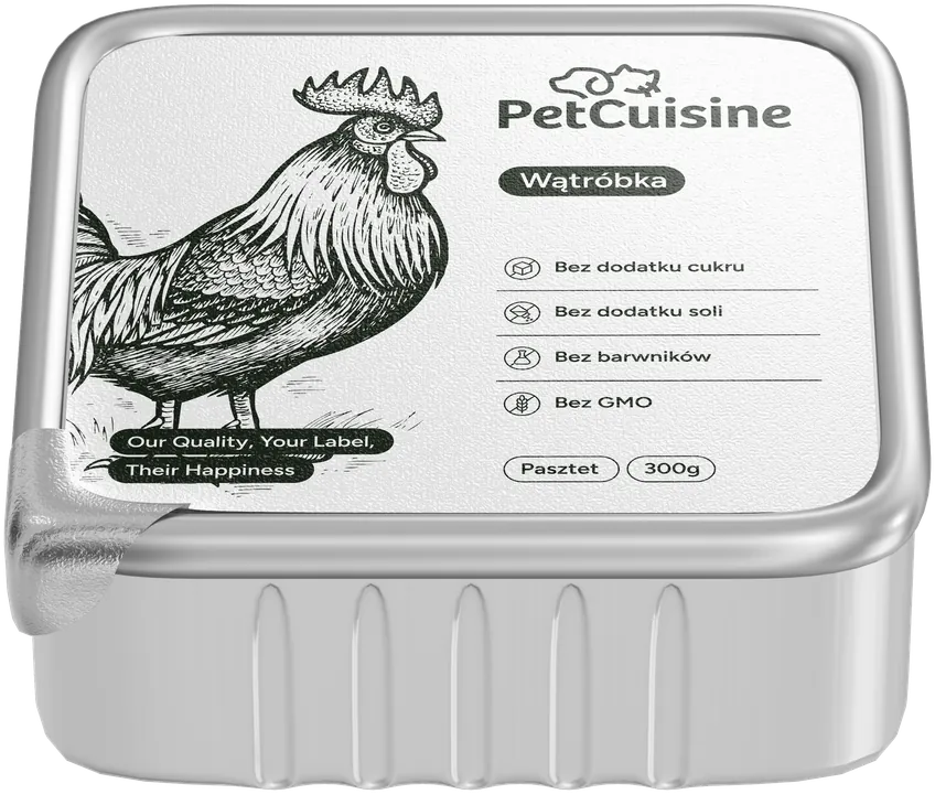
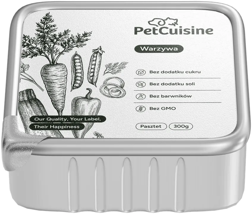
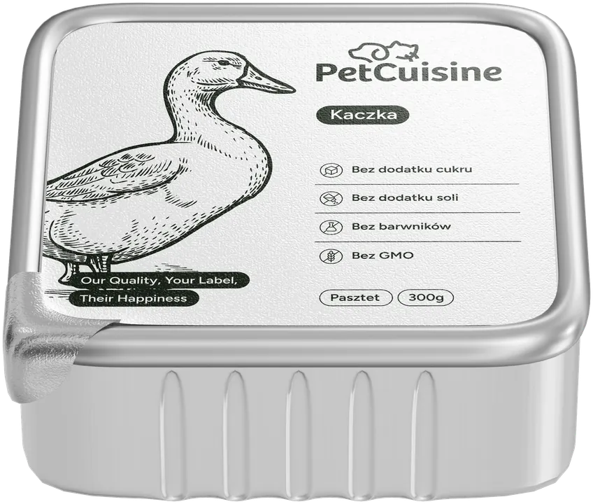
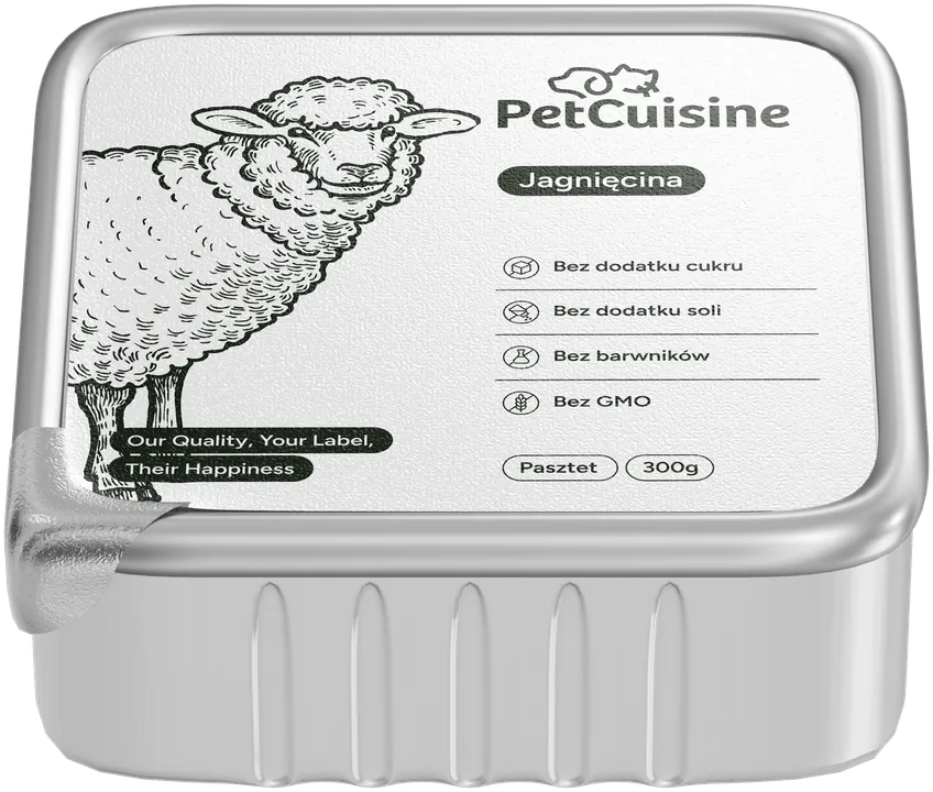
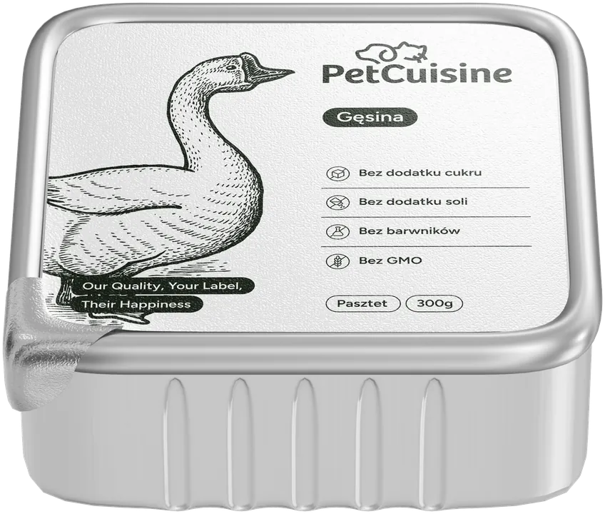
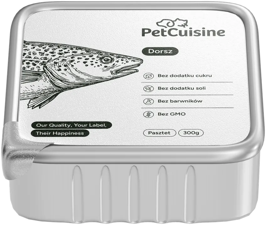
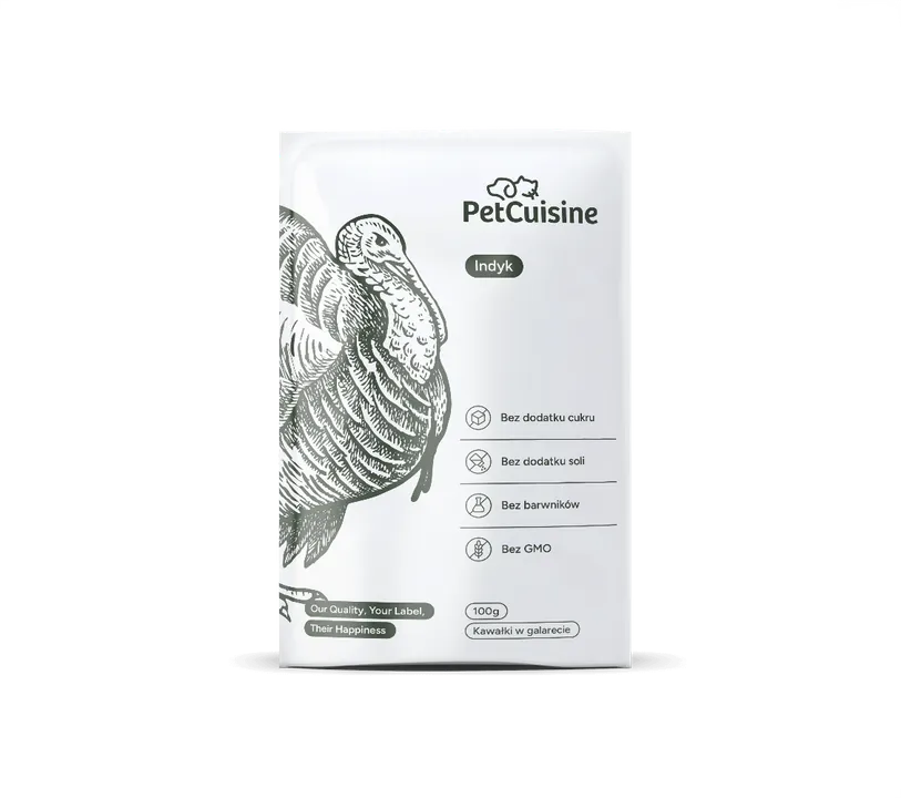
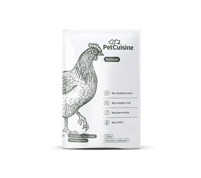
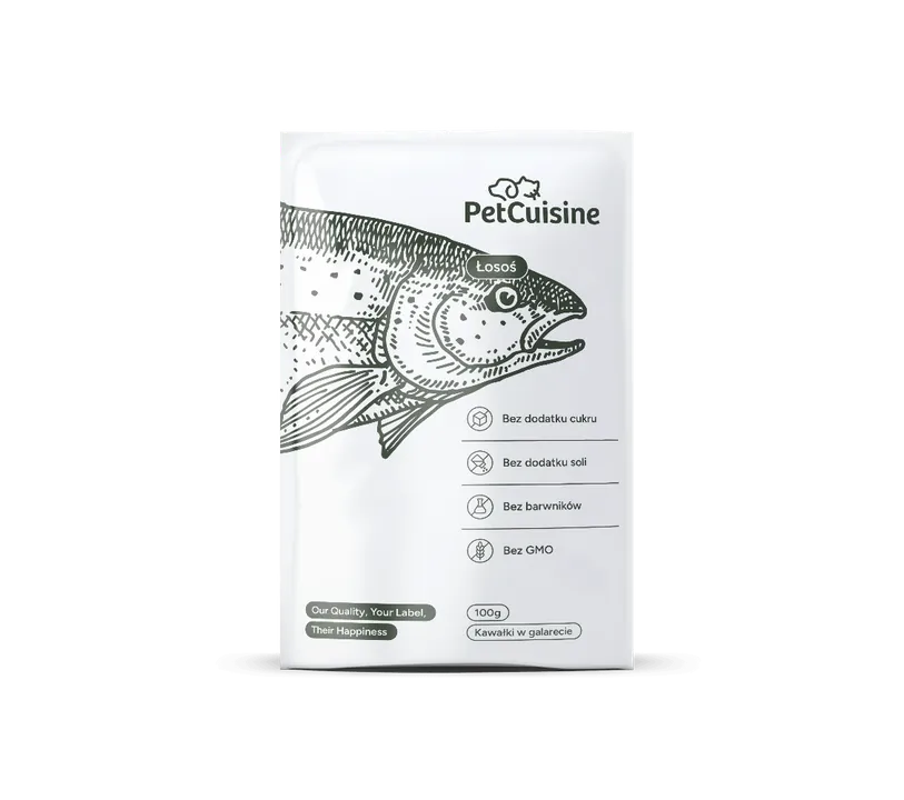
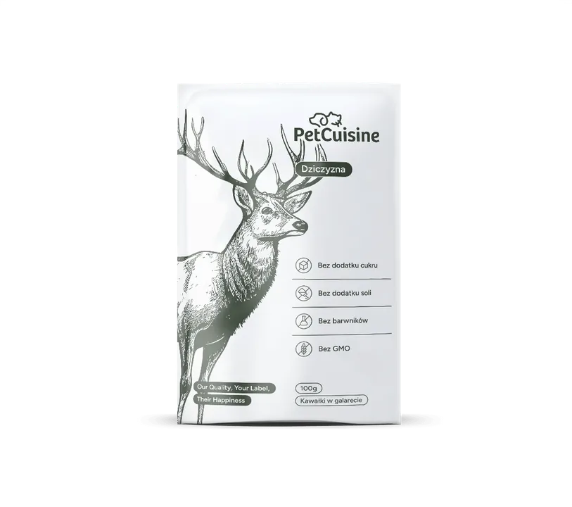
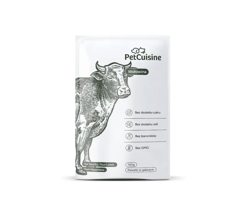
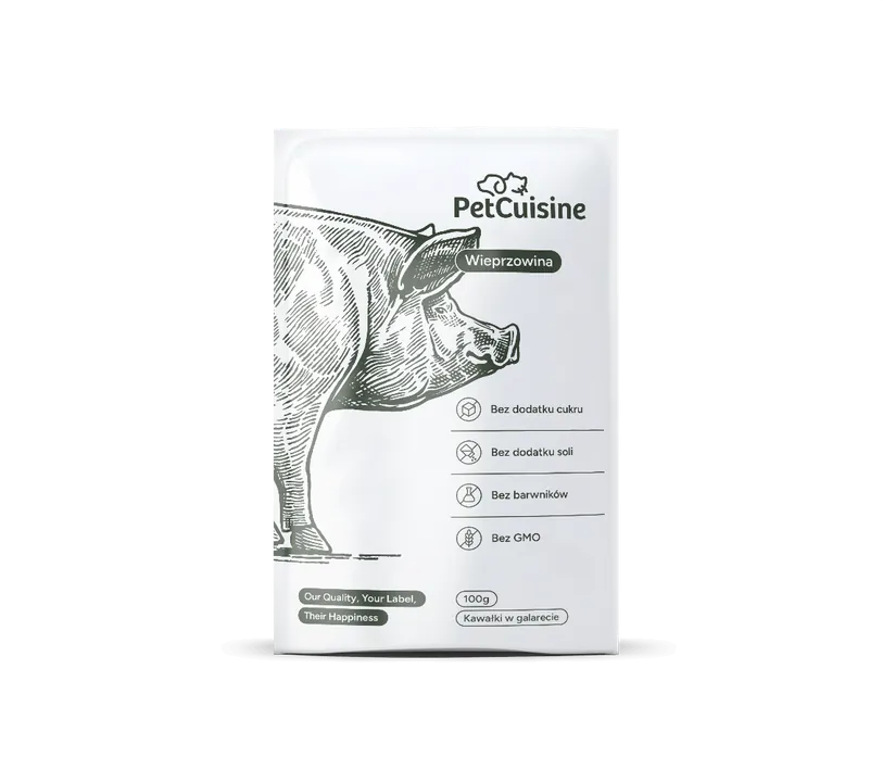
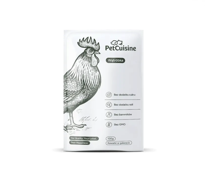
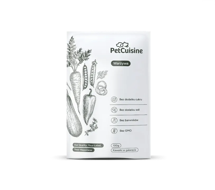
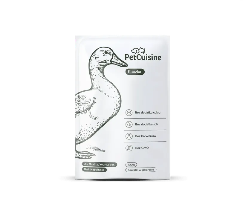
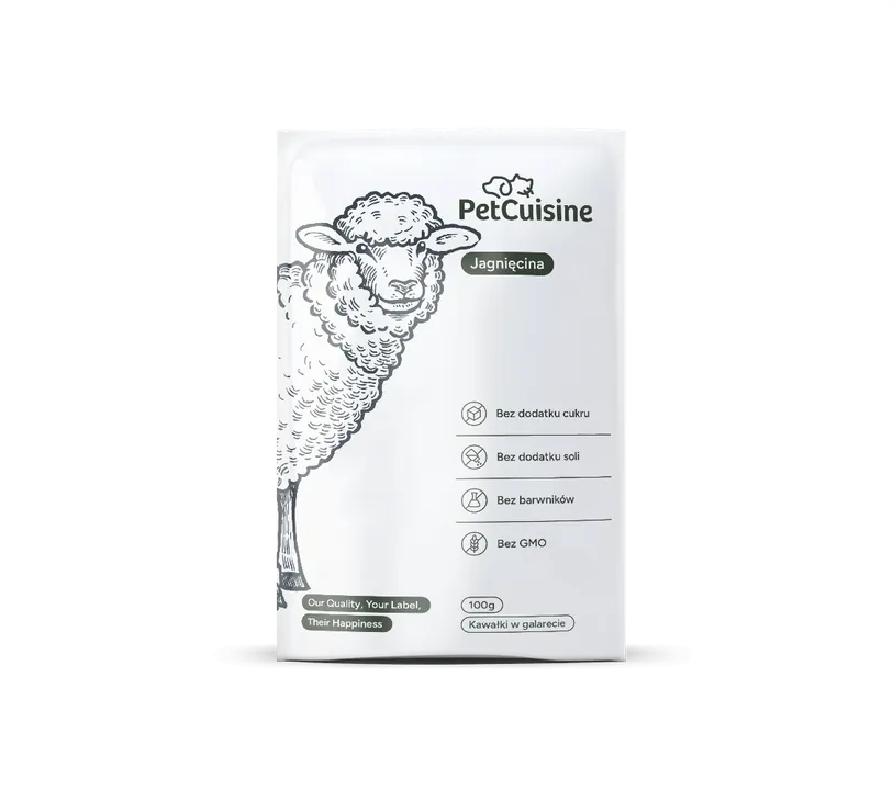
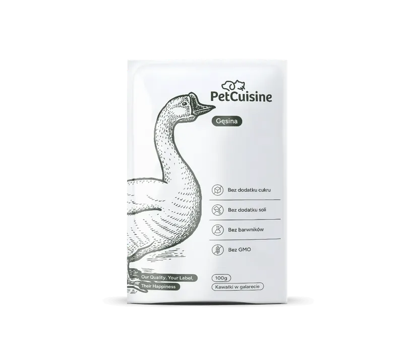
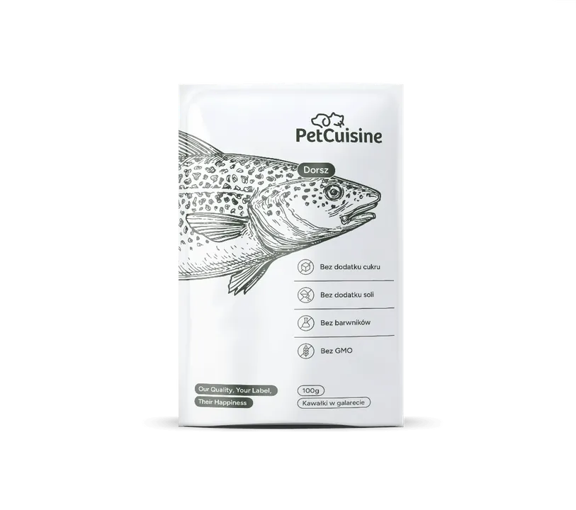
TurkeyChickenSalmonGameBeefPorkLiverVegetablesDuckLambGooseCod Tin · 415 · 850 · 1250 gAlucap · 100 · 150 · 300 gPouch · 85 · 100 · 200 g
The packaging in 12 flavours is our design, from the product configurator on pet-cuisine.pl.
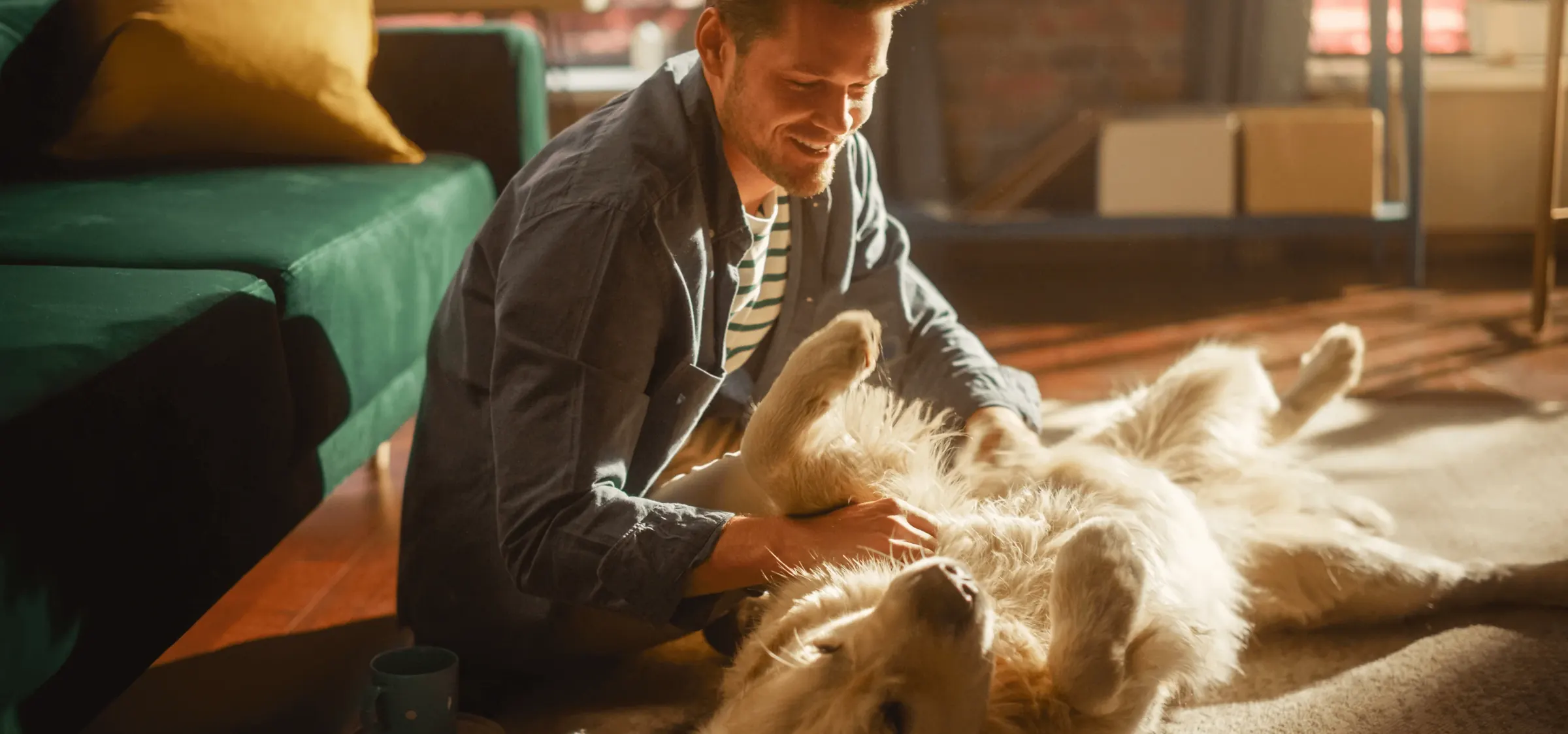 Photo palette
#1e1a12#50341b#7b5b37#a59168#e0d0b3
Before the packaging
A website ready before the first tin existed
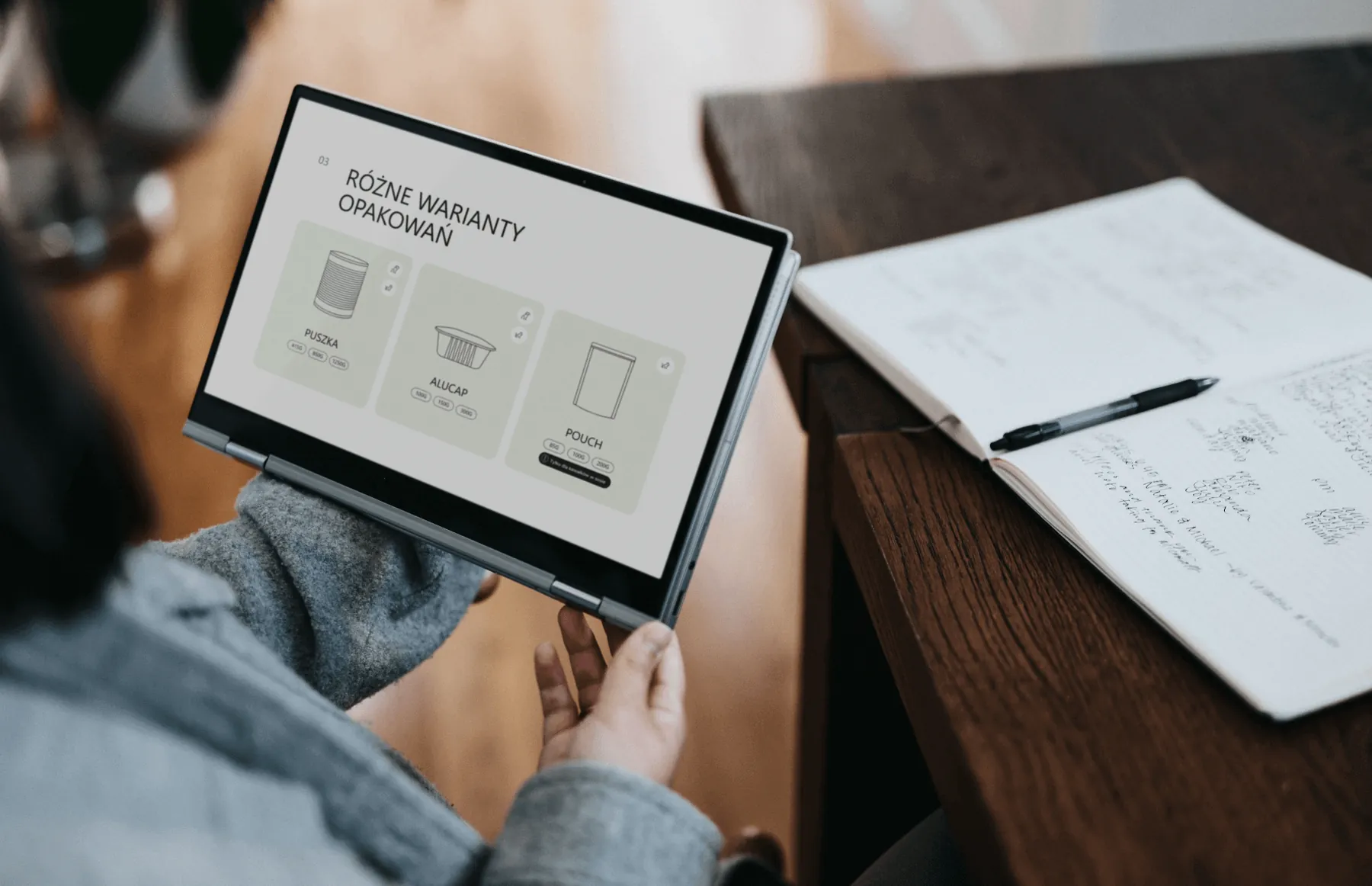
When we started, the brand didn't have its own packaging yet, but the website had to show the products. So we drew the tin, alucap and pouch from photos of real packaging, in a thin line, like the logo. Photos of ingredients instead of a finished product underlined the natural recipe.
Later we moved the client's existing packaging onto the new key visual, in 12 flavours. For the first trade fair we printed samples with English labels in five flavours.
-
Tin
415 · 850 · 1250 g
-
Alucap
100 · 150 · 300 g
-
Pouch
85 · 100 · 200 g
Identity
A dog and a cat in profile, in one line
The symbol is a minimal profile of a dog and a cat joined by one line. In the identity presentation we spelled out its meaning: the dog's face, the cat's face, care for animals and a continuous line, as in a drawing. We started from the client's earlier sketches: we made the lines flow, simplified the details, chose a typeface and planned a short version of the logo right away.
The rest of the system is earth colours: deep green, light grey and white, plus Figtree, a confident sans serif that immediately reads as B2B. Line icons based on a circle complete the descriptions and explain product features.
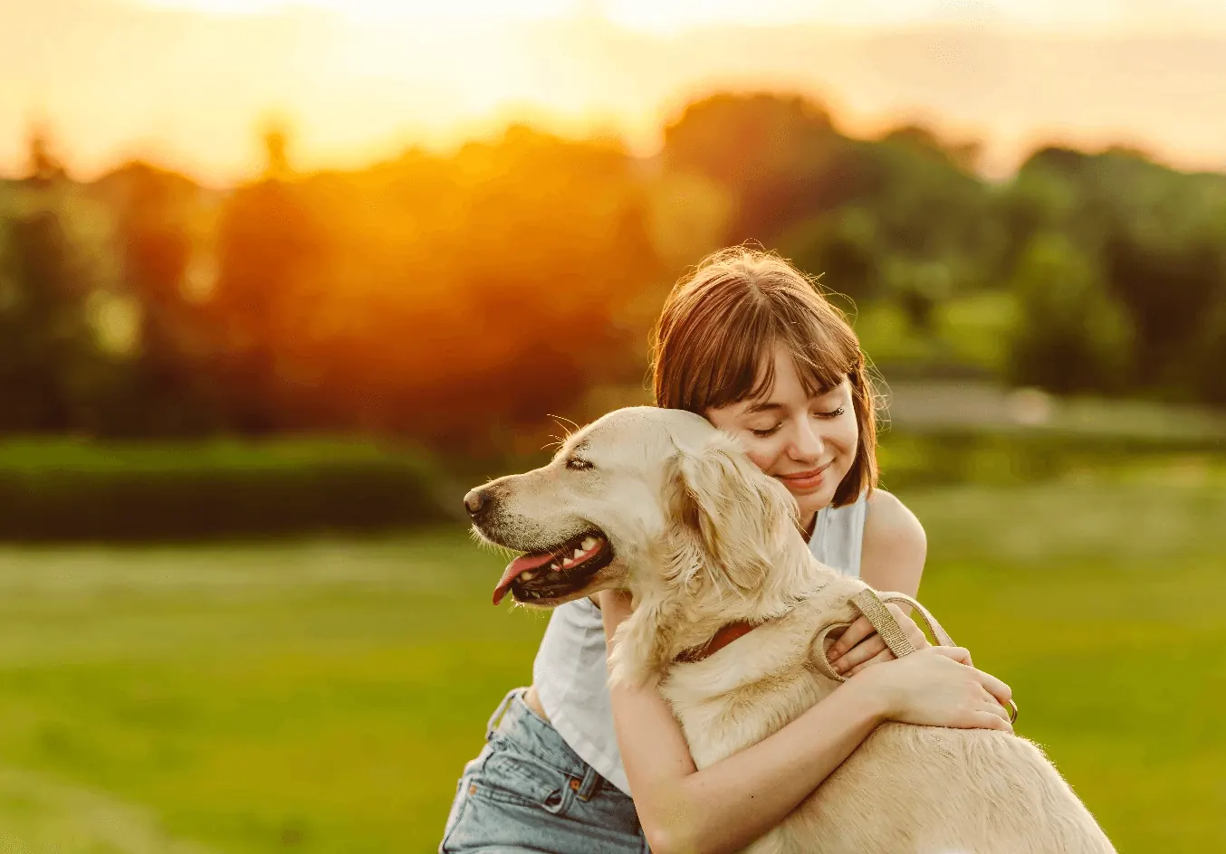
The photos are natural and full of sunshine, in warm tones that match the brand colours. They fall into two categories: care, meaning people with their pets, and the quality of the ingredients.
We chose every photo for the same colour temperature: golden light, beiges, browns and olive green. That way shots from different sources look as if they came from one shoot.
- Green#30382E · Pantone 5605 C
- Grey#EFF3E8 · Pantone P 154-1 C
- White#FFFFFF · background and logo on green
Website
A quote request in a few clicks
The client wanted a simple website where partners choose a product the way they would at an online print shop: click the food type, packaging and flavour, then send an enquiry. That's how the products page came about: food types, customisation options, packaging variants, 12 flavours and outer cartons.
The website is the main point of contact with the brand and the source of knowledge about its services. It has to shorten the path to an enquiry, show the company in a nutshell and spark curiosity, so we went for clarity, easy navigation and an orderly rhythm: modular, simple layouts, clear typography and calm colours.
The website runs in Polish and English, and we look after it.
Offer structure
We organised the offer in four steps, in the order in which a partner chooses a product. The same structure runs through the website, catalogue and presentation.
-
Food type
- Pâté
- Premium pâté
- Chunks in sauce
- Chunks in jelly
-
Packaging
- Tin
- Alucap
- Pouch
-
Flavour
12 flavours: turkey, chicken, salmon, game, beef, pork, liver, vegetables, duck, lamb, goose, cod
-
Recipe
- Made to order
- Single or two-colour chunks
- Grain free and gluten free
- Organic
- No added sugar
- No artificial colourings or flavourings
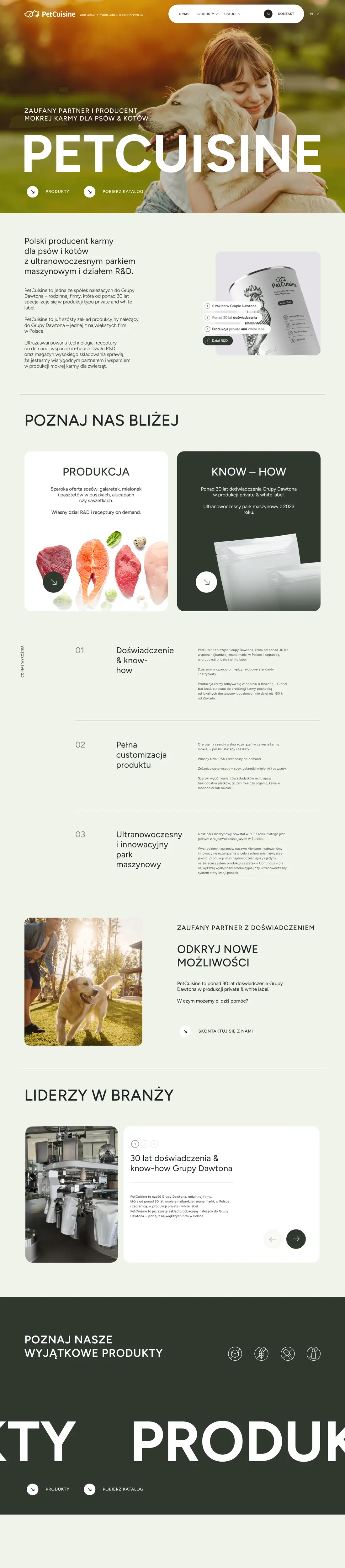
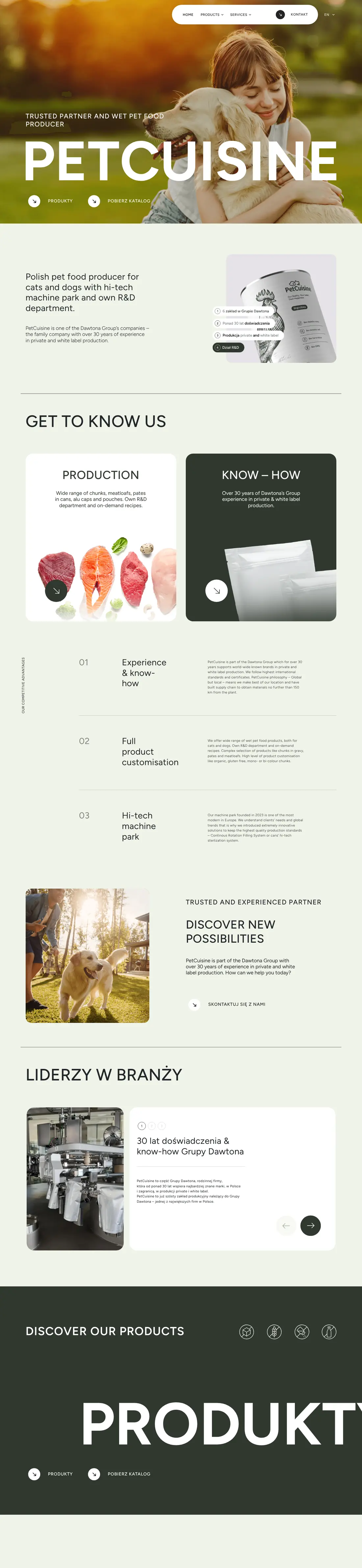

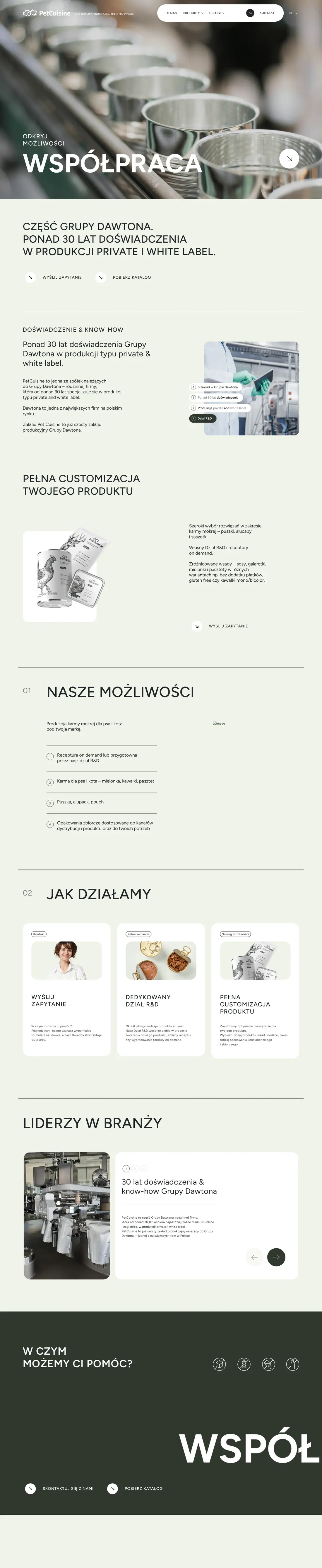

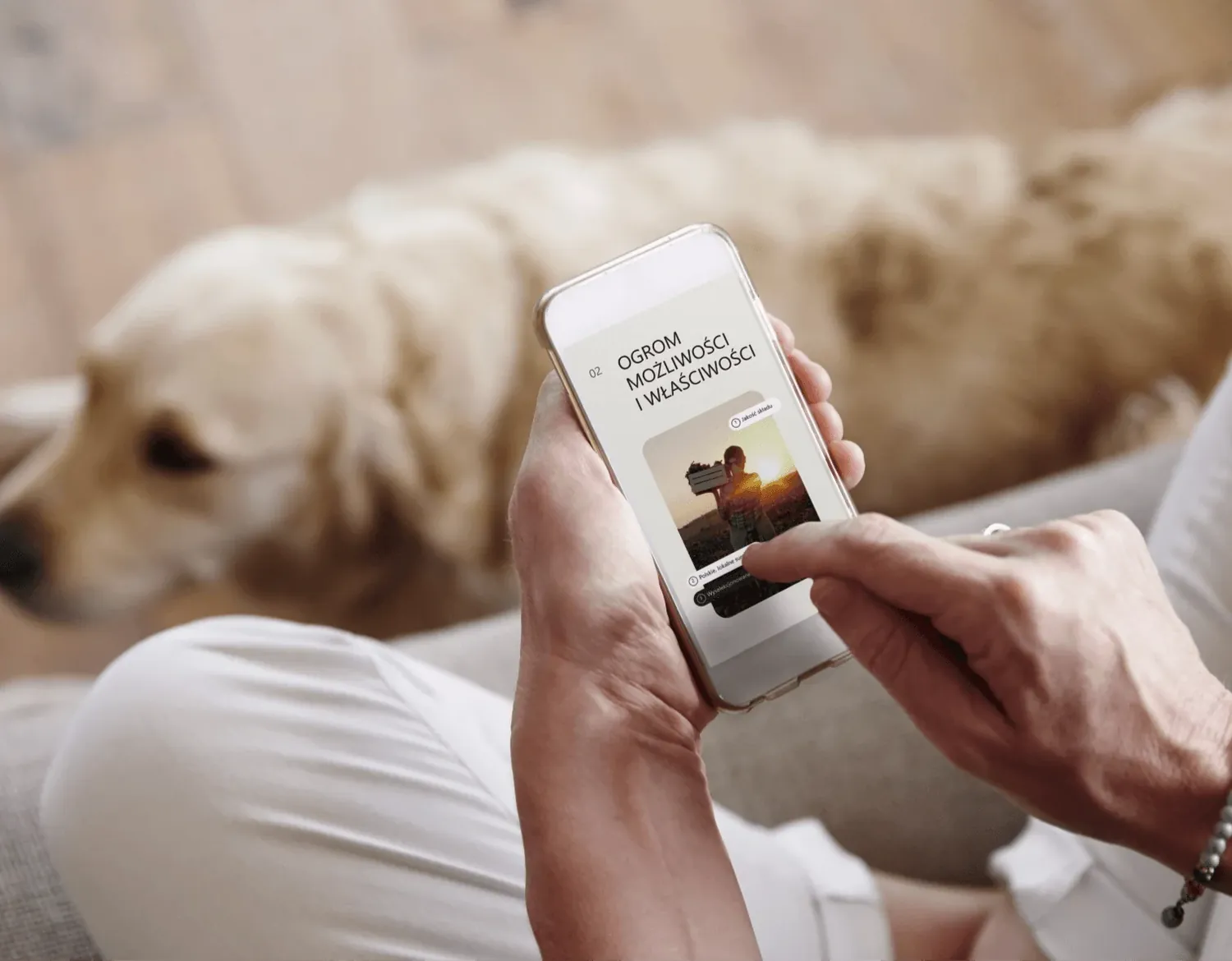
Screenshots of the live pet-cuisine.pl website.
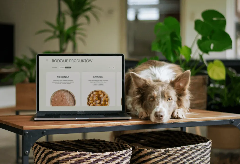
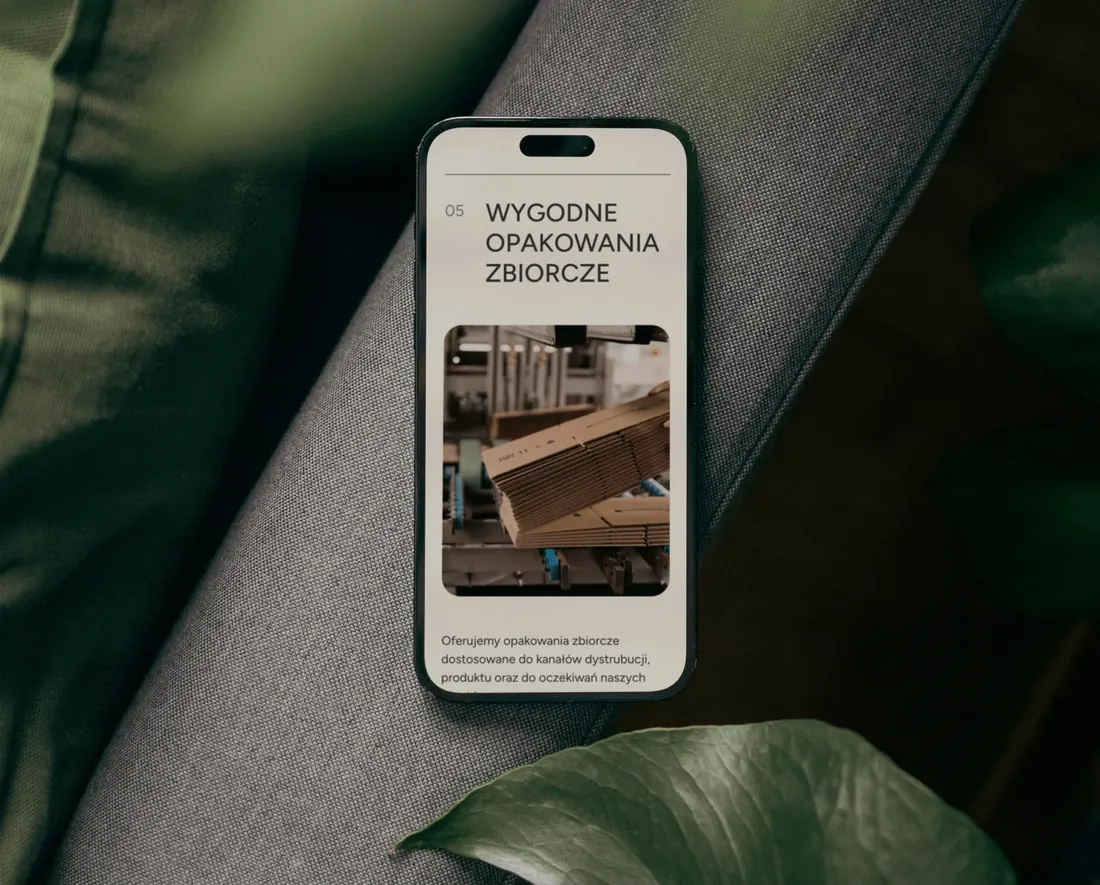
On screen

Trade fairs
One slogan, six stands
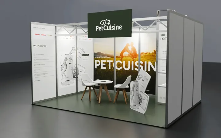
The first stand at Interzoo was the brand's first meeting with partners. Each new stand builds on the previous one, and the slogan “Our quality, your label, their happiness” has stayed on the wall from the start.
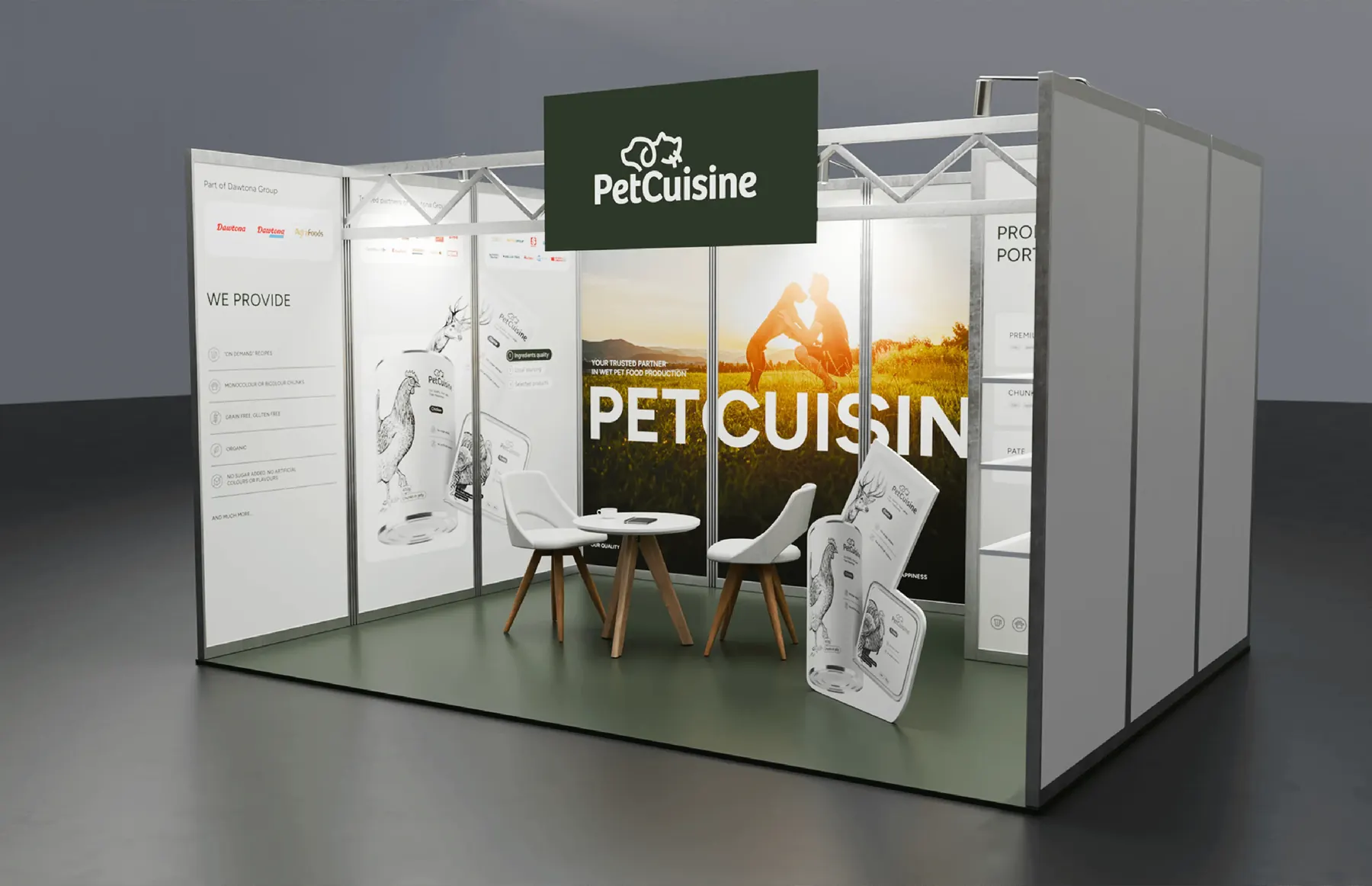
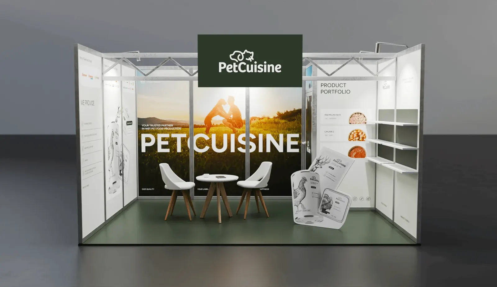
The first PetCuisine stand at Interzoo.
-
Interzoo Nuremberg
The brand's first stand: ten 100 × 250 cm panels, a back room and a shelf with sample packaging. At the next edition we added a map of locations, certificates and a wall of tins.
-
Zoomark Bologna
A refreshed stand in a light version. In the foreground, a private label manufacturer from Poland; on the side wall, the group's partners and a QR code leading to the sales team.
-
PLMA Amsterdam
A PetCuisine zone in bottle green on Dawtona's red stand: animation on the screens, a map of the group's plants and a 2200 × 2400 mm wall.
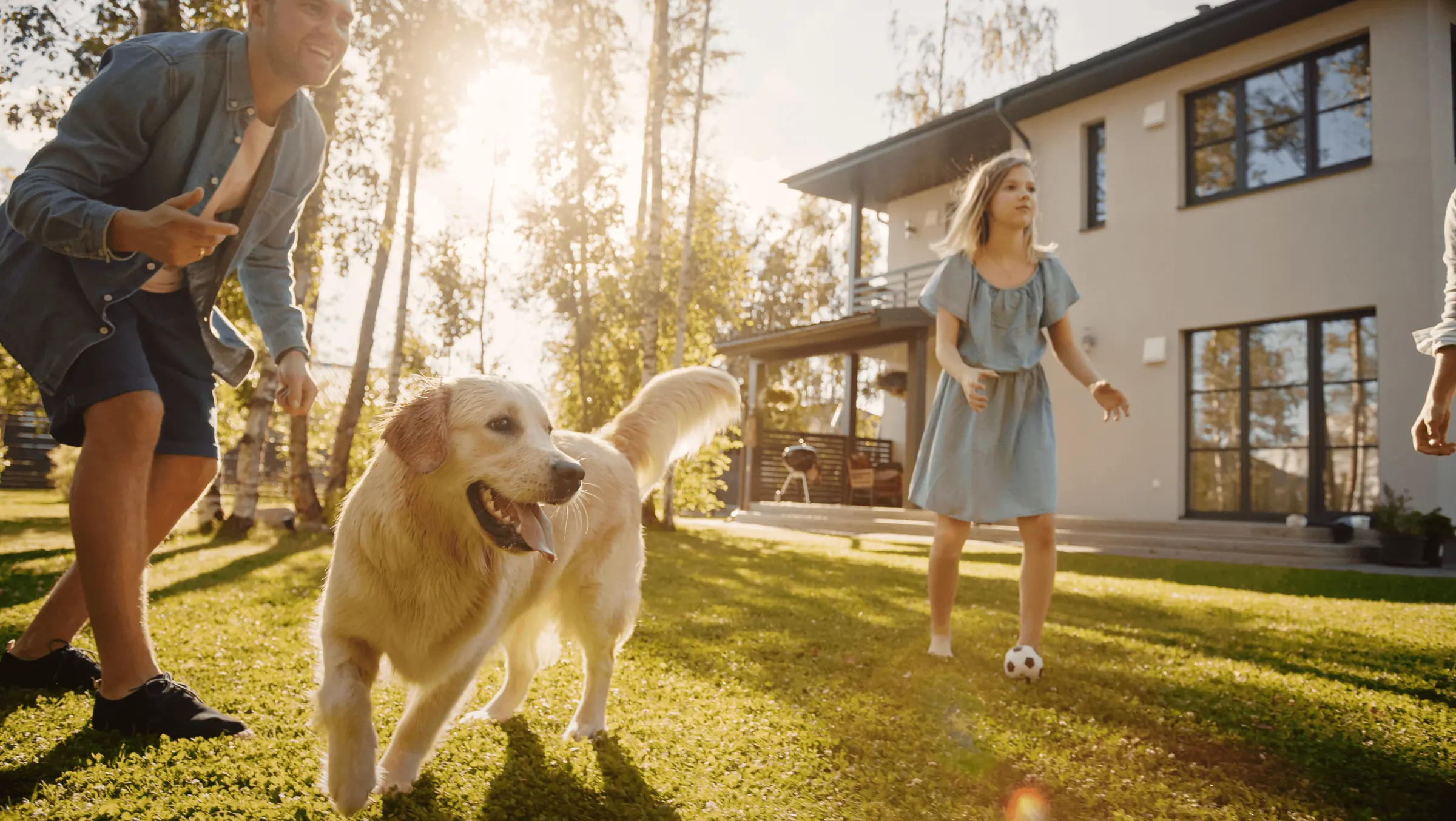 Photo palette
#4d3c23#886f42#ae9768#d7c08e#f2e9df
Materials
Everything for a good start
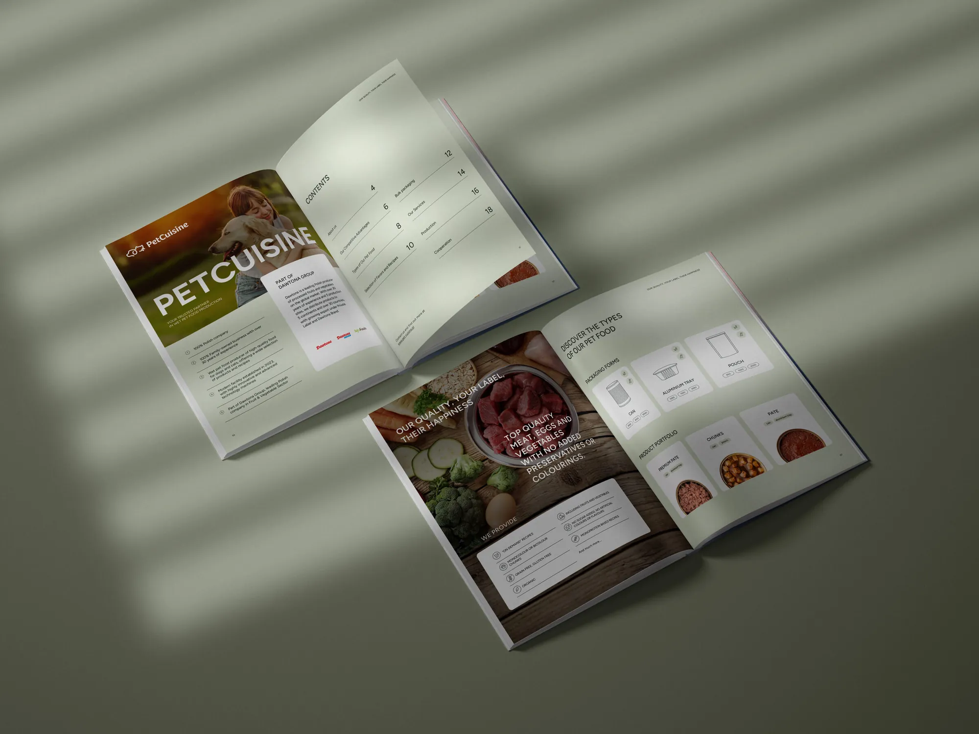
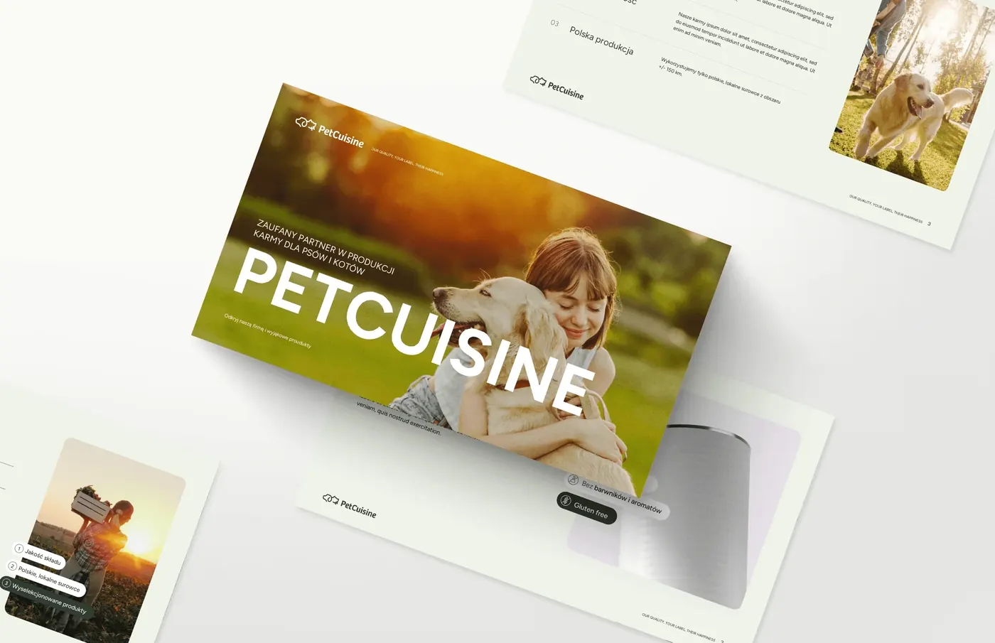
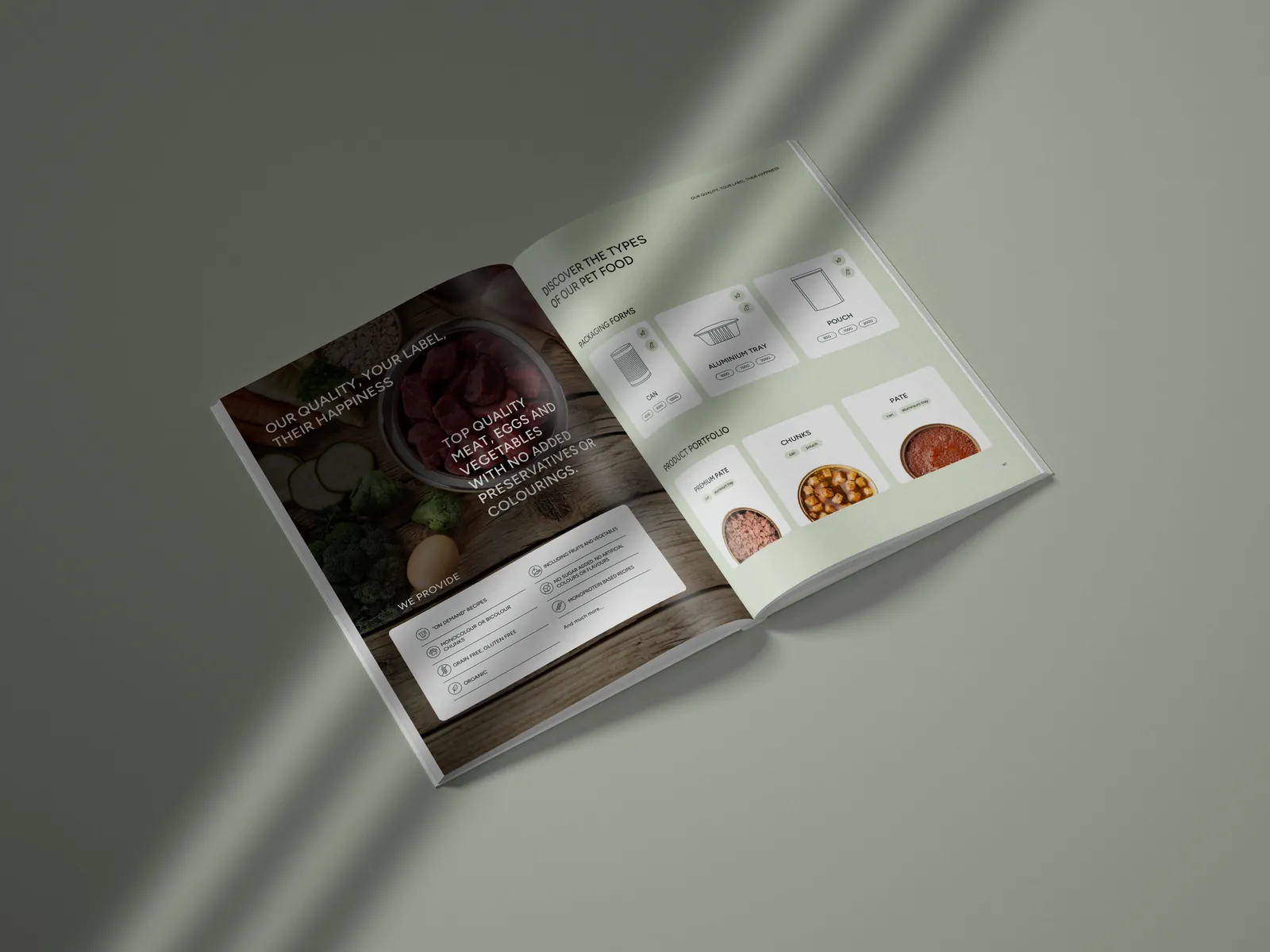
For talks with partners the brand got a company presentation, a presentation template the team fills in itself, a product catalogue, a sales one-pager, social media materials and sample packaging for trade fairs.
The catalogue has 20 pages: about the company, advantages, food types, flavours and recipes, outer cartons, services, production and cooperation. Everything reached the client in a numbered package: open files, previews and ready materials the team uses every day.
The visual identity fully reflects the character of our brand, combining aesthetics with functionality. We received a consistent set of materials that helps us a great deal in our everyday work, both online and offline.
The website prepared for us is intuitive, modern and attractive, and our customers appreciate it.
Grupa Dawtona
One of the brands we've worked with for years
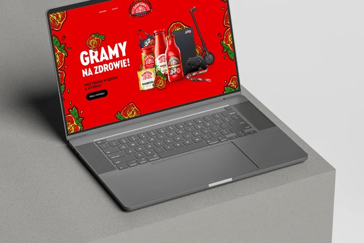
PetCuisine is part of Grupa Dawtona, which we've worked with for years. We've done over 90 projects for the group, including the work for PetCuisine, as well as the dawtona.pl, dawtonafrozen.pl and dawtonahoreca.pl websites, the Moc Pomidora quiz for successive Grand Finales of the Great Orchestra of Christmas Charity (WOŚP), 3D product animations and trade fair stands.
See the Grupa Dawtona project- 90+projects for Grupa Dawtona
- 20+projects for PetCuisine
- 6stands and zones at trade fairs
- 2language versions of the website
- Client
- Pet Cuisine sp. z o.o., part of Grupa Dawtona
- Scope
- Name and tagline · Branding · Logo · Website · Packaging · Catalogue · Trade fairs
- Technologies
- WordPress · Adobe XD
- Online
- pet-cuisine.pl
More projects
-
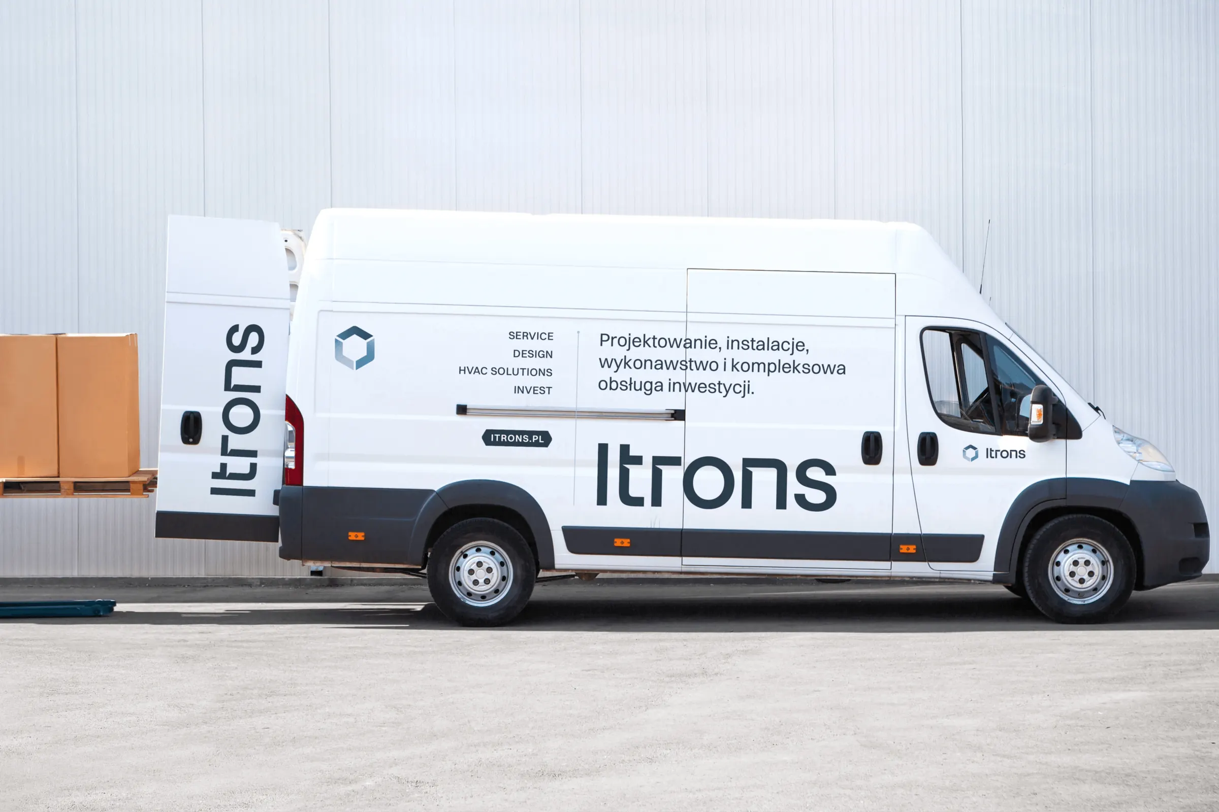 Itrons
A system of five sub-brands built from a single hexagon, a visual identity and the itrons.pl website for an installation company from Kraków.
-
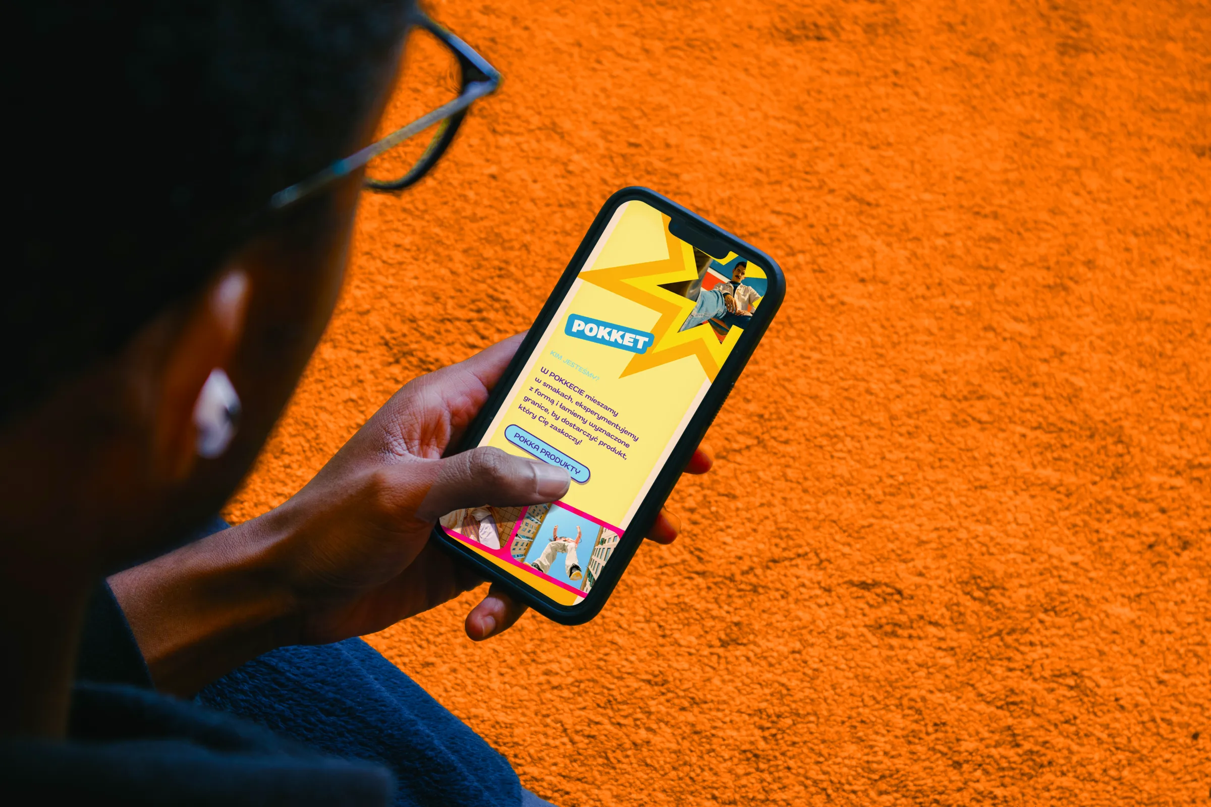 Pokket
A loud, colourful website full of movement for a Gen Z brand of fruit mousse pouches from the Dawtona Group, developed as the brand's range grows.
-
 Mily Group
A rebrand for a deer antler supplier: communication strategy, logo, logo guidelines, the milygroup.com website and trade fair materials.
-
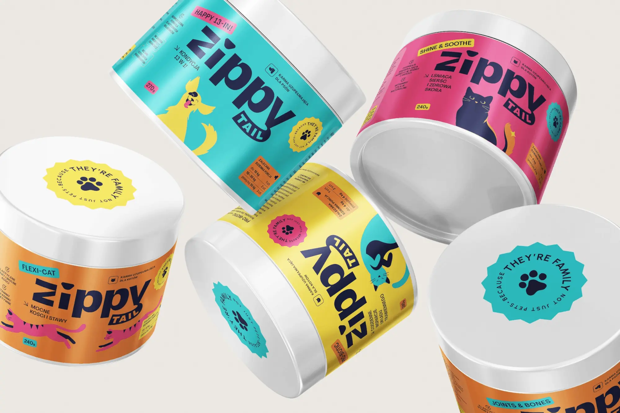 Zippy Tail
We built the Zippy Tail brand from scratch: the name, strategy, labels for eight supplements for dogs and cats, the shipping box and the shop design.
-
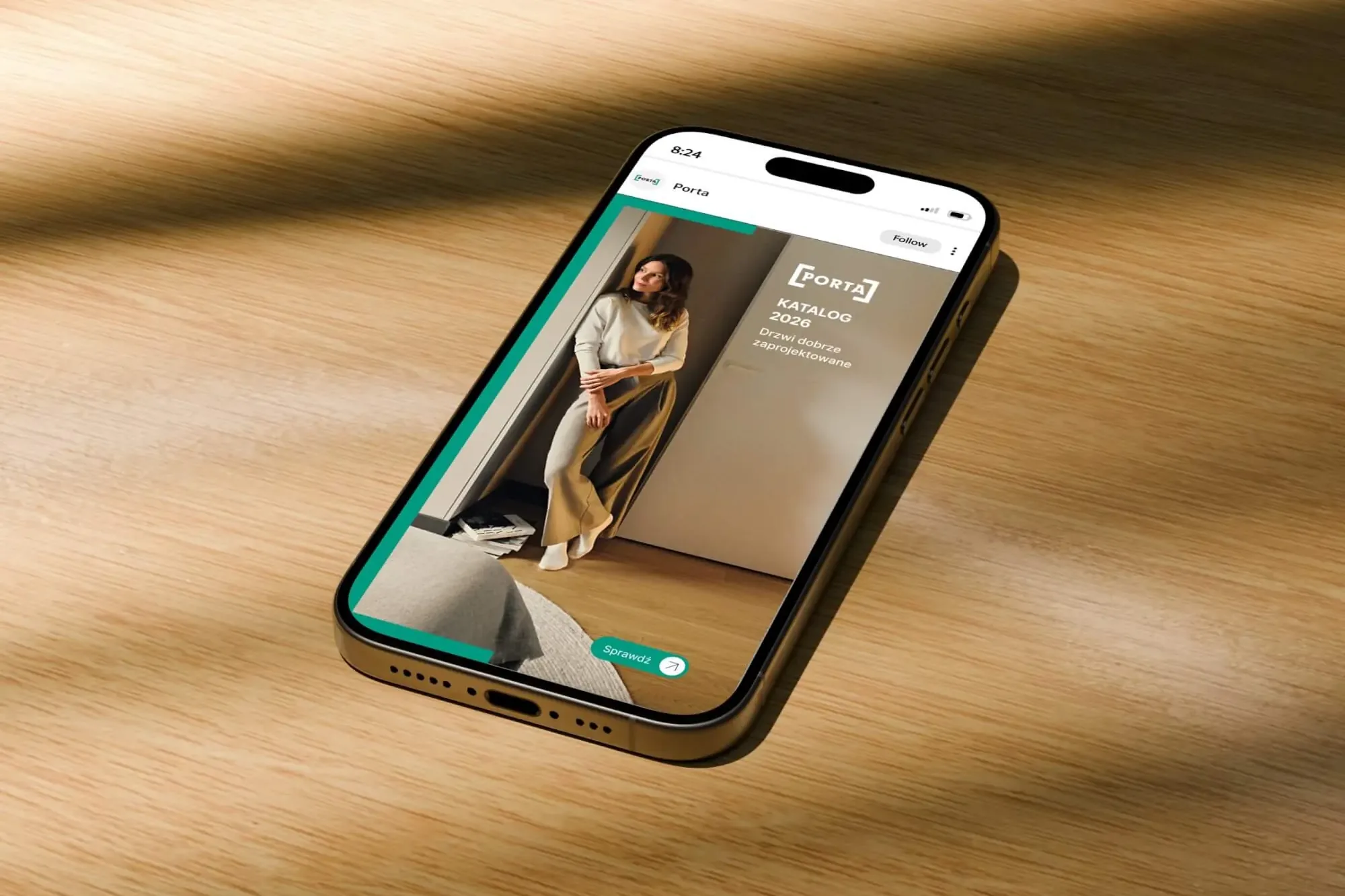 Porta Drzwi
A design system for an existing logo: a frame taken from the logo, grids, icons, drawings, a catalogue, porta.com.pl, social media and sales materials for a door manufacturer.
-
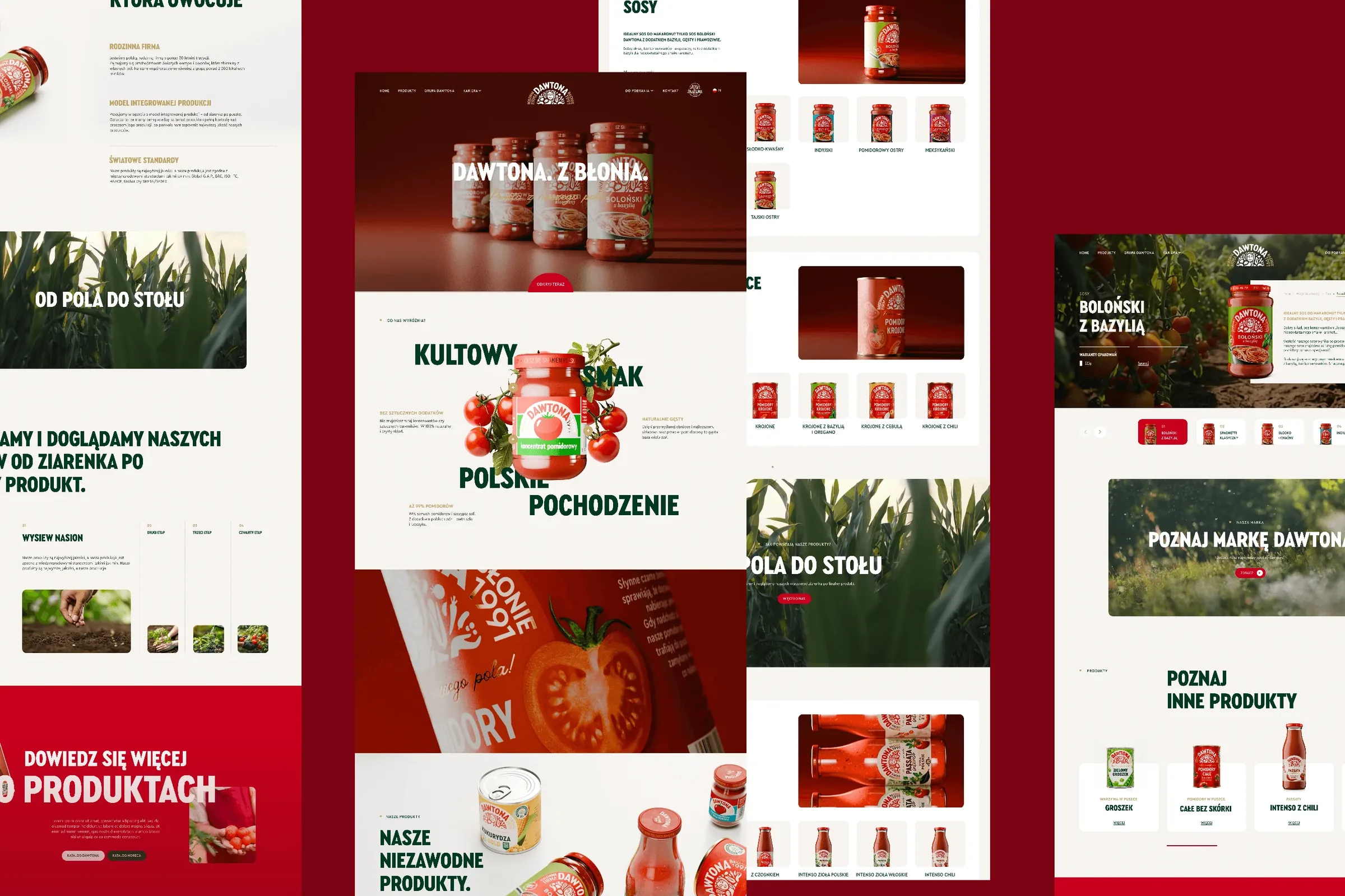 Dawtona Group
All of Dawtona's communication beyond the shelf: over 90 projects, from posts and trade fair stands to four websites and animations.
-
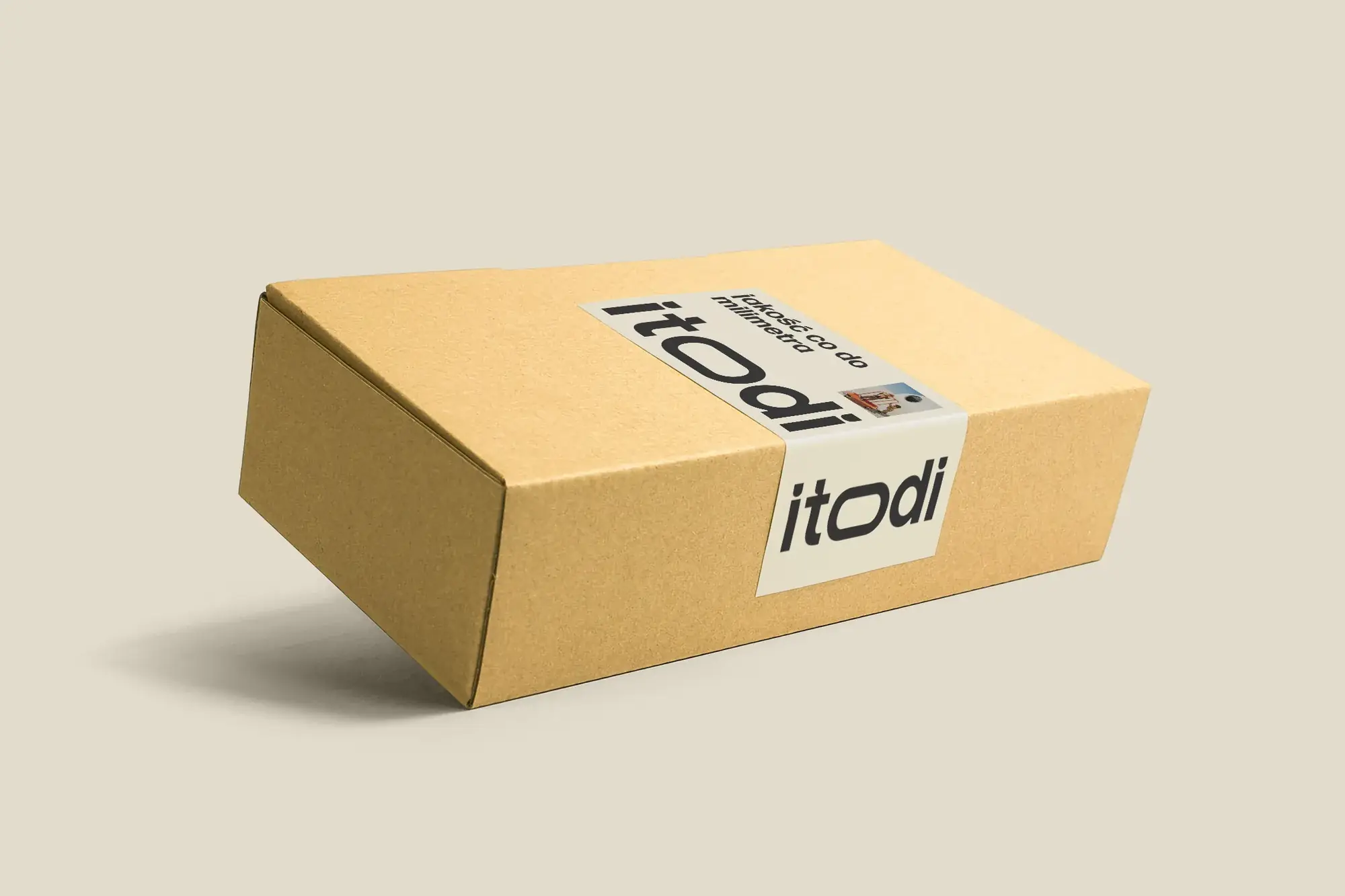 Itodi
A new made-to-measure furniture brand built from scratch: the name, a logo with a stretched “o”, the design of a shop with a configurator, an instruction leaflet and packaging.
-
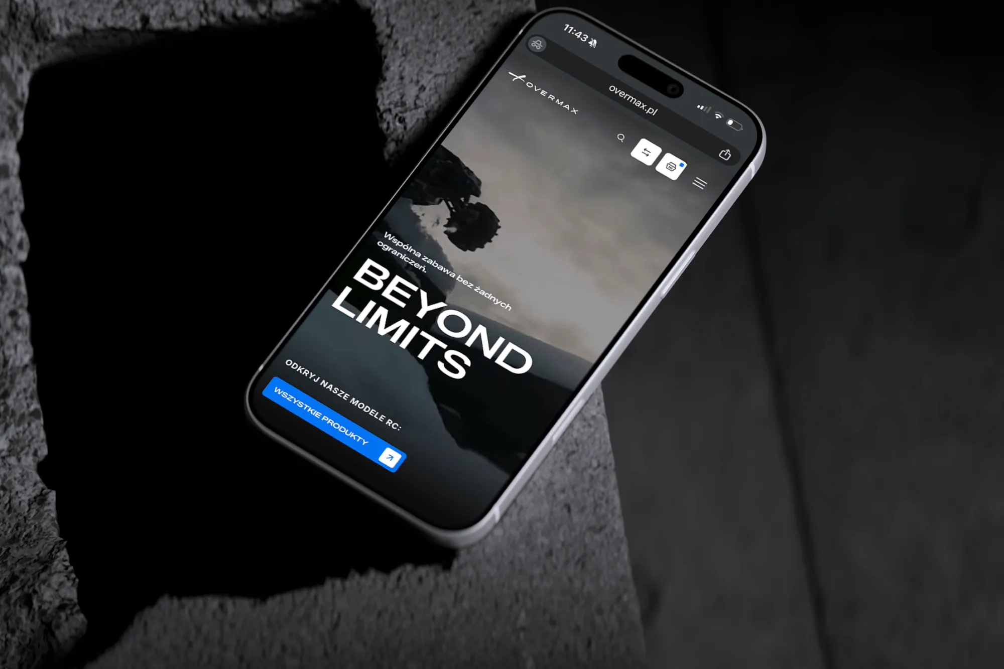 Overmax
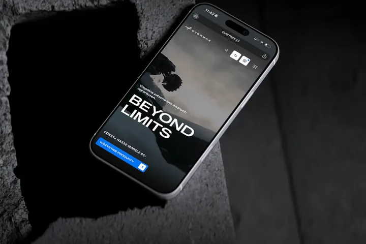
UX/UI design for the Overmax shop: RC cars in cinematic shots, a carefully worked-out product page, a category menu and a quiz that picks a model for you.
-
 Design Optyk
A family-run chain of premium eyewear stores: an identity without gold, in-store materials and a new online shop linked to the stock of six of its seven stores.
-
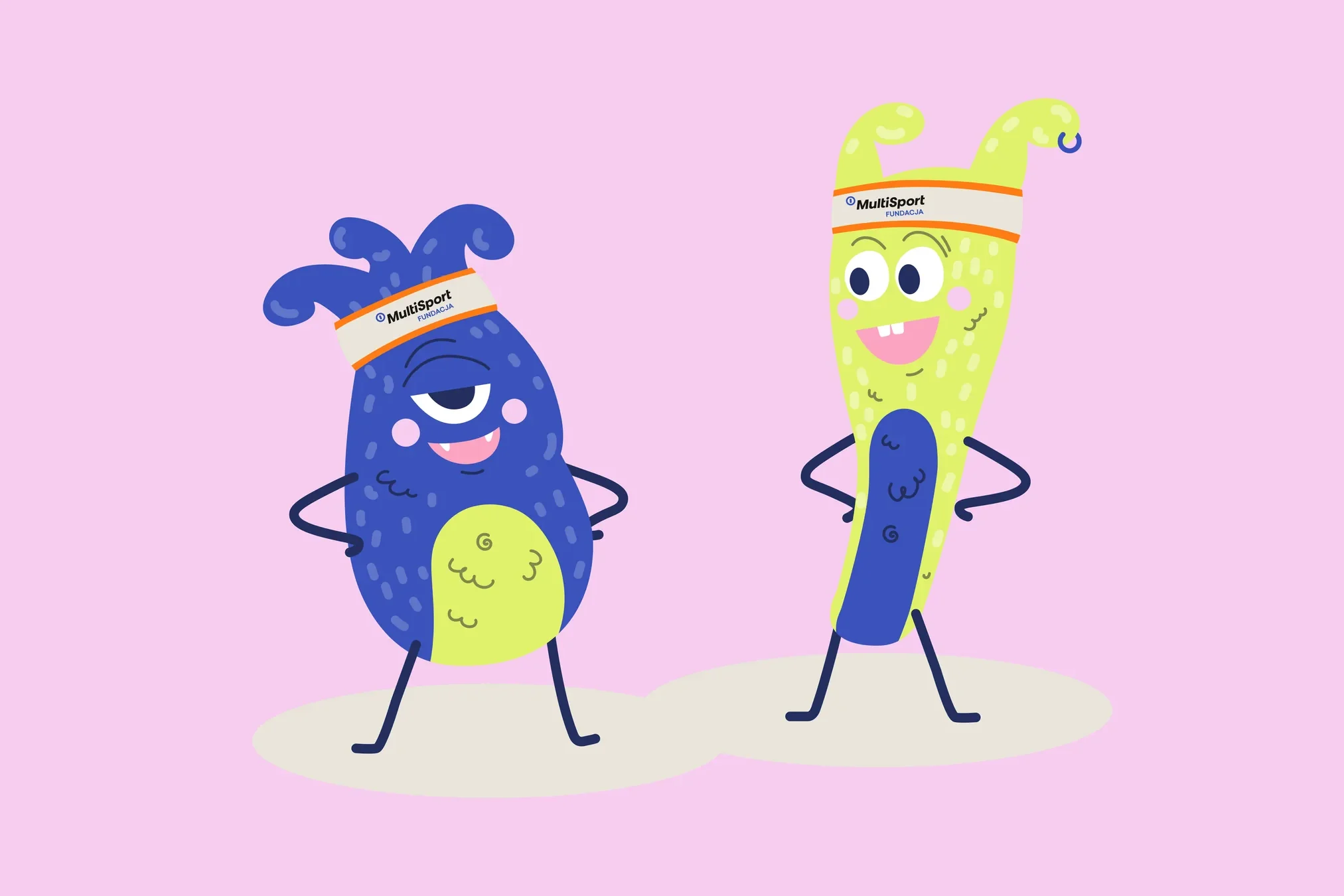 Fundacja MultiSport
An identity with a design system in Figma, a WCAG-compliant website and a brand hero duo that gets people moving.
-
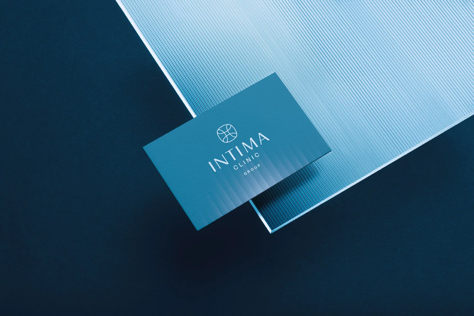 Intima Clinic
Six medical brands in one group. Workshops, names, identity, clinic signage, print, animations and the intimaclinic.pl website.
-
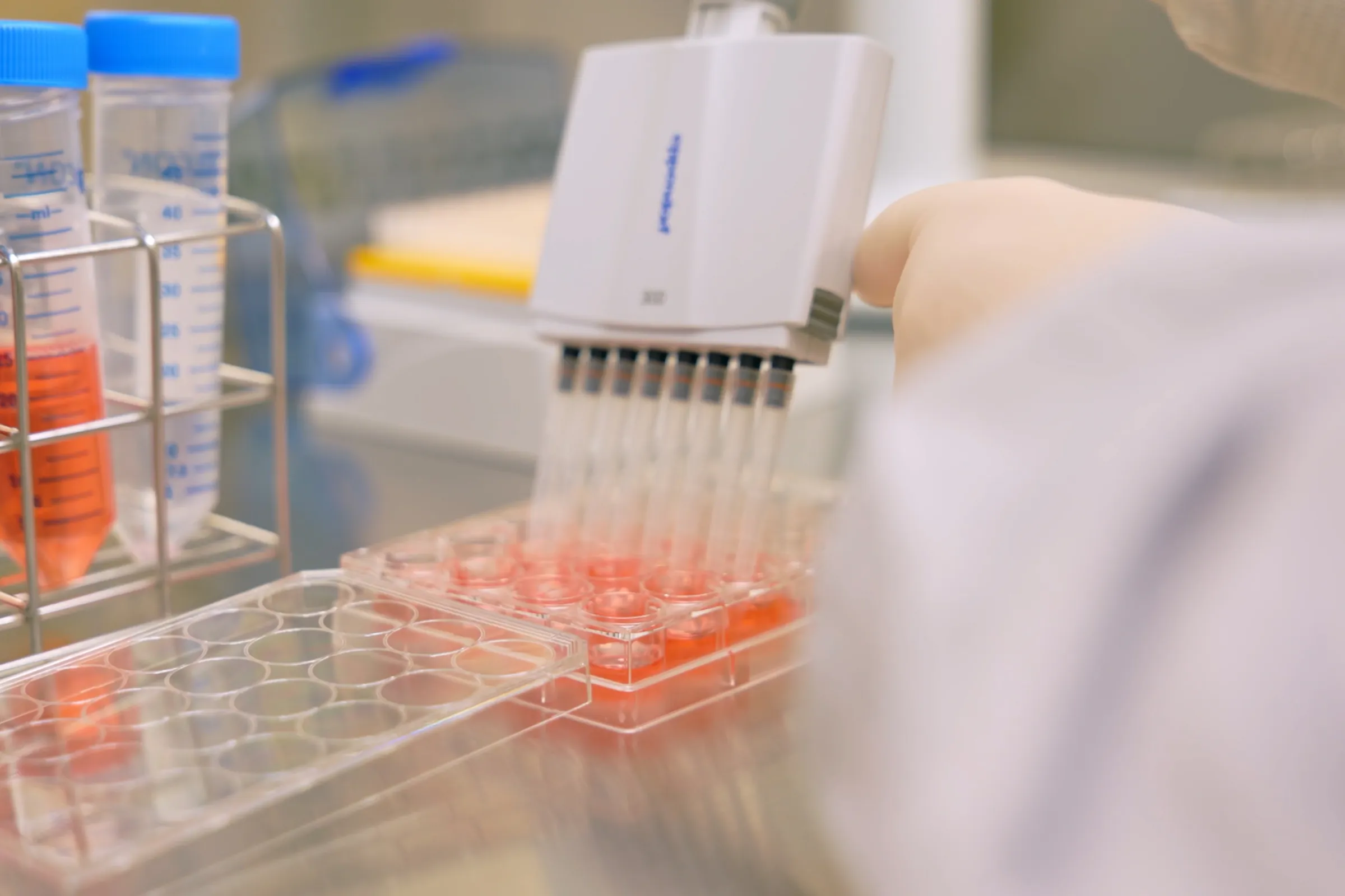 PolTREG
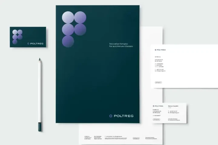
A rebrand for a biotech company listed on the Warsaw Stock Exchange, the poltreg.bio website for patients, investors and partners, and ongoing design support.
Facing a similar challenge?
Tell us what you want to change. In a first, no-obligation call we will see whether and how we can help.