









Pokket · a Grupa Dawtona brand
Pokket. A website and materials for a brand of mousse pouches
Pokket is mousse in squeeze pouches for Gen Z: dessert-style mochi, Protein Booster with 20 g of protein and exotic Fruit Bomb. We designed and built pokket.pl, then kept developing it together with the brand: new flavours, social media animations, a newsletter and a leaflet for retailers.
Squeeze on






The world of Pokket
Slogans that slide into the middle
Pokket is a new, totally crazy food brand that redefines what a handy snack means: convenient tubes that fit in any pocket, and flavours you won't find anywhere else on the market.
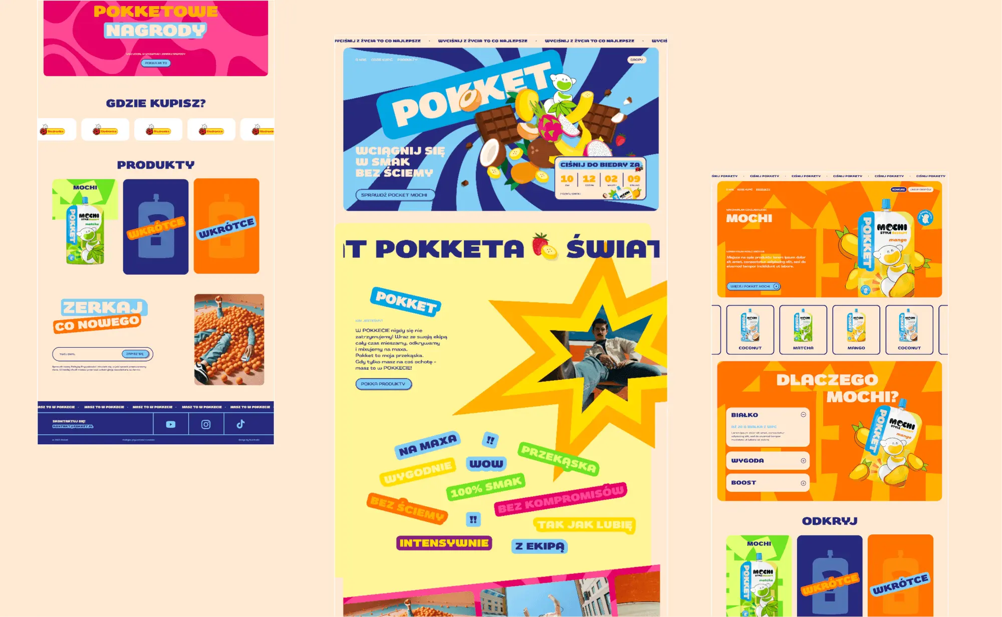
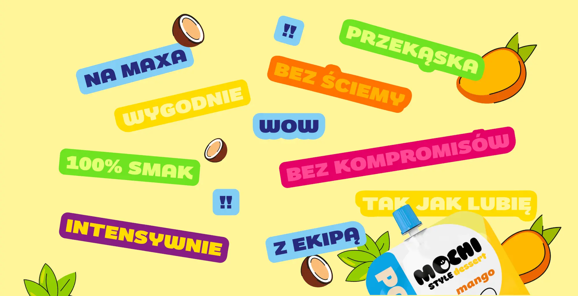
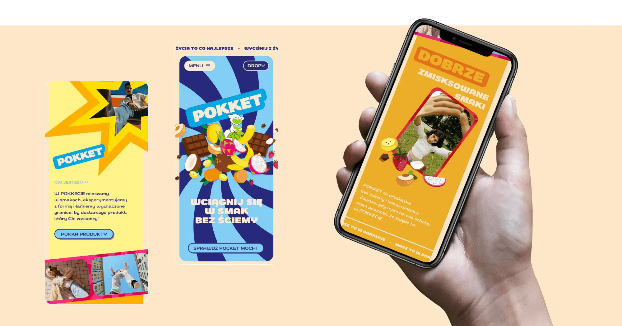
The brand speaks short and loud: to the max, no faking, 100% flavour. In “The world of Pokket” section, slogans are scattered across the screen like stickers and slide into the middle as you scroll, until they form a single composition.
That's how we described it in the animation specification for development.
Flavours
Each flavour has its own colour
On the product page, the hero background changes colour along with the flavour, and in the product grid, hovering sets the background in motion while three pouches overlap in a loop.
Fruit Bomb: a “Coming soon” tile is waiting on the site
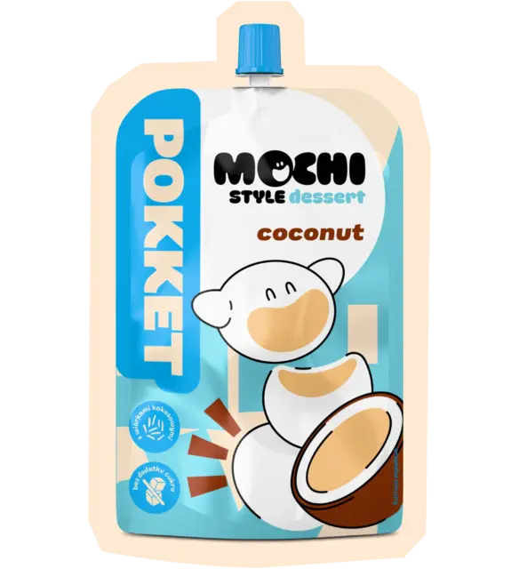
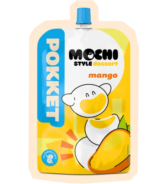
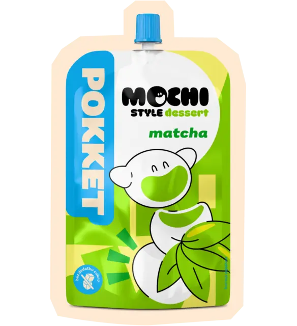
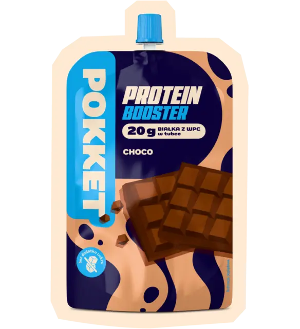
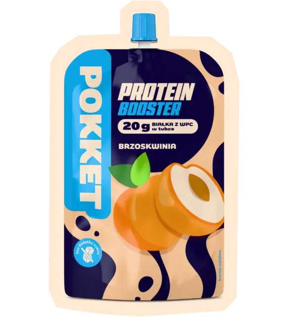
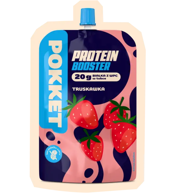
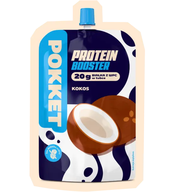
The pouches and flavour colours come from the brand's materials. We prepared the pouch composites and background animations for development.
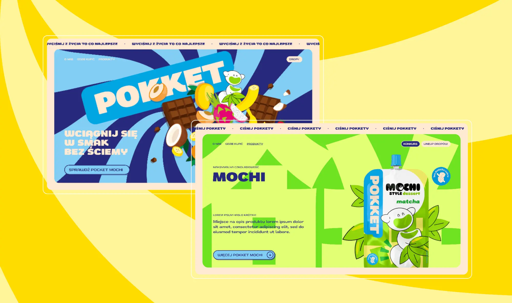
Motion spec
Every section moves differently
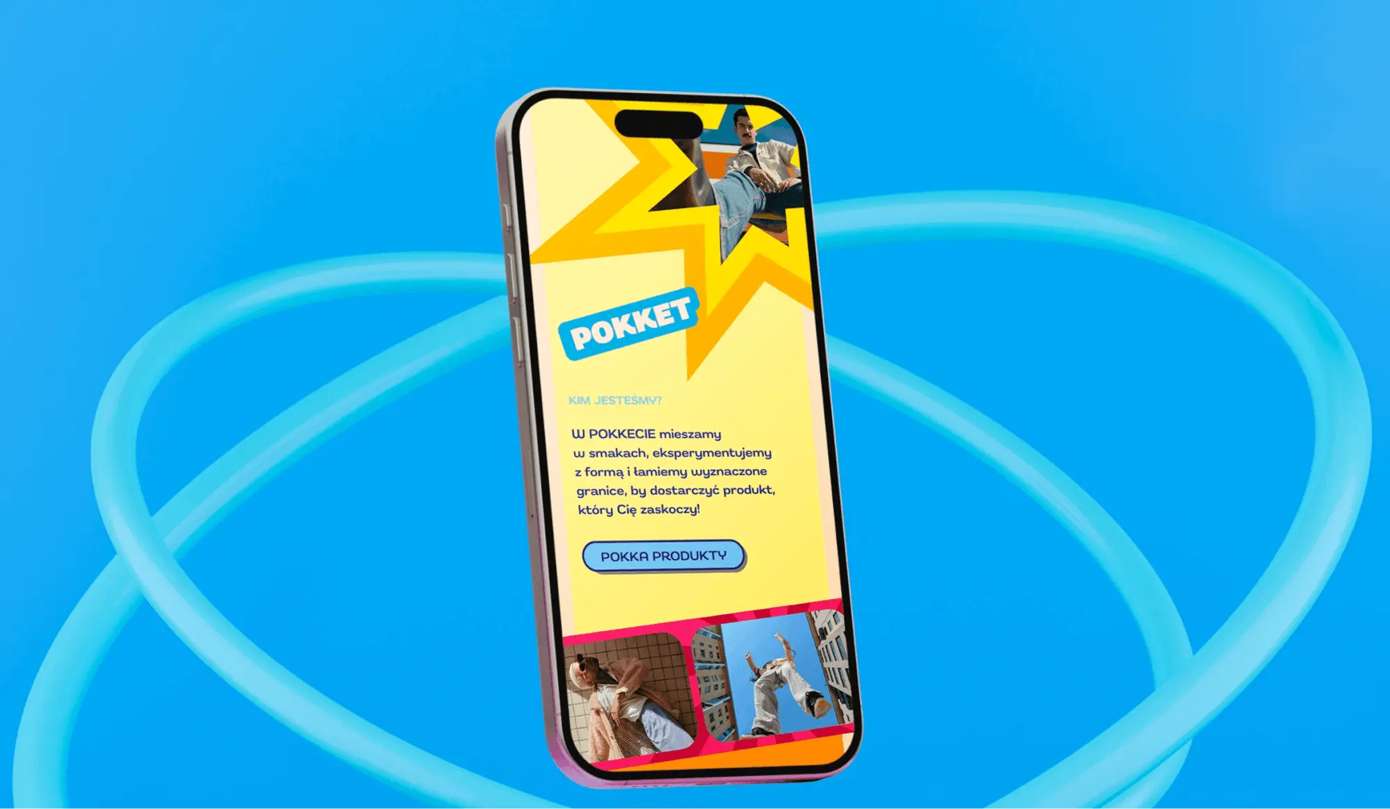
The site reflects the essence of the brand: intense flavour experiences, no faking. It's colourful, full of animation and pulls you into the world of Pokket.
For development we handed over a written-up animation for every section of the home page, with links to sites where similar motion works best.
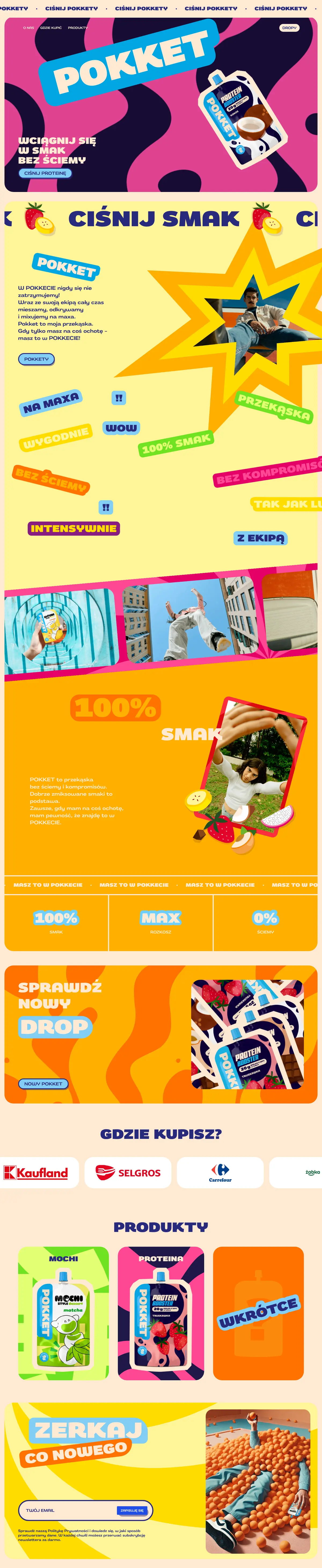

A spinning background that draws you in, and a composite with fruit sliding in.
New line
A new line arrived, so we expanded the site
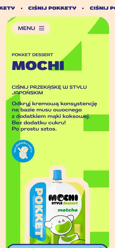
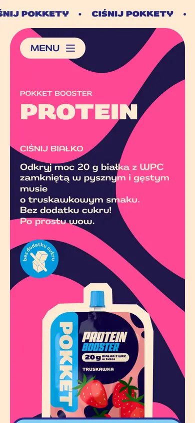
The first version was built around the Mochi line. A few days after launch the brand added Protein Booster, so we expanded the site: a new hero animation, new backgrounds and product photos, and flavour pages.
We prepared the background animations in portrait and landscape, separately for phone and desktop, and later converted them into lighter files.
Keywords
BoldColourfulWowIntenseDynamic
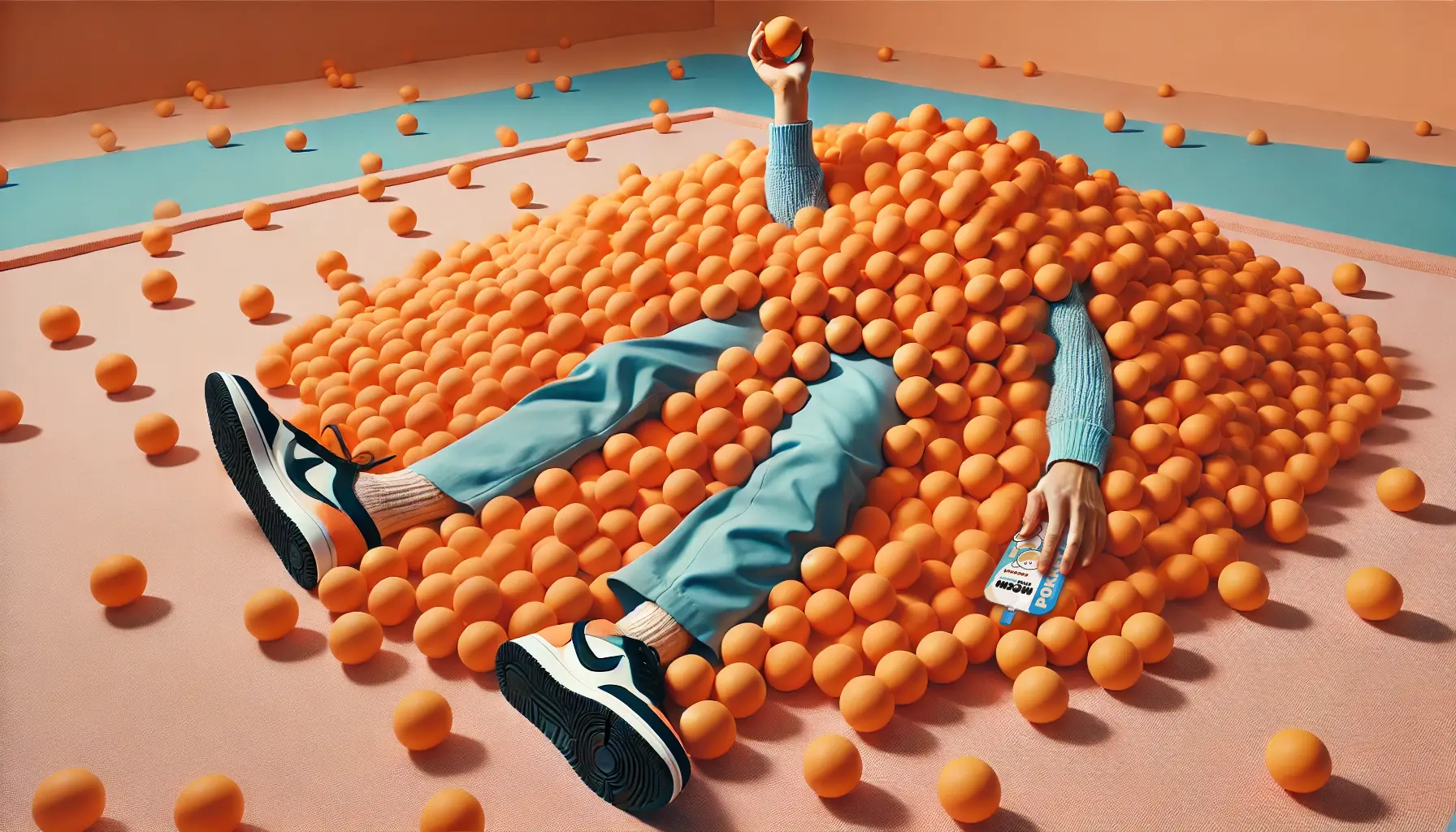
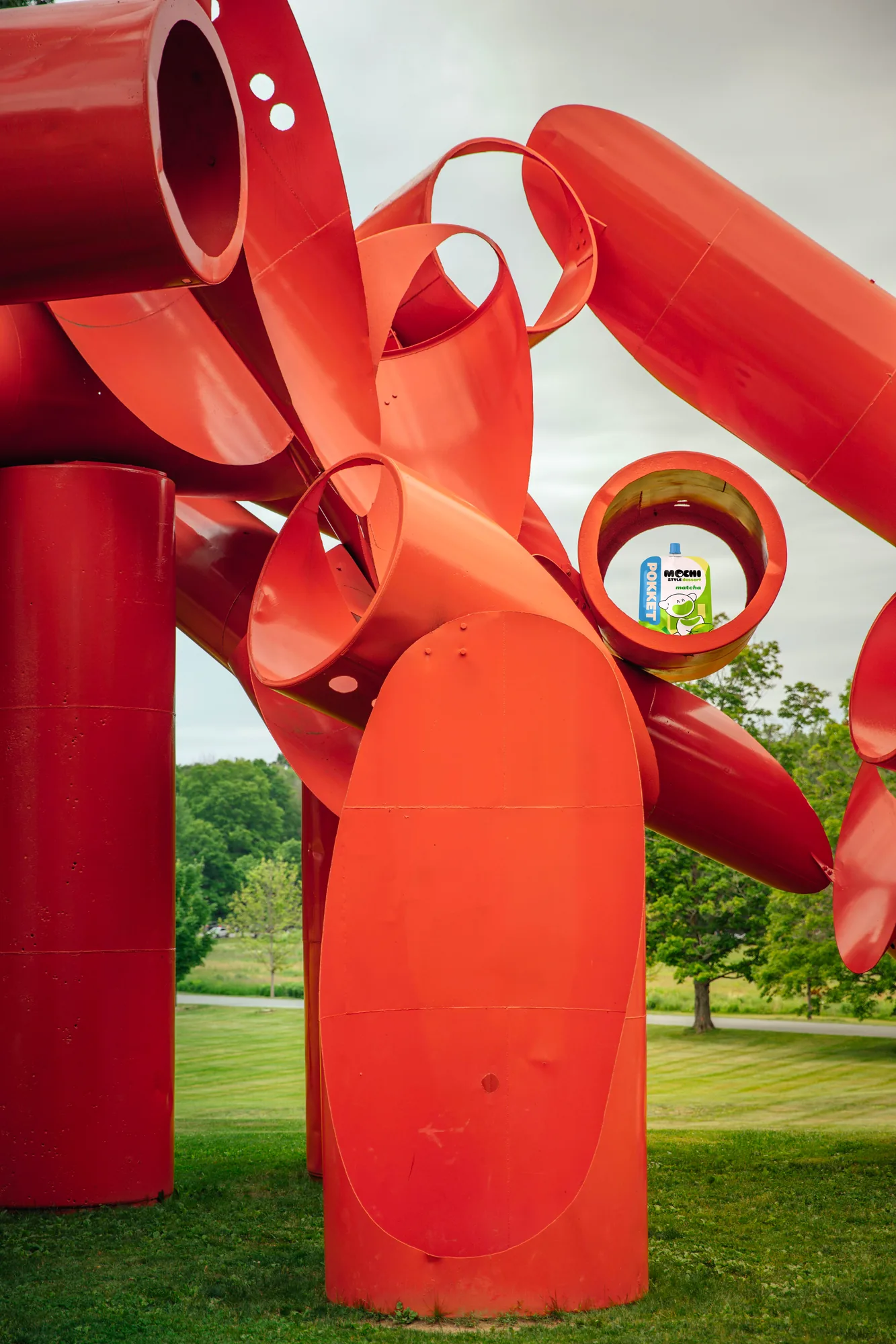
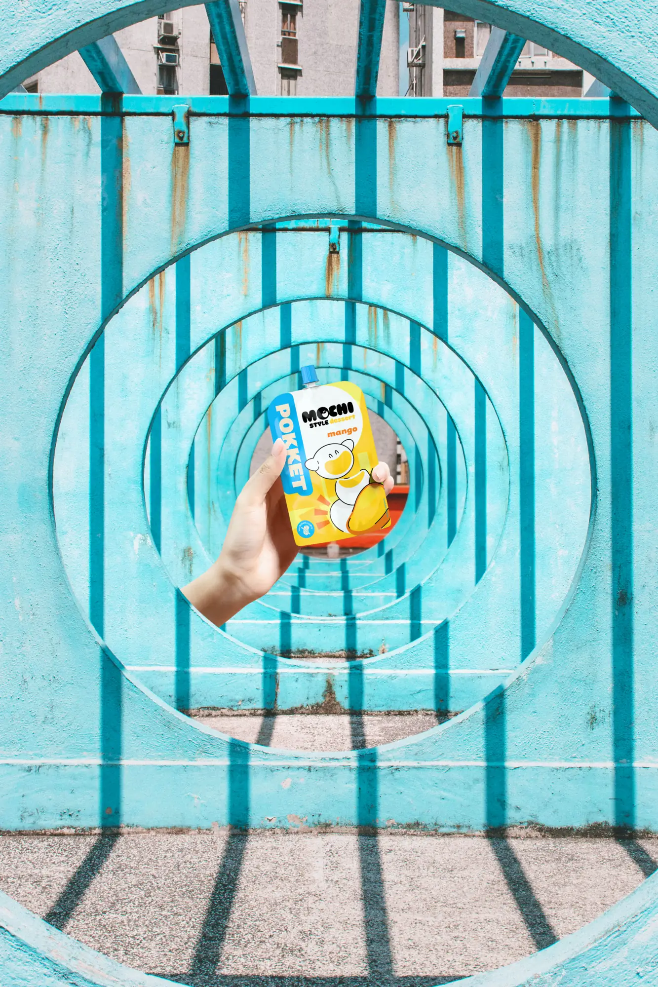
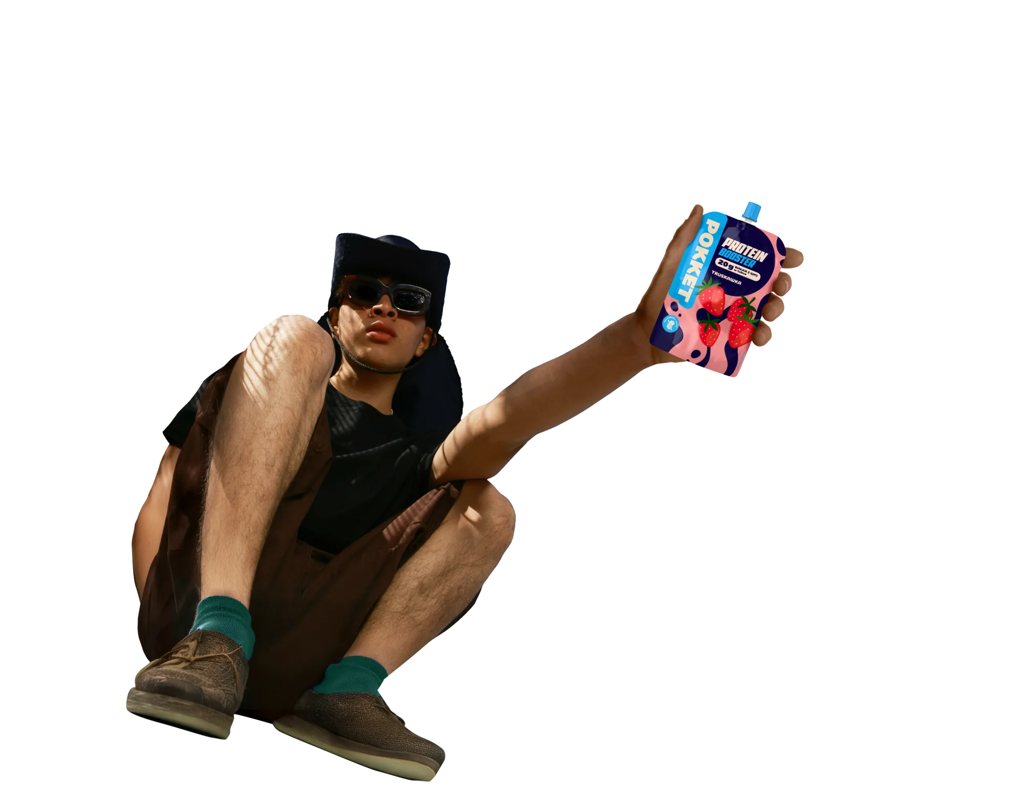
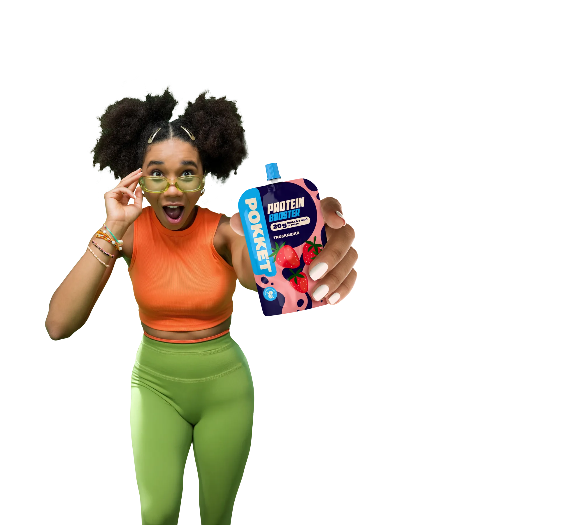
We prepared the pouch composites for the website, social media and the retail leaflet.
Scope
What we did for Pokket
- Design Wireframes for desktop and mobile, assets, pouch composites and an animation specification for development. The brand supplied the creative platform, colours and packshots.
- Development WordPress with a CMS panel where the brand team adds flavours and drops itself.
- Protein Booster The new line on the site: hero animation, backgrounds, product photos and flavour pages.
- Social media and mailing Social media animations, a key visual for mailing and a newsletter template.
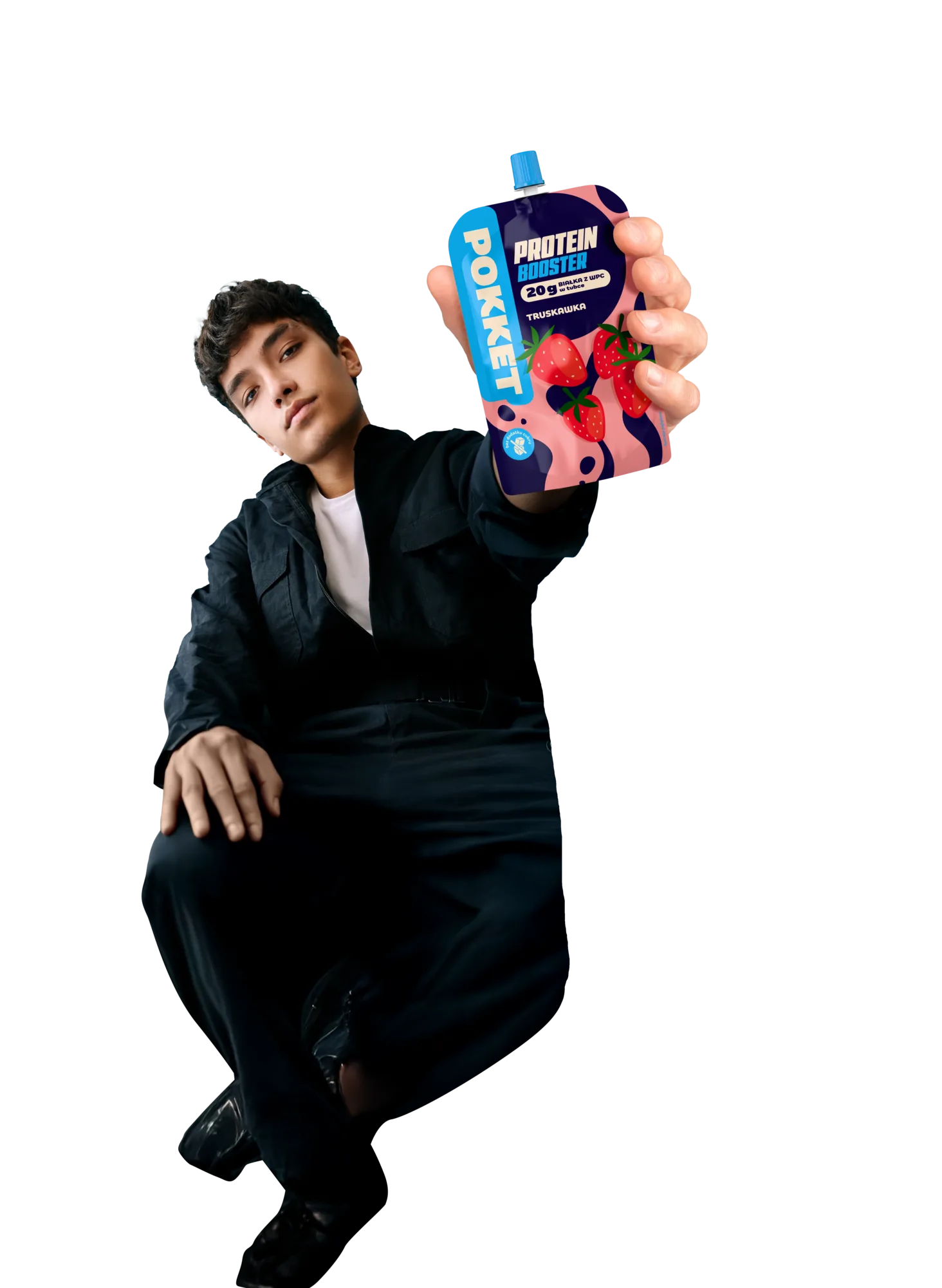
- Retail An A3 leaflet for Dawtona and Pokket mousses, with composites of people holding a pouch.
What the brand gets out of it
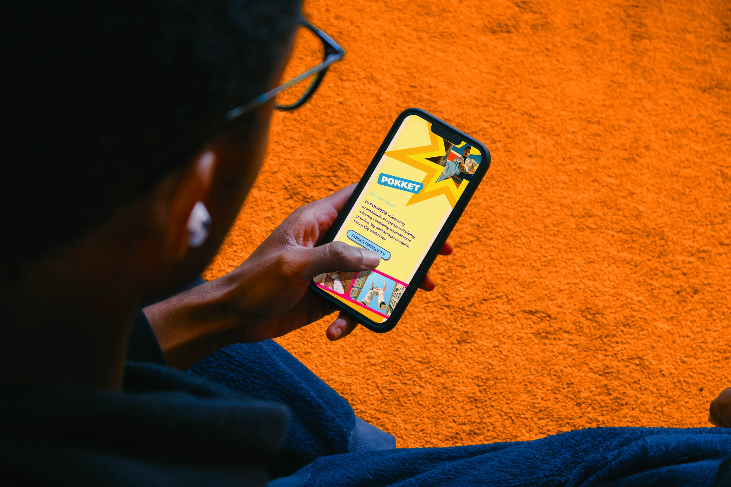
The new brand got a website in its own voice: loud, colourful and always moving. The CMS panel lets the brand team add flavours and drops on its own, and we add new materials as the range grows.
- Client
- Pokket (Grupa Dawtona)
- Scope
- UI/UX Design · Website · Animation · Video editing · Rollout · CMS panel · Social media · Leaflets and brochures
- Technologies
- WordPress · ACF · Gravity Forms · Adobe XD · After Effects
- Online
- pokket.pl
More projects
-
 Made in Podlasie
Workshops, identity, labels and a trade stand for a Polish health food brand entering Kuwait.
-
 PetCuisine
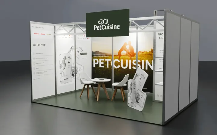
We built a brand from scratch for a pet food manufacturer in the Dawtona Group: from the name and tagline, through packaging in 12 flavours and the website, to trade fair stands across Europe.
-
 Mily Group
A rebrand for a deer antler supplier: communication strategy, logo, logo guidelines, the milygroup.com website and trade fair materials.
-
 Zippy Tail
We built the Zippy Tail brand from scratch: the name, strategy, labels for eight supplements for dogs and cats, the shipping box and the shop design.
-
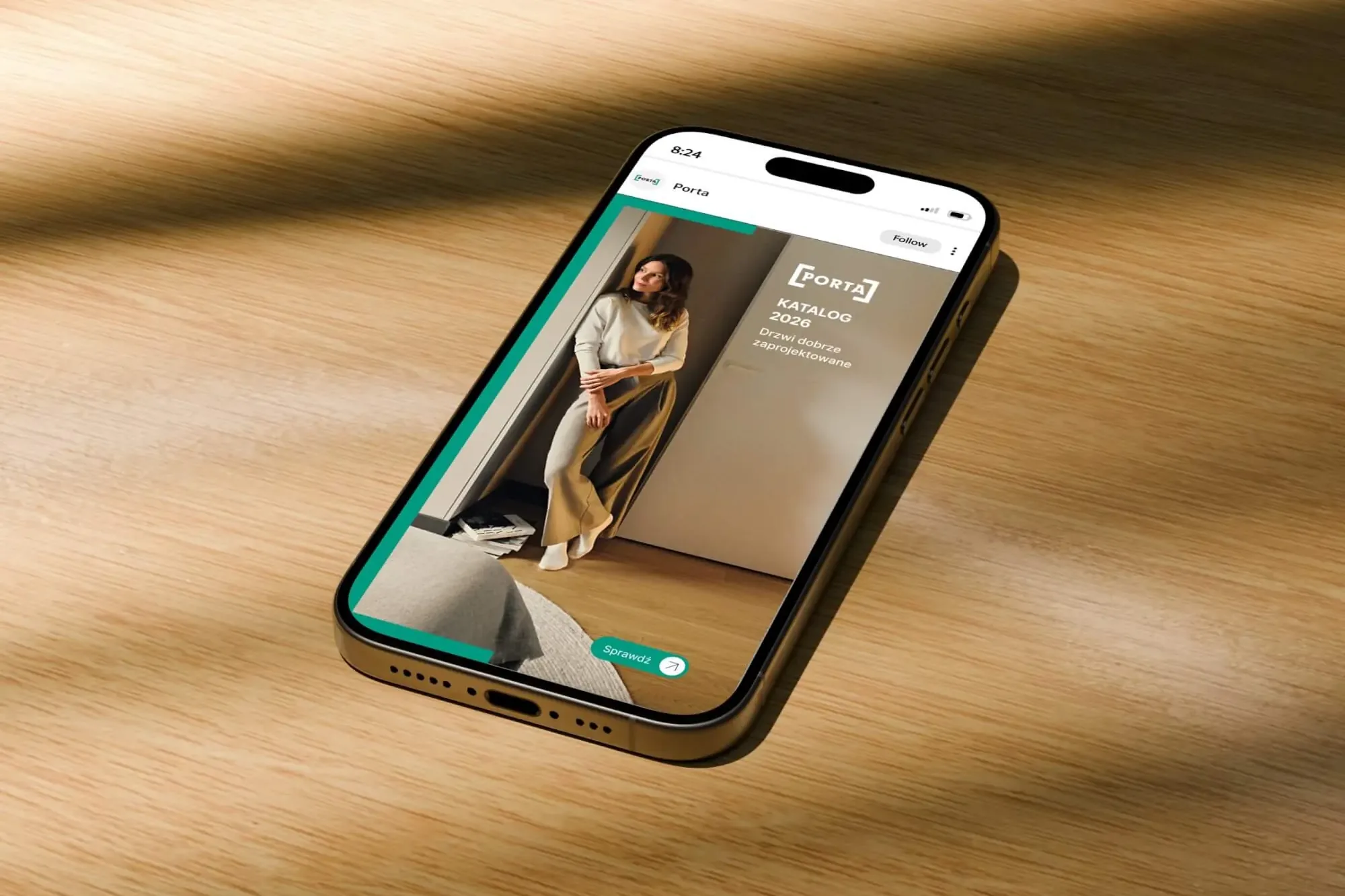 Porta Drzwi
A design system for an existing logo: a frame taken from the logo, grids, icons, drawings, a catalogue, porta.com.pl, social media and sales materials for a door manufacturer.
-
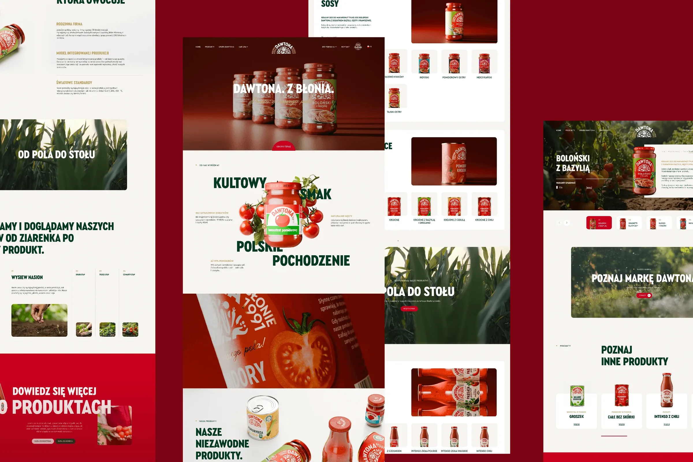 Dawtona Group
All of Dawtona's communication beyond the shelf: over 90 projects, from posts and trade fair stands to four websites and animations.
-
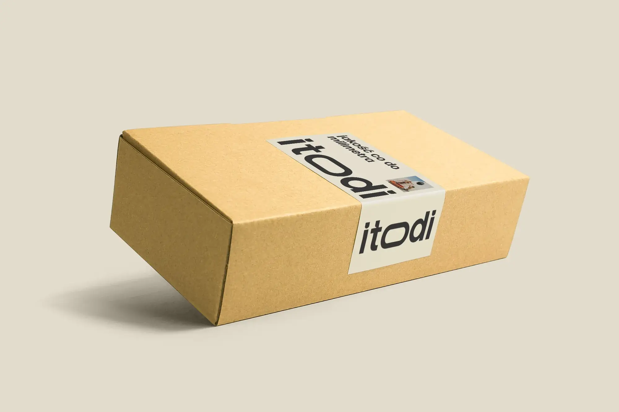 Itodi
A new made-to-measure furniture brand built from scratch: the name, a logo with a stretched “o”, the design of a shop with a configurator, an instruction leaflet and packaging.
-
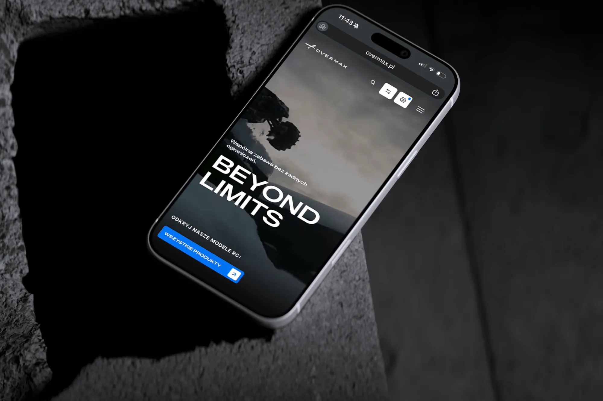 Overmax
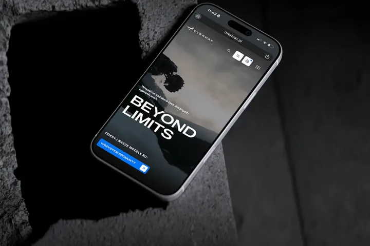
UX/UI design for the Overmax shop: RC cars in cinematic shots, a carefully worked-out product page, a category menu and a quiz that picks a model for you.
-
 Design Optyk
A family-run chain of premium eyewear stores: an identity without gold, in-store materials and a new online shop linked to the stock of six of its seven stores.
-
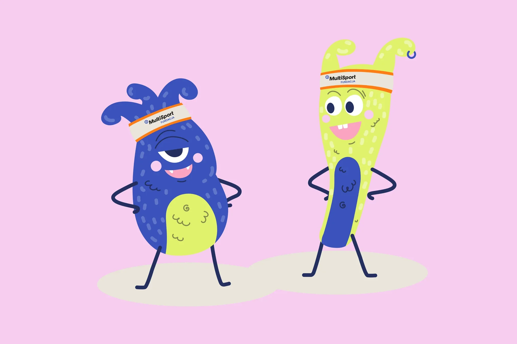 Fundacja MultiSport
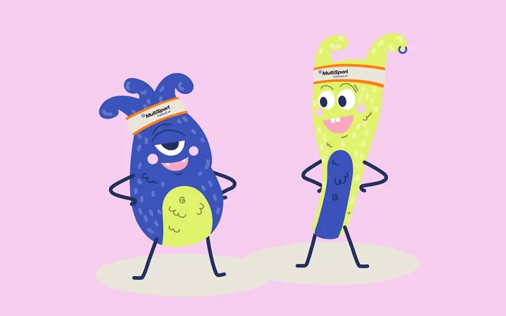
An identity with a design system in Figma, a WCAG-compliant website and a brand hero duo that gets people moving.
-
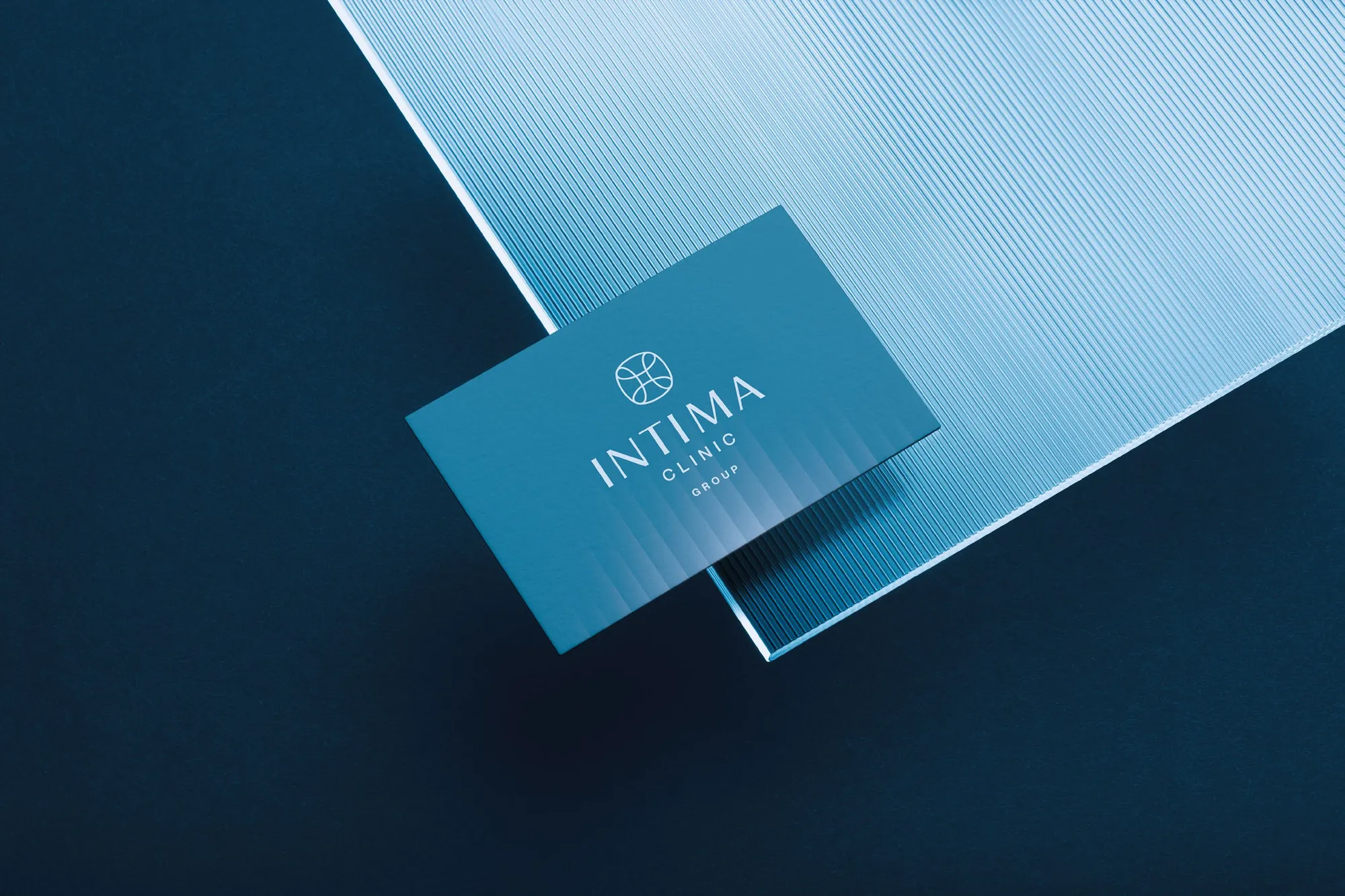 Intima Clinic
Six medical brands in one group. Workshops, names, identity, clinic signage, print, animations and the intimaclinic.pl website.
-
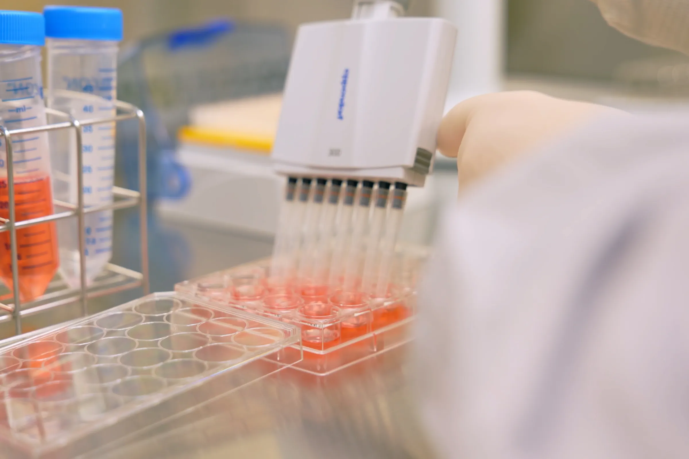 PolTREG
A rebrand for a biotech company listed on the Warsaw Stock Exchange, the poltreg.bio website for patients, investors and partners, and ongoing design support.
Facing a similar challenge?
Tell us what you want to change. In a first, no-obligation call we will see whether and how we can help.