





PolTREG S.A. · ongoing support
Cell science you can finally see
PolTREG, based in Gdańsk, is a biotech company listed on the Warsaw Stock Exchange and a world pioneer in cell therapies for autoimmune diseases. We started with workshops, created a new brand and website for the company, and then stayed on as its regular design team.
See how it came together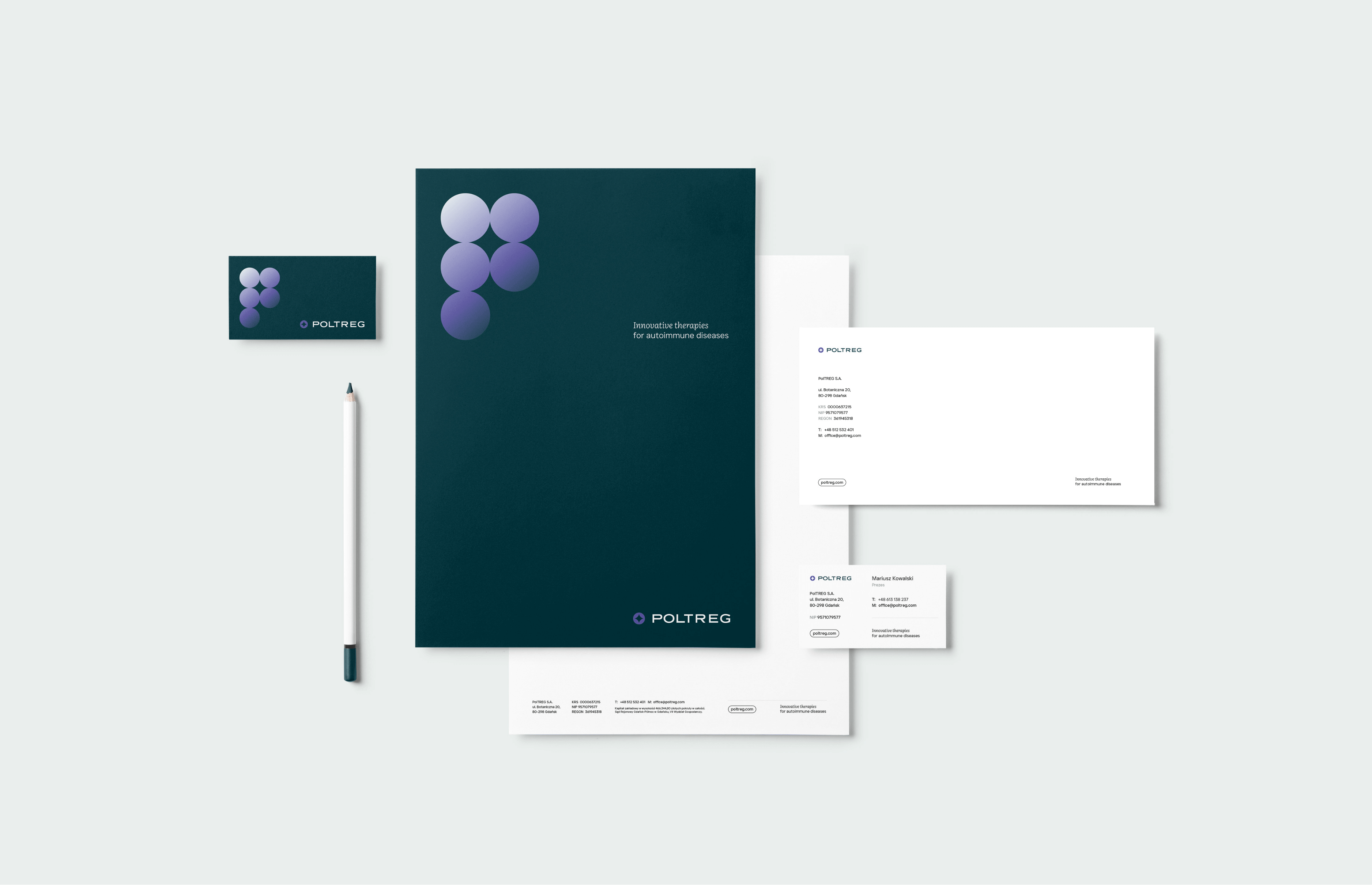
Assumptions
Medical, safe and built for growth
The design had to show the brand's huge growth potential and the innovation of the therapy, to interest investors and partners, while also highlighting the team's knowledge and experience. Patients should feel trust and hope for effective treatment and a better, longer life.
Goal
A complete visual identity and a functional website in line with the brand's DNA: its medical character, extensive knowledge and experience, the safety of the therapy, innovation and global growth potential.
Solution
A key visual in shades of grey and dark green, broken up with purple and gradients. A circle motif and rounded elements that refer to the cells of the human body. Plus an extensive set of icons and photos that explain the content and processes.
Result
A professional, modern image of a fast-growing company that conveys the safety of the therapy and the care patients receive.
Working together
It started with a rebrand. We stayed on for good
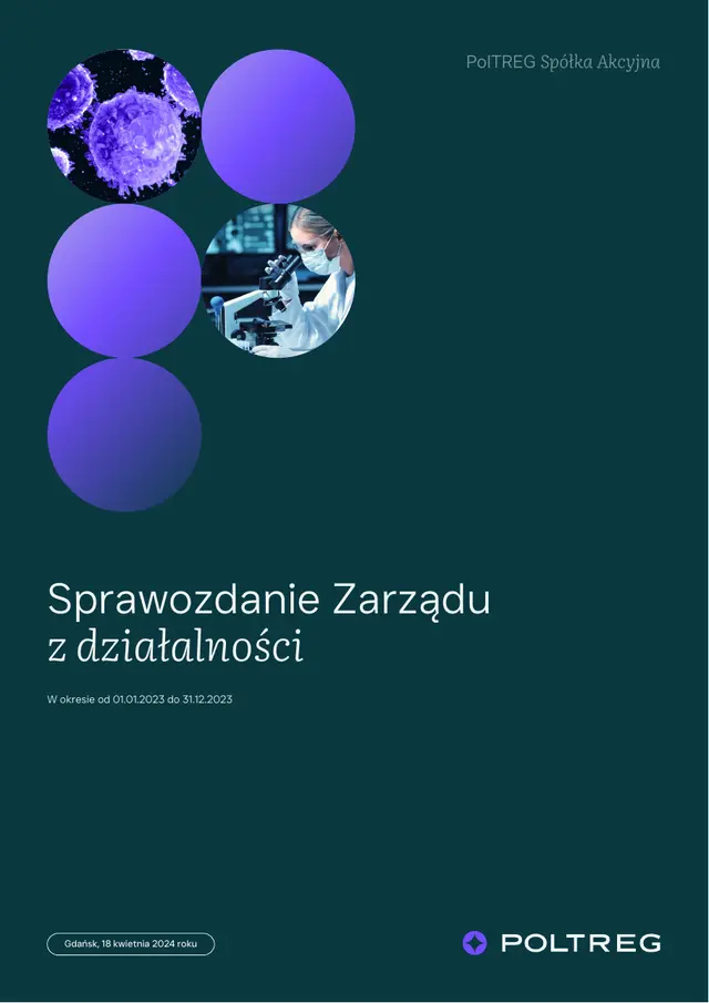
Once the brand and website were live, PolTREG didn't close the project but moved on to ongoing support with us. Periodic reports, investor presentations, new subpages, charts, board portraits, announcements on the website: all in the same identity, by the same people.
- 70+separate jobs after the rebrand and website
- 2language versions of the website: English and Polish
- 58pages in a single management board report in the new identity
- 3audiences on one website: patients, investors, partners
Periodic reports
Quarterly, half-year and annual reports and management board reports, laid out in the brand template.
Investors
Investor presentations, shareholder structure charts and data for the investor calendar.
Website
New subpages, the pipeline, announcements and WordPress care in two languages.
Social media
Posts, reels and animated formats in the same identity.
Company materials
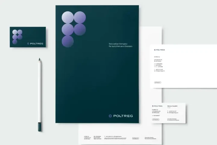
Letterhead, email signatures, PowerPoint templates, board portraits and a photo library.
Workshops
One brand, three very different readers
The workshops showed that PolTREG speaks at the same time to the parent of a sick child, to a stock market investor and to a global pharmaceutical company. Each is looking for something different and makes decisions differently. We set the tone: calm, open, educational. The brand should explain, not intimidate. English is the main language, with Polish where it's needed.
The brand core from the workshops
- 01Pioneering spirit
- 02Safety and efficacy
- 03Innovation
- 04Experience
- 05Potential
Moodboard
Two directions, one choice
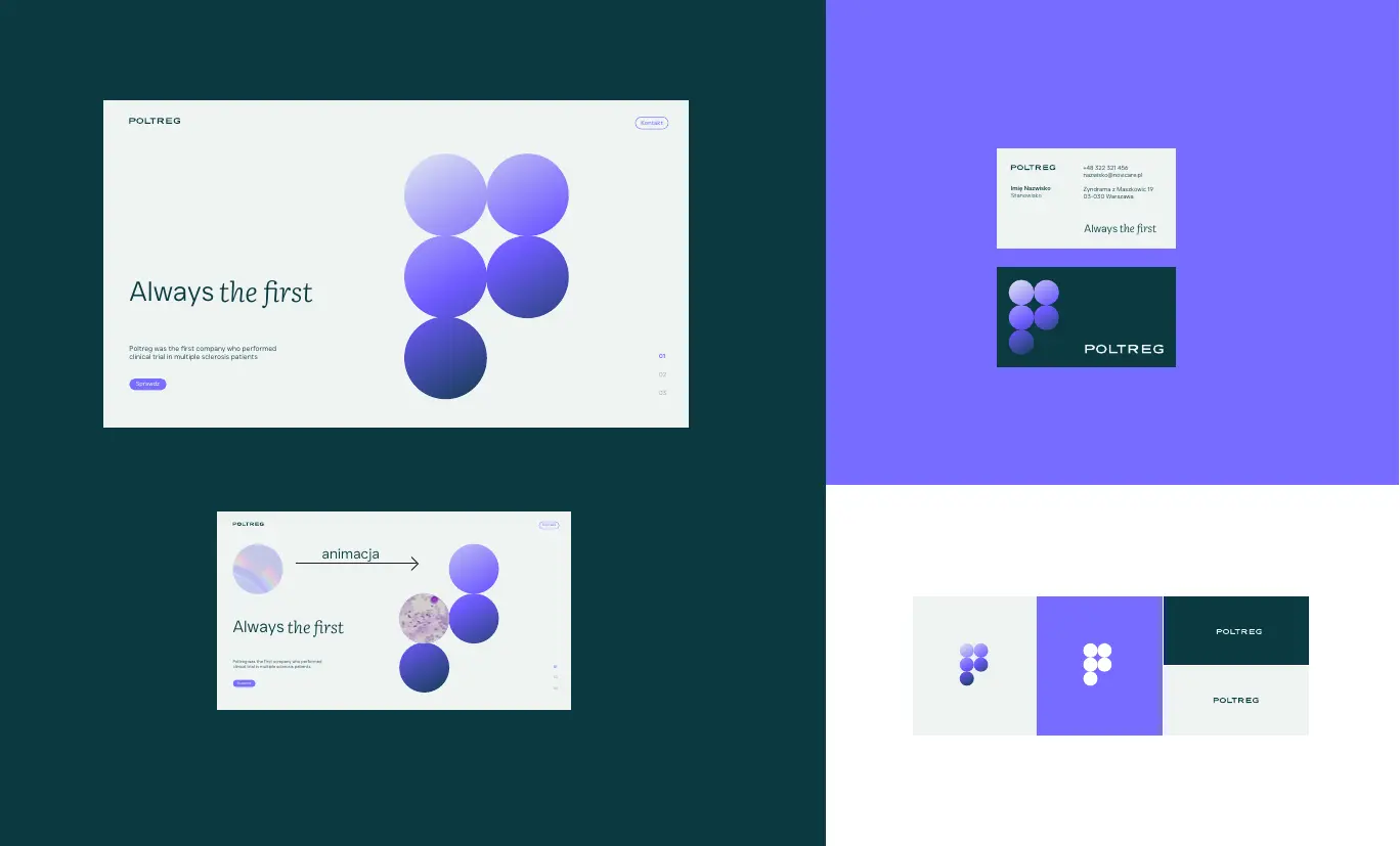
We showed two directions. The first: modern and medical, with a geometric pattern. The second: scientific, with a circle motif, minimalist layouts like in a laboratory and a mix of sans serif and serif typefaces. The company chose the second, and we built the whole brand on it.
The mark
Cells under a microscope
We drew the symbol like a view through a microscope. It's one cell overlapped by four neighbouring ones. Only their shared parts remain, and in the middle, between them, a flash appears. That star stands for the company's innovation and pioneering research.
Before the flash
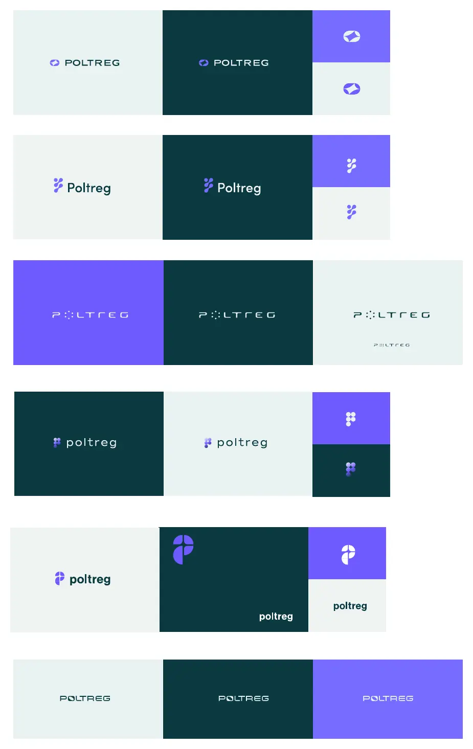
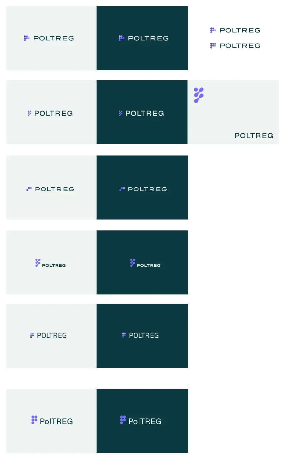
Concepts for the mark. We explored the letter P, a circle and the typeface. The simplest geometry won.

Identity
Five cells that form a P
The key visual is a pattern of gradient circles, standing for cells and lymphocytes. Arranged together, they form the letter P, from the company's name. Dark green gives a listed company the right gravity, purple guides the eye to buttons and details, and light grey leaves plenty of light. The icons complete and explain the content in company materials and on the website.
Two typefaces, two roles
The geometric Just Sans brings scientific order. The serif Literata, in headings and highlights, builds trust. On the website and in materials, part of a sentence is set upright and part in Literata italics.


The brand in materials
From business cards to investor presentations


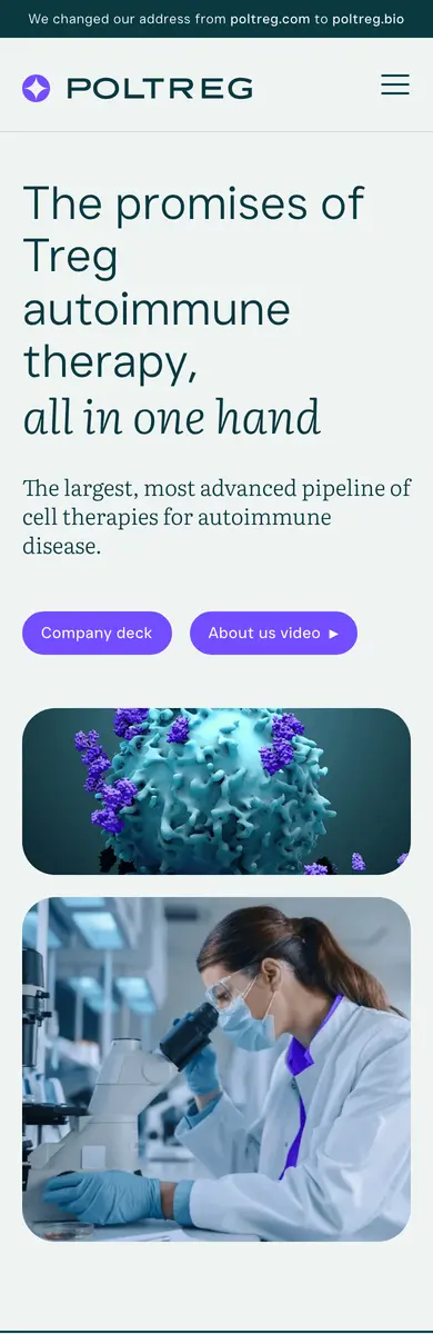
Website
One readable page instead of ten subpages
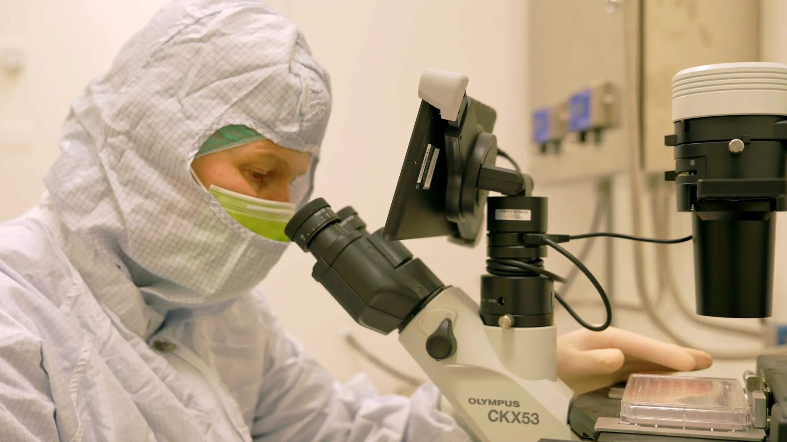
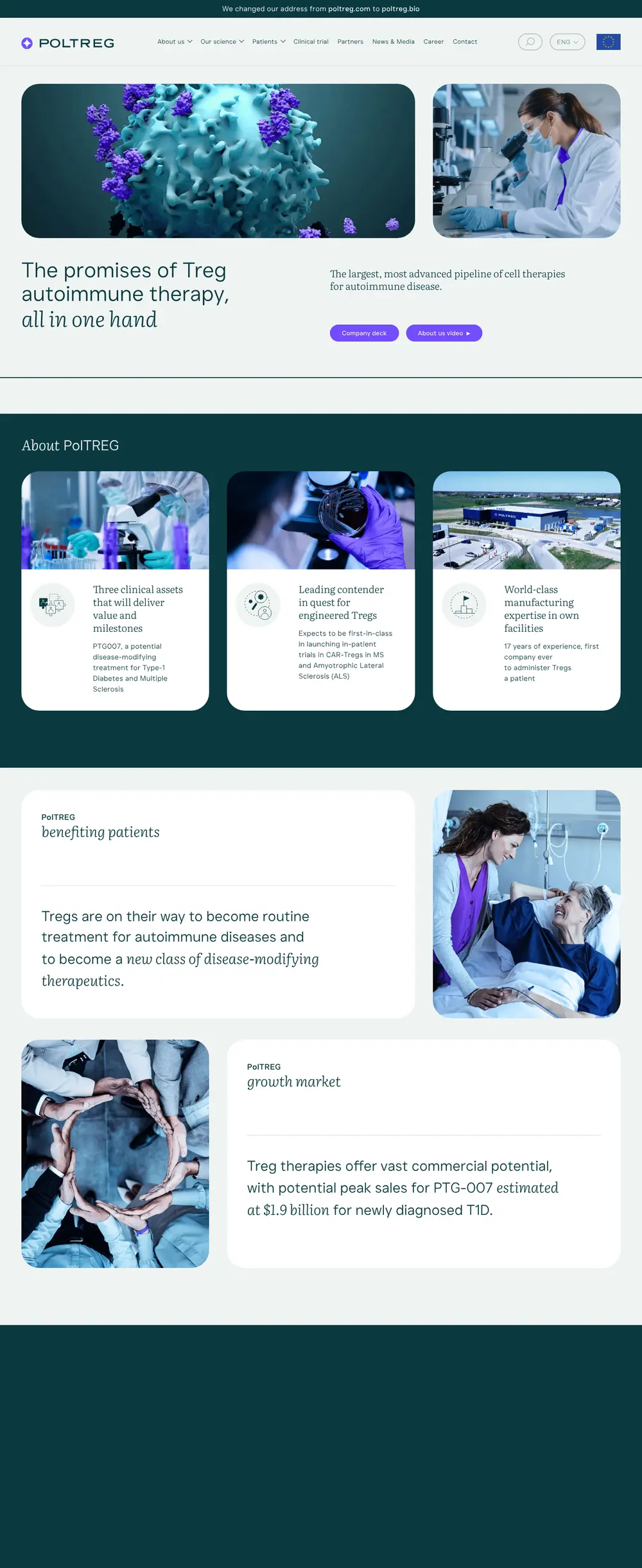
The old website had a mass of technical information in long, repetitive blocks of text, scattered across many small subpages. We gathered everything about the company on one subpage with sections and anchors in the menu: mission, strategy, history, facility, results, management and boards.
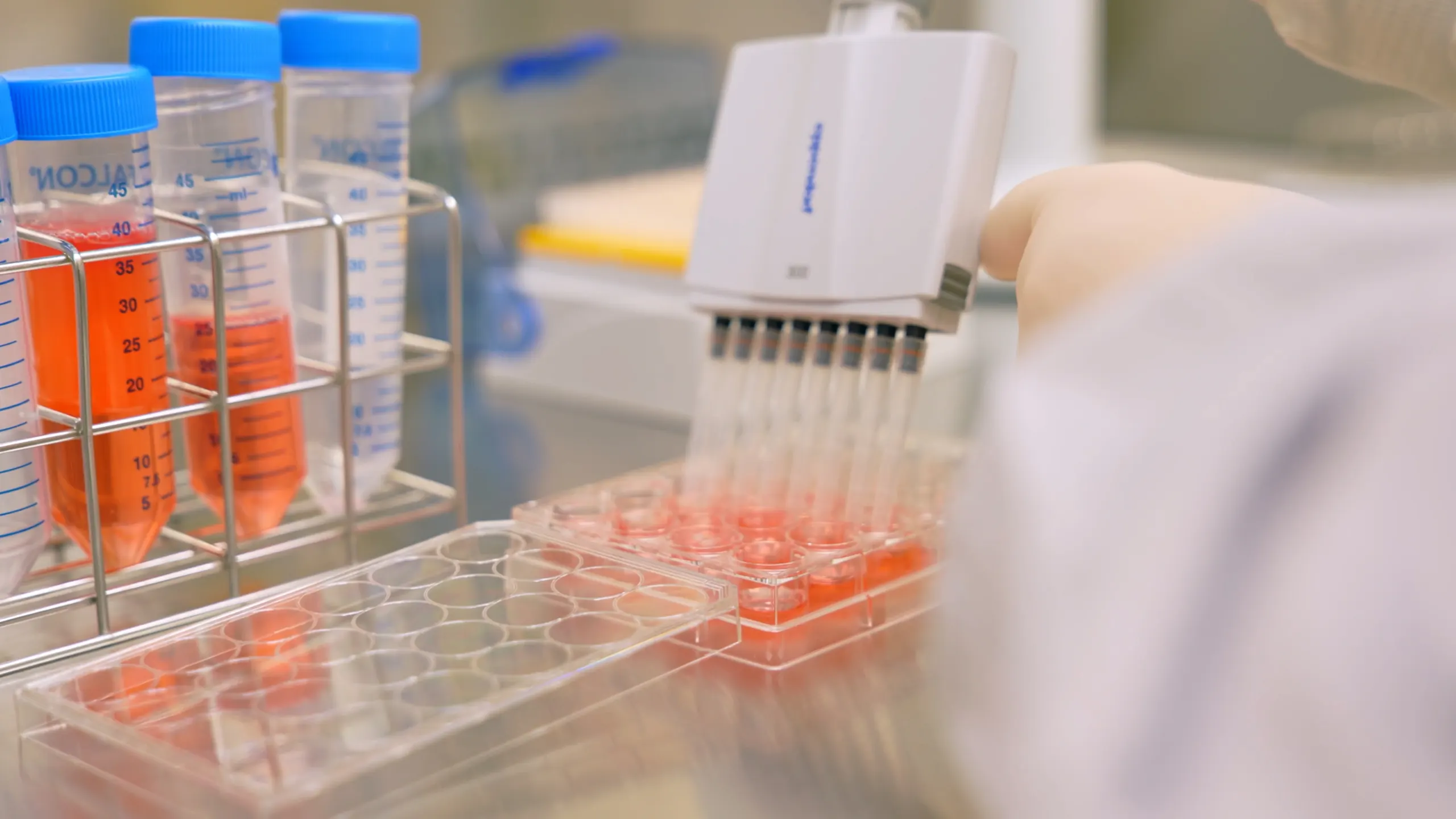
Icons, charts and photos from a laboratory shoot explain the technology. The website runs in two languages, on WordPress with a panel where the company's team adds news itself. After launch we trained the team to use it.

Company reports
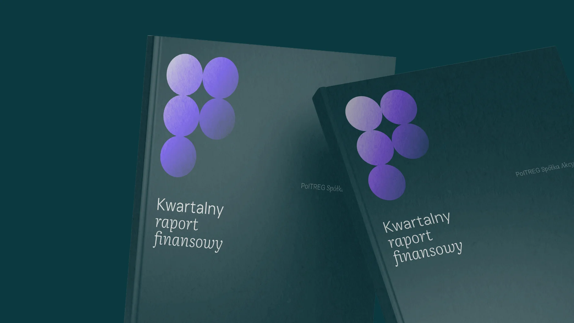
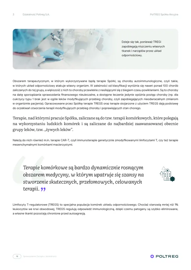
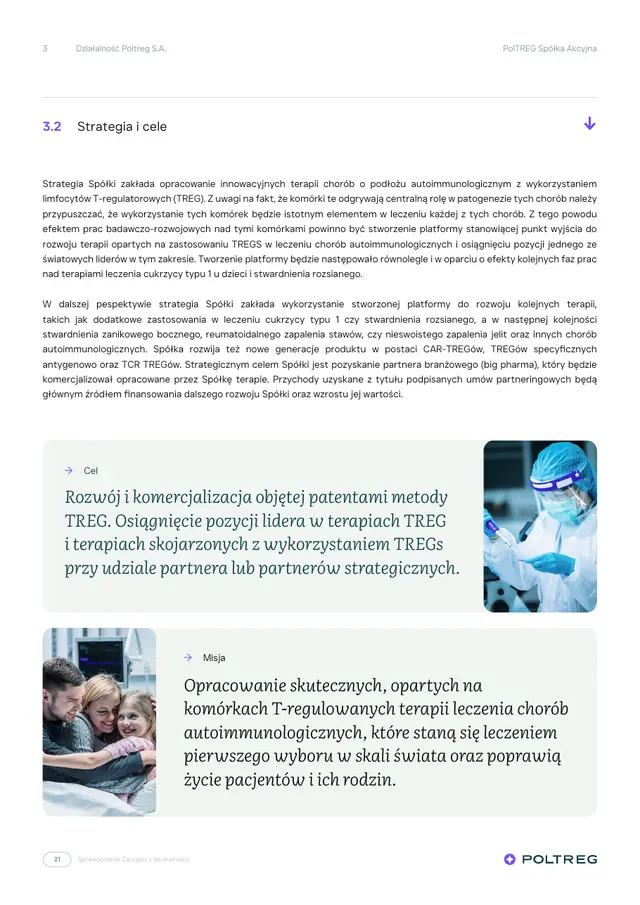
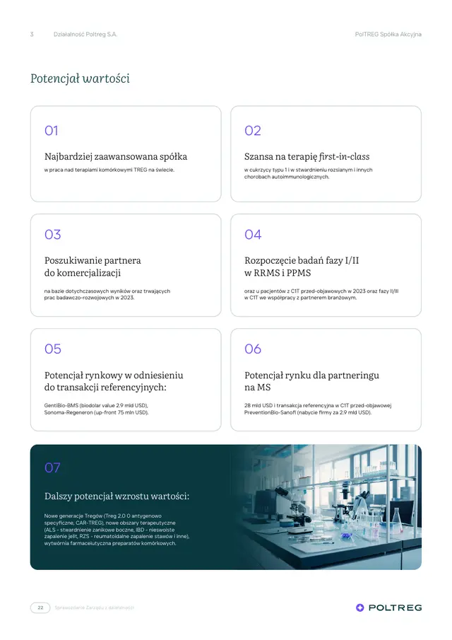
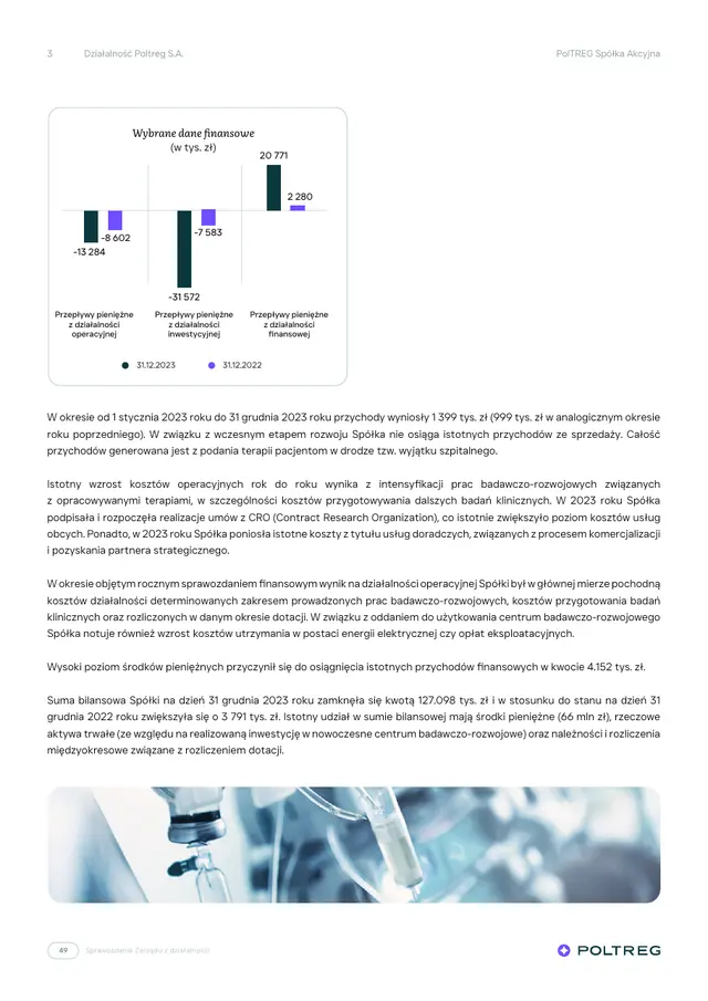
A financial report can have room to breathe too
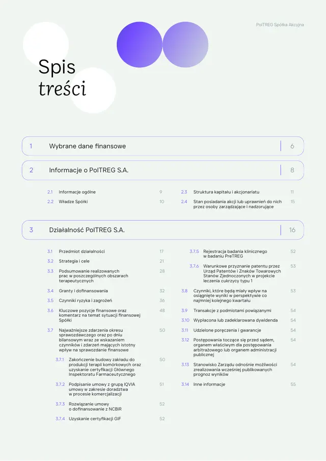
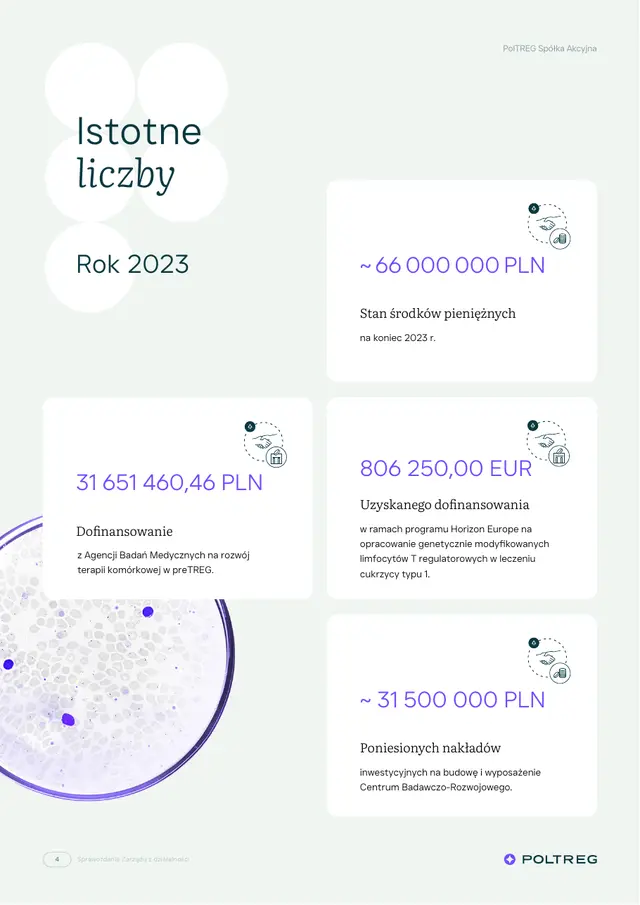
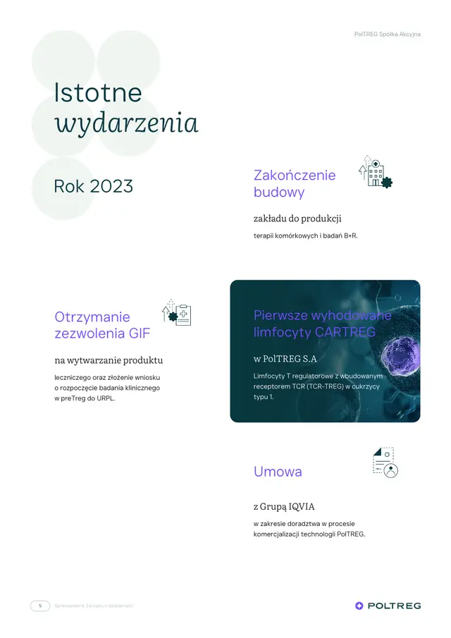
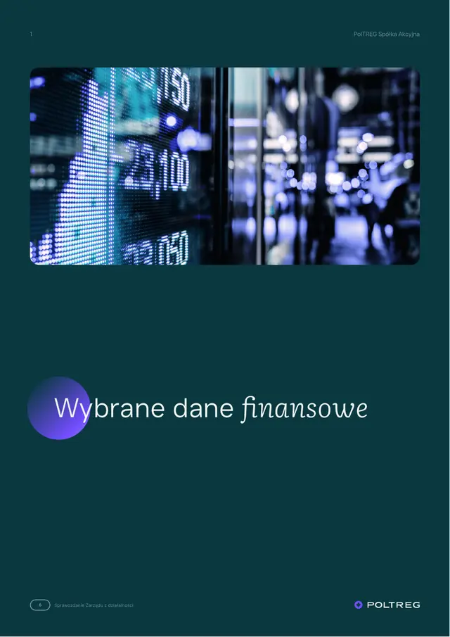
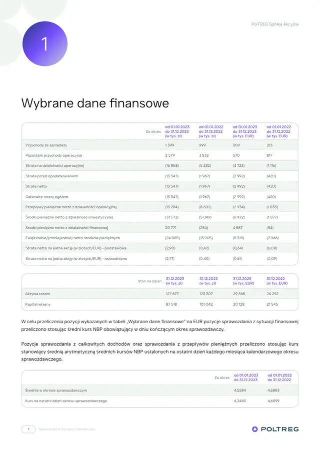
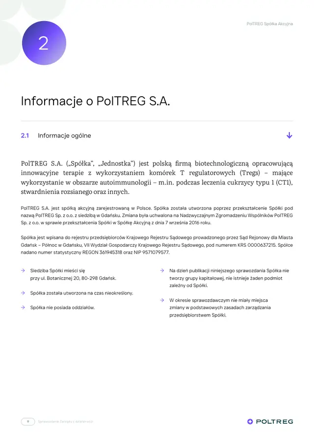
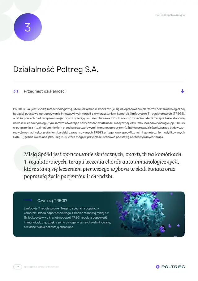
As a listed company, PolTREG publishes reports every quarter. We designed a template for them in the new identity and have laid them out ourselves ever since: no large blocks of text, simple tables and plenty of light. Sections open with dark green pages carrying a photo and a number in a circle.
Management Board report on operations
Social media
The brand in motion
Pre-launch teasers and posts were created together with the brand, and new ones followed regularly.
Before the launch
Before the brand and website went live, the company announced them in social media.
The visual identity sets our brand apart on the market and builds a consistent, professional image that both our customers and our business partners appreciate.
Our cooperation didn't end with one project: we still turn to fluostudio for our ongoing design needs. Every job is delivered on time, with care for the smallest details and to the highest standard.
A brand that works every month
The brand and website were created in 12 weeks, over 6 sprints. Since then the same identity has carried reports, investor presentations and new subpages. The company speaks calmly and clearly to patients, investors and partners, and we make sure every new piece looks like PolTREG.
- Client
- PolTREG
- Collaboration
- ongoing support
- Scope
- Strategy workshops
- Branding
- Logo
- Business materials
- Social media
- Animation
- UI/UX Design
- Website
- Coding
- CMS panel
- Rollout
- PPTX presentations
- Technologies
- WordPress
- CMS panel
- PL and EN
- InDesign
- PowerPoint
- Online
- poltreg.bio
More projects
-
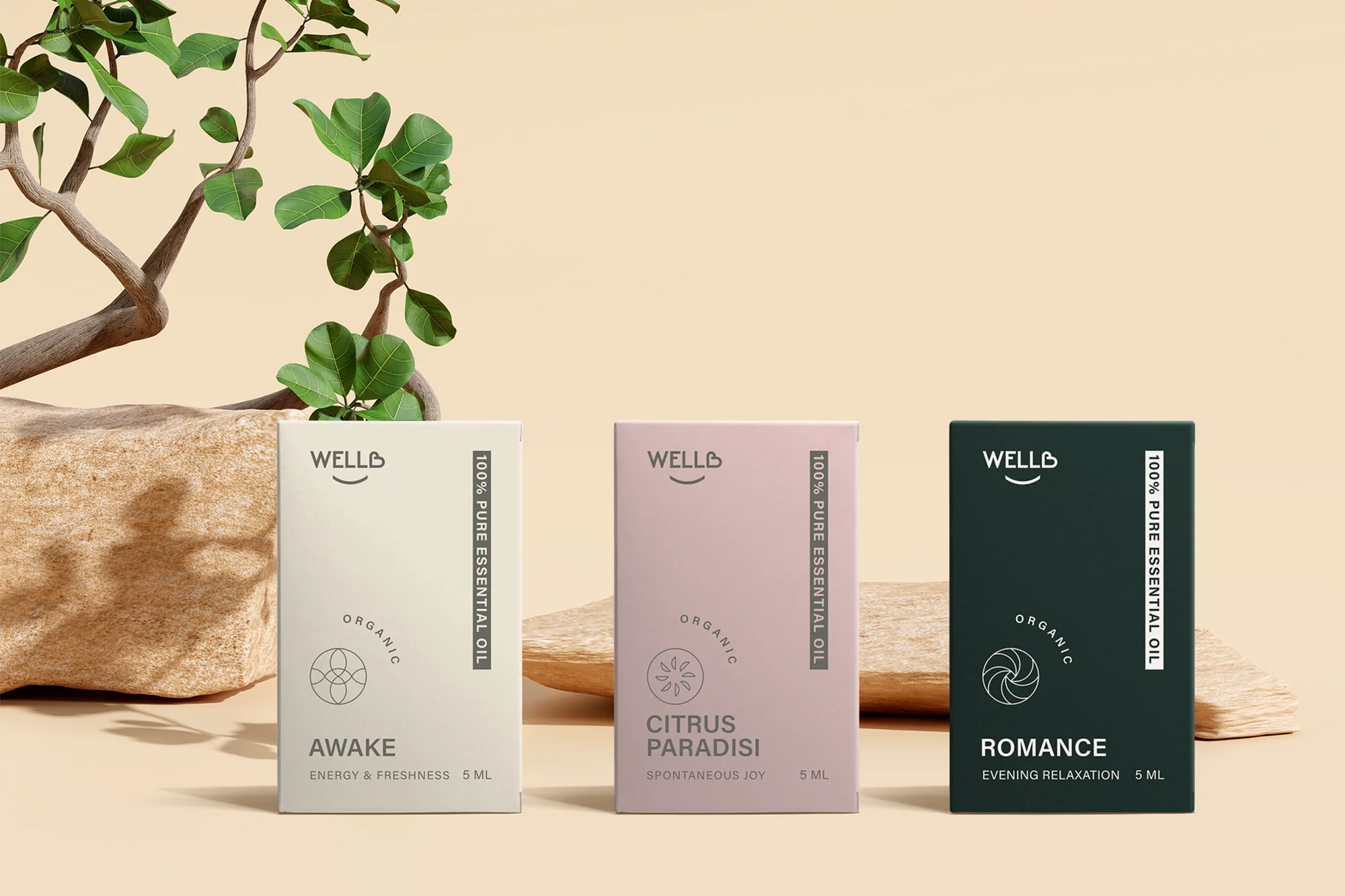 WellB
The name, logo, pillow tags, position cards and a series of five essential oils for a brand of relaxation pillows.
-
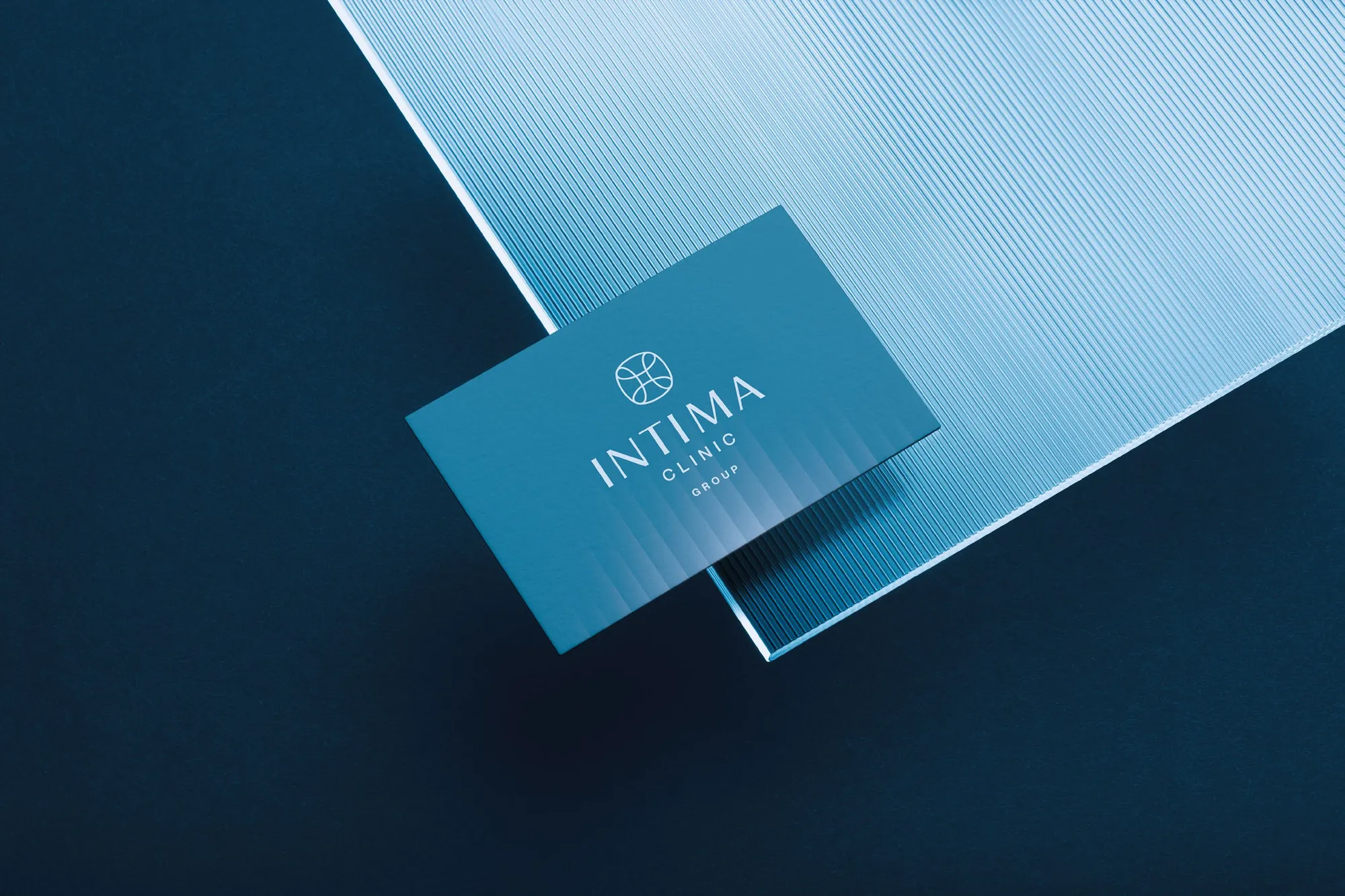 Intima Clinic
Six medical brands in one group. Workshops, names, identity, clinic signage, print, animations and the intimaclinic.pl website.
-
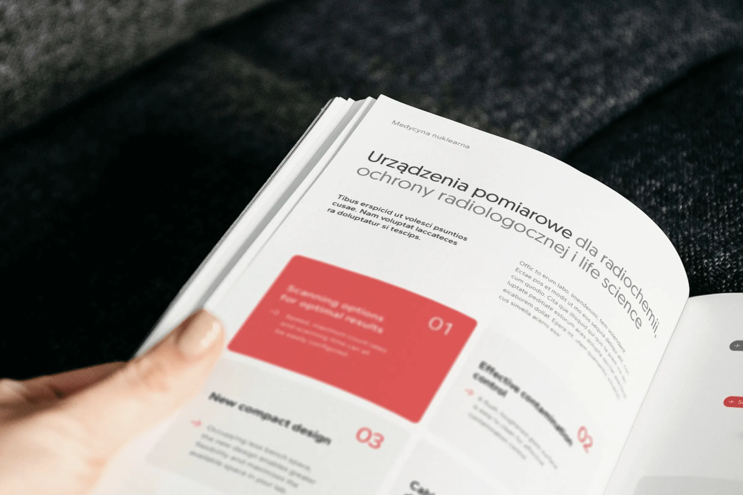 irtech
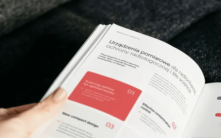
Two workshops, a logo with a plus formed from the letters r and t, over 20 templates and one style for product photos, for a distributor of measuring equipment.
-
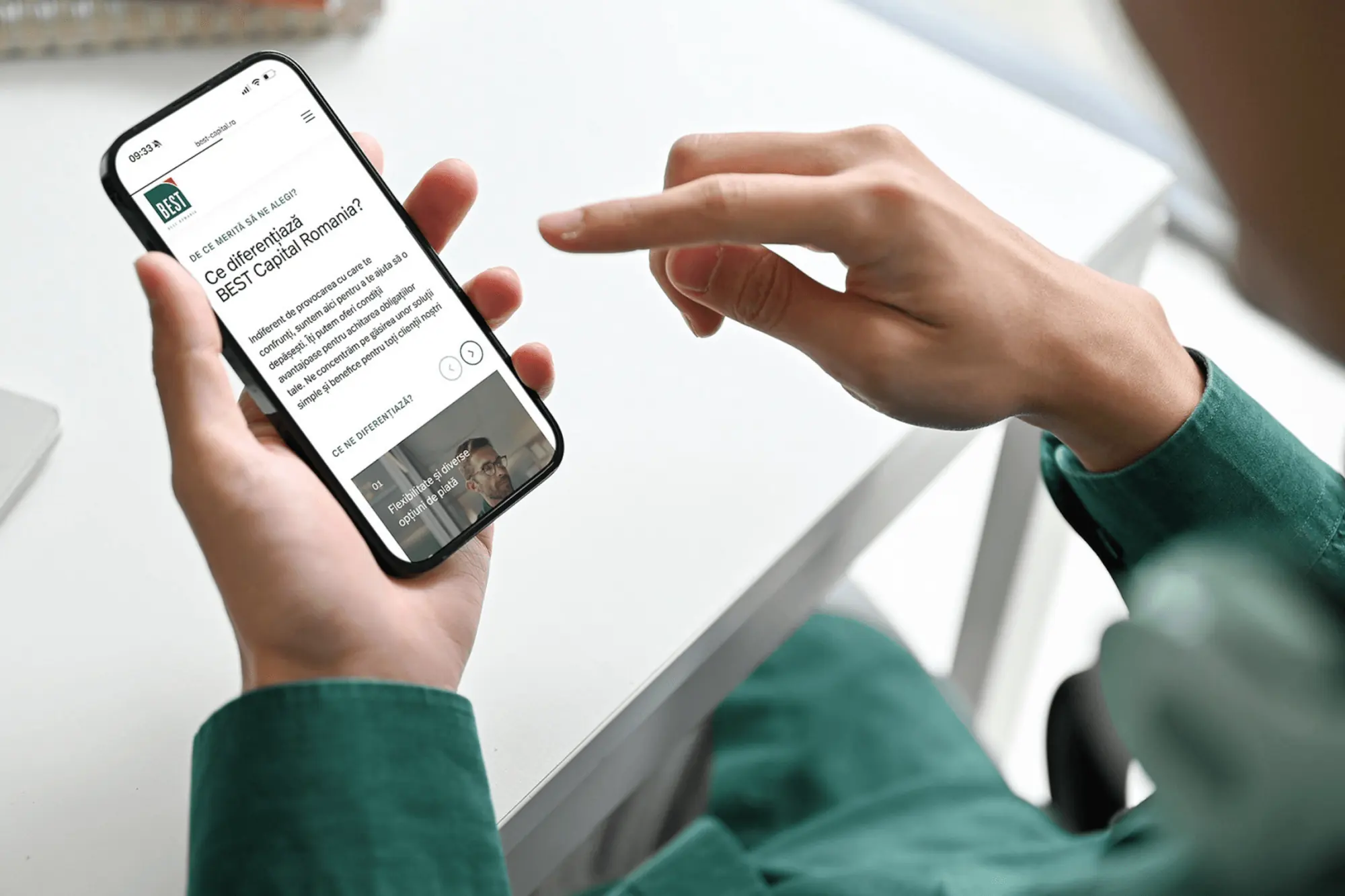 BEST Group
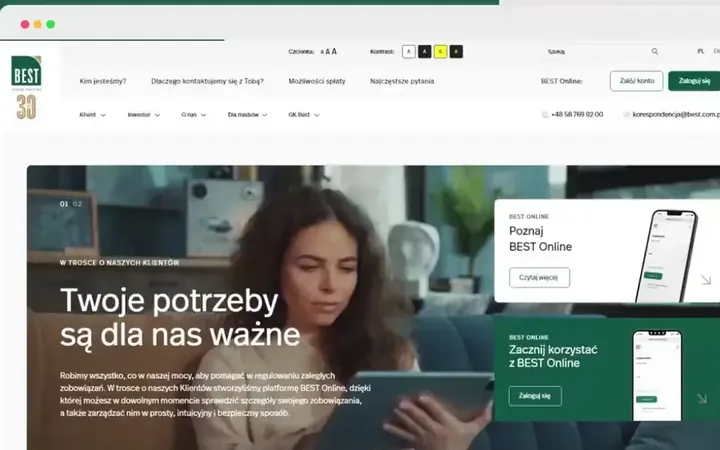
A logo for BEST's 30th anniversary, the new best.com.pl website and one brand system for the group companies' websites in five countries.
-
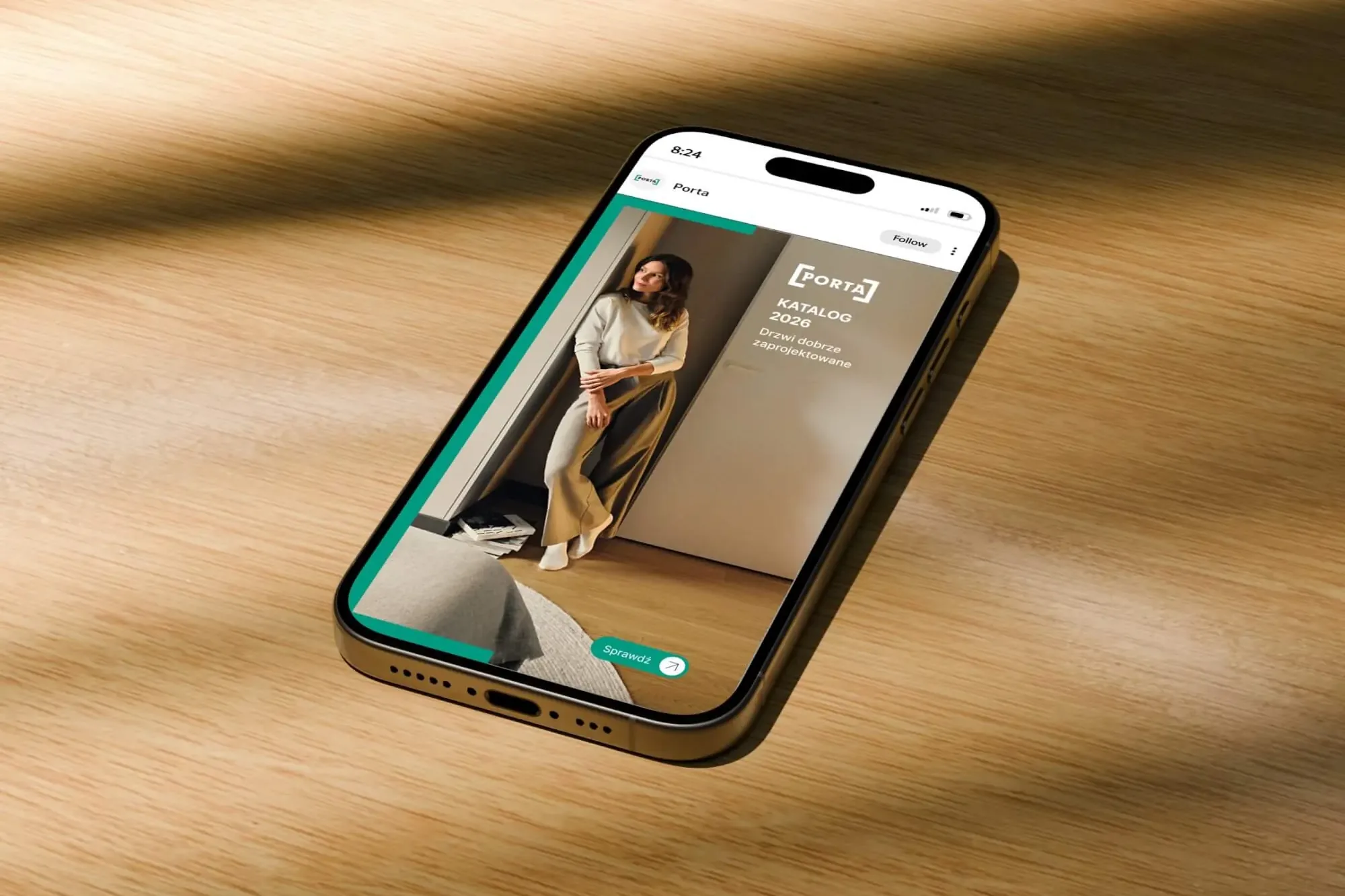 Porta Drzwi
A design system for an existing logo: a frame taken from the logo, grids, icons, drawings, a catalogue, porta.com.pl, social media and sales materials for a door manufacturer.
-
 Mily Group
A rebrand for a deer antler supplier: communication strategy, logo, logo guidelines, the milygroup.com website and trade fair materials.
-
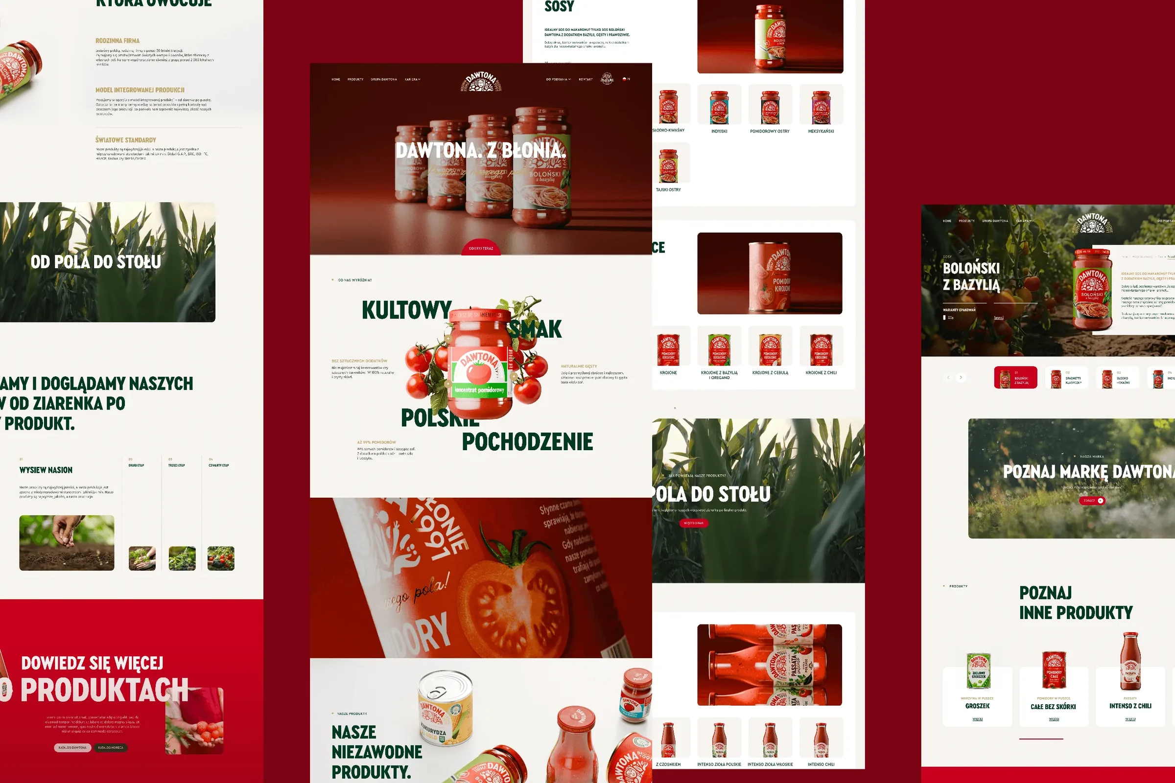 Dawtona Group
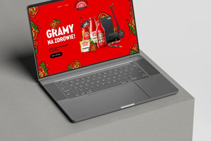
All of Dawtona's communication beyond the shelf: over 90 projects, from posts and trade fair stands to four websites and animations.
-
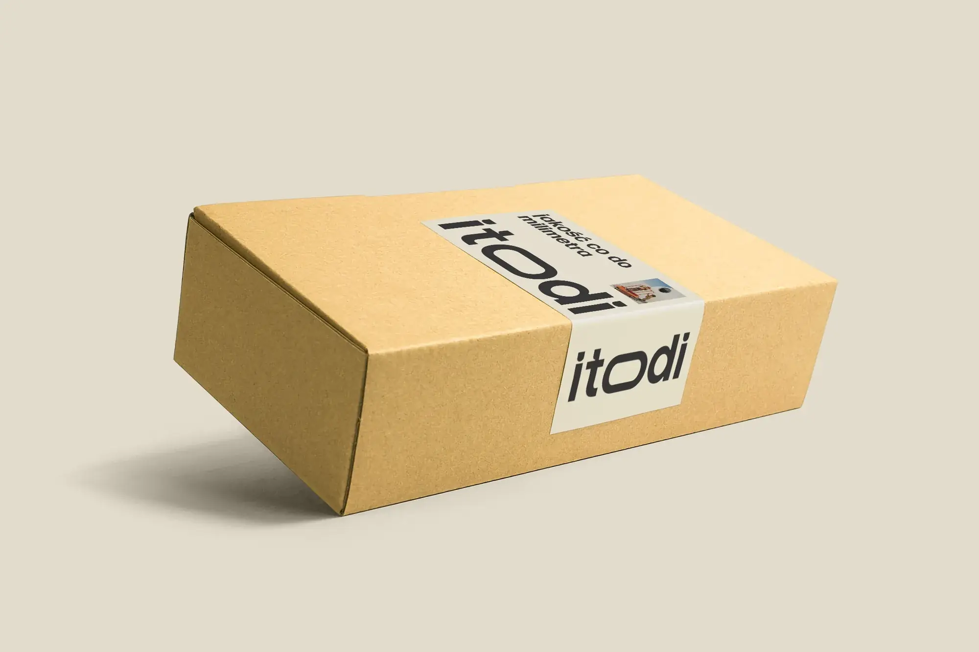 Itodi
A new made-to-measure furniture brand built from scratch: the name, a logo with a stretched “o”, the design of a shop with a configurator, an instruction leaflet and packaging.
-
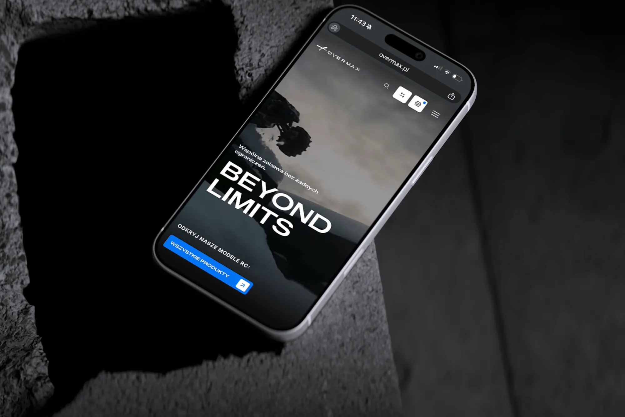 Overmax
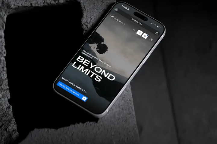
UX/UI design for the Overmax shop: RC cars in cinematic shots, a carefully worked-out product page, a category menu and a quiz that picks a model for you.
-
 Design Optyk
A family-run chain of premium eyewear stores: an identity without gold, in-store materials and a new online shop linked to the stock of six of its seven stores.
-
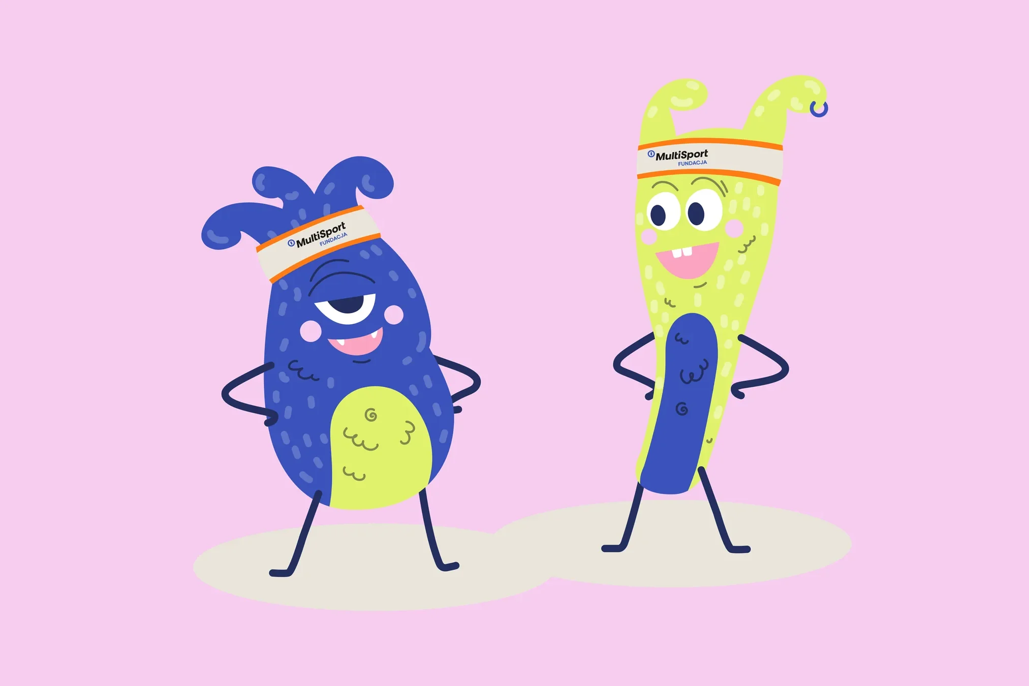 Fundacja MultiSport
An identity with a design system in Figma, a WCAG-compliant website and a brand hero duo that gets people moving.
-
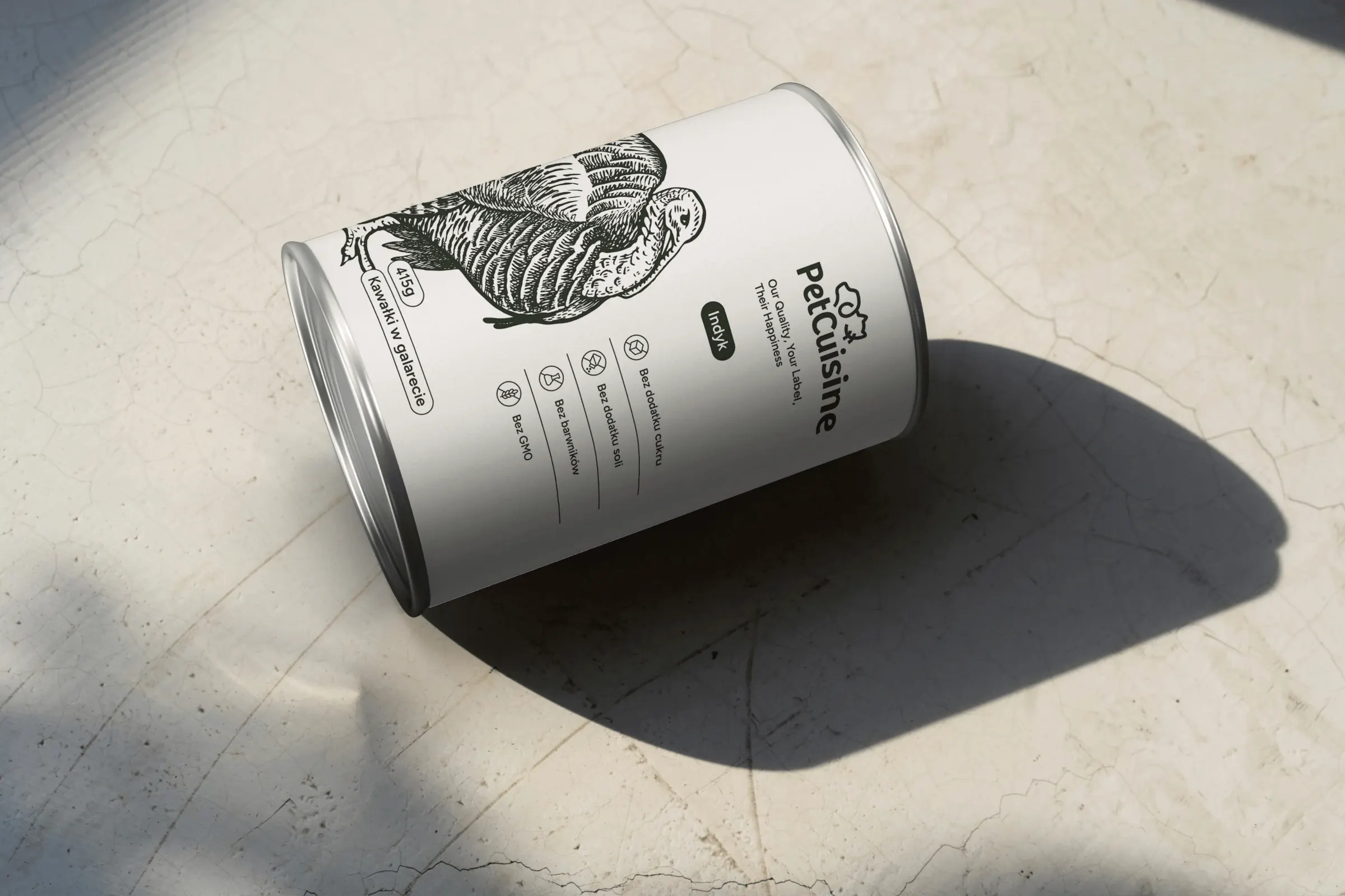 PetCuisine
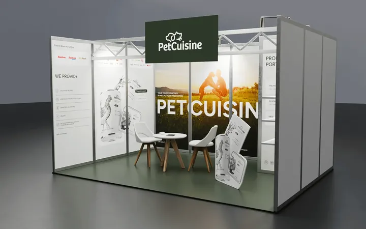
We built a brand from scratch for a pet food manufacturer in the Dawtona Group: from the name and tagline, through packaging in 12 flavours and the website, to trade fair stands across Europe.
Facing a similar challenge?
Tell us what you want to change. In a first, no-obligation call we will see whether and how we can help.