



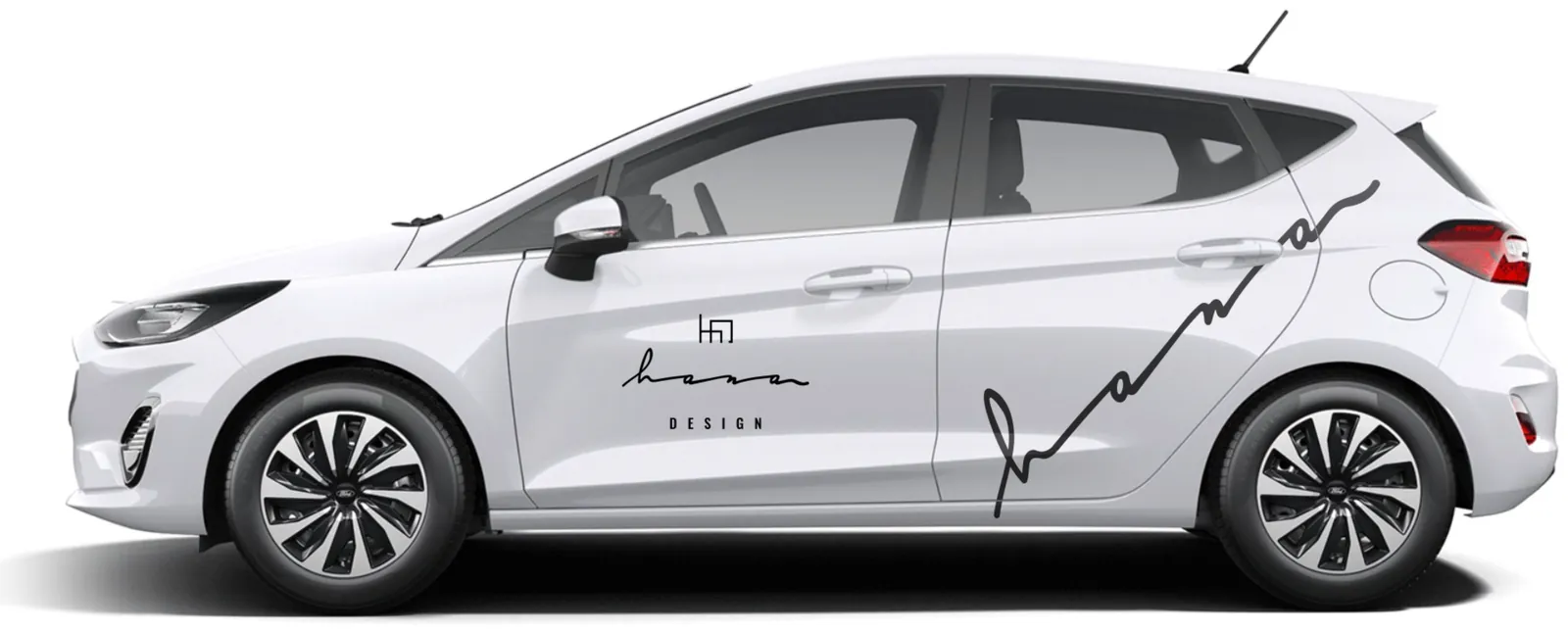
Ford Fiesta
-
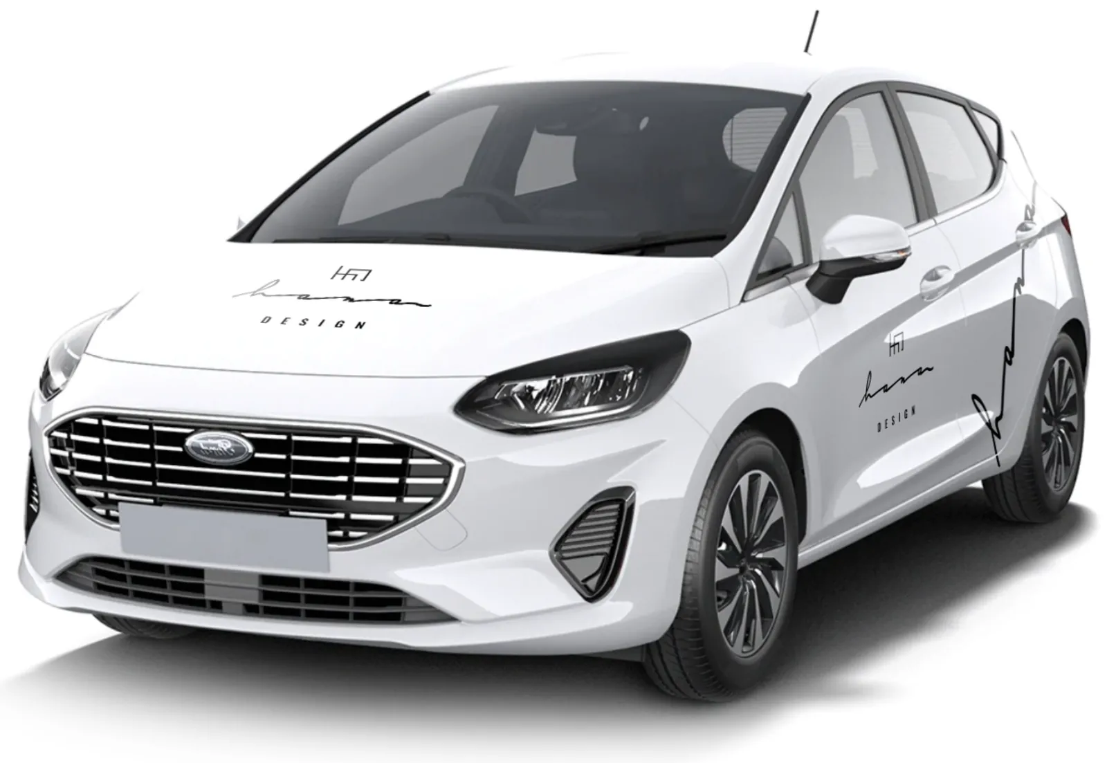
Front
-
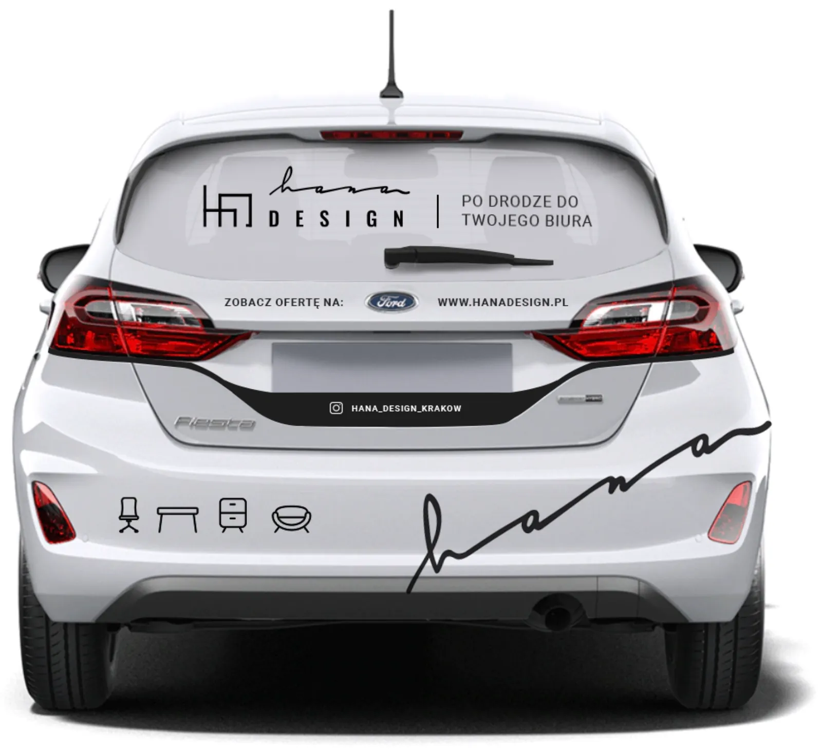
Back
-
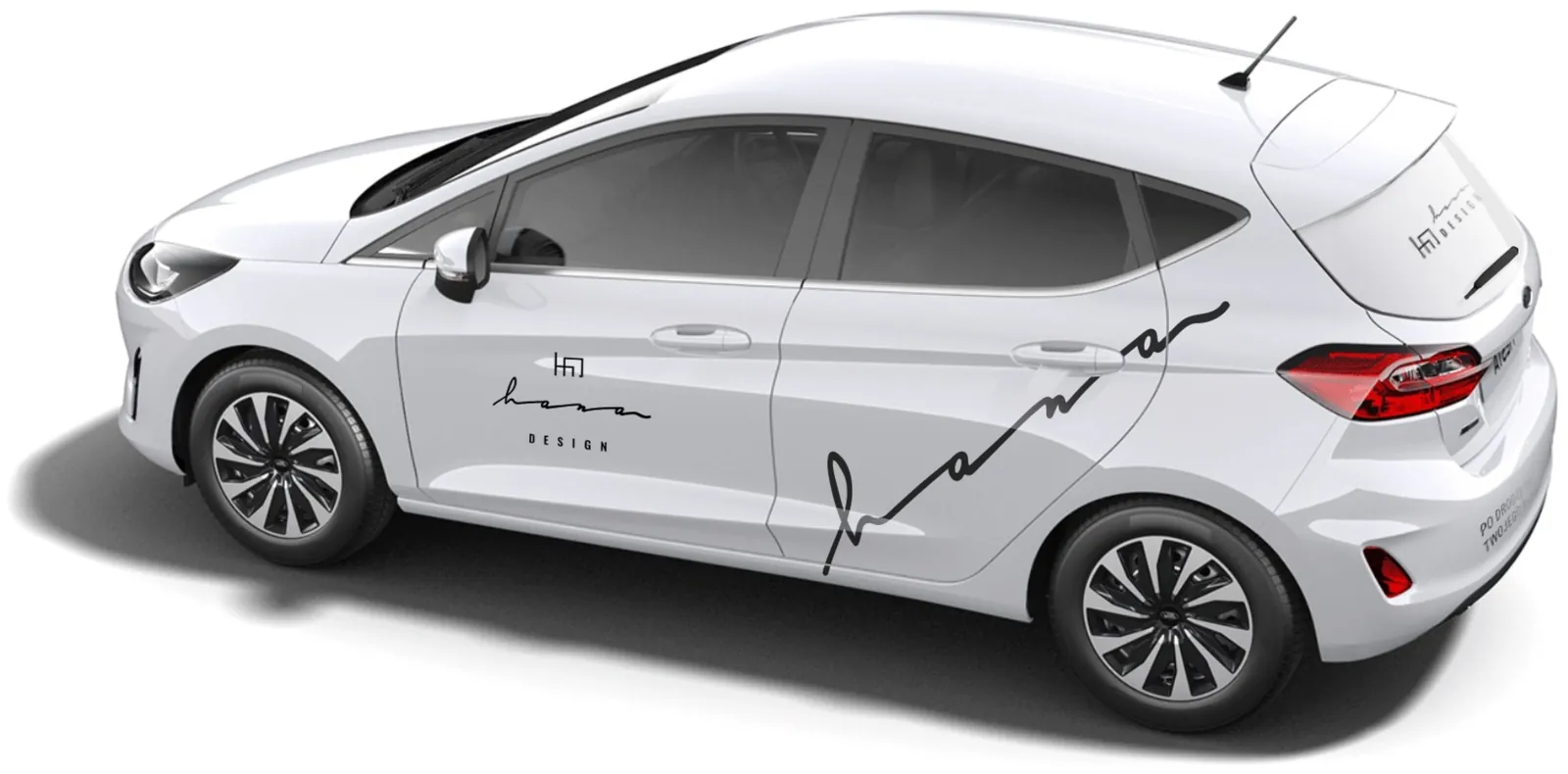
From above
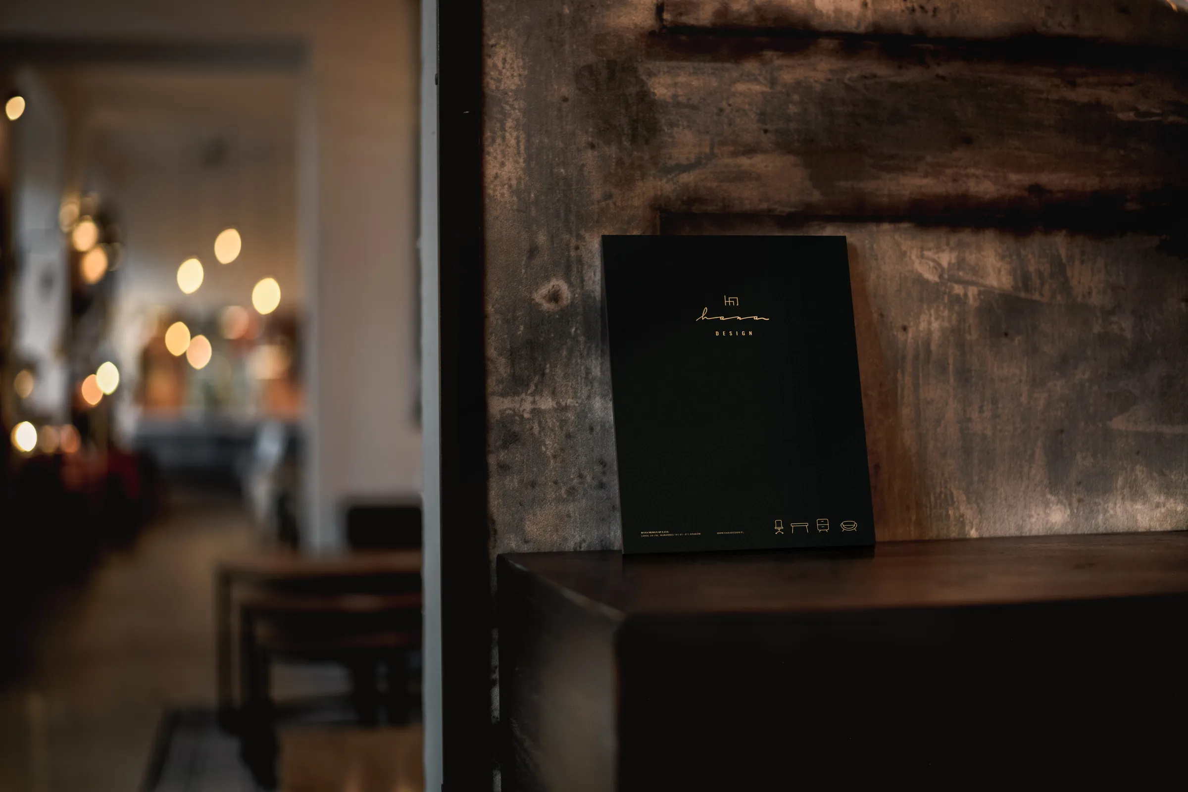
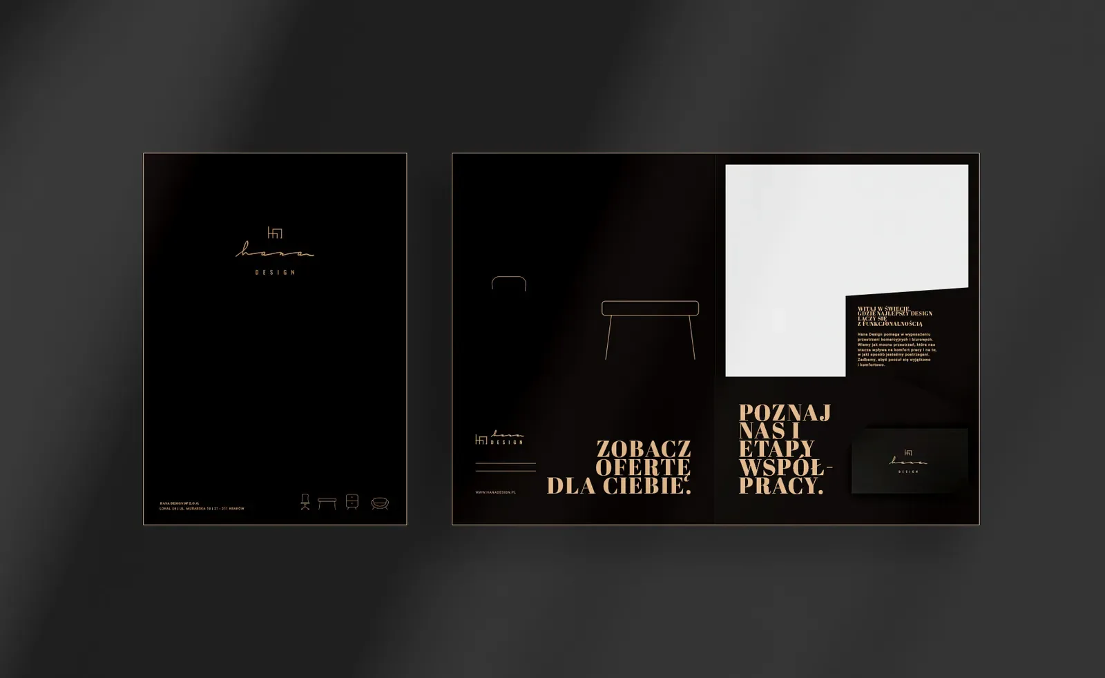
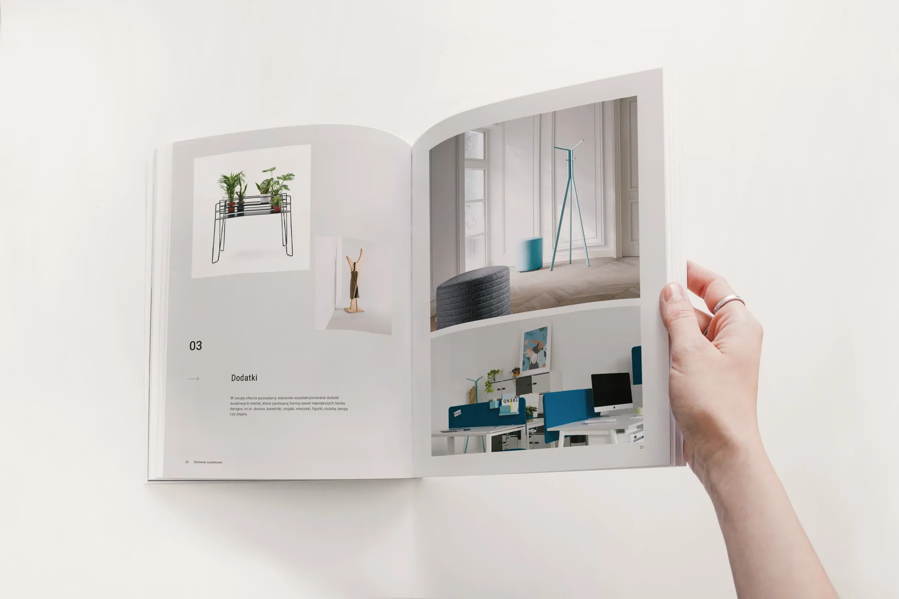
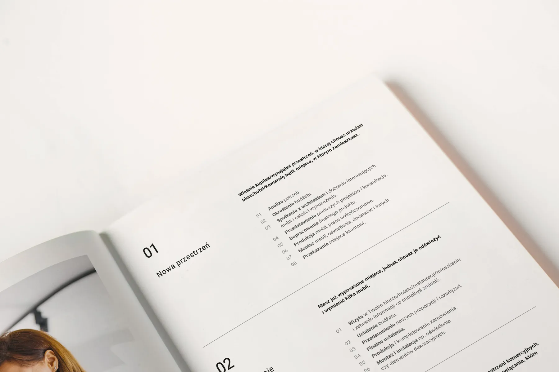
A refreshed logo, printed materials with copper foil, materials for architects, a website with a furniture configurator and vehicle wraps.
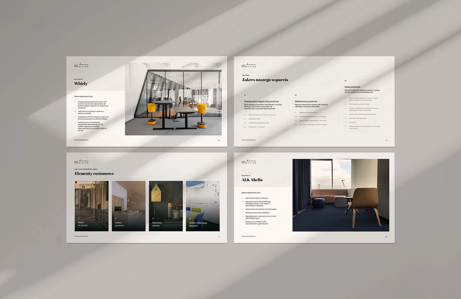
Hana Design furnishes offices and commercial interiors with furniture from several dozen international brands, and makes made-to-measure furniture itself. Where the client buys is often decided by architects and interior designers, so the brand had to win over both.
How it works
Logo facelift
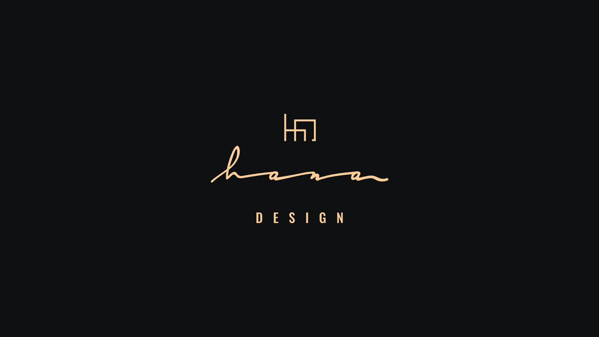
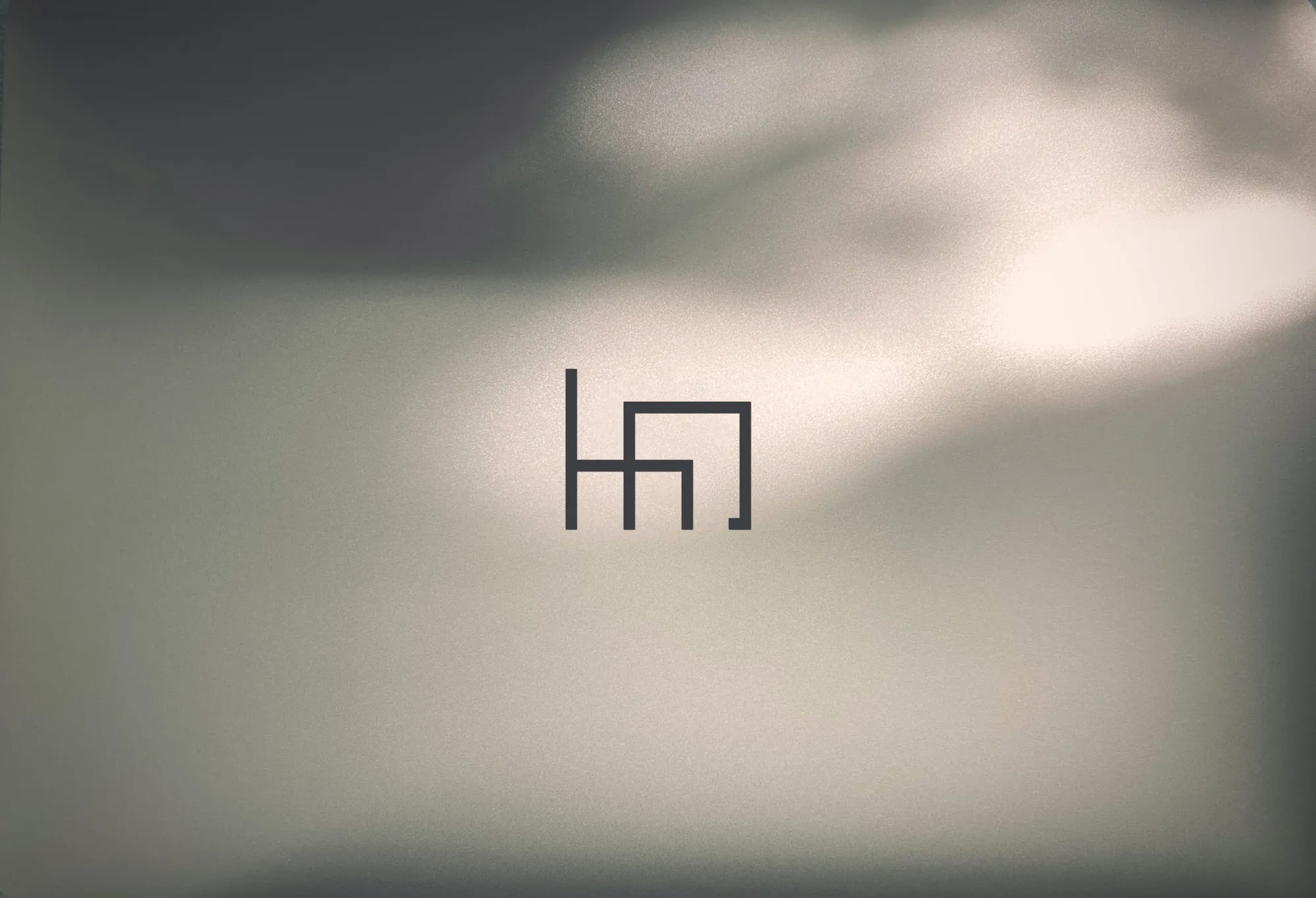
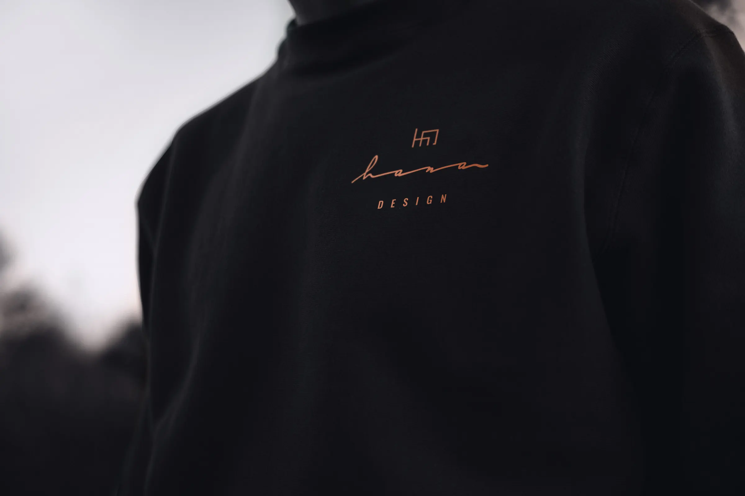
The handwritten “hana” in a thin line wasn't always legible, and the logo had only one version, which was hard to fit on a folder, a car or a website header. The brand was well known, so the logo stayed and we gave it a refresh.
Company materials
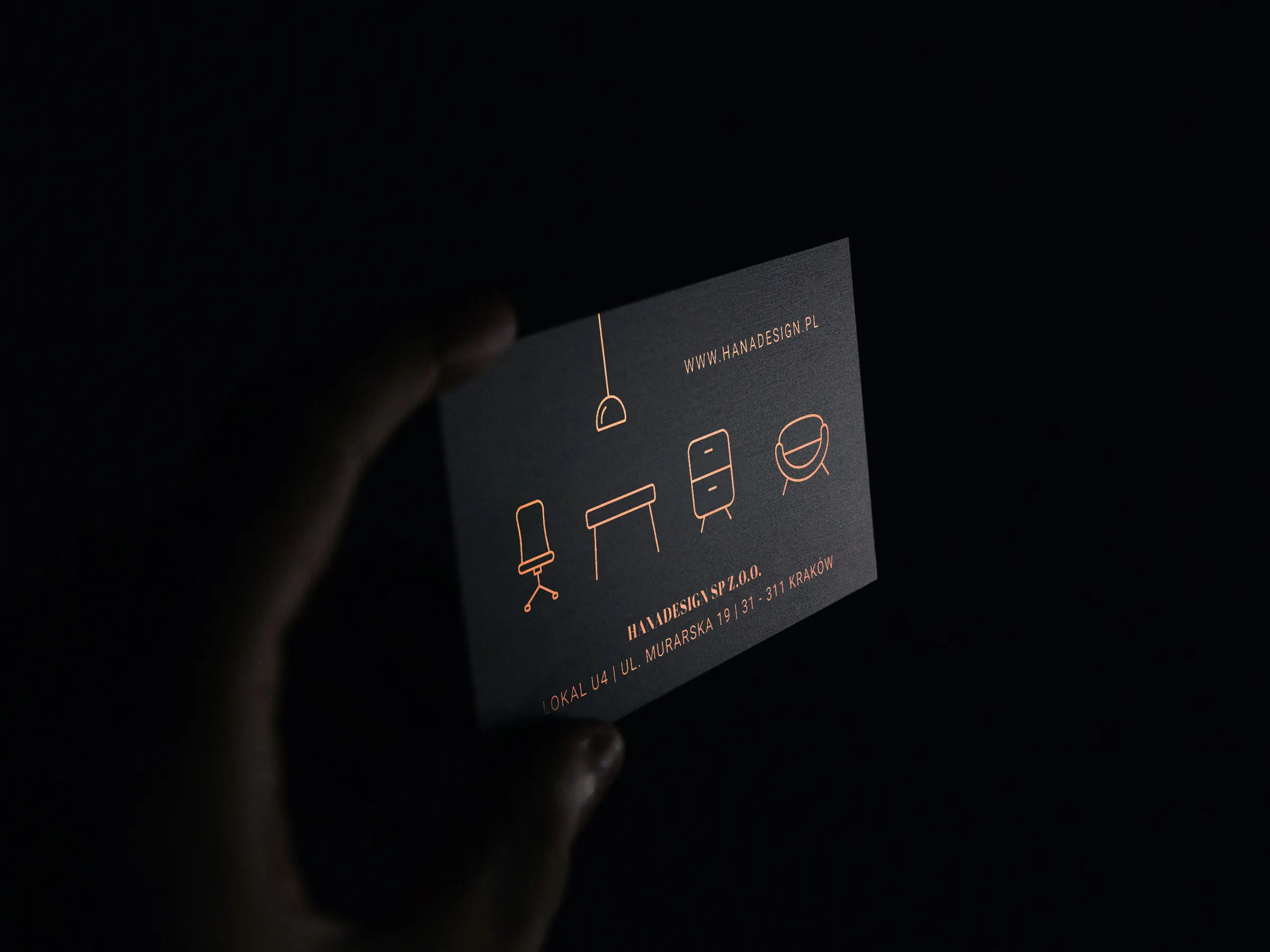
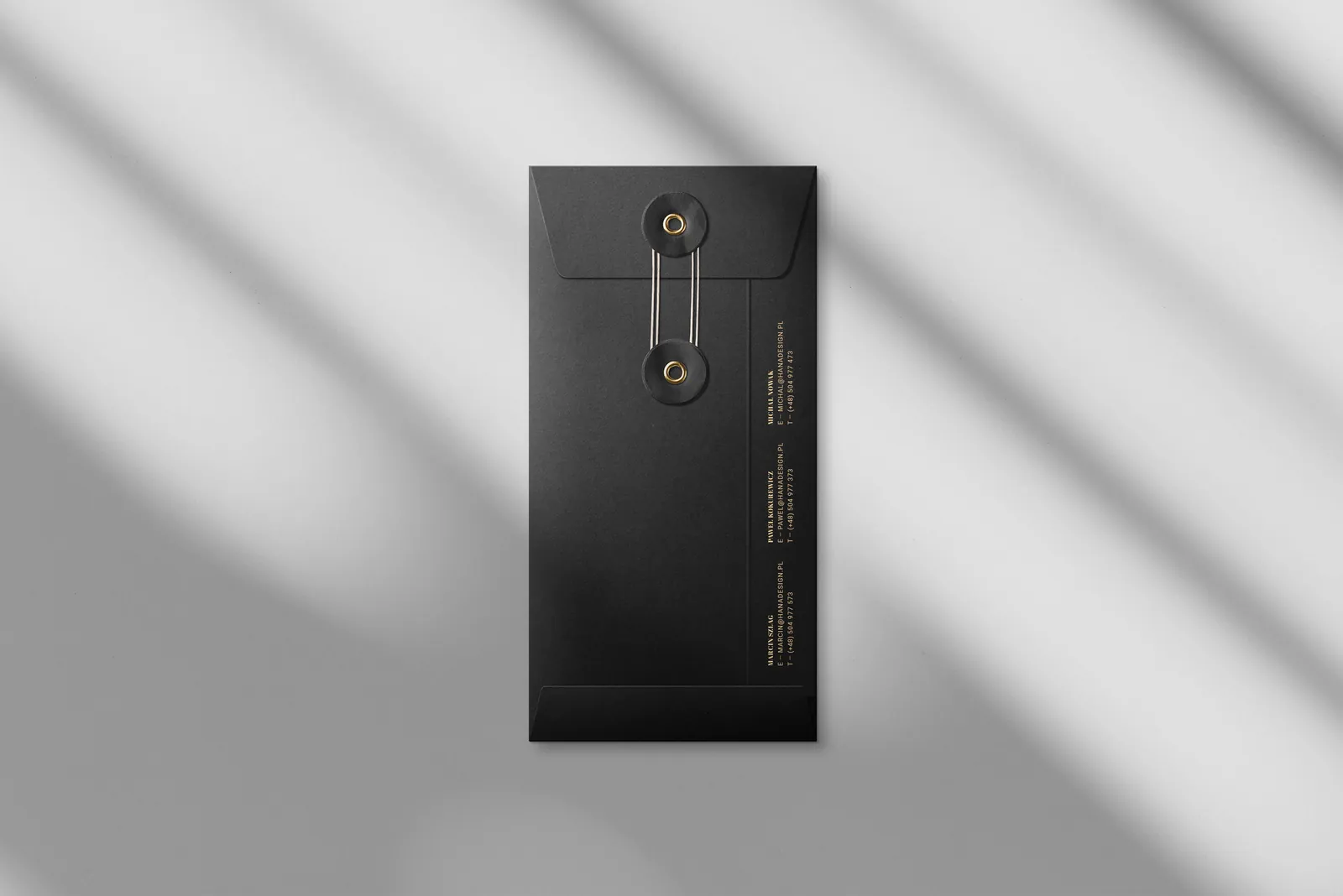
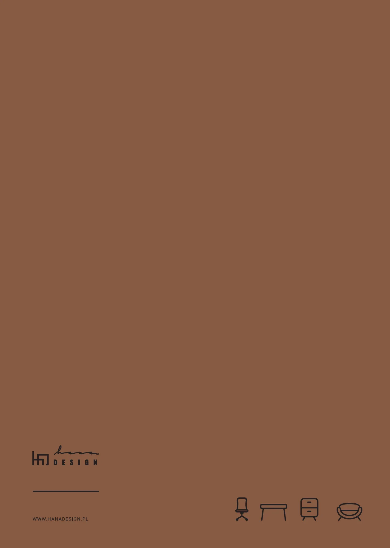
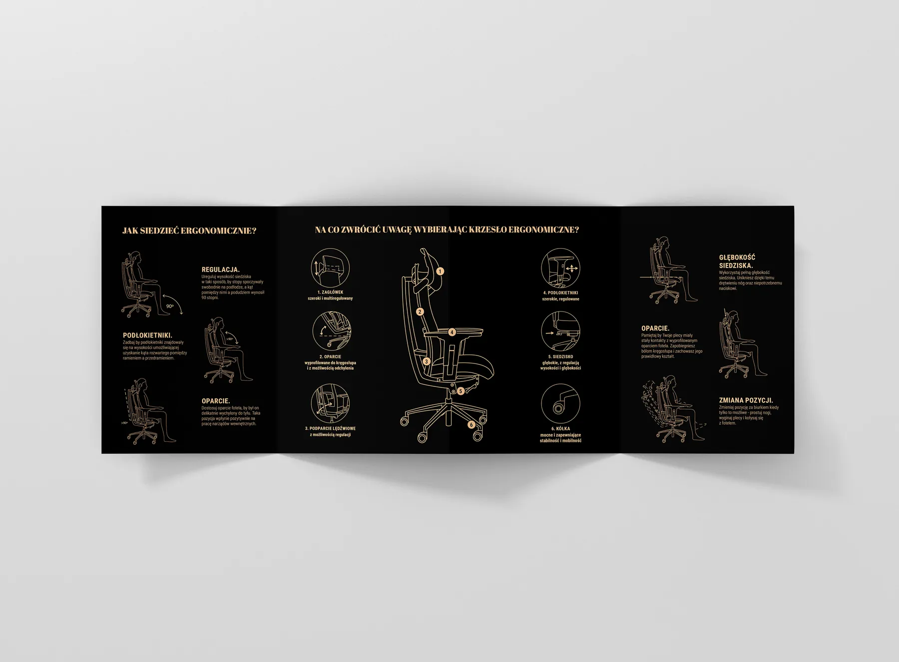
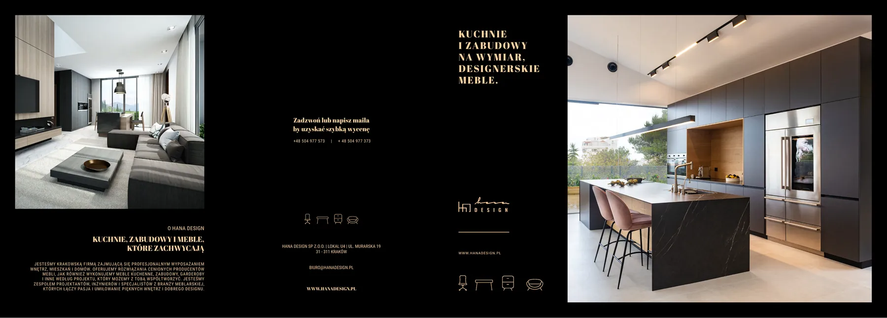
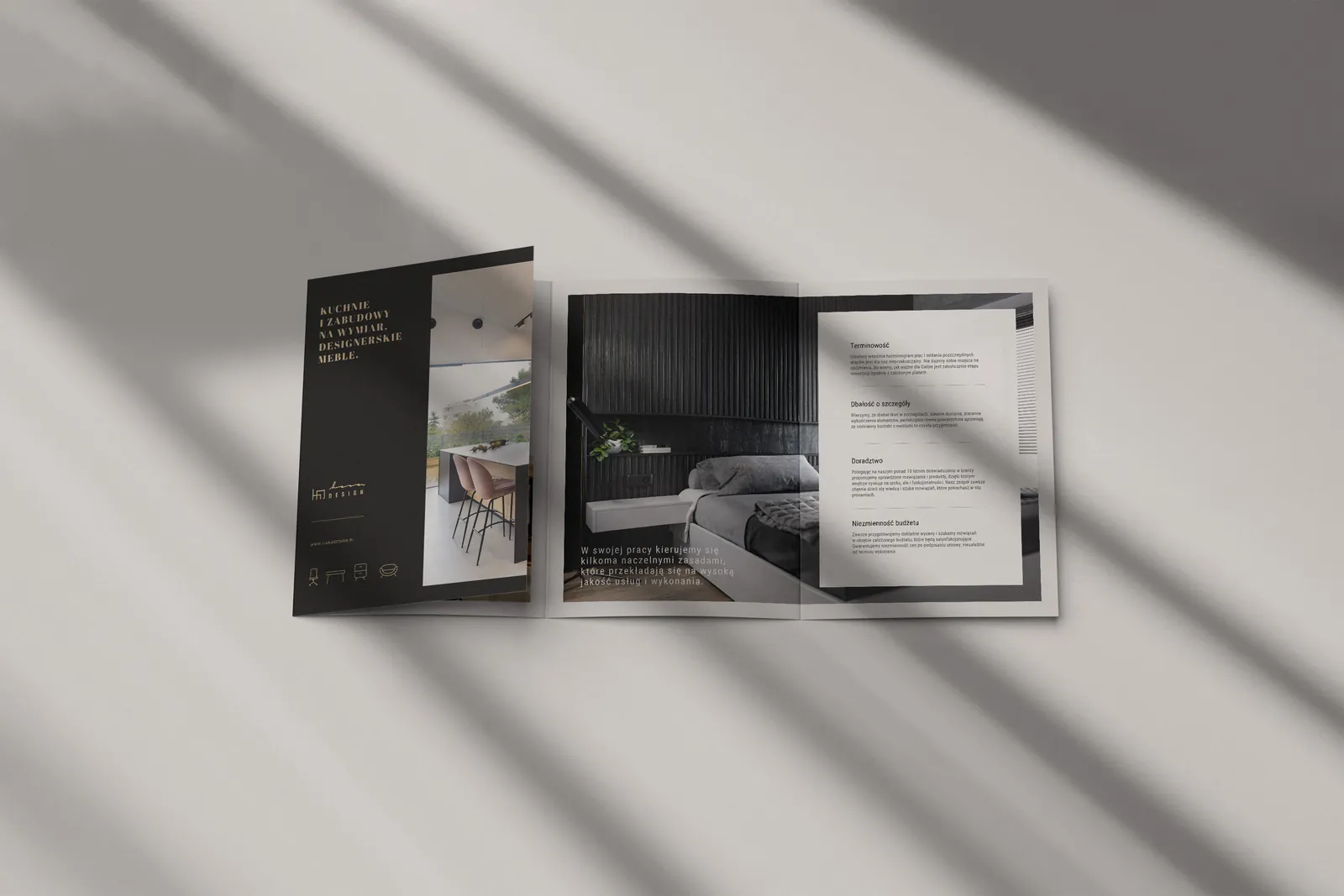
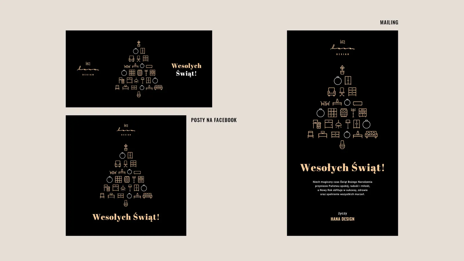
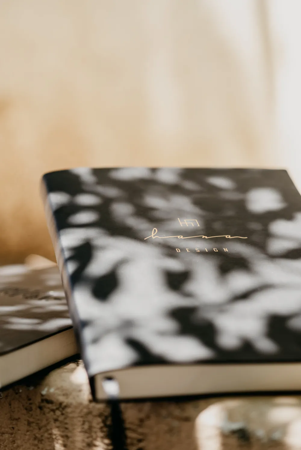
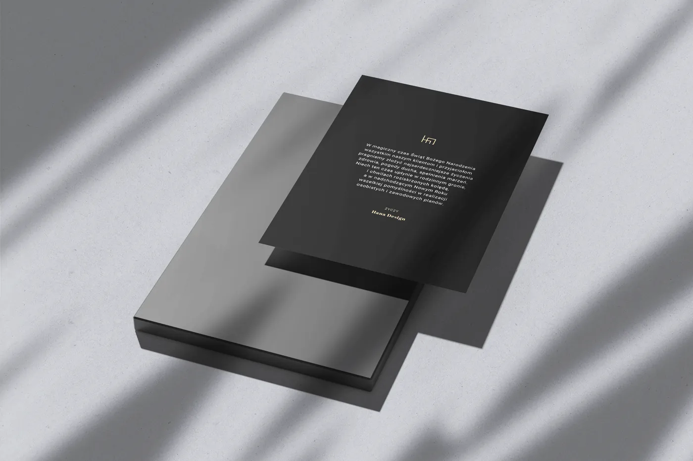
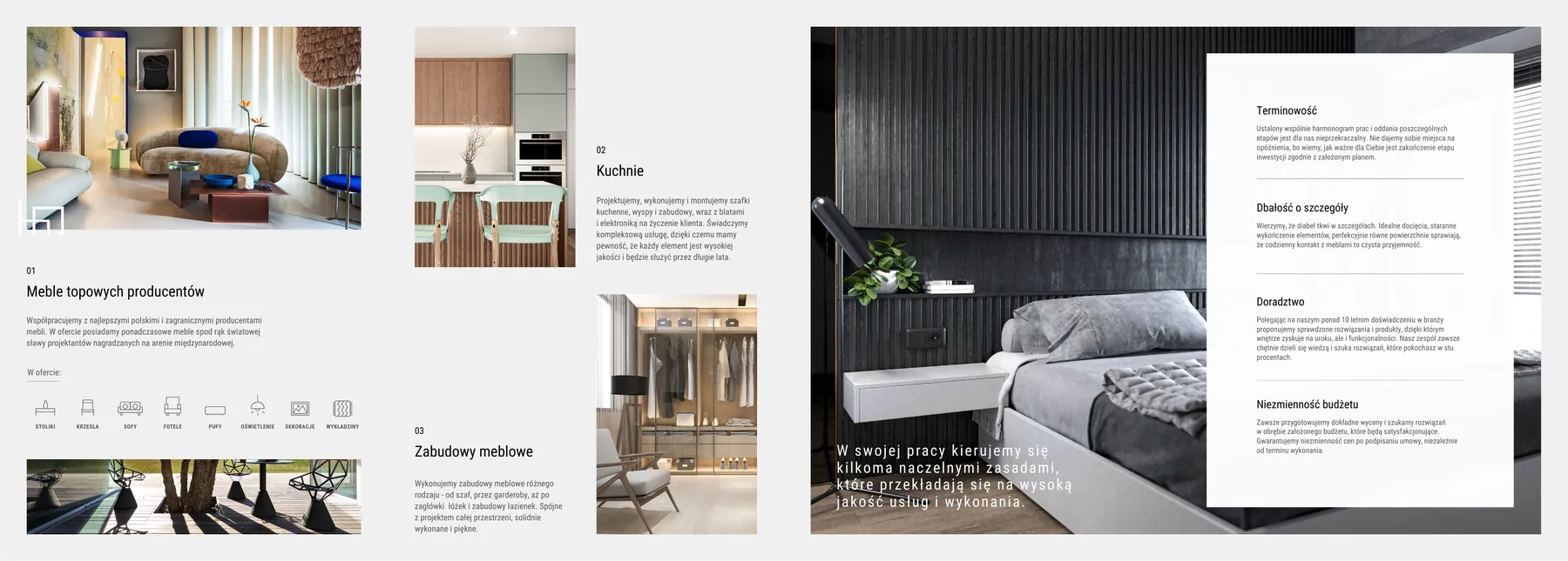
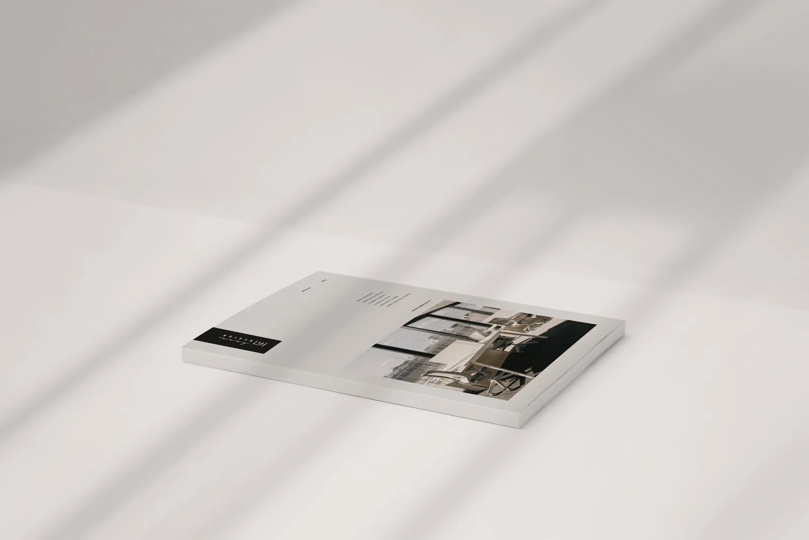
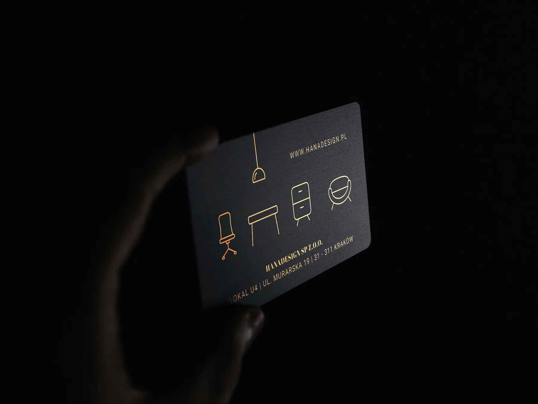
The furniture on offer is often colourful and interesting in form, so the printed materials are quiet: black through-dyed paper, plenty of space and one accent, copper gold. On the business cards it's hot stamping, foil pressed into the paper with heat.
Website with a configurator
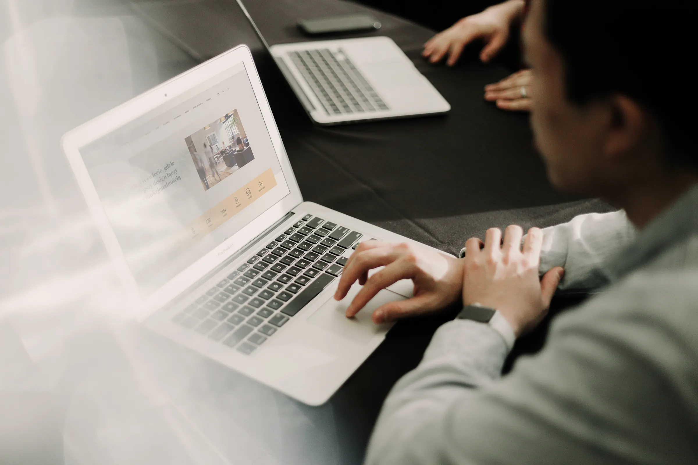
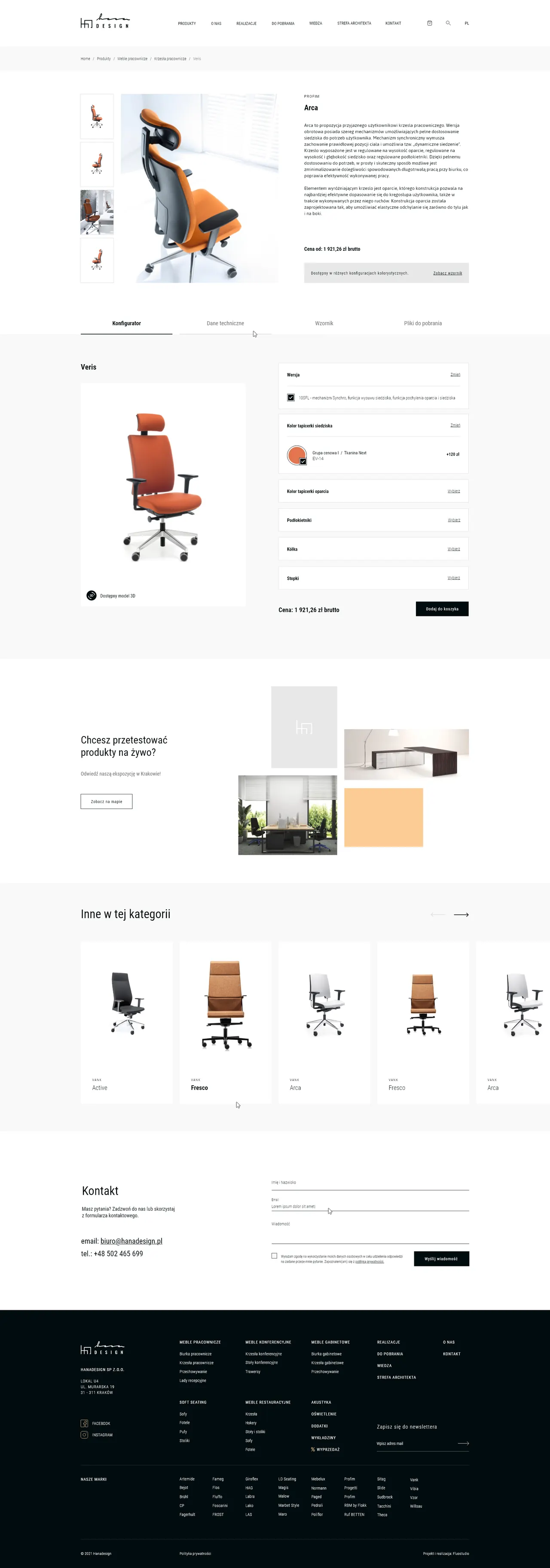
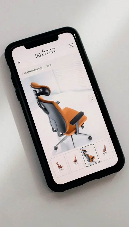
A chair has upholstery and a frame, a desk has a top and legs, a reception counter has melamine and metal. We designed one configurator structure that fits all of them. The customer picks variants from the swatches, sees only their own selection and adds the product to an enquiry, which goes to a sales rep.
MARO
Emel reception counter
Enquiry
Melamine and metal swatches from the product page on hanadesign.pl
Vehicle wraps
That's Hana Design's tagline, and the cars of its sales reps and fitters carried it around the city. The “hana” from the logo runs along the whole side, with furniture icons from the catalogue below it. First came a Fiesta car, then a Ducato van in the same style.
Front
Back
From above
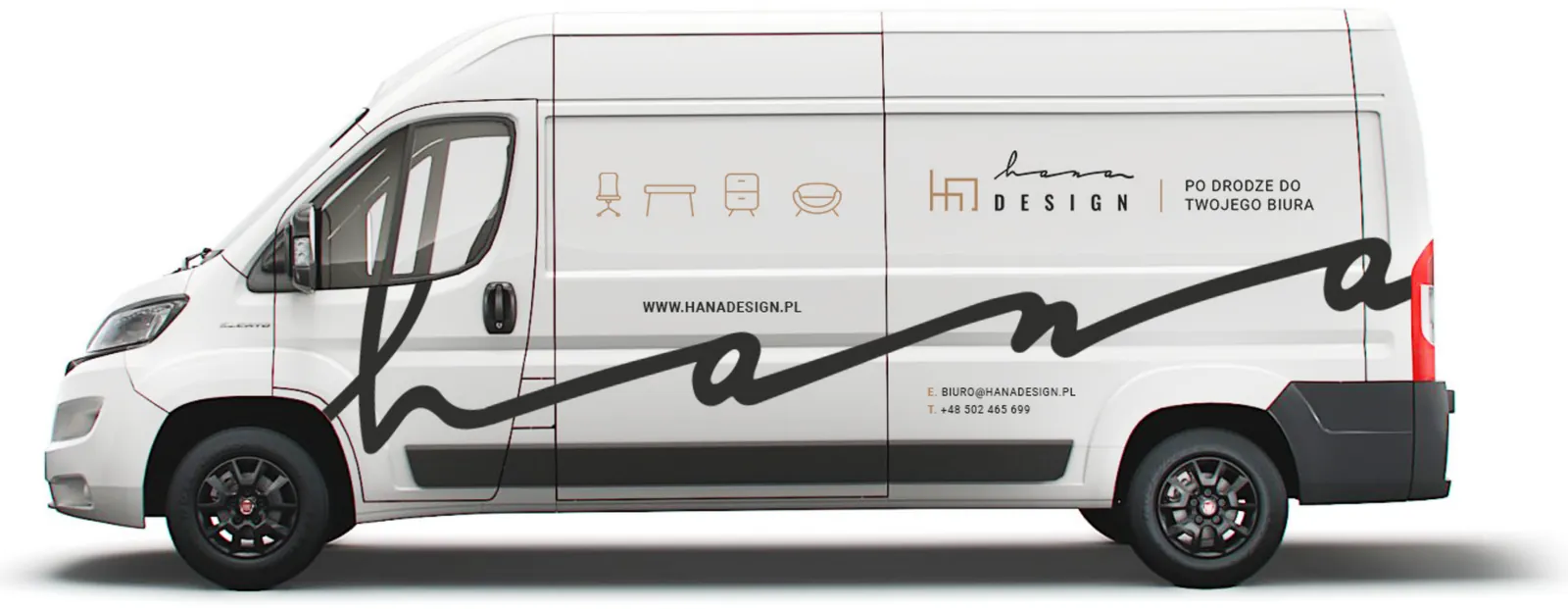
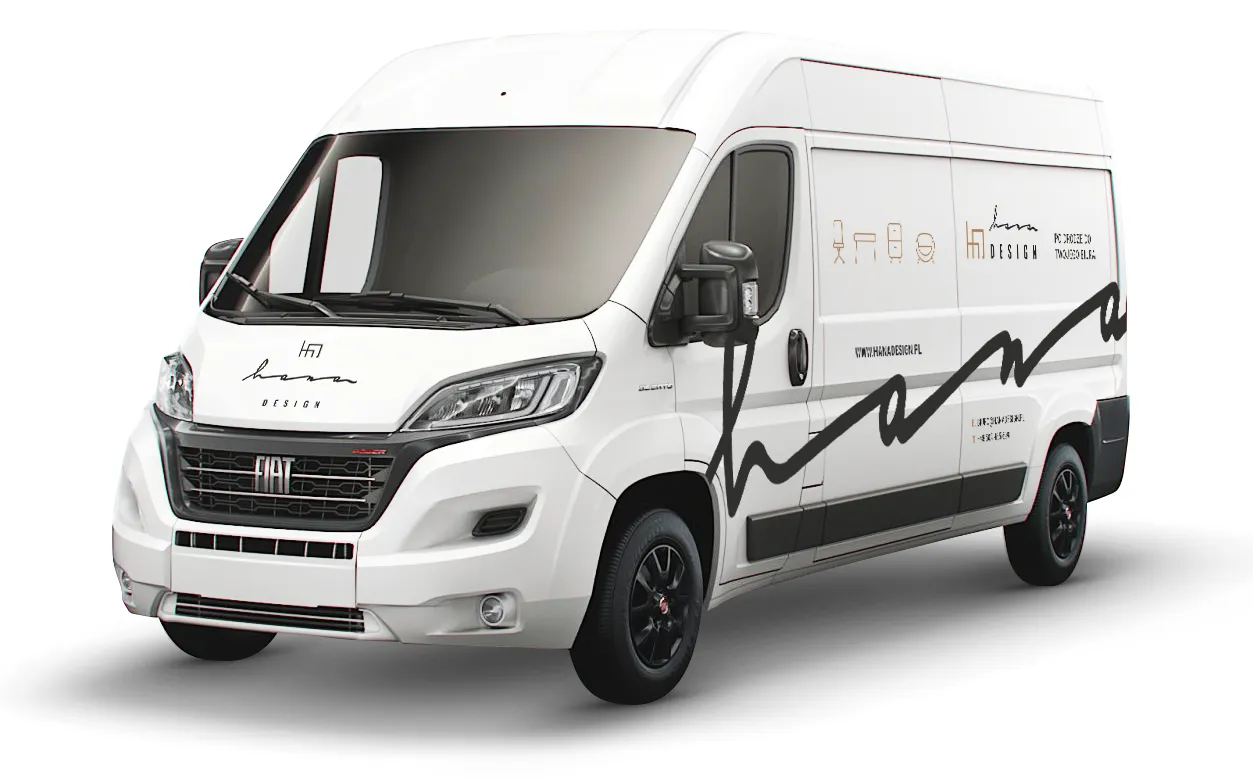
Front
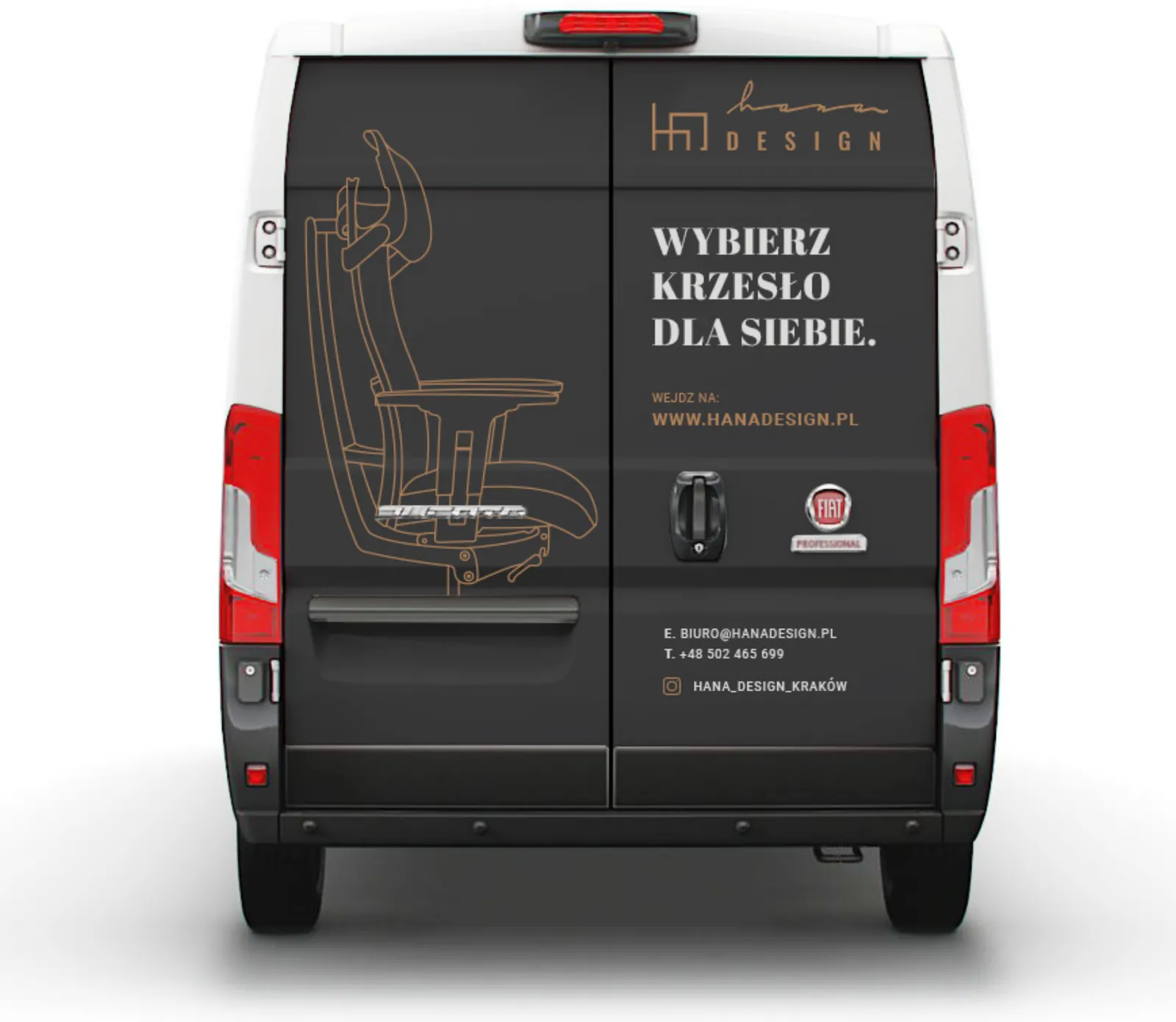
Back
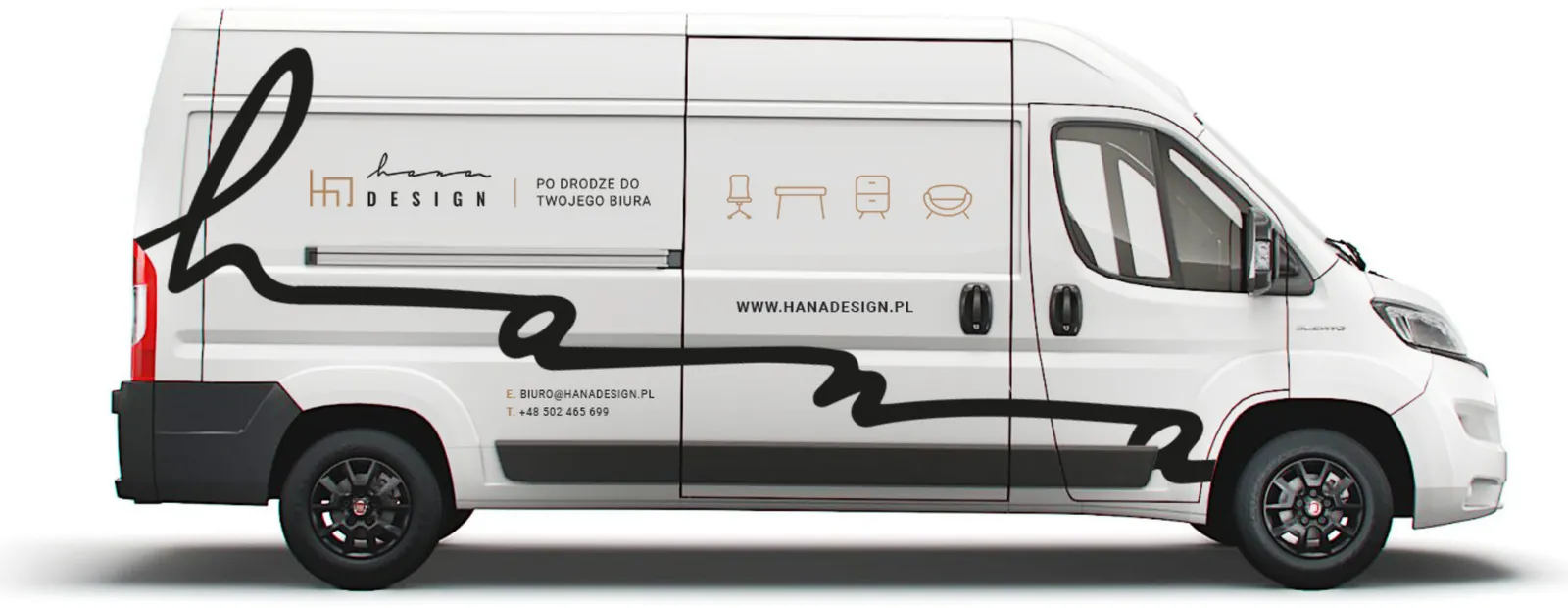
Right side
Questions and answers
What we did, how and why, in short answers.
Questions about working with us and our servicesWe looked after the Hana Design brand, from workshops and a logo facelift to the materials the brand needed day to day. The scope of work:
No. The brand was well known, so we gave it a facelift. We balanced the proportions between the handwritten “hana” and “design”, made the line stronger so the mark is legible, and added the two versions it was missing: a symbol derived from the shape of a piece of furniture, and a horizontal logo.
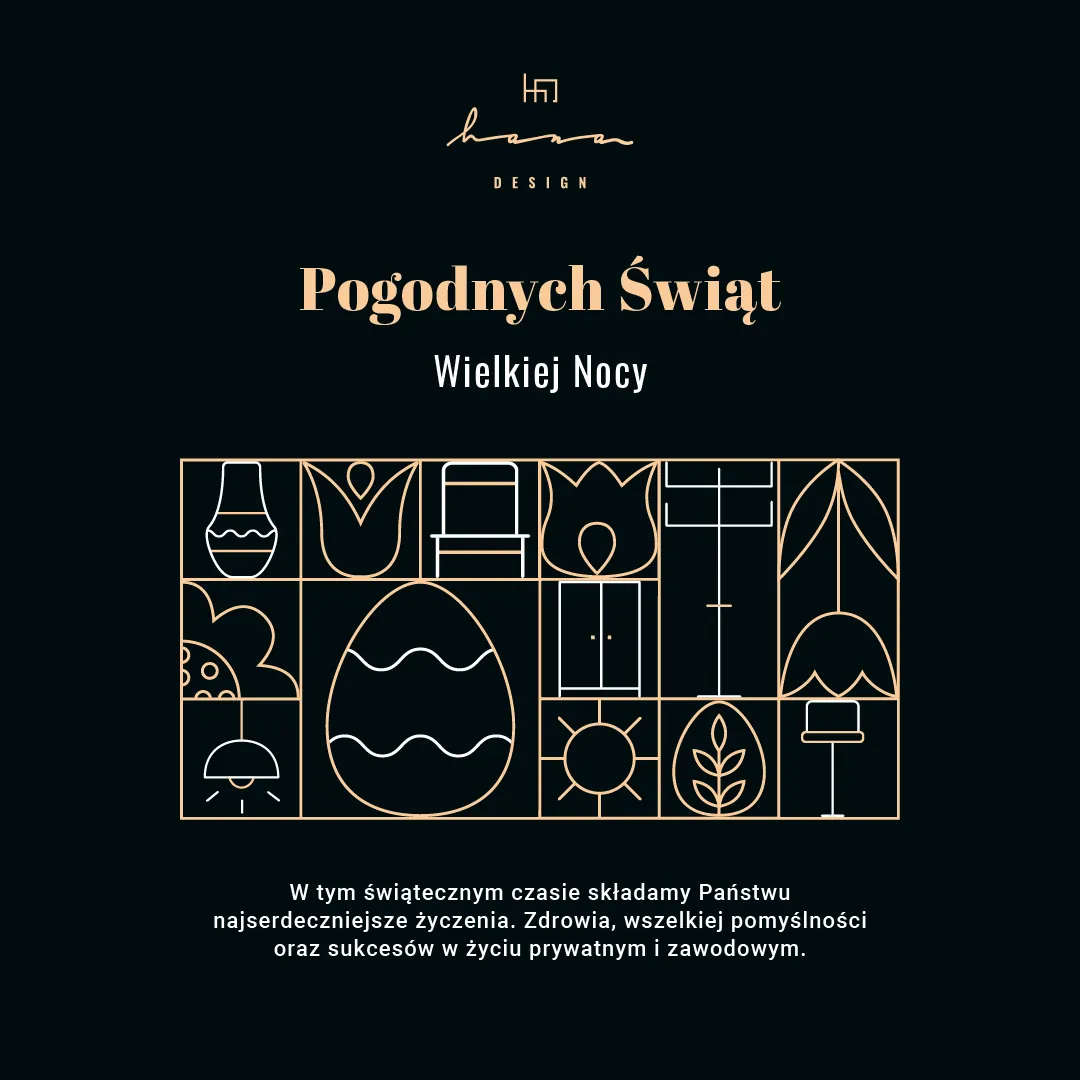
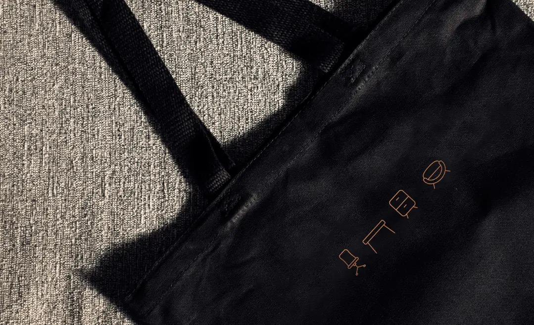
Because the furniture comes first. The products on offer are often colourful and interesting in form, so the identity works as a backdrop for them: black, white, greys and one accent, copper gold. The sans serif Roboto was paired with the serif Abril Fatface, and line icons of furniture show the breadth of the range.
Before the website was built, we ran a survey among architects and interior designers. 13 people replied, and their answers set the project's priorities:
One structure fits very different furniture. On the product page, the customer picks variants from a swatch window, sees only their own selection and adds the product to an enquiry. The enquiry works like a basket, but instead of going to payment it goes to a sales rep. Next to it are technical data, swatches and downloads: 2D and 3D models in DWG, 3DS and SKP, the brand catalogue and textures.
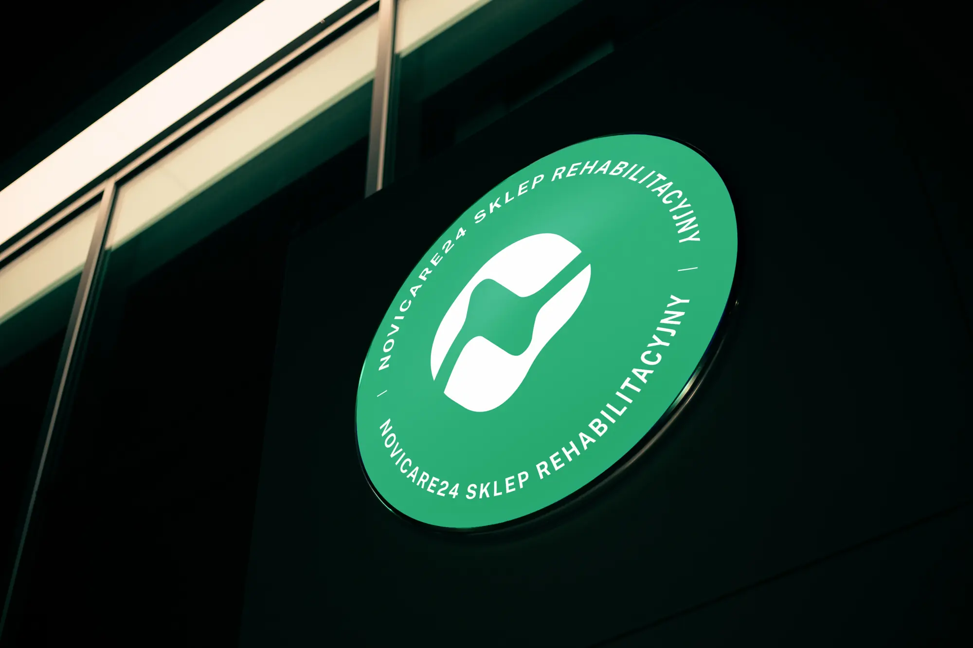 Novicare
Identity for a manufacturer and distributor of orthopaedic equipment, the Novicare24 sub-brand, shop windows, materials and an online shop.
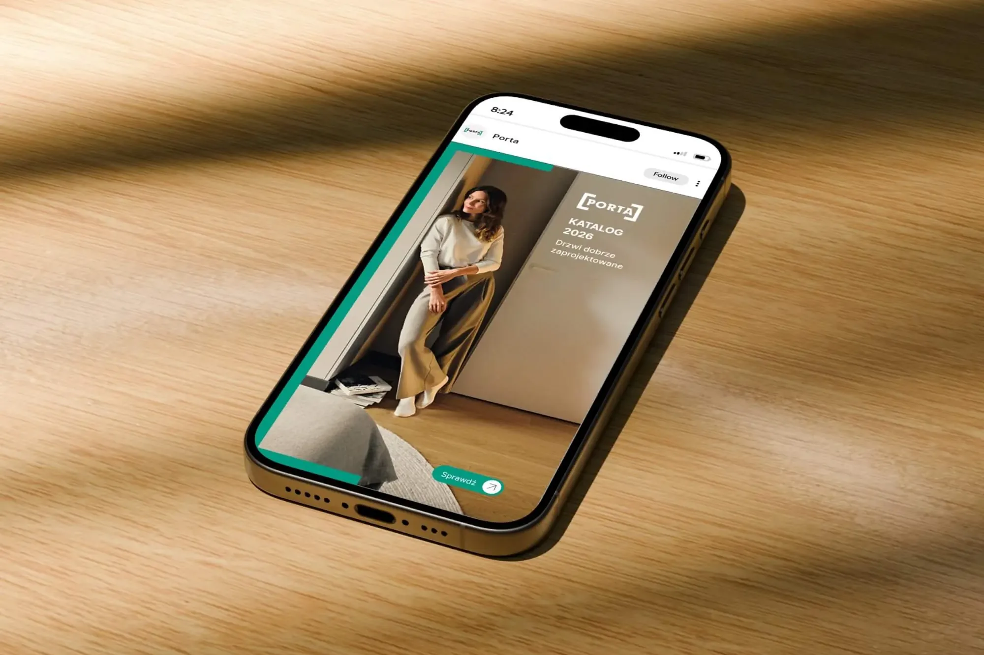 Porta Drzwi
A design system for an existing logo: a frame taken from the logo, grids, icons, drawings, a catalogue, porta.com.pl, social media and sales materials for a door manufacturer.
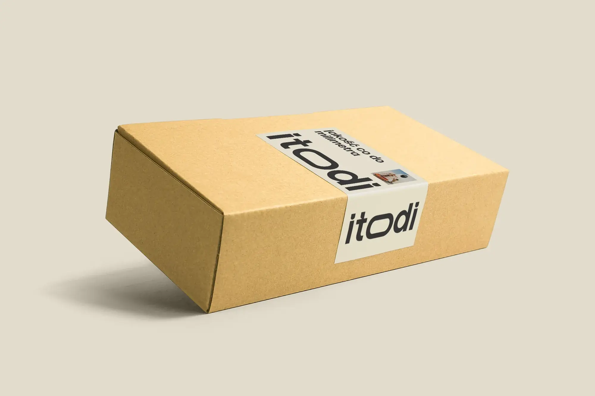 Itodi
A new made-to-measure furniture brand built from scratch: the name, a logo with a stretched “o”, the design of a shop with a configurator, an instruction leaflet and packaging.
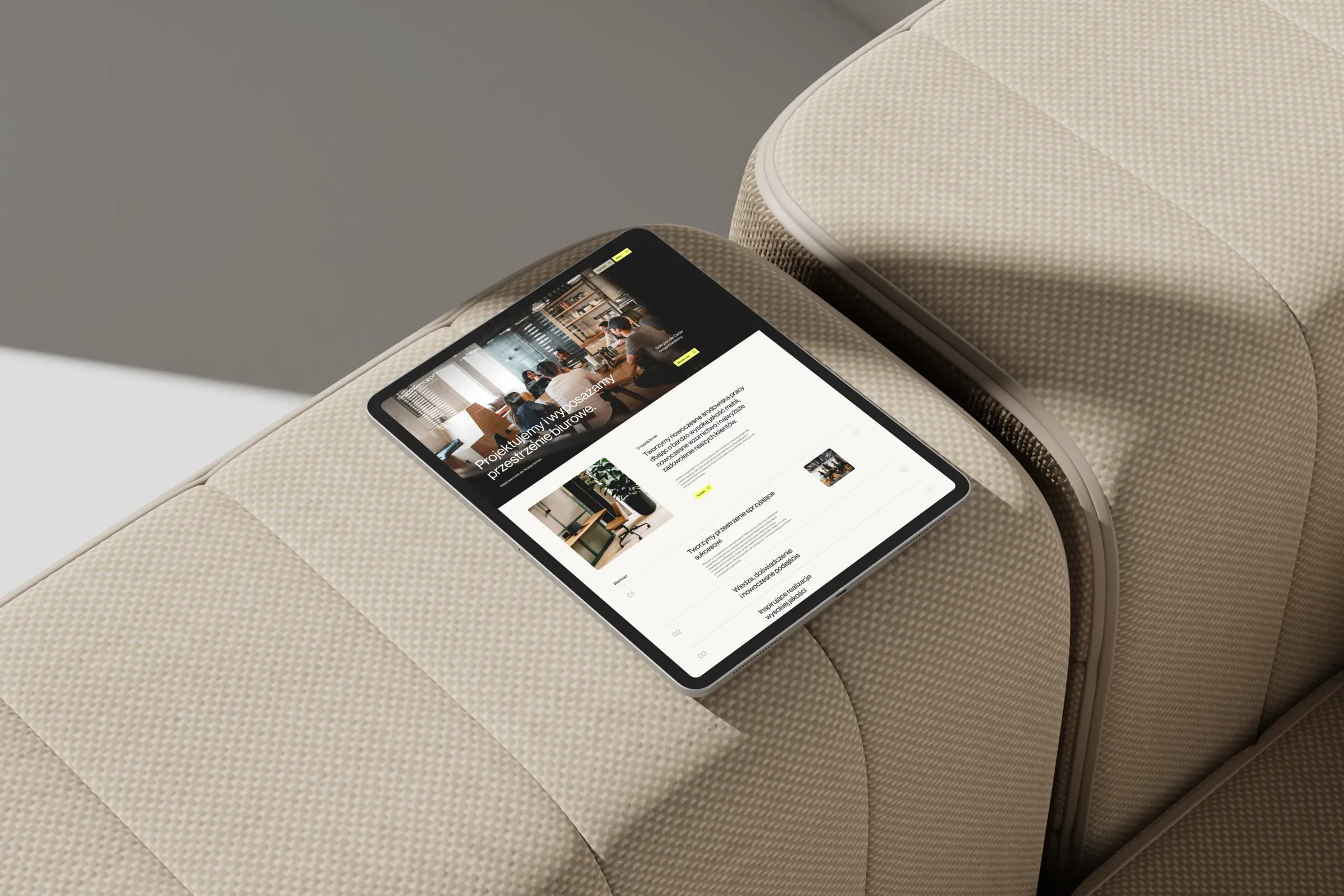 Biurokoncept
We designed and coded biurokoncept.pl: a catalogue of over a thousand pieces of furniture with a pCon configurator and an enquiry basket.
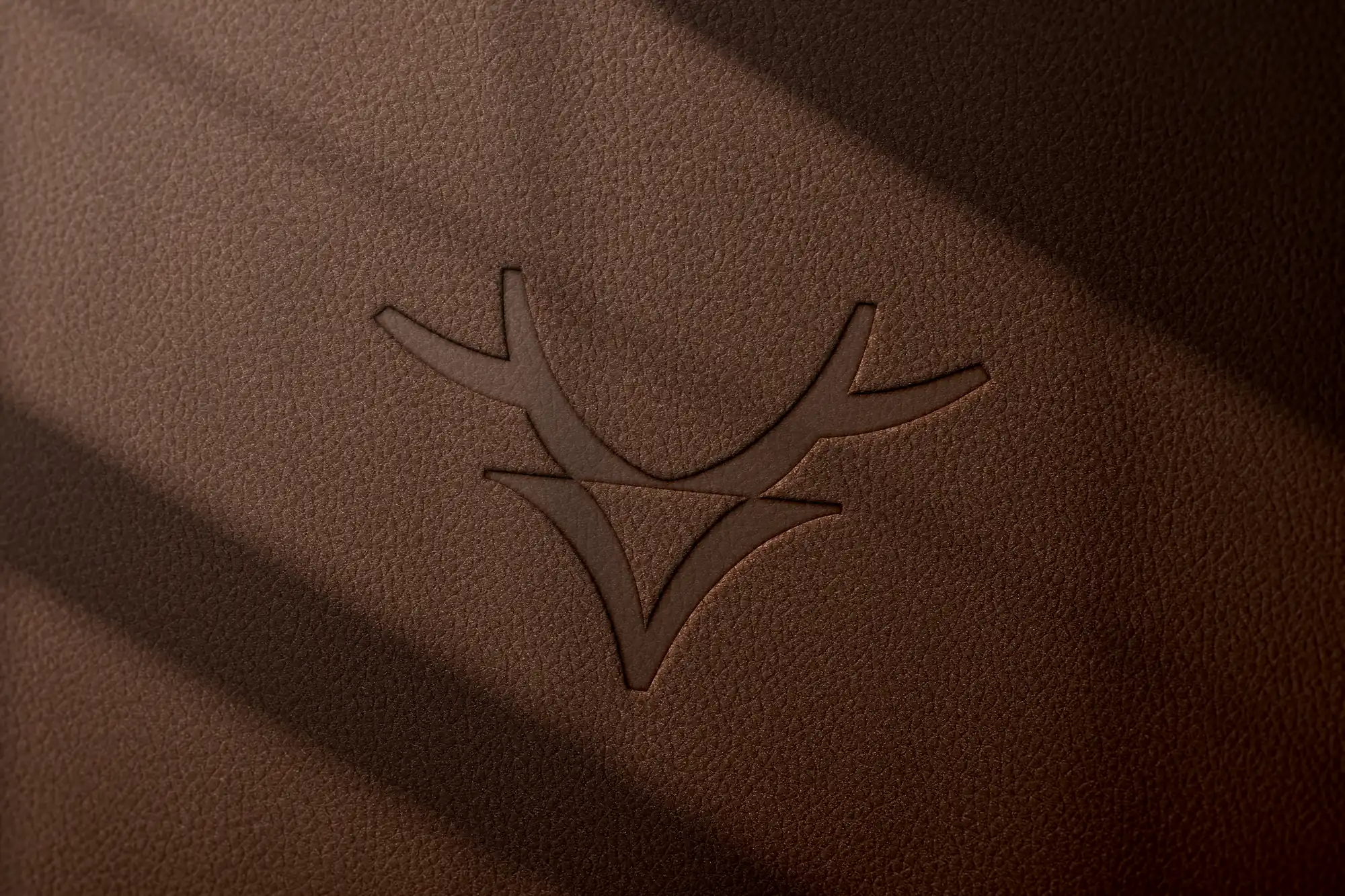 Mily Group
A rebrand for a deer antler supplier: communication strategy, logo, logo guidelines, the milygroup.com website and trade fair materials.
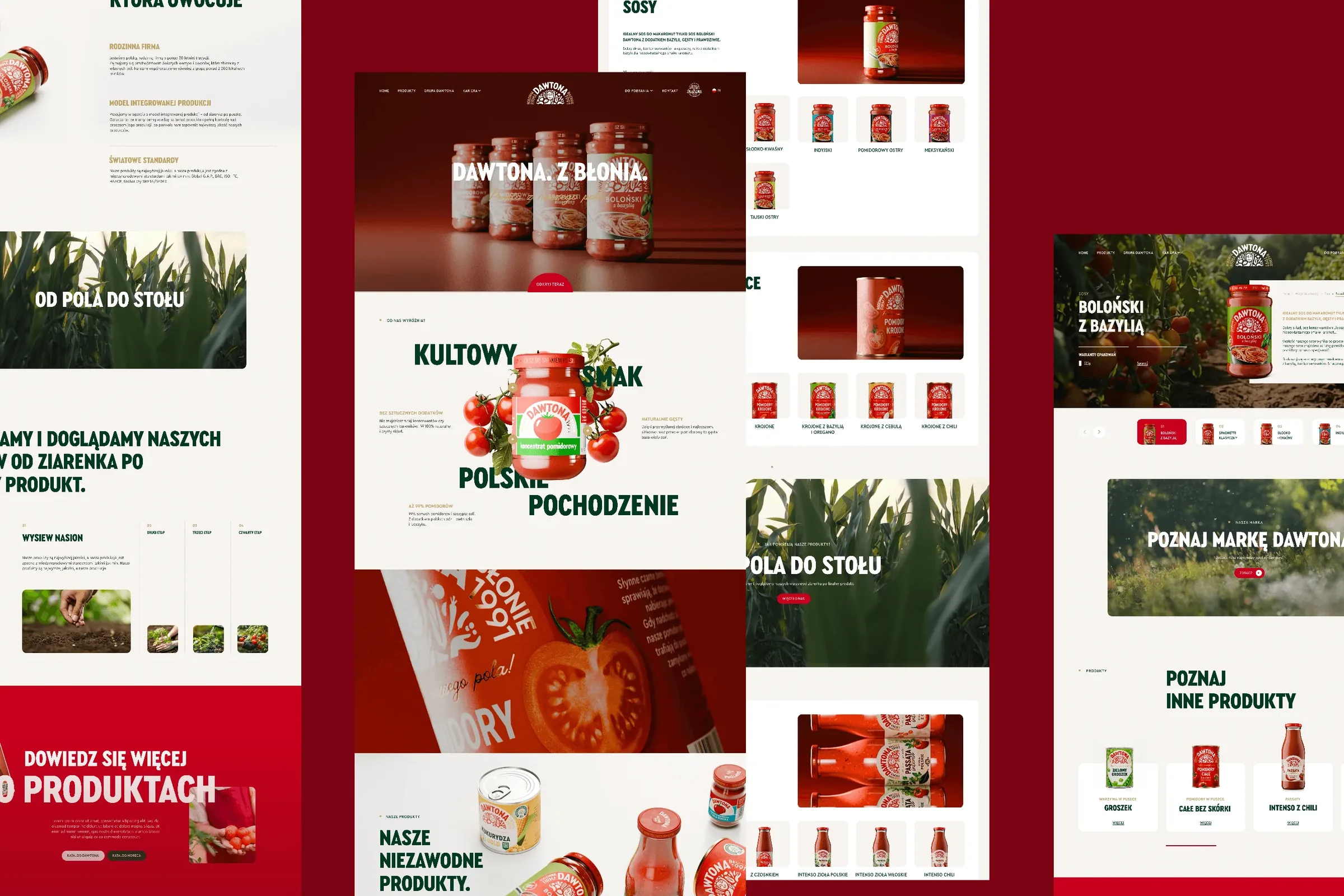 Dawtona Group
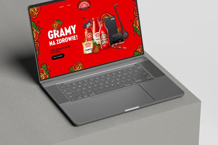
All of Dawtona's communication beyond the shelf: over 90 projects, from posts and trade fair stands to four websites and animations.
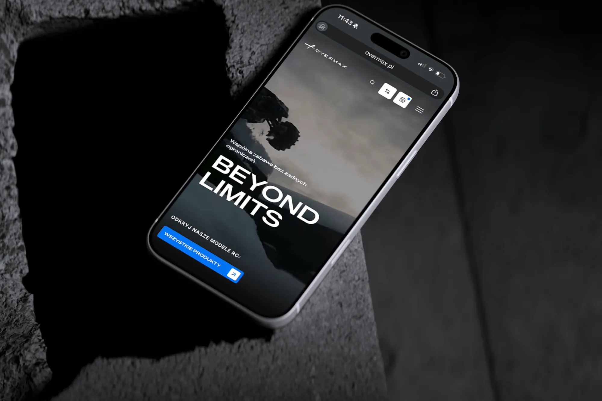 Overmax
UX/UI design for the Overmax shop: RC cars in cinematic shots, a carefully worked-out product page, a category menu and a quiz that picks a model for you.
 Design Optyk
A family-run chain of premium eyewear stores: an identity without gold, in-store materials and a new online shop linked to the stock of six of its seven stores.
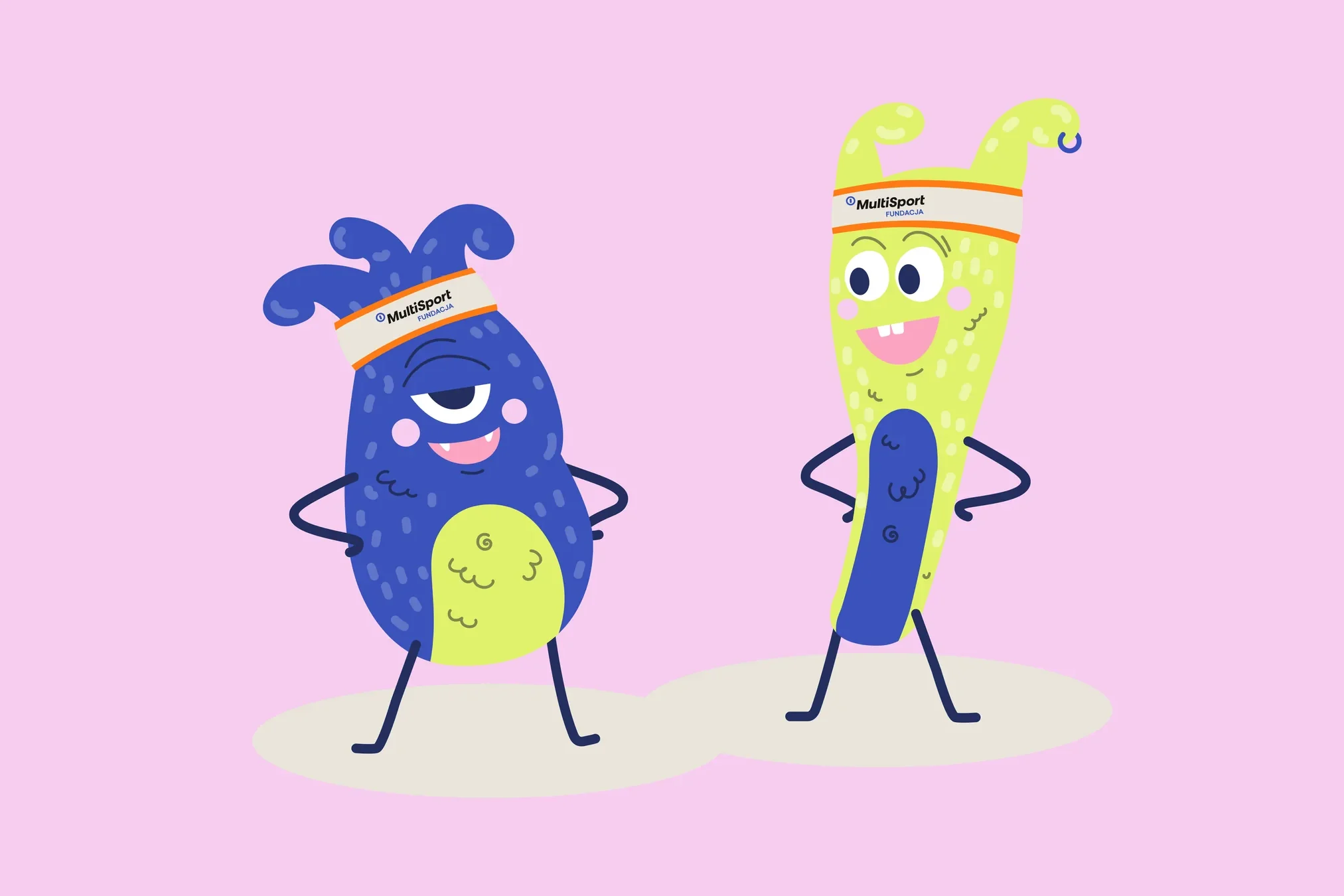 Fundacja MultiSport
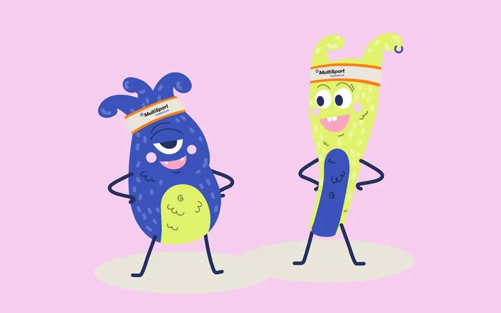
An identity with a design system in Figma, a WCAG-compliant website and a brand hero duo that gets people moving.
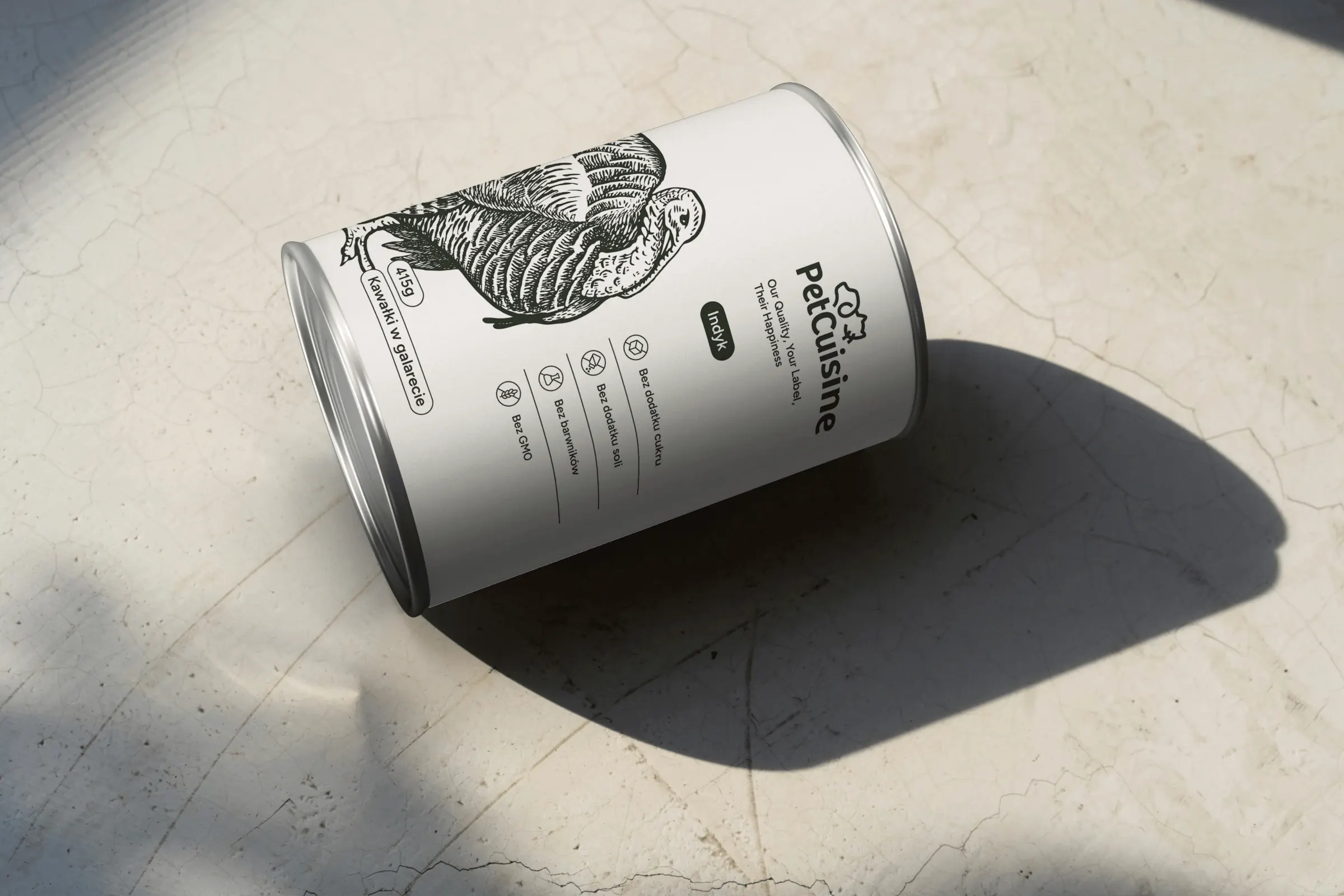 PetCuisine
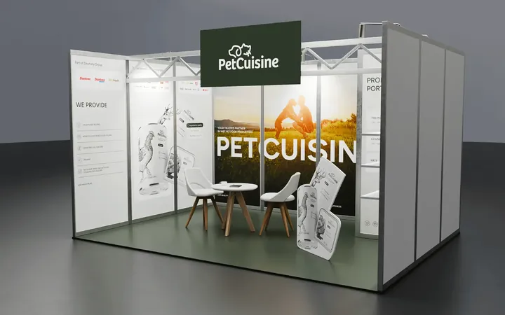
We built a brand from scratch for a pet food manufacturer in the Dawtona Group: from the name and tagline, through packaging in 12 flavours and the website, to trade fair stands across Europe.
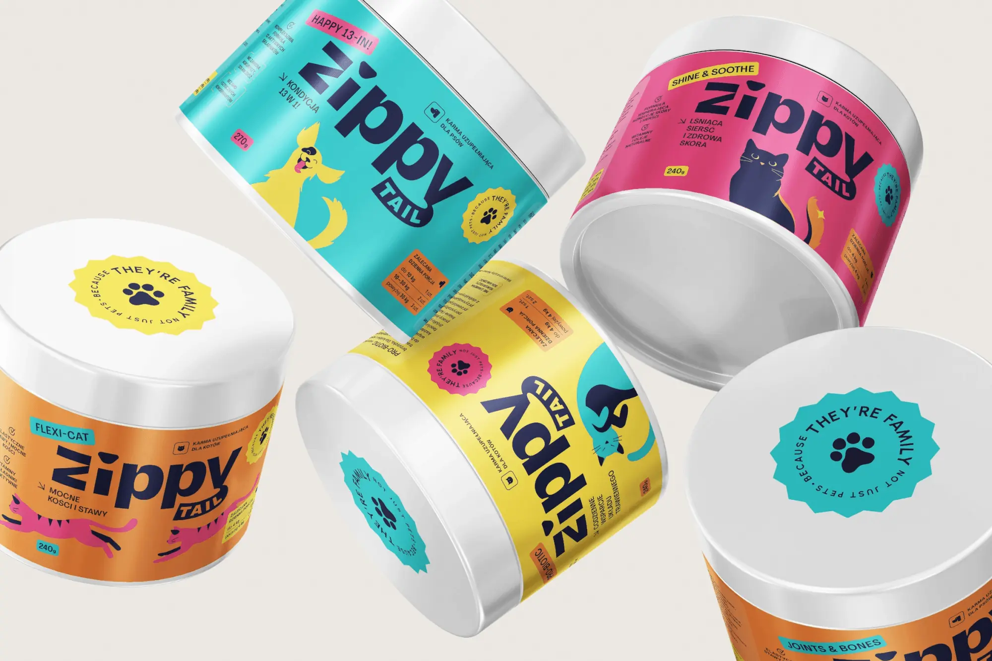 Zippy Tail
We built the Zippy Tail brand from scratch: the name, strategy, labels for eight supplements for dogs and cats, the shipping box and the shop design.
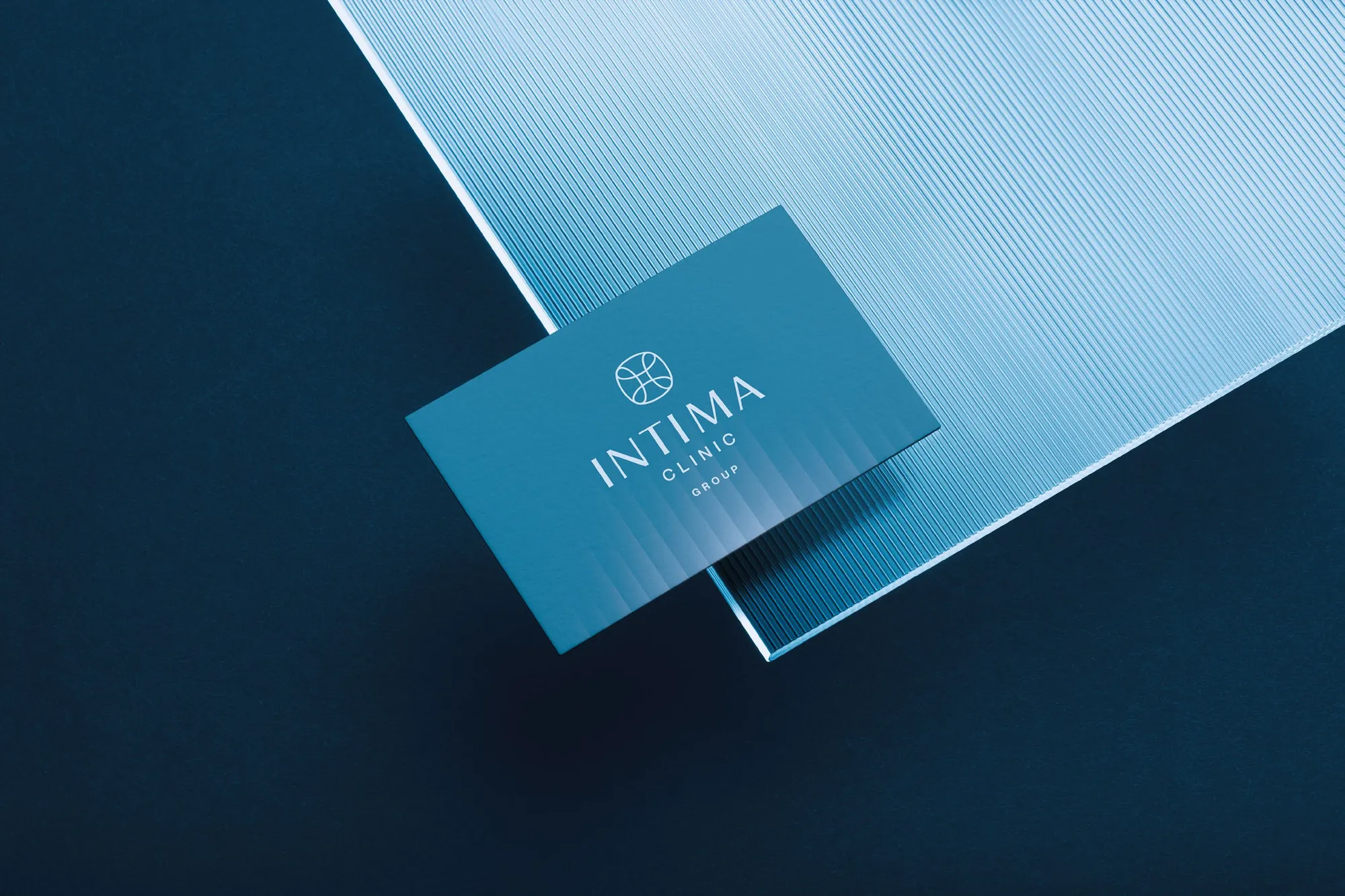 Intima Clinic
Six medical brands in one group. Workshops, names, identity, clinic signage, print, animations and the intimaclinic.pl website.
Tell us what you want to change. In a first, no-obligation call we will see whether and how we can help.
Cookies
With your consent, we use Google Analytics and Hotjar to see how people use the site, and Google Ads to measure how well our ads work. Without consent, the site works just the same. You can change your choice at any time under “Cookie settings” in the footer. Details are in our privacy policy.
The fluo_zgoda cookie remembers this choice for 12 months. Cloudflare Turnstile protects the forms from bots.
Plausible counts visits without cookies or personal data, so it works regardless of this choice.