






Made in Podlasie · Kuwait
Polish folk paper-cuts for the Kuwaiti market
We ran strategy workshops and then designed the logo, identity, labels, social media and trade fair stand for a new Polish healthy food brand from Podlasie, a region in north-eastern Poland, as it entered Kuwait.
See where it came from- 8weeksfrom the first moodboard to the production files for the stand
- 6coloursin the palette, each with its own role
- 2languagesof the identity presentation: Polish and English
- 5sizesof paper bags, with print files
Two markets
Products from Podlasie for customers in Kuwait
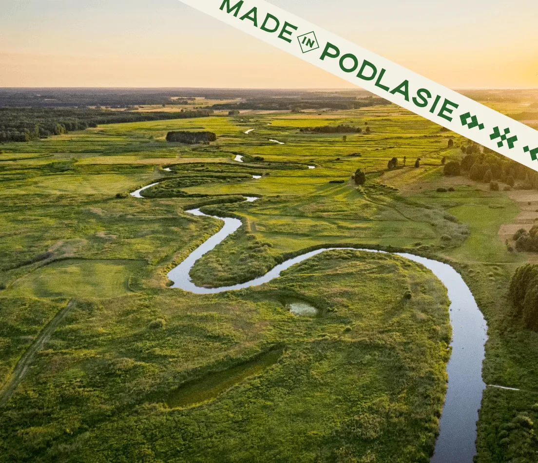
Podlasie
A region known as the green lungs of Poland: clean air, organic farms and traditional farming methods. All the brand's products come from here, from flours and flakes to oils, teas and dried fruit.
Kuwait
Affluent, well-informed customers are increasingly choosing organic, natural and minimally processed food that is low in sugar. They readily follow global trends, but also value their own cultural roots.
Why now
- Customers are looking for organic, GMO-free products with less sugar.
- Food from Europe is associated with high quality and strict standards.
- More and more people want to try new flavours.
Strategy workshops
First we agreed who the brand should help
The brand was meant for conscious shoppers looking for organic, good-quality products. It had to be modern, consistent and distinctive, with the spirit of Podlasie, while still making sense in Kuwait.
In the workshops with the client we described the brand's market, values, differentiators and audiences. The most important turned out to be the differentiator: products that are safe for people with diabetes and allergies. Customers should know at once that they don't need to read the label several times.
Brand core
- Health
- Authenticity
- Accessibility
- Credibility
- Calm
Who it's for
- Young professionalsshop online and follow health trends
- Families with childrenread the ingredients and choose what's safe
- Active peoplelook for light, natural snacks
- People with diabetesneed products with a low glycaemic index
If the brand were a person
She would be a woman you trust: calm, sincere and well informed. She has a timeless elegance, like traditional flowers, but never overdone. She gives advice with care and thinks of her loved ones first.
Direction
Colour from one moodboard, style from the other
The starting point was folk motifs from Podlasie: embroidery, paper-cuts and floral patterns. We wanted to translate them into a modern, restrained form that shows where the products come from and that they are natural.
We showed two directions. The client liked the fresh colours of the first, because they brought nature and life to mind. But they chose the drawing style of the second: simple, strong patterns from Podlasie, similar in structure to Kuwaiti ornaments. We combined the two.
Vivid colours of nature, a bold label and graphics rooted in folklore.
we take the coloursMinimalist floral and geometric patterns, a restrained palette.
we take the formThe result shows in the brand's ornament: simple geometry in the vivid colours of nature.
Logo
Paper-cuts, embroidery and hand-made letters
The logo is made up of the name and an ornament. Each part refers to the handicrafts of Podlasie.
Colours
Colour hints at what's inside
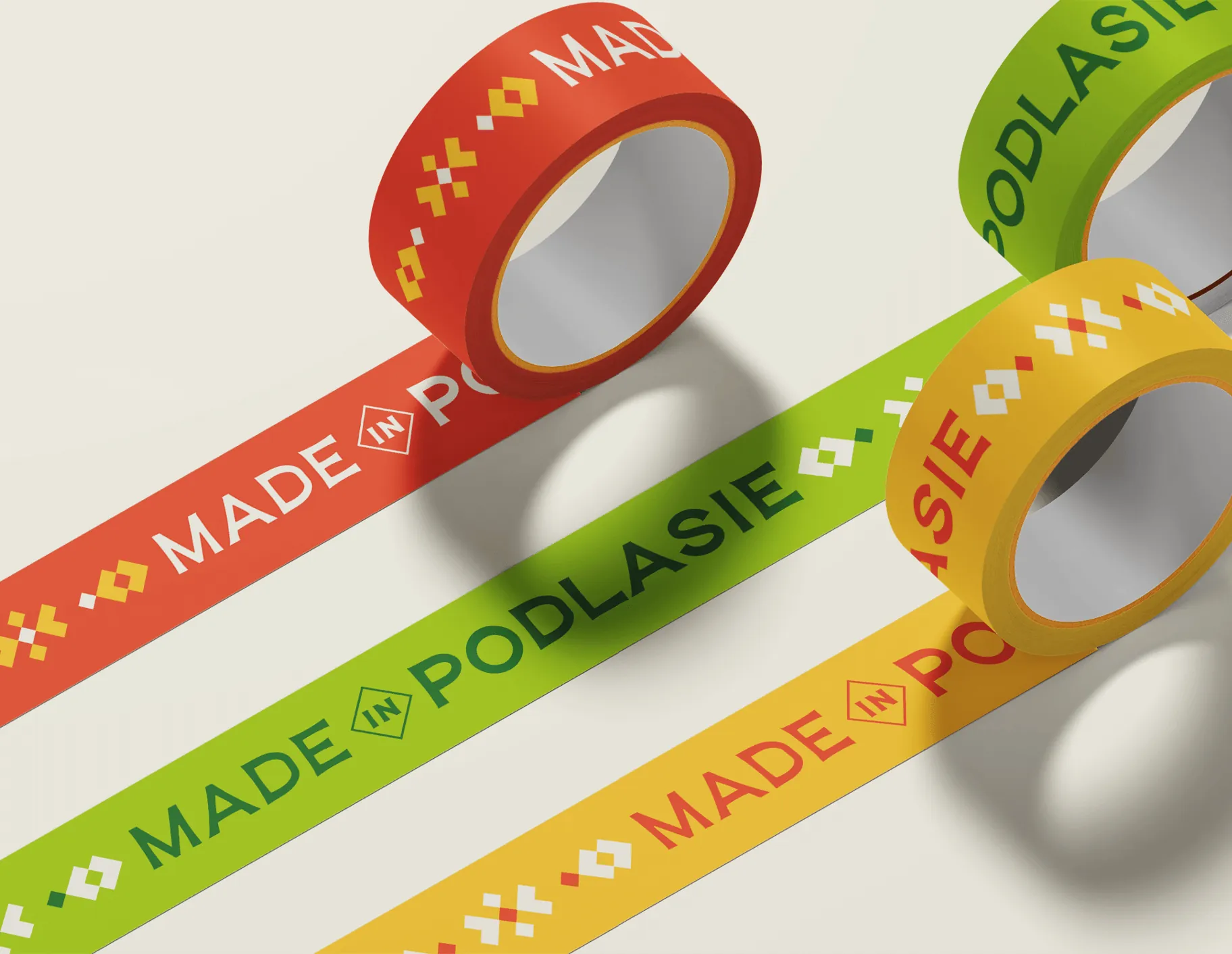
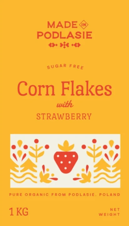
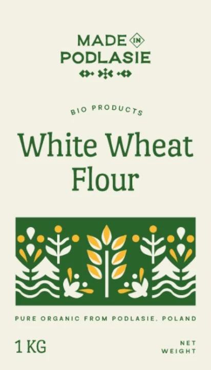
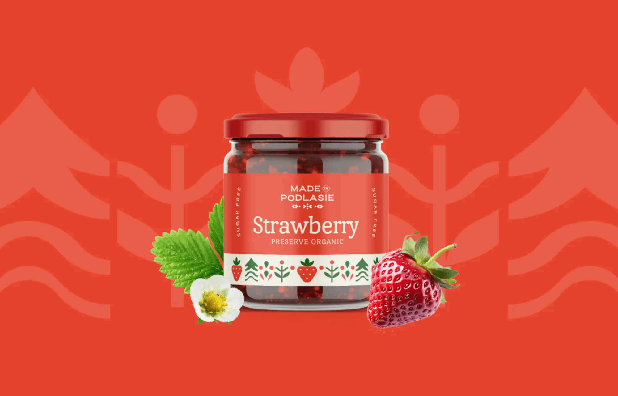
Each of the six colours has its source in the region. On the packaging, the background colour depends on the type of product, so the category is visible from a distance, before anyone reads the name.
Yellow
HEX #FBBB30 · Pantone 136 C
Golden fields of grain, corn and the sun.
The background for cereal products, e.g. corn flakes.
Light beige
HEX #F5F3E7
Natural materials and white embroidery.
The background for flour products.
Red
HEX #E8442D · Pantone Bright Red C
The colour of folk patterns, fruit and flowers.
Accents on fruit products, e.g. strawberry jam.
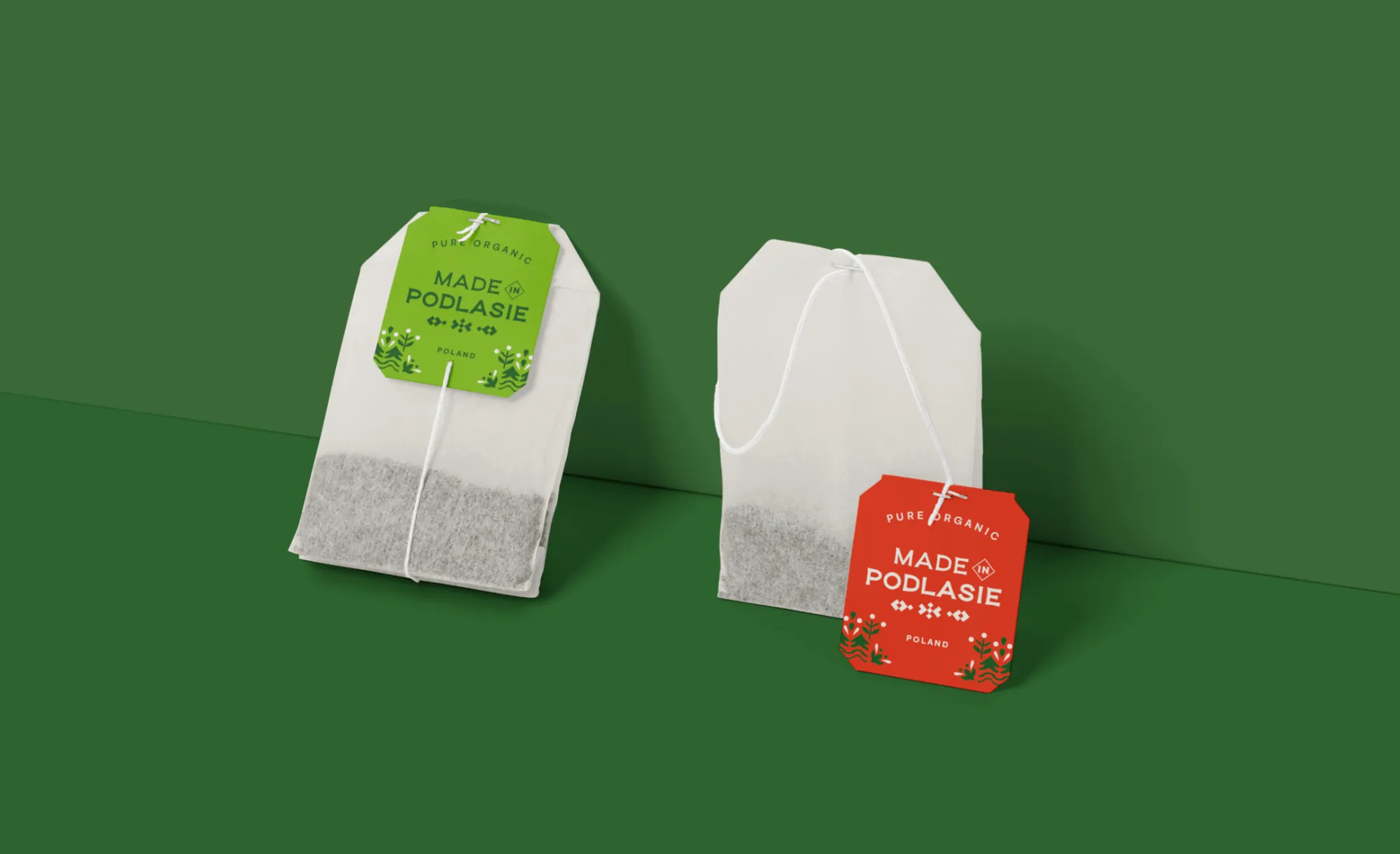
Grass green
HEX #87BD27 · Pantone 368 C
Herbs and fresh ingredients.
For example, tea bag tags.
Deep green
HEX #29642C · Pantone 357 C
The forests of Podlasie.
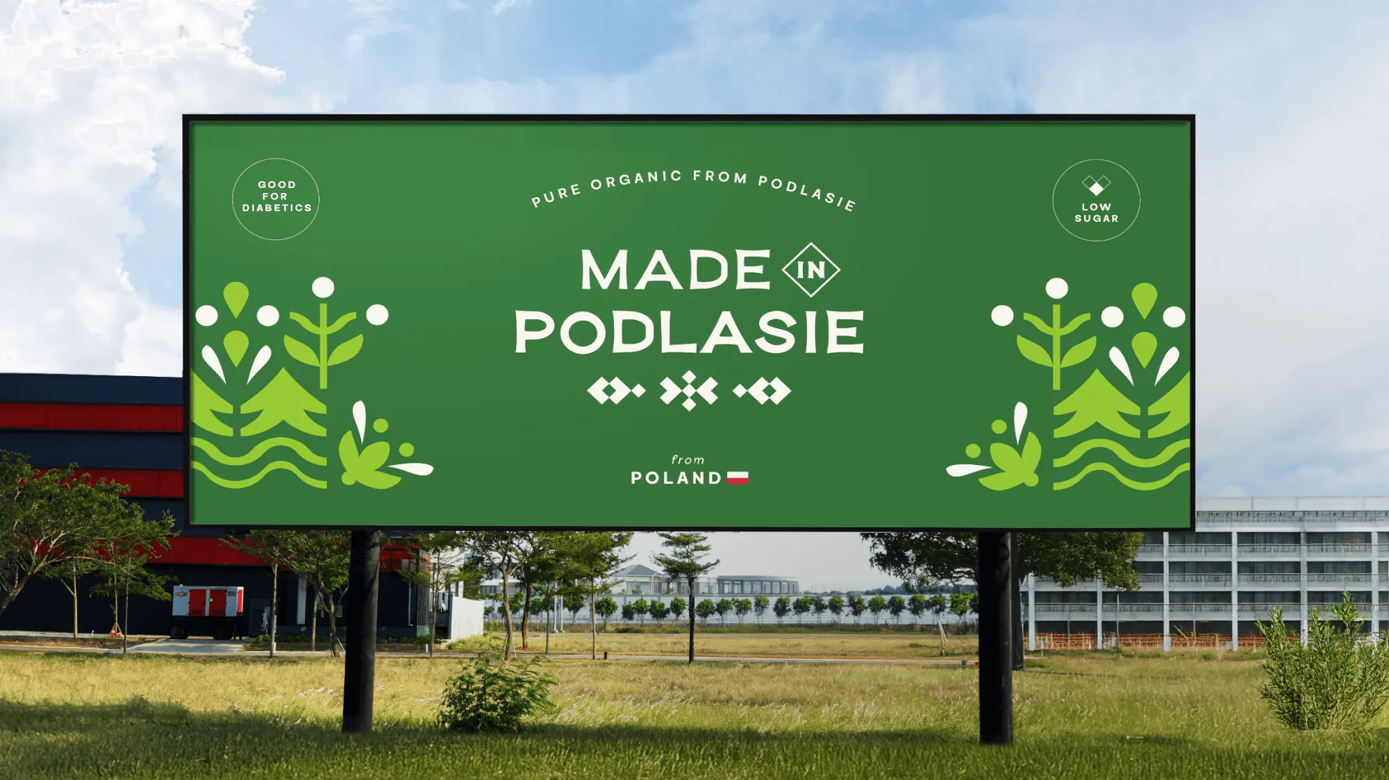
The logo colour and large surfaces, e.g. the billboard and the stand wall.
Blue
HEX #1659A4 · Pantone 300 C
Water.
Blueberry and flax products, e.g. blueberry jam and linseed oil.
Packaging
Illustrations that grow with the range
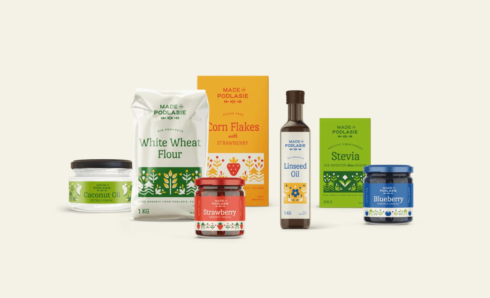
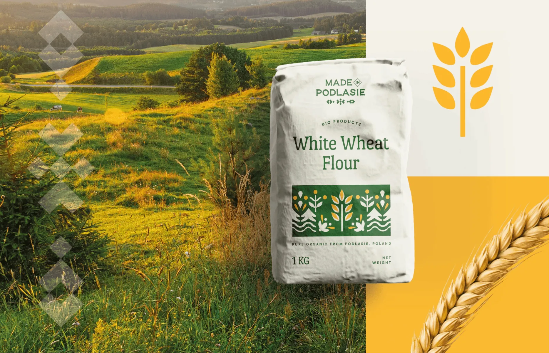
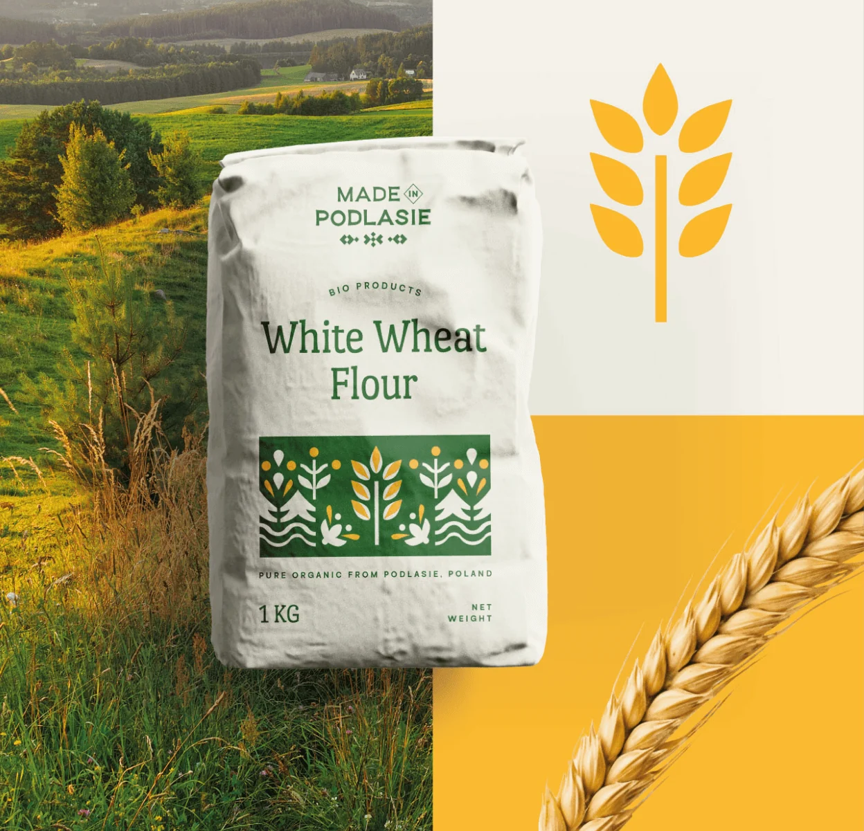
On the packaging we rely on colour and subtle illustrations. They make the product stand out on the shelf, build trust and say straight away which region it comes from.
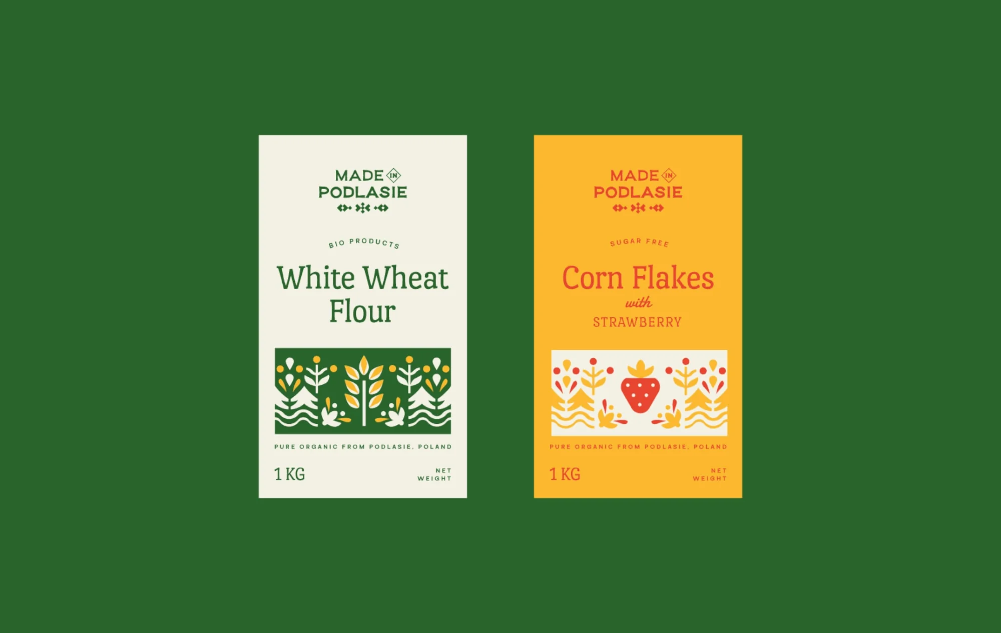
We draw the illustrations like paper-cuts: ears of grain, flowers, leaves and fruit made of simple, flat shapes. The illustrated band sits in the same place on every pack, and the motif changes with the product.
The client wanted the products to look good enough to eat and to catch the eye of the whole family, children included. New products will simply get a new motif, and the shelf will still look consistent.
We chose typefaces that make the labels easy to read. The letters of the main typeface flare slightly and are a little irregular, as if written by hand.
- Main typeface
- Port Lligat Slab
- Secondary typeface
- Serotiva
Stand
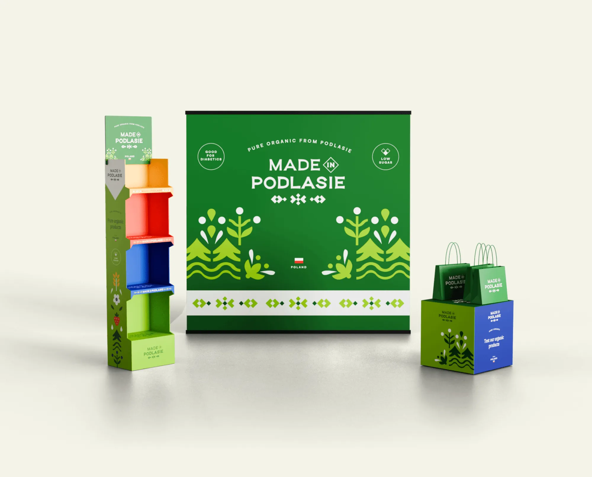
A stand built in Kuwait from our files
The stand was built by a contractor on site in Kuwait, so the design alone wasn't enough. We prepared print files, cutting templates and views from several sides so the contractor knew exactly how everything should look once assembled.
Applications
From flags to an online shop
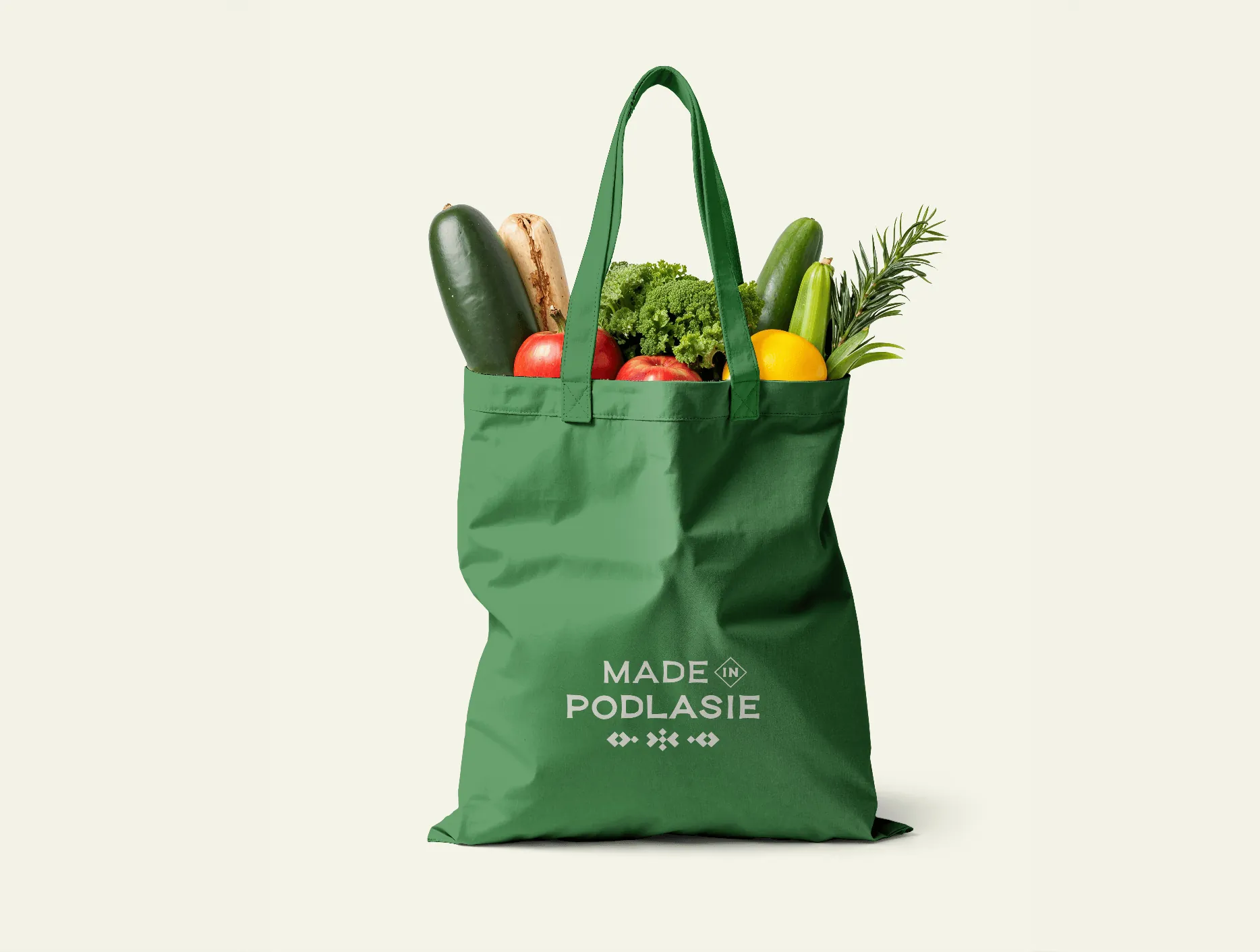
We handed over the identity together with brand guidelines, the logo in the brand colours, sample posts and print files. This is how it looks in use.
-
Flags
-
Posts for Instagram and Facebook
-
Tea bags
-
Online shop concept from the identity presentation
-
Product categories and the story of the region
What the brand took to Kuwait
Made in Podlasie has an identity that shows at once where its products come from. It's also simple, because that's the aesthetic customers in Kuwait like.
The system of illustrations and colours is ready for new products, and the stand was built in Kuwait by a local contractor from our files.
- Client
- Made in PodlasieOrganic food straight from Podlasie
- Market
- Kuwait
- Scope
- Strategy workshops
- Branding
- Logo
- Illustration
- Packaging
- Animation
- Social media
- Business materials
- Production and print
More projects
-
 DCX
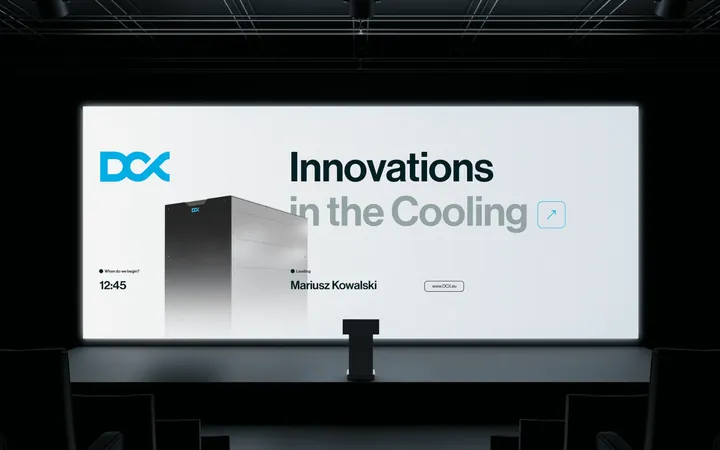
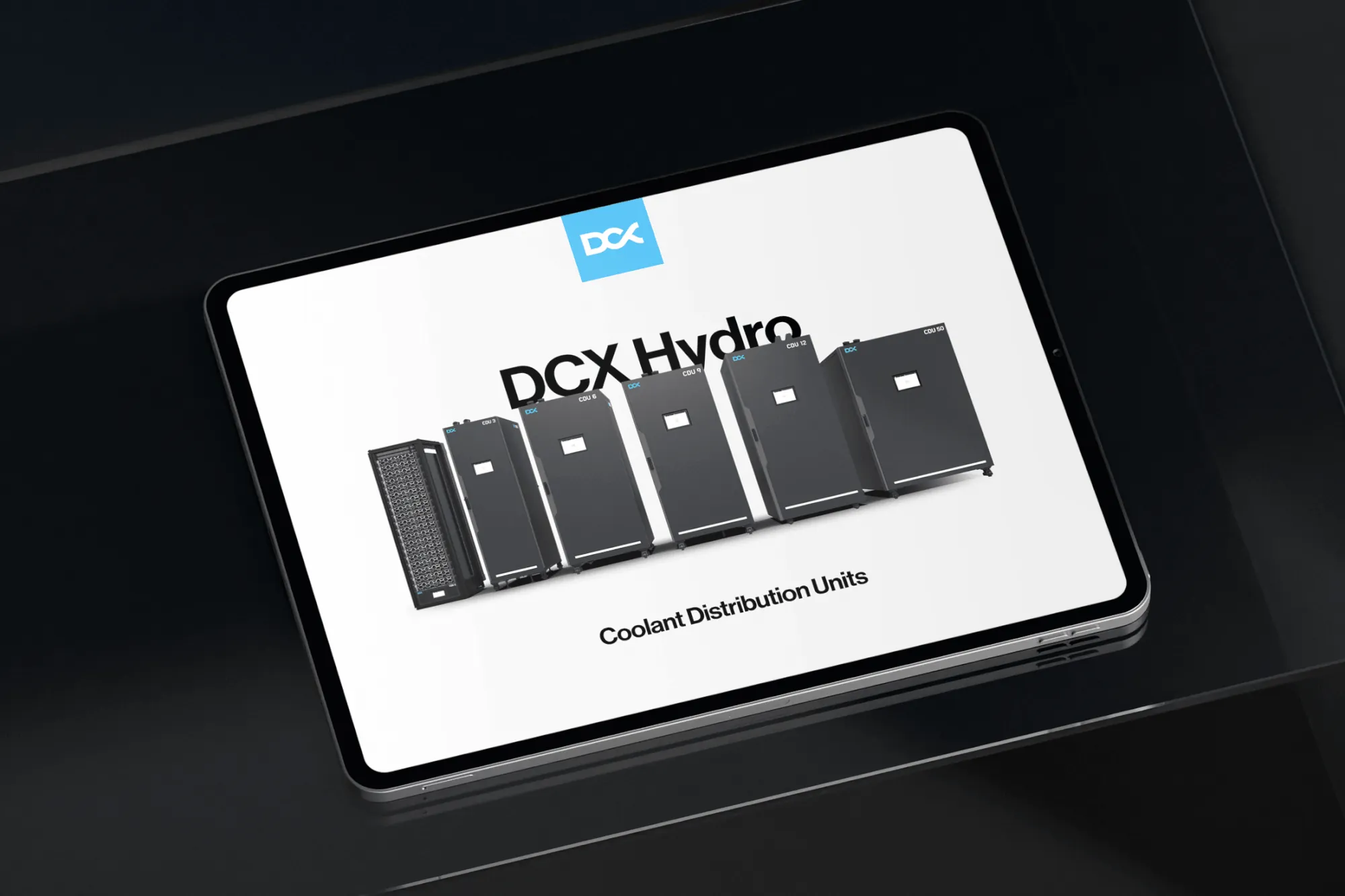
We built DCX's whole brand communication on the logo it already had: from trade fairs and a catalogue to 3D launch animations, a website and LinkedIn.
-
 Zippy Tail
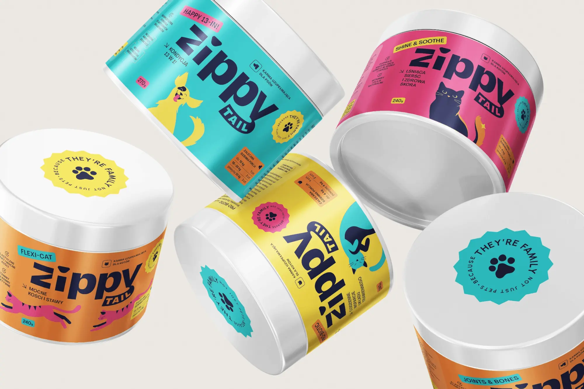
We built the Zippy Tail brand from scratch: the name, strategy, labels for eight supplements for dogs and cats, the shipping box and the shop design.
-
 Mily Group
A rebrand for a deer antler supplier: communication strategy, logo, logo guidelines, the milygroup.com website and trade fair materials.
-
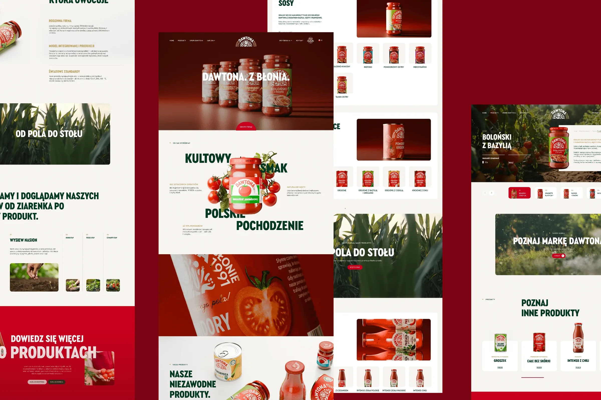 Dawtona Group
All of Dawtona's communication beyond the shelf: over 90 projects, from posts and trade fair stands to four websites and animations.
-
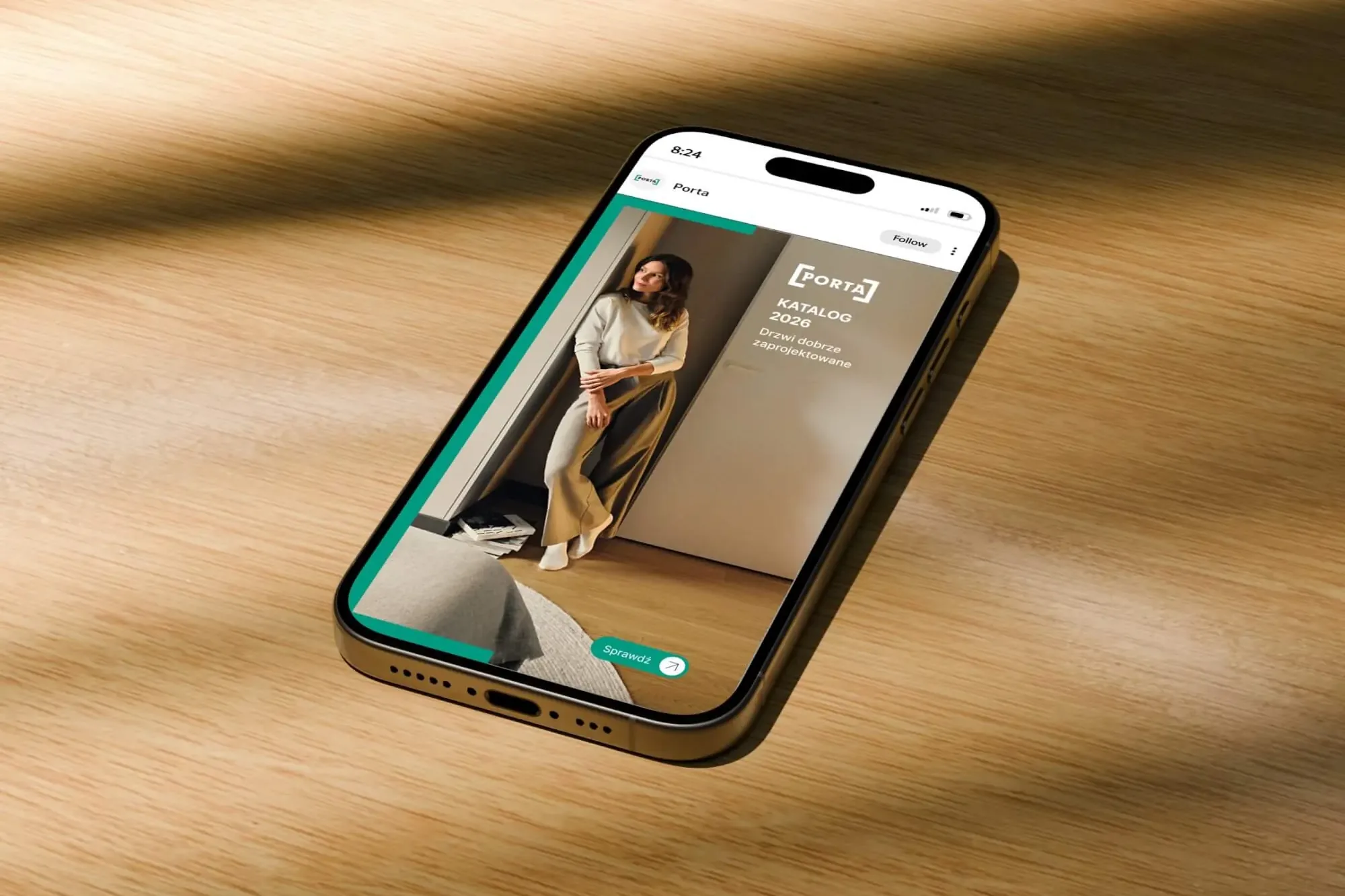 Porta Drzwi
A design system for an existing logo: a frame taken from the logo, grids, icons, drawings, a catalogue, porta.com.pl, social media and sales materials for a door manufacturer.
-
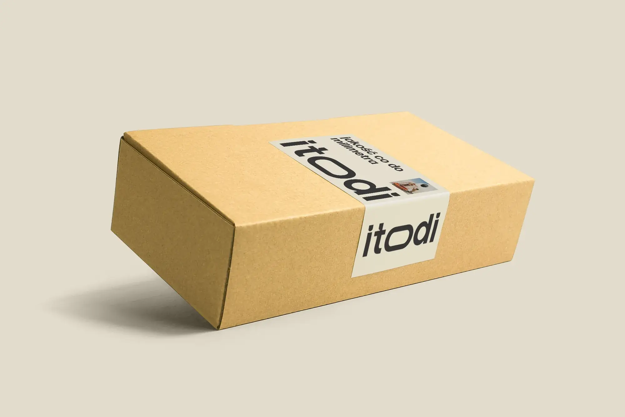 Itodi
A new made-to-measure furniture brand built from scratch: the name, a logo with a stretched “o”, the design of a shop with a configurator, an instruction leaflet and packaging.
-
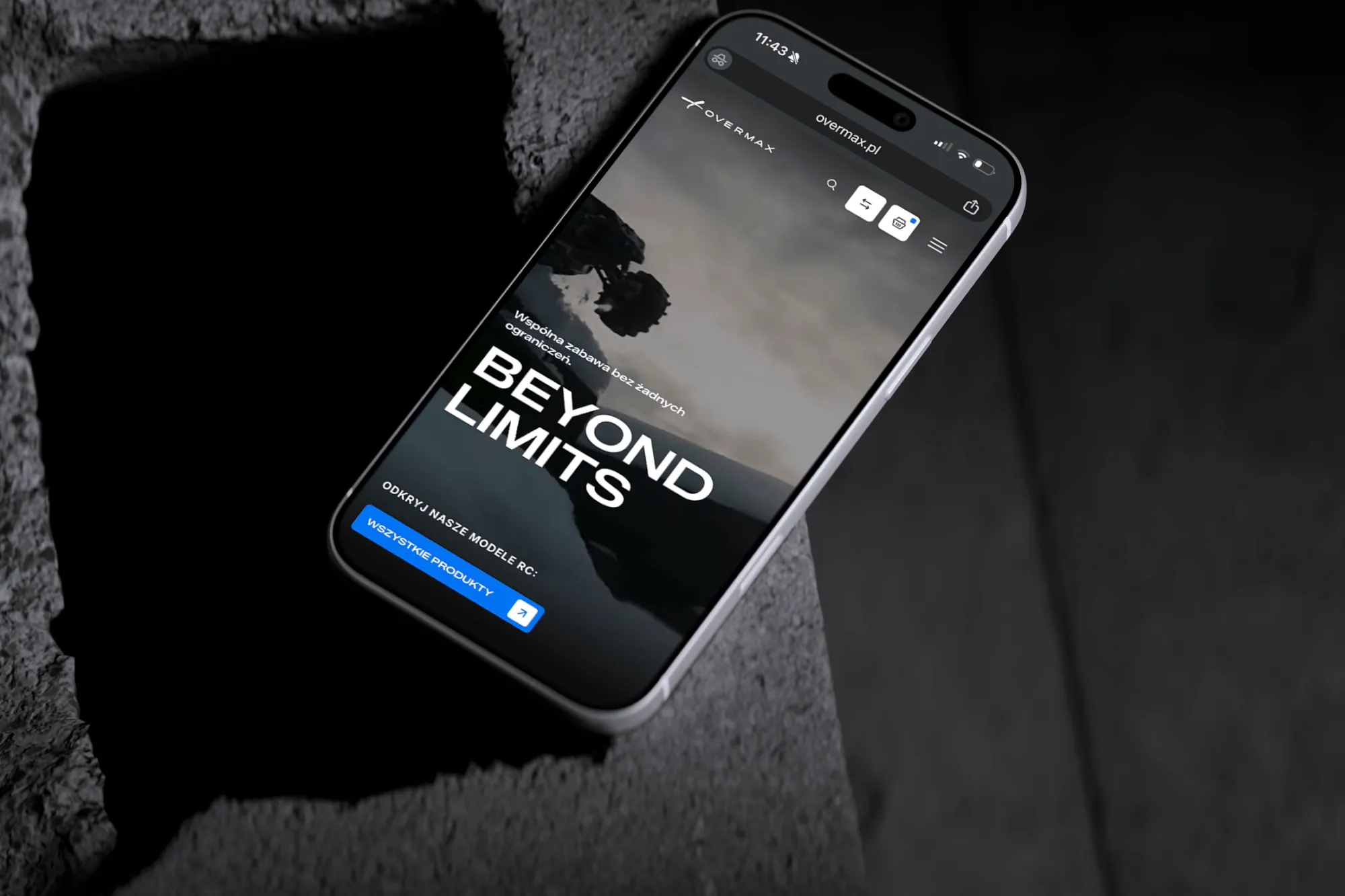 Overmax
UX/UI design for the Overmax shop: RC cars in cinematic shots, a carefully worked-out product page, a category menu and a quiz that picks a model for you.
-
 Design Optyk
A family-run chain of premium eyewear stores: an identity without gold, in-store materials and a new online shop linked to the stock of six of its seven stores.
-
 Fundacja MultiSport
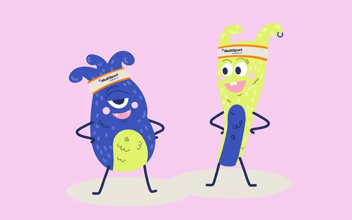
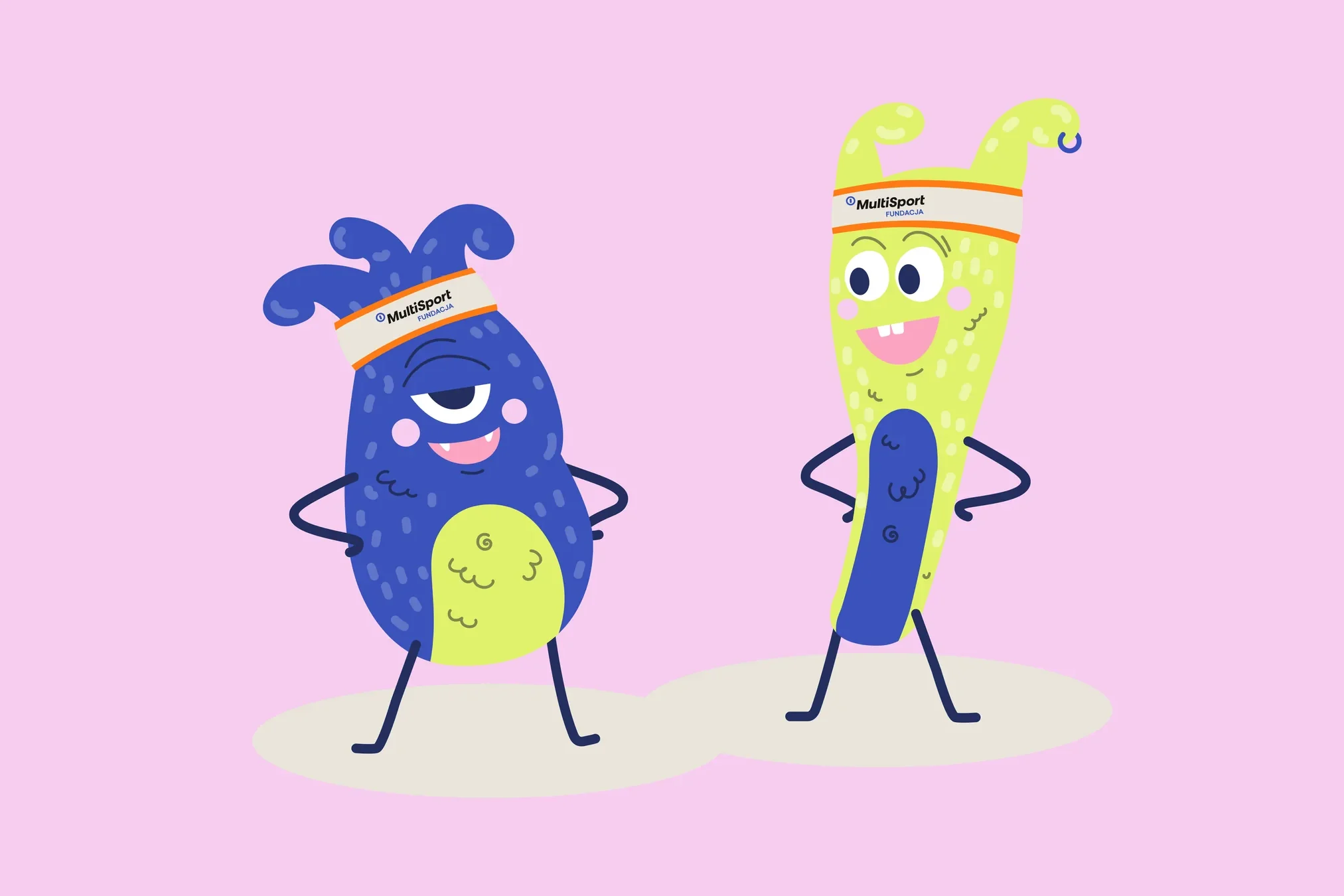
An identity with a design system in Figma, a WCAG-compliant website and a brand hero duo that gets people moving.
-
 PetCuisine
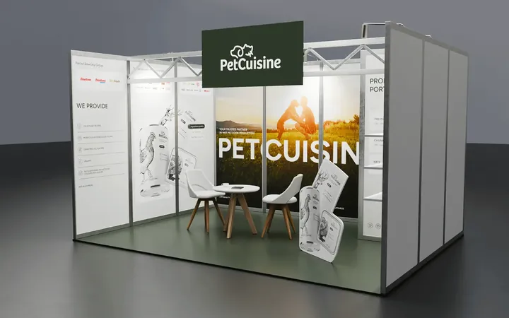
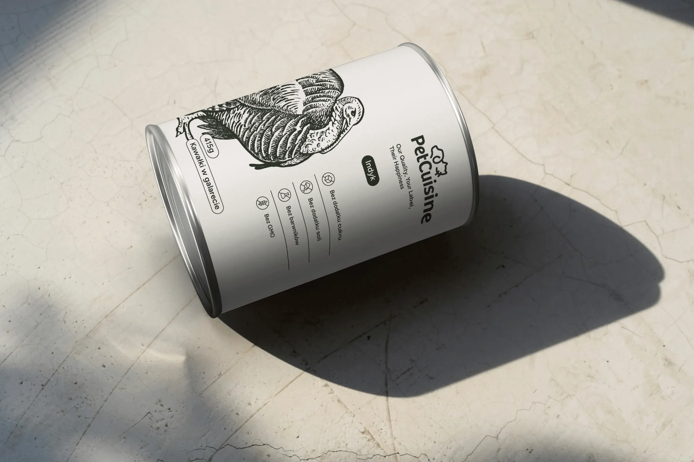
We built a brand from scratch for a pet food manufacturer in the Dawtona Group: from the name and tagline, through packaging in 12 flavours and the website, to trade fair stands across Europe.
-
 Intima Clinic
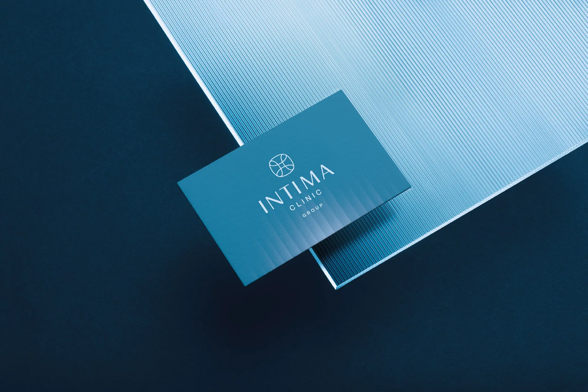
Six medical brands in one group. Workshops, names, identity, clinic signage, print, animations and the intimaclinic.pl website.
-
 PolTREG
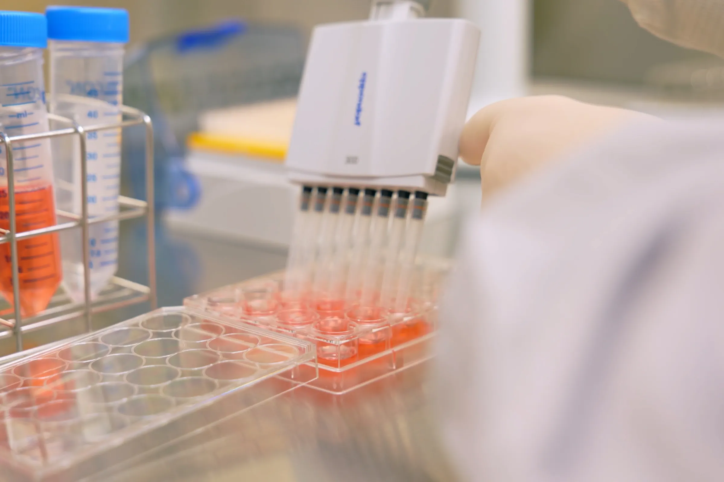
A rebrand for a biotech company listed on the Warsaw Stock Exchange, the poltreg.bio website for patients, investors and partners, and ongoing design support.
Facing a similar challenge?
Tell us what you want to change. In a first, no-obligation call we will see whether and how we can help.