




Liquid Cooling Systems
DCX
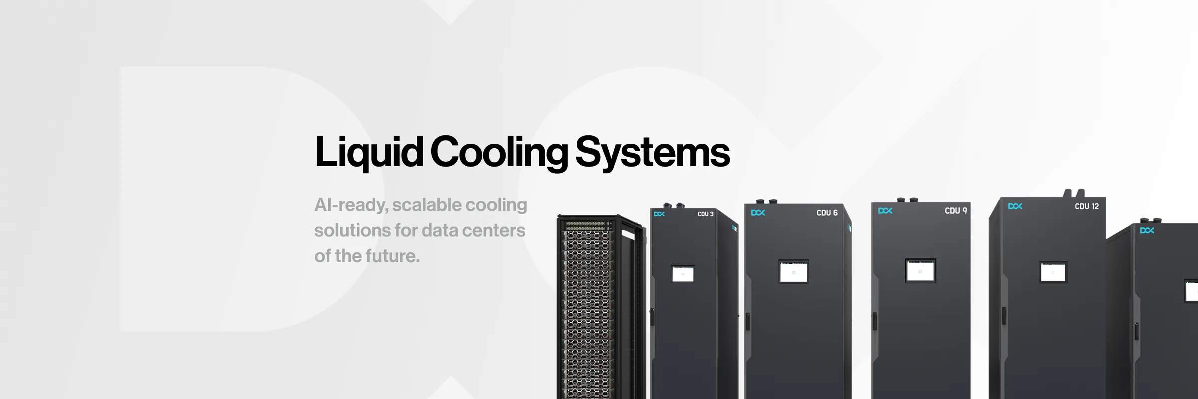
Starting from the logo DCX already had, we built the brand's entire communication, from trade fairs and a catalogue to 3D launch animations, a website and LinkedIn.
- Branding
- 3D animation
- Presentation
- Website design
- Social media
Client
The cooling no AI data centre can run without
DCX is a European engineering and manufacturing company. It designs, manufactures, installs and commissions liquid cooling systems: coolant distribution units (CDUs), cold plates, dry coolers and immersion cooling fluids. All its equipment is made in Poland.
DCX came to us with a logo but no communication, which is a common starting point in our work with manufacturers. The company was preparing launches of new units and trips to trade fairs where it wanted to be clearly visible: as a company that delivers, with professionalism, but also with the modern edge and the breakthrough it had brought to the market. The goal was an image that builds credibility and brand strength, shows high quality, inspires trust and goes beyond the industry's usual standards.
- 8.15 MW
- cooling capacity in a single CDU
- 500+ MW
- cooling capacity delivered and contracted
- 66
- countries DCX has shipped its equipment to
Company data: dcx.eu and the DCX Hydro FDU leaflet.
Start
Stability, technology, quality
We began by analysing how the biggest players in data centre cooling communicate, and by running a workshop with the DCX team. That led to a moodboard with a three-word message, and from there to an identity concept. The direction: data centre equipment presented the way modern consumer electronics are. Minimalism, a modern feel and the product at the centre, with its features clearly shown and the brand's energising blue.
-
01
Blue as an accent
It suggests cooling, professionalism and reliability. That's why it's used sparingly.
-
02
Greys as the base
Neutral and modern, associated with advanced technology and good design.
-
03
Shots like an electronics ad
Close-ups and light that turn a cooling cabinet into an object, not a line in a table.
-
04
Swiss-style typography
Large, refined and sans serif. Black, strong and confident.
-
05
Technical drawings and renders
Clean and precise, with no ornament. The product explains itself.
Key visual
Colour in just two places
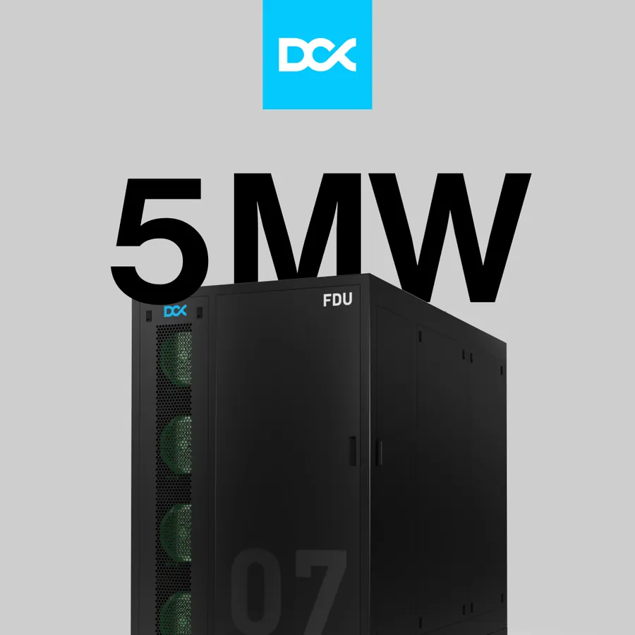
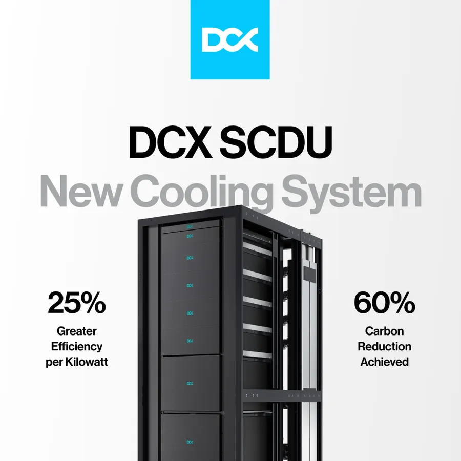
The brandbook says it plainly: the key visual rests on large, centred typography and product graphics, and the only accents of colour are the logo and the button. Everything else is black, white or grey, in clean layouts with plenty of light. That way the blue always leads the eye where it should, and the product has room to show its features.

Brandbook
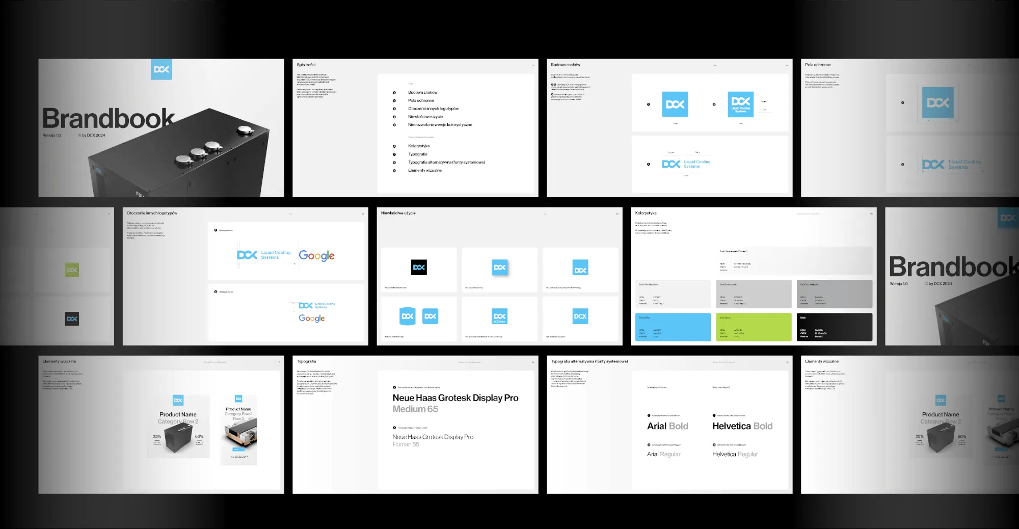
Black, greys and two extras
The logo stayed as it was. Around it we chose colours and typography, and from them we built a design system for the catalogue, product sheets, website and presentations. The base is black and shades of grey, with green and blue only as complements.
-
Black
#000000
Pantone Black 6 C -
Grey 1
#F2F2F2
Pantone Cool Gray 1 C - Gradient #FFFFFF → #ECECEC
-
Grey 2
#CECECE
Pantone Cool Gray 2 C -
Grey 7
#A6A8A9
Pantone Cool Gray 7 C -
Electric Blue
#04C8FC
Pantone 306 C -
Juicy Green
#ACDA1B
Pantone 375 C
Neue Haas Grotesk Display Pro
Medium 65 for headings and short texts, Roman 55 for longer ones. When the typeface isn't available, the brandbook calls for Helvetica on macOS and Arial on Windows. This page does the same: the DCX headings here are set in exactly those.
Launch animations
A launch built from engineering files
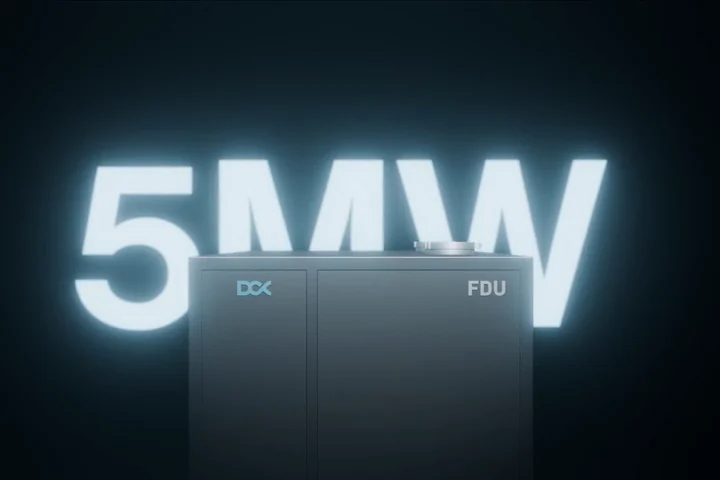
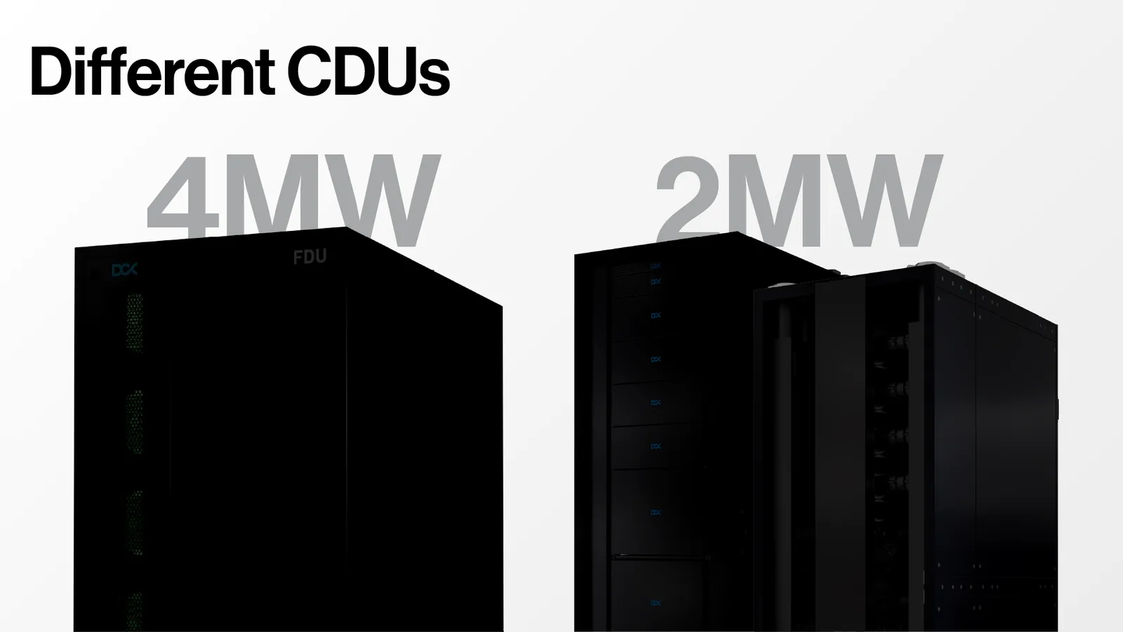
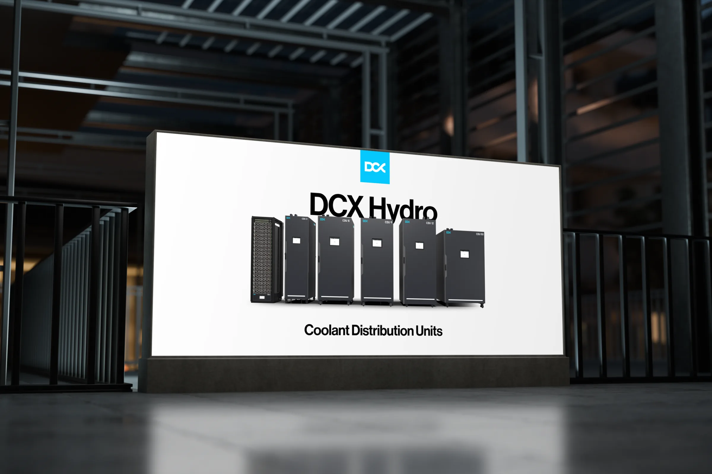
Launch animations are an important part of the brand's image: subtle, and building curiosity before the product is shown in full. The new units hadn't been photographed yet. What existed were engineering models: DCX sent us the units' design files, and on them we built a dark scene in which the product slowly emerges from the light.
The idea for the final shot came from the client: a glowing sign, as in an ad for a new iPhone, with the unit standing in front of it. During the work we received an updated model, so we re-rendered the scenes from the new files.
- 2 MW and 5 MW units
- Dark and blue versions
- Short and longer versions
- Intros and outros for brand videos
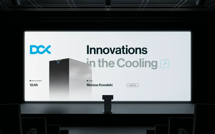
Presentation for the stage
15 minutes, one slide a minute
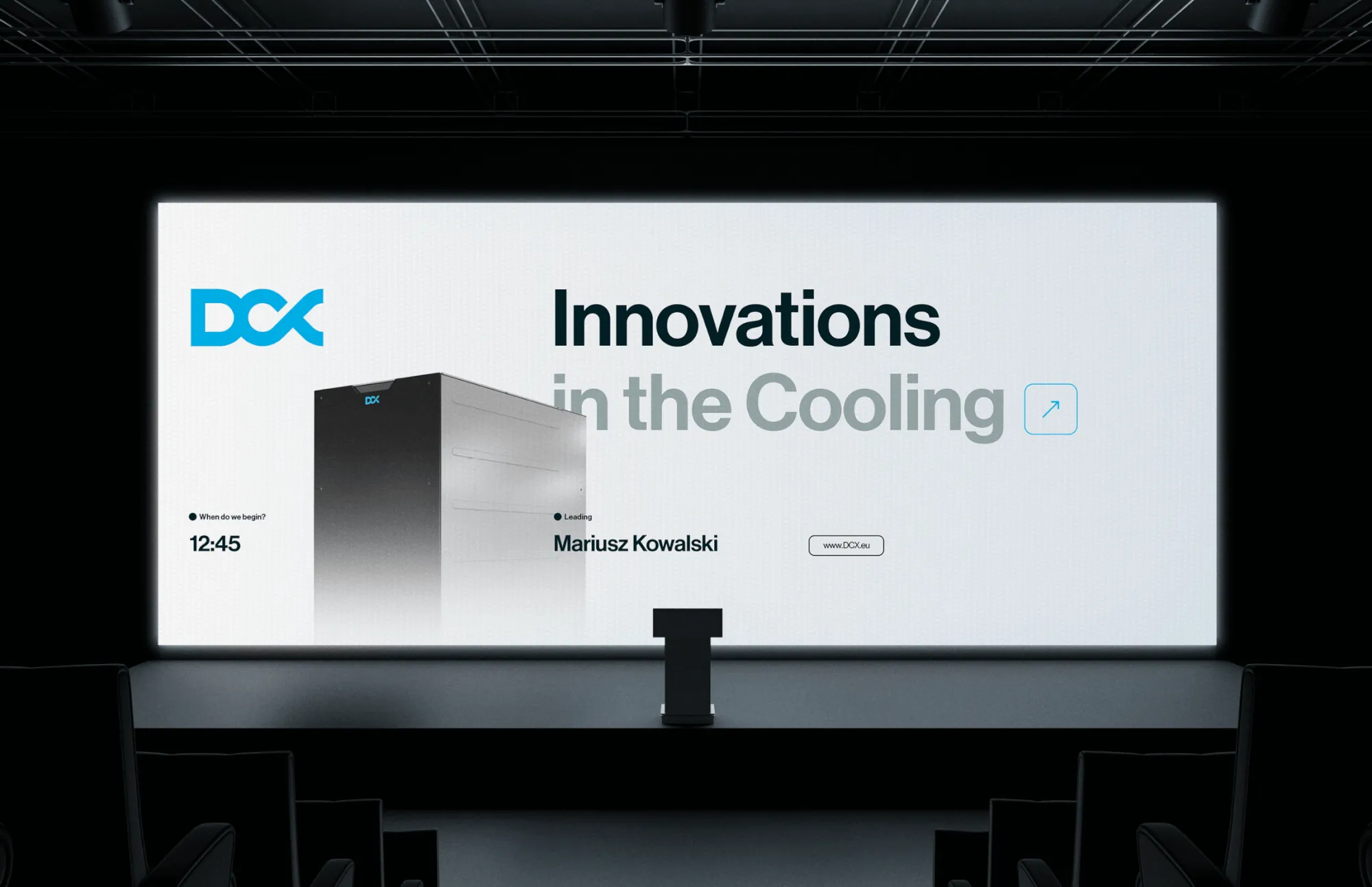
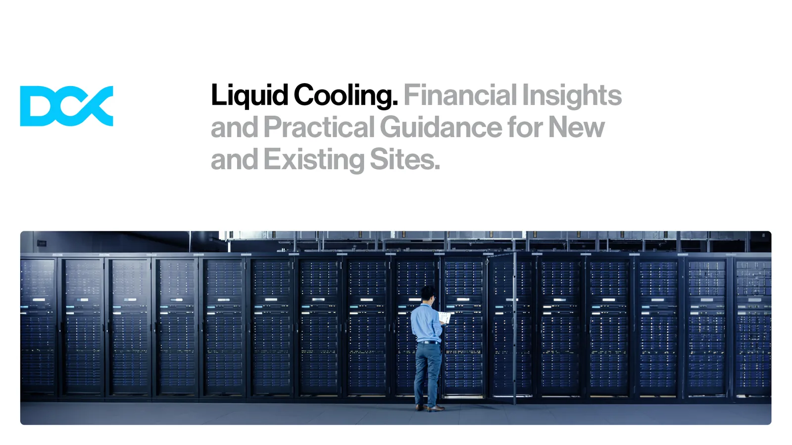
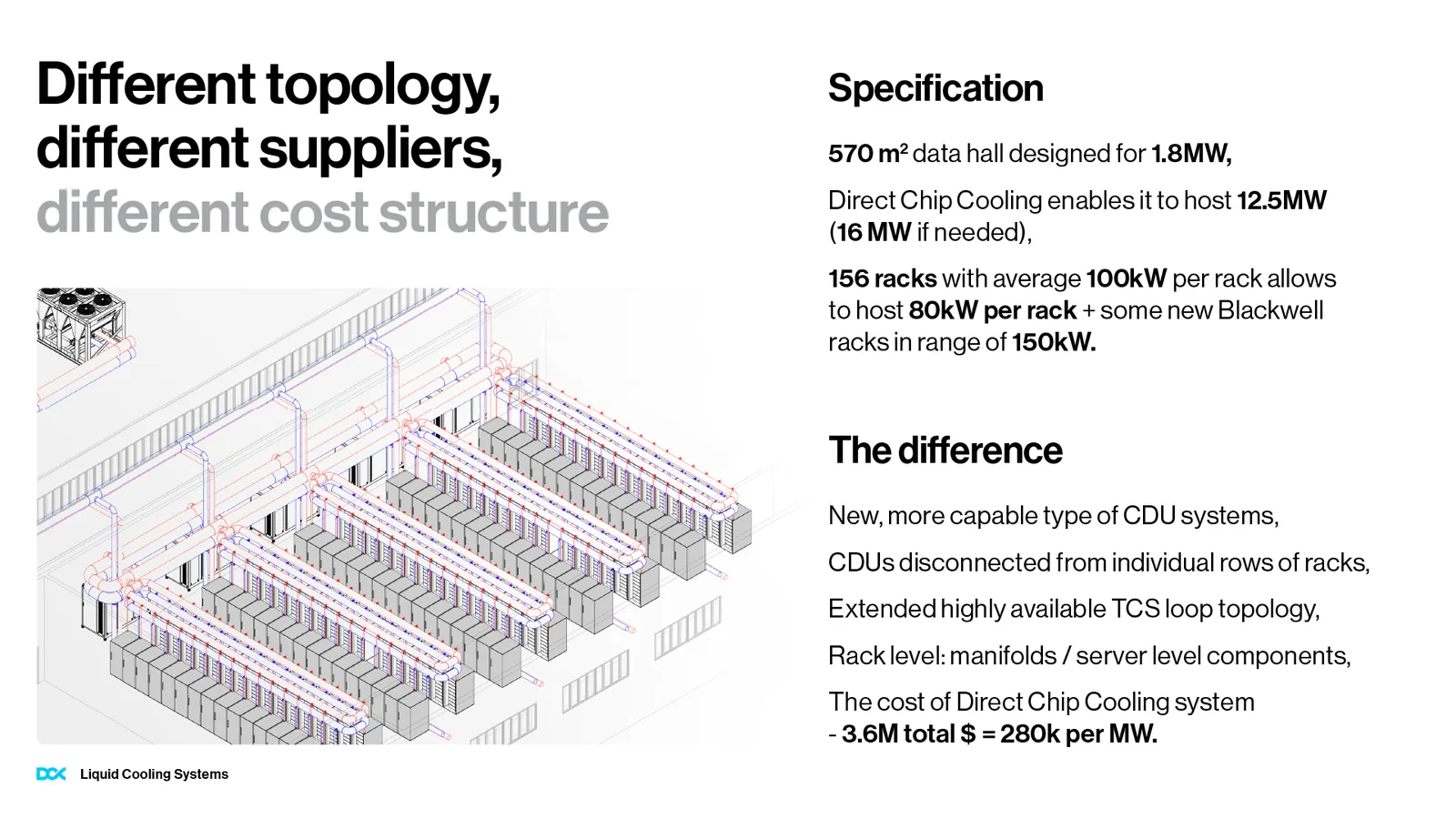
“Liquid Cooling: Financial Insights and Practical Guidance for New and Existing Sites”
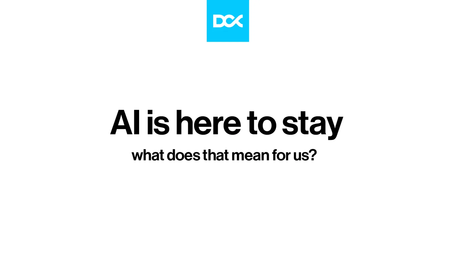
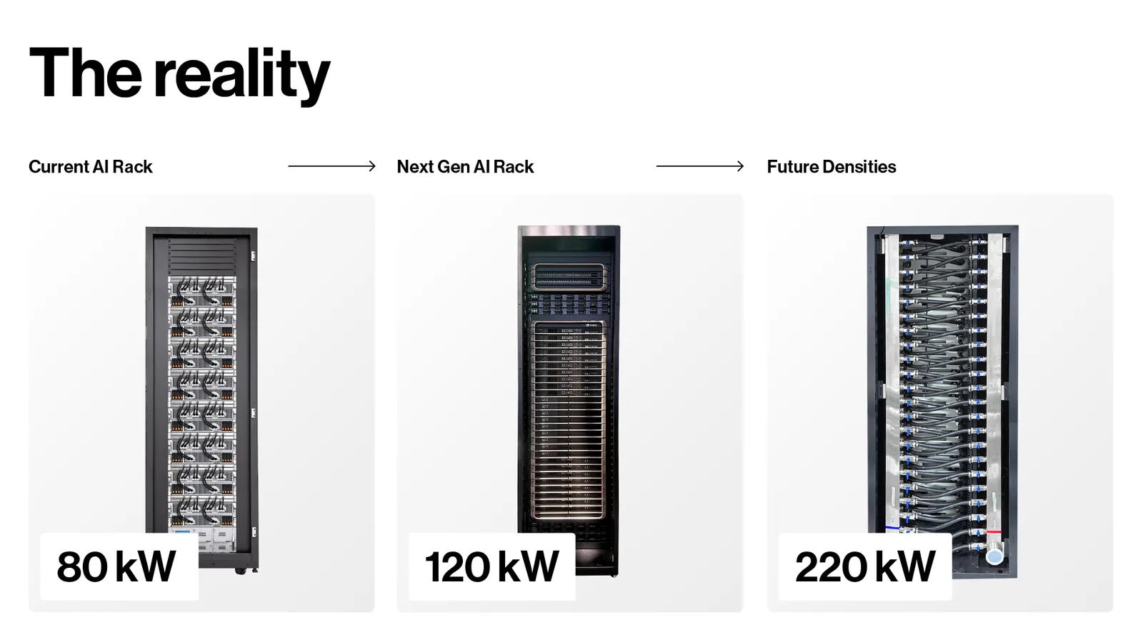
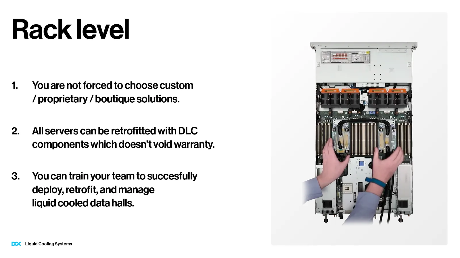
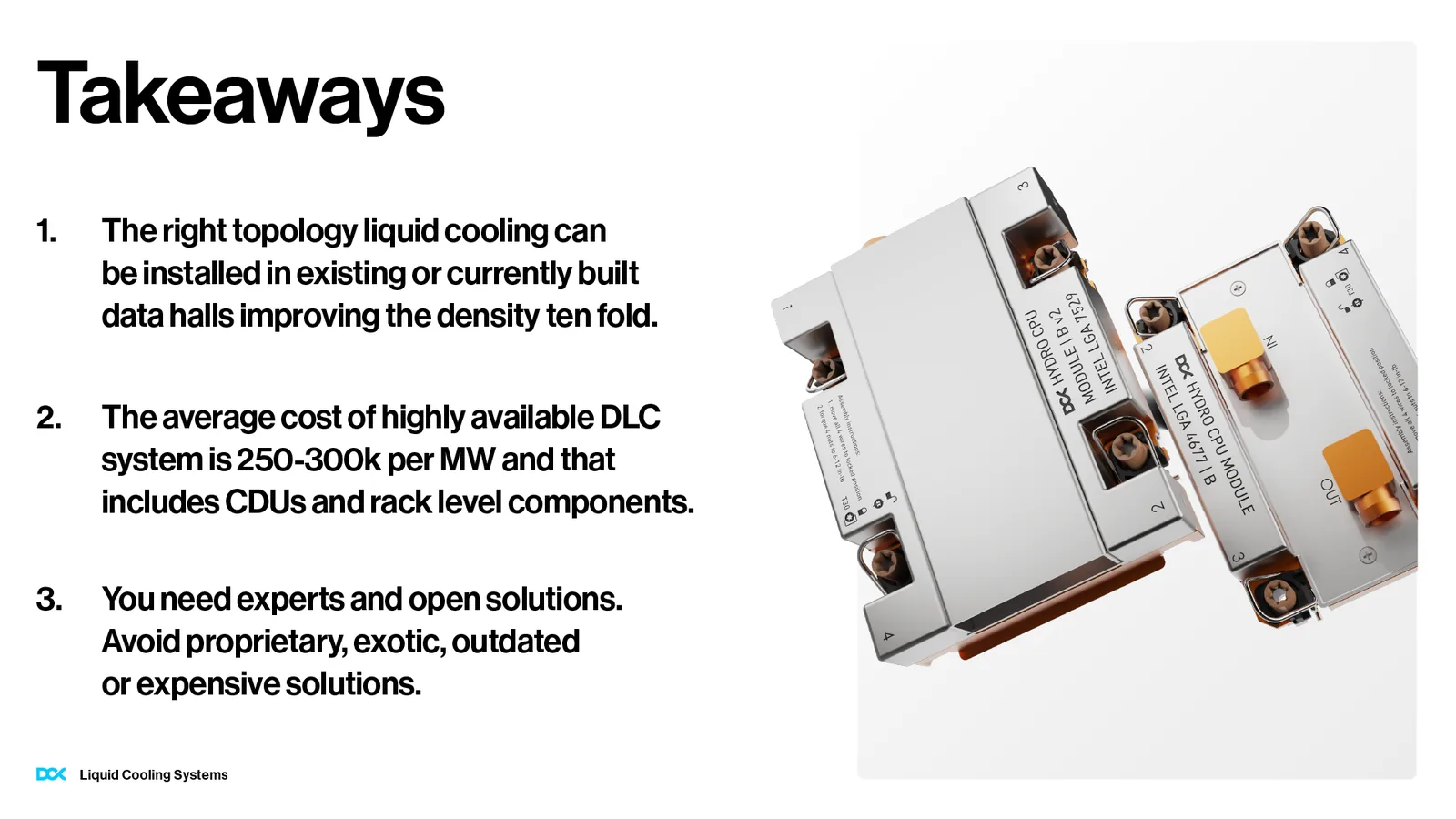
For DCX's talk at an industry event in Antibes we received an outline: the topic, a plan for the quarter of an hour, the speaker's script, and “to be styled” notes next to diagrams, renders and photos from installations. There was one rule: no more than one slide per minute.
The presentation was already made in the new identity. The team received it in PowerPoint, with slide masters, so it can prepare future talks on its own.
Website design
A website like an electronics shop window
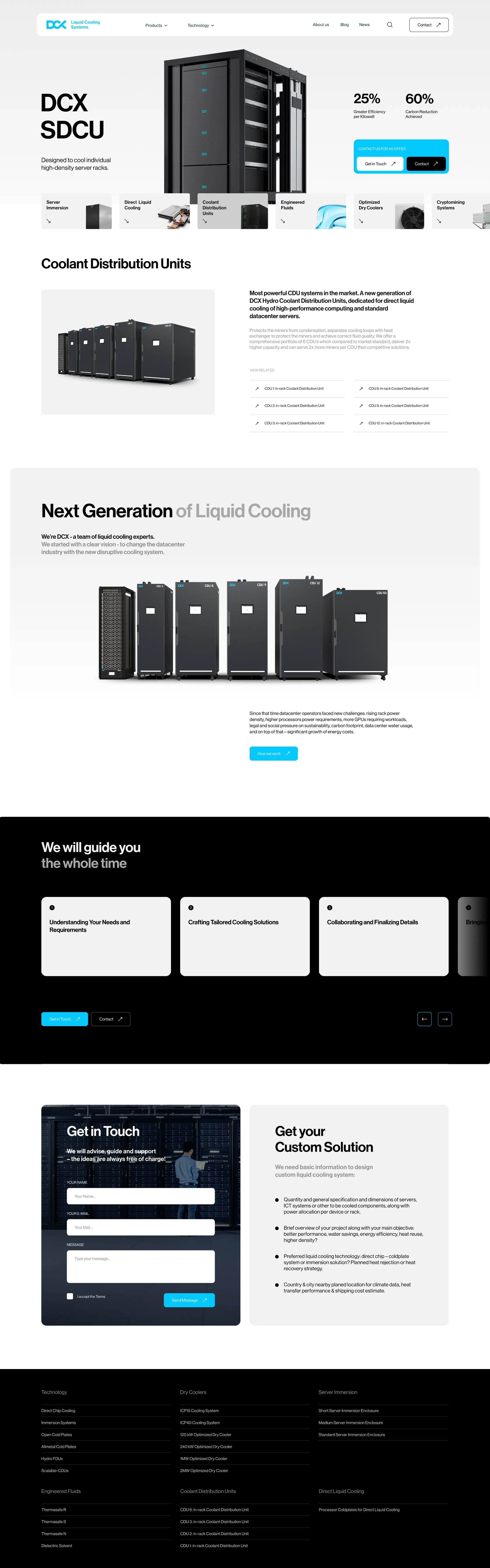
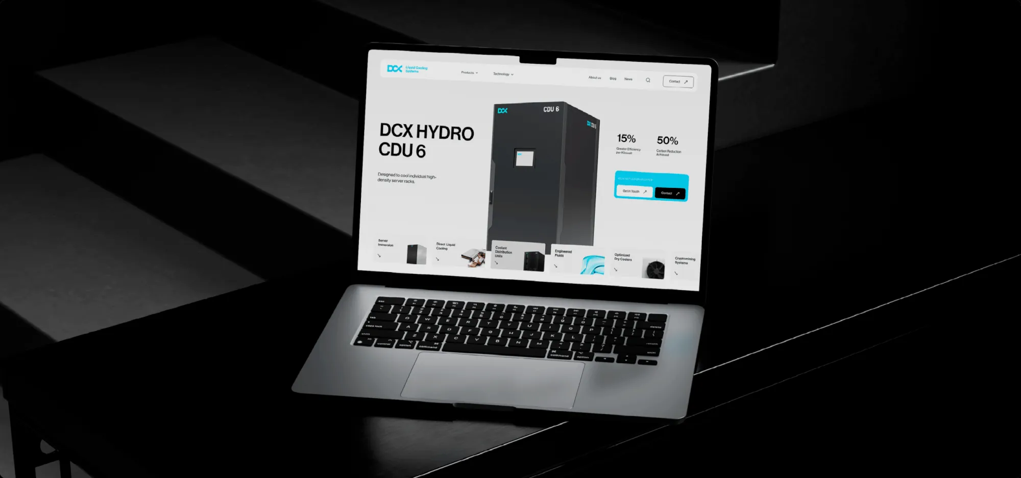
The home page has a single unit at the centre, its name in large letters, two figures and two buttons. Below come category tiles, from immersion cooling to dry coolers, followed by products, a few sentences about the company, the steps of working together and an enquiry form. We designed it together with the rest of the system.
Materials
From a trade fair leaflet to a billboard
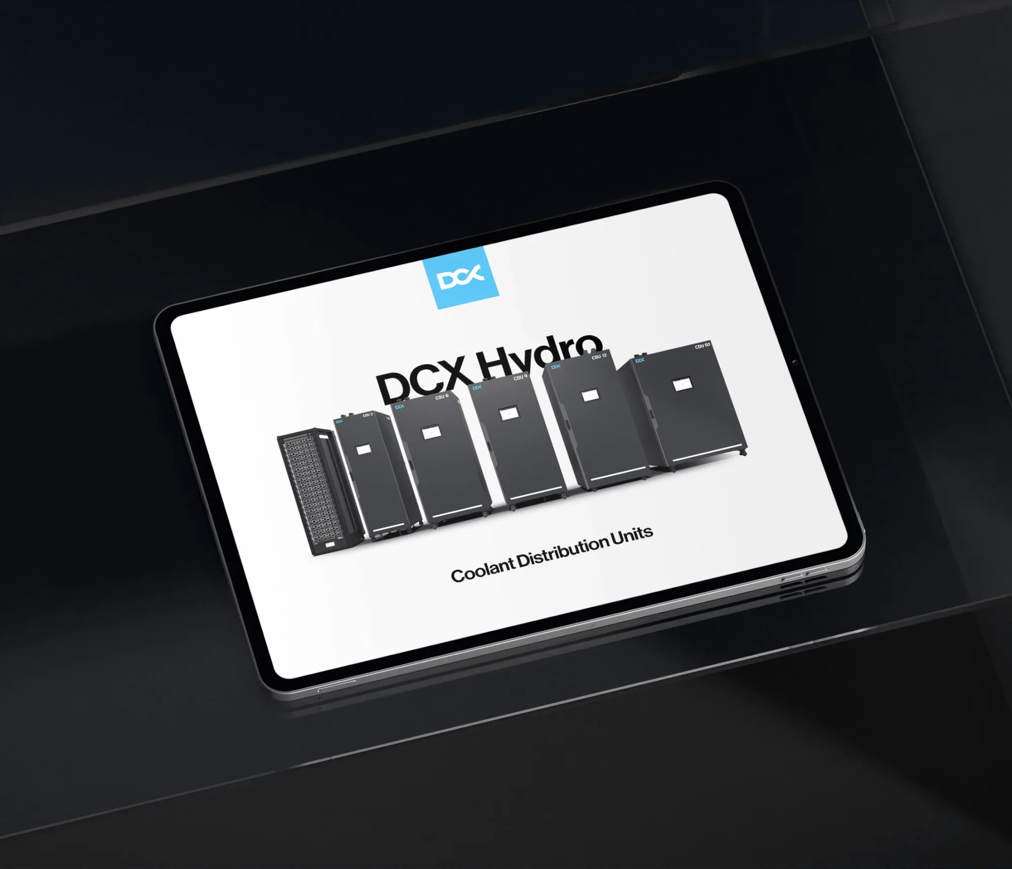
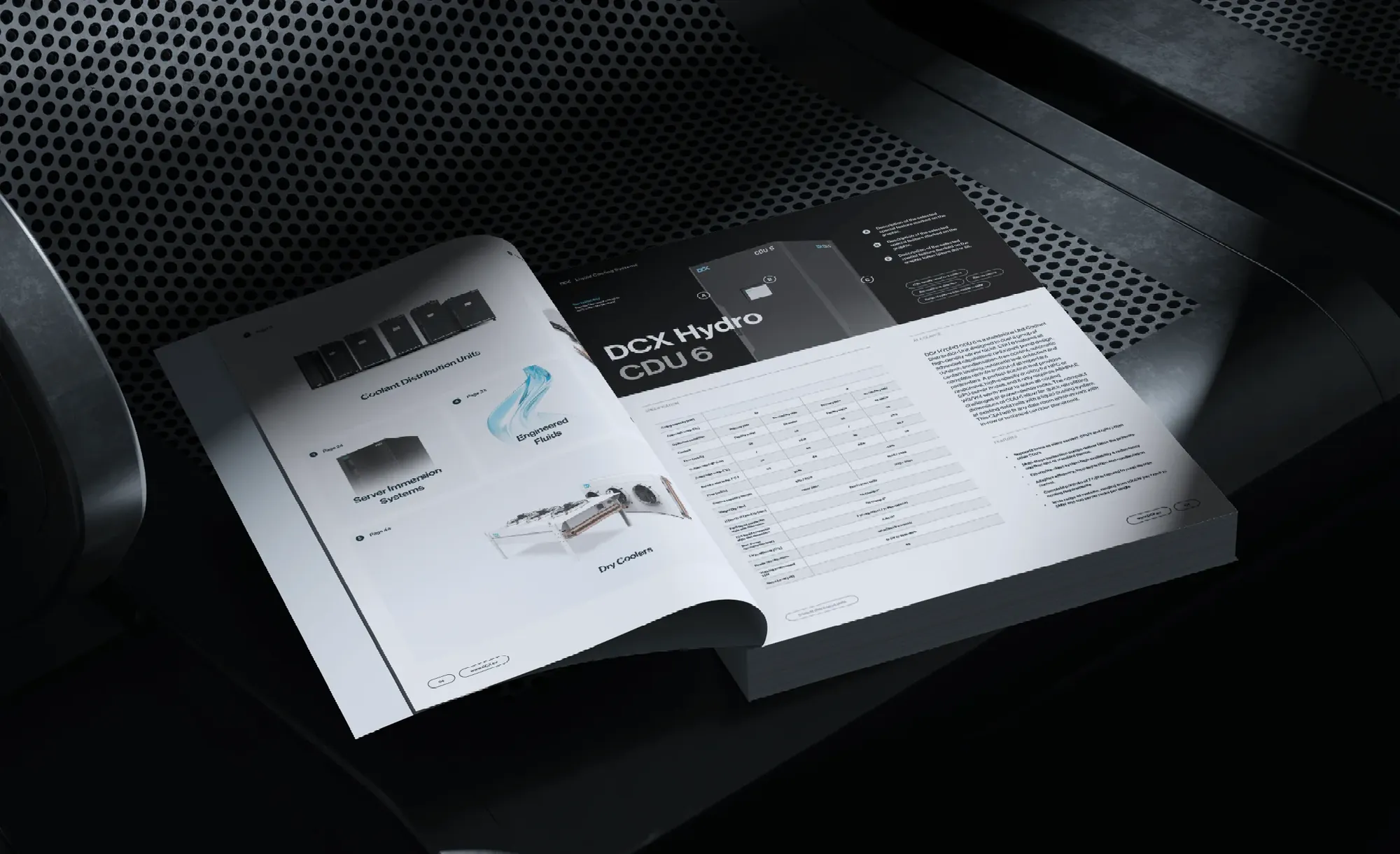
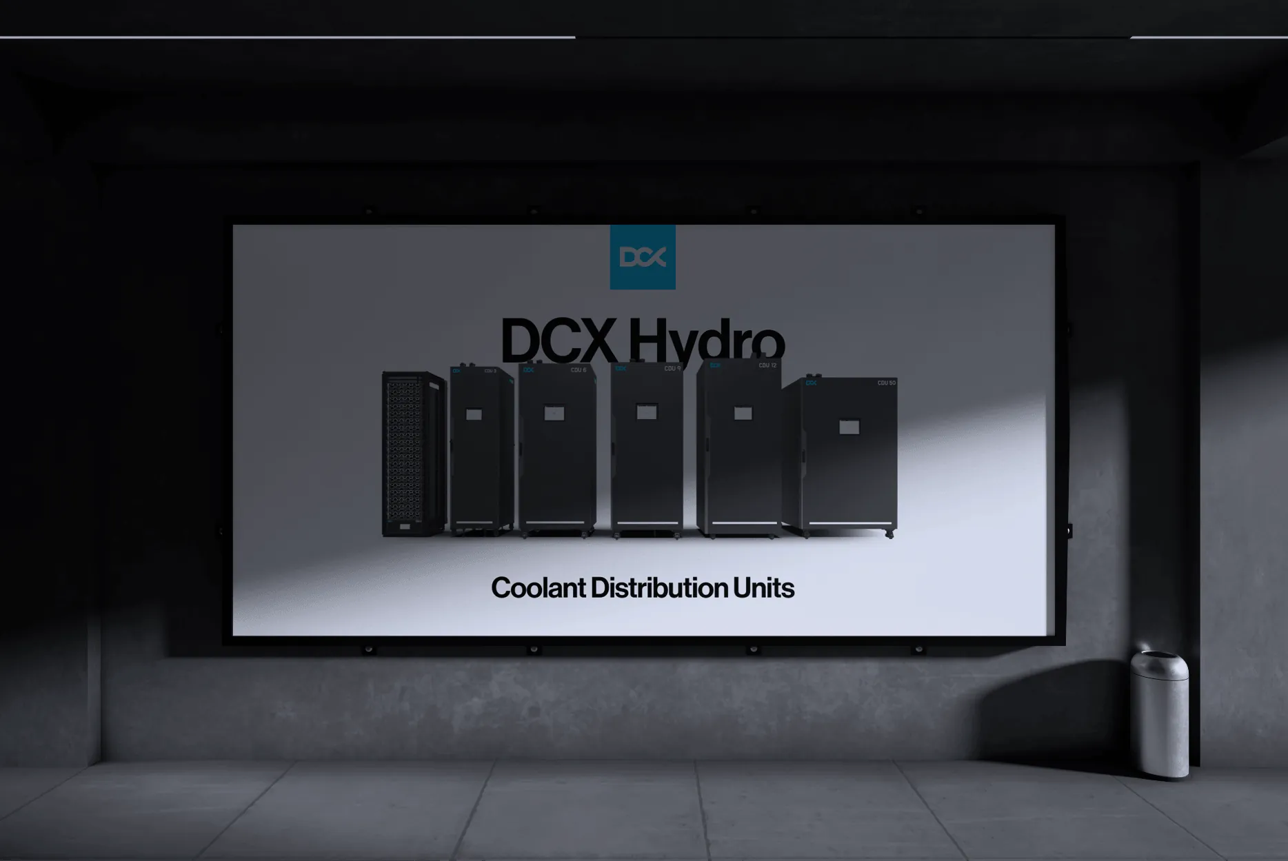
The brand materials cover social media, leaflets, a product catalogue and a presentation the DCX team edits on its own. Technical, complex topics are shown in them simply and clearly, and the same layout works in every format: a square post, the catalogue, an A5 leaflet handed out at trade fairs and a billboard.
-
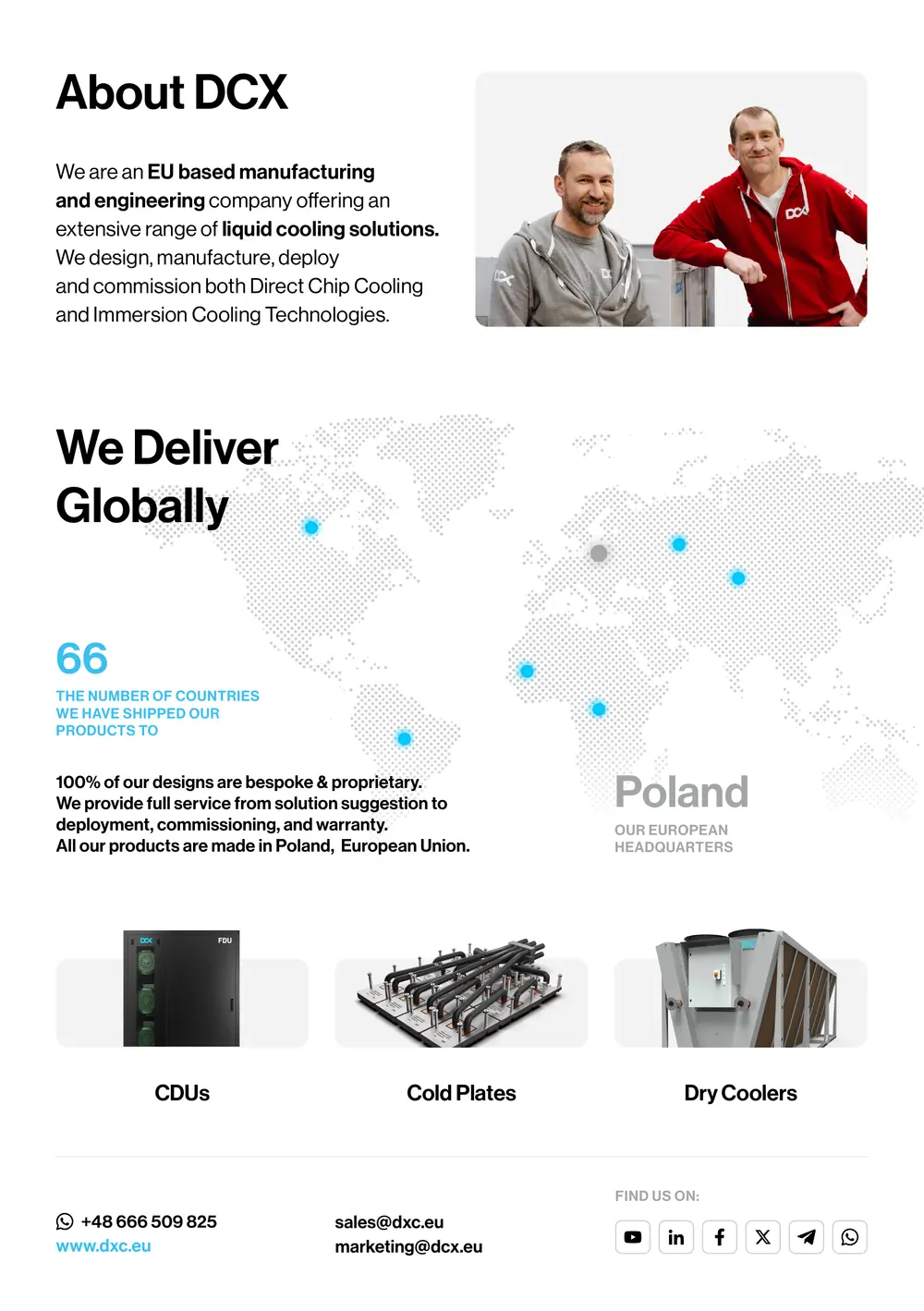
A5 company leaflet Print page -
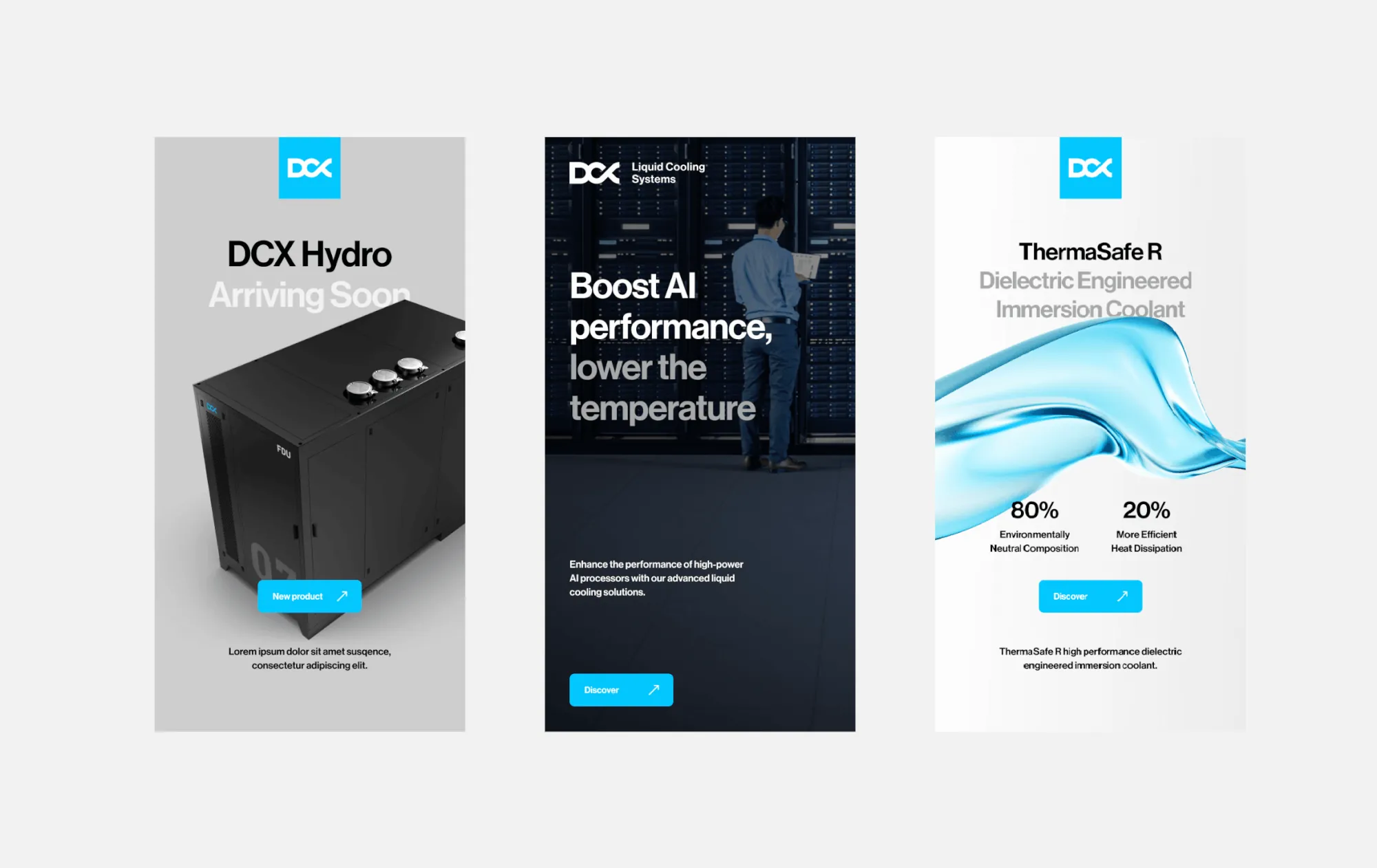
Vertical formats Stories and ads -
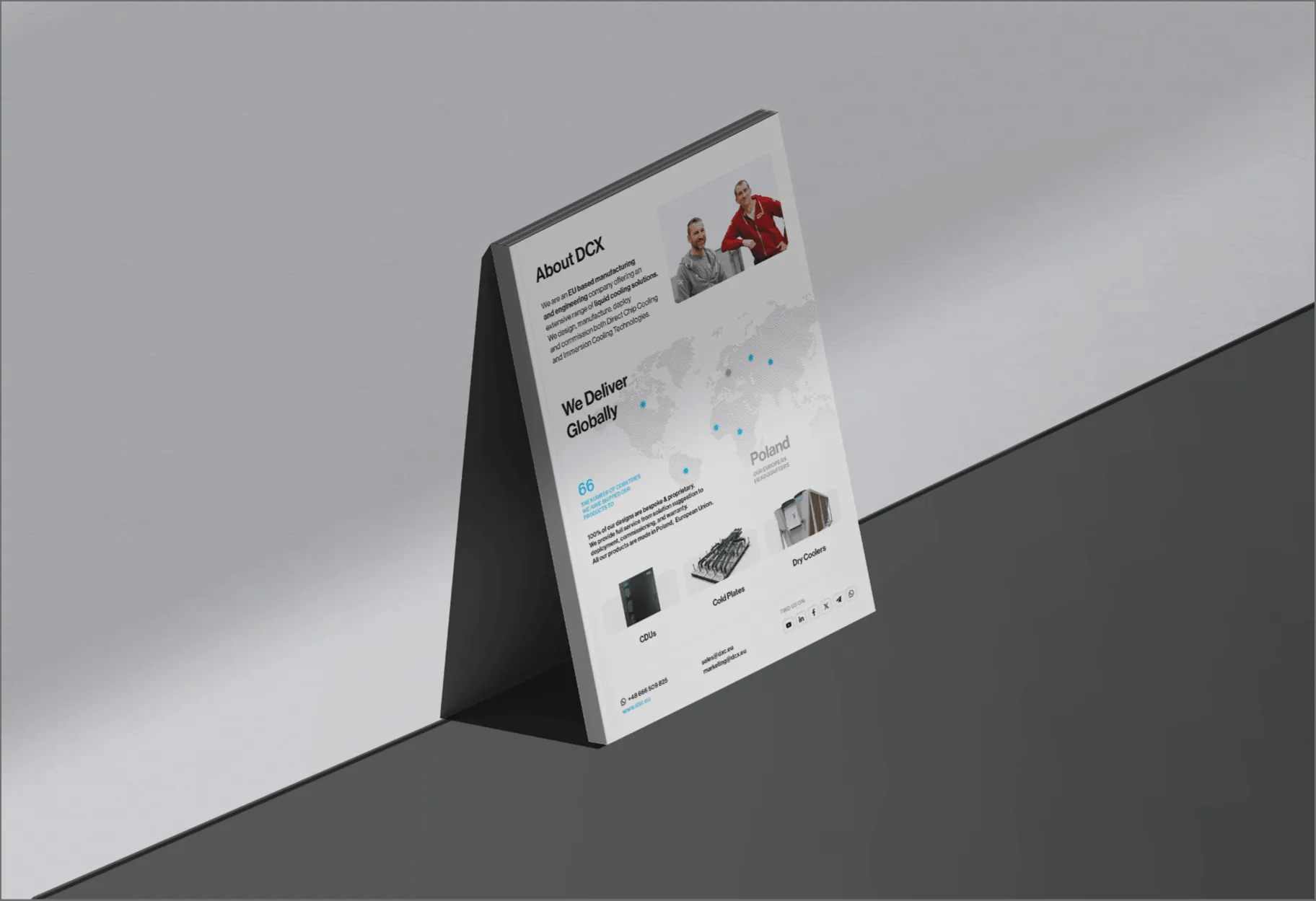
Company leaflet For trade fairs
Social media
LinkedIn, YouTube and X in one style
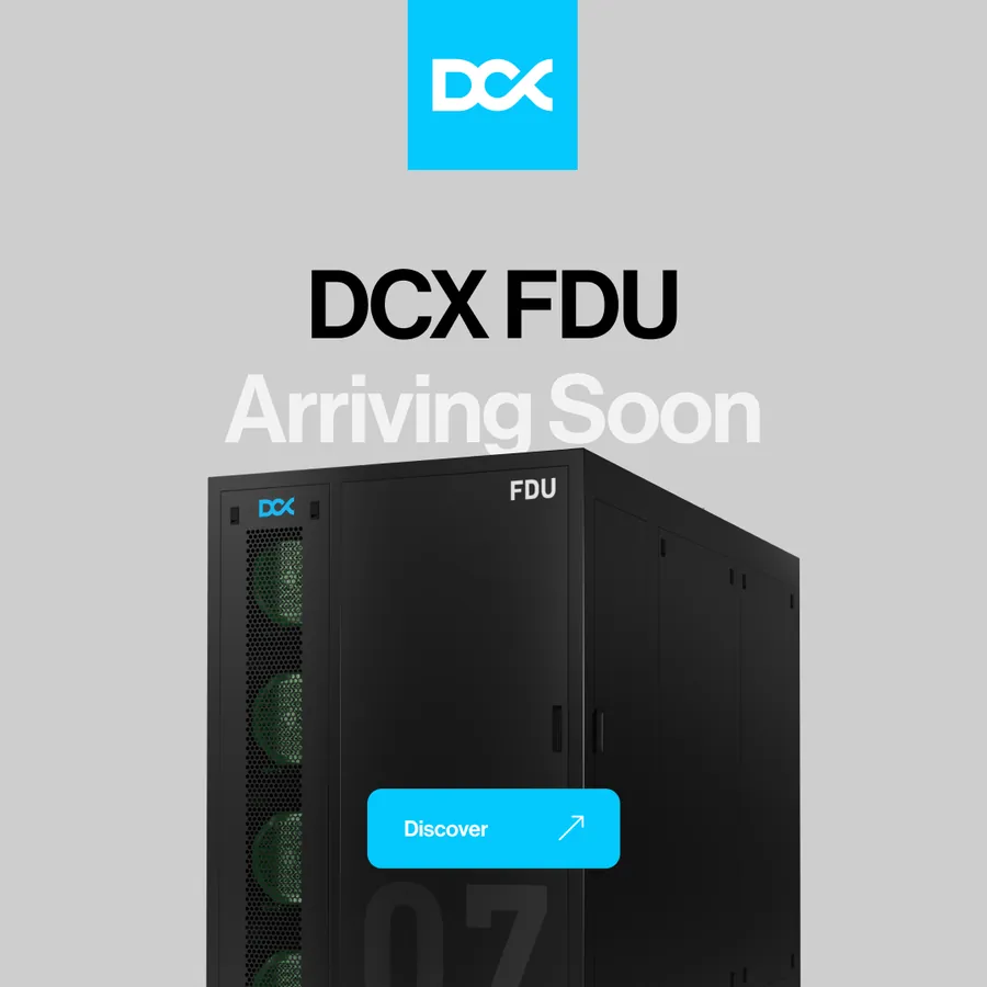
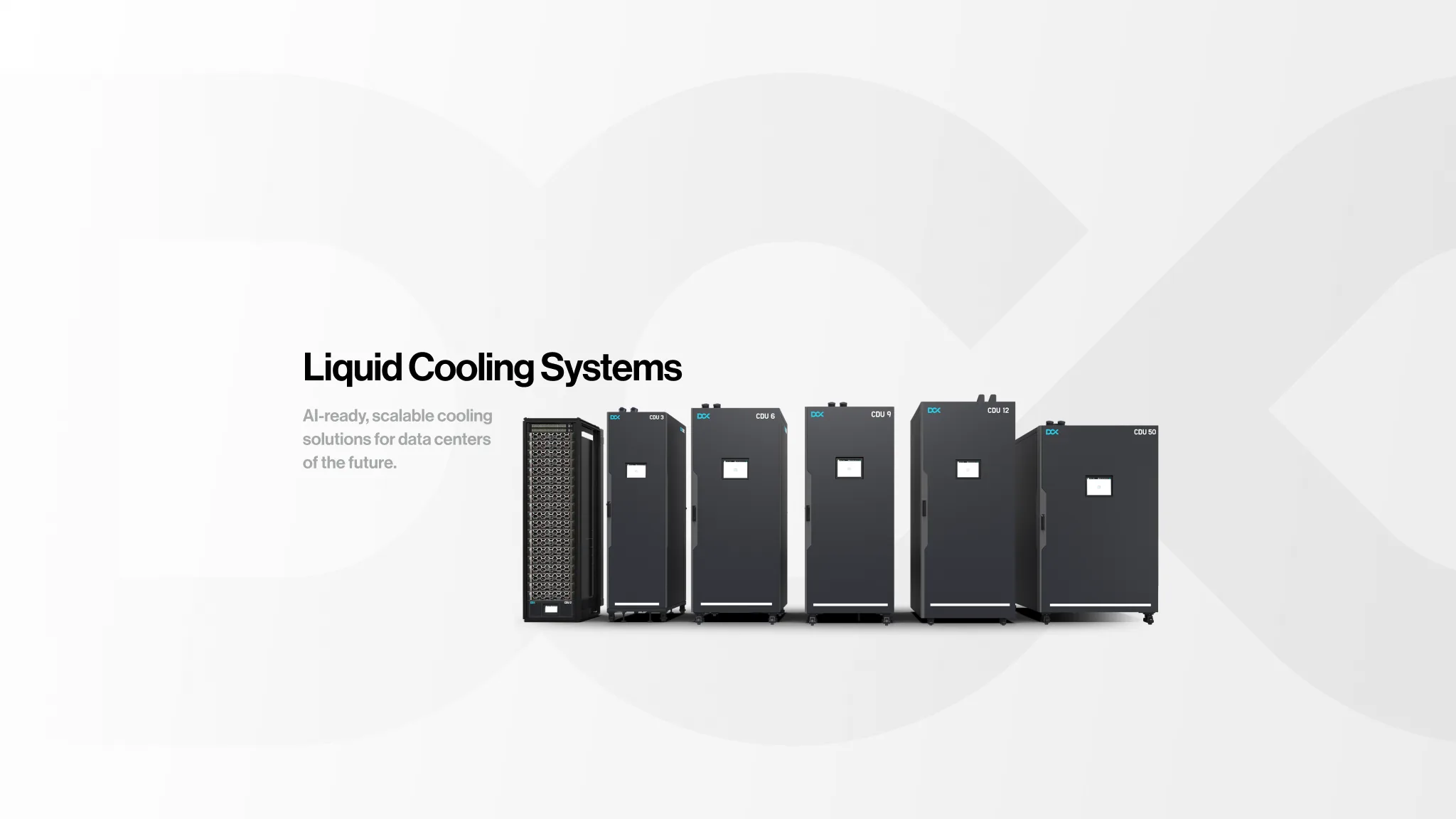
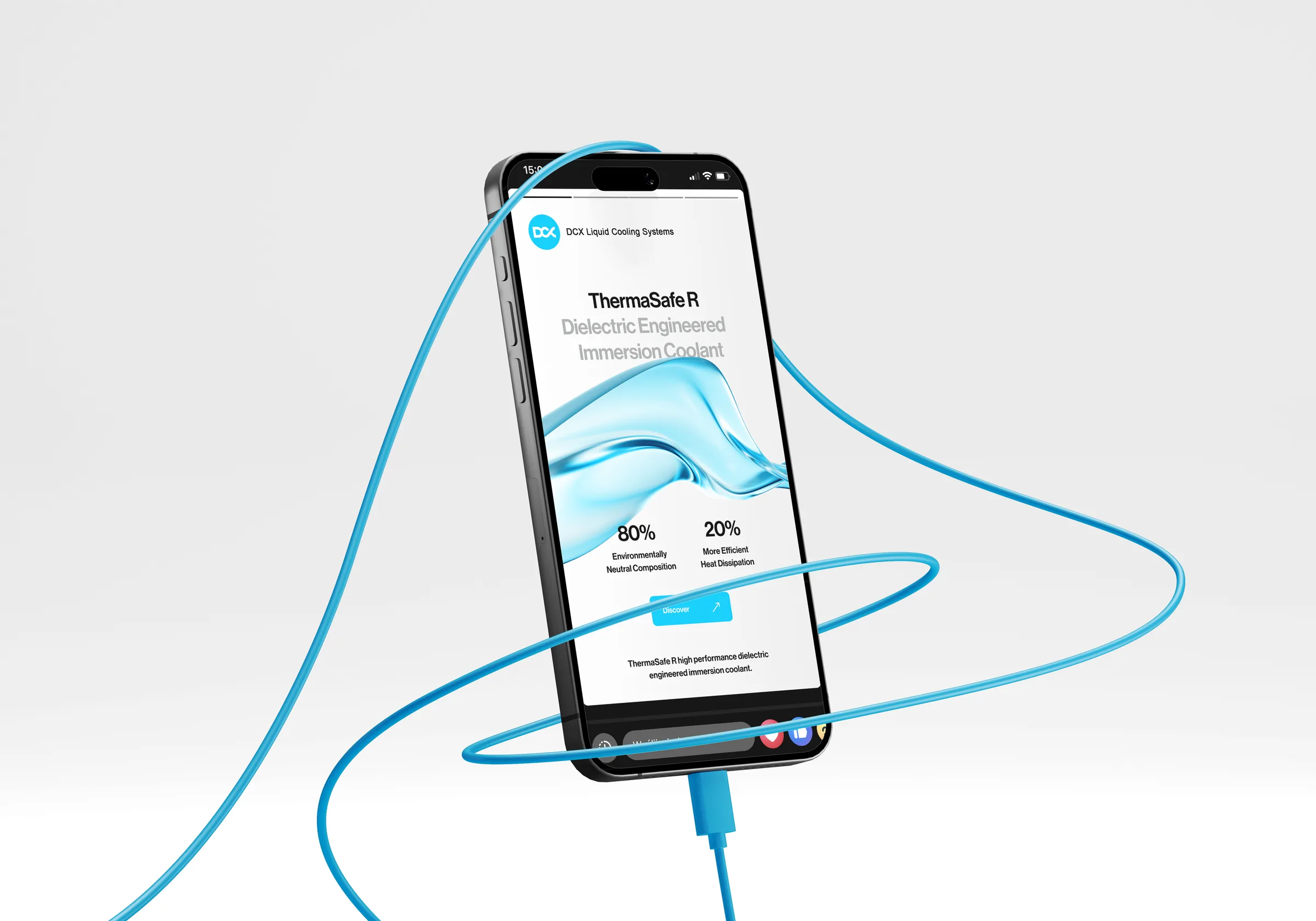
We set up the social media communication so that DCX can run it on its own, LinkedIn included. The profile covers share one layout: the name, a short sentence and the product line. YouTube video thumbnails are templates: the product name in black, a second line in grey, a short description and a button, with a render alongside.

-
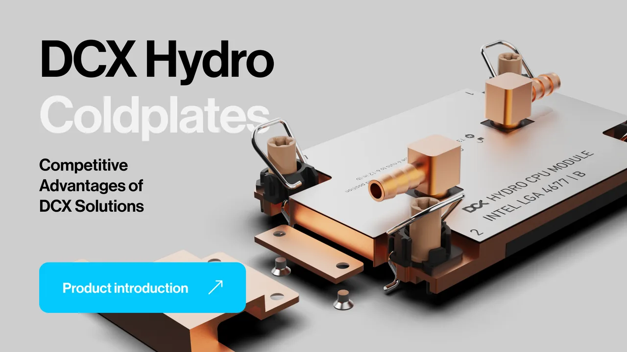
Product presentation Darker version -
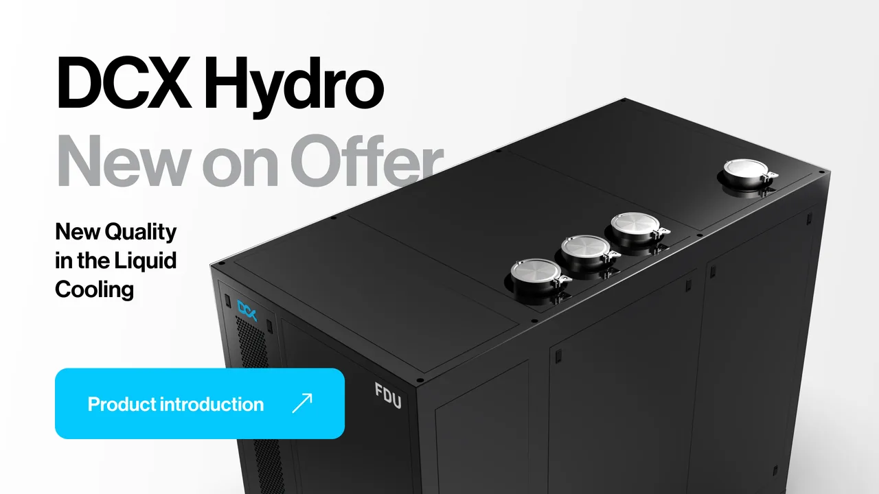
New in the range Light version -
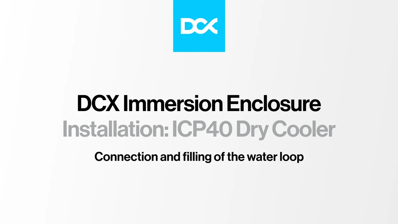
Installation guide Text-only version
The brand in pictures
Scale
20 jobs in one system
After the identity came more work: launches, campaigns and print for trade fairs. All of it on the same system, often needed right away.
- 20
- jobs, from the identity to trade fair print
- 3
- rounds of the key visual before it went into the brandbook
- 2
- unit launches with 3D animations: 2 MW and 5 MW
- 16
- slides for a 15-minute talk, plus PowerPoint masters
- 2
- campaigns on social media and in ads
- 2
- leaflets printed for trade fairs
A brand that looks like its equipment
DCX got a system in which everything has its place: a black and grey base, one colour to lead the eye, typography that speaks with a full voice, and the product always at the centre.
The launch animations, the stage presentation, the website design and the trade fair materials were all built on this system. Complex engineering is shown simply in them, without burying the audience in specifications.
- Client
- DCX
- Scope
- Branding · Animation · 3D renders · PPTX presentations · Website · Social media · Leaflets and brochures · Catalogue
- Online
- dcx.eu
More projects
-
 PetCuisine
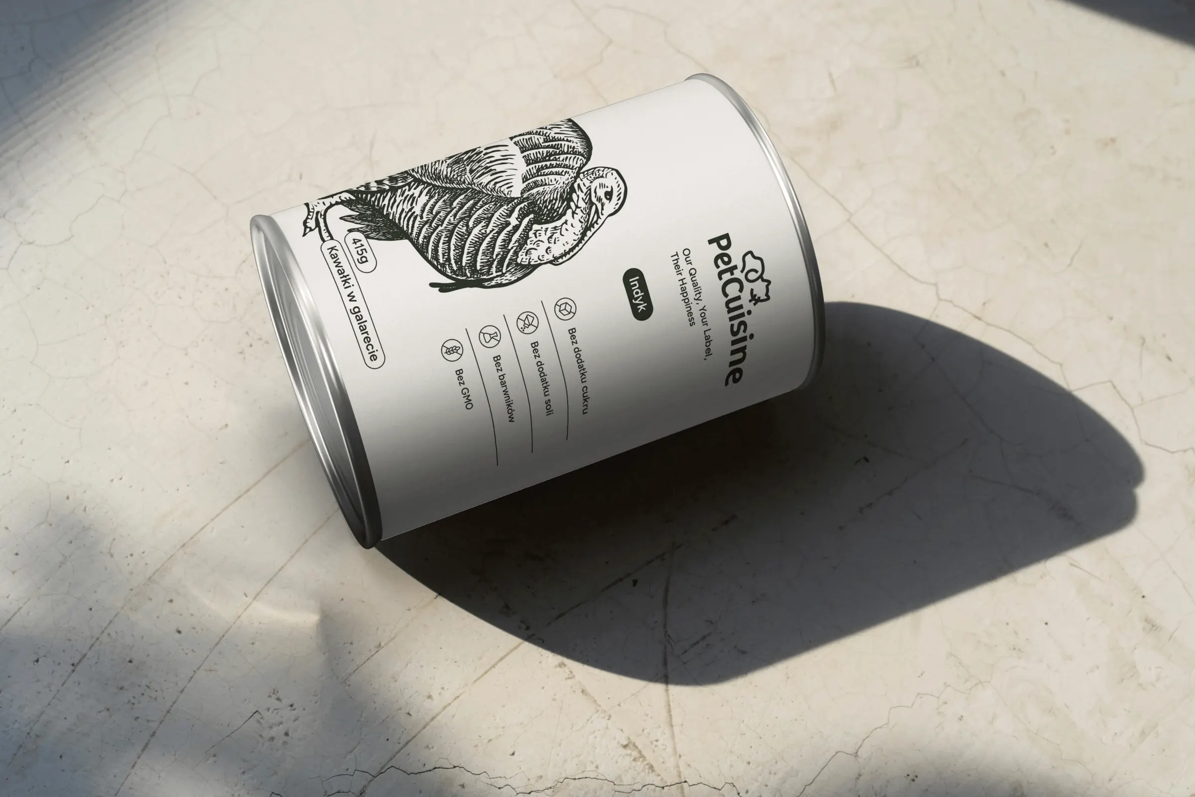
We built a brand from scratch for a pet food manufacturer in the Dawtona Group: from the name and tagline, through packaging in 12 flavours and the website, to trade fair stands across Europe.
-
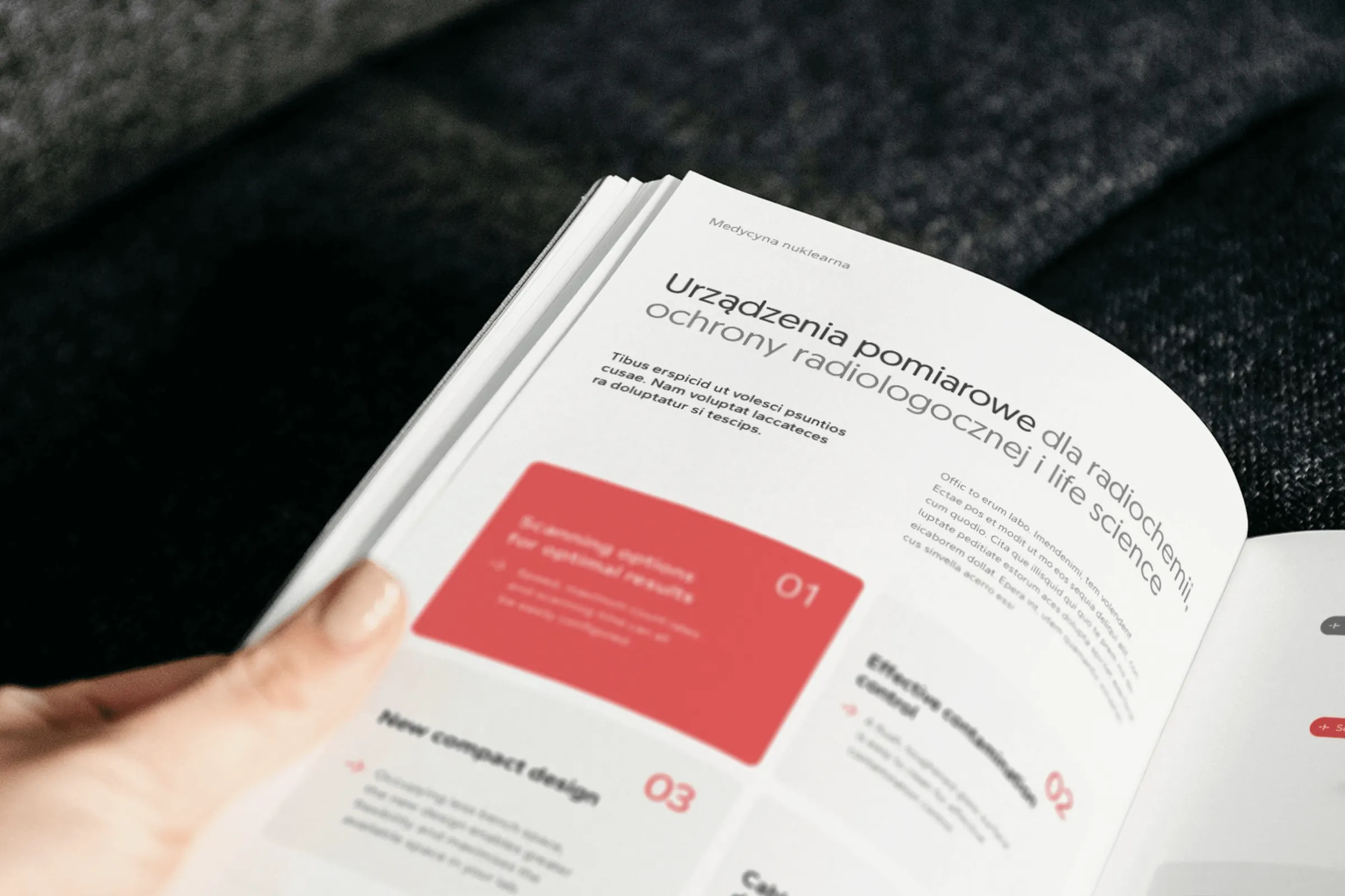 irtech
Two workshops, a logo with a plus formed from the letters r and t, over 20 templates and one style for product photos, for a distributor of measuring equipment.
-
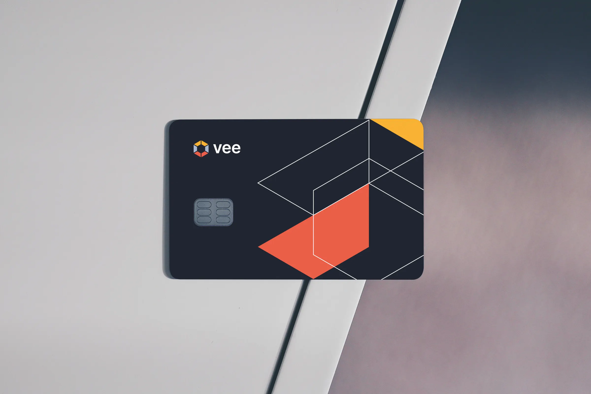 Vee
We designed the Vee brand with its sub-brands, the vee.ai website, web applications and trade fair materials, and for myvee, the identity and a store.
-
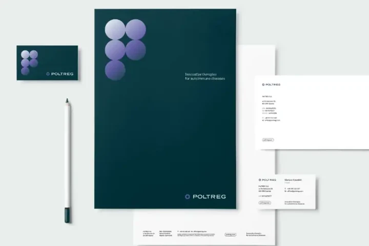
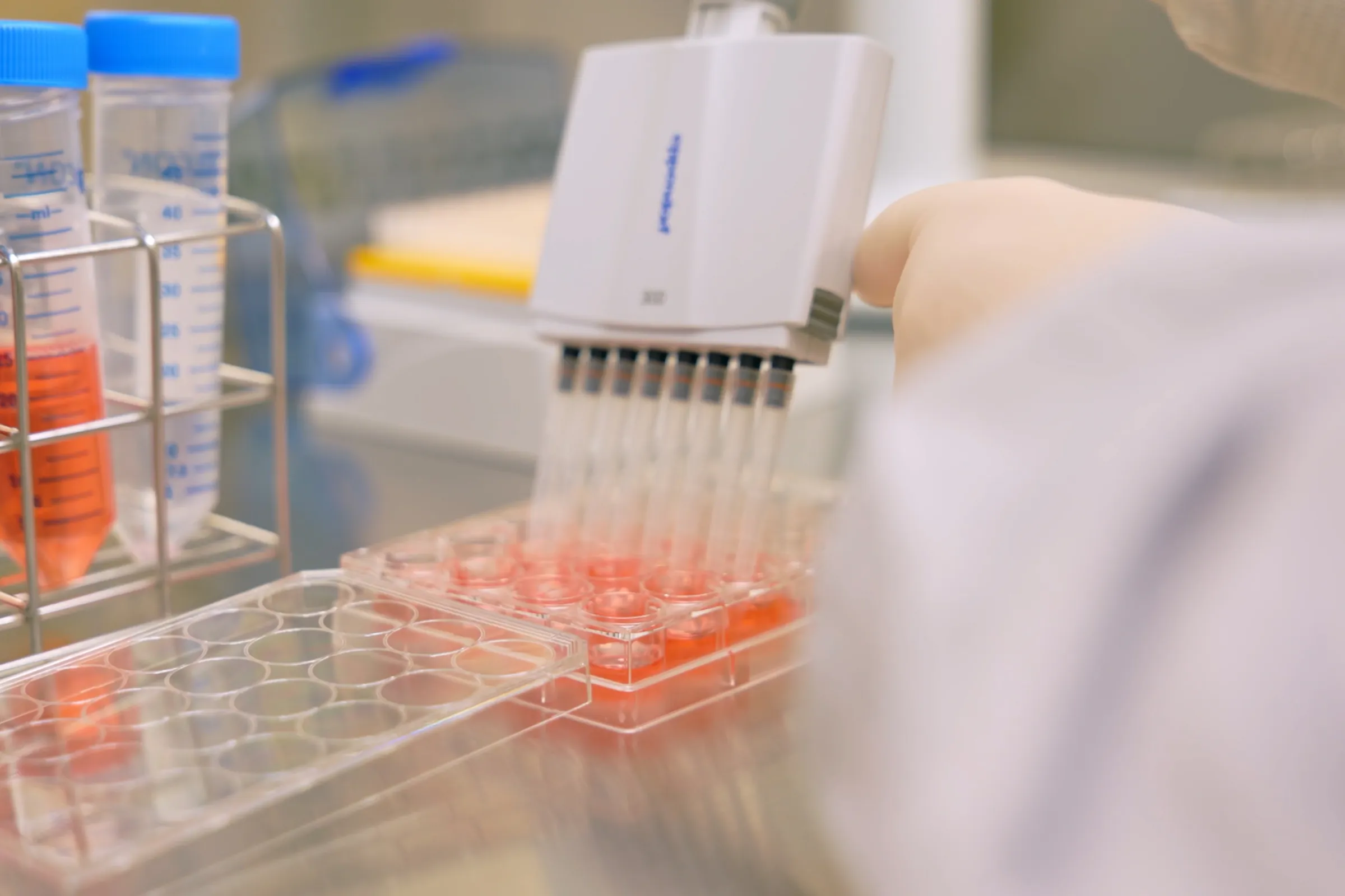 PolTREG
A rebrand for a biotech company listed on the Warsaw Stock Exchange, the poltreg.bio website for patients, investors and partners, and ongoing design support.
-
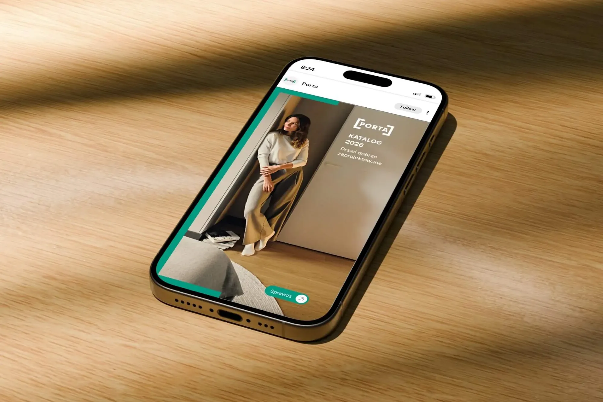 Porta Drzwi
A design system for an existing logo: a frame taken from the logo, grids, icons, drawings, a catalogue, porta.com.pl, social media and sales materials for a door manufacturer.
-
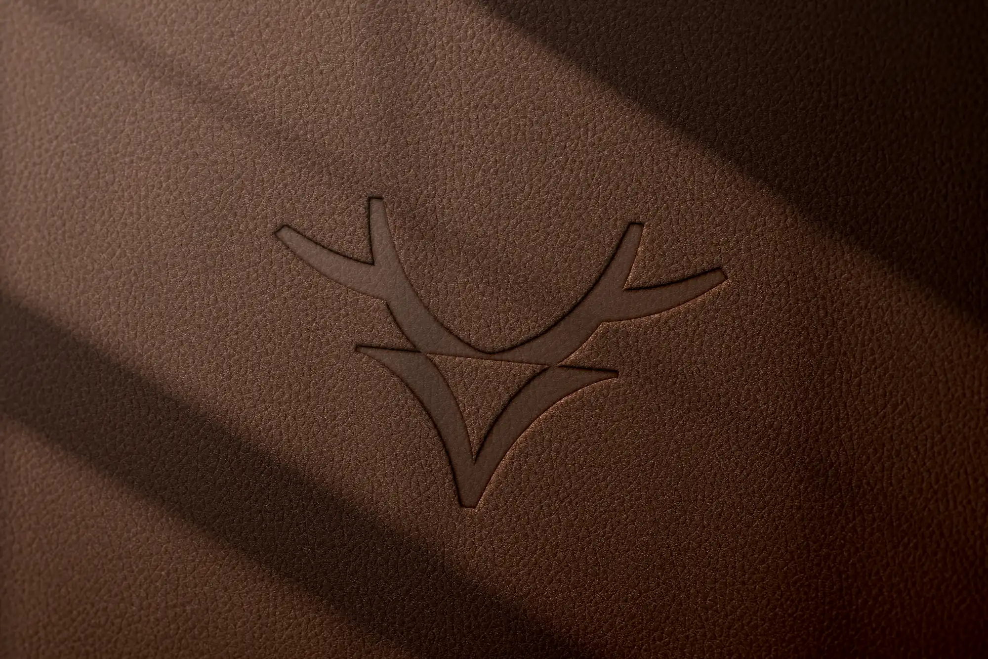 Mily Group
A rebrand for a deer antler supplier: communication strategy, logo, logo guidelines, the milygroup.com website and trade fair materials.
-
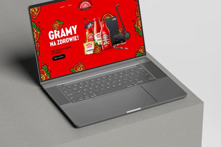
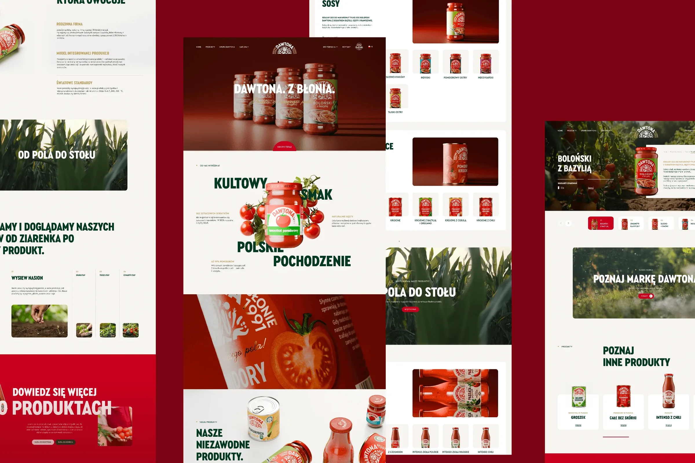 Dawtona Group
All of Dawtona's communication beyond the shelf: over 90 projects, from posts and trade fair stands to four websites and animations.
-
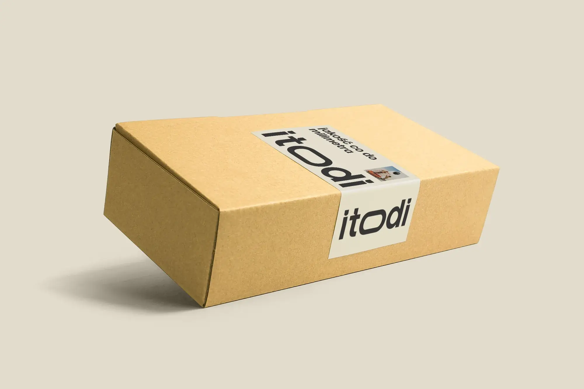 Itodi
A new made-to-measure furniture brand built from scratch: the name, a logo with a stretched “o”, the design of a shop with a configurator, an instruction leaflet and packaging.
-
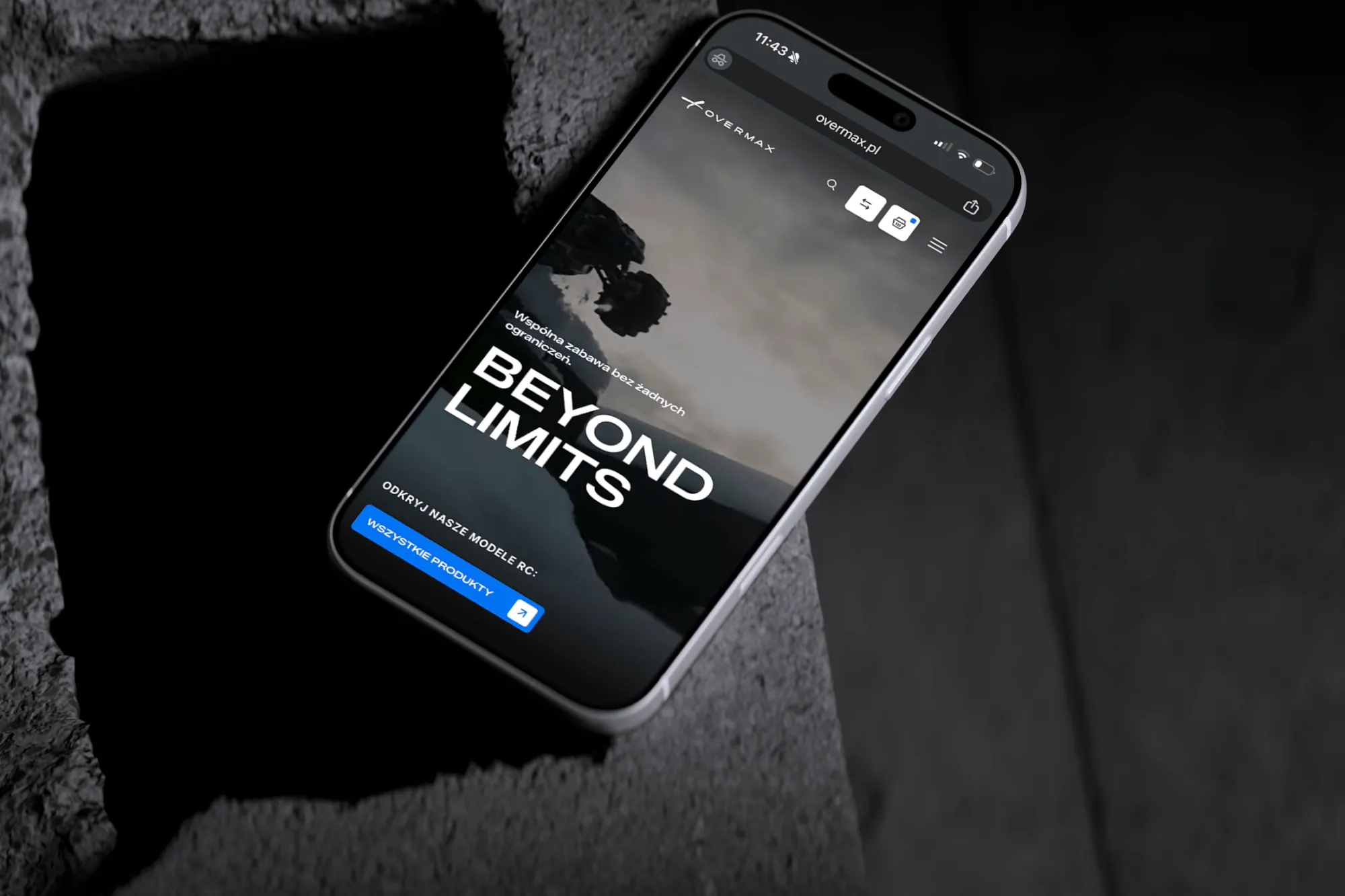 Overmax
UX/UI design for the Overmax shop: RC cars in cinematic shots, a carefully worked-out product page, a category menu and a quiz that picks a model for you.
-
 Design Optyk
A family-run chain of premium eyewear stores: an identity without gold, in-store materials and a new online shop linked to the stock of six of its seven stores.
-
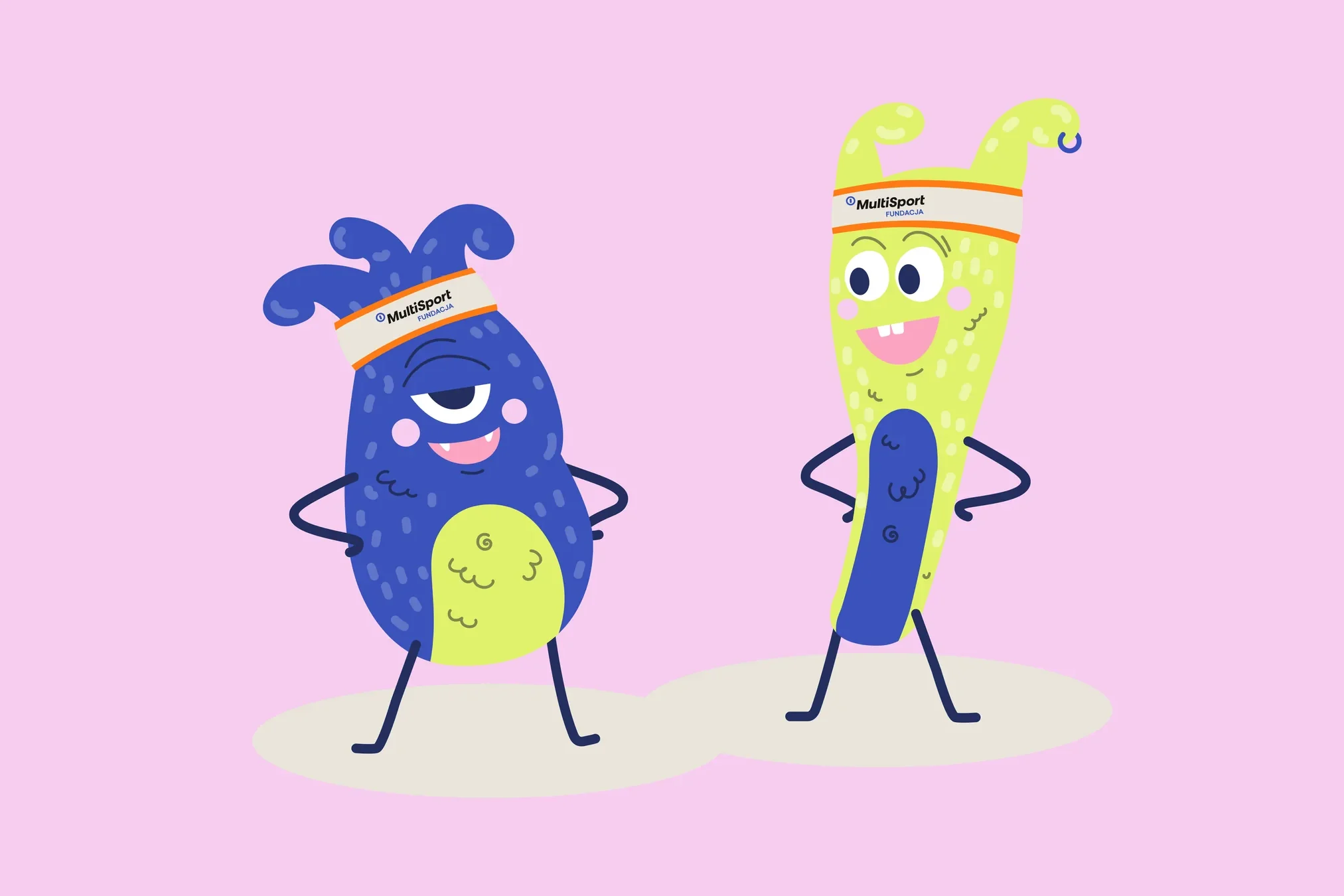 Fundacja MultiSport
An identity with a design system in Figma, a WCAG-compliant website and a brand hero duo that gets people moving.
-
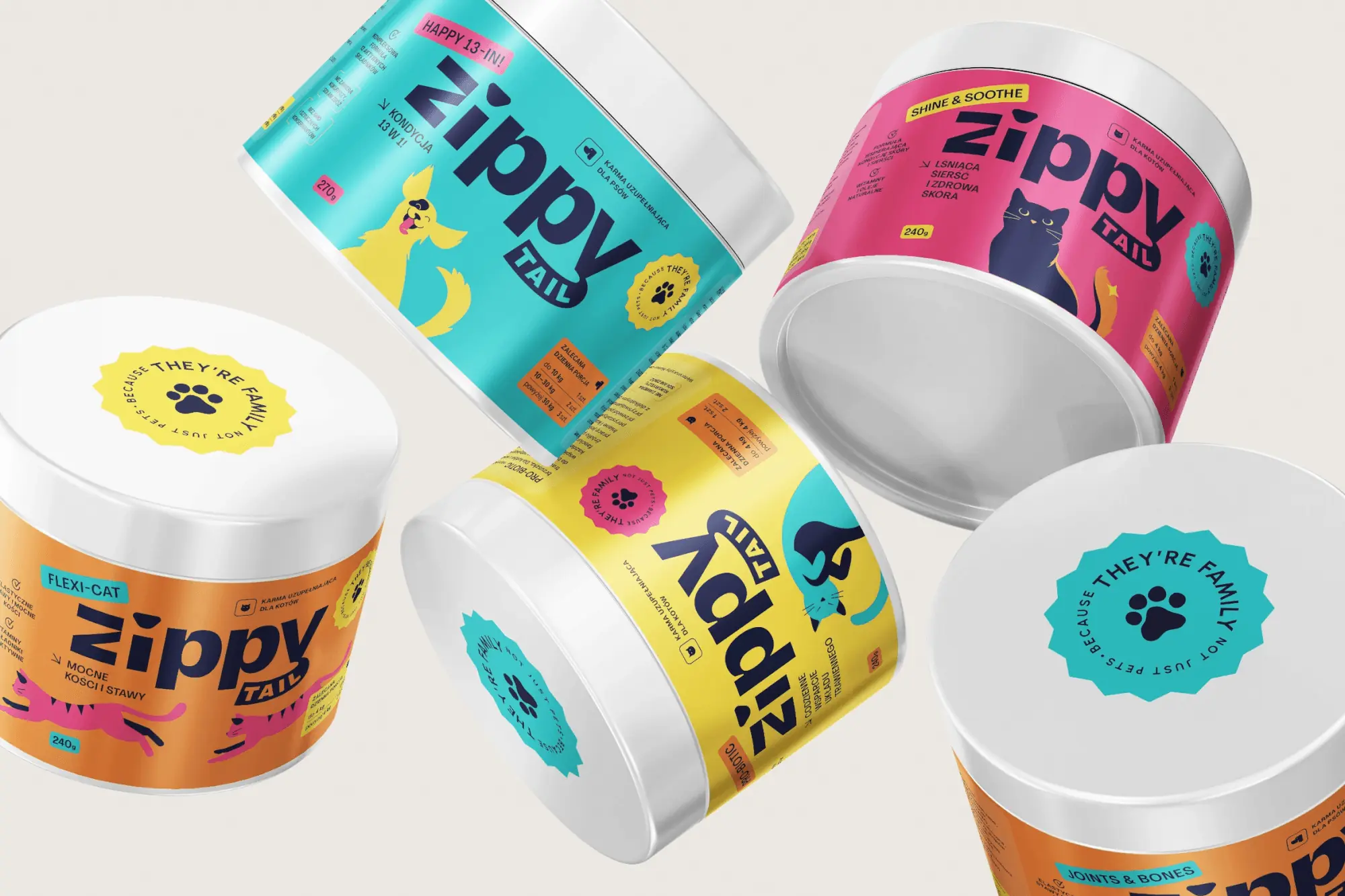 Zippy Tail
We built the Zippy Tail brand from scratch: the name, strategy, labels for eight supplements for dogs and cats, the shipping box and the shop design.
Facing a similar challenge?
Tell us what you want to change. In a first, no-obligation call we will see whether and how we can help.