


Medical, but not cold
Identity for a manufacturer and distributor of orthopaedic equipment, the Novicare24 chain of shops and everything that grew out of them: from the shop sign and window to the online shop.
See how it came togetherNovicare sign
Working together
14 projects for one brand
Novicare came to us for an identity. Then came shop windows, a price list, leaflets, an online shop and a website for partners. Each new piece used the same system, so it went faster.
- 4 Novicare24 shops branded according to one brand book
- 3 brands planned in one architecture: Novicare, Novicare24 and Novipillow
- 2 audiences: orthopaedic shops and patients
- Goal
- An identity that shows the brand's professionalism and expertise, along with approachability and empathy towards its audience.
- Solution
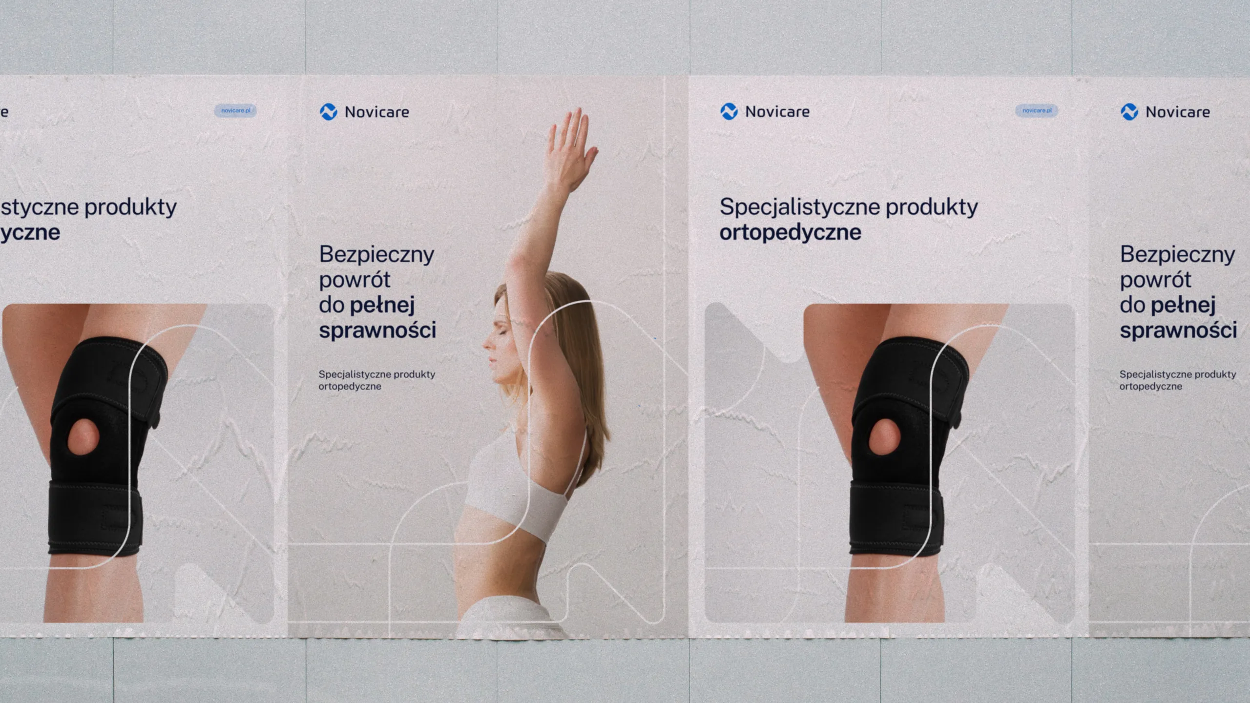
- Colours associated with medicine, professionalism and support. Natural, harmonious photos of patients and products on plain backgrounds.
- Result
- A consistent system that combines an empathetic relationship with the audience with quality and professionalism. It gives a sense of a confident choice and of safety.
Workshops
A brand that doesn't shout
We started with workshops with the Novicare team. Novicare makes orthoses, braces and orthopaedic pillows, distributes the Orthocare, Dr. Med and ABCTeks brands and runs four Novicare24 shops. All of it so that customers get back to full fitness as quickly as possible. What sets it apart is high quality at a good price, and the fact that every product is tested before it joins the range.
When we described the brand as a person, we got an empathetic, self-assured woman in her thirties: elegant, understated, someone who cares about quality and doesn't dress to shout. She likes navy. That description guided us through the whole project, colour included.
- quality
- care
- flexibility
- innovation
- Who they are
- A sales assistant in an orthopaedic shop, trained as a physiotherapist. Every day she handles products from many brands.
- What motivates them
- She wants to broaden the offer for her customers, but without hassle: products have to be proven, good quality and cheaper.
- How they decide
- Carefully. She prefers things she's sure will work, and needs encouragement to try something new.
- Who they are
- A woman or man after an injury or accident, living in a city, aware that well-chosen equipment helps them recover faster.
- What motivates them
- A doctor's or physiotherapist's recommendation, sound advice in the shop and quality you can feel in your hand, at a reasonable price.
- How they decide
- On a recommendation, or because the product's benefits are concrete and convincing enough to give it a try.
The identity had to answer five words from the workshops
- 01effectiveness
- 02innovation
- 03confident choice
- 04comfort
- 05accessibility
Direction
Two moodboards, one choice
After the workshops we showed two directions. Navy and blue were meant to feature in one of them from the start. The client chose the calmer one. The whole identity grew out of it: blue with soft beige, natural, minimal photos of people and a line drawn from the shape of the logo.
-
Moodboard 01
Relationship and quality
Subtle, meant to highlight the relationship with the audience and the high quality of the products.
- minimal photos of people
- medical shades of blue with beige
- a line as a motif of recovery
- sans serif typography
The client chose this one
-
Moodboard 02
Movement and getting back in shape
Dynamic, focused on movement, meaning the return to full fitness that Novicare helps with.
- a circle as a reference to joints
- a repeated main motif
- a scientific, laboratory feel
- serif accents in the text
Symbol
Four meanings in one mark
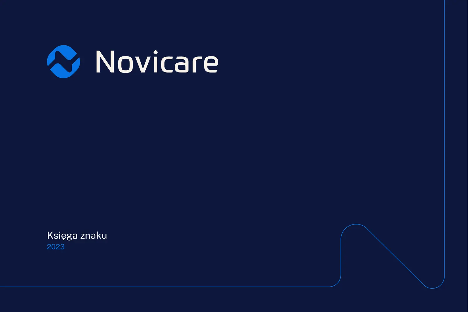
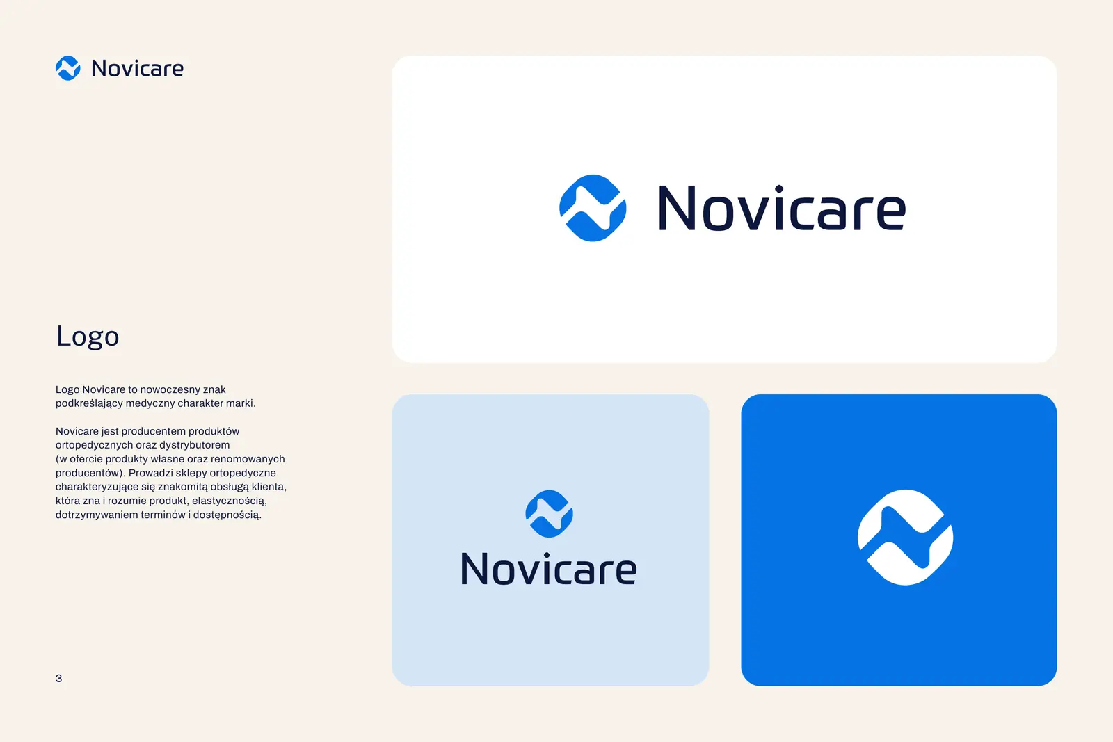
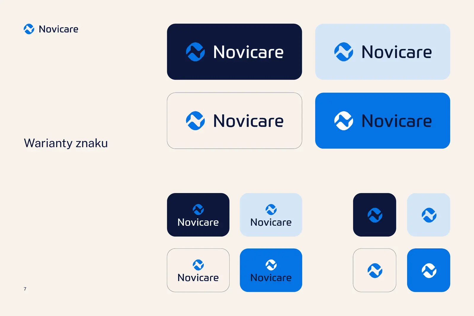
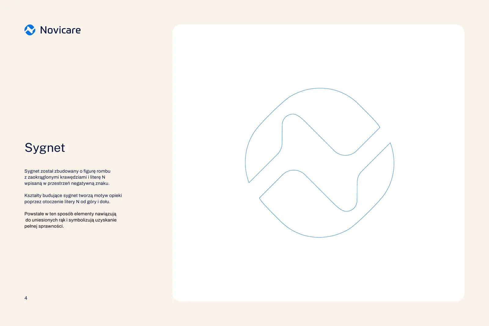
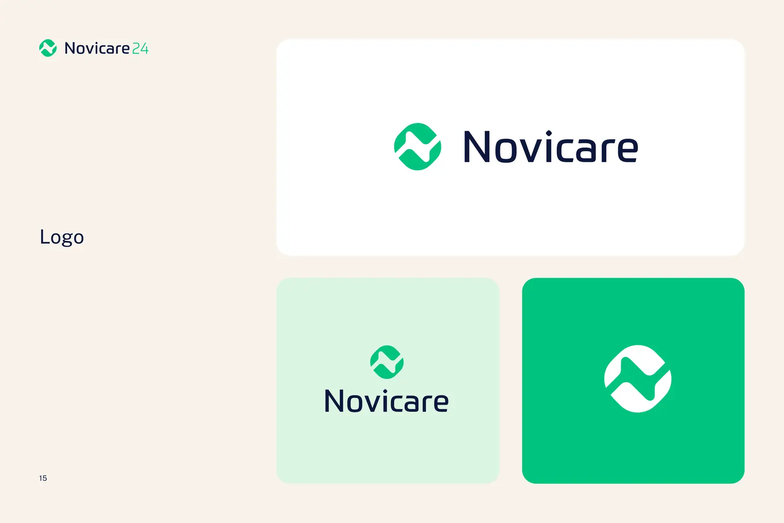
The logo is simple and uses medical shades. The symbol is a rhombus with rounded edges, cut into two shapes: we set the letter N into it, wrapped in rounded forms that resemble hands and speak of care.
The letter N is built from the space between the shapes. You only see it when you look for it.
Two shapes wrap around the letter from above and below, like hands protecting something.
The rounded ends resemble raised arms, a sign of full fitness regained.
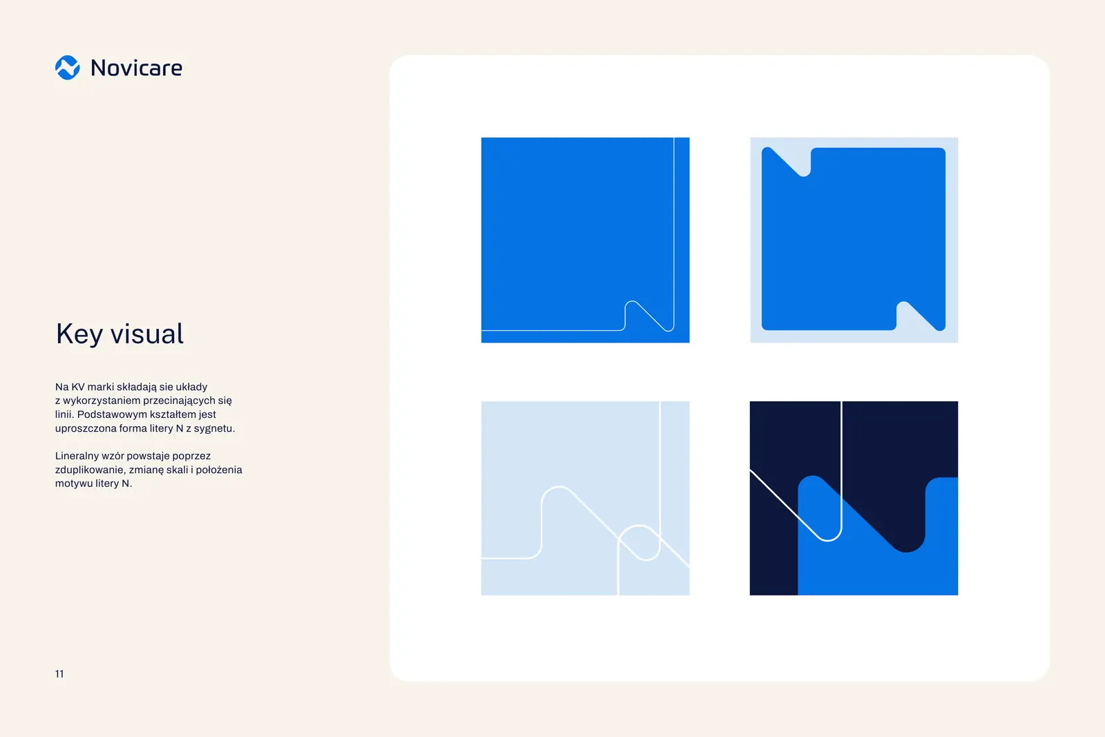
The line of the N climbs upwards. The same line, repeated and rescaled, became the brand's key visual.
Brand book
Guidelines on 23 pages
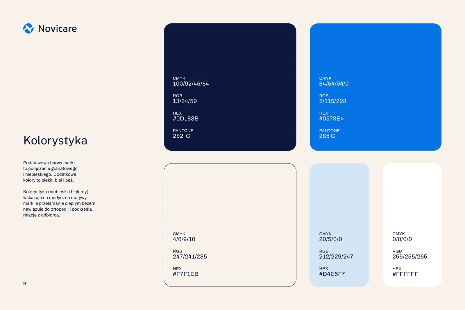
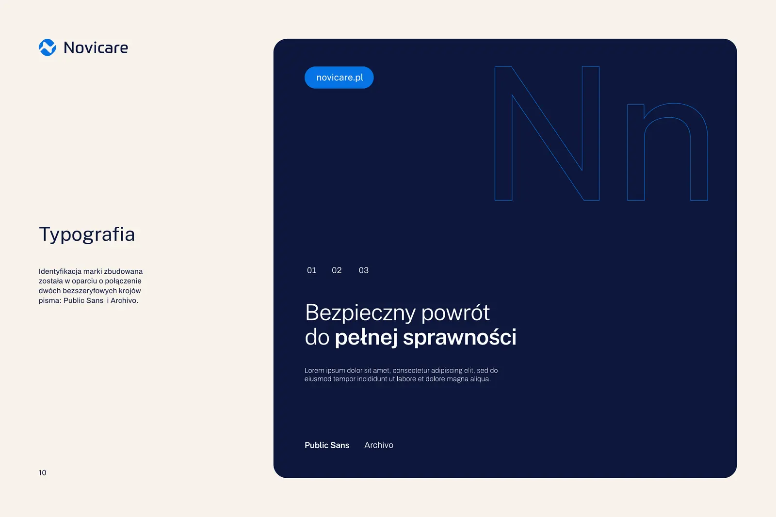
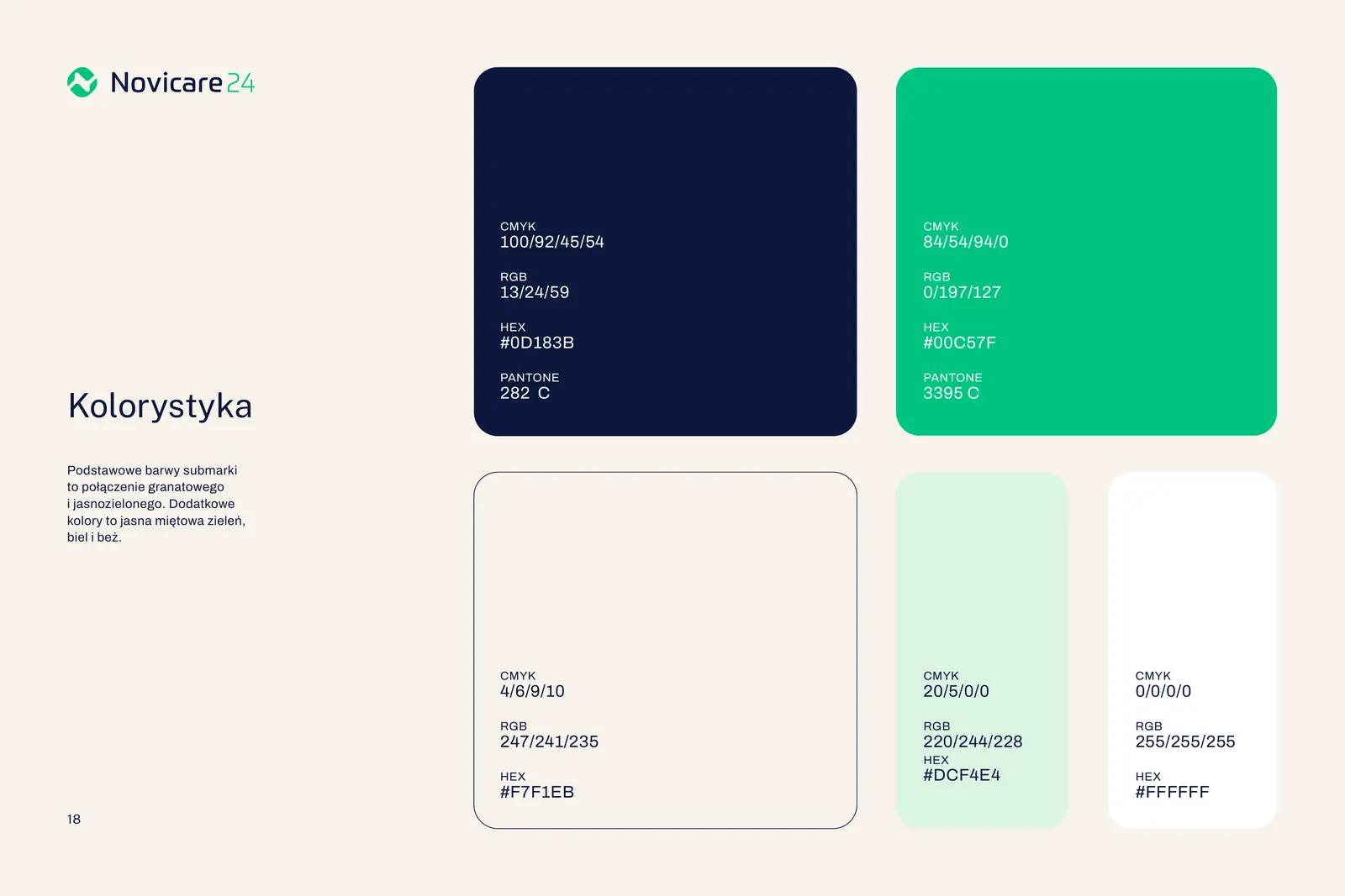
Navy and blue are the primary colours, with light blue, white and beige as complements. Blue speaks of medicine, warm beige of orthopaedics and the human relationship. The main typeface is Public Sans, the secondary one Archivo.
-
Navy #0D183B
CMYK 78 59 0 77
RGB 13 24 59 -
Blue #0573E4
CMYK 98 50 0 11
RGB 5 115 228 -
Beige #F7F1EB
CMYK 0 2 5 3
RGB 247 241 235
Brand architecture
One mark, more brands
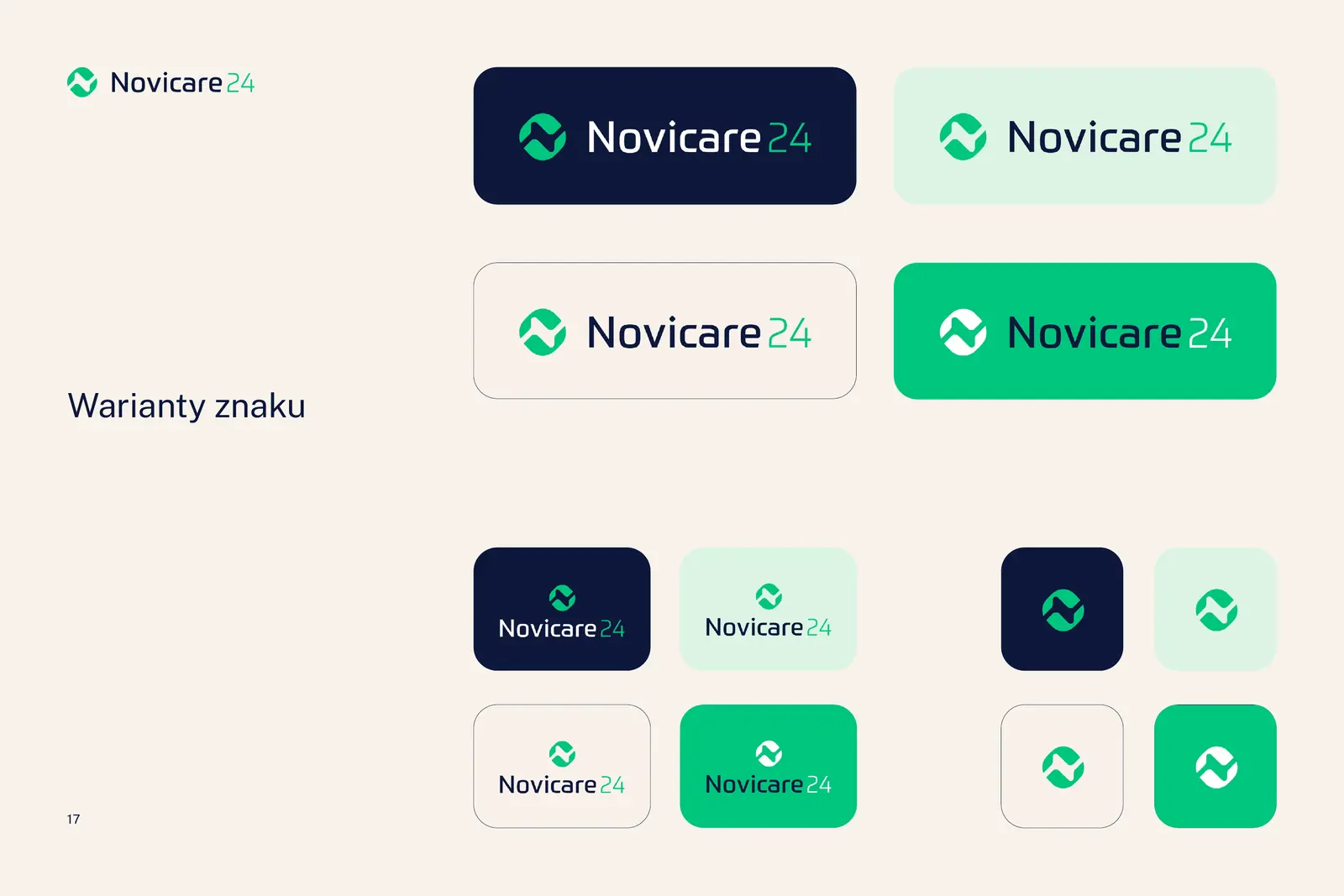
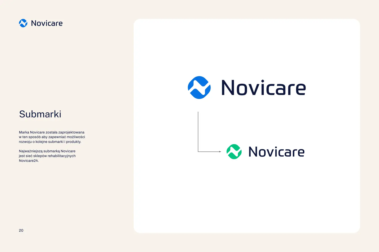
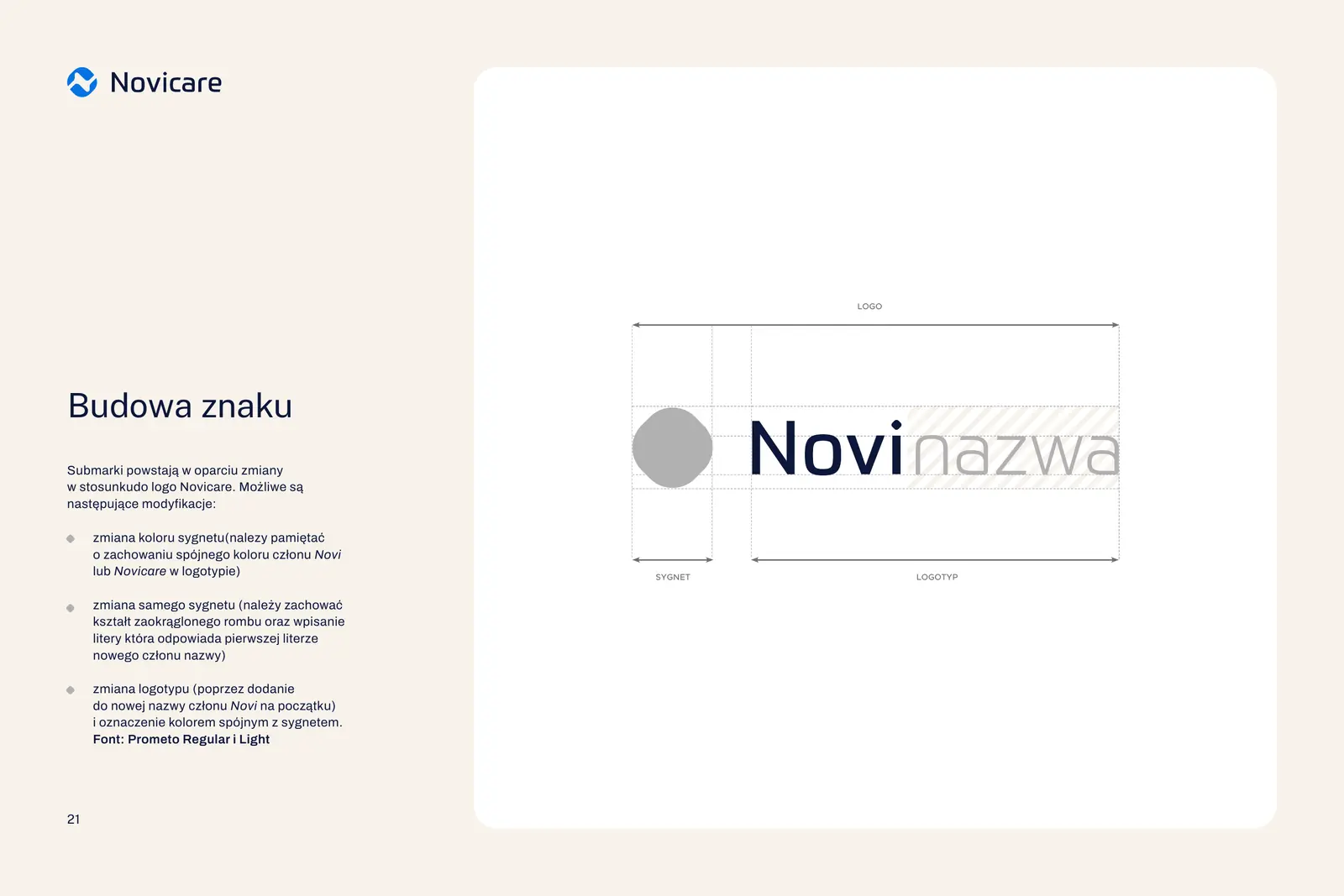
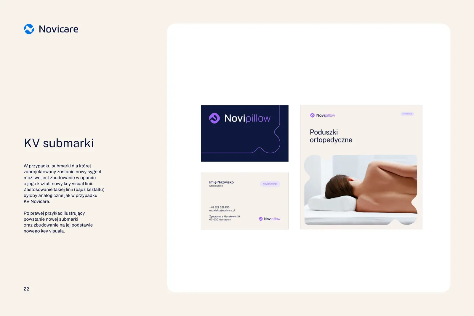
We designed the symbol so that more brands could grow out of it. A new brand gets its own colour, the first letter of its name goes into the rhombus, and the name starts with “Novi”.
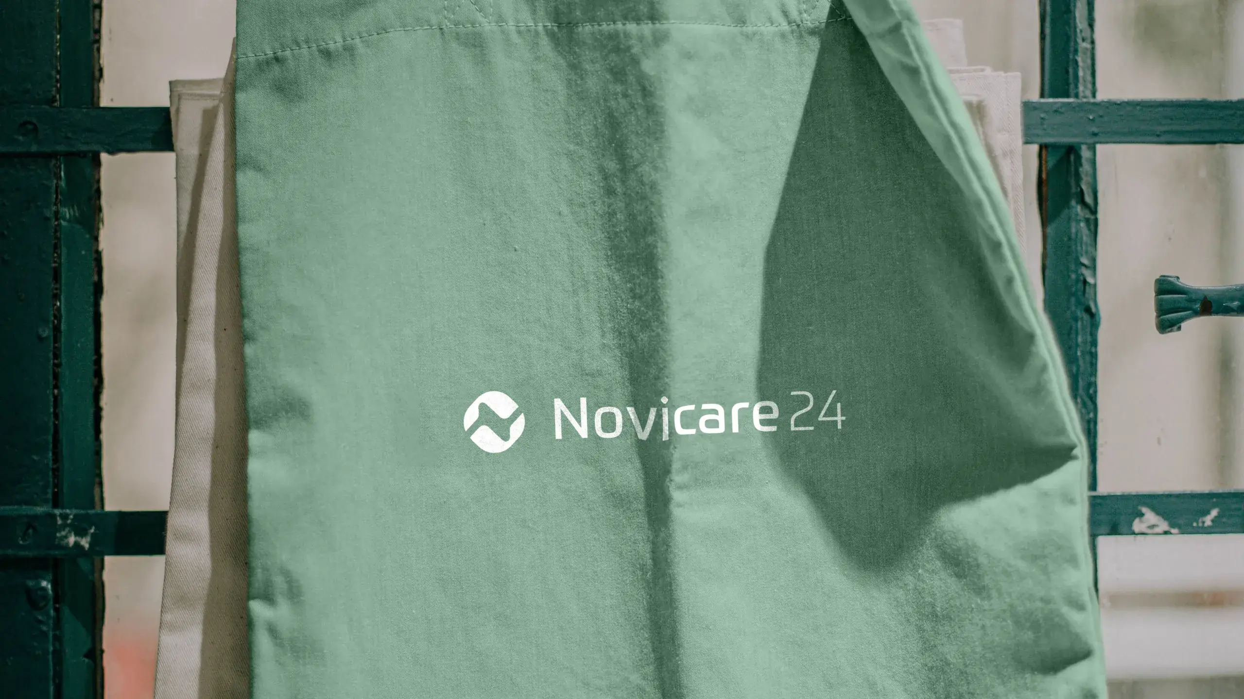
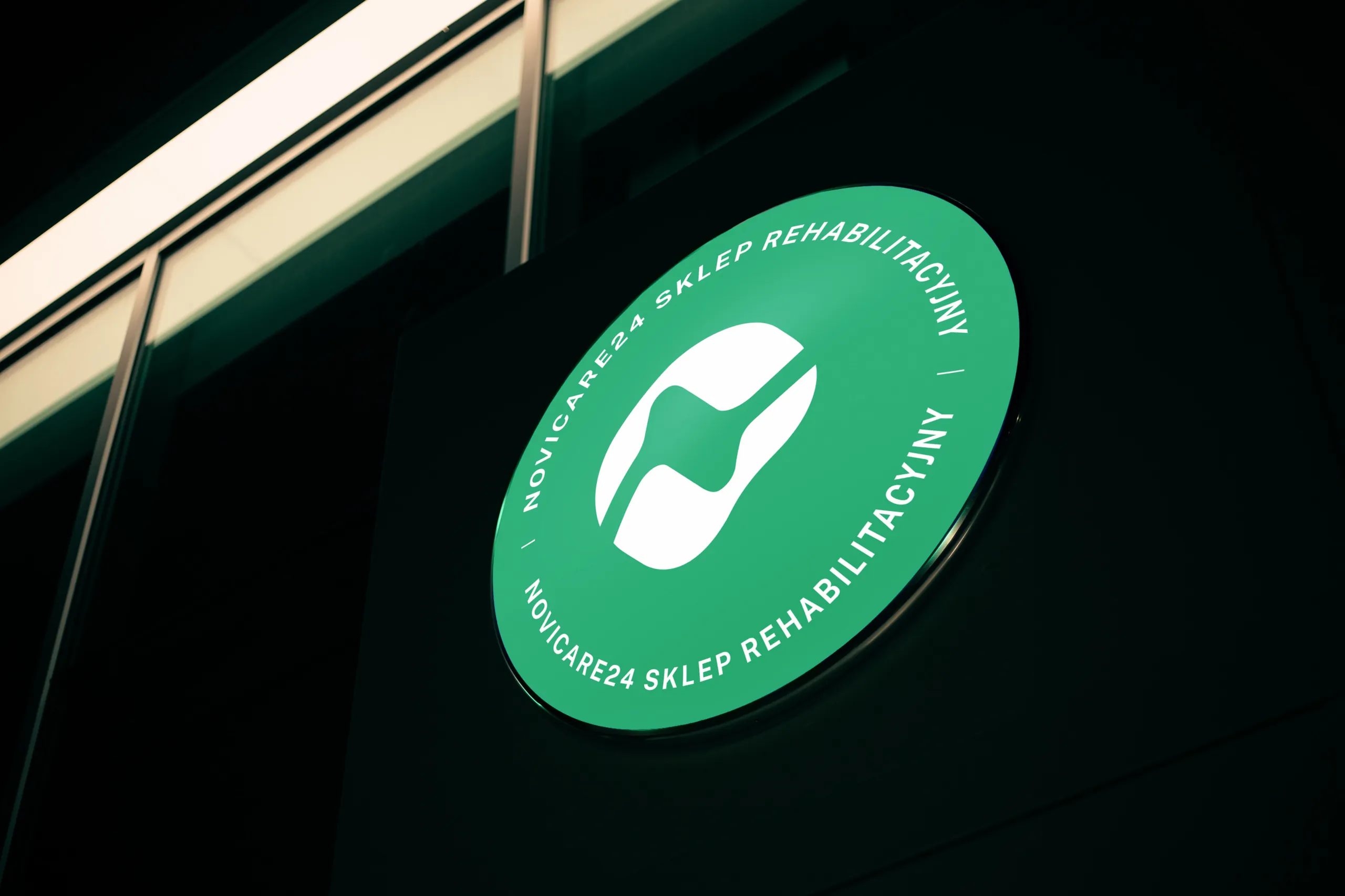
The first was the Novicare24 chain of shops, in green, which is associated with innovation and freshness. The number 24 speaks of the offer being available around the clock. In the presentation we also showed how a Novipillow line of pillows could look.
Distributor and manufacturer of rehabilitation equipment
Rehabilitation equipment shop
Orthopaedic pillows, a proposal from the presentation
Novicare24 on the street
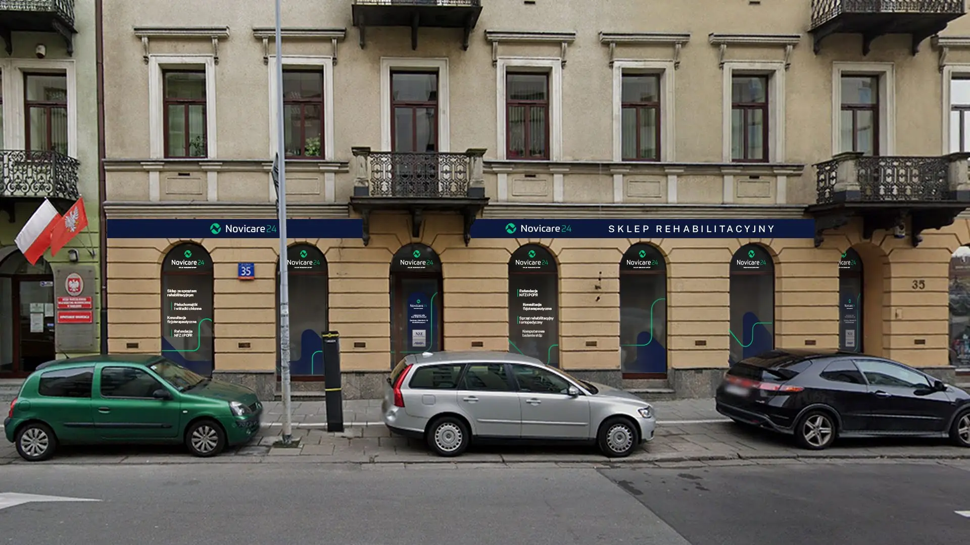
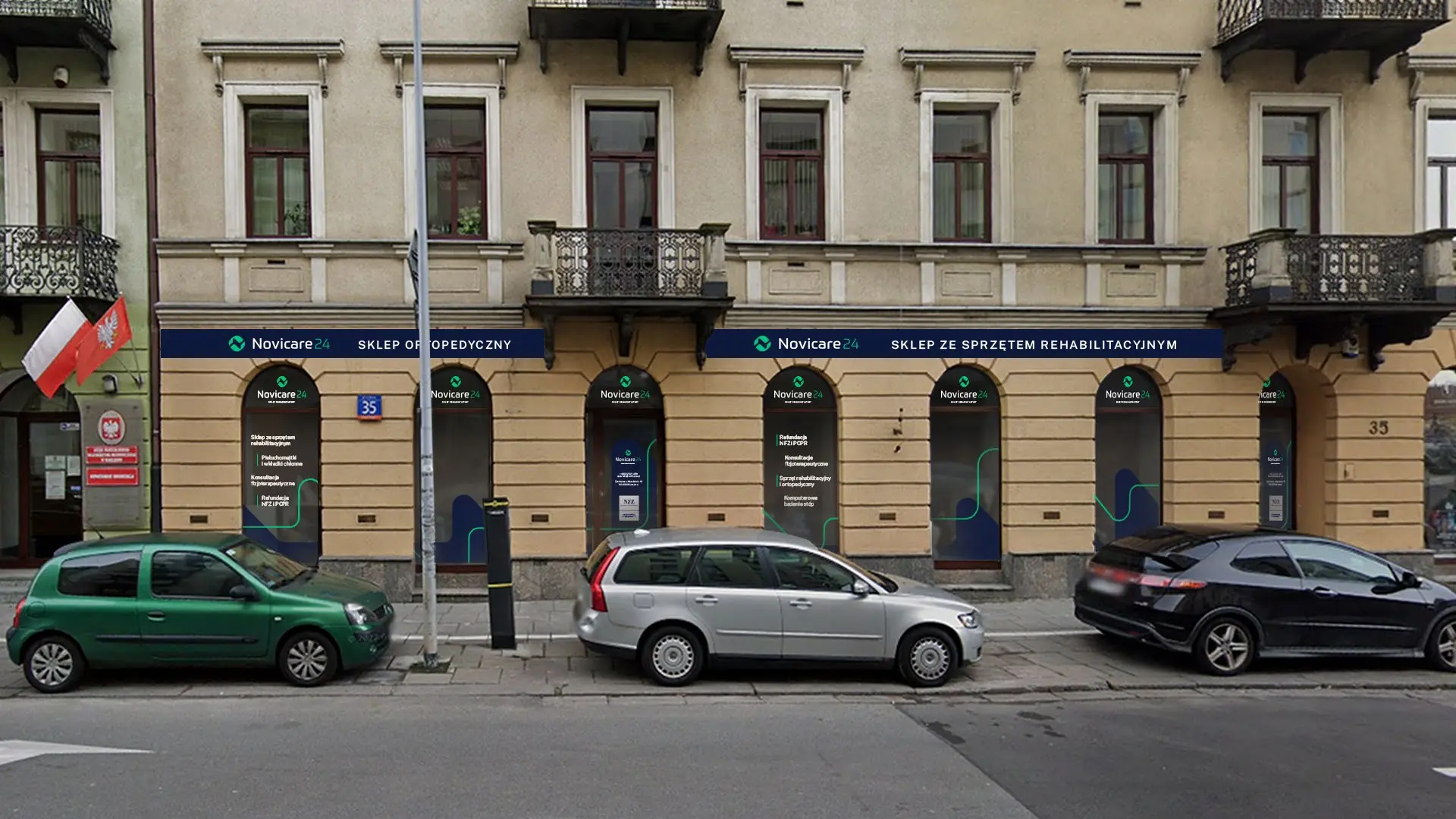
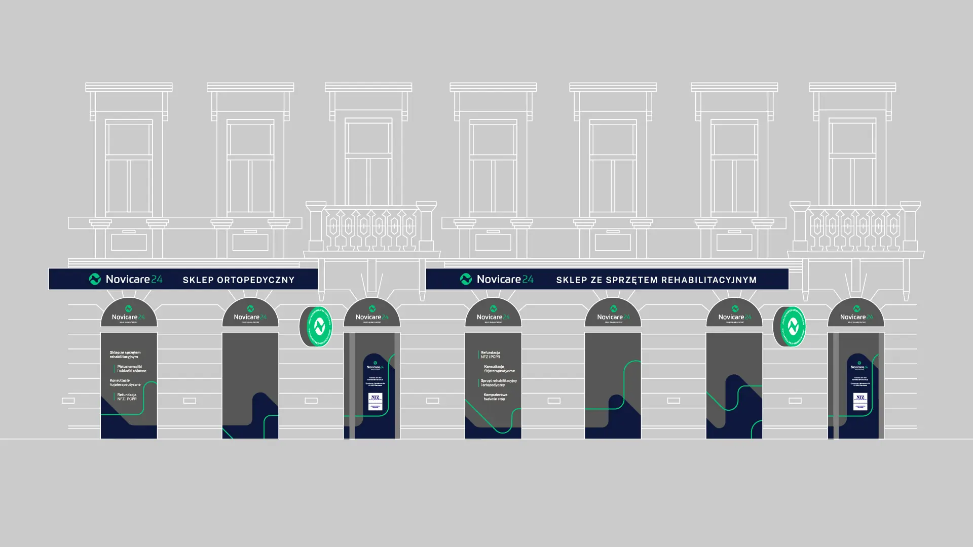
A shop window across the whole ground floor of a townhouse
The Novicare24 shop is on the ground floor of a townhouse, so the window has to be visible from afar. A navy band with the name runs above all the windows, green light boxes with the symbol project over the pavement, and in the window arches the line from the key visual leads through the list of services.
We prepared two lettering variants and print files with every element separate.
Materials
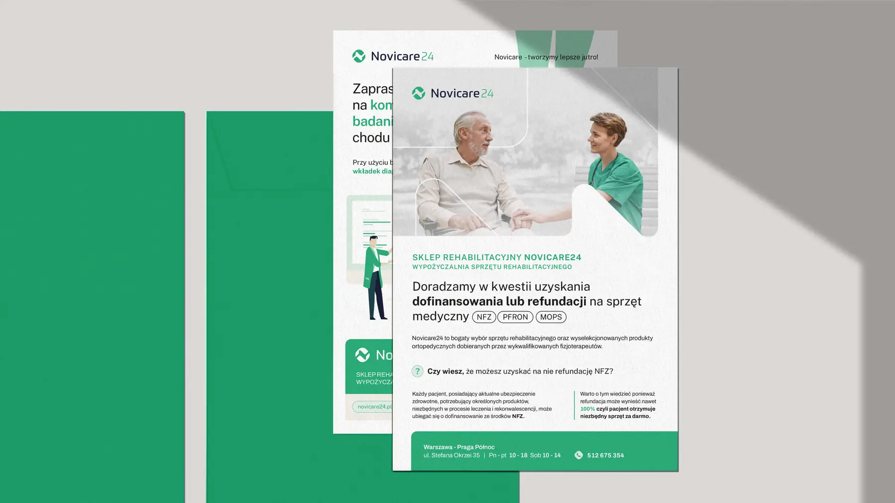
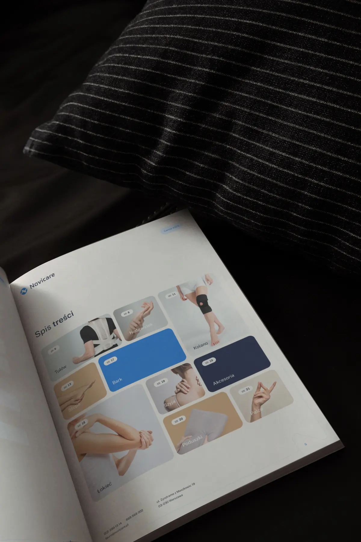
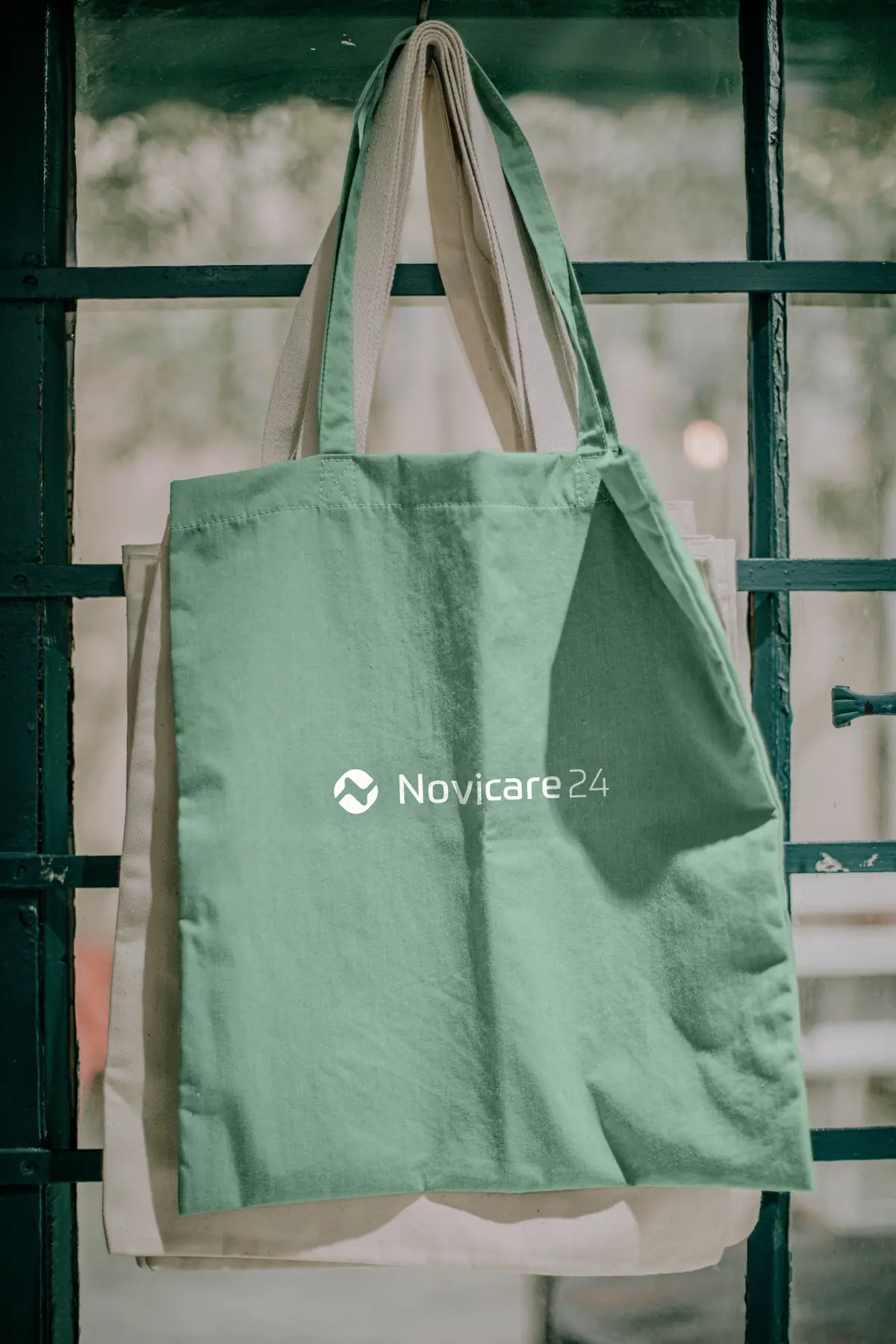
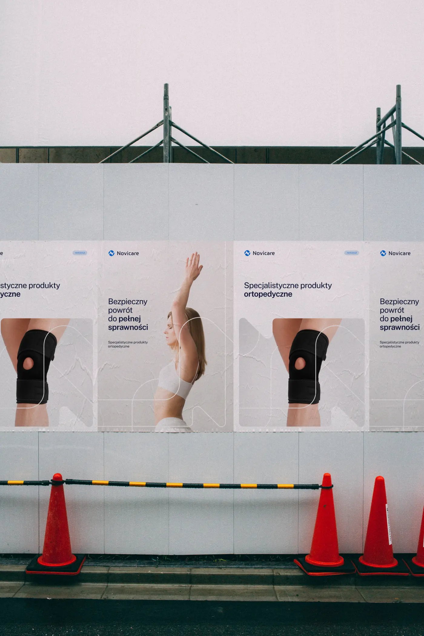
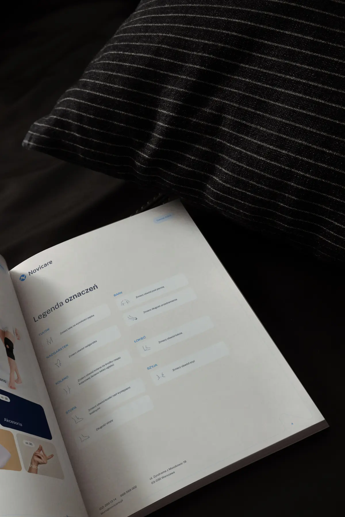
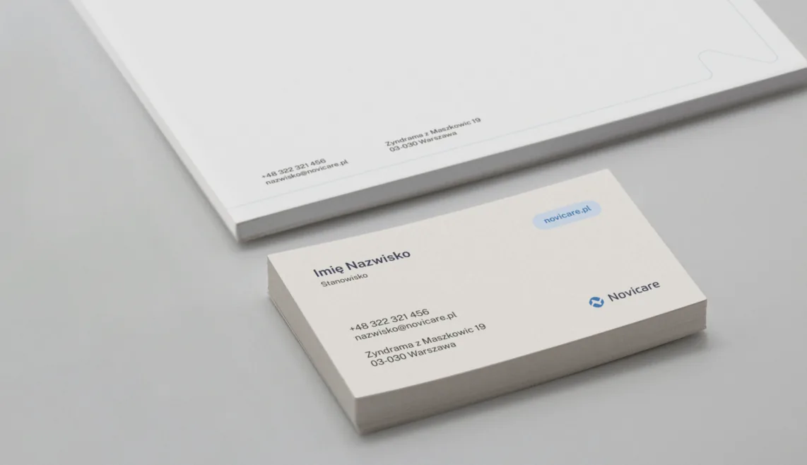
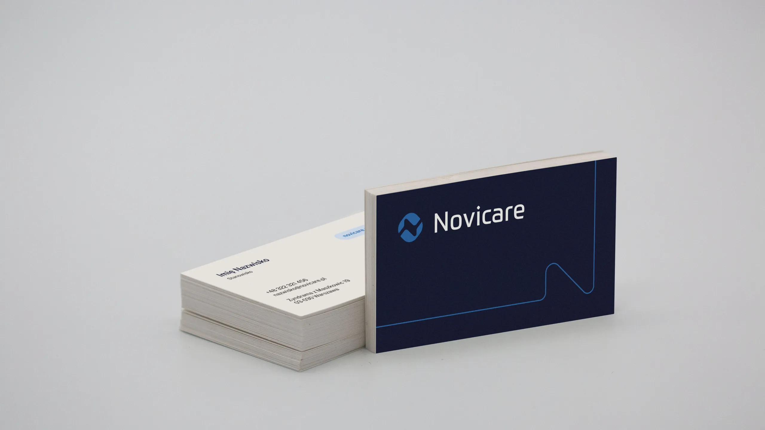
From the price list to the tote bag
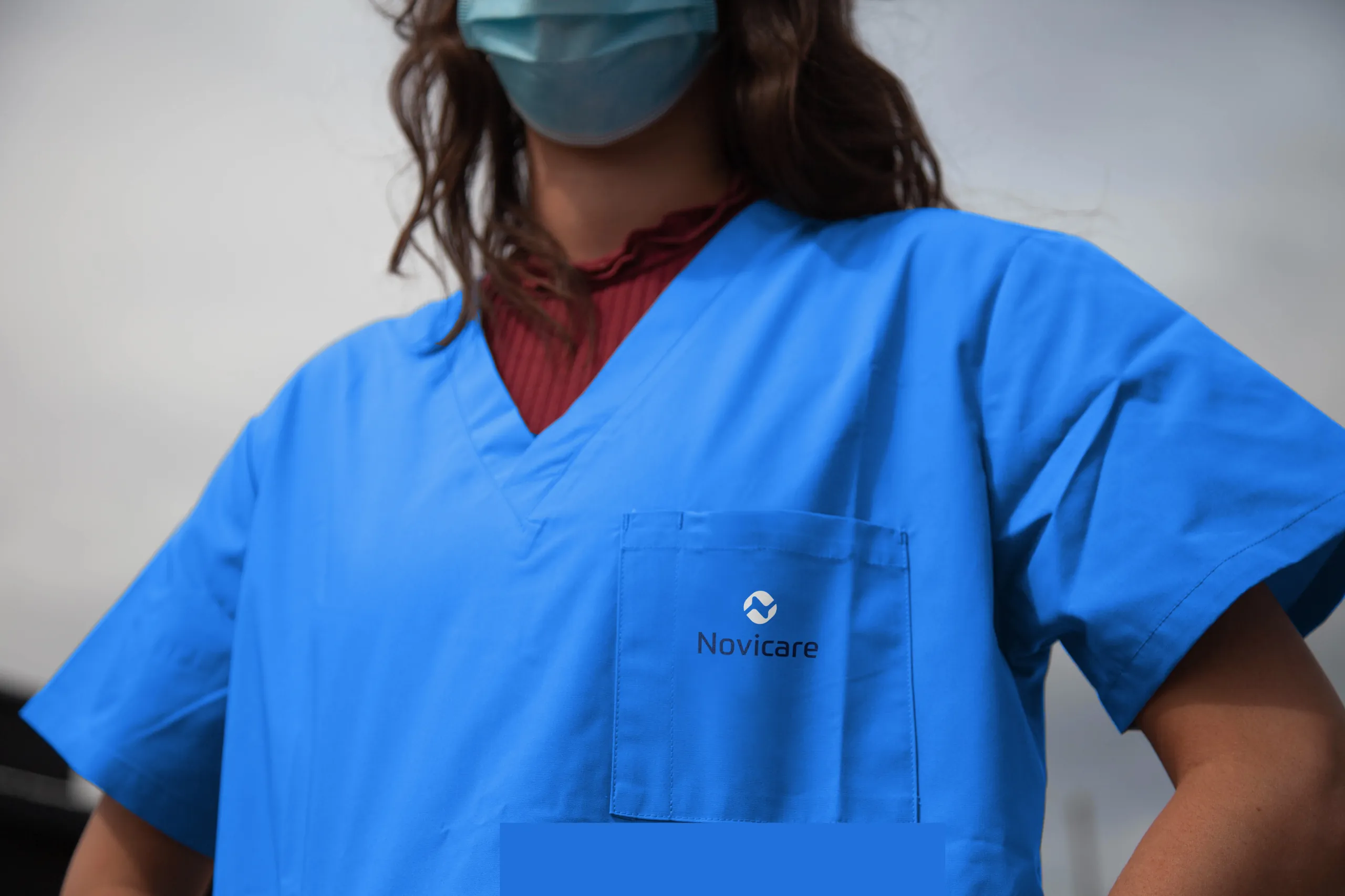
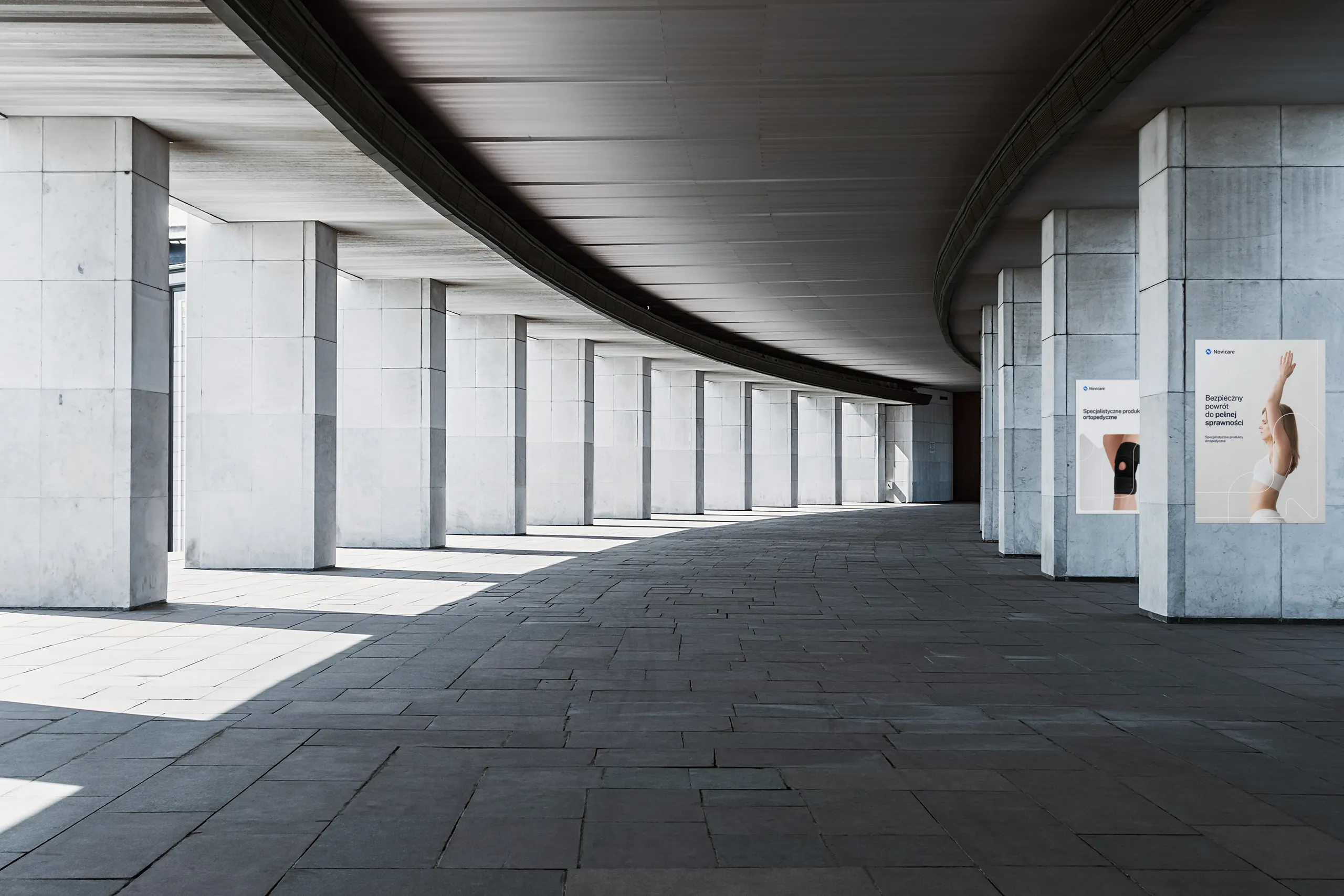
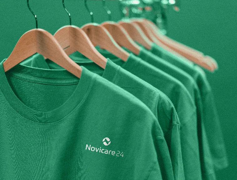
The same rules work on paper, fabric and walls.
Online
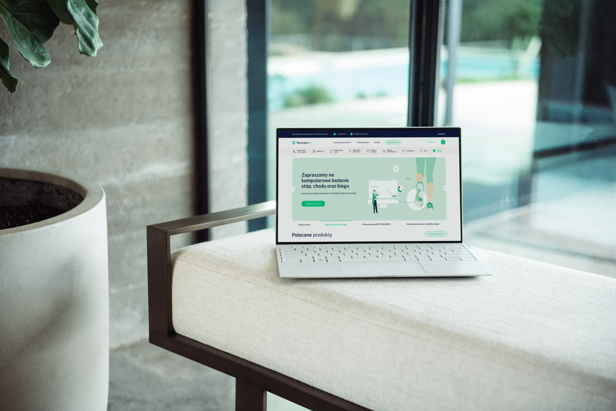
The Novicare24 shop
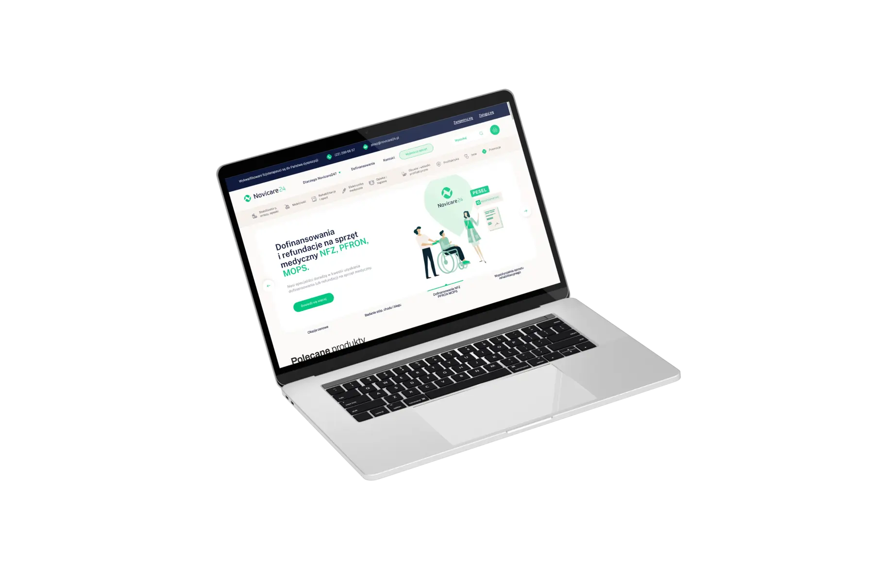
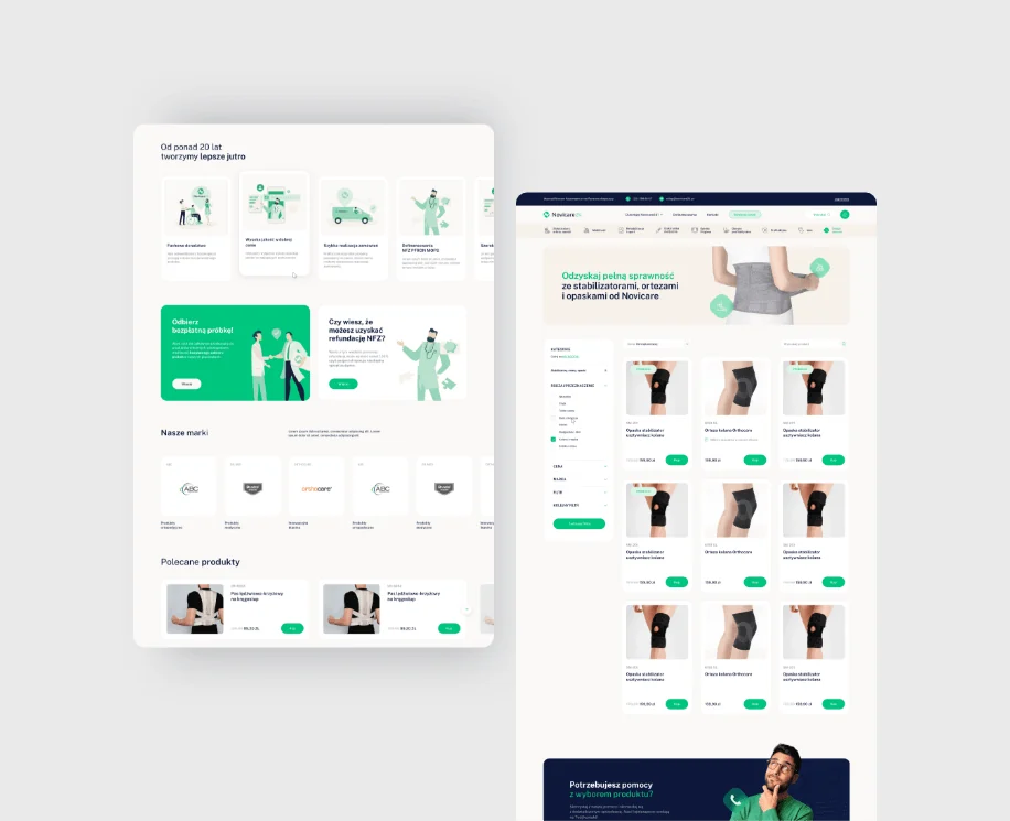
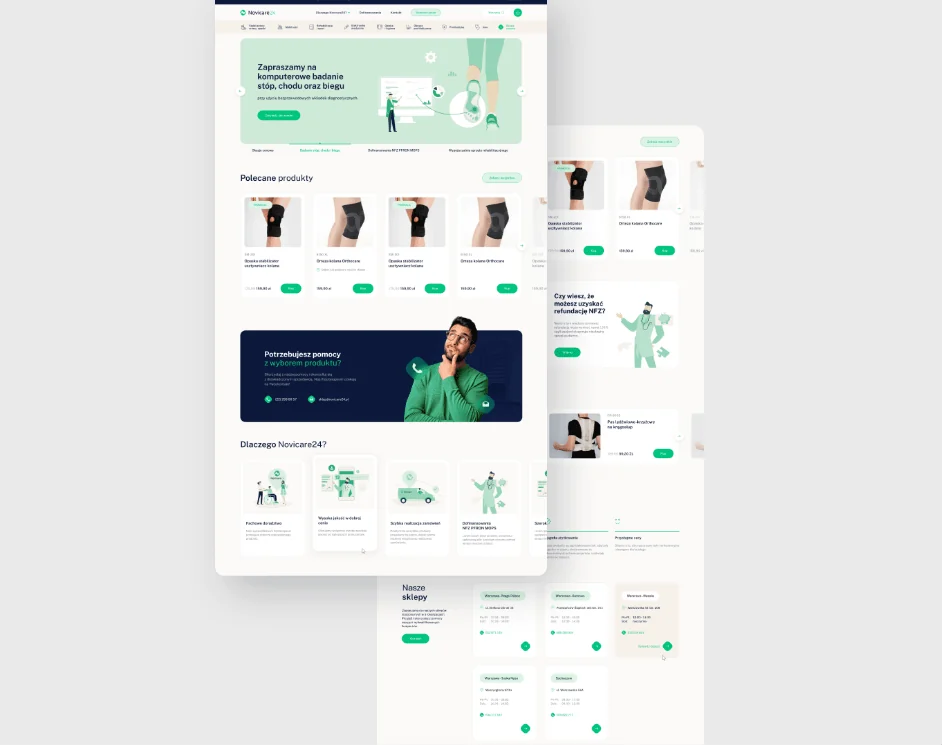
We designed the Novicare24 online shop for desktop and mobile. What mattered was readability and simple navigation: getting to a product quickly and buying it without hassle. Front and centre are funding options from NFZ, PFRON and MOPS, the Polish public health, disability and social welfare bodies, and advice from a physiotherapist.
After the first version, the Novicare team asked for more navy so the site wouldn't look too green. Links to funding also came off the product page, because only part of the range is reimbursed and we didn't want to mislead anyone. The client's team built the shop on the Shoper platform, and we prepared graphics for the template.
Icons
Icons drawn in a thin line, each on a background with a shape taken from the symbol.
Posts
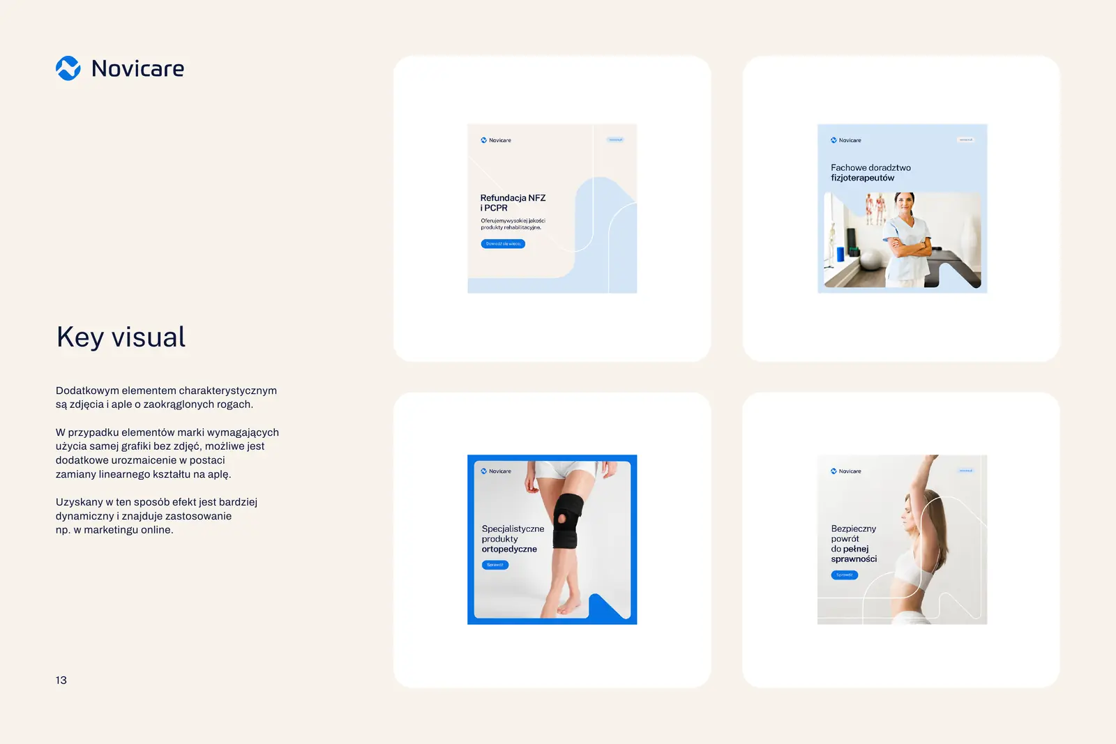
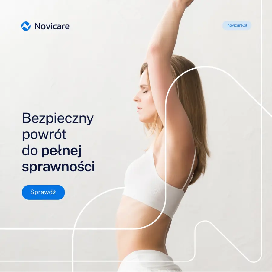
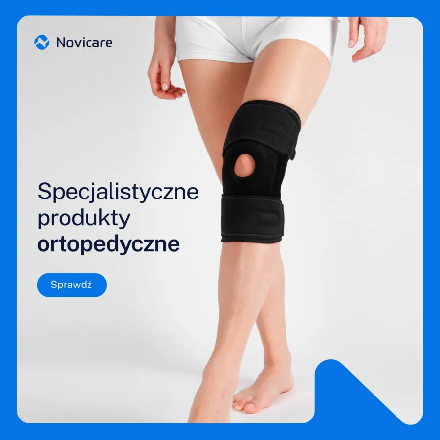
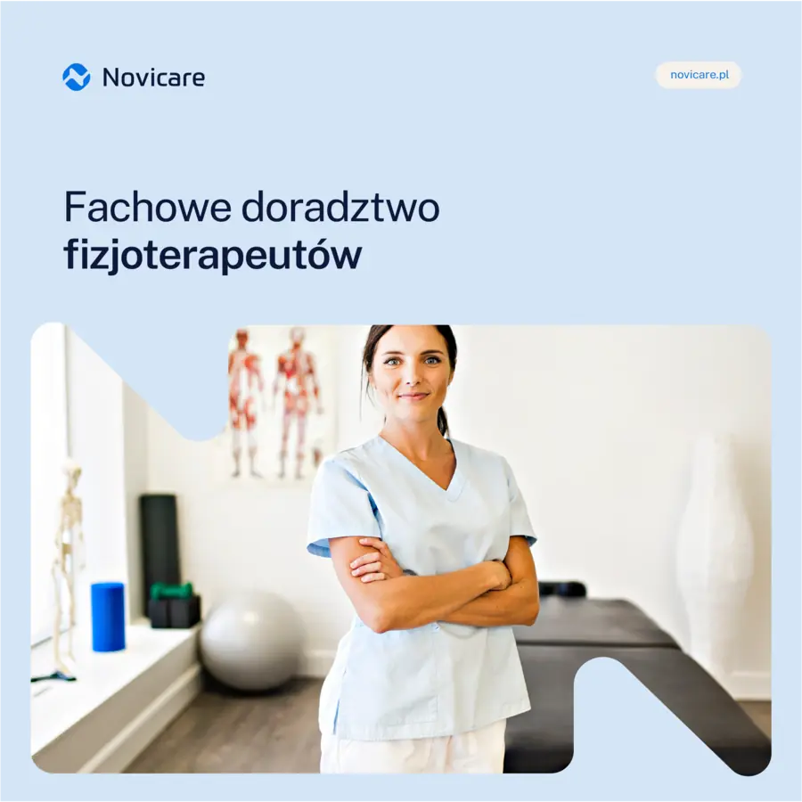
Post templates: a photo in a rounded frame, the line from the symbol and a short message.
Website for partners
A website for shops, not patients
Then we came back to novicare.pl. This time the audience isn't the patient but the rehabilitation shop, looking for a reliable trade partner and wanting to compare products with what it already sells.
Slogans about ailments and photos of staff in white disappeared from the messaging. The site doesn't sell or send people to the Novicare24 shop, because Novicare directs customers to its partners. The menu shrank to six items, and each topic got its own colour on the site.
A confident choice, without shouting
Novicare got a system that was ready for more brands from the start. That's why the shop windows, price list, online shop and partner website were all built on the same rules, and Novicare24 looked like part of the family from day one.
- Client
- Novicare Sp. z o.o.
- Scope
- Strategy workshops · Branding · Logo · Production and print · Social media · UI/UX Design · Website
- Tools
- Illustrator · InDesign · Adobe XD · Blender
More projects
-
 Vee
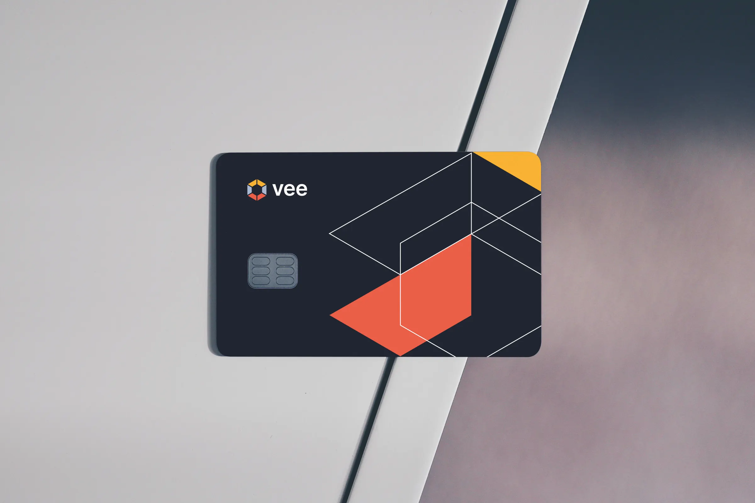
We designed the Vee brand with its sub-brands, the vee.ai website, web applications and trade fair materials, and for myvee, the identity and a store.
-
 PolTREG
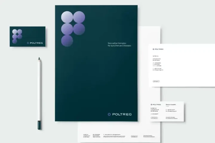
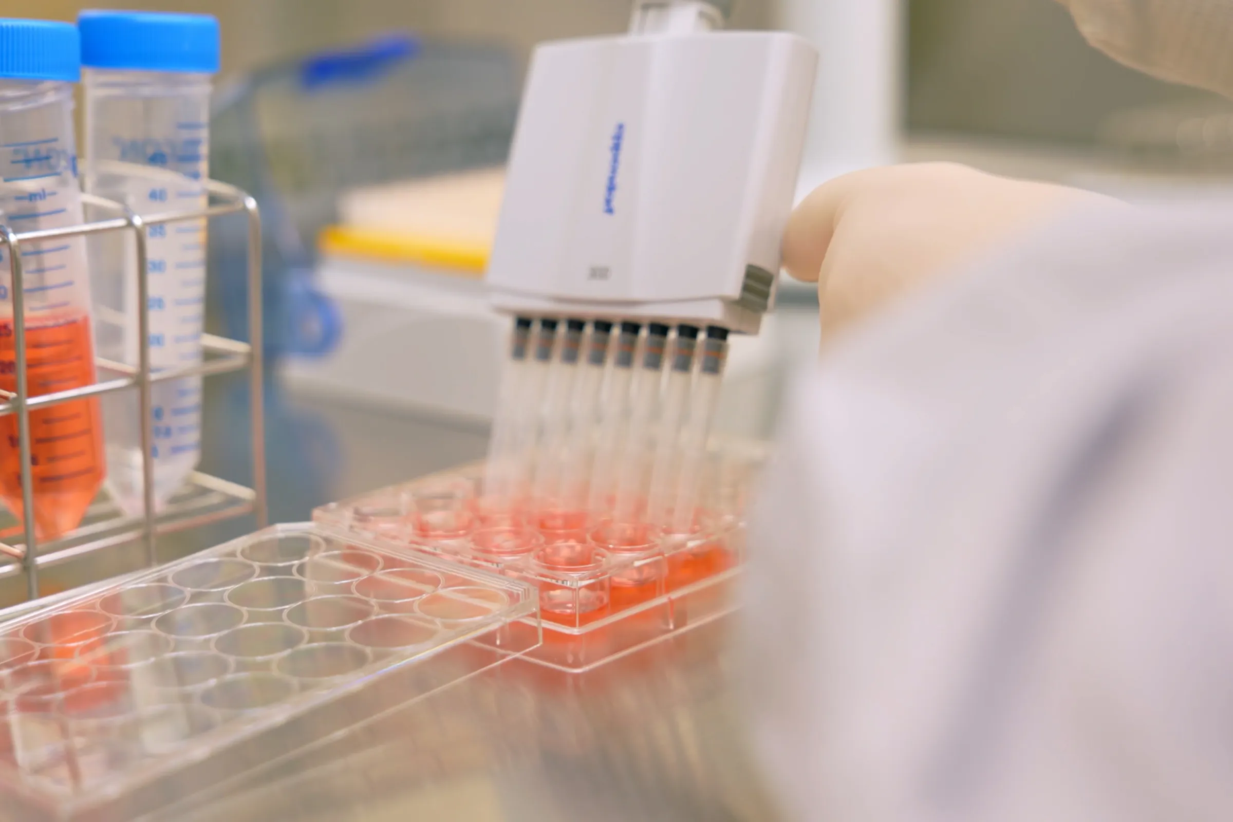
A rebrand for a biotech company listed on the Warsaw Stock Exchange, the poltreg.bio website for patients, investors and partners, and ongoing design support.
-
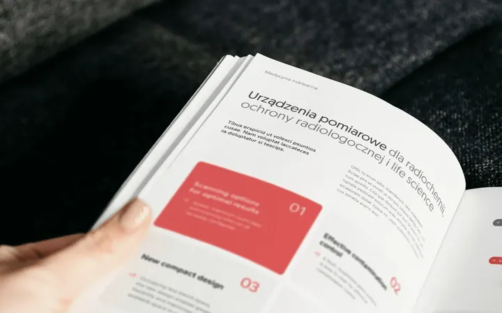
 irtech
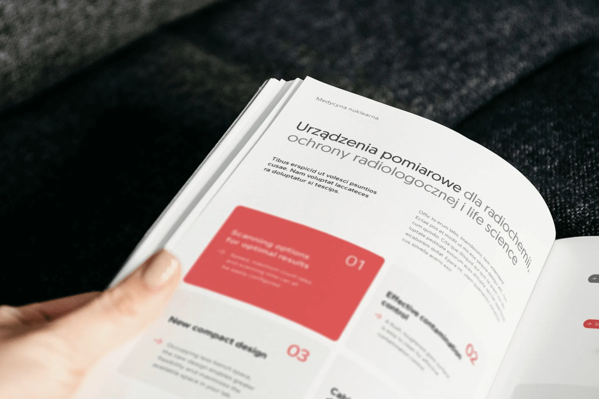
Two workshops, a logo with a plus formed from the letters r and t, over 20 templates and one style for product photos, for a distributor of measuring equipment.
-
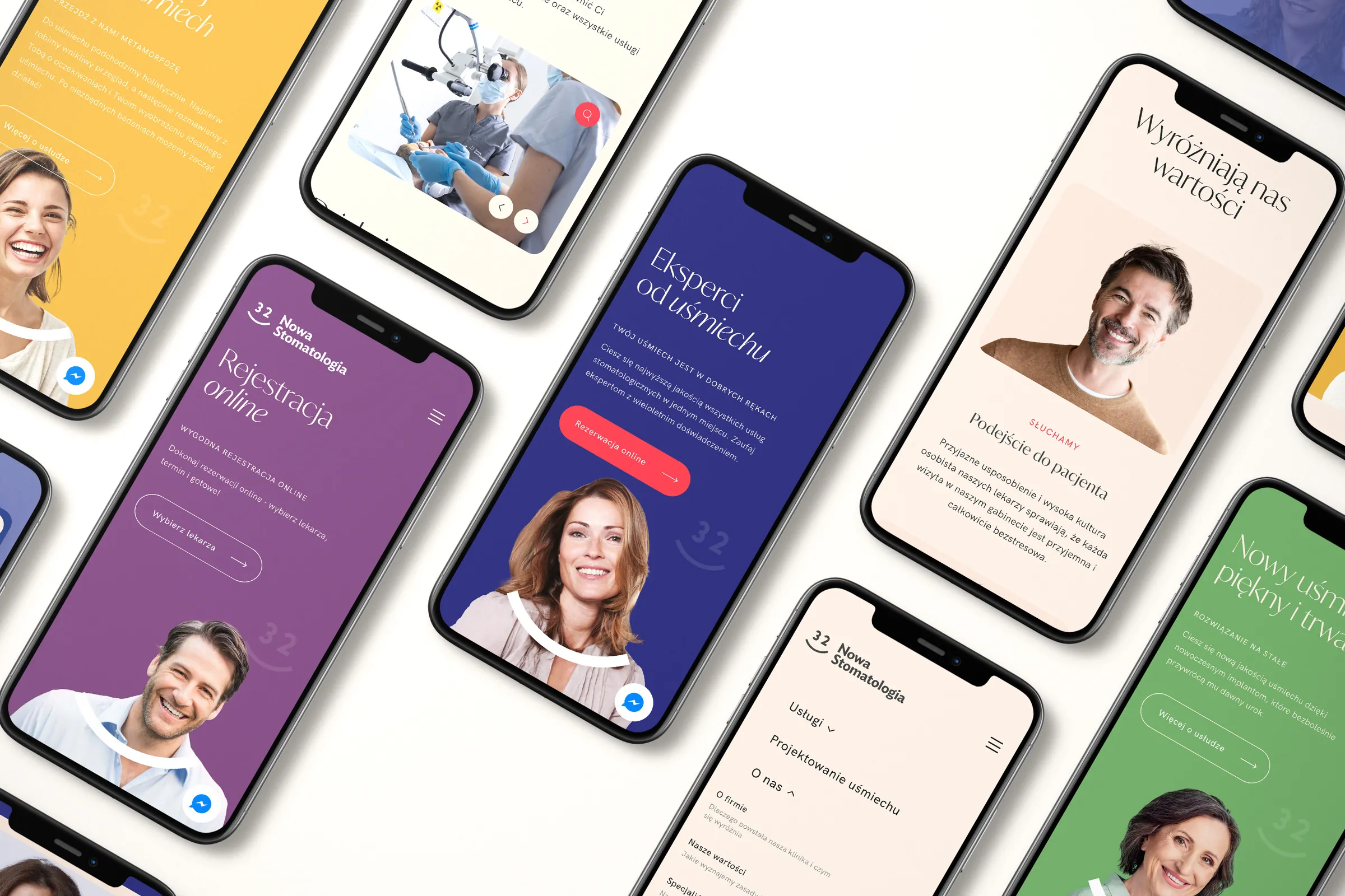 Nowa Stomatologia
A website for a dental clinic in Kraków that books appointments in two clicks, developed over four years.
-
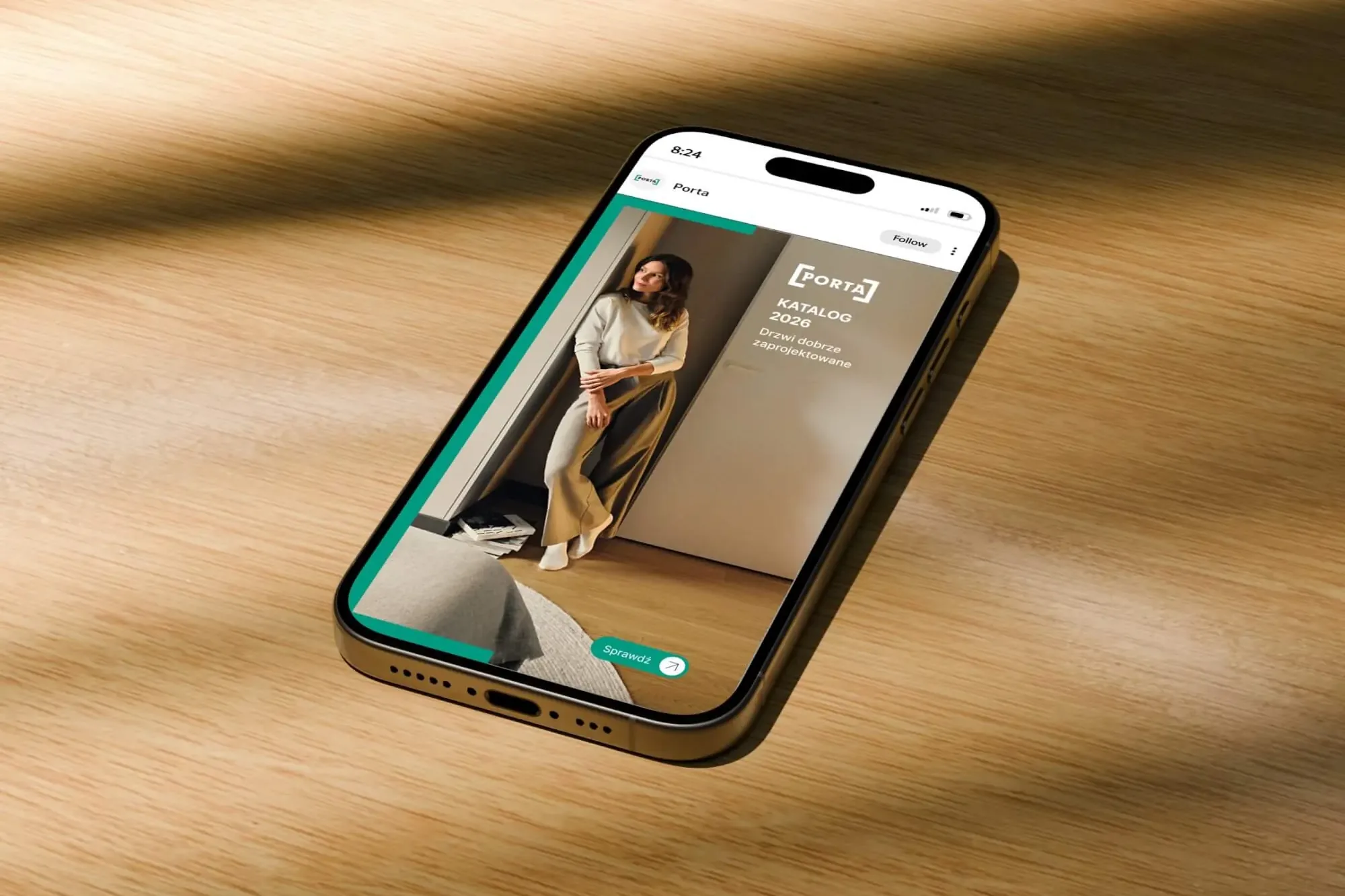 Porta Drzwi
A design system for an existing logo: a frame taken from the logo, grids, icons, drawings, a catalogue, porta.com.pl, social media and sales materials for a door manufacturer.
-
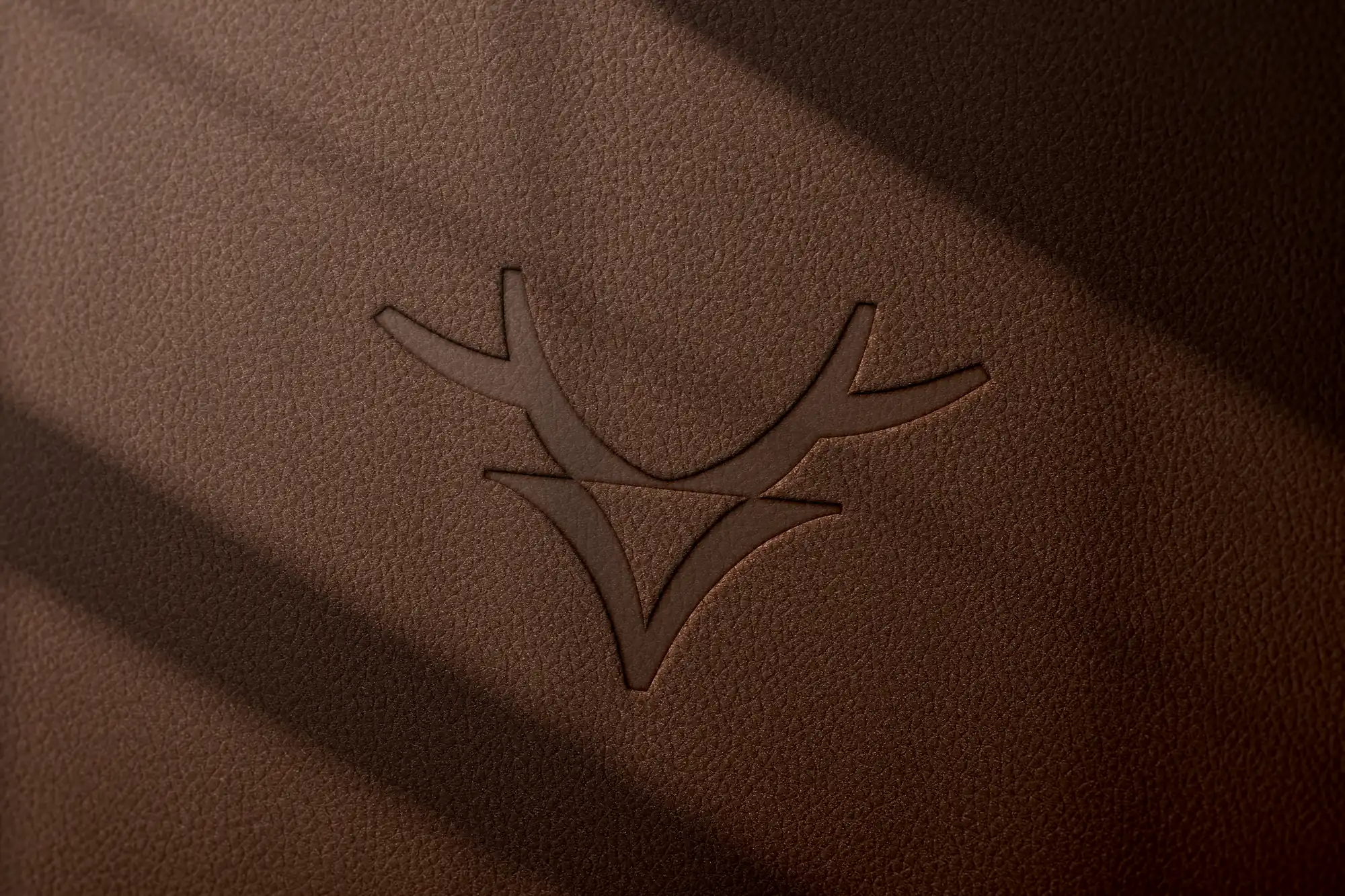 Mily Group
A rebrand for a deer antler supplier: communication strategy, logo, logo guidelines, the milygroup.com website and trade fair materials.
-
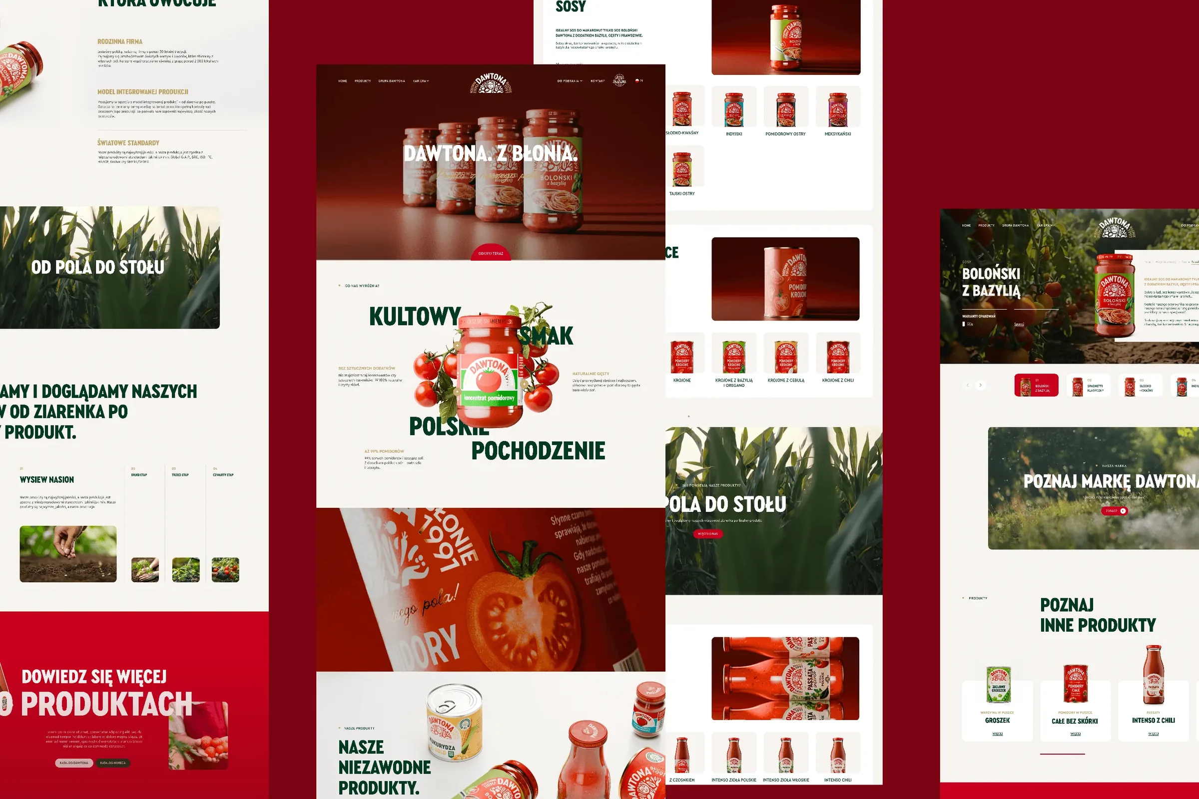 Dawtona Group
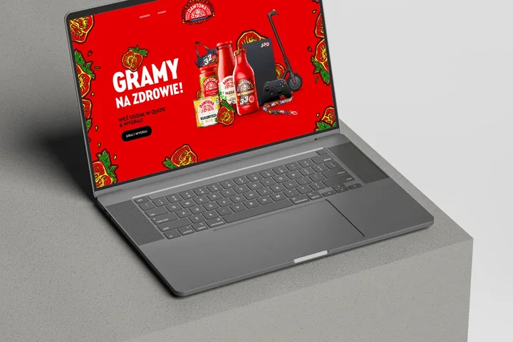
All of Dawtona's communication beyond the shelf: over 90 projects, from posts and trade fair stands to four websites and animations.
-
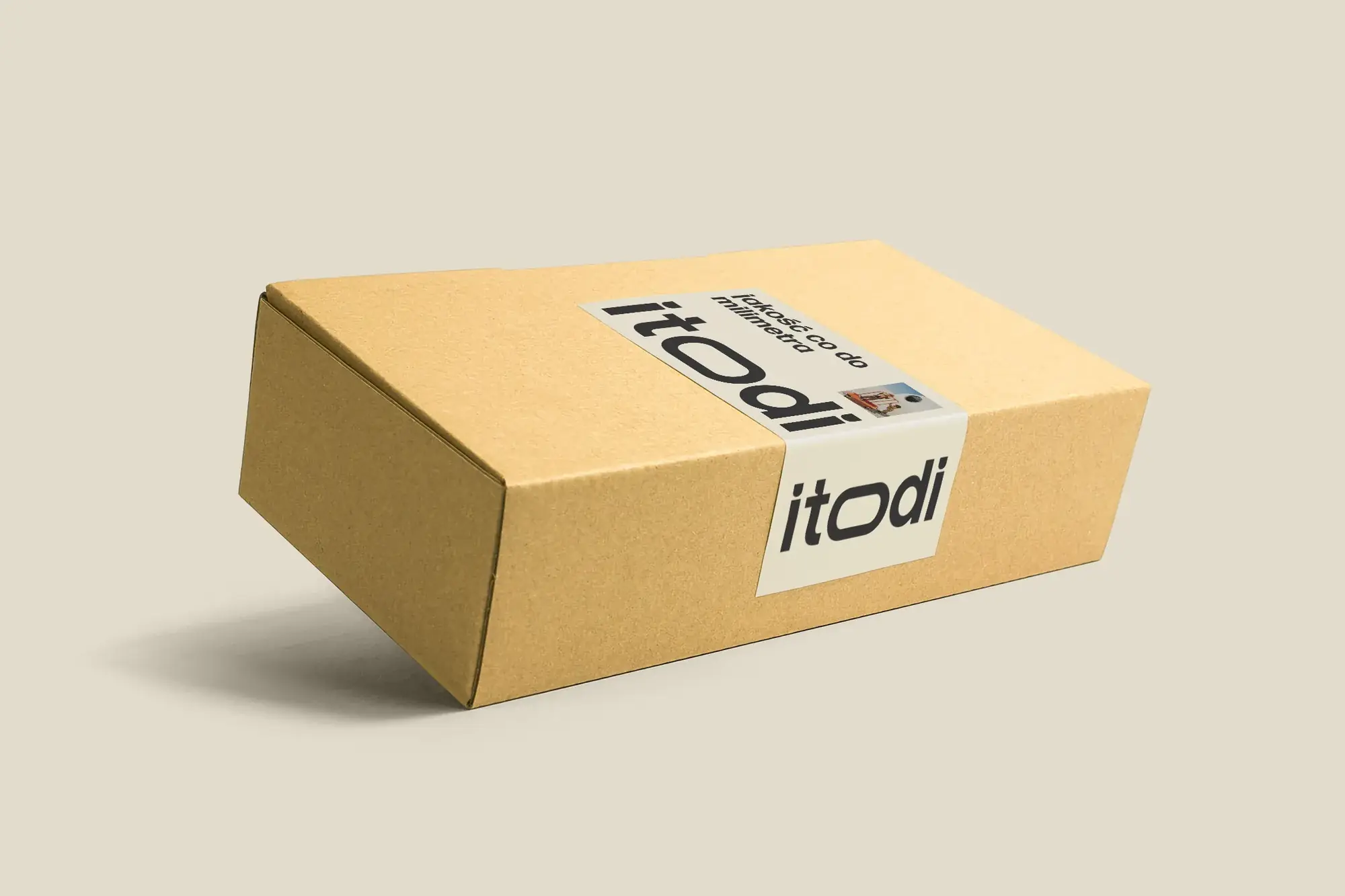 Itodi
A new made-to-measure furniture brand built from scratch: the name, a logo with a stretched “o”, the design of a shop with a configurator, an instruction leaflet and packaging.
-
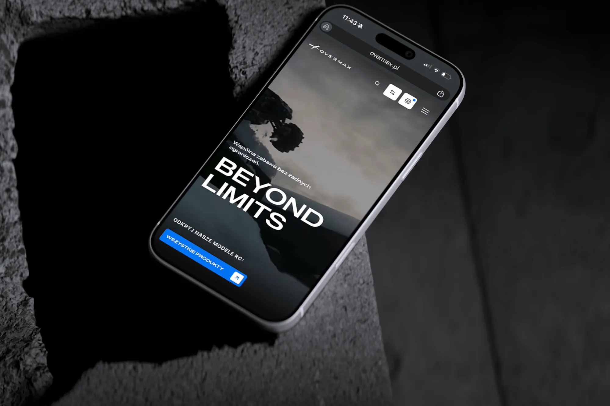 Overmax
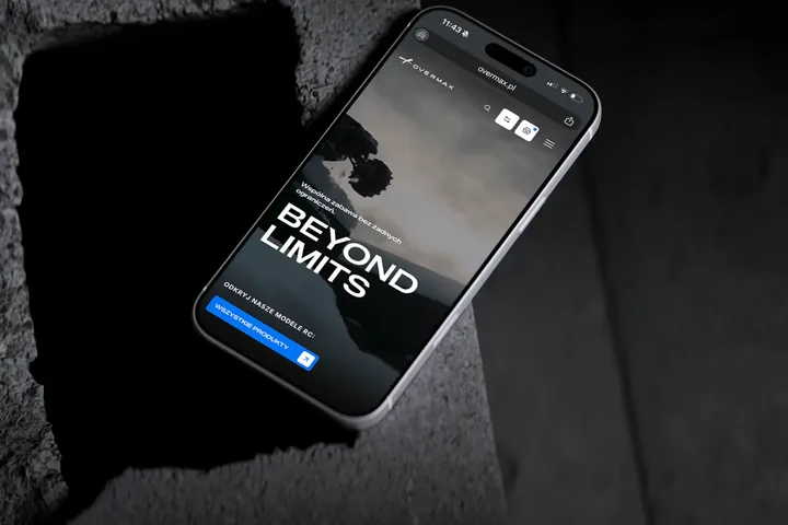
UX/UI design for the Overmax shop: RC cars in cinematic shots, a carefully worked-out product page, a category menu and a quiz that picks a model for you.
-
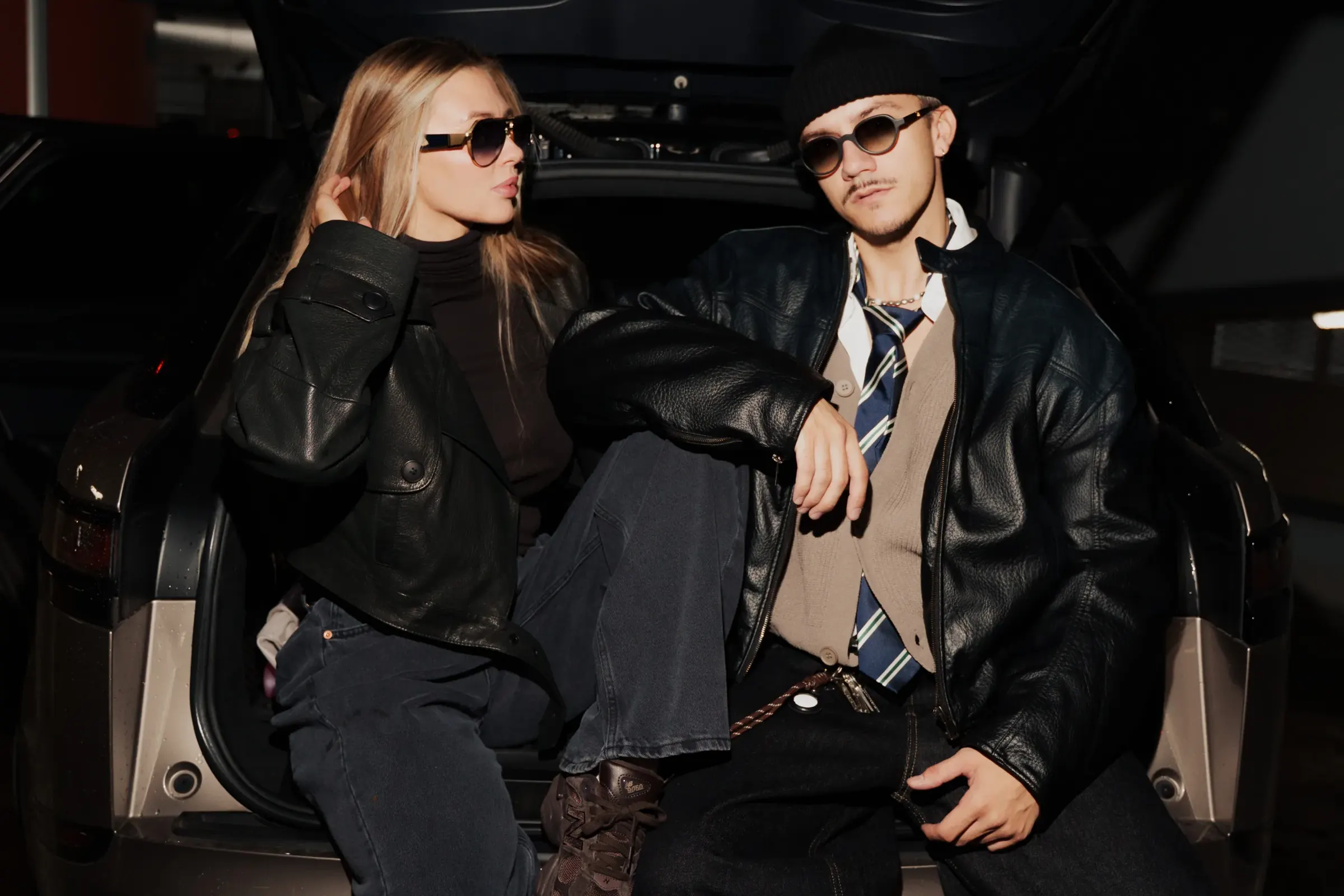 Design Optyk
A family-run chain of premium eyewear stores: an identity without gold, in-store materials and a new online shop linked to the stock of six of its seven stores.
-
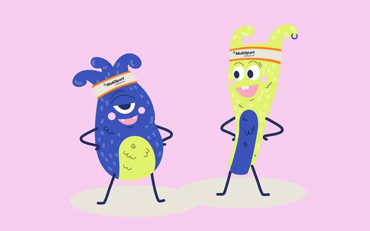
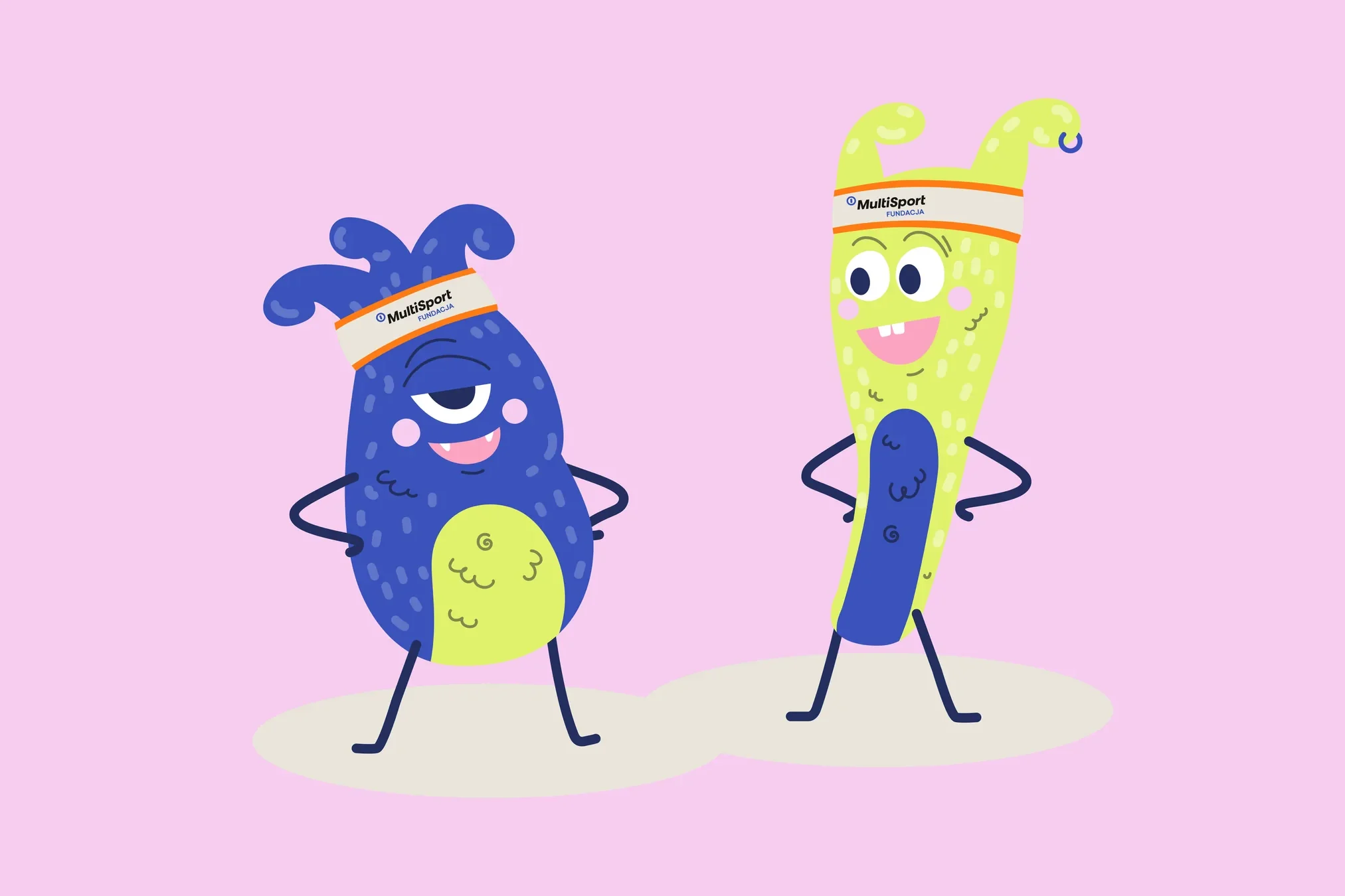 Fundacja MultiSport
An identity with a design system in Figma, a WCAG-compliant website and a brand hero duo that gets people moving.
-
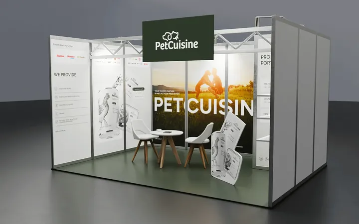
 PetCuisine
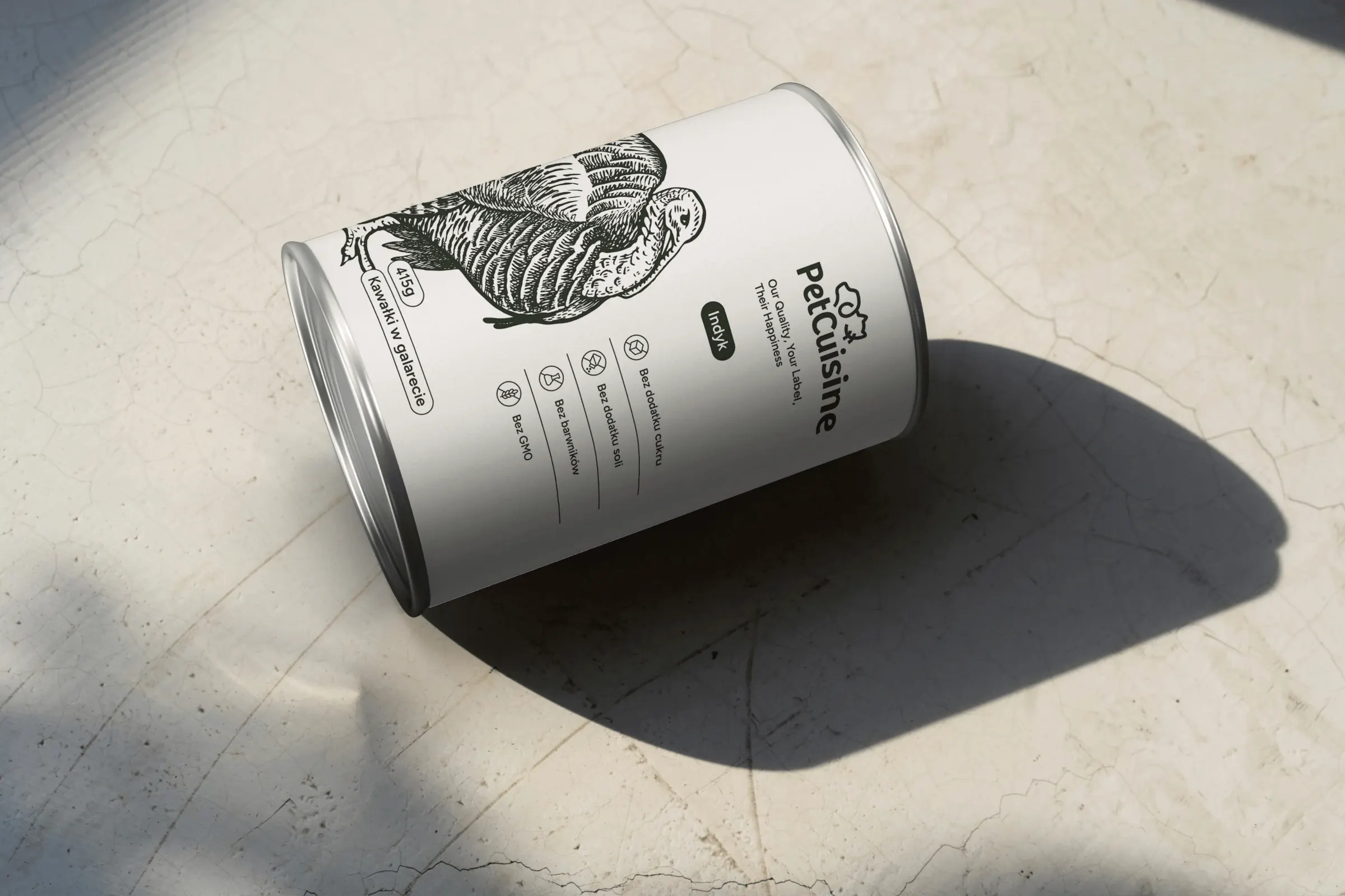
We built a brand from scratch for a pet food manufacturer in the Dawtona Group: from the name and tagline, through packaging in 12 flavours and the website, to trade fair stands across Europe.
Facing a similar challenge?
Tell us what you want to change. In a first, no-obligation call we will see whether and how we can help.