





HomeKoncept
A brand built like a good house design
HomeKoncept is an architecture studio in Kraków, Poland, that designs modern houses and sells ready-made house plans. We led the studio's rebrand from the workshops to the brand guidelines, then used the new system to design company materials, ads, plan covers, a catalogue and a website with a house search.
See how it was built- Client
- HomeKoncept, Kraków, Poland
- Scope
- Strategy, identity, materials, UX/UI
- Scale
- 25 materials and a website
- Sheet
- 01 / 07
Starting point
The studio outgrew its logo
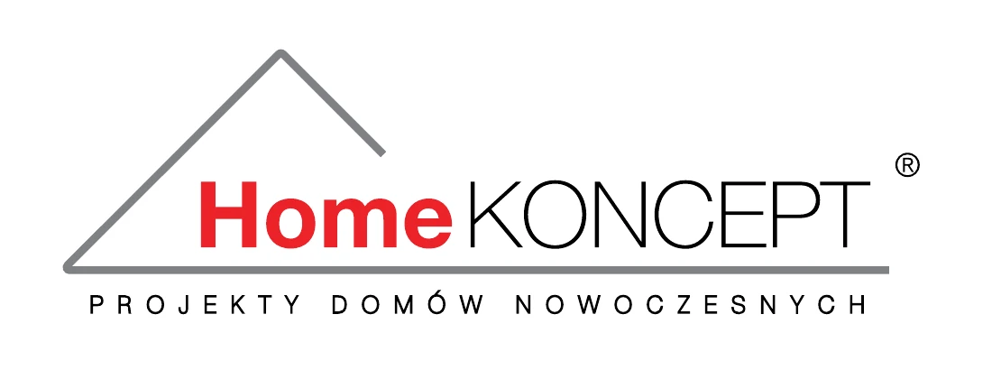
When we started, HomeKoncept had been selling house plans for eight years and had sold over a thousand of them (figures from the company history on homekoncept.com.pl). The old mark, with a roof, a red “Home” and the descriptor “Projekty domów nowoczesnych” (“Modern house designs”), looked like hundreds of others in the industry.
The houses the studio offers stand out for their modern design, well-thought-out solutions and polished visualisations. It was time the brand looked the same way: minimalist, timeless and unconventional.
 Before
Sheet 02 · Brief
Workshops first, then drawing
We started with workshops with the HomeKoncept team, in two panels: on the company's values, its target audience and trends. Right after that the studio received a moodboard with our conclusions and two visual directions.
The brand core agreed in the workshops
- 01Unconventional
- 02Minimalist
- 03Timeless
Women and men aged 25–50 for whom design, trends and a functional layout matter in a house plan. Many of them are premium customers, or want to be seen as such.
HomeKoncept doesn't sell plans. HomeKoncept makes dreams come true.
The best way in is through imagery, typography and a touch of luxury.
The goal was a simple visual key with a fairly exclusive feel. The mark kept clean sans serif typography and a calm palette of black, cool grey and white. It came straight away with a letterhead and a business card.
Sheet 03 · Mark
The letter H sets the dimensions of the whole brand
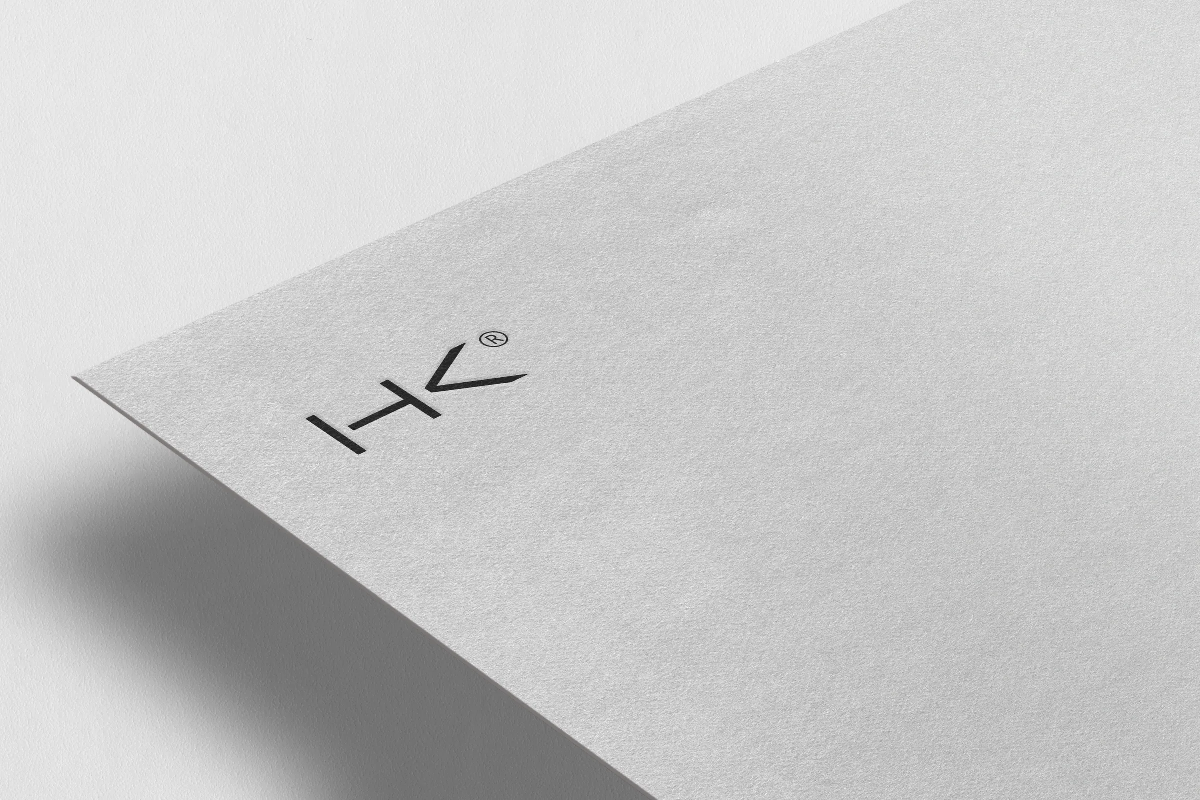
The mark is a balanced typographic logo built on a sans serif typeface. It was inspired by house plans, so it got its own grid and units of measurement. X is the width of the letter H in the word HOMEKONCEPT, and Y is its height. They define the proportions of the logotype, the tagline and the HK symbol, the clear space and the bar with the website address.
The brand guidelines cover this in 13 chapters: versions of the mark and how they're built, versions on a colour panel, colour variants and modifications that aren't allowed, the address bar, typography and colours.
-
Black
- HEX
- #262626
- CMYK
- C65 M55 Y55 K75
- RGB
- 38 38 38
- Pantone
- Jet Black
-
Grey
- HEX
- #D9DCDE
- CMYK
- C15 M10 Y10 K0
- RGB
- 217 220 222
- Pantone
- Cool Gray 1 U
-
White
- HEX
- #FFFFFF
- CMYK
- C0 M0 Y0 K0
- RGB
- 255 255 255
- Pantone
- White C
Typography
Two sans serif type families that together make a minimalist yet striking pairing.
- Aktiv Grotesk Ex
- primary typeface: headings, logotype, ads
- Work Sans
- long and small text
On this page we use Work Sans. Aktiv Grotesk Ex is a licensed typeface, so we only show it in photos of the materials.
Main idea
A minimalist design, orderly and understated, that works in harmony with the house designs. The result is a simple, uncluttered image that suits what the studio does.
Sheet 04 · Materials
From the office to the building site
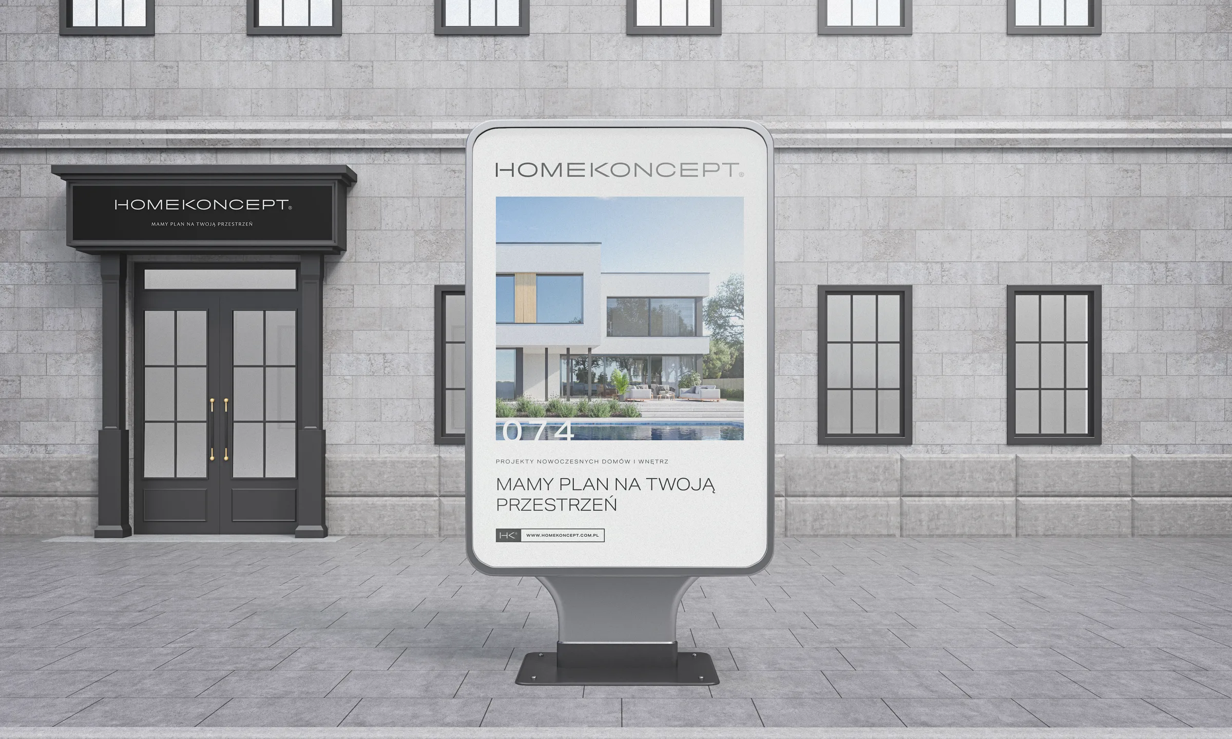
The brand had to work everywhere customers meet it. All the materials follow the same grid, taken from a house plan drawing, so everything is orderly and symmetrical. No decoration: the house visualisation always plays first fiddle.
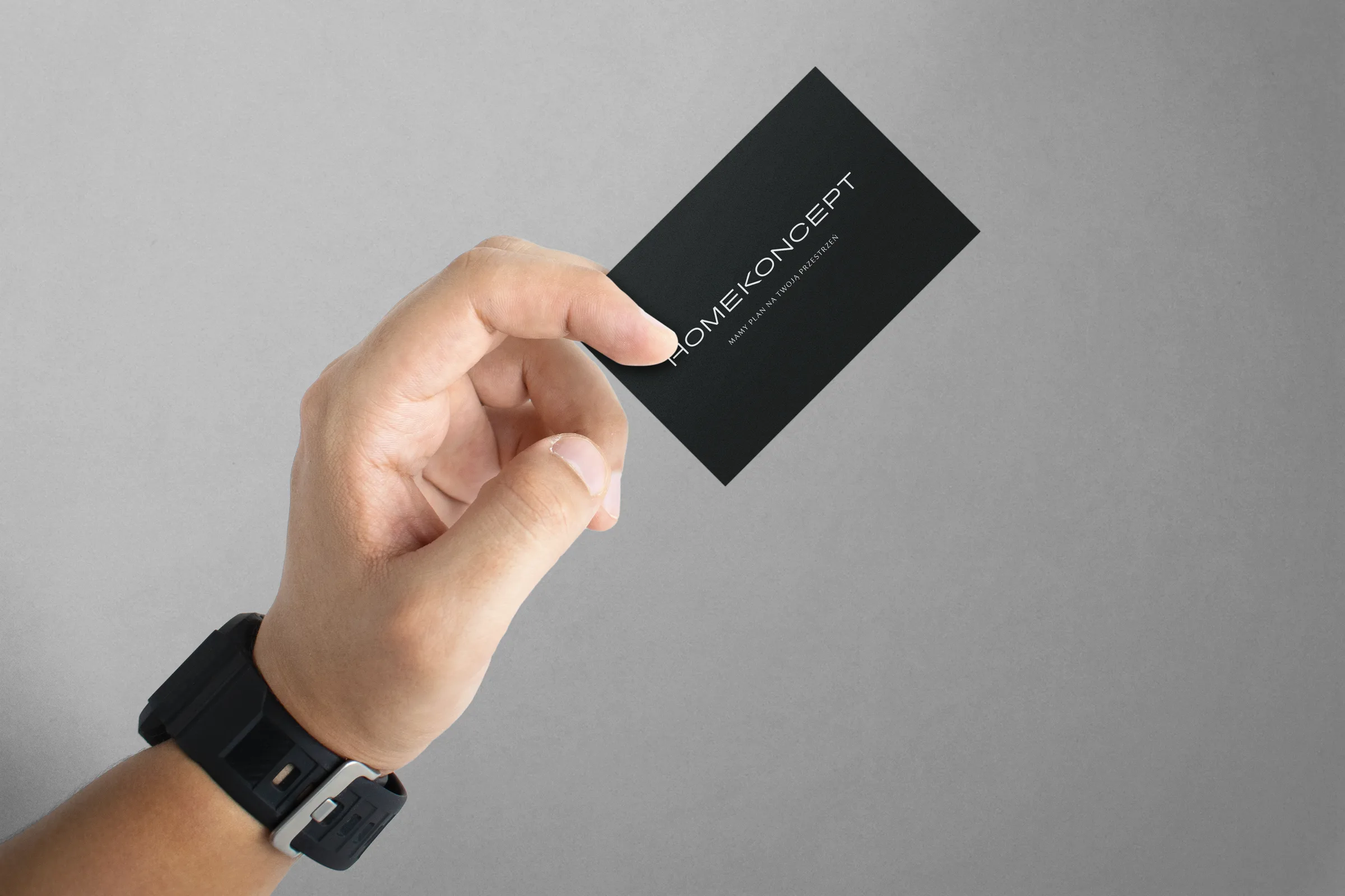
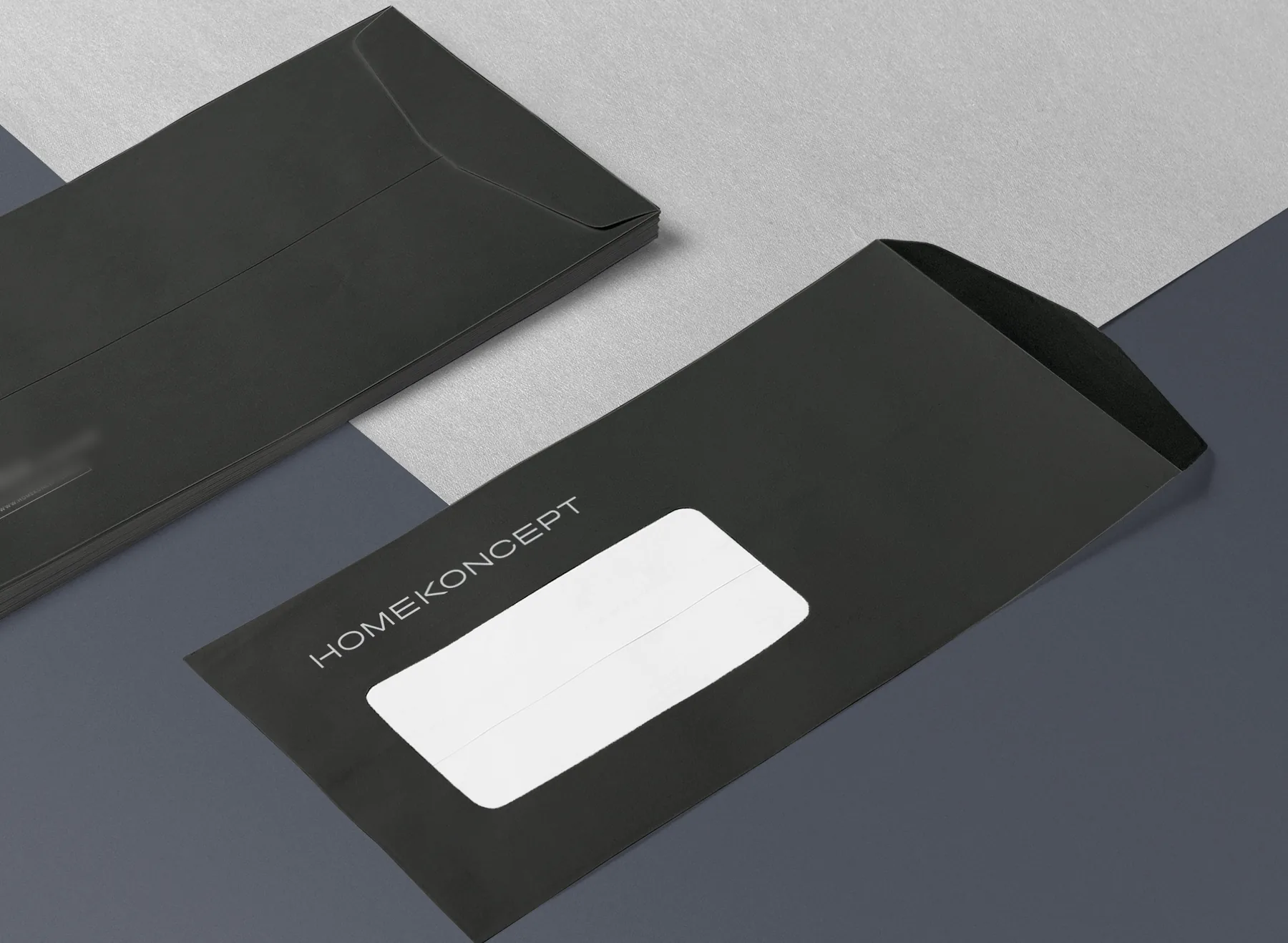
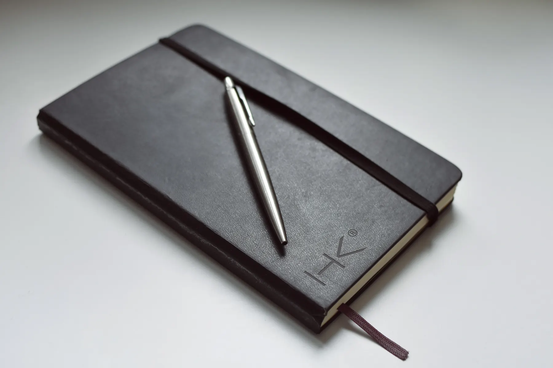
Business card, letterhead, envelope, email signature and email template. Plus branded pens and boxes.
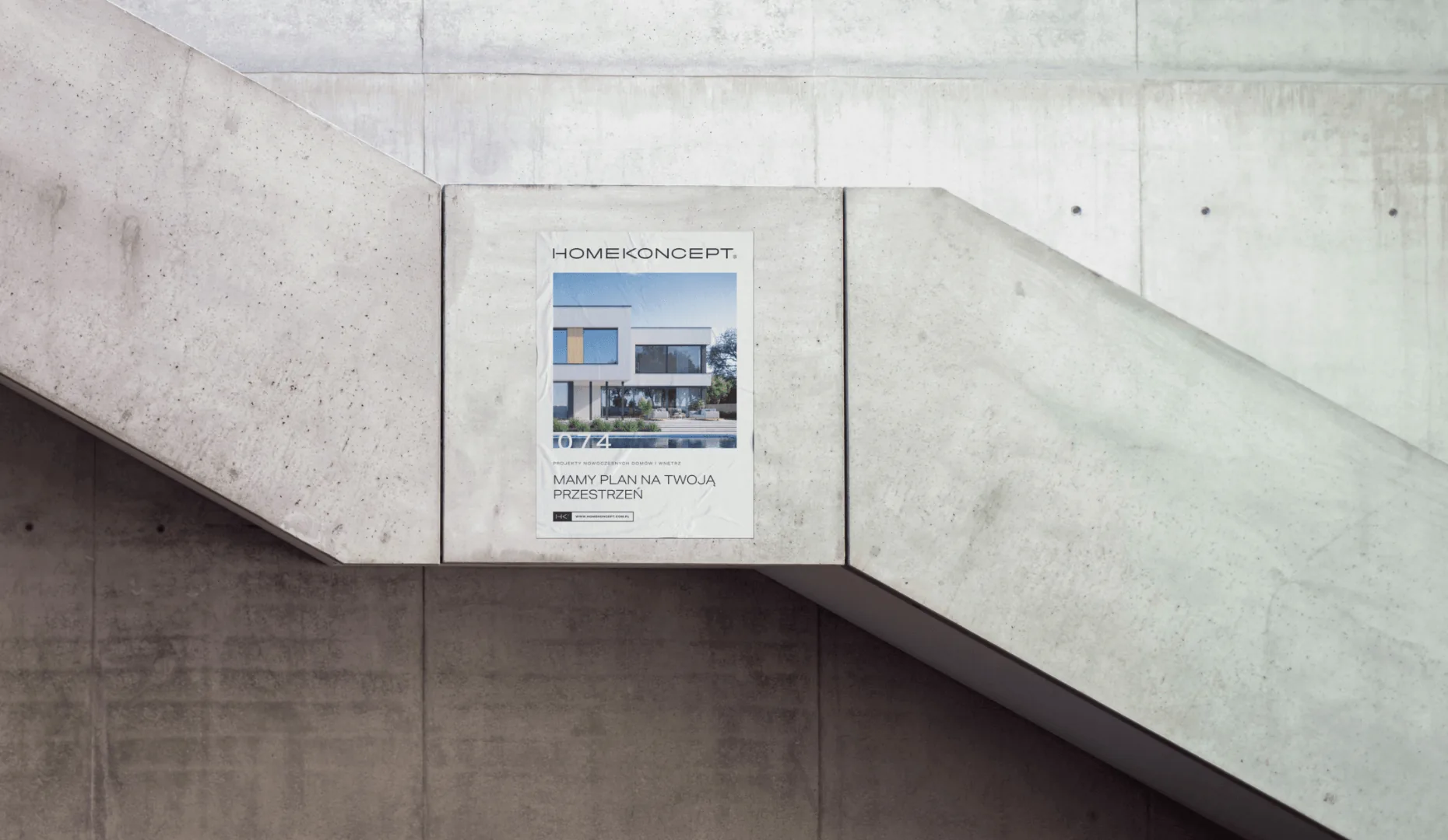
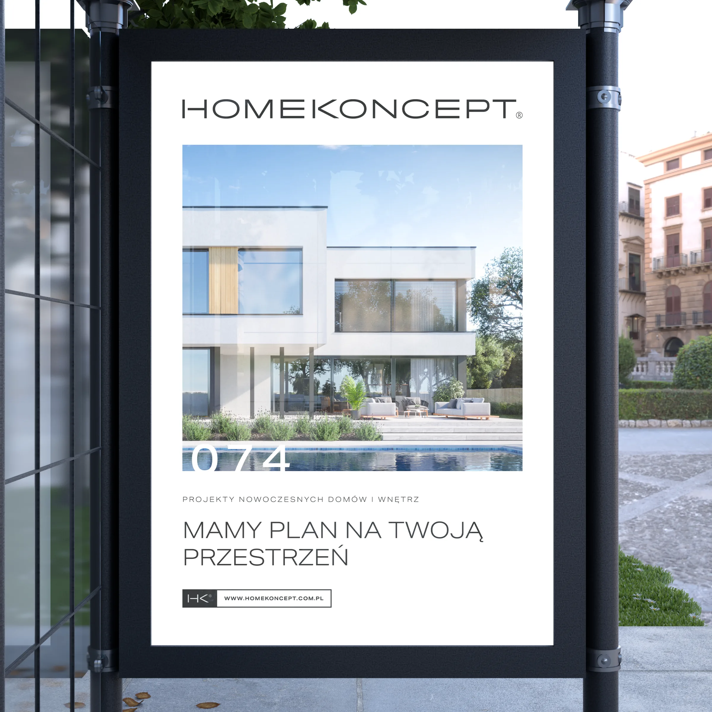
A poster, a roll-up, a 222 × 148 mm press ad, Google ads in formats from 120 × 120 to 300 × 600 px, Facebook posts and holiday cards.
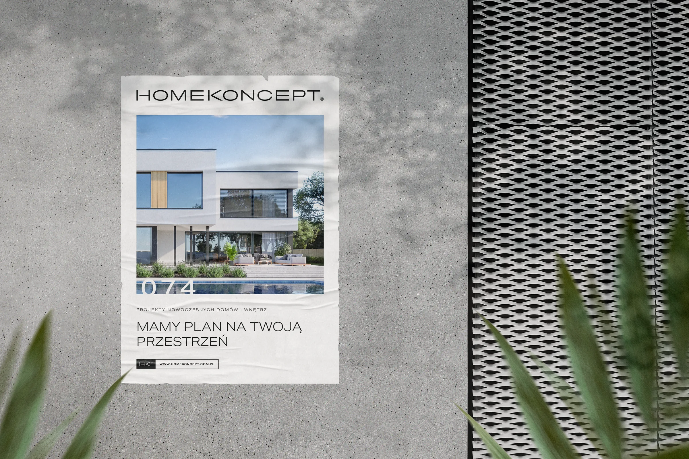
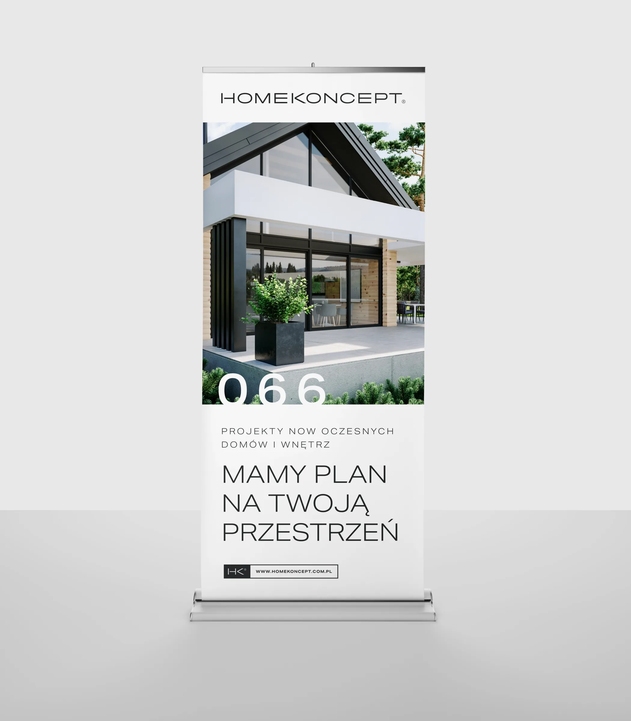
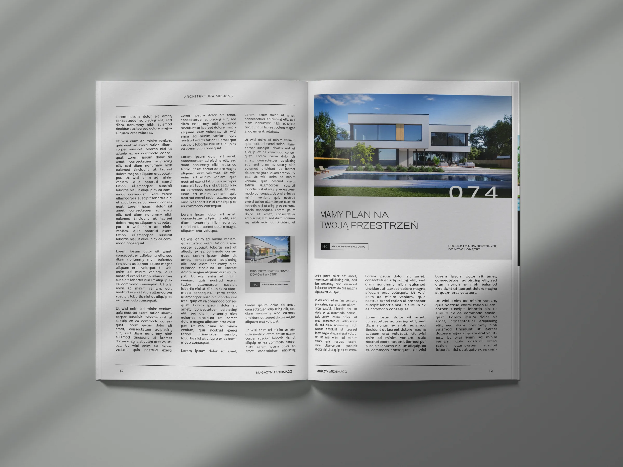
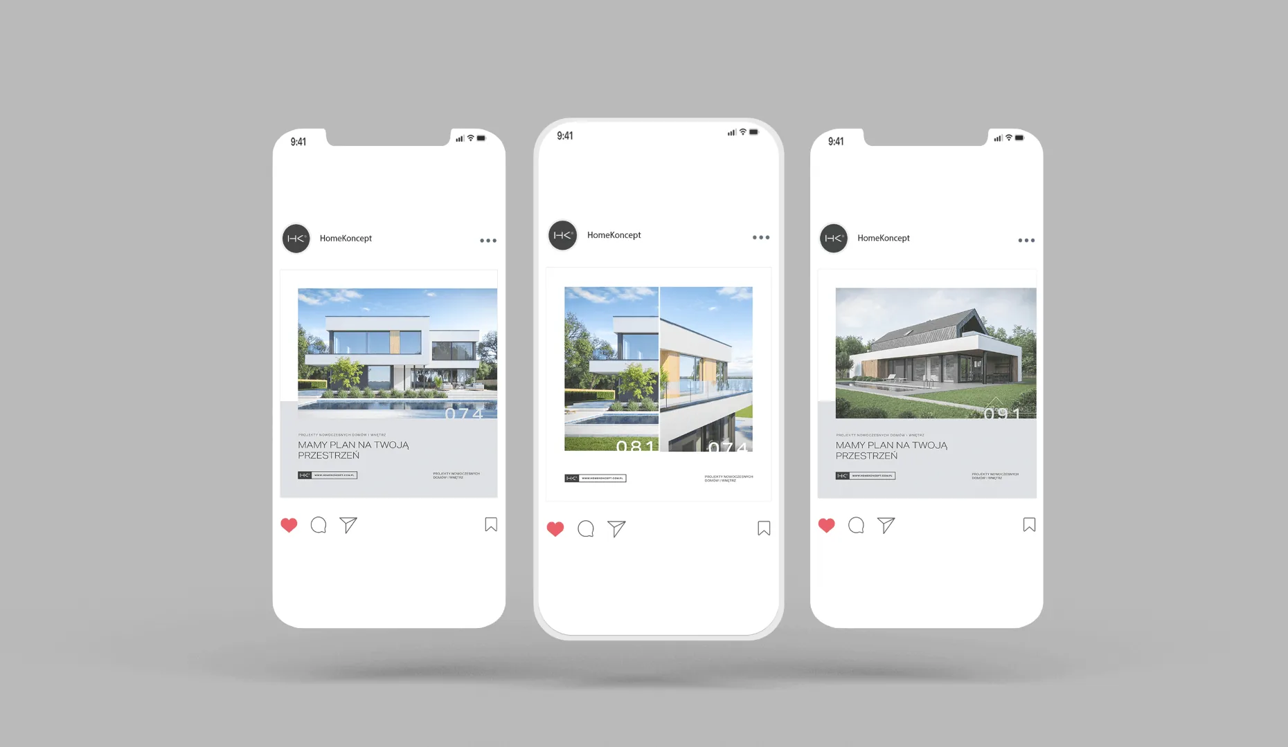
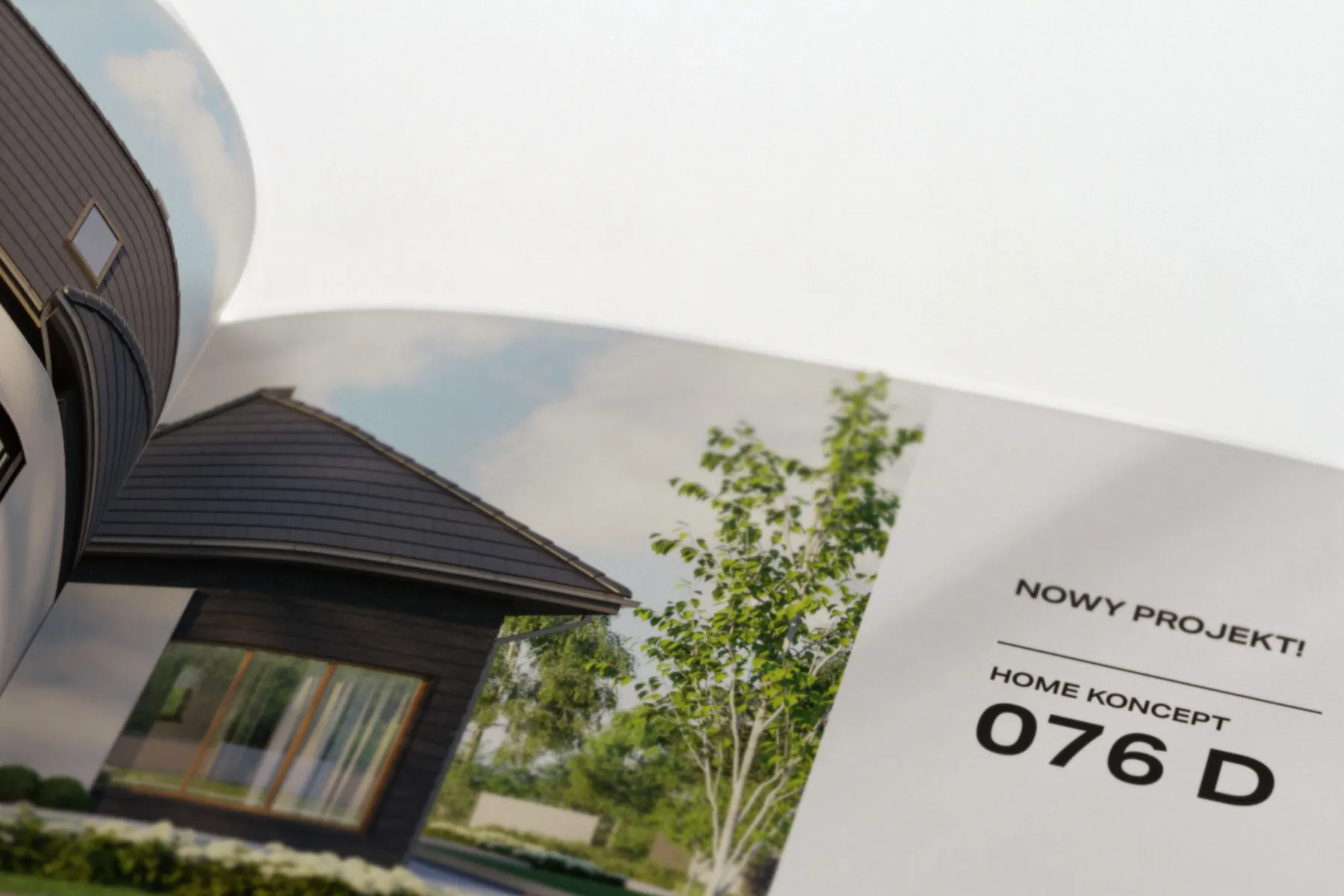
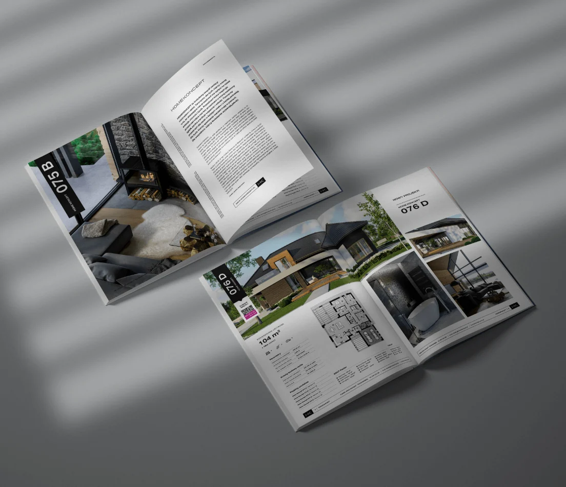
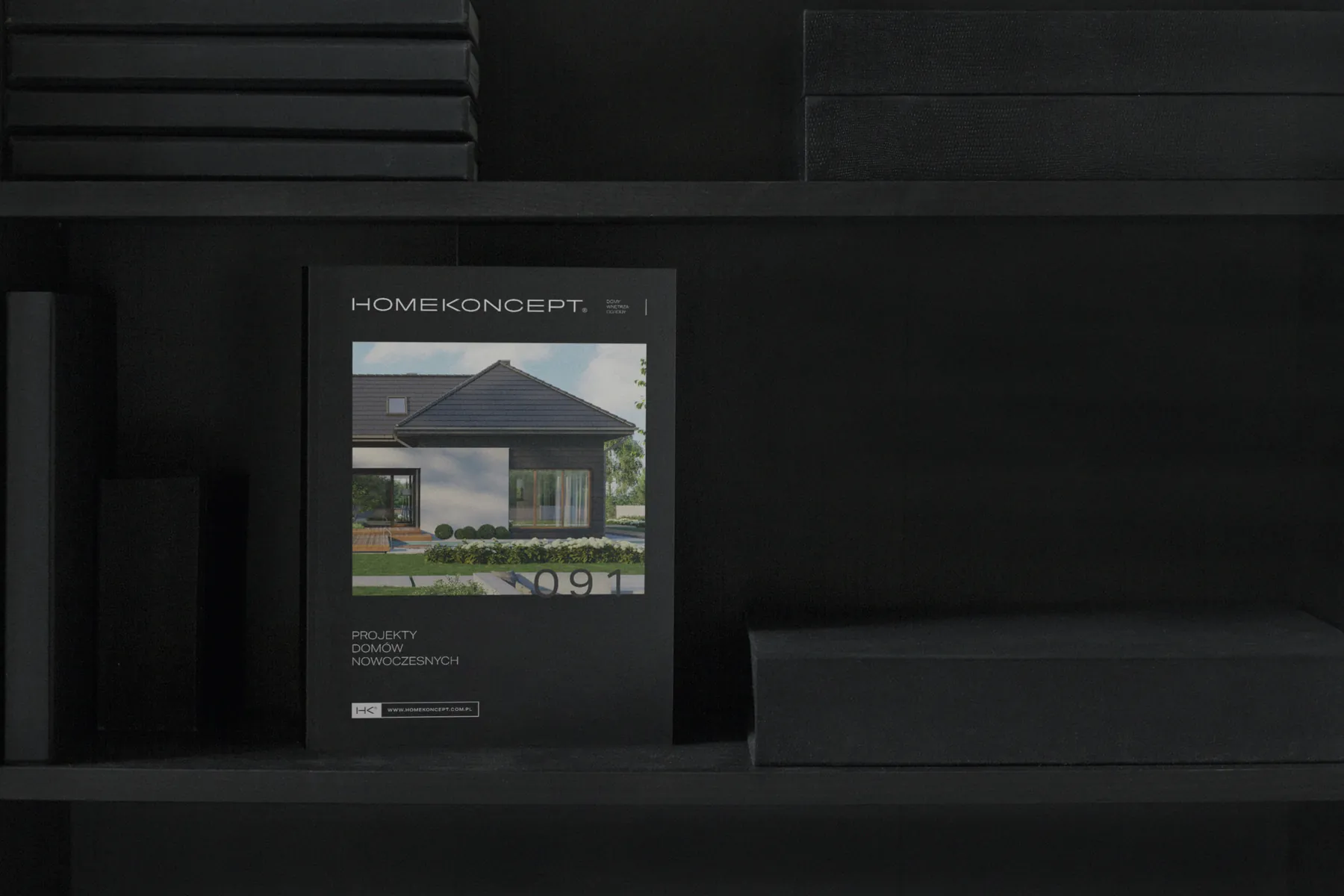
The cover of the house plan customers buy, a downloadable PDF plan sheet and a catalogue organised into four house categories (single-storey, two-storey, with an attic and holiday homes), with icons for bedrooms and bathrooms and six key data points for each house.
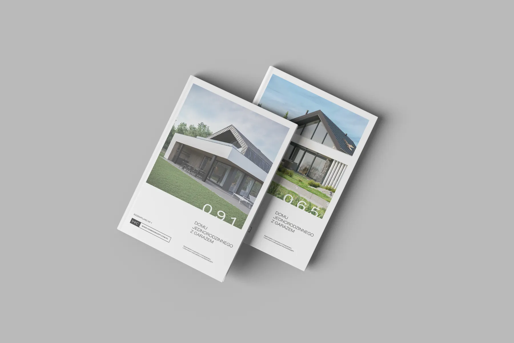
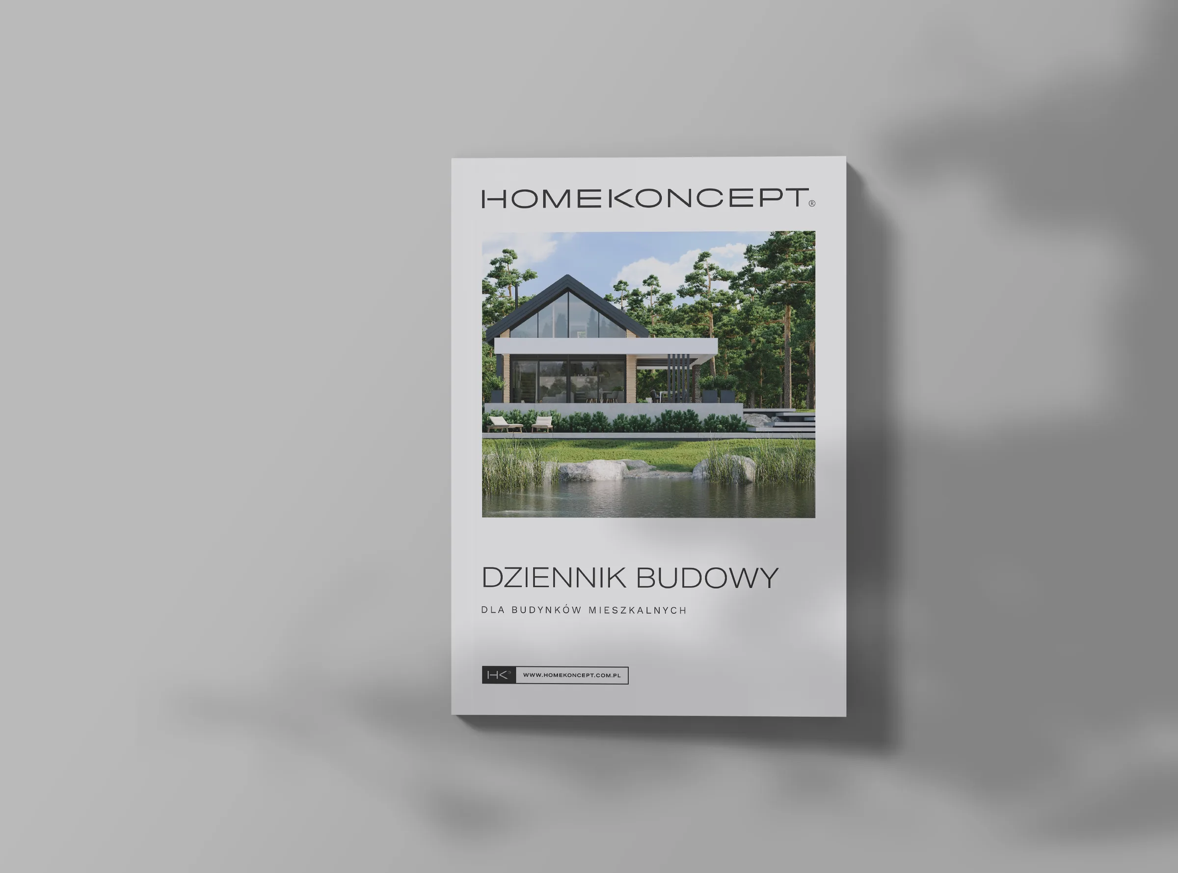
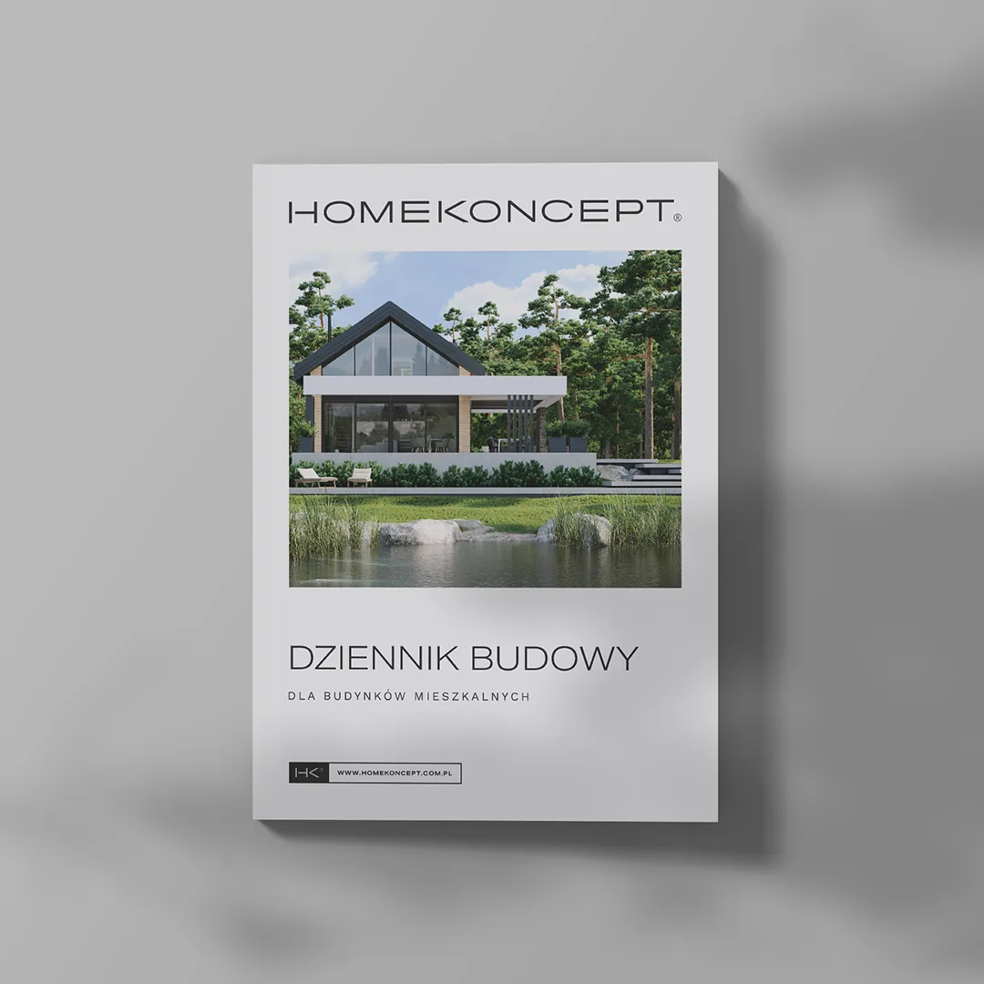
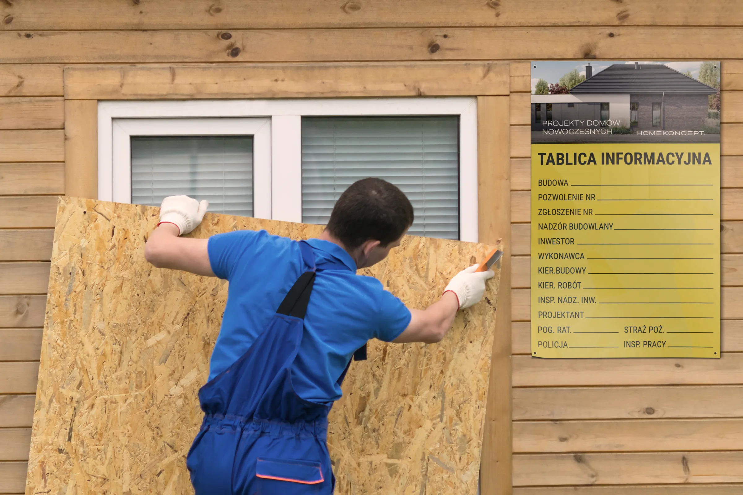
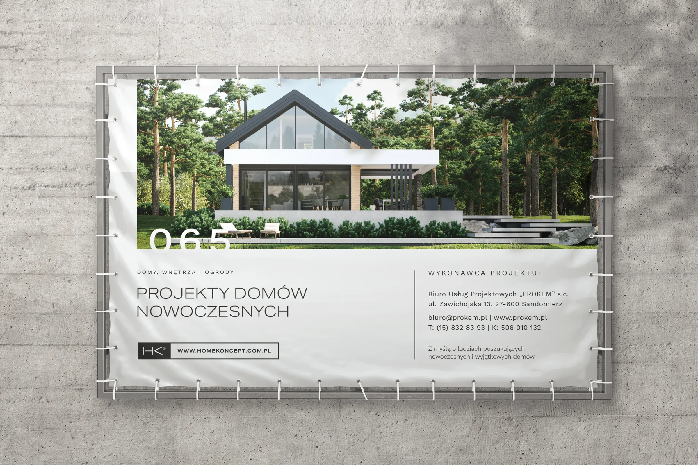
A construction log cover, a building site board and a fence banner. Customers live with these long after buying the plan, so we designed them as carefully as the ads.
Sheet 05 · Website
A house plan shop designed to sell add-ons
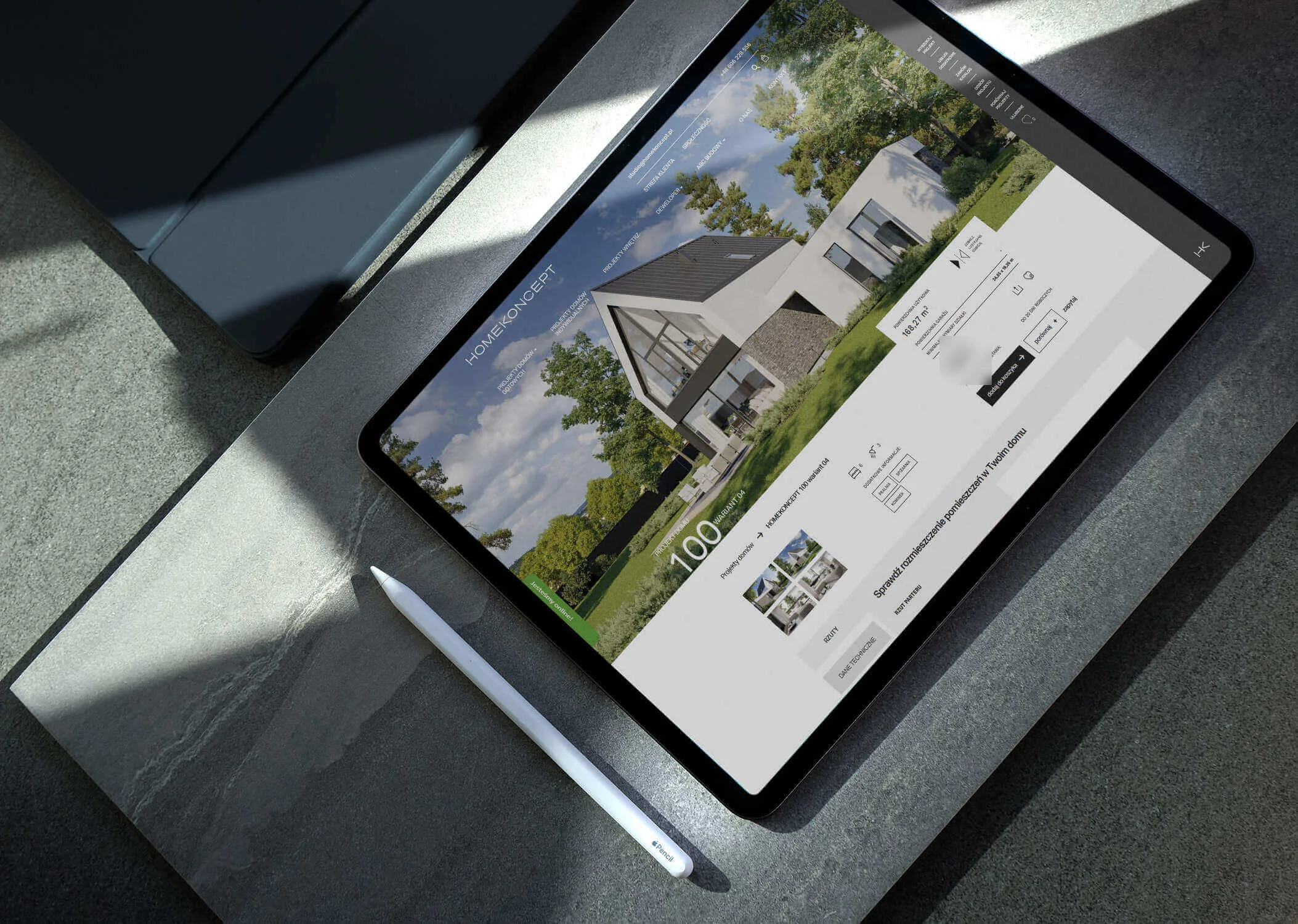
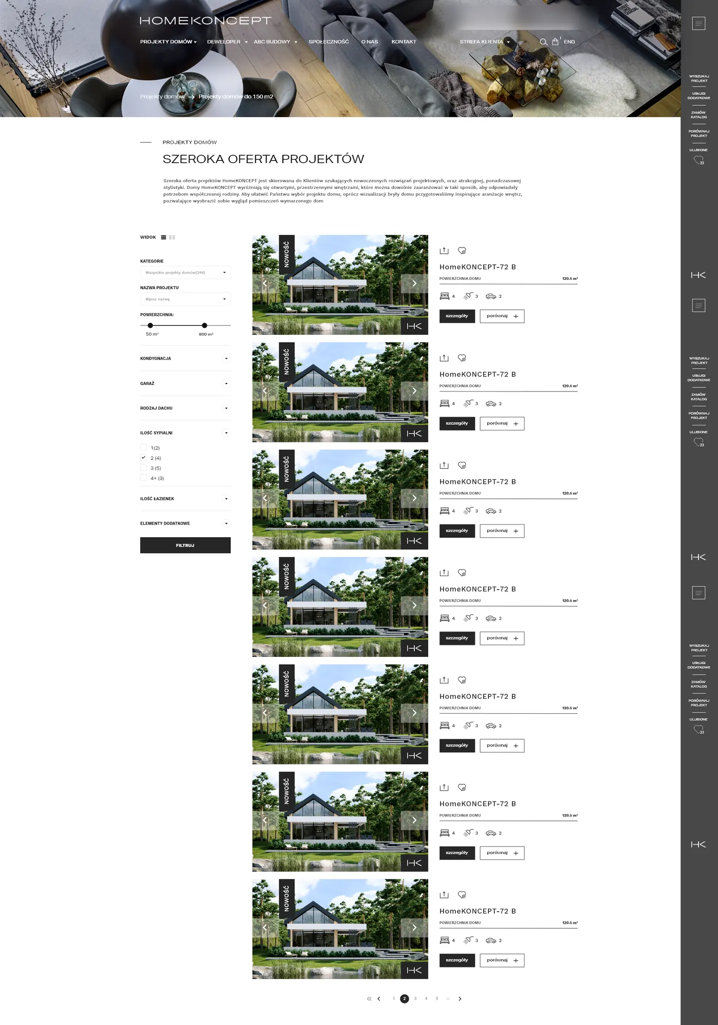
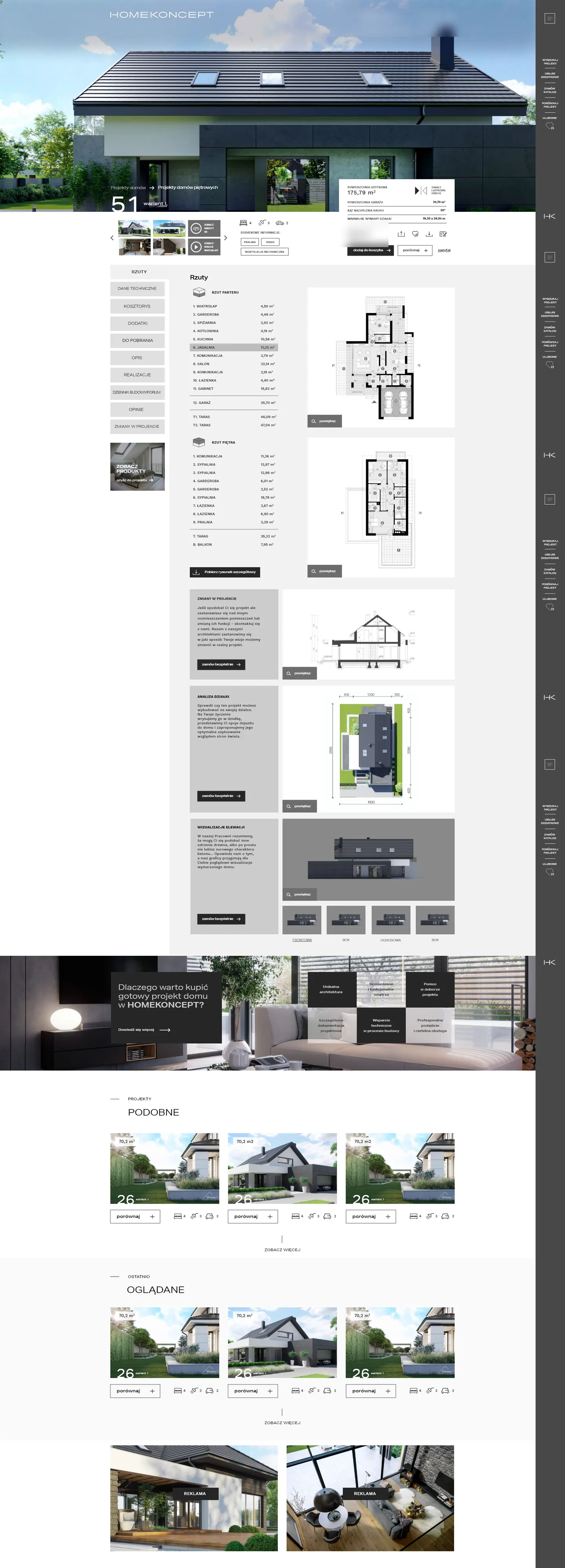
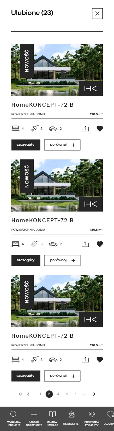
The website is where the studio shows the houses it offers, so above all it has to support the purchase: be clear, and give all the information needed on each plan page in a visual way.
The website had two goals: build the brand and sell plans together with add-ons. The sitemap had around 20 sections: a search with filters, a plan page with floor plans, a cost estimate, variants and a construction log, a comparison tool, favourites, an offer for developers, a forum and a community.
Most of the work went into sales. The cart has five steps, add-on packages are compared in a table, and when a customer has only the plan in the cart, the site suggests a matching package. The cart went through four rounds of revisions with the HomeKoncept team. On top of that came a customer account (purchased plans, cost estimates, offers and discounts) and a partner area.
We prepared the UX/UI design at 1366 and 1920 px widths and in a mobile version, for the client's developers. Today's homekoncept.com.pl is a different build.
Sheet 06 · The project in numbers
Two projects, one brand
First the identity, then the website design. Here's how it looks in numbers.
- 2 workshop panels and two visual directions in the moodboard.
- 3 versions of the mark: logotype, logotype with tagline and HK symbol.
- 13 chapters in the brand guidelines.
- 25 identity materials, from the business card to the building site board.
- 16 designs handed over to the HomeKoncept team as working files.
- 4 house categories in the catalogue and 6 data points for each house.
- ≈20 sections in the sitemap: search, plan page, comparison tool, customer account, partner area.
- 5 cart steps and 4 rounds of revisions with the HomeKoncept team.
- 3 screen versions: 1366 px, 1920 px and mobile.
- 31 tasks on the website and materials in the second stage of our work together.
Brand site manager: Fluostudio
Sheet 07 · Handover
A brand that stayed
On its website, HomeKoncept added the change to its company history: “A new logo and a new dimension for the brand”. To this day homekoncept.com.pl runs on our logotype, the Aktiv Grotesk Ex typeface and the black #262626 from the brand guidelines.
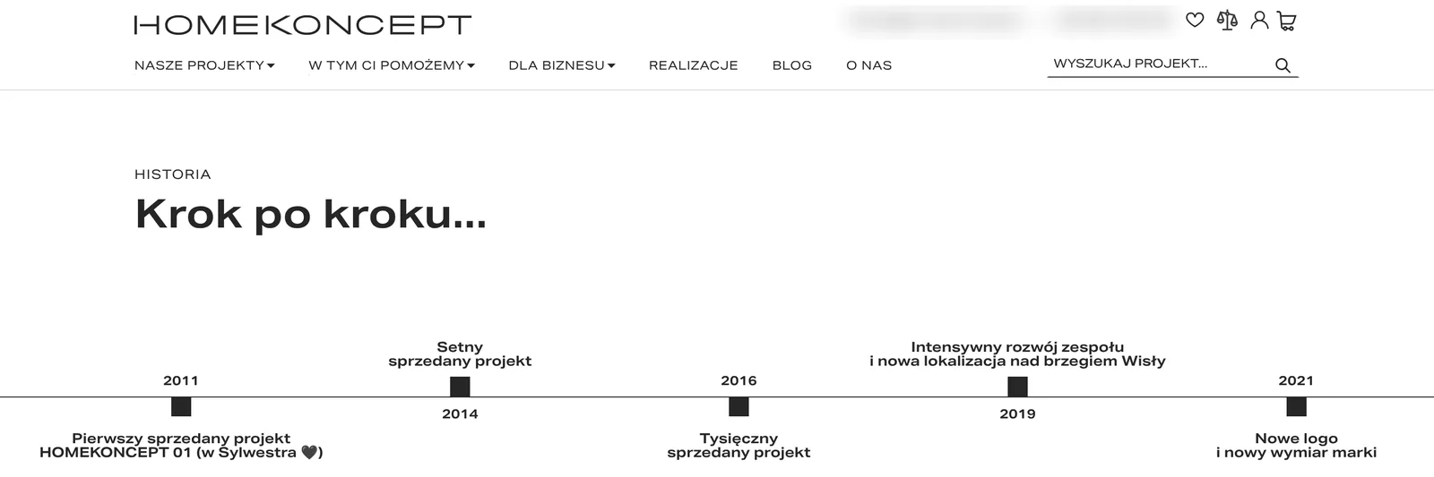
- plans sold before we started
- 1 000+
- houses built, according to the studio
- 15 000+
- house designs on offer
- 150+
HomeKoncept figures from homekoncept.com.pl/o-nas/.
Schedule of handed-over files
At the end, the HomeKoncept team received working files for every material. They now make new ones themselves, within the finished system.
- 01Business card
- 02Letterhead
- 03Email signature
- 04Envelope
- 05Branded pens
- 06Poster
- 07Roll-up
- 08Newspaper ad
- 09AdWords ads, 5 formats
- 10Building site board
- 11Construction log cover
- 12Fence banner
- 13Plan cover
- 14Key visual presentation
- 15Christmas and Easter cards
- 16Facebook posts
- Client
- HomeKoncept
- Materials
- 25
- Scope
- Branding · Logo · Production and print · Social media · Website
- Tools
- Adobe Illustrator · Adobe InDesign · Adobe XD · Photoshop
More projects
-
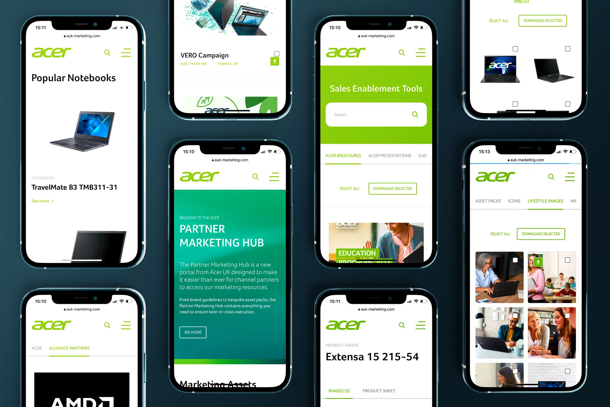 Acer
Over 1,200 jobs for five Acer markets, from banners for retail chains to a partner portal for Acer UK.
-
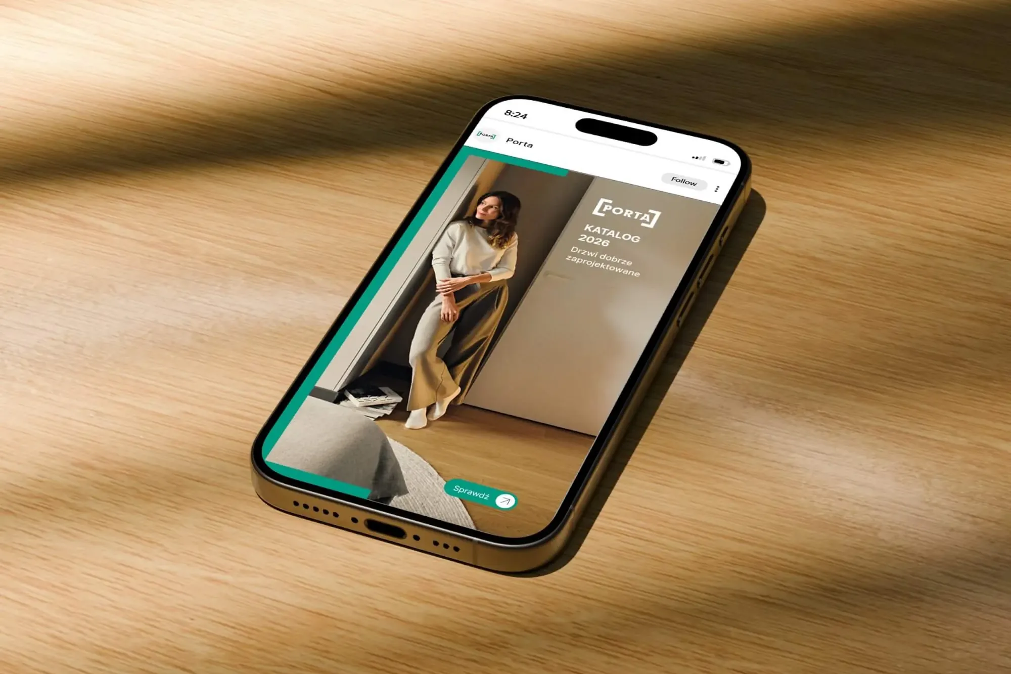 Porta Drzwi
A design system for an existing logo: a frame taken from the logo, grids, icons, drawings, a catalogue, porta.com.pl, social media and sales materials for a door manufacturer.
-
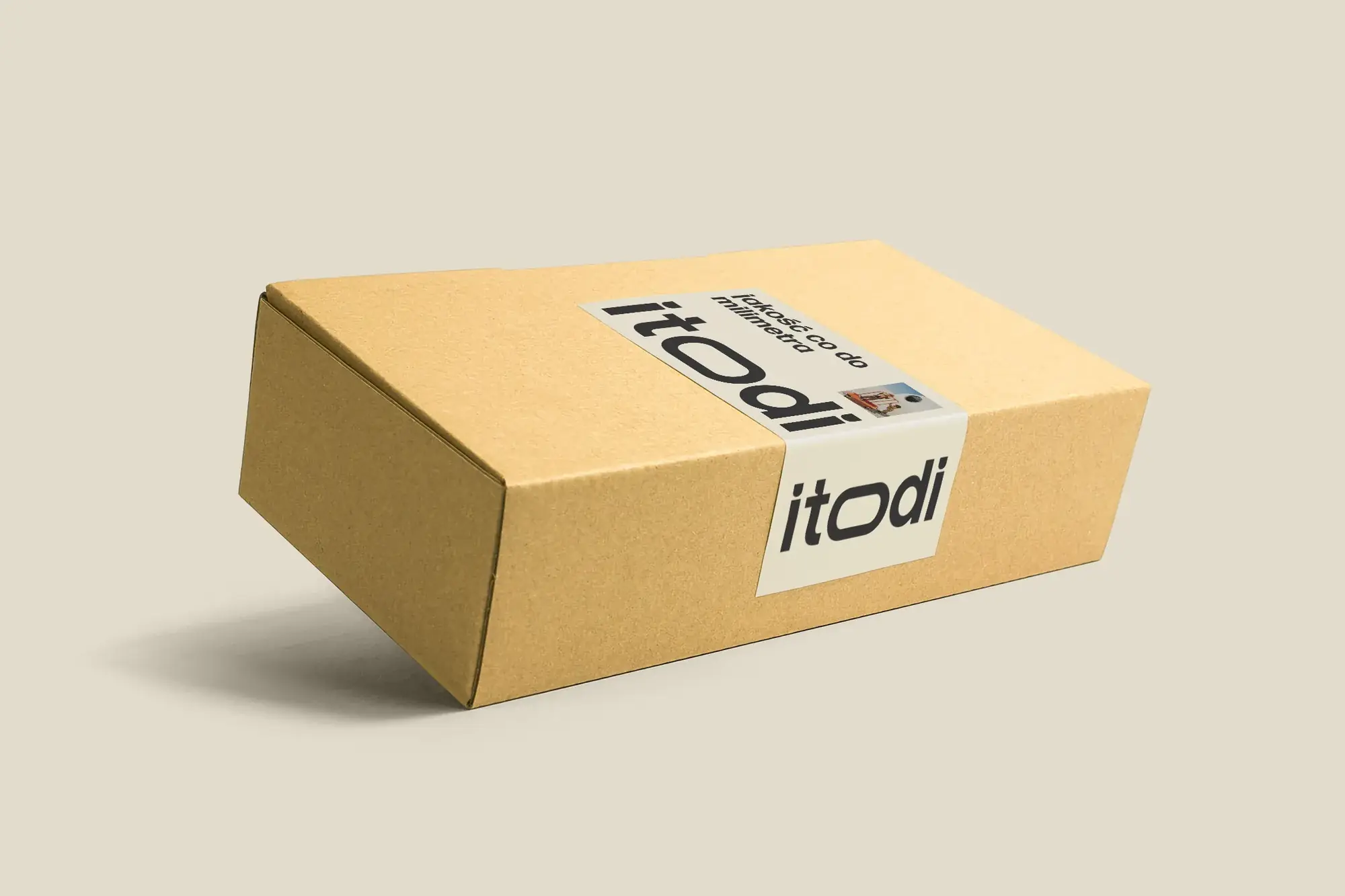 Itodi
A new made-to-measure furniture brand built from scratch: the name, a logo with a stretched “o”, the design of a shop with a configurator, an instruction leaflet and packaging.
-
 Design Optyk
A family-run chain of premium eyewear stores: an identity without gold, in-store materials and a new online shop linked to the stock of six of its seven stores.
-
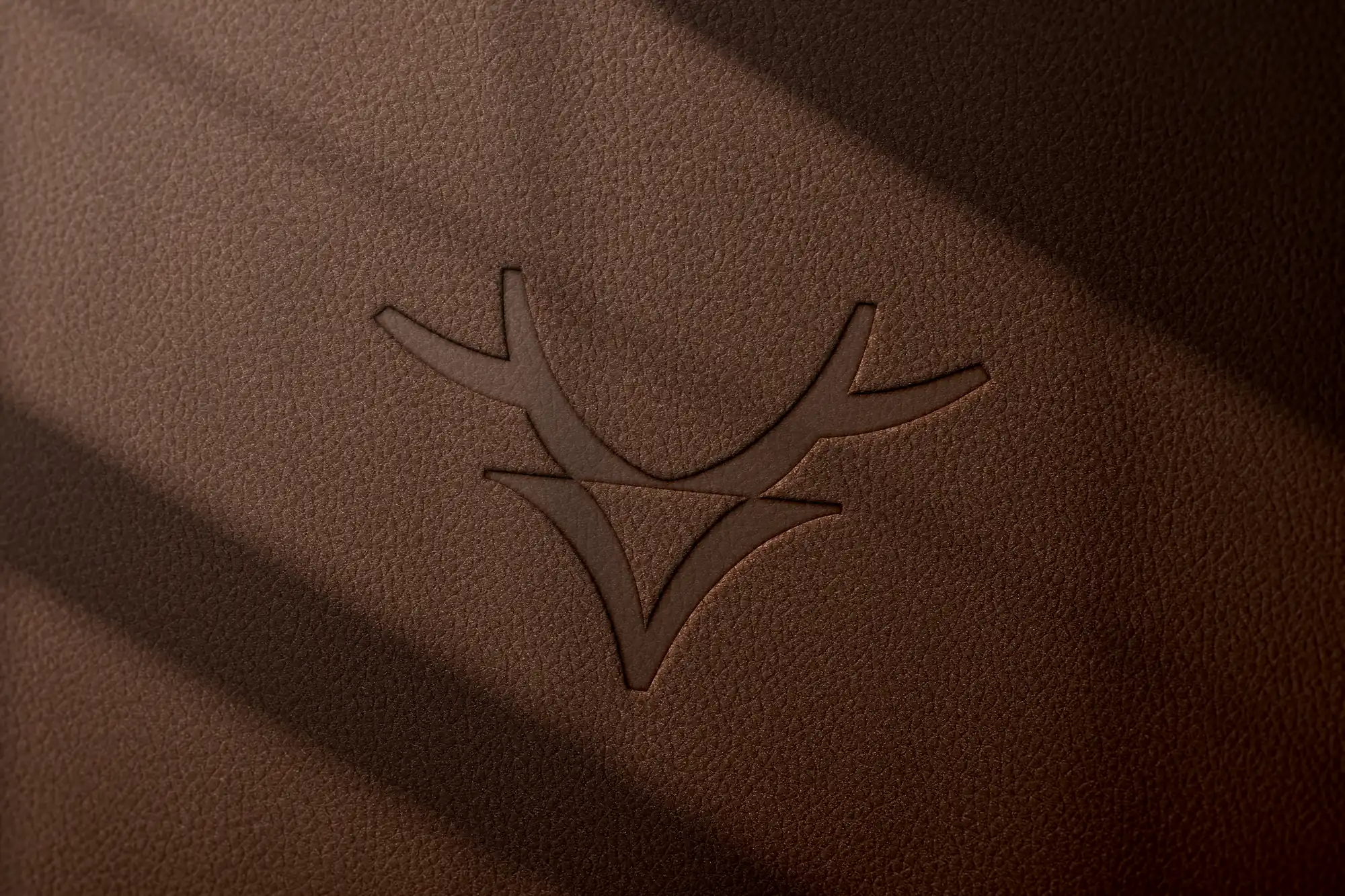 Mily Group
A rebrand for a deer antler supplier: communication strategy, logo, logo guidelines, the milygroup.com website and trade fair materials.
-
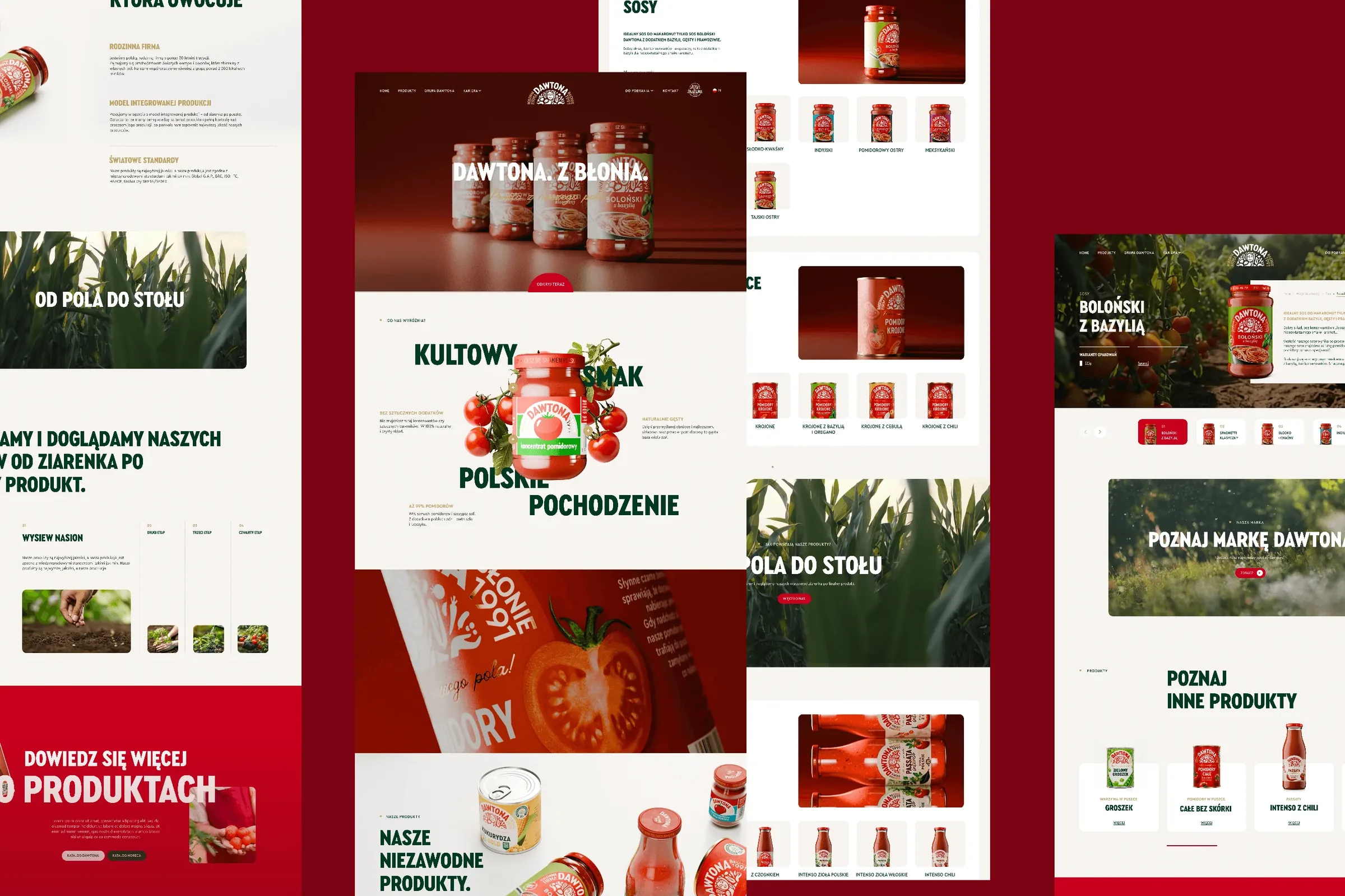 Dawtona Group
All of Dawtona's communication beyond the shelf: over 90 projects, from posts and trade fair stands to four websites and animations.
-
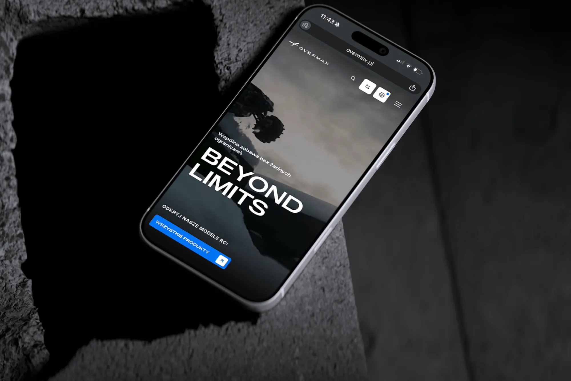 Overmax
UX/UI design for the Overmax shop: RC cars in cinematic shots, a carefully worked-out product page, a category menu and a quiz that picks a model for you.
-
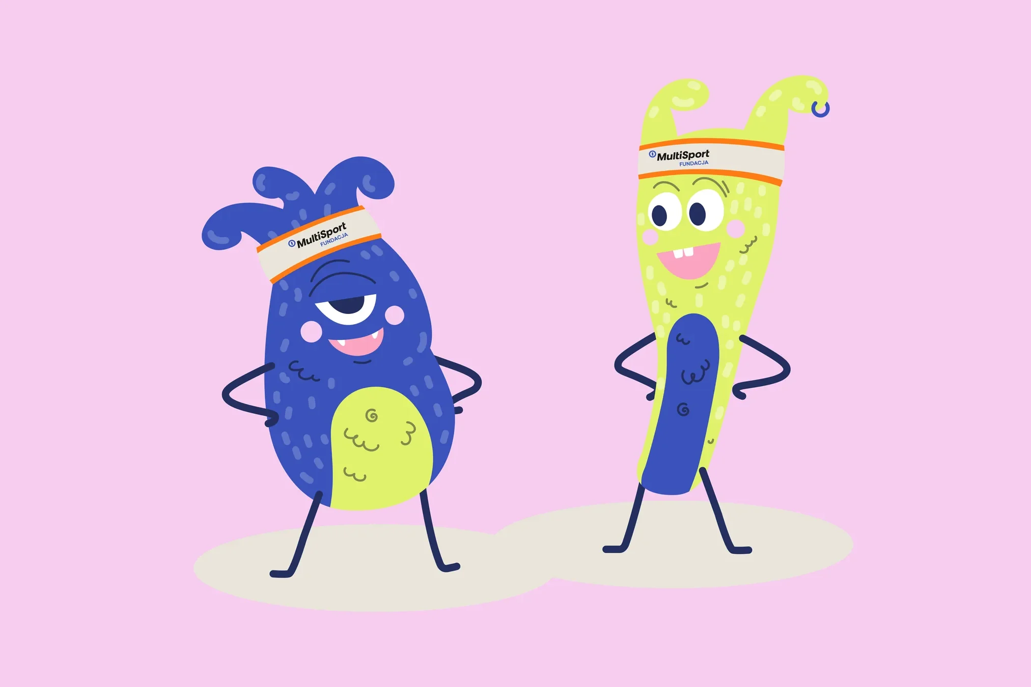 Fundacja MultiSport
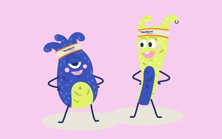
An identity with a design system in Figma, a WCAG-compliant website and a brand hero duo that gets people moving.
-
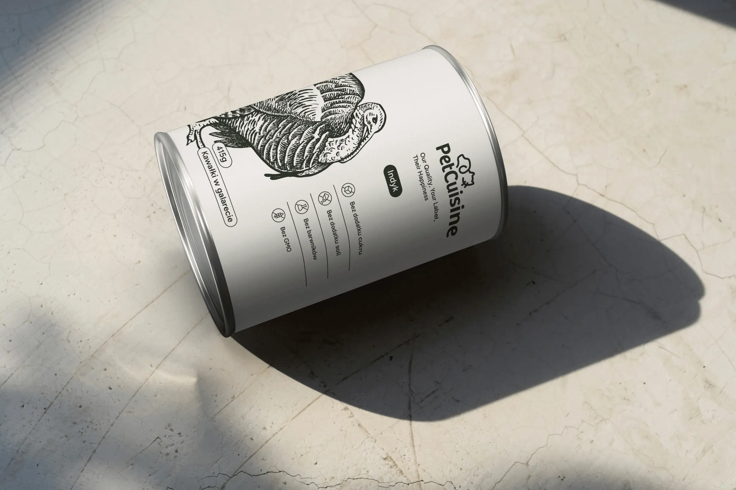 PetCuisine
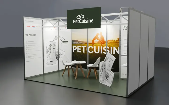
We built a brand from scratch for a pet food manufacturer in the Dawtona Group: from the name and tagline, through packaging in 12 flavours and the website, to trade fair stands across Europe.
-
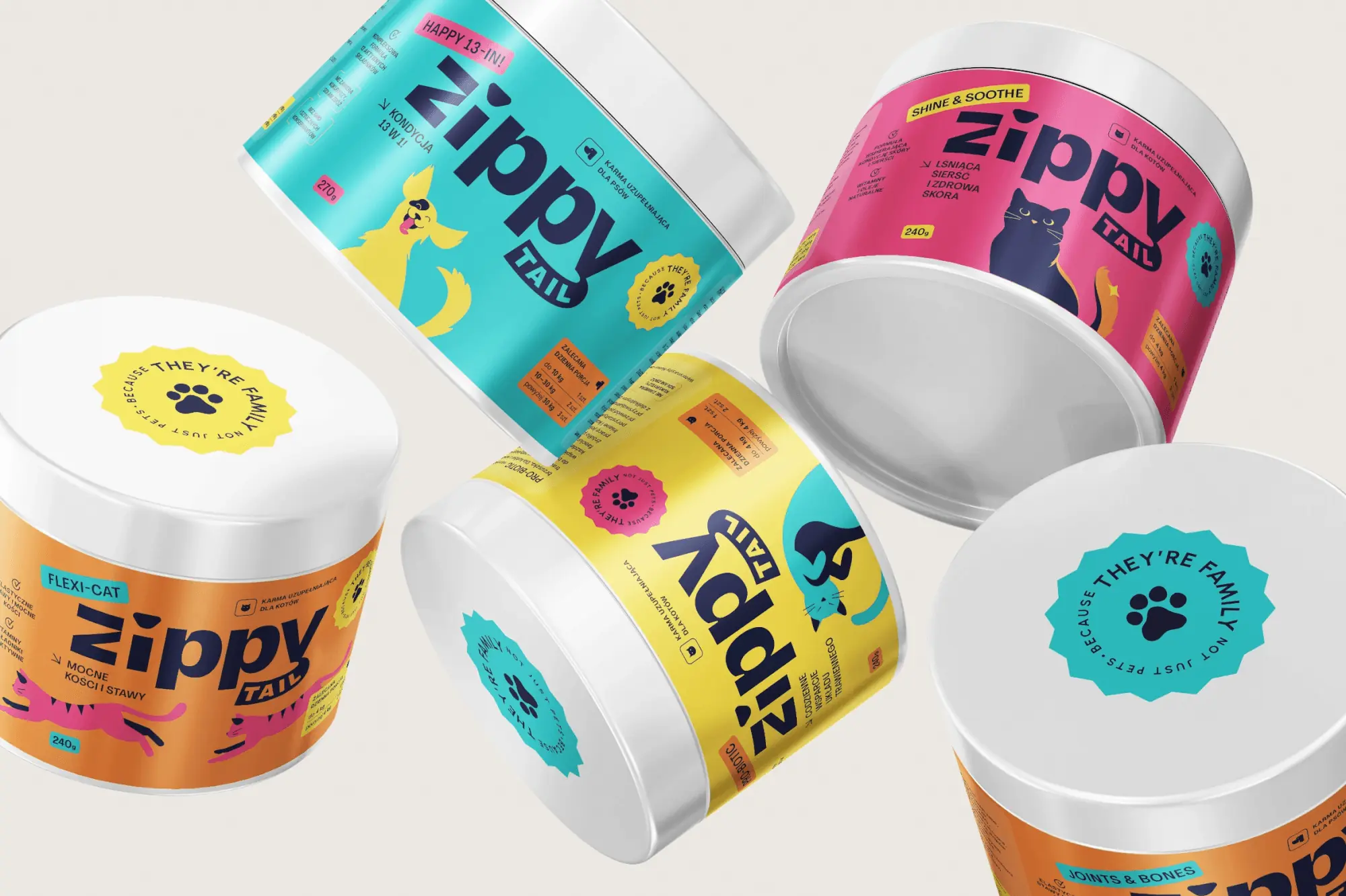 Zippy Tail
We built the Zippy Tail brand from scratch: the name, strategy, labels for eight supplements for dogs and cats, the shipping box and the shop design.
-
 Intima Clinic
Six medical brands in one group. Workshops, names, identity, clinic signage, print, animations and the intimaclinic.pl website.
-
 PolTREG
A rebrand for a biotech company listed on the Warsaw Stock Exchange, the poltreg.bio website for patients, investors and partners, and ongoing design support.
Facing a similar challenge?
Tell us what you want to change. In a first, no-obligation call we will see whether and how we can help.